Project: Orange Dental Clinic
Design company: RIGI Design
Designer: Liu Kai
Area: 250m2
Main Materials: Paint, mosaic, blackboard paint, perforated plate, concrete precast slab, colored glass
Location: Tianjin, China
Photographer: Bian Huan-Min
Author of the Design Description: Liu Kai
Located in the port city of Tianjin in northeastern China, Orange Dental Clinic was completed in November 2015 by RIGI Design.
Project description: Dental clinic is not a happy place to go, or we should say, no clinic could make people feel happy: the cold reg-istration desk, the worrisome waiting chairs and the disturbing doors of the clinic rooms; the whole space is filled with a sense of distrust between doctors and patients. However, from spiritual aspect, clinic should be a place which brings hope, or at least should be a warm space. It might not be a delightful thing to go to the dentist, so RIGI does some magic to this space through design, bringing it some kind of warmth and caring.
Before RIGI took over this project, the owner had already got a complete set of space design plan, but his plan did not solve problems existing in traditional medical space. After RIGI is commissioned to do the design for this project, together with the owner, RIGI overthrows the original design concept. RIGI hopes to get rid of the sense of discomfort created by medical space through the space design, and to create a different atmosphere for the whole space. RIGI hopes to express the idea that medical space needs to show trust and hope through different design insights. There should be warmth, goodwill, openness, communication and smile in life. RIGI wishes that all of these could be shown within this space. Because there’s warmth, life should have been happier.
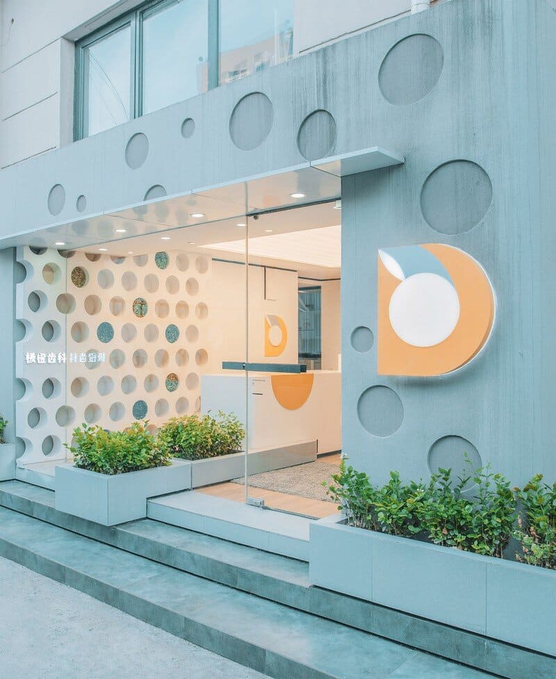
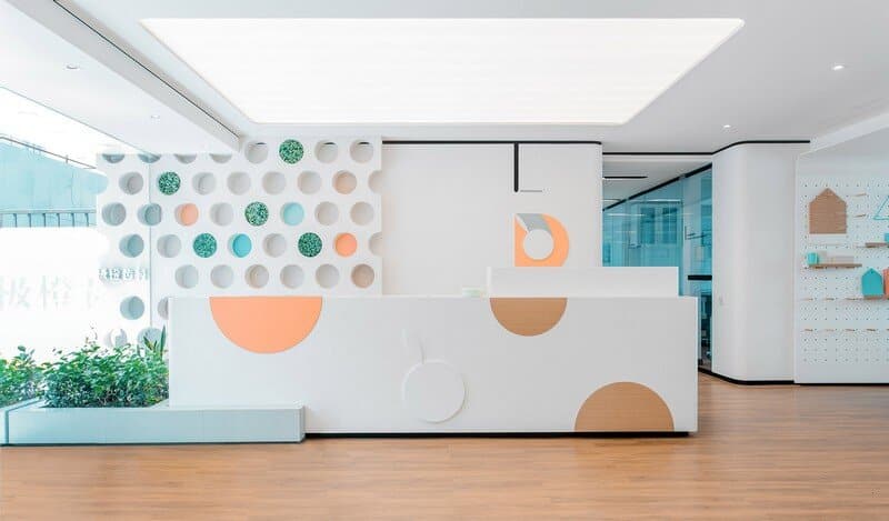
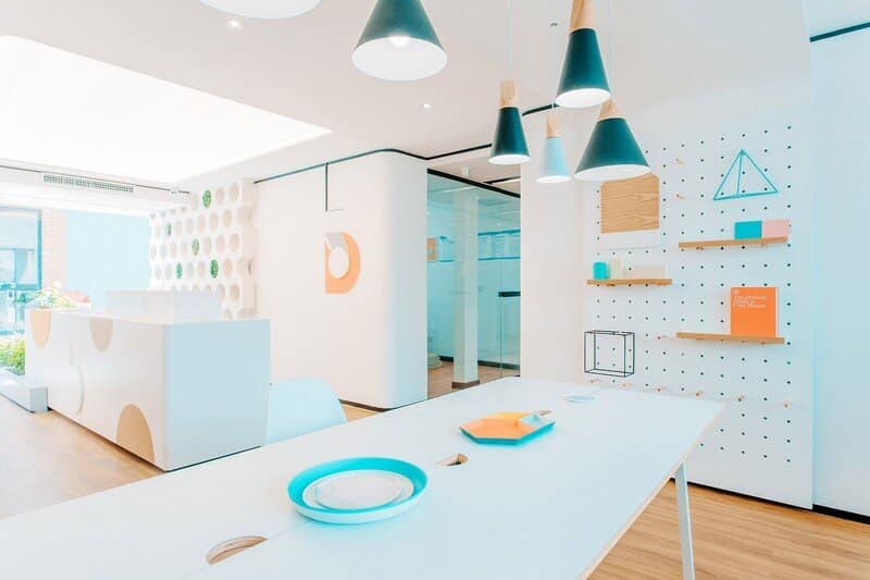
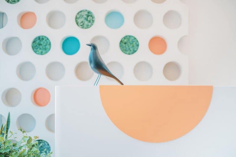
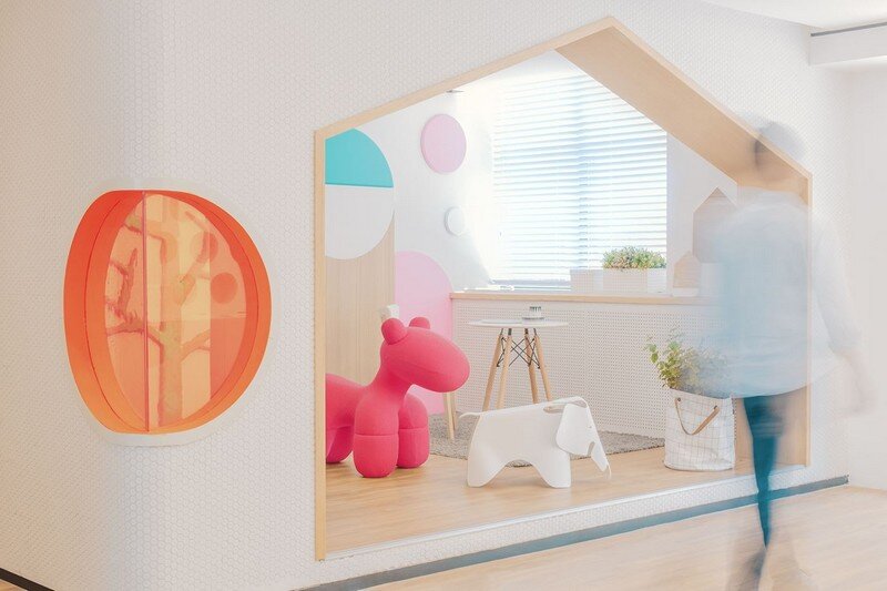
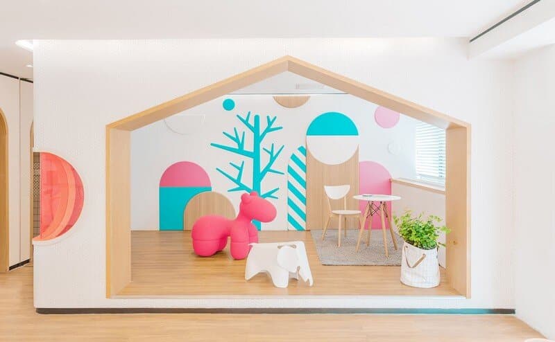
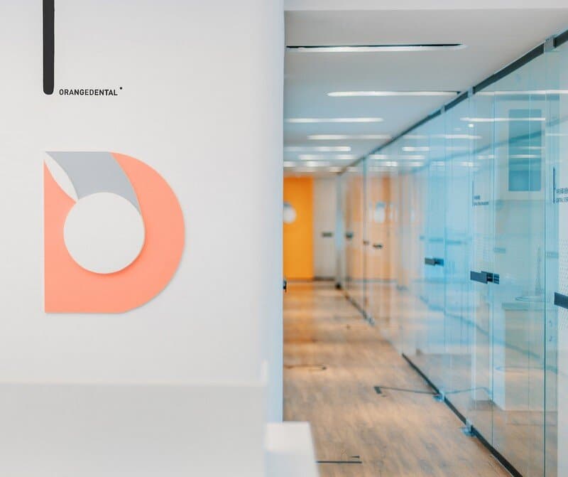
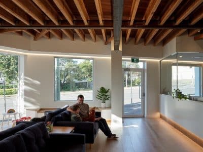
The brand logo and brand IP image of this dental clinic is orange. So circle penetrates the whole design as basic element, and wood material and the match of selected colors deliver a warm texture sensually. The space con-sists of four areas: entrance, kids area, waiting area and clinic. Besides its basic function, each of the areas has its corresponding design insight, and together, these four areas make up the genes of this dental brand and turn the cold medical space into a life terminal which connects to people and spreads warmth and caring.
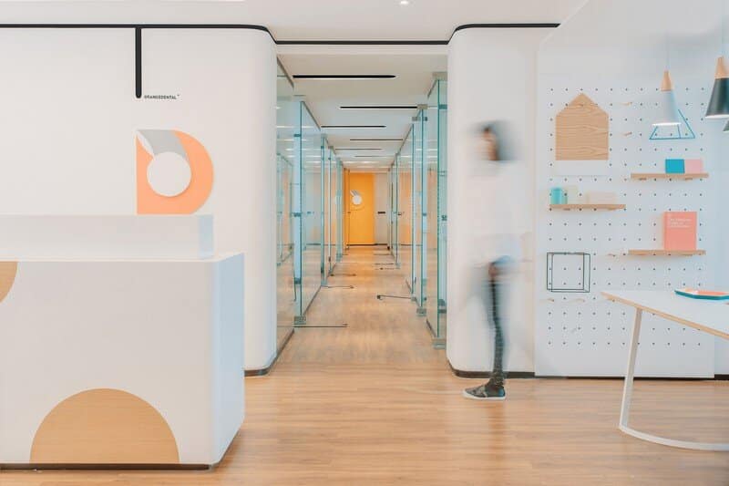
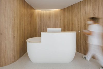
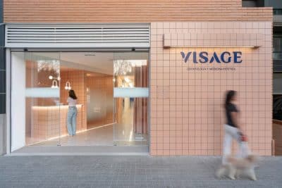
Orange Dental Clinic is located in a creative park. To analyze from the perspective of behavior, seeing a doctor is differ-ent from going shopping. There is almost no occasional guest for clinics; patients only choose to come after learning about it. The special nature of this industry determines that this space needs no use of eye-catching signs to attract customers, and a friendly façade could narrow the sense of distance between medical space and the patients. Thus, RIGI adopts a design strategy of weakening the boundary between outdoor and indoor space through using plants on the façade to connect the outdoor and indoor space, and simplifies the scale of the logo on the wall to avoid delivering excessive commercial atmosphere. The façade extends to the interior space through circle, an element from the IP image, and interesting materials are used to create a warm com-mercial atmosphere. The design of the front desk also tries to present an attitude of relaxed and equal. Starting from the entrance, people could tell this is a friendly space and a warm clinic.
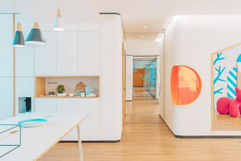
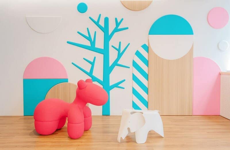
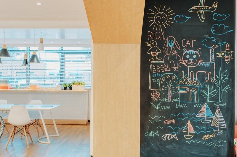
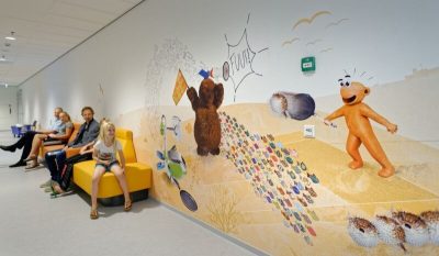
Building a sense of trust within the space is one of RIGI’s design focuses. The world of adults is complex and lack of security, excessive attentions may create an unfriendly sense of distance on the contrary, so we suggest the owner to build a kids area in the important place of the entrance. Caring for kids is caring for adults; a clinic which cares for kids would, to some degree, present a sense of caring and responsibility. Space does not exist in isolation, the emotions and need of roles of people’s behavior within the space are what RIGI is always trying to explore. Design idea is not top-down propaganda, but something that users could always perceive and un-derstand in the terminal. That is the key to design in this age.
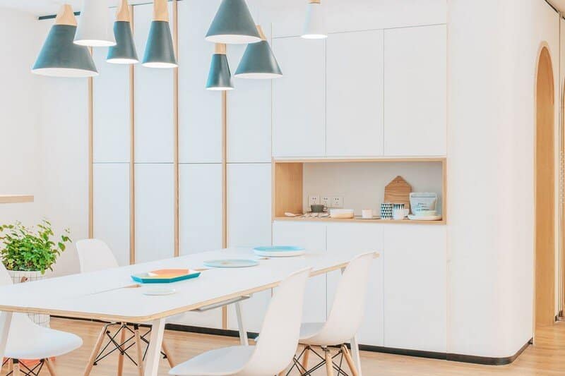
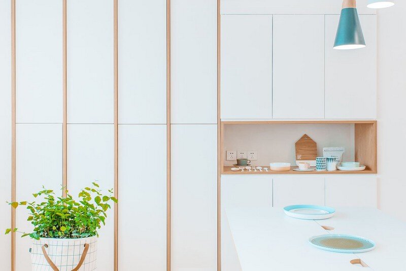
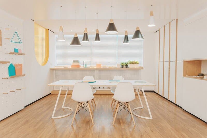
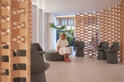
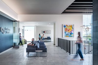
Waiting chairs in traditional hospitals are arranged in a parallel way and in orders. However, it is this sense of order that enhances the unease of patients. After all, what waiting for you is a terrible experience of seeing a dentist; it is anything but nothing good to be looking forward. So we make the layout of the waiting area looks like a dinner table. Here people can sit face to face; they could communicate with each other or wait quietly. In this way, this waiting process is equal and random during which patients could feel the temperament of the space. The orange and transparent area on the left side of the waiting area is the central supply room of the clinic. All medical devices and gauze will be centralized and sterilized here; thus the philosophy of “going transparent” of the clinic will be reflected through this transparent and open way. All these designs make people have a further perception of the clinic’s philosophy, while life scenario oriented design further ex-presses the clinic’s warm and caring nature. It might not be a home, but RIGI hopes to bring people a percep-tion of home through design. After all, Orange Dental Clinic is a place where problems will be solved and hopes be created, just like a home.
When people see the rows of doorplates such as dental implant department and radiology department, to some extent, a sense of discomfort and anxiety will grow. RIGI cancels all the logos and adds text signs with readable dimensions on the glass of corridors while doing the design. The issue of spatial recognition chaos does not exist in a clinic of this size. RIGI also uses signs of numbers to connect the corridor and departments. Different numbers on the floor mark different functional spaces. To eliminate in maximum the uneasy and an-xiety of seeing a doctor is the key point of RIGI’s design.
Thank you for reading this article!

