Project: Fiddleneck-Kemp Modernist Home Renovation
Architects: Studio AR+D Architects
Architect in charge: Sean Lockyer
Location: Palm Springs, California, United States
Size:4100 square feet
Photography: Michal Utterback
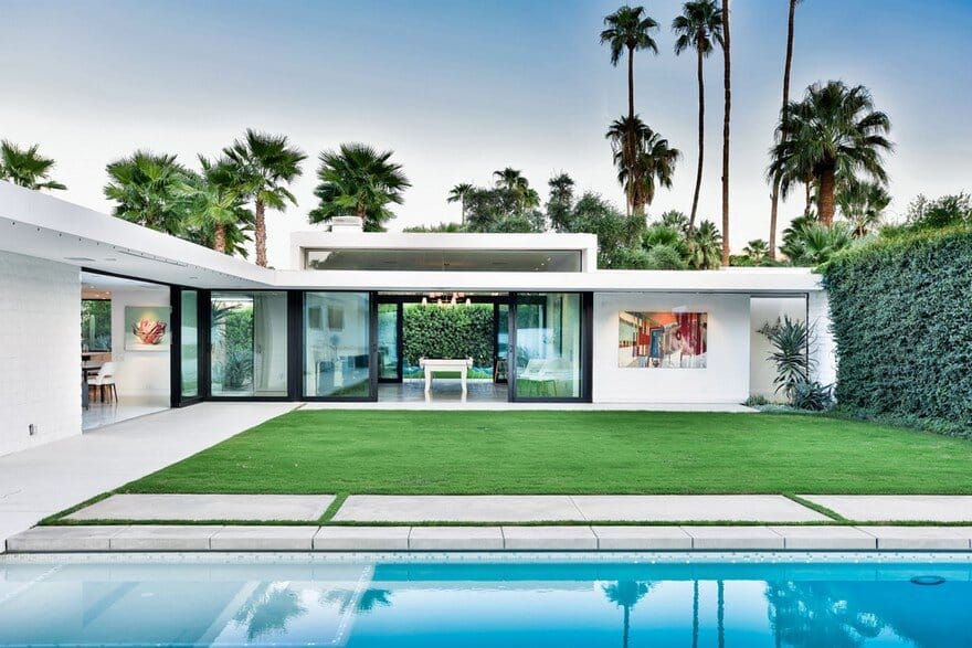
Original architect William Krisel designed the block home in 1963 for a builder friend, creating a U-shaped plan that wraps around a backyard lawn and pool, allowing all rooms to have access to the outdoors and views of the landscape.
When a rare 1963 Krisel-designed custom home came on the market in Palm Springs, a Canadian couple snapped it up with the intent of using it as a vacation home for their family when the weather got chilly up north. The house, though, had endured the whims of numerous owners, its clean lines faded under heavy landscaping and layers of not-so-appropriate interior finishes. They asked architect Sean Lockyer, principal of Studio AR+D, to restore the home to its midcentury serenity and to tweak the floor plan to accommodate 21st-century living.
Renovating architect Sean Lockyer took on the project’s architecture, construction, landscaping and interiors. Before he tackled the renovation, he visited the Getty Research Institute in Los Angeles, which is the repository of Krisel’s archives, to look at the original blueprints. “We discovered that previous owners had already enclosed an atrium in the master bathroom and a few patios to expand the house,” Lockyer says. “Some of the patios were also enclosed in a wood lattice work, which shrouded the patios and made the interiors seem cavelike. We decided to strip things back and open the house back up to the outdoors.”
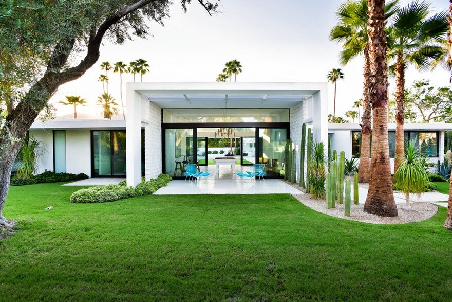
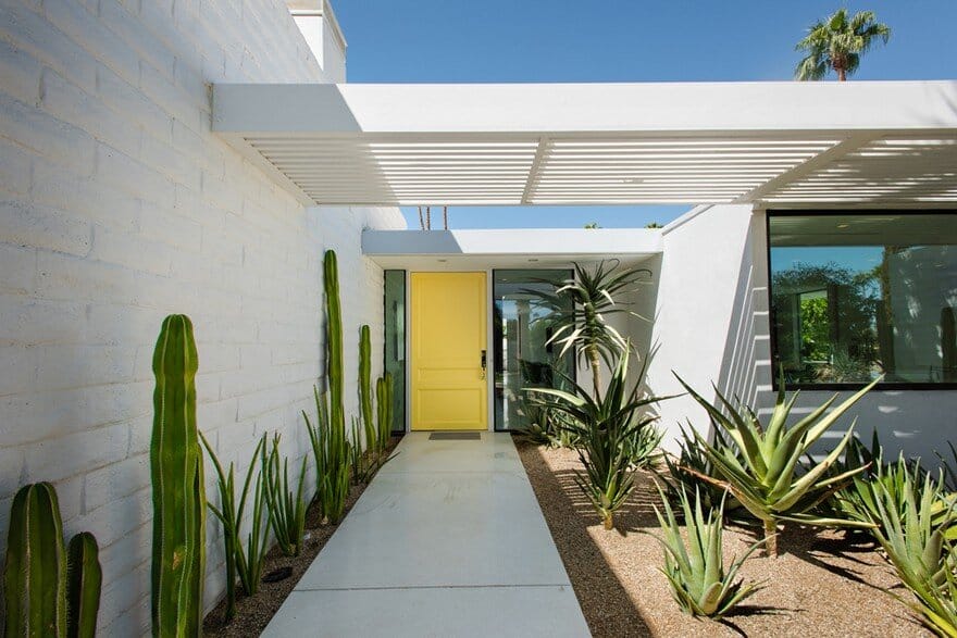
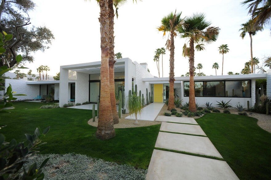
Lockyer revamped the front of the home by removing low garden walls and the remnants of heavy shrubbery to reveal a more open street-side view. In keeping with the local oasis aesthetic, he added palms in front. To make the garden more drought-tolerant, he replaced water-intensive plantings with sculptural cactus. Decomposed granite took the place of some of the original lawn.
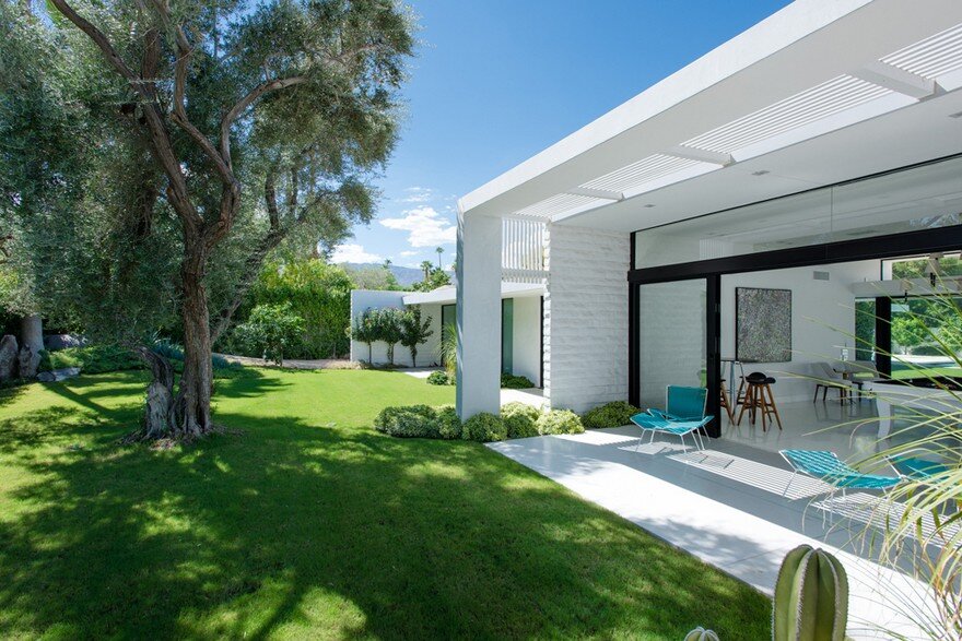
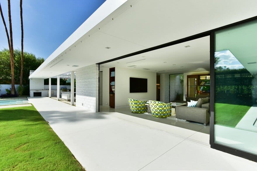
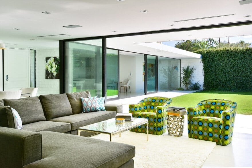
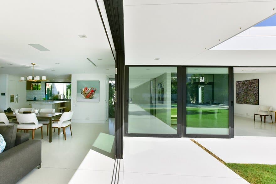
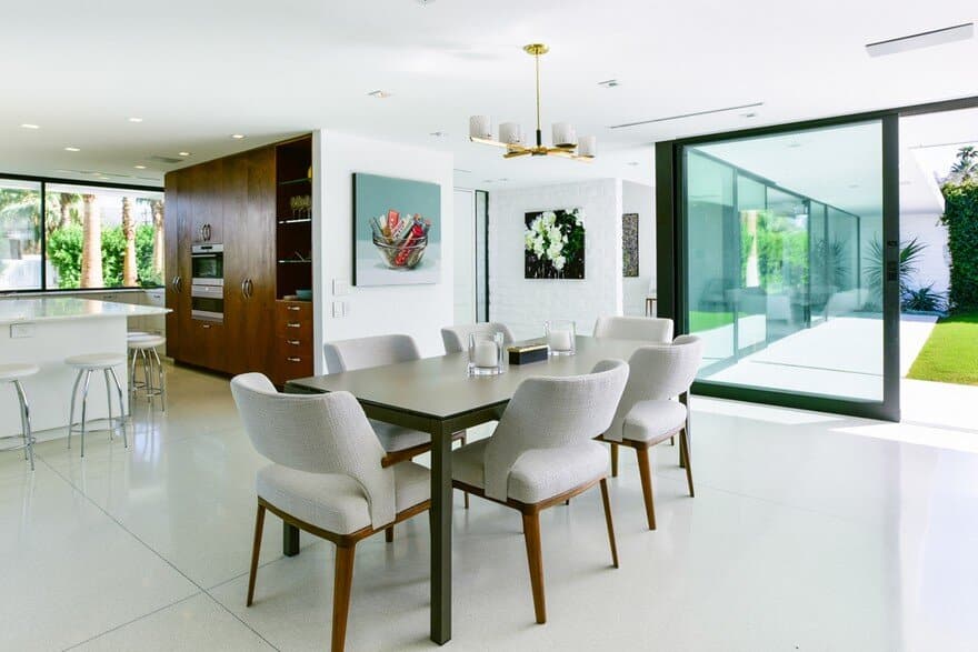
Lockyer revamped the living room — and the rest of the house — by replacing original sliding glass doors with telescoping window walls that open the interior to the home’s many patios.
An original olive tree shades the living room’s patio. Lockyer removed tile and carpeting from the interior and installed era-appropriate terrazzo flooring throughout the home, extending it to the patios to create a seamless transition from indoors to out.
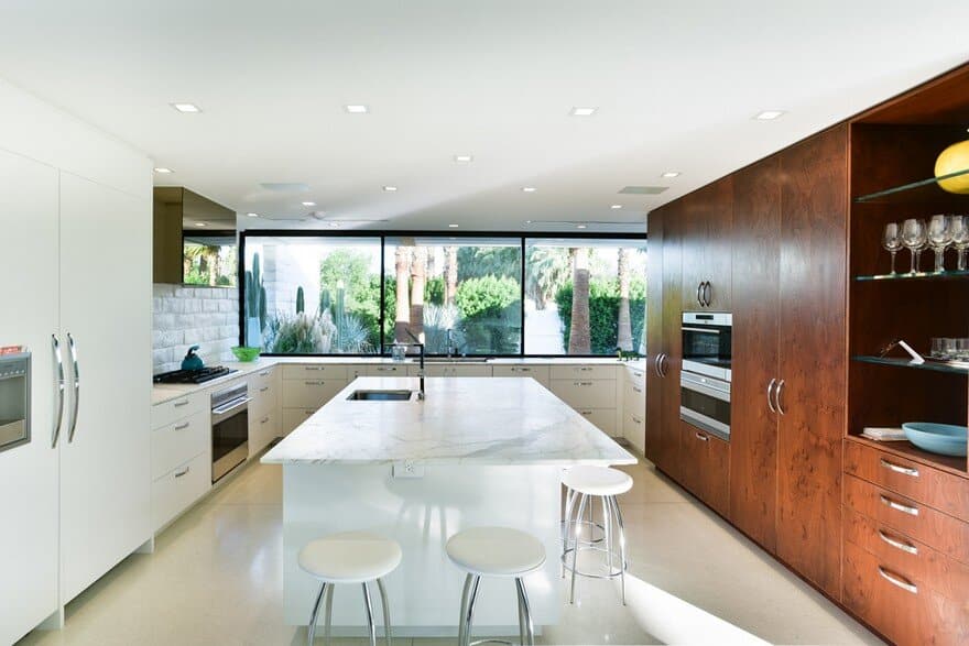
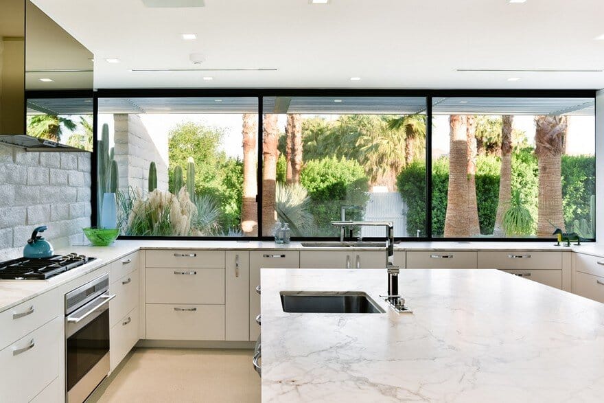
Lockyer removed walls between the original kitchen, dining room and family room and enclosed a small patio to create an open great room that includes living, dining and kitchen spaces with access to the backyard. Popcorn ceilings were also banished and custom linear slot diffusers replaced clunky old-school air conditioning supply vents.
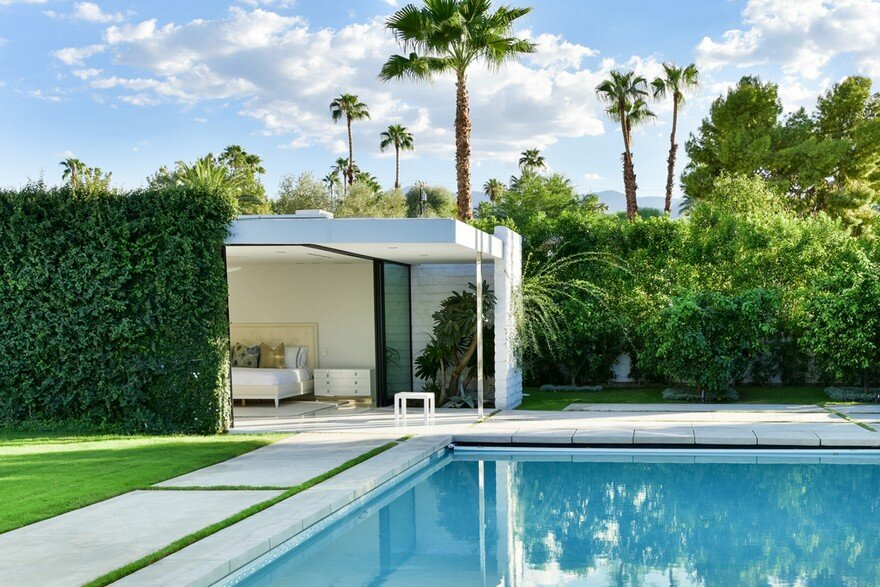
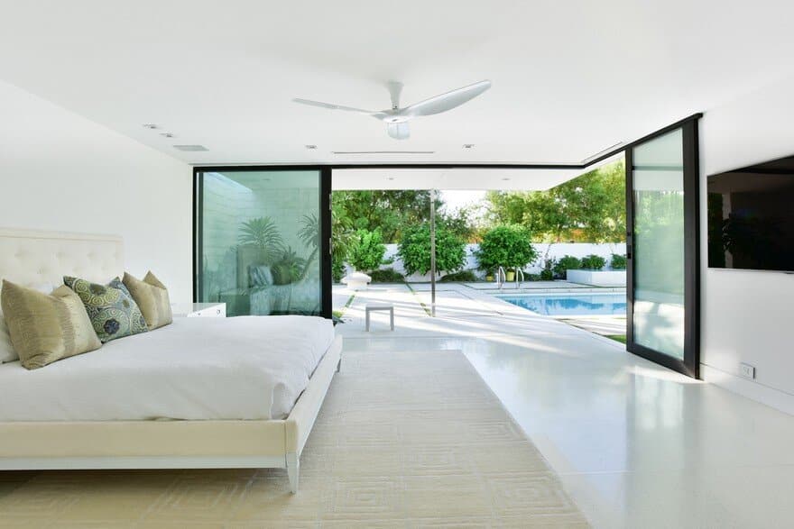
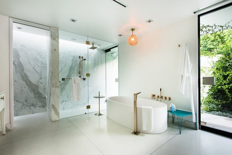
The corner of the house with its renovated master bedroom, viewed here from the pool patio, accentuates several of Krisel’s architectural details, including floating rooflines, linear forms and slender fascias. The architect reworked the previously compartmentalized master bath, opening it up to create a greater sense of space. A new glass door leads to a private side patio. The vintage light fixture is a local find. The turquoise bench is a custom piece.
When it came to the furnishings in the living space and throughout the house, the architect kept things simple and spare, choosing a mix of new pieces and local vintage finds, such as the coffee table. The owners added a splash of color with custom armchairs.
Lockyer had the covered outdoor living space rebuilt and turned the original barbecue into a fireplace. “The structure had started to deteriorate and was sagging in spots, so it was easier just to rebuild,” he says. He replaced the original brick and concrete paving materials with terrazzo near the house and white concrete squares and rectangles around the pool. “I interspersed the terrazzo and the concrete with strips of grass,” he says. “The breaks signal a change in materials from terrazzo to concrete and prevent the backyard from looking like a sea of concrete.”
The pool was replastered and remodeled with the addition of a shallow shelf and, to one side, a negative-edge spa. Seen at dusk, the renovated modernist home has become more transparent and connected with the outdoors.

