Project: S5 House / The House with a Ribbon Envelope
Architecture: Architect Raz Melamed
Location: Hod Hasharon, Israel
Year: 2021
Photography: Amit Geron
Text and photos provided by Raz Melamed
A thin black iron ribbon envelops the house in Hod Hasharon, embodying the gift that its owners return to every time they come home.
The S5 house was designed for a refined couple and their 3 children, who came to the project equipped with knowledge about innovations and construction technologies coupled with a vision for a unique design that spawned a fruitful dialogue with the architect.
In this 500 square meter plot, architect Raz Melamed plays masses and transparencies which hide behind meticulous architecture and an interesting and harmonious combination of materials.
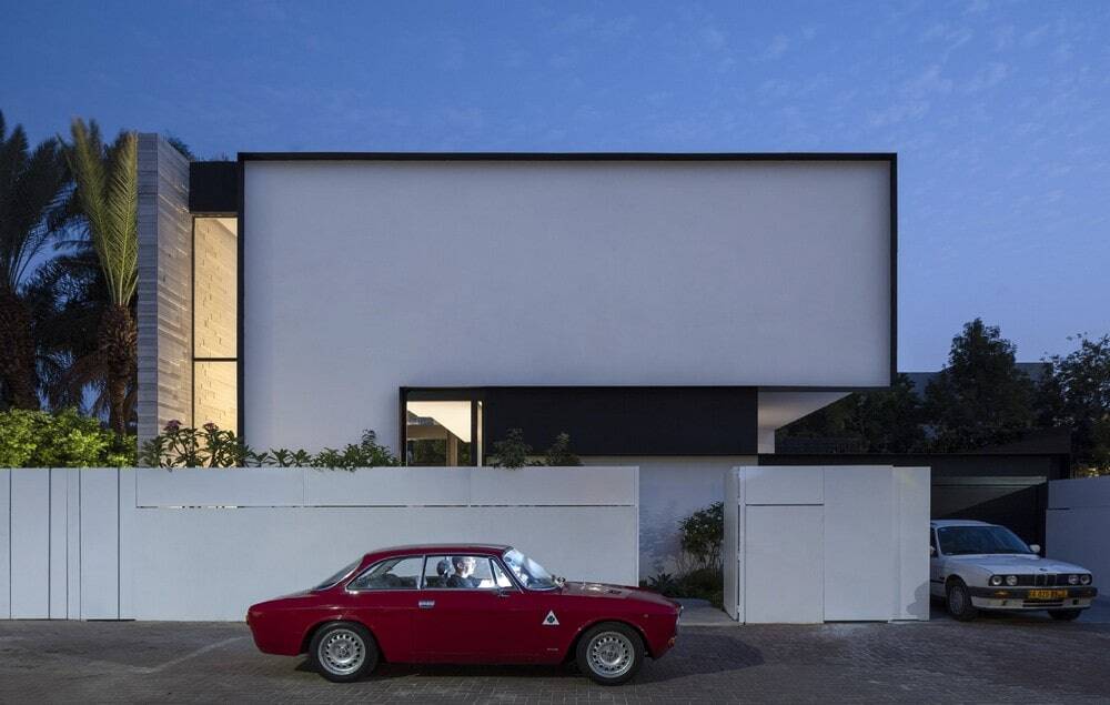
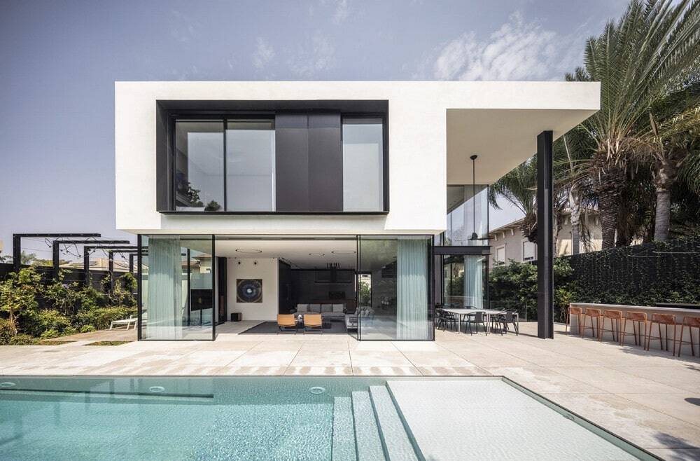
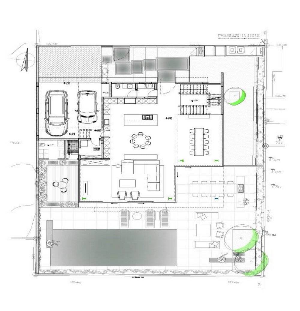
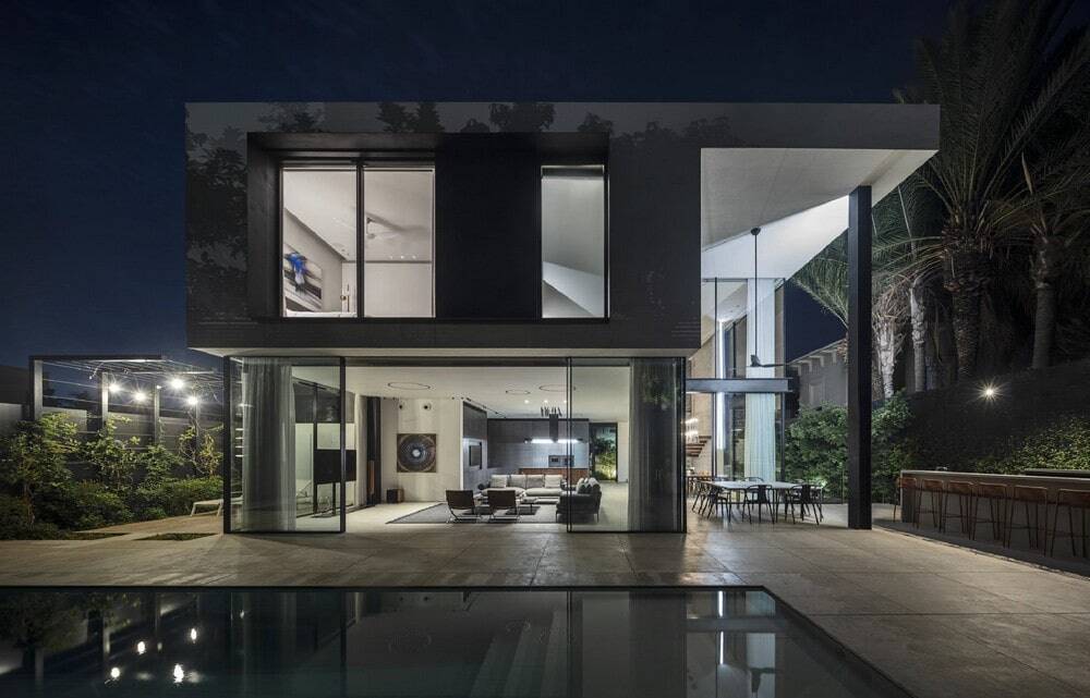
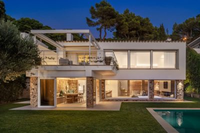
The front façade is almost completely sealed off to the street, and apart from a long stairway window that lets in light it maintains the occupants privacy. At the same time, Melamed’s intention was to create maximum transparency for the public space, so the other 3 facades open to the garden. Together, this forms an internal external connection with large glass opening that create the illusion that the living floor, designed as a white opaque cube, floats in the air. The top developers incorporated refined iron reductions that both produce a sense of grandeur alongside privacy, meanwhile producing a continuous architectural language. Black iron runs as the second thread creating continuity of architectural element on all facades, openings and the parking lot. It is as if precisely its thinness, framed by openings and masses, is the actor that emphasizes the house s contours and makes it both light and powerful.
The entrance gate opens to rows of large sidewalks surrounded by flourishing trees that produce a long and dramatic walk to the black door. The interior of the S5 house displays the concept of the architect who believes in presenting materials in their natural state by using walnut wood, black iron, stone and clear glass. In this project, Melamed chose rather to use polished material, not in their raw state, to emphasize warmth and a sense of home alongside a modern and clean line.
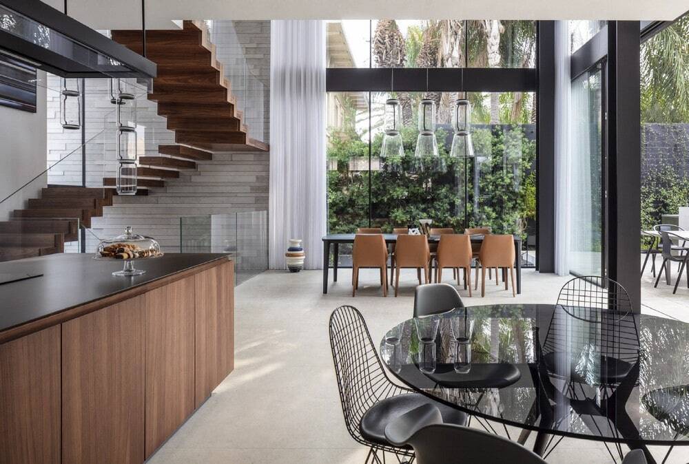
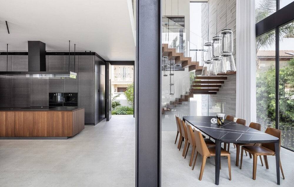
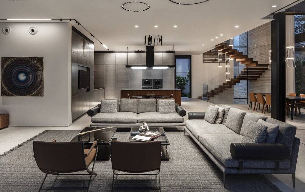
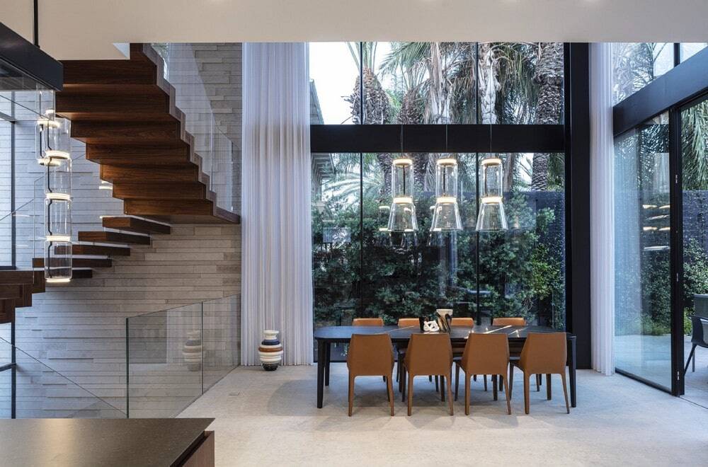
The entrance to the S5 house is enhanced by natural stone flooring, with a walnut staircase to the left leading from the basement to the top floor. These two floors are also paved with walnut wood, which a material frame that produces a continuous flow of material to the entire height of the house. Some of the wood comes out of the floor as a continuous move, some comes out of the covered wall as an individual unit, and all together it looks like a floating sculpture that creates interest in the space. The wood rest on a wall covered with natural stone like the flooring, which has been cut for cladding in varying sizes and depths. The cladding begins on an exterior wall that separates this home from the neighboring house, thus creating a continuous and spectacular connection with the facade of the S5 house. Along the walls are hand picked art pieces from an art curator who chose the perfect works to complement the home and its occupants.
Each step on the stairwell ends in a straight and sharp corner, just like the thin iron detail on the side, all connected through a clear glass railing that disappears into space and reinforces the stairs as the main showpiece of the home.
In the double ceiling hangs a transparent light fixture consisting of round cylinders and black touches, with its transparency contributing to the continuous line from the door to the garden. At the same time, its round shape applies the concept of the architect who believes that alongside straight lines in architecture, lighting and vegetation are essential to well rounded geometry, which adds softness and refines the entire space.
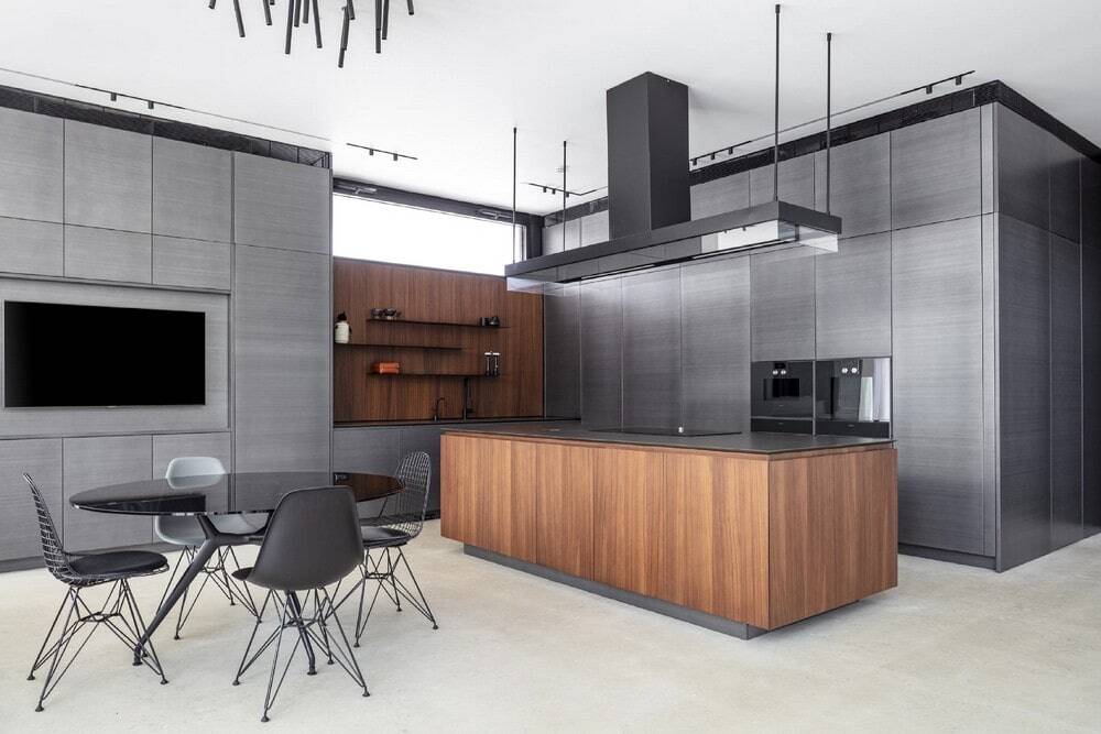
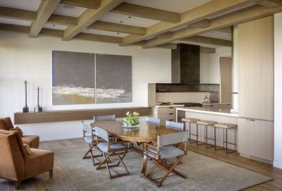
Opposite the stairs is the kitchen, which was designed to suit the occupants who love to cook In the center of the kitchen is a large wooden island. The kitchen s ceiling features a massive fume hood, painted by the architect of his choice in gray graphite, a shade chosen for all the metals in the house such as aluminum, air conditioning, light fixtures and shelves above the sink. These shelves are hung on a walnut wood cladding, which just like the island in front of it contributes to the warmth of the space and the interest in the cooking and hospitality experience. Above the sink, at the top of the walnut tree, a window opening lets in natural light and is responsible for ventilating the space.
The kitchen fronts are covered in a metallic looking gray shade, including a TV wall and a hidden door planted in it that leads to the pantry and parking lot. The TV serves a casual daily dining area with light furniture, and above it an amorphous light fixture that looks like it is dancing down from the ceiling, bringing interest and joy to the area.
In the kitchen, the colorful combination that is repeated throughout the house, consisting of gray, black and brown wood, stands out.These shades are repeated throughout the house in different shapes and dosages, whether it is in architecture and lighting and whether it is in furniture and textiles.
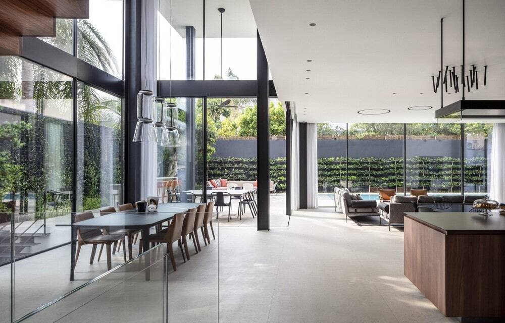
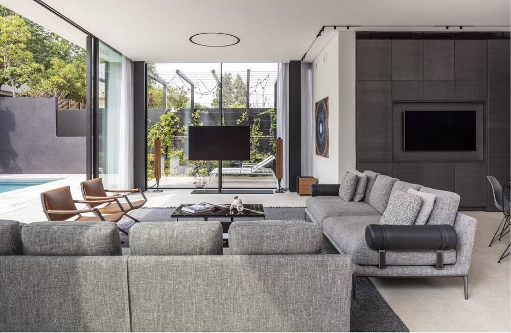
Next to the kitchen is the living room, whose furniture also centers on the colors in question the carpet and gray sofas, the black table and the brown armchairs. Its ceiling has three recessed round light fixtures that create a dialogue with the geometry of the stair lighting, as well as with the sofa cushions. They create interest and soften the feeling of hospitality, in front of the rigid steel pillars that support the perimeter glass walls. The TV stands on a pillar that allows for outward viewing. The TV s control center, along with the controls of the home, are strategically hidden with easy access.
Adjacent to the living room is the dining area which stands among a double space that allows eye contact with both the basement and the upper floor. It overlooks the row of trees that hides that carefully hide the neighbor s house and consists of a spacious black table adorned with white tendons surrounded by brown chairs in the shade of the stairs. Above it hangs a light fixture that is a descendant of the same family from which the light fixture came out on the stairs, and the two quite literally maintain transparency in the space.
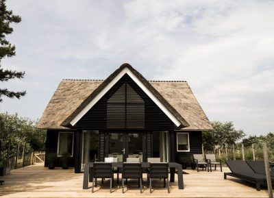
Outside, parallel to the dining area and the living room, is another dining area. Its sides, which point towards the garden, are open and above it a floating white concrete ceiling that is held in a black pillar in which a vertical light strip has been invested. The white ceiling produces a square shaped cover for the house, thus equating an entire outline shape to the roof despite the deficiency of the dining area.
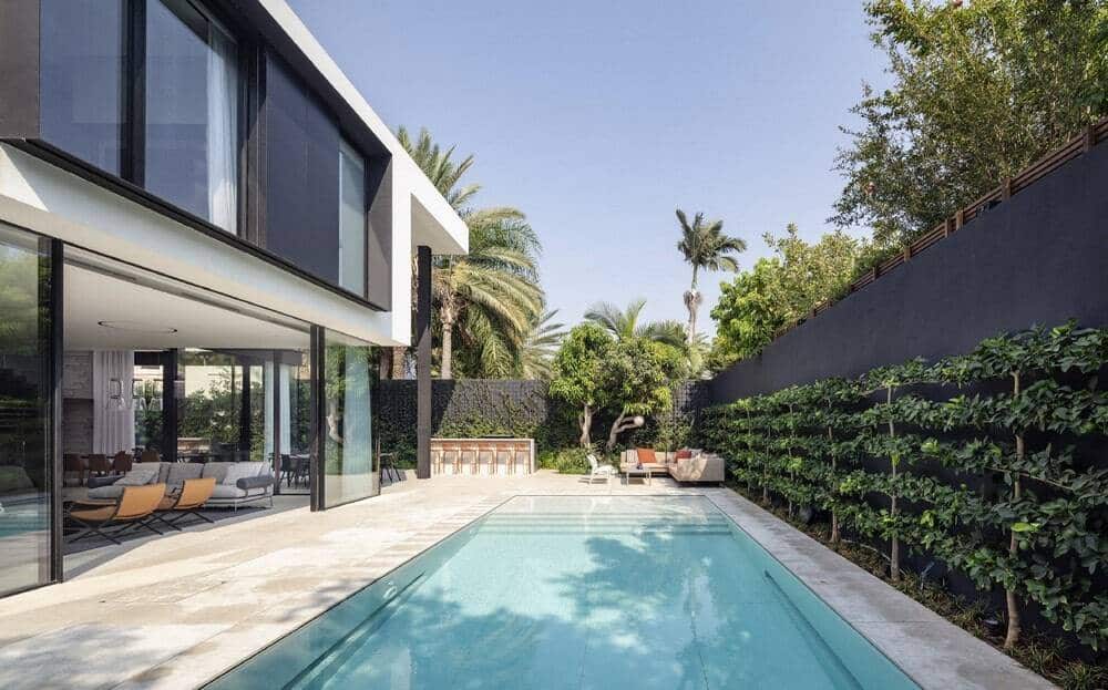
The outdoor kitchen serves both the outdoor dining area and the pool, with Corian cladding that wraps the airy brown chairs. To relax in front of the pool, a luxurious seating area with
parquet colored cushions and dining chairs was chosen, so that they resonate with the front of the house at the back.
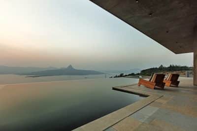
The pool continues the straight lines of the interior of the house and was designed to recline from a deep seat to recline to a zero degree line. The scope of the building environment was not wide and presented a challenge in choosing the vegetation. As such, we planted lemon trees by the pool, a vine wall in front of the kitchen, and a climbing plant wall in front of the dining area. The vegetation that meets the exterior walls in graphite gray has a dual purpose to decorate and create privacy.
The children’s rooms upstairs combine wood and white, with the black color that appears in the rest of the house absent as this is a design for a young age. The design interest is revived thanks to the carpentry that repeats the transparency and masses that appear on the facades of the S5 house.
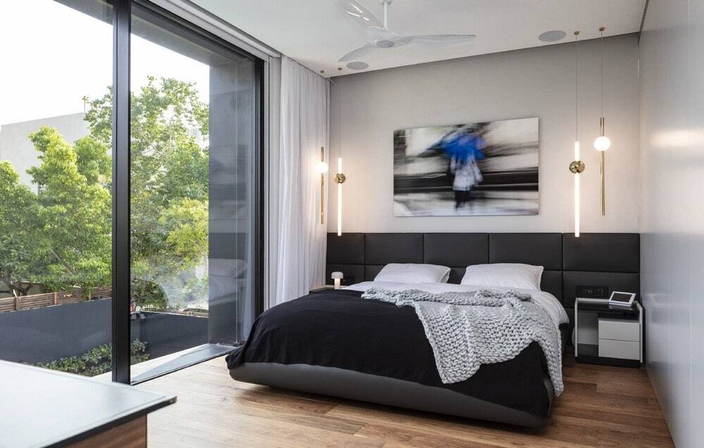
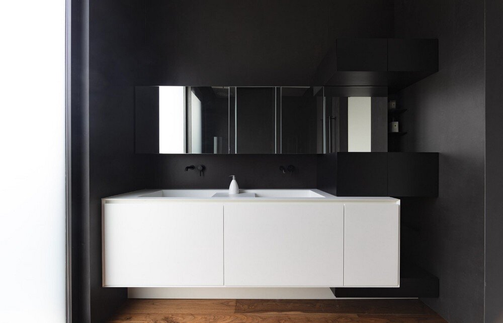
The master suite boasts a spacious closet made of polypropylene, with a gray carpentry wall separating it from the sleeping area. The back of a black bed stretches over the entire back wall and is lit by brass lighting fixtures that hang over the dressers and are responsible for the solemnity of the room. Adjacent to it is a theatrical bath with black walls. It features an interesting black and white carpentry, which repeats the external visibility, so that the white cube floats and is supported by black cubes. The architectural language of the macro from the outside, goes into the micro inside and proves that proper architecture does not forget even for a moment the small and important details.
Suppliers S5 House:
Lighting FLOS
Garden lighting LIGHTIN LTD.
closet: poliform
Kitchen POLIFORM by varenna
Furniture B&B italia , flexform , poliform , vitra
Kitchen chairs vitra
Kitchen table Rimadesio

