Project: Sela Logistics Offices
Architecture, planning and design: Marina Rechter-Rubinstein
Location: Ashdod, Israel
Office space: 1,000 square meters
Photo Credits: Lior Teitler
Courtesy of Marina Rechter-Rubinstein
Sela Logistics’ offices have been redesigned to become more inviting and welcoming via the “backwards logic” method, using properties and materials from their line of work, including a huge, repainted container. And the result? Extraordinary. So much fun to come back home. Oh, to work.
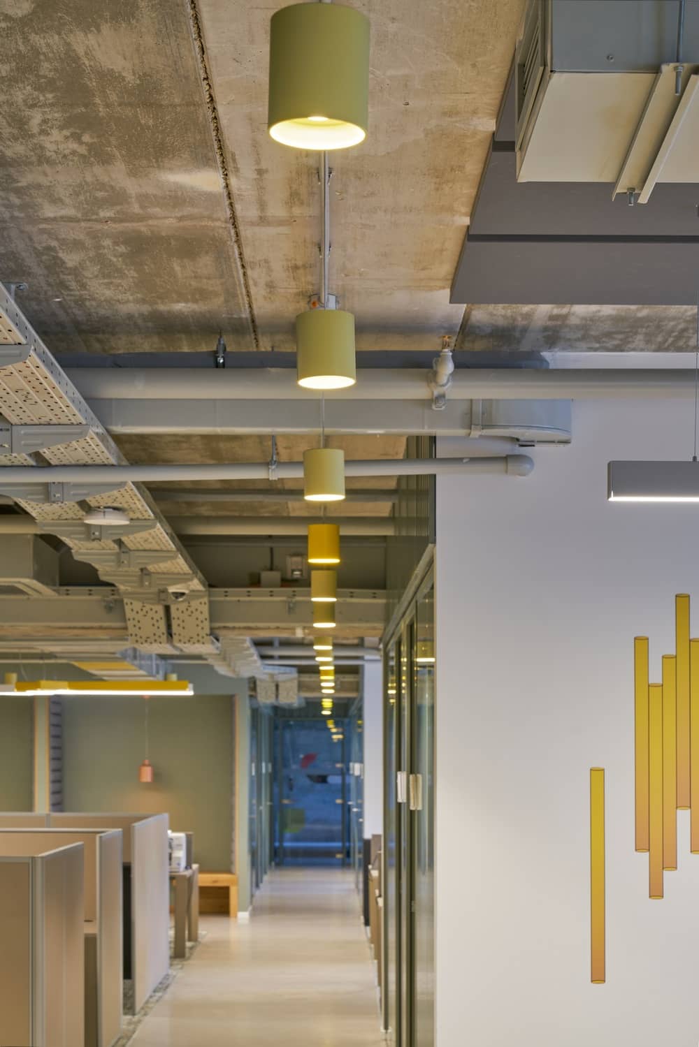
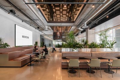
Even before the global Panton company announced the selected shades for 2021 to be gray and yellow, it was the rough shades of grey concrete and electrifying yellow that made a spectacular entrance into the offices of Sela Logistics, a veteran company leading in the field of logistics solutions.
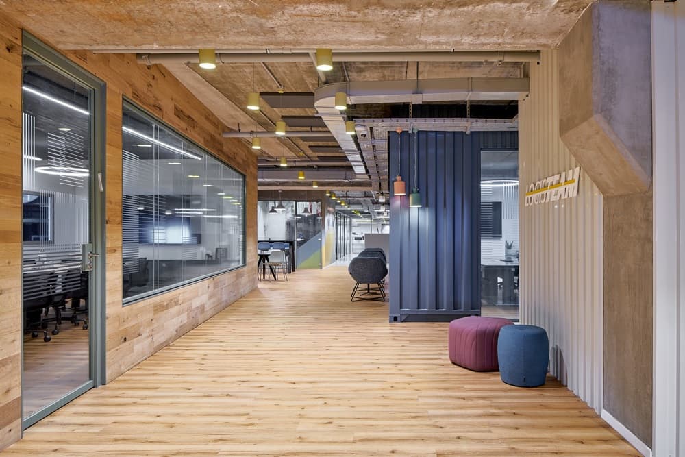
The company’s management made a pre-COVID decision, to relish with new finely designed offices, which will provide a refreshing and pleasant setting for their personnel. The well-renowned architect Marina Rechter-Rubinstein, with an impressive resume in the field of commercial and industrial space design, was chosen for the ambitious task. But instead of going away from the aesthetic direction of the logistics offices, she chose “why fight them when you can join them”, and provide a powerful, surprising twist to the materials that characterize the day-to-day labor.
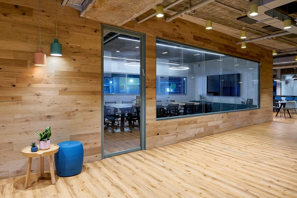
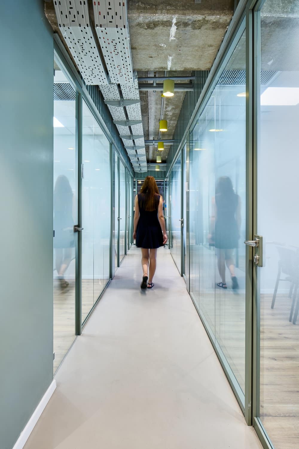
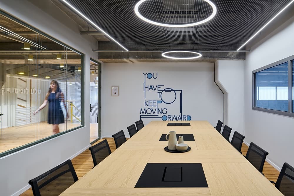
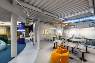
Thus, simple materials such as wood, aluminum, exposed pipes, glass and even an entire container found its way into the offices. “I treated the materials with a different conotation, and I am proud of the combination I created. They seemingly do not relate or connect – but they establish something new and interesting which connects perfectly.” And the result? Highly impressive, cozy and enveloping. Just like Schechter-Rubinstein intended. “To me, the plan is most important,” she says. “If it is right and accurate for the space, then from it flows the vision. It all starts from the plan itself, and the rest, just like a jigsaw puzzle that fits into place and completes the picture, creating a cozy, pleasant space”.
As Covid emerged while working on the project, it took twice as long as expected. But the spectacular result suggests that it was worth the wait. Rechter-Rubinstein explains that her plan was to create a space that encourages a creative, young, and vibrant work environment, instead of a mundane, boring office space. The brief delivered by the owners of the company focused on creating a space design that emphasizes the identity of the group and the nature and values the group adheres. The refined aesthetic, despite the rough materials, conveys this message wonderfully.
Rechter-Rubinstein notes that especially during this current period, one understands the value of creativity. “A company must retain its creativity and adjust to stay relevant, especially this company, which exists over 40 years and holds innovation as part of its sight and vision”, She says.
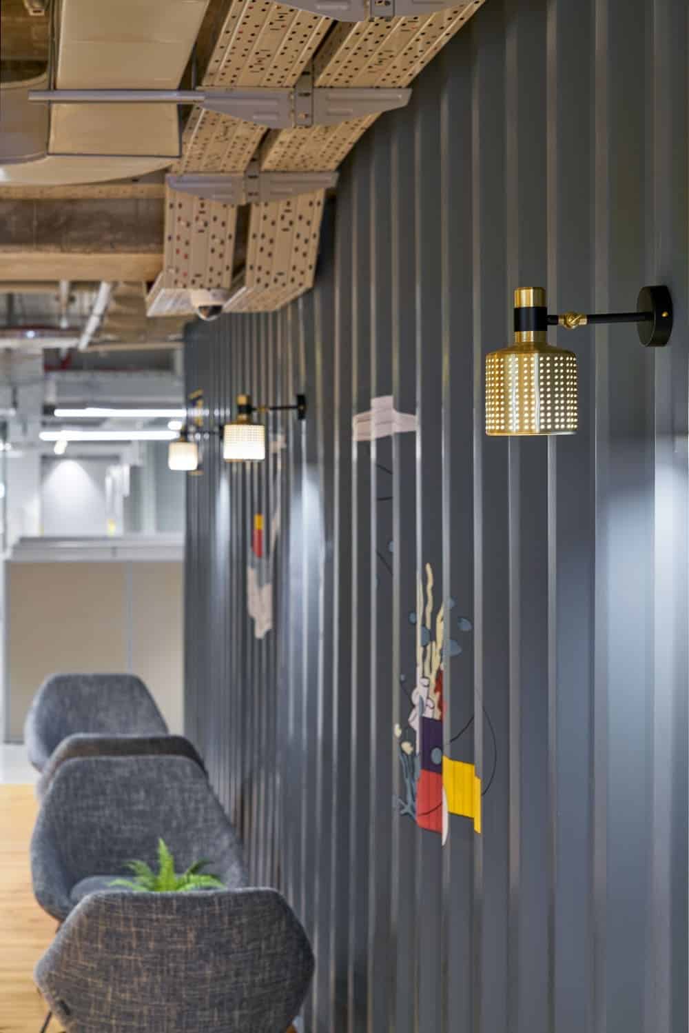
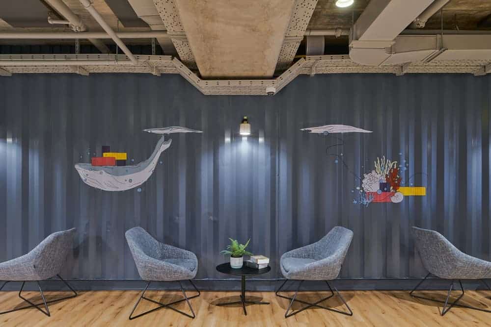
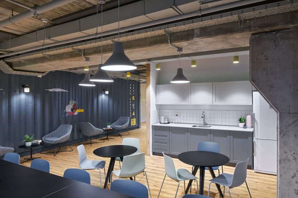
There is no doubt that the most interesting addition of the new design is the container, a clearly unconventional “accessory”. “We went ahead and picked up a container from the warehouse in the yard,” she says. “I deliberately chose an imperfect container, with ‘bangs’ and defects.” The oversized container became a challenge, as they sought to put it inside the offices. “The whole concept of the container illustrates how family-friendly this business is, and how dedicated and committed the employees are to their workplace,” she adds. The owner of the company strongly supported this idea, making great efforts to find solutions that would aid in bringing in an actual container. All the company employees got involved and made this project their own. “It totally contributed to the success of the whole project,” she emphasizes.
In the end, the container was cut open on one side and covered with glass windows, so that it would become a kind of additional room, which reveals, on its one side, the large warehouse, the heart of the company. On the other side are windows, which are reflecting the landscape in an unconventional and fascinating fashion.
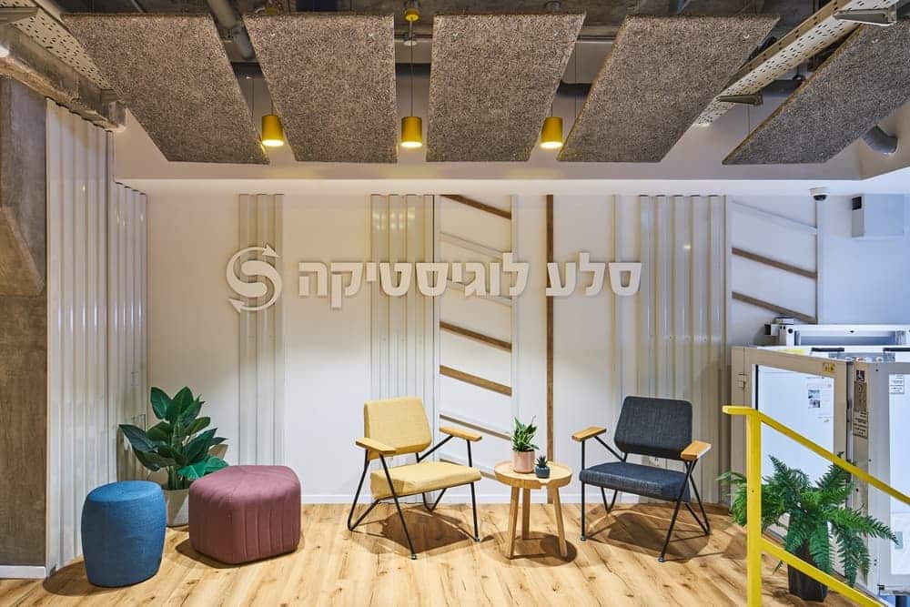
The low ceiling challenge led to the dismantling of the existing ceiling and the exposure of sewer pipes, which were very prominent in the entrance area. Rechter-Rubinstein chose to hang acoustically suspended ceilings diagonally, in a way that hides the defects and blurs a less appealing view.
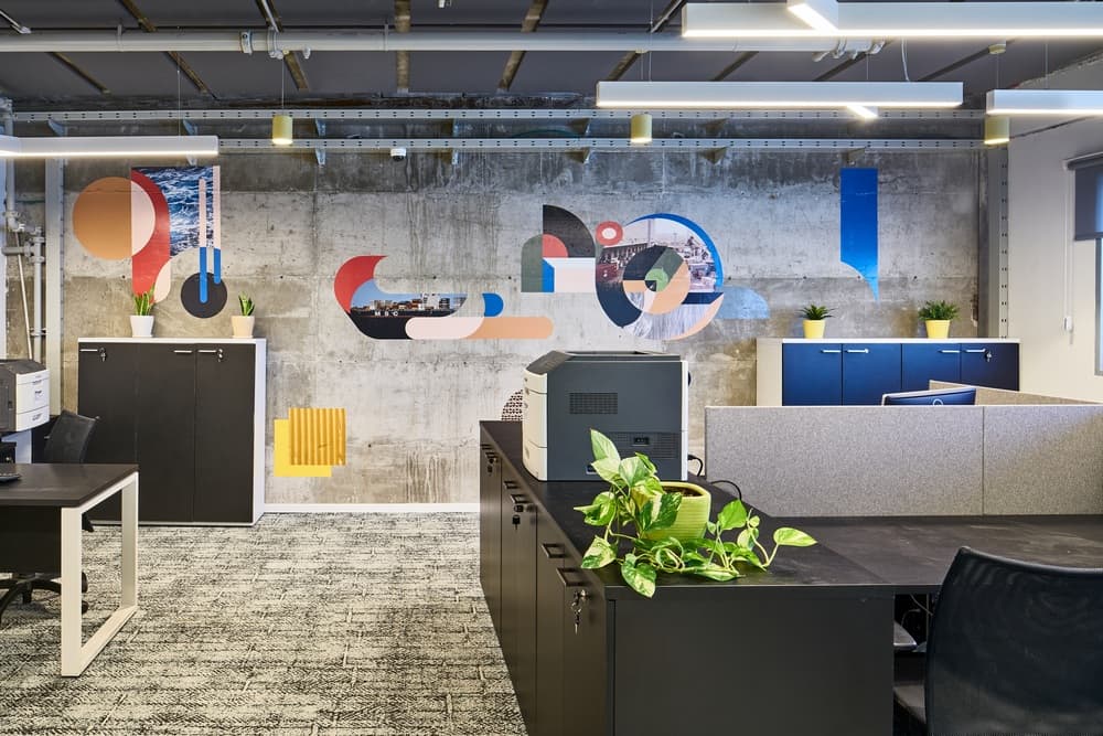
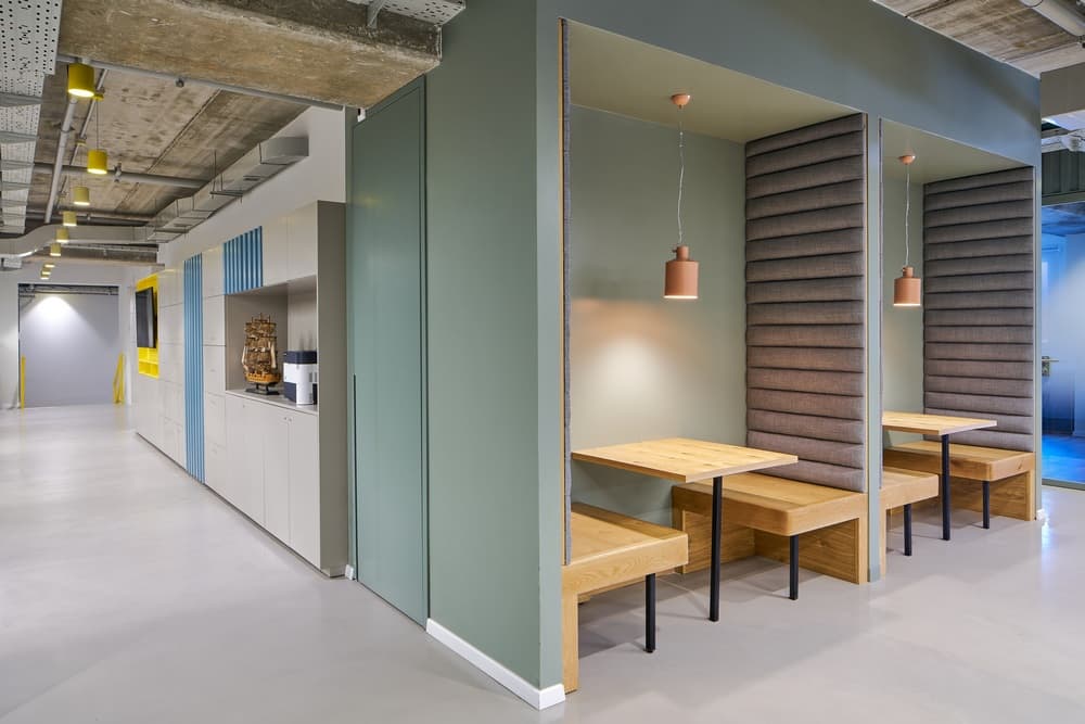
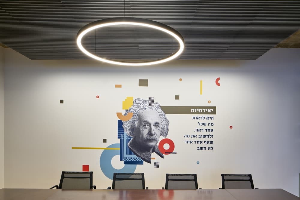
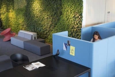
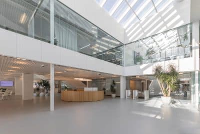
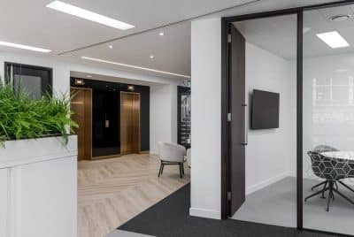
Eventually, the choice of furniture, which blended well with the rest of the choices in the designed spaces, and “sowing” graphic elements around the different spaces – made these offices into something other than what they usually convey. There is, without a doubt, an appreciation for the employees, treating them as family, and the space serving them as their second home.

