When it comes to creating a harmonious and timeless interior design, choosing the right color palette is crucial. Some colors are celebrated for their versatility and ability to seamlessly blend with various styles, making them ideal choices for any space. Below are some of the most reliable and trending colors in interior design that pair well with everything.
The Classic Neutral: Eggshell White
Eggshell white remains a cornerstone of interior design due to its ability to bring freshness and light into any space. It’s a color that effortlessly pairs with both modern and traditional furniture, providing a clean backdrop that makes accent pieces pop. A vibrant photo frame holding a cherished memory, ornate candle holder, or colorful vase will grab attention instantly against a white space. Whether you’re highlighting a vintage wooden table or a modern art piece, eggshell white ensures that every detail stands out beautifully.
Modern Sophistication: Soft Gray
Gray is another go-to neutral that adds sophistication and modernity to interiors. From light dove gray to deep charcoal, this color offers flexibility in creating a calming environment. Gray’s subtle nature allows it to absorb light gently, making it perfect for rooms where you want smaller details, like artwork or decor, to shine without being overshadowed.
Warm and Inviting: Beige
Beige continues to be a popular choice in interior design for its warm and inviting qualities. This color blends seamlessly with a wide range of styles, from contemporary to classic, making it a favorite among designers. In 2024, variations of beige, such as biscuit tones, are particularly trendy, offering a natural and earthy feel that complements both modern and rustic designs.
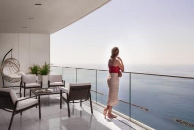
Timeless Depth: Navy Blue
For those seeking a deeper hue, navy blue is an excellent option. It adds a level of sophistication and richness to a space without overwhelming it. Navy blue works well with bright colors, making them pop, and also pairs elegantly with other neutrals. This color is timeless, ensuring that your space remains stylish for years to come.
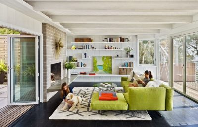
Earthy Elegance: Deep Green
Deep greens, such as emerald or sage, are gaining popularity in 2024 for their ability to bring a touch of nature indoors. These shades offer a sense of tranquility and are perfect for creating a serene and inviting environment. Deep green pairs well with natural materials like wood and stone, enhancing the organic feel of a space.
Bold and Dramatic: Chocolate Brown
Rich chocolate brown is making a strong comeback in interior design. This color adds warmth and depth, making rooms feel cozy and luxurious. It’s particularly effective in spaces where you want to create a cocooning atmosphere, such as living rooms or bedrooms. When paired with lighter accents or metallic touches, chocolate brown can transform a space into a sophisticated retreat.
Unexpected Pop: Red Accents
Red is an exciting color choice that, when used sparingly, can add a vibrant pop to any room. Whether it’s through a statement piece of furniture or a bold accent wall, red brings energy and passion into the space. Designers recommend using it in social areas like dining rooms or living rooms to create a lively and welcoming environment.
Soft Serenity: Muted Pink
Muted pinks, like plaster pink, are becoming increasingly popular as they offer a soft, calming presence in a room. This color is perfect for creating a serene atmosphere in bedrooms or reading nooks, providing a subtle warmth without overwhelming the space.
Versatile Accent: Sky Blue
Sky blue is another versatile color that can serve as a neutral in modern design. It brings a light, airy feel to a room and pairs beautifully with both warm and cool tones. Sky blue is particularly effective in spaces like bathrooms or kitchens, where you want to create a refreshing and uplifting environment.
The Importance of Color in Interior Design
Color plays a crucial role in interior design, as it has the power to influence the mood, perception, and overall ambiance of a space. A well-chosen color palette can make a room feel larger, cozier, more dynamic, or more tranquil. One of the essential principles in color application is the 60-30-10 rule, a guideline that suggests using 60% of a dominant color, 30% of a secondary color, and 10% of an accent color. This balance ensures that the design feels cohesive and visually appealing without being overwhelming. Mixing colors thoughtfully allows for the creation of depth and interest in a space, combining vibrant hues with softer tones to achieve harmony. Understanding the psychological impact of different colors is also vital; for example, blues and greens are known for their calming effects, while reds and oranges can energize a room
Conclusion
When choosing colors for your interior design, it’s essential to consider not only their aesthetic appeal but also their versatility. The colors mentioned above—eggshell white, soft gray, beige, navy blue, deep green, chocolate brown, red accents, muted pink, and sky blue—offer a wide range of possibilities for creating spaces that are both stylish and timeless. Whether you’re redesigning a room or building a new home, these colors provide a solid foundation for any interior design project