Project: The Carpenter Hotel
Architects: Specht Novak
Interior Design: The Mighty Union
Landscape Architecture: Pharis Design
Graphic Design: LAND
Contractor: DPR
Location: Austin, Texas
Year 2019
Photography: Chase Daniel
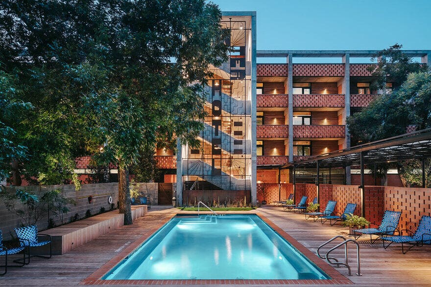
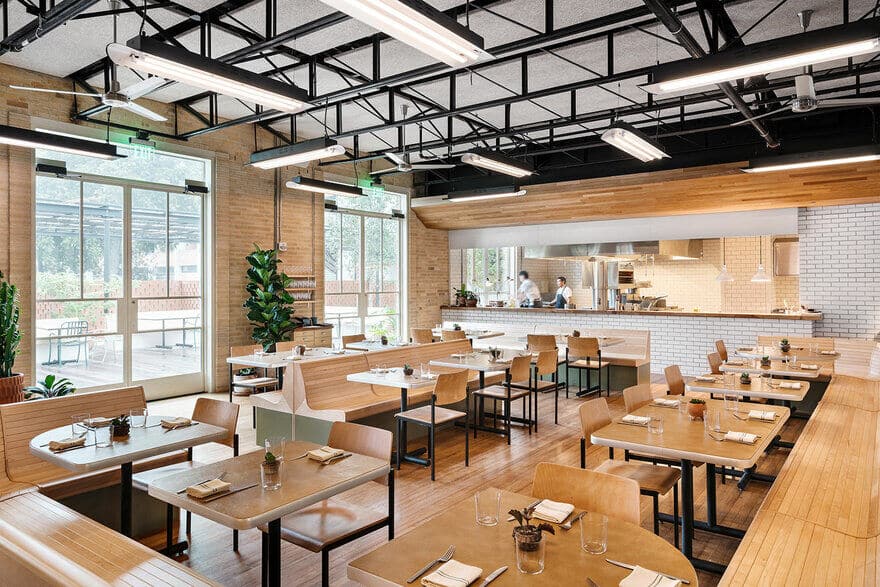
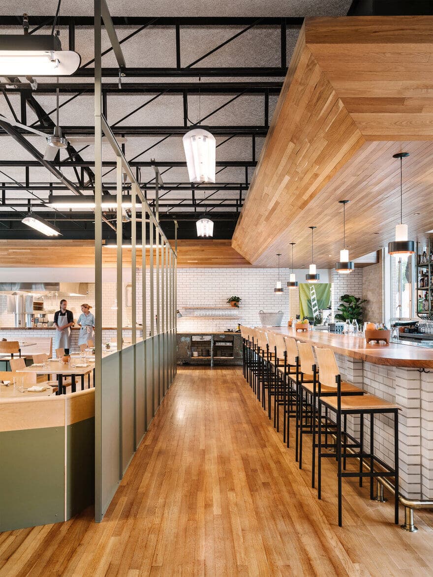
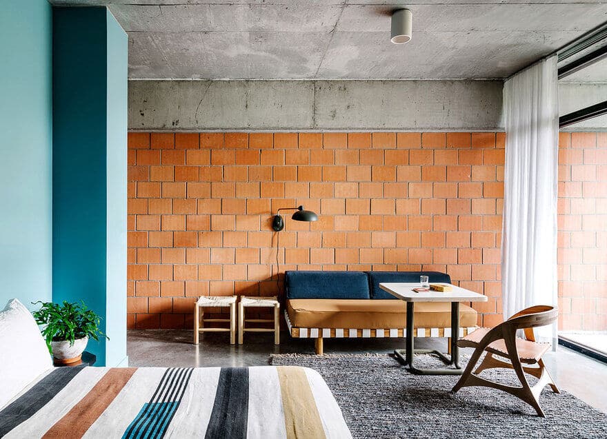
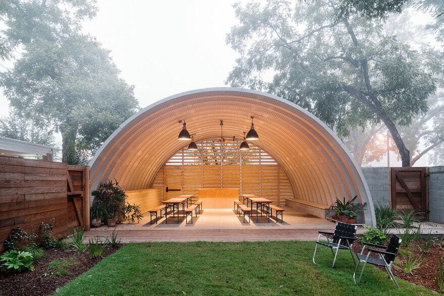
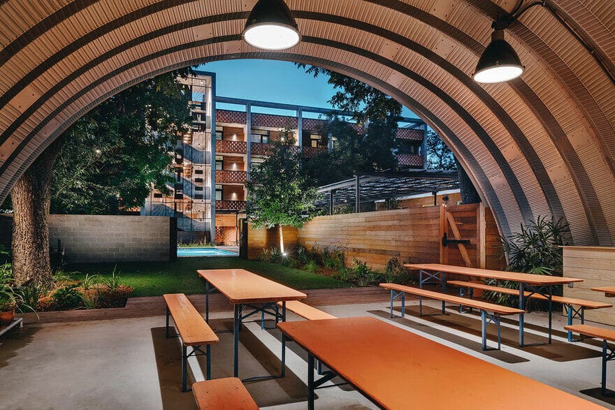
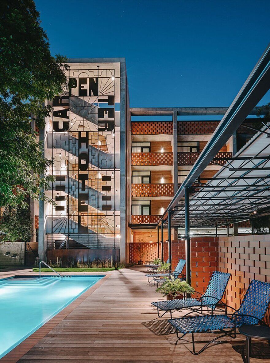
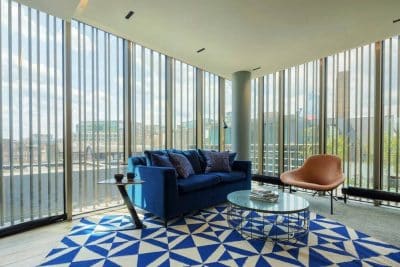
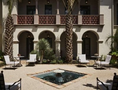
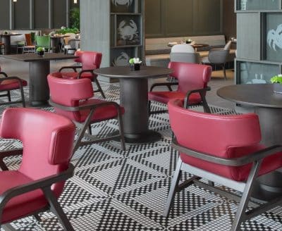
Nestled into a pecan grove between the Barton Springs swimming hole and downtown, The Carpenter Hotel is a hidden oasis in one of the last pockets of Old Austin. It is a compound of buildings of different vintages surrounding a tree-shaded courtyard and pool, and features a restaurant, café, event pavilion, and 93 guest rooms. It has a character unlike any other hotel in town.
The design was driven by a sense of place; the desire to create something that is natural to its location, neighborhood, and the city as a whole. It is a new take on the idea of adaptive re-use that doesn’t mimic what was existing, or create a bright line between the “old” and the “new”, but a stealth approach that merges all the parts into a collage that feels effortless and authentic.
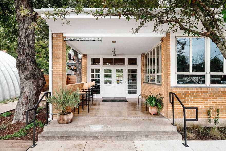
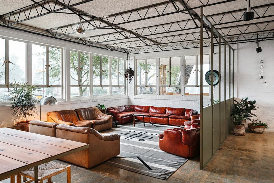
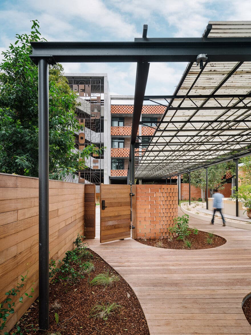
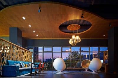
Almost all of the original heritage pecan trees on the site are preserved and incorporated into the design. An existing “mid-century-utilitarian” union hall for Carpenter’s Local 1266 on the site is also re-purposed as the lobby and restaurant with minimal changes. The new hotel building, shade canopies, and Quonset-hut-based pavilion have a new and distinct architectural expression, but the forms and materials are harmonious with the existing union hall and the other industrial buildings in the area. It all fits together seamlessly.
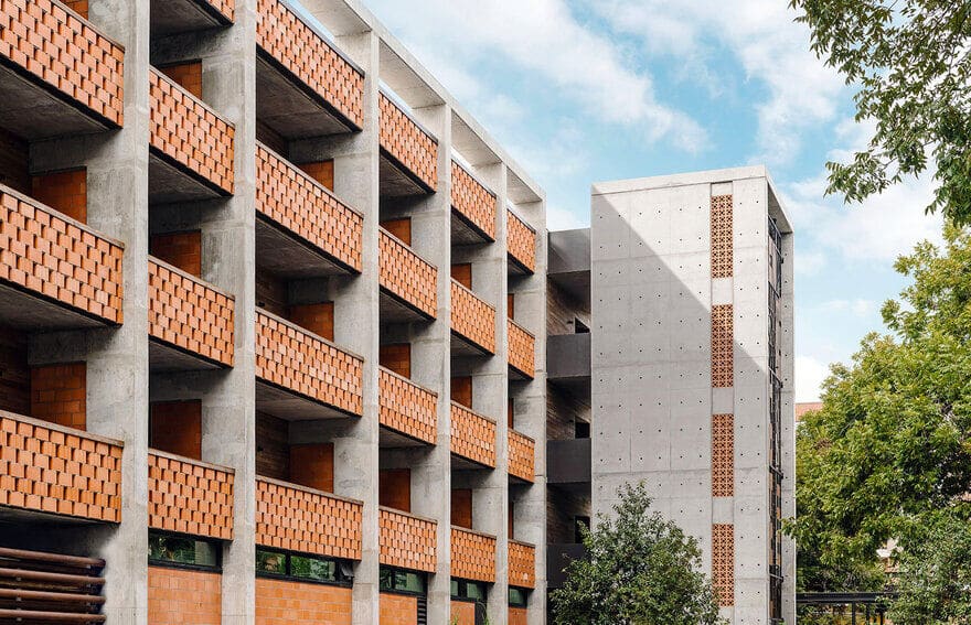
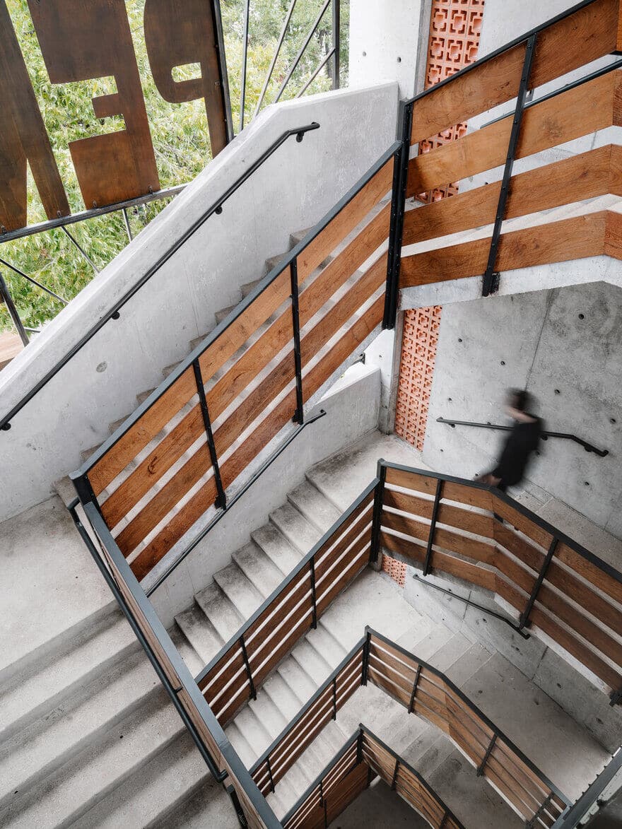
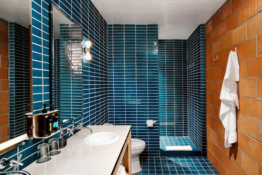
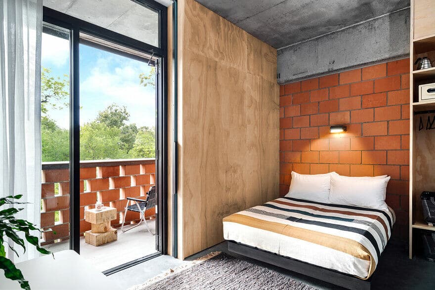
The new hotel building is composed of an exposed rough-concrete frame, with infill walls made of locally-sourced clay masonry blocks and recycled steel oil-drilling pipe. Where trees had to be removed (in all cases these were damaged or otherwise compromised), the pecan wood was sawn into boards and used as feature elements in the restaurant and lobby. Materials are expressed as-is, and decorative effect, where it exists, is created through the spacing and patterning of basic elements, or by the direct application of signage. There is no attempt to mimic historic styles, nor is there an attempt to follow architectural trends. It is simple and direct, and its power comes from this straightforward expression.

