Project: The Home of Moshik Hadida
Architecture: Moshik Hadida
Location: Ganei Tikva, Israel
Built Area: Approx. 420 sq.m
Photography: Oded Smadar
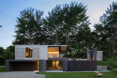
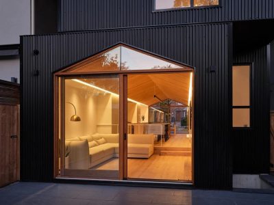
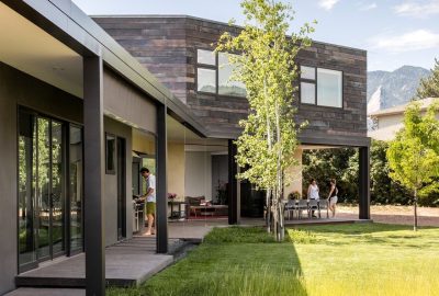
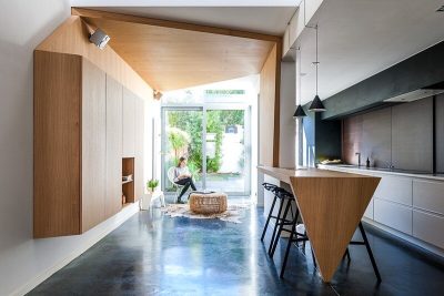
A deliberate combination of masses, dimensions, and volumes, the use of natural materials alongside industrial ones, a monochromatic and precise color palette, and facades that penetrate the building and become an integral part of the internal space are just some of the features of the home designed by Moshik Hadida, owner of a firm specializing in architecture and interior design, for his family.
Welcome to the home of Moshik Hadida, owner of an architecture and interior design firm, his wife the accountant, and their three adult children – a home that faithfully represents the wide range of styles characterizing Hadida’s signature, ranging from neo-classical to modern-industrial. The new home, built from the ground up during the three waves of the Corona pandemic, is where the family moved from their apartment in Kiryat Ono, and it’s clear that Hadida succeeded in translating the list of wants and needs into a pleasant and accommodating living environment on one hand, and a powerful one on the other.
“After years of living in an apartment, the time came to fulfill the family dream and move into a spacious private home where I could realize my desires and cravings as a designer, and no less important, those of each and every one of us,” he says. “The overarching goal was to create a personal space, with a surrounding garden that would allow us to enjoy the surrounding tranquility. It was important for me to create meaningful yet accommodating spaces, while simultaneously implementing the technical and creative knowledge and tools I’ve acquired over the years. Unlike the homes I design for others, here I didn’t need to decipher needs and build a program from scratch – I quickly understood how the house would look in terms of planning, and indeed, the natural changes that occurred along the way were minor in that respect. The greater challenge for me was choosing from the countless finishing materials I was exposed to over the years, but I believe the end result demonstrates a balanced choice that creates a complete and harmonious whole.”
“The line is very clear, minimalist and tight, the spaces are large and bright, and the elements are mostly made of natural materials like wood, stone, and iron, alongside industrial materials like aluminum and concrete, creating an organic appearance rich with many textures and layers.”
Unlike many new homes in Israel, where the unmediated connection between the outside and inside is a derivative of open, unobstructed views between the two arenas, in his private home, Hadida managed to express the connection between them in another way: he employed the facades as a visual element – they penetrate the building and become an integral part of the interior spaces’ experience. The boundaries between the wings blur, and the architecture is interwoven, becoming an inseparable part of the interior design.
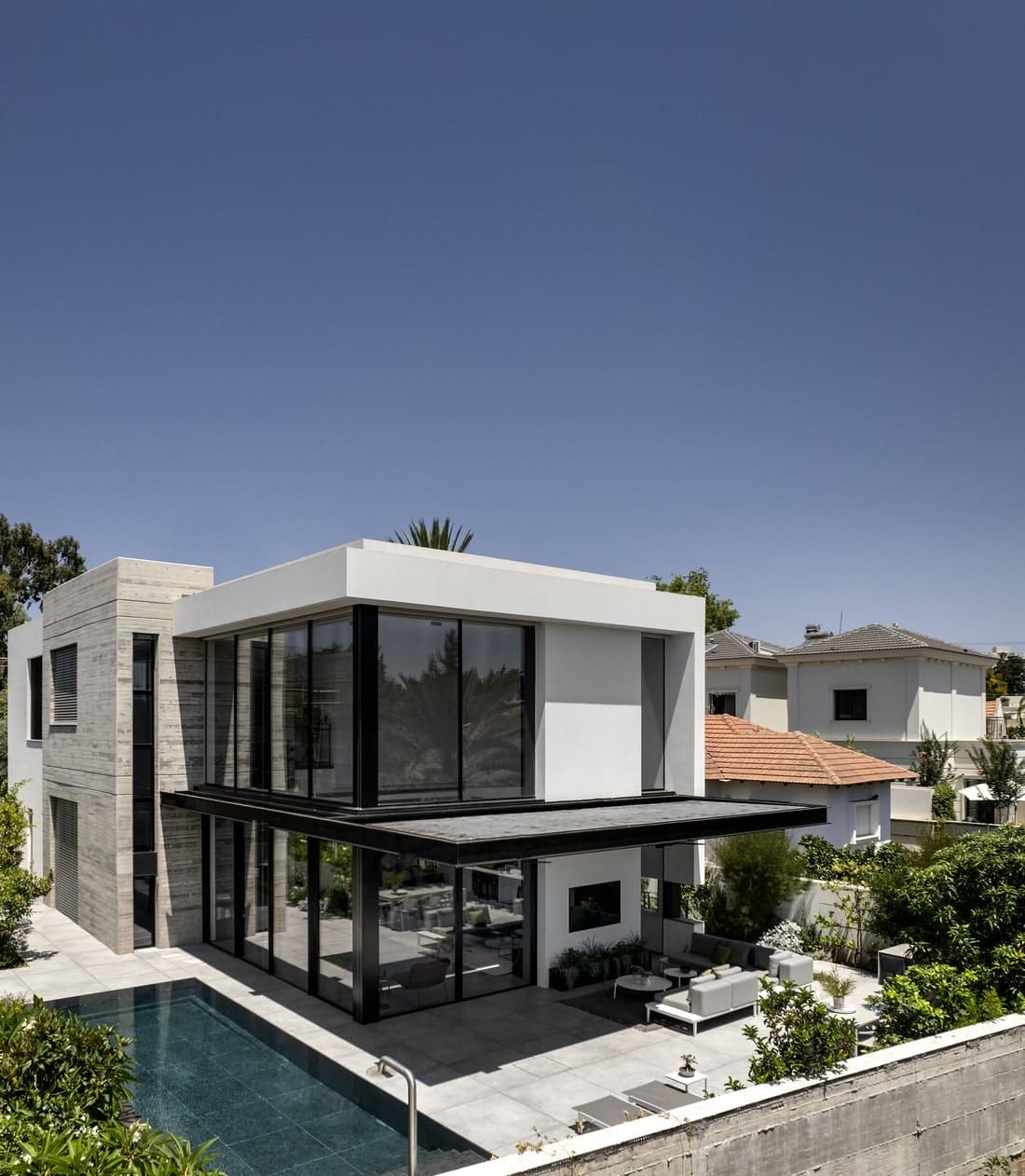
“The house consists of several masses, some made of exposed concrete and others clad in stucco. For the street-facing facade, I wanted to keep it as minimalist and modest as possible, while as you progress inward, deeper into the plot, the experience changes and the openness between the house and the rear courtyard and entertaining areas is at its peak.”
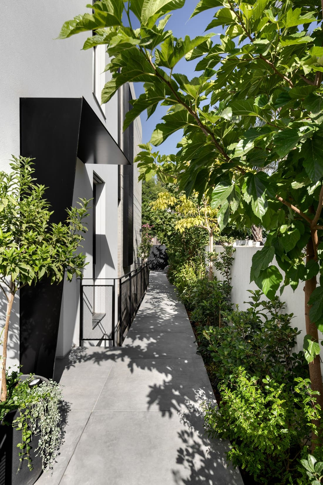
“Upon opening the entrance gate, a path leads to the side entrance door, above which I created an asymmetrical metal awning, resembling a paper fold emanating from the plaster plane. The path is flanked by vegetation on one side and an iron railing with a rigid wire mesh infill on the other, allowing natural light to penetrate unobstructed into the English courtyards surrounding the lower level.”
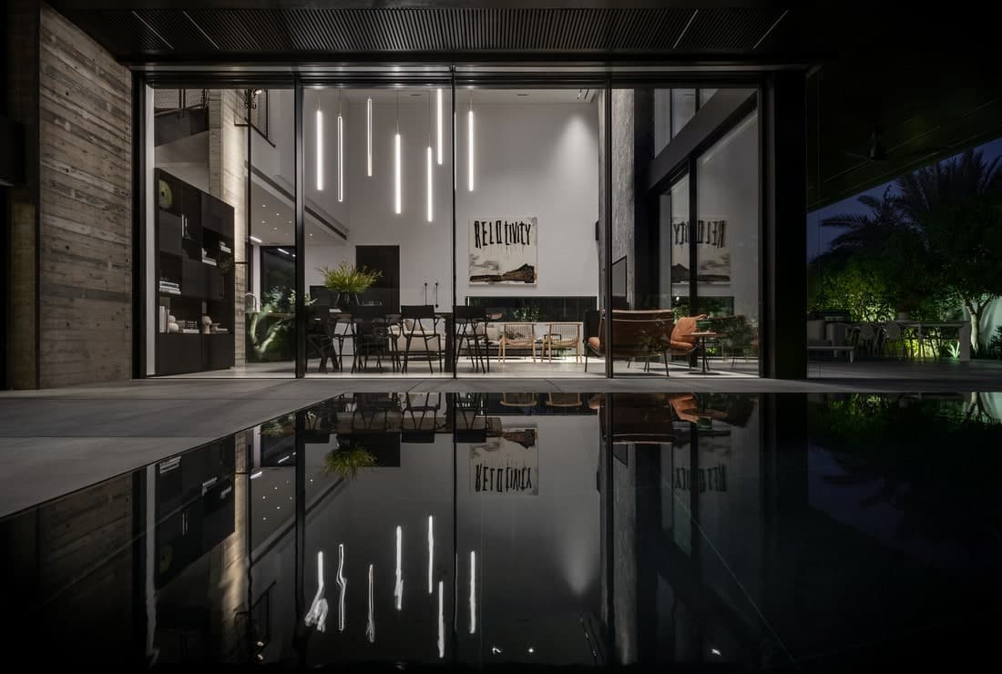
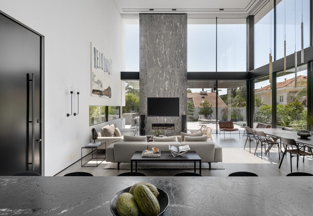
“The entrance door is free of ornamentation and made of smooth black aluminum. Immediately upon opening it, the public space that soars to a height of 6.8 meters is revealed, along with the giant windows overlooking the garden and pool. The dimensions in this space are certainly powerful, but the proportions are right, so you don’t feel exposed or threatened.”
To the right of the entrance is the parallel kitchen, composed of a high cabinet facade covered in textured, metallic-hued formica, concealing the appliances, ample storage space, and a hidden niche that opens as needed to reveal an additional worktop. For the island, Hadida chose to clad it in blackened veneer facades and a natural stone countertop.
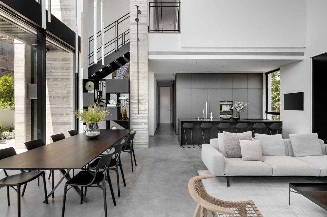
On the other side of the door is the family living room, for which Hadida created a vertical power wall with a recessed fireplace and TV screen. “This axis enhances the dimension of height and creates a pause in the continuity of the window walls surrounding the space,” he explains. “I chose to work with black cosmic marble cladding because it has a slightly rough and coarse texture, and it amalgamates many of the elements and hues I incorporated into the house – it has unique aggregates and iron particles, and despite the element being composed of several slabs, the veins are continuous, creating a very natural-looking surface.” The dining area stands parallel to the living room and adjacent to the swimming pool. It’s exceptionally large and made of a natural wood slab and stainless steel legs.
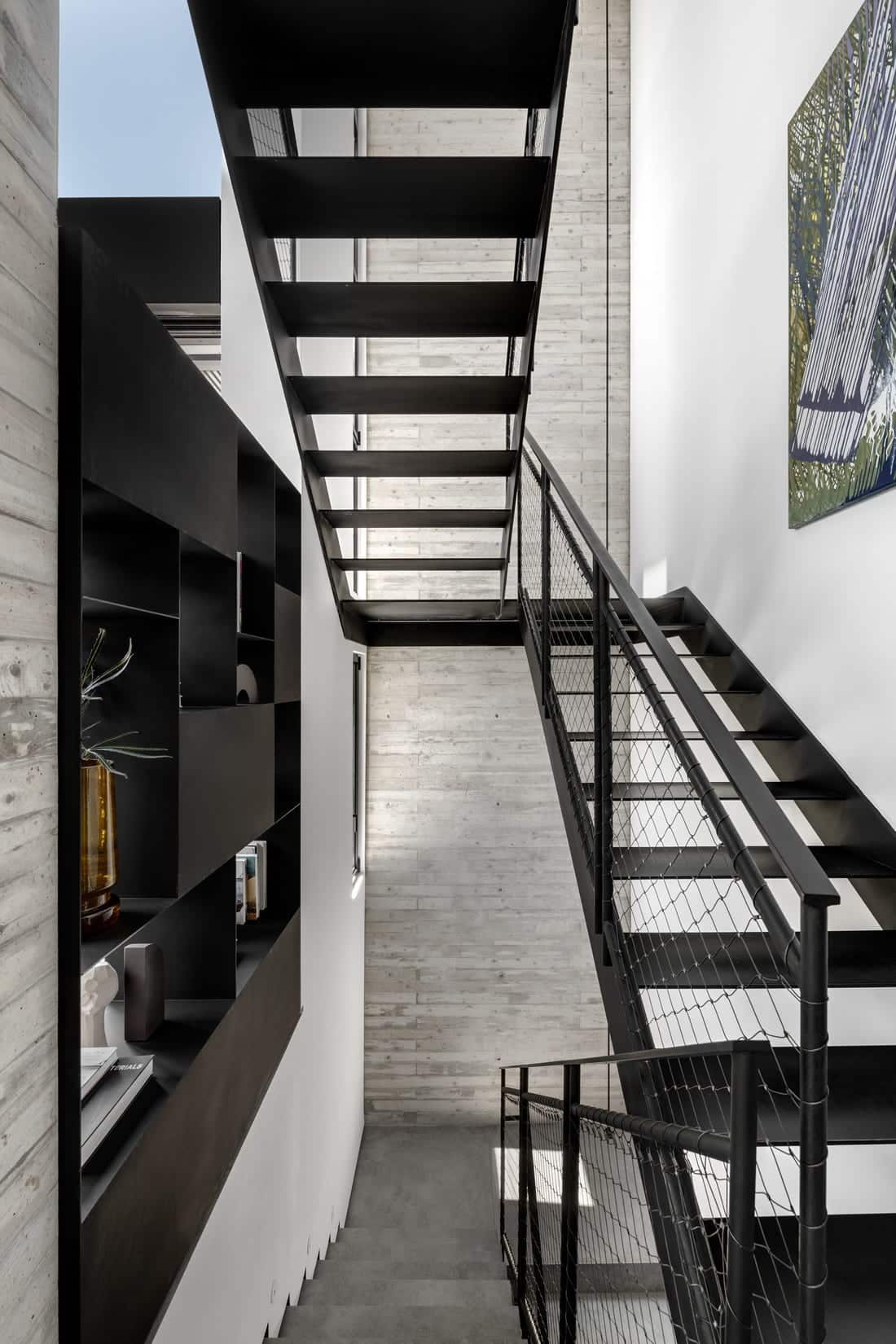
Between the dining area and the stairwell is a concrete column and a two-way iron bookcase: “On the central concrete wall, we attached a thin, vertical lighting cable that starts from the lower level floor, penetrates the podium, and continues all the way up to the double-height ceiling – a design element that emphasizes the dimension of height and creates a dramatic ambiance, especially as evening falls,” says Hadida. “Moreover, I chose to work with iron stairs because they create a light feeling, as do the iron railings in which I incorporated black-painted stainless steel meshes. This dark axis dialogues with the openings and the steel beam that separates the lower windows from the upper ones while simultaneously anchoring the external pergola.”
Adjacent to the kitchen, a secluded, intimate hallway leads to the private wing, where the guest bathrooms, safe room, the eldest son’s suite, and the master bedroom are located. The hallway is lined with a blackened veneer wood facade concealing a row of storage solutions, the electrical and communications cabinets, and a hidden door leading to the safe room.
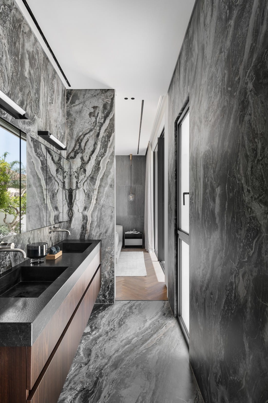
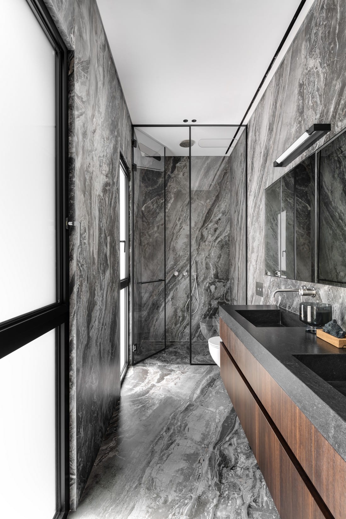
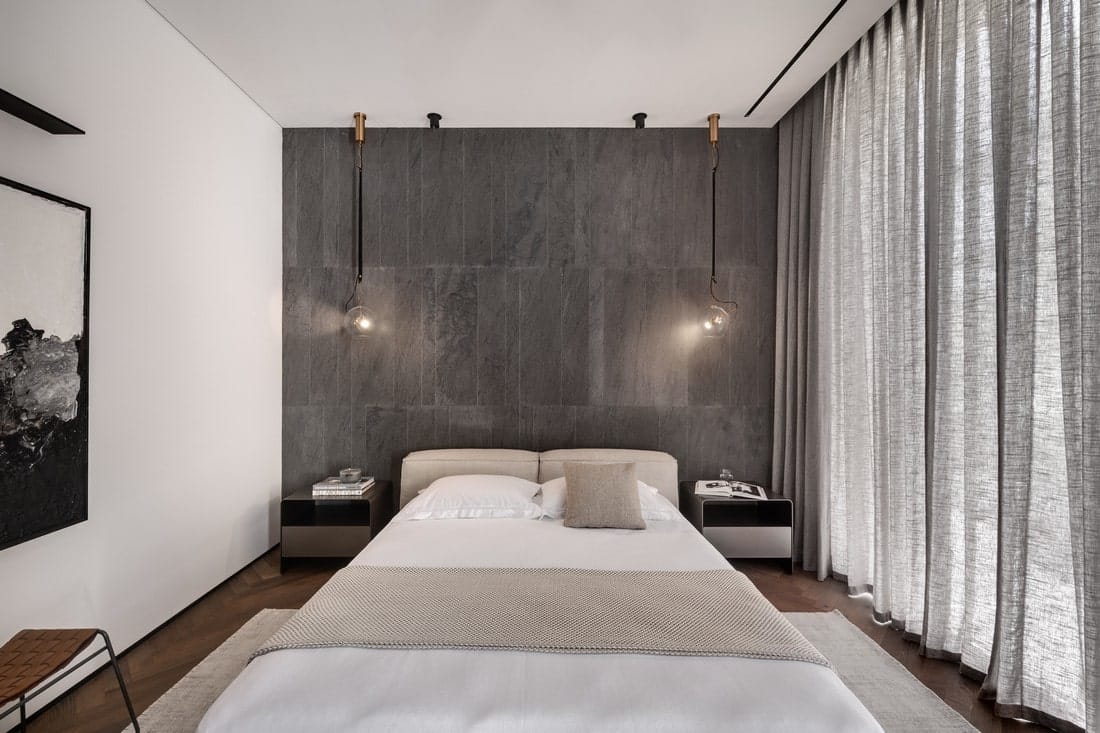
The spacious master bedroom includes a sleeping area with a dominant headboard wall clad in basaltina stone in three different sizes arranged randomly. The transitions to the wardrobe and bathroom are doorless yet remain intimate. The couple’s bathroom is clad in large porcelain granite slabs (1.6/3.2 m) that create a continuous appearance of wild marble. The double shower is framed by a black metal profile, and the bathtub cabinet, featuring his-and-hers sinks, is clad in veneer wood, adding warmth to the space.
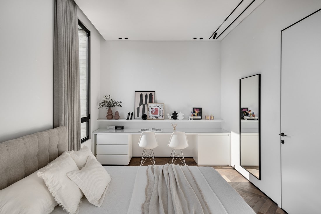
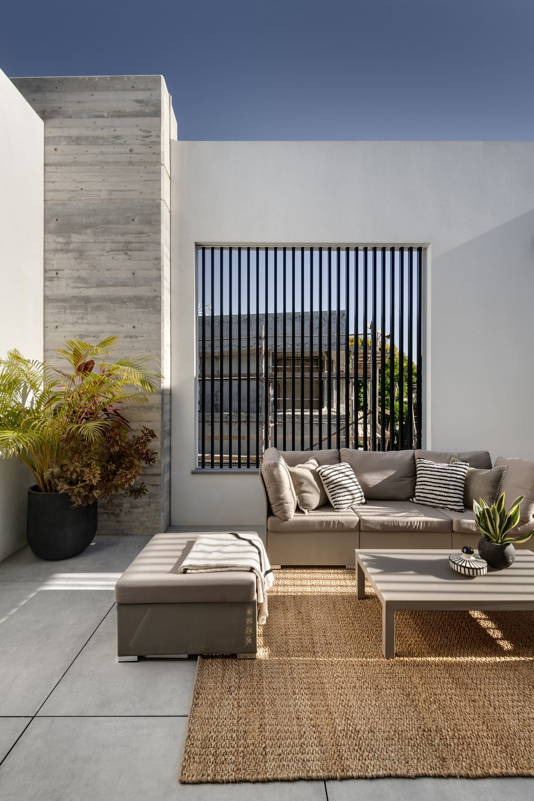
On the upper floor, a separate wing was designed for the two younger children, including two large master bedrooms and a pampering shared balcony for entertaining. The floor is covered in a herringbone hardwood parquet, and the children’s rooms were designed in a style that remained faithful to the modern aesthetic prevalent in the house, incorporating touches of elements and objects representing each child’s beloved colors, loves, and hobbies. For each of them, a private bathroom was designed, fully tiled from floor to ceiling in a light stone hue. The woodwork units are clad in blackened oak veneer – an element that recurs in various parts of the house. The shared balcony is stylish and meticulous, and the outdoor-appropriate furniture creates a beautiful contrast against the exposed concrete masses of the envelope.
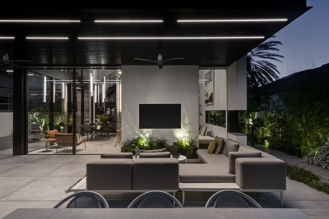
The exit to the ground-level outdoor entertaining area is through the window walls in the dining area and living room. Awaiting the family and their guests is an outdoor living room sitting under a metal pergola, a dining area, and an outdoor kitchen with a B.B.Q. station.
“The swimming pool is adjacent to the indoor dining area and is felt throughout the entire floor. Within that, it’s positioned in the optimal location in terms of light and sun exposure,” explains Hadida. “For the outdoor entertaining area, I clad it in floating porcelain granite tiles, creating a continuous surface between the indoor living room and the infinity pool, whose surroundings are paved in blue stone. This is an area that serves as a focal point from which all the unique elements designed into the house can be seen, like the exposed concrete mass that penetrates inward and the horizontal window that begins in the outdoor living room area and continues inside along the wall of the indoor living room, so it’s not always clear where, if at all, the boundaries between inside and outside lie. At the narrow end of the pool, there’s a sunbathing deck with loungers, and at the long end, the water cascades cyclically to the lower level.”
