Project: Urban Classy Home Design
Designer: Hamid Nicola Katrib
Location: Cricovului, Bucharest, Romania
Year 2018
Photographs: Alex Melente
The 150 sqm apartment covers the entire last floor of a newly built block of flats; it has a spacious terrace (around 60 sqm) and a smart partitioning, so we didn’t need to make radical changes in this aspect.
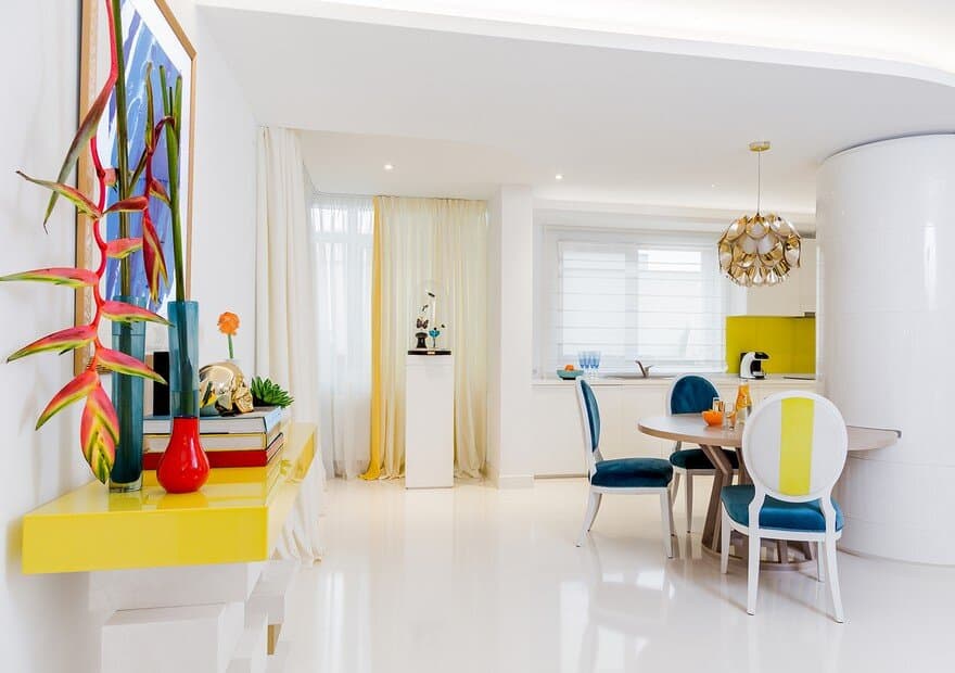
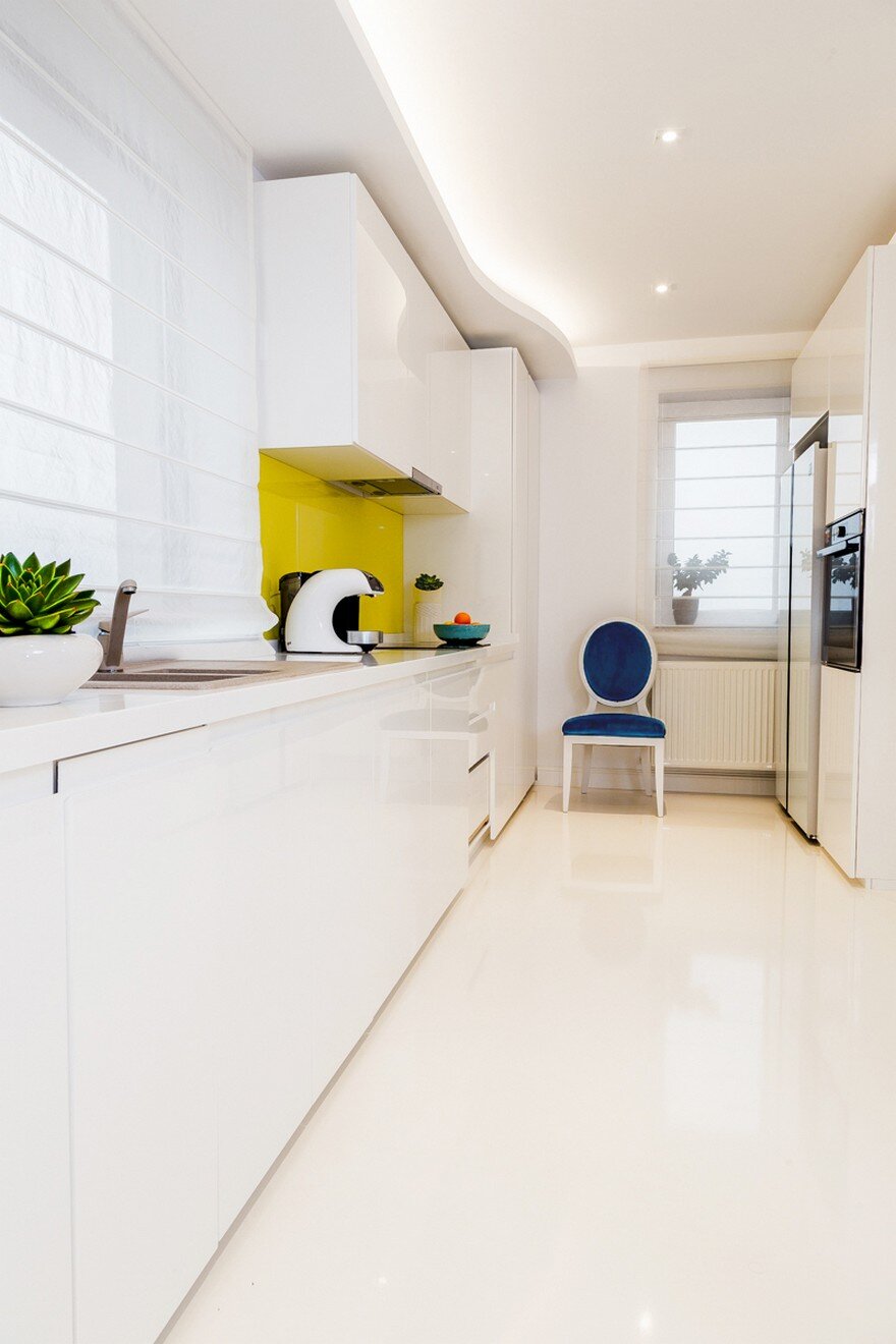
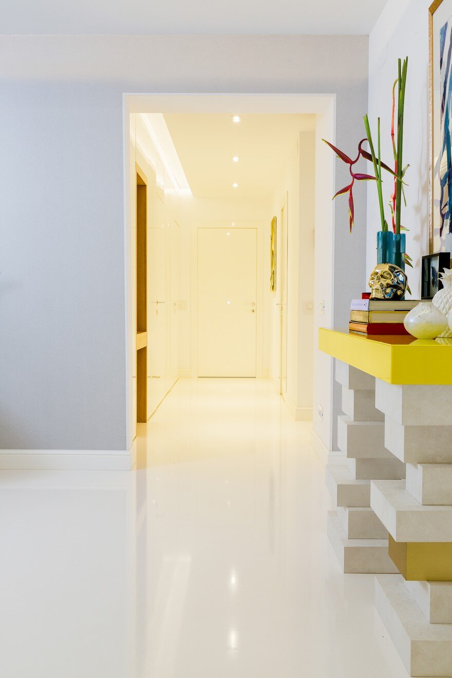
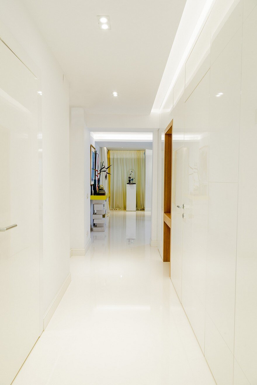
When it came to finishes, our team had free will to create a design that completely reflects the HNK signature. The owner of the apartment fell in love with the glossy white floors she has seen in other projects of us, so we replicated this flawless technique in this house. The entrance, the hallway, the living room – both the kitchen and the dining area – had the floor covered in impeccable white epoxy resin.
To keep the simplicity and minimalism of the space, we built a false wall made of glossy white MDF which integrates two adjacent doors (the master bedroom and play room doors). The wall creates a clean design and completes the elegance of the floor.
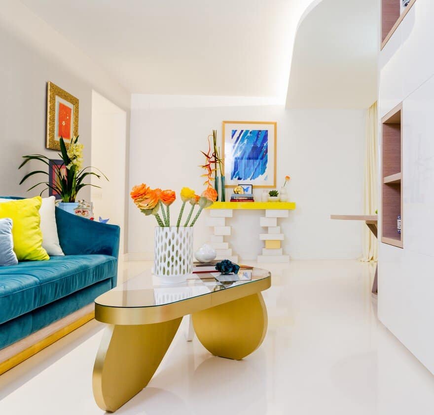
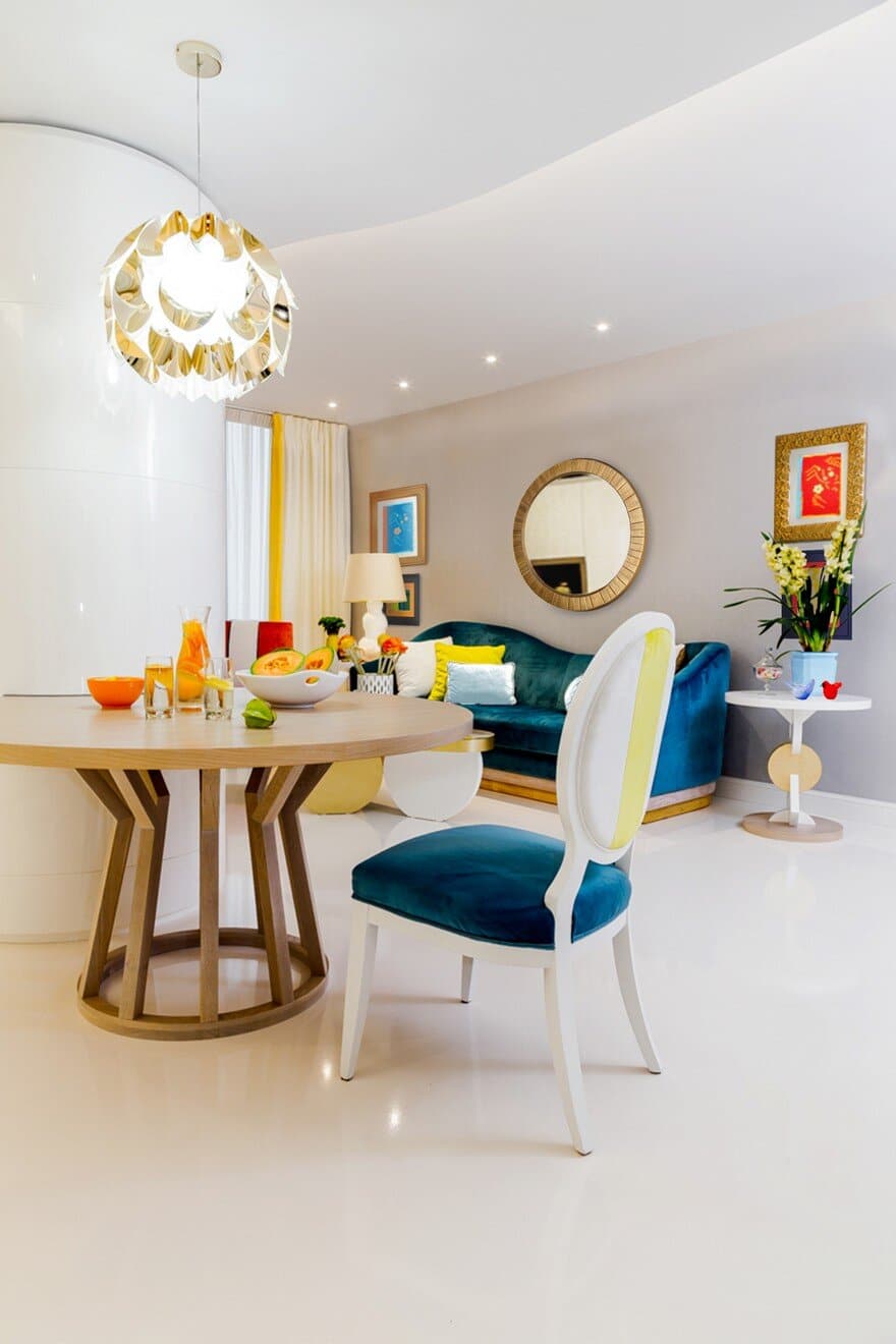
The bright white tone is the dominant element in the living room, while some sparks of color give energy and cheer up the spirit. The tones of orange and yellow are meant to counterbalance the vibrant blue and the predominant white – which can give a quite cold ambience. Following the same colour rule, the living room paintings by HNK were conceived in warm, optimistic colours, with golden frames.
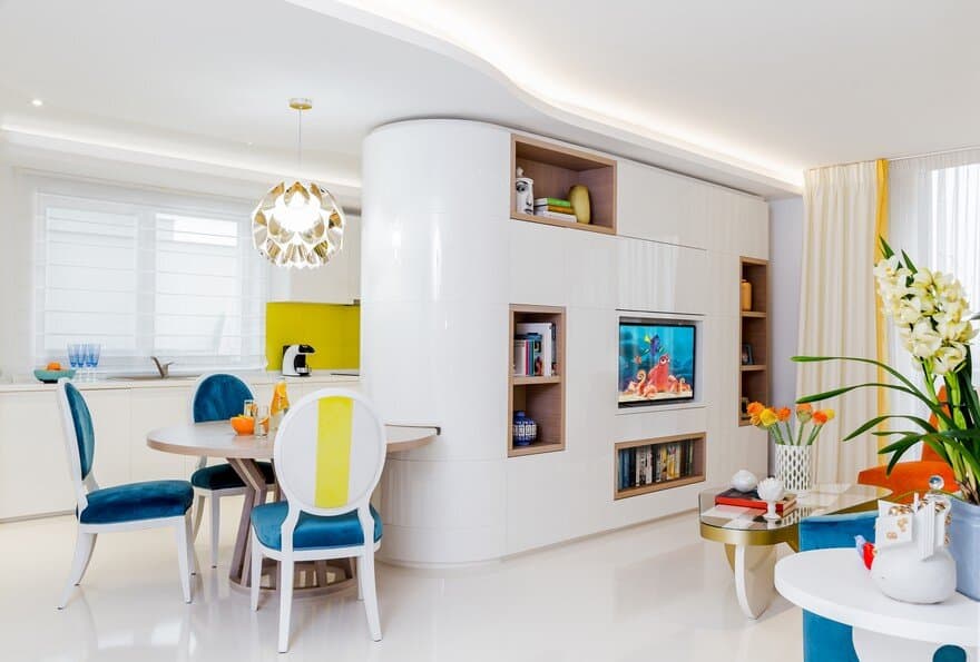
The living area didn’t give us too much room for the dining table, so we got creative. We designed a storage piece built of cubes with rounded edges, and it became one of the main attractions in the living room. The circular closet serves both the kitchen – as a cabinet – and the living room – as library, a space designed for TV, hidden closet doors, and dining table. A white oak wooden disk extends from the circular storage piece and becomes the table. The HNK team worked on many design proposals. Initially, we wanted to create a suspended disk, with no support. Since the disk was pretty big though, we decided we needed a supporting leg, so we sketched three designs. In the end, we went for this innovative, geometric shape.
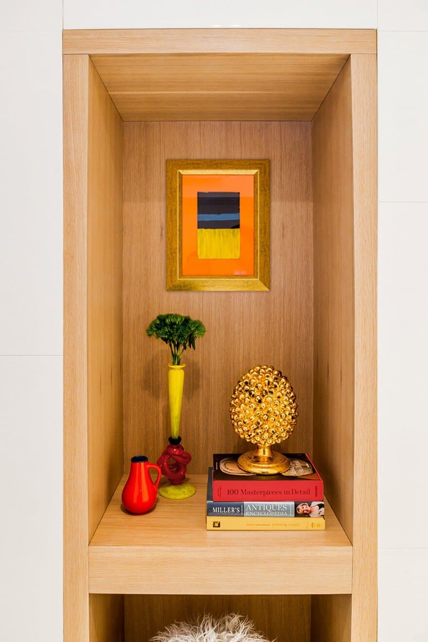
Using white oak wood for the disk and for the open cubes in the library, we added a warm touch to the predominant glossy white design. The decorative items have their own role in defining the elegance of this area. The outstanding white table lamp is a Natuzzi creation, while the bright coloured ceramics exposed in the library are part of a vintage `50 collection.
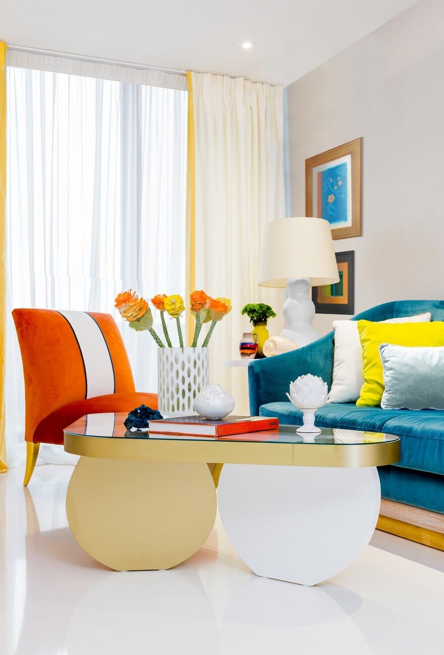
Speaking of vivid colors, the velvety blue sofa became another central piece of the living room. We built the color palette around this vibrant blue – we added the warm-orange armchair and decorated the sofa with yellow pillows, to counterbalance the cold tones.
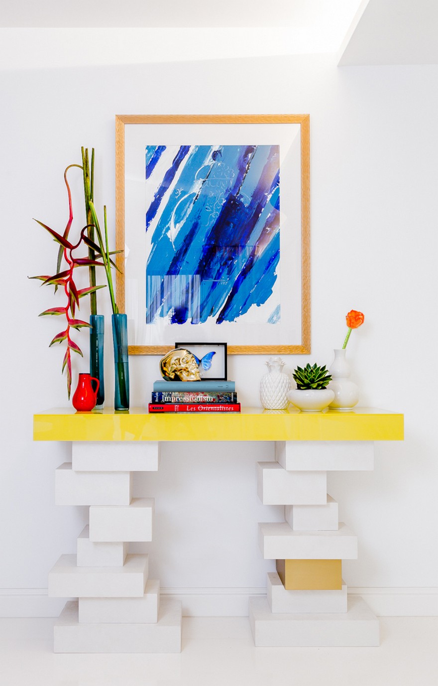
In this house, the HNK signature is present in all the details – the unconventional brass-colored coffee table is our creation. Also, the small tables on each side of the sofa, called totem tables, are also part of the HNK collection. The yellow console in the living room, as well as the minimalist painting in blue tones from above and all the other paintings in the apartment, are HNK creations.
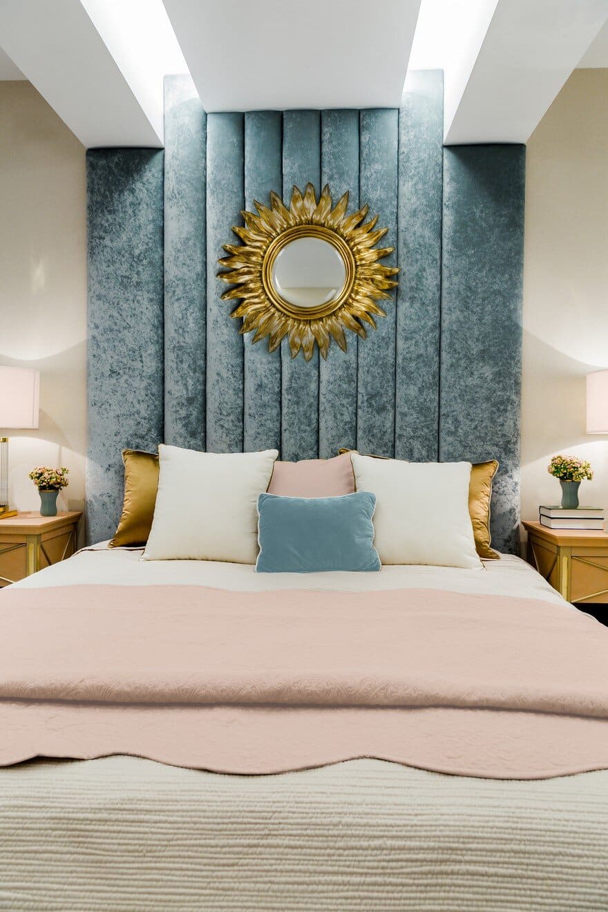
Conceived for a good rest, the master bedroom follows a warm and welcoming design, with soft and dense textures, which suggest comfort and sumptuousness. The tall headboard made of blue pearl velvet is enhanced by the salmon-rose nightstands with golden details. We chose the salmon-rose touch to complete the blue elements in the decor in a subtle and elegant way.
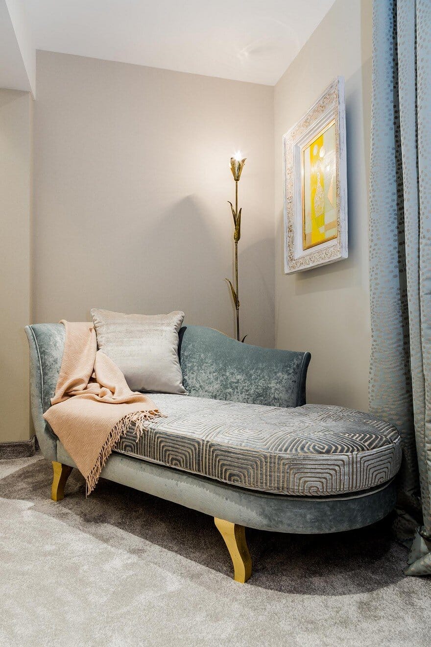
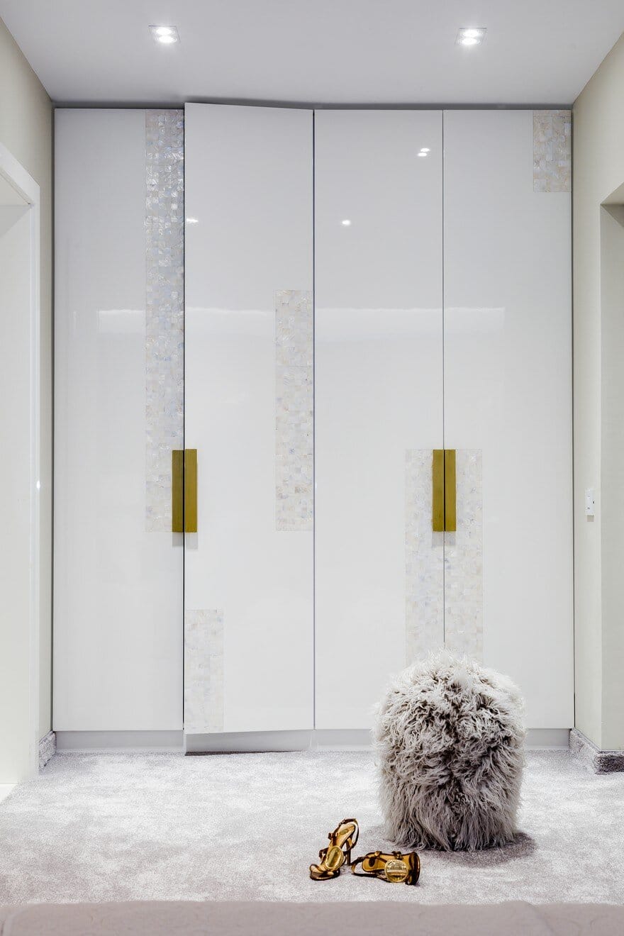
The lounge chair is part of the same diaphanous story created in the bedroom, and the brass and yellow accents from the lamp and the solar painting complete the composition. Also, the dressing is a unique HNK creation made of white MDF with natural sea shell insertions and brass handles, which add a unique preciousness.
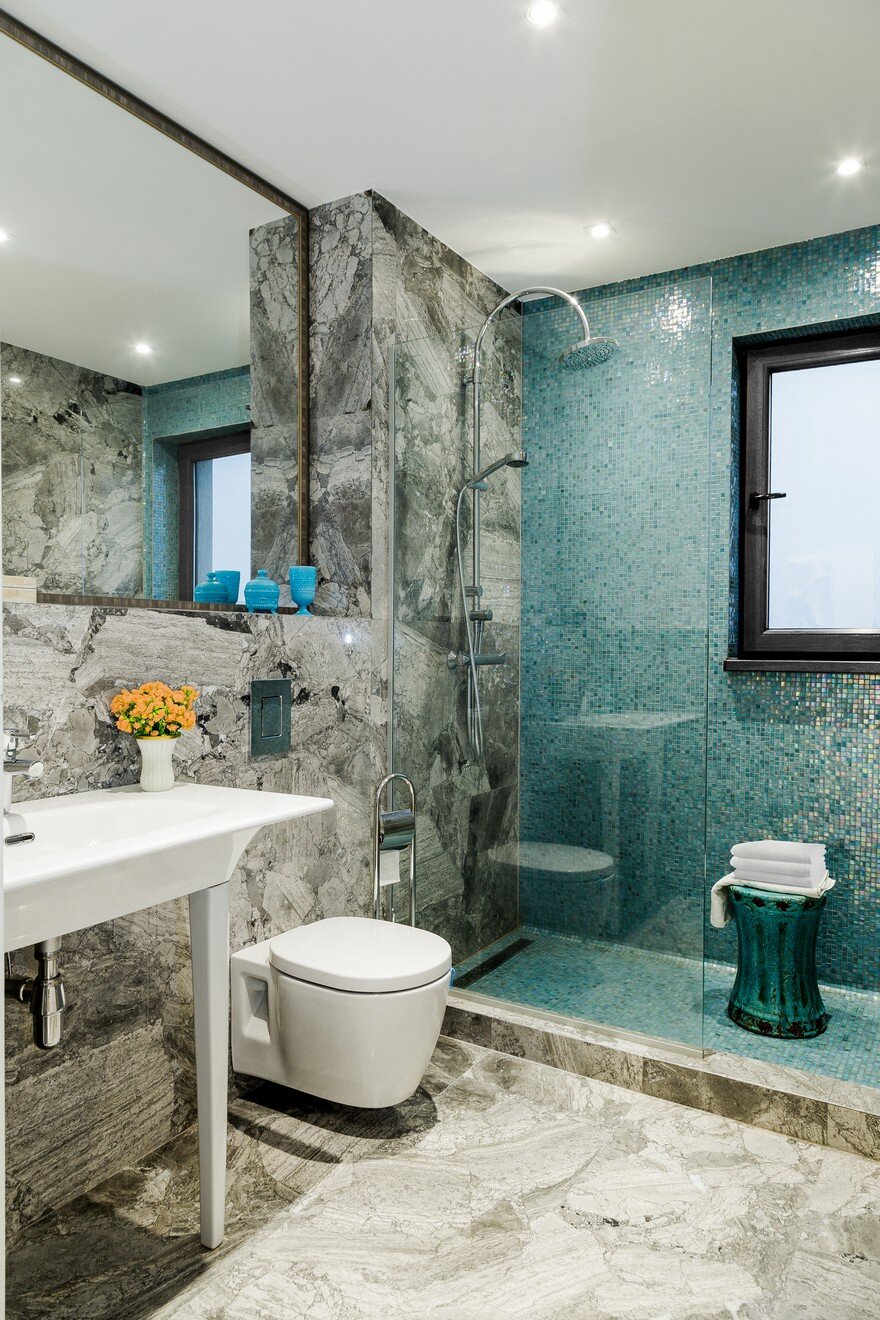
The grey bedroom carpet with pearly reflections needed a similar approach for the master bathroom. We chose a grey tone of marble and a turquoise mosaic for the shower area, which are beautifully enhanced by a large mirror that gives more space and light.
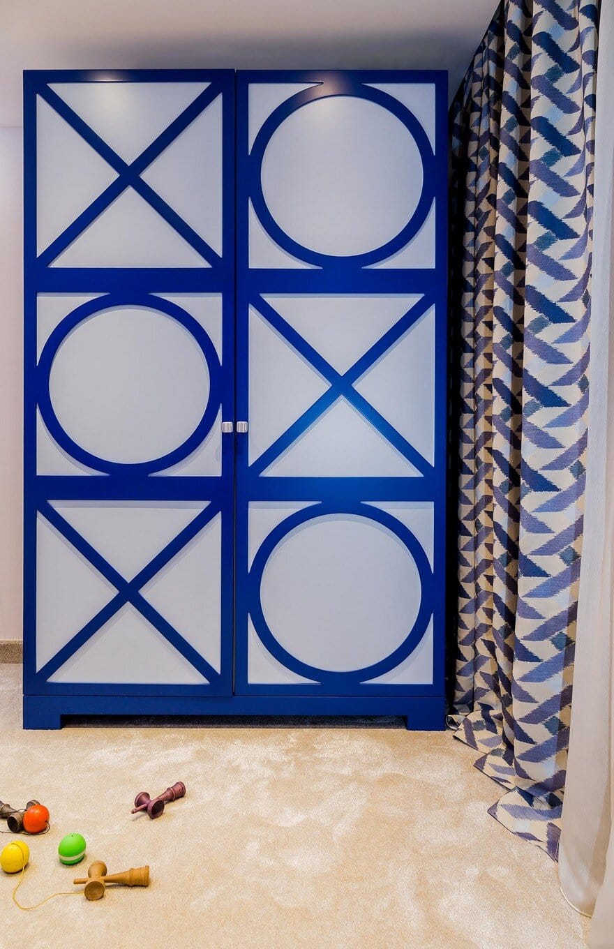
In the teenager’s bedroom, we went for electric blue for the headboard and the wallpaper, and a fluffy beige carpet to better enhance the blue tones. The red accents complete the color palette, while the `X & 0` nightstands’ and closet’s theme, entirely designed by our team, brings a playful mood in this space.
Designing a home in plenty of white and vivid colors look like the recipe for fresh energy and optimism in a house. If well combined, colors have this superpower to brighten your day and make you feel young forever, like living in an endless summer!

