Project: Veranda on a Roof
Architects: Studio Course
Location: Maharashtra, India
Architect in Charge: Kalpak Shah
Area: 50.0 m2
Project Year 2017
Photography: Hemant Patil
Located on the roof of a 12 storey building of a duplex apartment, this space was conceptualized as a ‘Veranda’. (Hindi meaning: A transitional space between public and private area or, between a house and a street). A concept, which conjures up an image of a welcoming social space meant for all.
Traditionally, verandas have always been an integral part of our homes. However, in recent years, to a certain degree forgotten and disappeared. A veranda was always an element, central to making our houses into homes, an accidental space for long conversations, a place for one to relax and unwind. “There’s a special feeling you get on a veranda that you just can’t get anywhere else.” – Haruki Murakami.
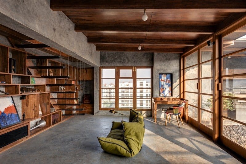
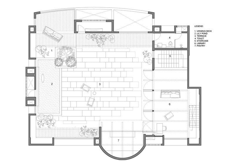
But, the ‘Veranda on the Roof’ is no accidental space. It is a space designed keeping in mind the family and their clear understanding of a special place they wanted to add to their home. A space crafted out from their lifestyle which revolves around books, food and plants. Hence, this ‘Veranda on the Roof’ houses a library and a pantry, which extend into a terrace, or in other words, parts of terrace which are covered to accommodate a reading nook and a pantry.
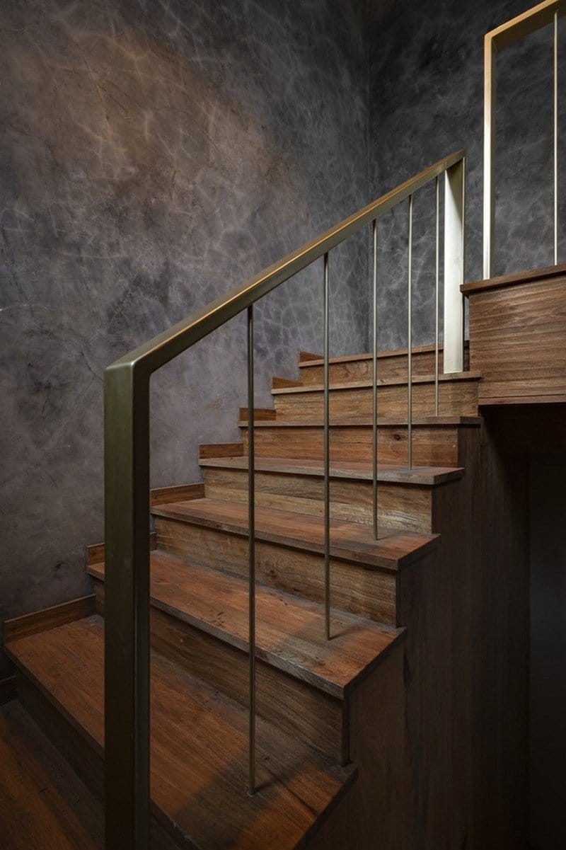
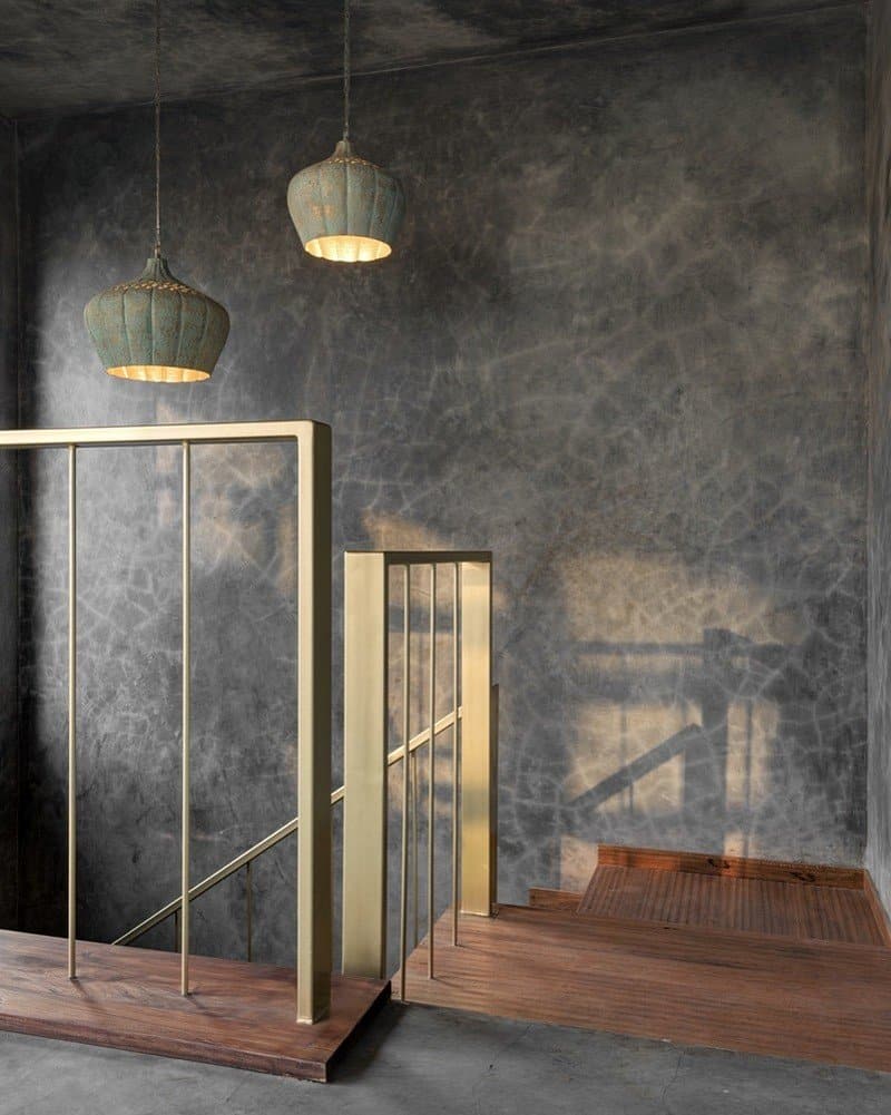
The design intends a play on the senses as one approaches the place through a wooden staircase from the living room below. The existing walls of the staircase were broken down and roof was created to open up the space and get better connection. This enabled us to make the Veranda into an extension to the main house below while allowing the two levels to engage in a dialogue.
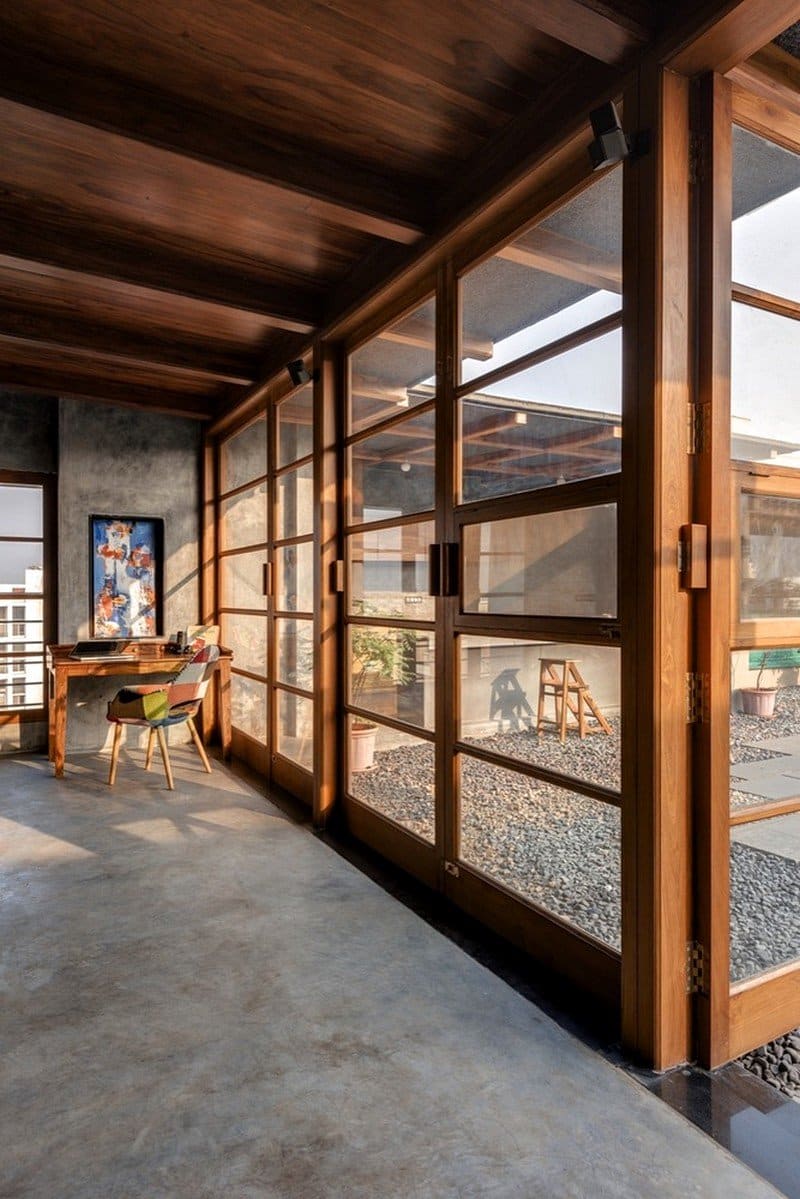
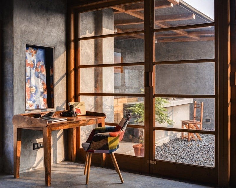
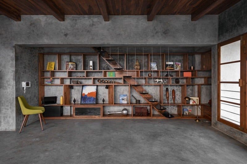
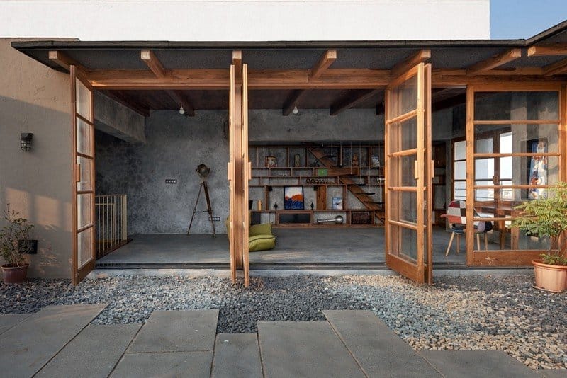
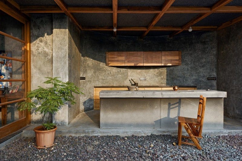
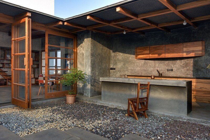
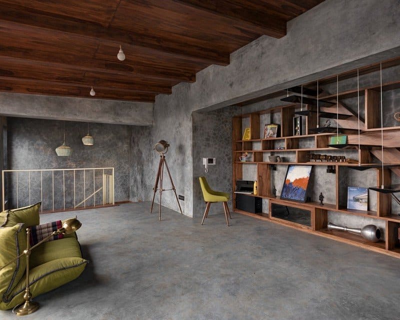
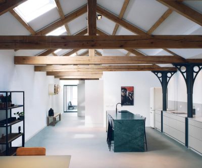
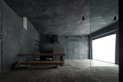
Bold earthy undertones of the cement textured walls and Teak wood furniture are used to set the tone of this space. The roof library overlooks the terrace garden through a wooden glass paneled façade, which gives a notion of an enclosure that can open up completely, blurring the boundaries of the inside from the outside. This uniformity of space is also accentuated by the use of natural materials like cement plaster, teak wood, granite stone and brass metal which span inside as well as outside. The hand movement imprints on the cement plaster constantly give a sense of tactility of the process that has undergone to make its architecture.
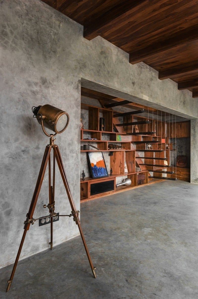
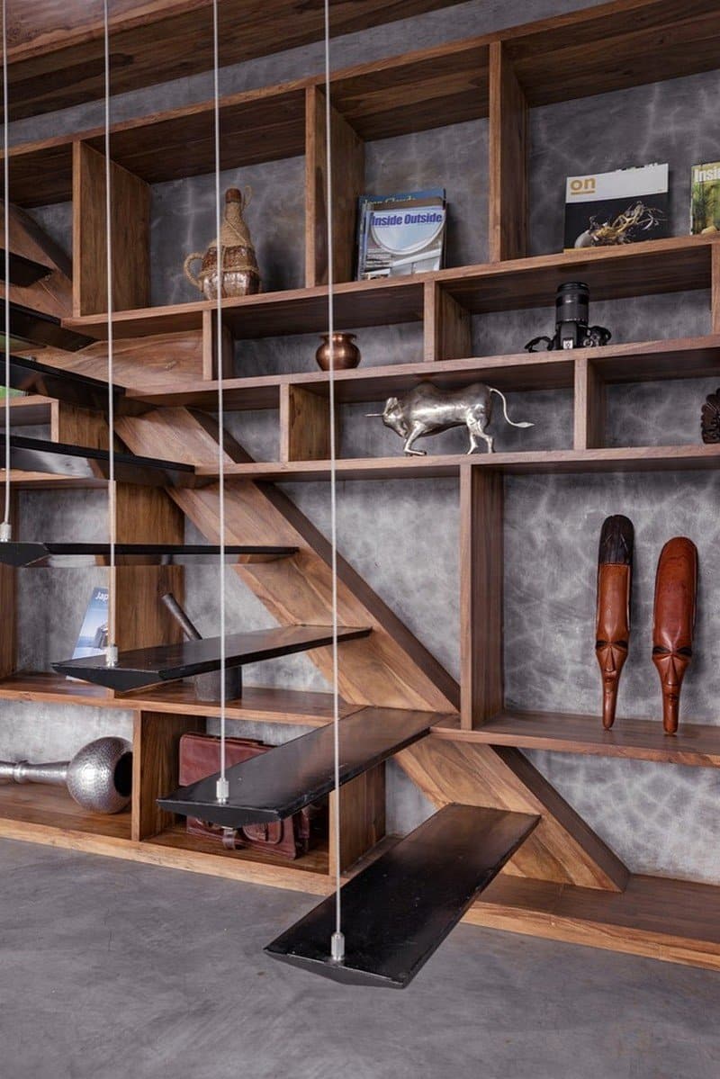
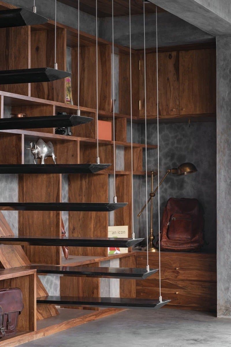
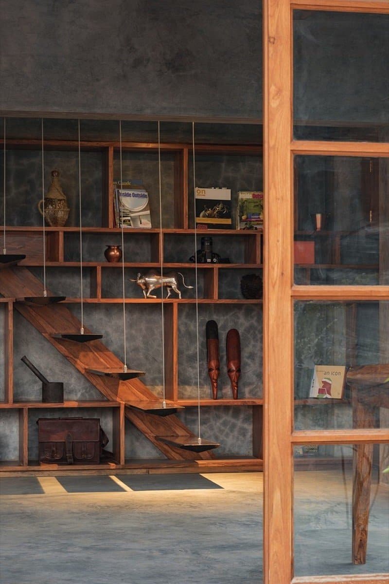
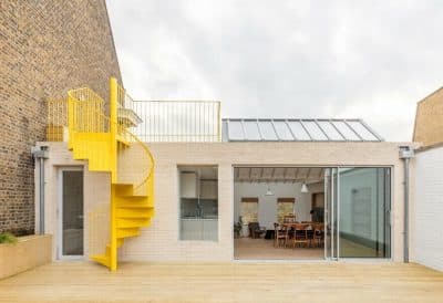
The low-on-clutter, minimal furniture allows for easy movement. The library unit is designed to be understated in its form so as to consciously reduce its visual impact. A metal staircase hung from stainless steel wires on one end and anchored to a wooden beam on the other leads to a store room above. Here, the treads are designed in a way, so as to perfectly align with the shelves of the library unit. Similarly, a lot of elements such as the door handle, door stopper, tower bolts, drawer handles are custom designed to follow this language with the notion to fade away.
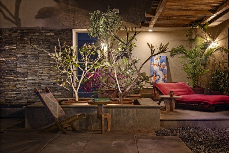
The fully equipped pantry on the terrace continues to have the same language where the thrilling idea of cooking outdoors is explored. Walking on the gravel produces a sound which triggers the memory of being in the outdoors. The gravel floor is used in parts across the terrace to heighten this tangibility. A reading nook, which sits along the water fall and a lotus pond within it, is a tranquil setting to indulge into a piece of literature with the garden partly screening it.
The veranda on the roof can not only overlook the exotic view of a race course but also be able to create a world within its own, where one can immerse and indulge in the pleasures of one’s seeking. Veranda on the Roof turns as a refuge, where the shifting contexts have created new meanings.
Product Description: The principal material used largely for floor and walls is cement plaster also known, by its process as ‘Ghotai’ (Hindi meaning: constant movement of hand) used in traditional Indian houses. It is an extensive process of laying cement in layers with hand by the method of constant straightening and curing it with water. This material and natural process give warmth and earthy tone to the space designed and intended to turn as a refuge from its immediate environment. The hand movement imprints on the plaster along with the Teak wood carpentry, constantly give a sense of tactility of the process that has undergone to make its architecture.

