Project: W Cafe
Architecture: Space Story Studio
Location: Nakhon Si Ratchasima, Thailand
Area: 510 m2
Year: 2021
Photo Credits: Nattakit Jeerapatmaitree
W cafe, a cafe near Aung Huay Yang, Nakhon Ratchasima, a cafe that combines coffee shops, Korean-style gardens, playgrounds.
“A family area, a group of friends, a creative experience space for children in the form of a cafe”
The beginning of the coffee shop project, an area of 510 sqm., occurs when the owner wants to make a cafe. That’s not just a sitting and drinking and eating place. If she still wants it to be a space for children that can come to play together, learn, and meet some new friends While parents can sit and sip a drink, Eating snacks, can wait throughout the day. and may become a destination at the weekend. Let the family find space to do activities together. According to the current era, cafes are popular among all groups.
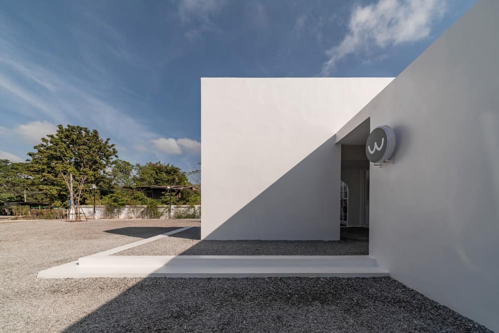
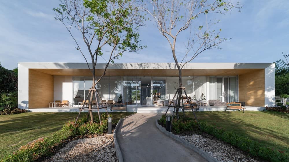
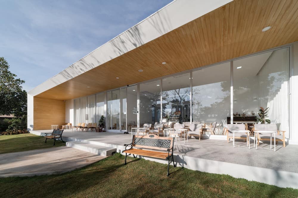
Because it’s the first cafe that the owner does. So she wanted to use the least amount of budget. Personally, she needs a building that looks simple, likes white, and wants something that is a box, which indicates something very simple. The work that comes out in the study process is a box style, all white. In terms of building design, there must be a memorable image that helps the building attract people to use it. It came up with the question “What connects people with buildings?”
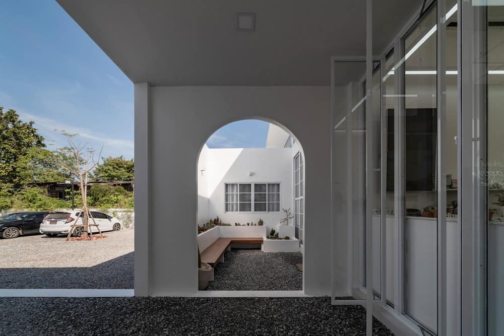
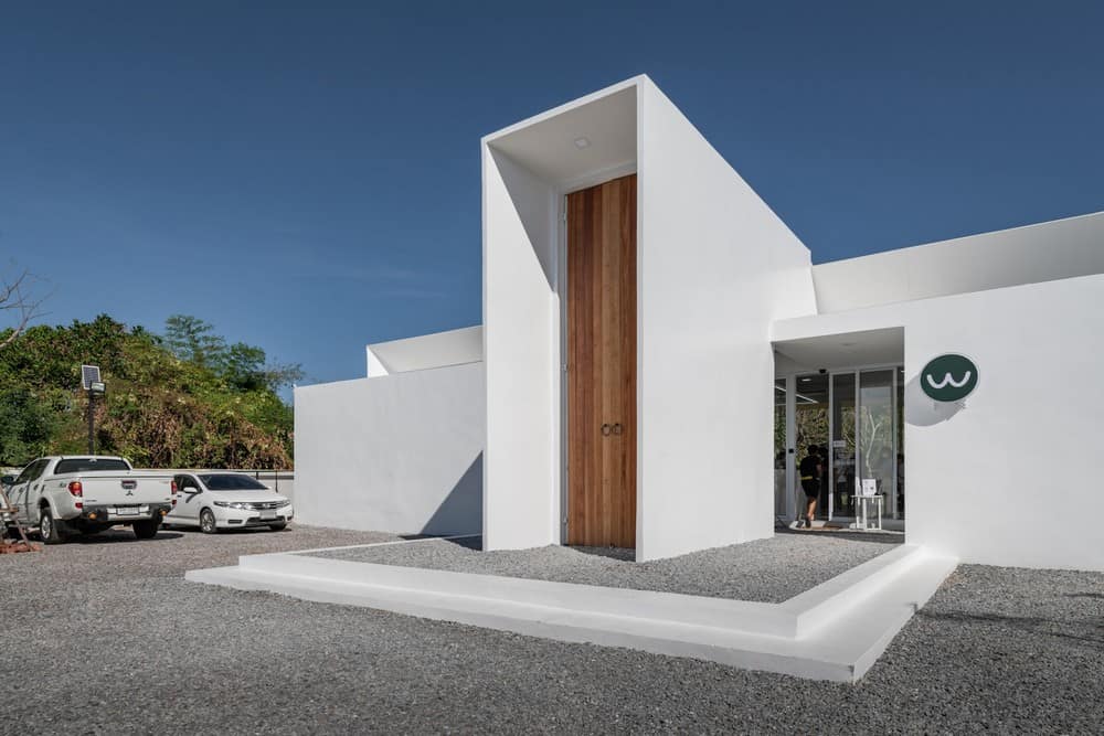
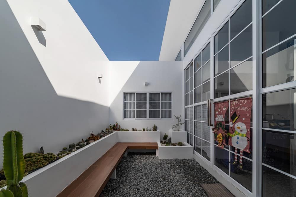
The shape of the land is long and deep. The narrow side adjacent to the road. The front half is divided to be a parking area. The other half of the land at the back is arranged as a playground, a waterfall in Korean style, according to the owner’s preference. Making the building a descriptor of the zoning of the project where the whole building is like a door + wall dividing the area front and back People outside hardly know that there is a garden inside, will know when have entered into use before only. Entering the building from the solid side to the other side of the building opens wide connected to the garden and seeing the activities taking place.
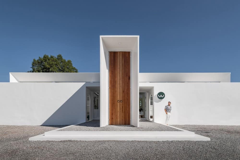
“Gate” is an important element in space transition, used to connect each space. The door was then used to create a unique identity for this building. The appearance of a simple white building when viewed from the street. The building’s walls are designed as smooth, white walls with a single door. The height of the building has a significant effect. That will happen with the feeling of a human scale and having enough space for use. Therefore, a cafe will welcome many people. therefore focusing on a higher than general door helps to make it interesting when seen as building height size. It will create an Instagram element. The building is 4.5 meters high and the large door is 5.3 meters high, helping to create a focus on the white building. Including the perception of the user as well.
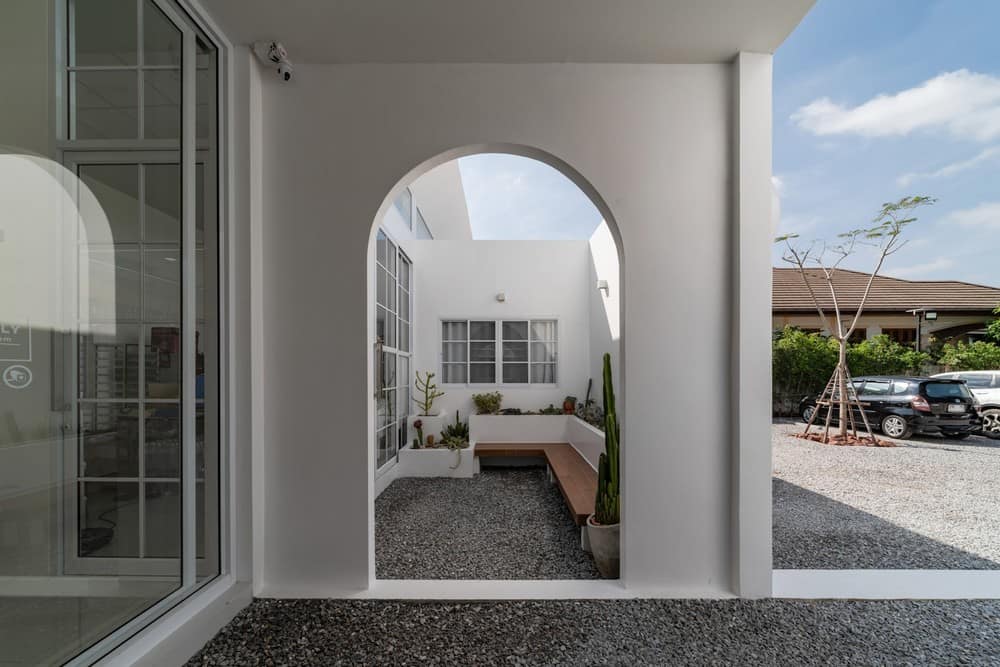
The function of building consists of a coffee shop area. Owner’s room, children’s room, 2 staff rooms, storage rooms including bathroom, Outside and inside seating areas, playgrounds, etc.
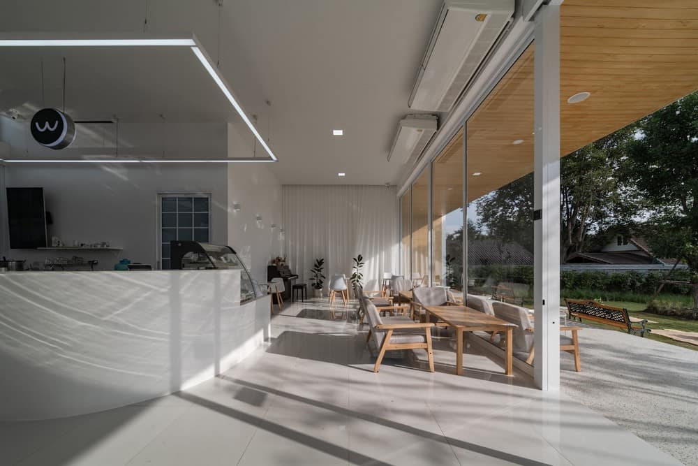
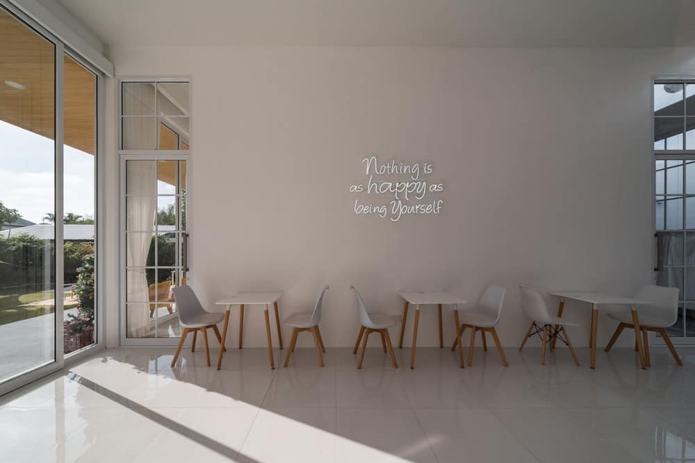
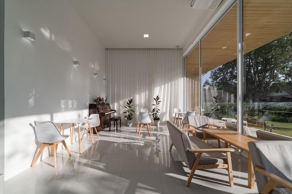
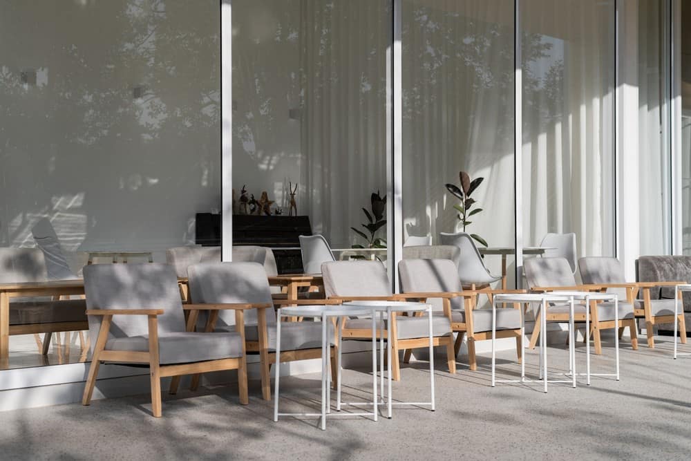
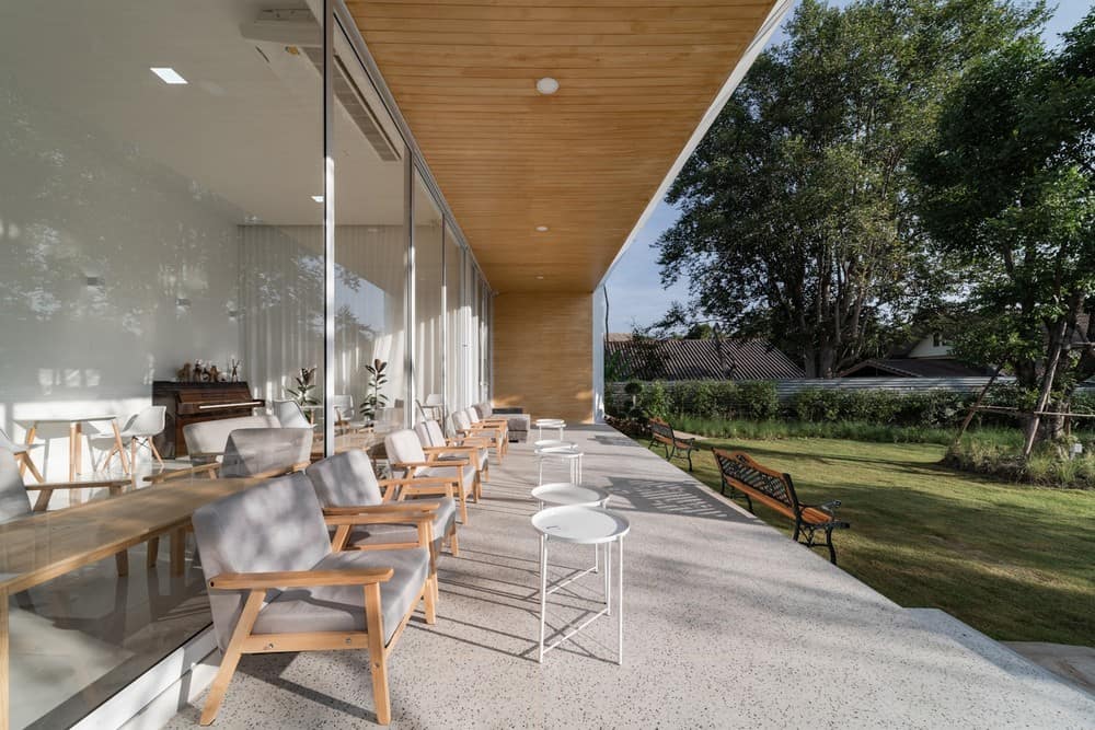
Unusual or diverse materials were not used in this work. due to management within the budget. The choice of white helps to make it look simple and has a classic beauty including having its own charm, merging with the wood color on the ceiling to give a feeling of warmth, comfortable on the eyes, and can also fit with every decoration style. And it can be matched with a variety of furniture as well. The white color of the building will blend with each other people. Furniture color schemes and patterns are selected in bright and simple tones, which will be easy the change in the future by the owner herself.
