Project: Wickham House
Architects: MODO – Michael Ong Design Office
Location: Strathmore, Melbourne, Australia
Year 2018
Photo Credits: Ben Hosking
Text by MODO
Located in Strathmore, in Melbourne, Wickham House is a new 520m2 single house designed over three levels to create an place for intimate family dinners to large birthday parties. MODO Architecture has carefully examined the traditional family home and reconstructed it as a series of texture-rich volumes that speak directly to the client and how they live.
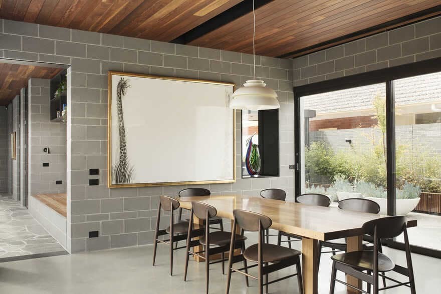
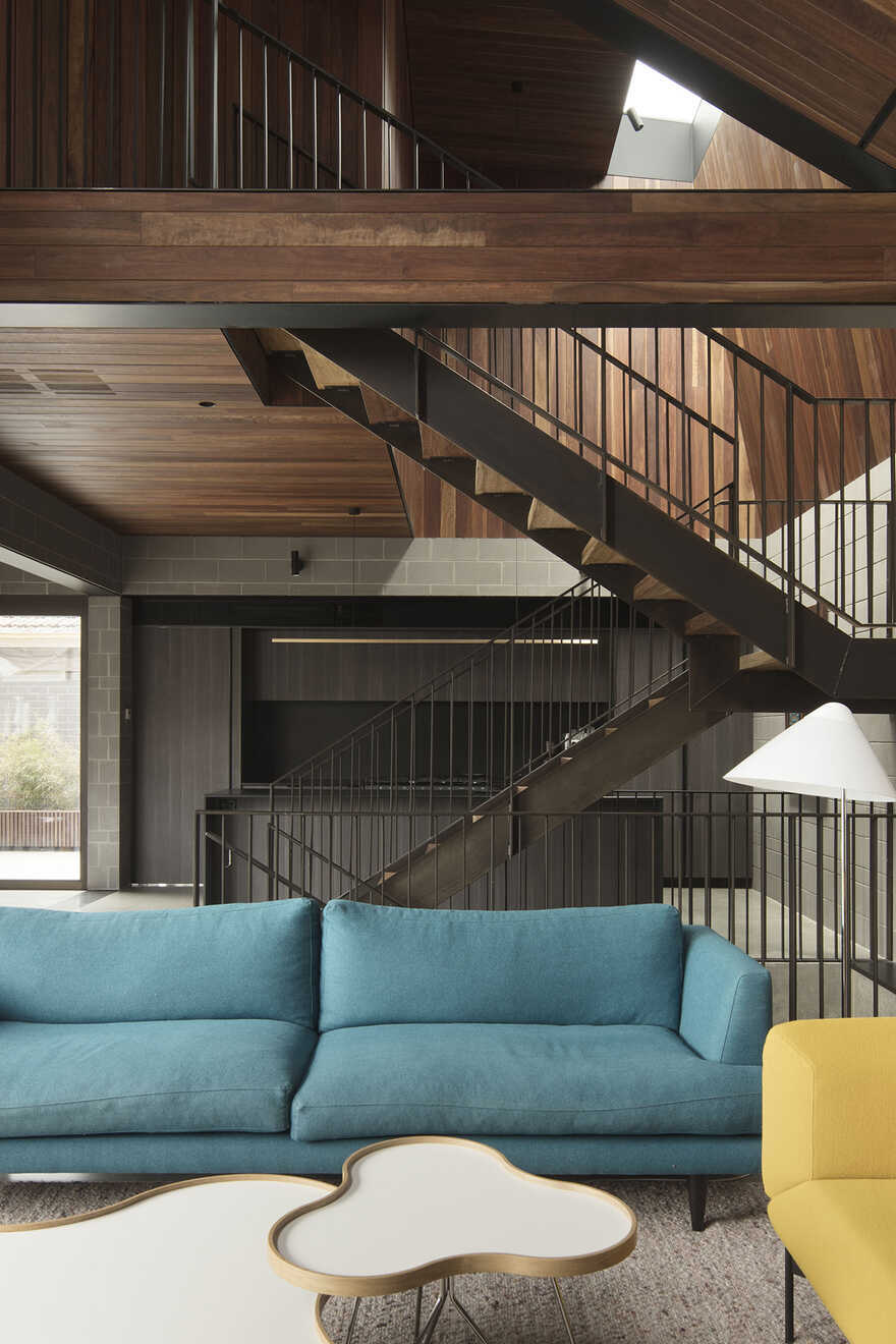
The brief for this new house in the leafy suburb of Strathmore was relatively simple and standard for a family home. At a minimum it needed to accommodate the themselves and their two teenage kids. They wanted to the house to feel open but not disconnected, we spoke about how the idea of a modern open living plan, is often a large room with loose furniture in them, creating this ‘gymnasium’ and ‘hollow’ atmosphere. Instead we looked at ways to define spaces with volumes and material distinction. For example, although the dining, kitchen and living are all connected in plan, in volume they are individually unique in their own way. We pulled down the dining room space but lowering the timber ceiling, this softens the acoustics and minimises echos creating a more intimate space, while the lowered height encourages you to sit deeper and more relax in your chair.
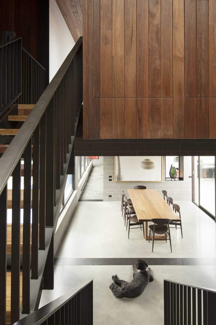
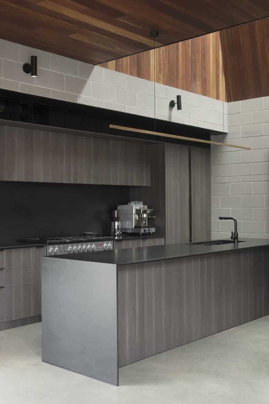
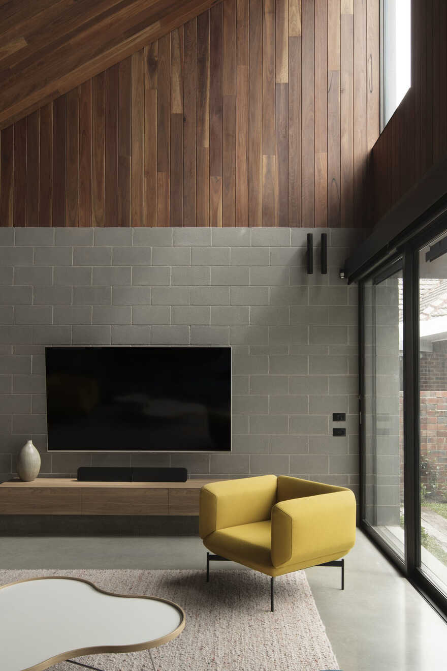
Built by Justin Gee Builder, Wickham House emphasises the vertical connection of the spaces. On the other hand, when you walk into the kitchen the height doubles create a space that is celebratory and alive. The datum line created by the block wall and the timber ceiling is used to accentuate this growth in height, a skylight above lets in a wash of natural light, gently changing the colours and tones of the timber through out the day.
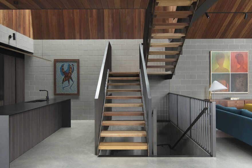
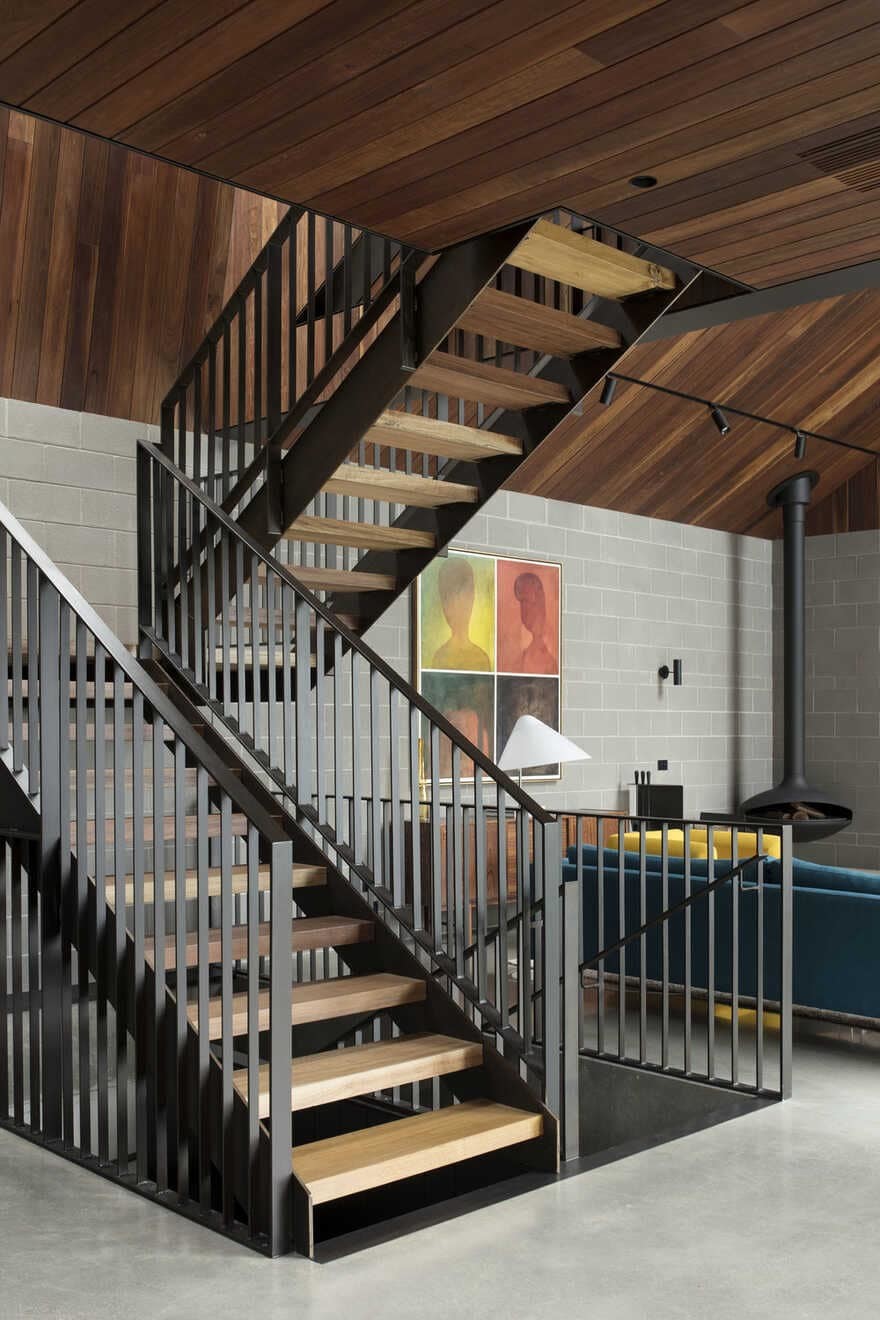
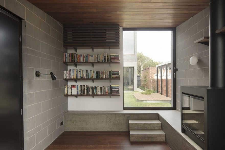
The steel stair punctuates the centre of these spaces to formally separate the living and the kitchen, the steel blades of the balustrade acts as both fall protection and a spatial screening device. Like the others, the living is distinguish by a change in volume, the raked ceiling allows the room to feel generous, while at the same time bringing in additional northern light into the room. It was also important for us that all rooms shared commonalities and felt unified, so our use of block wall and timber cladding was key to holding them together. Beside being a common material, they also help convey some important concepts and functions. The concrete block wall allowed the design to build a surrounding layer of thermal mass to help passively cool and warm the house.
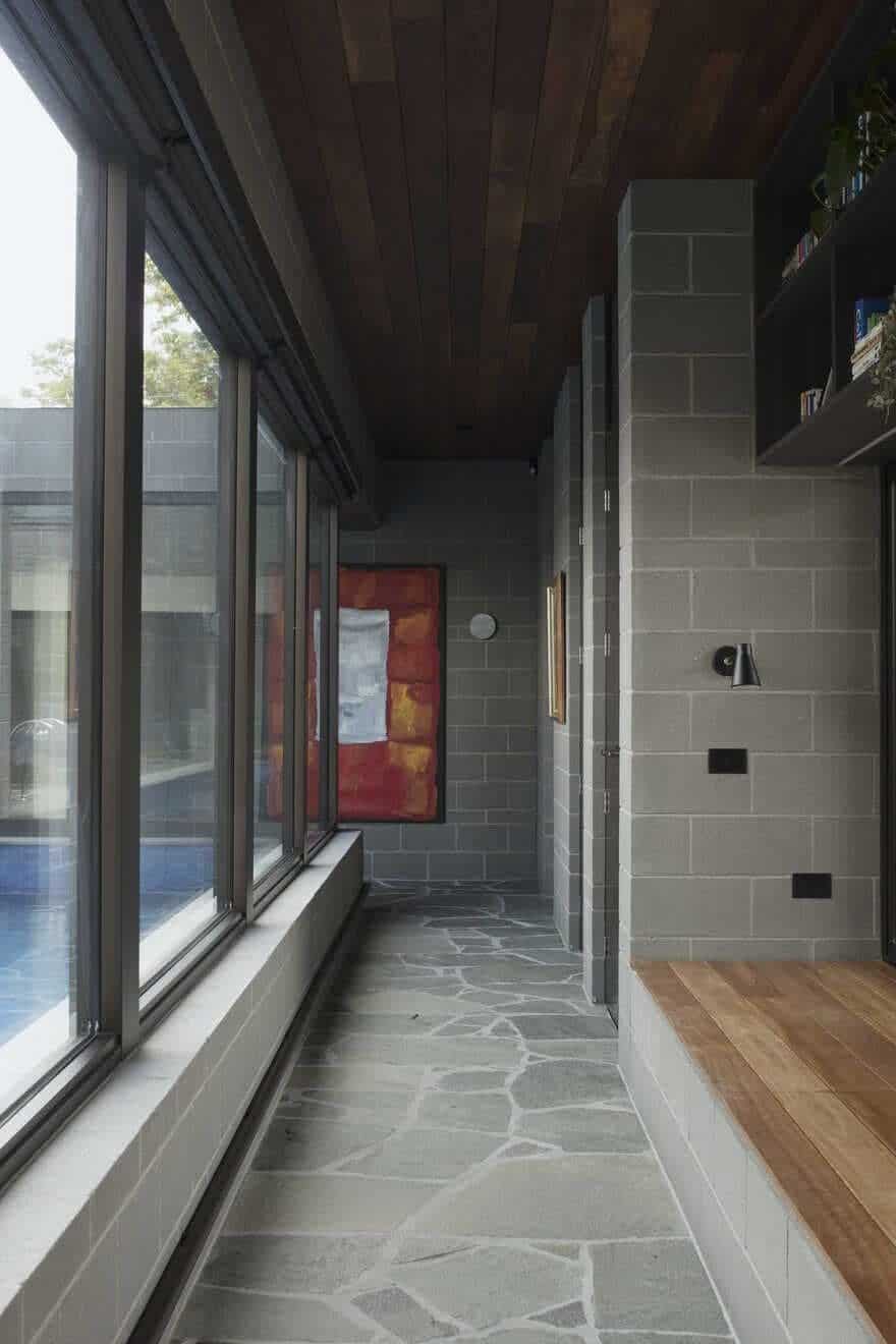
The clients also have a growing collection of Australian paintings and wanted a surface which they can continue to grow and display their collection, the block wall also ensured that every part of it could be used to support art. The timber lining is used to as a counterbalance to introduce warmth and textures into the spaces. When climbing up the stairs, the timber acts as a reminder that you are a moving up into a warmer and more cosy part of the house. A purposefully design progressional sequence to sit the tone and mood. The stairs moving up the void is designed to allow for snippet views down, and encourages incidental interaction between the family.
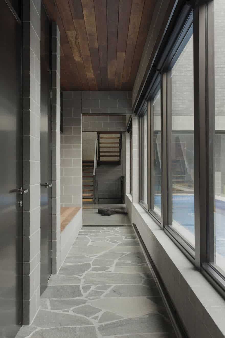
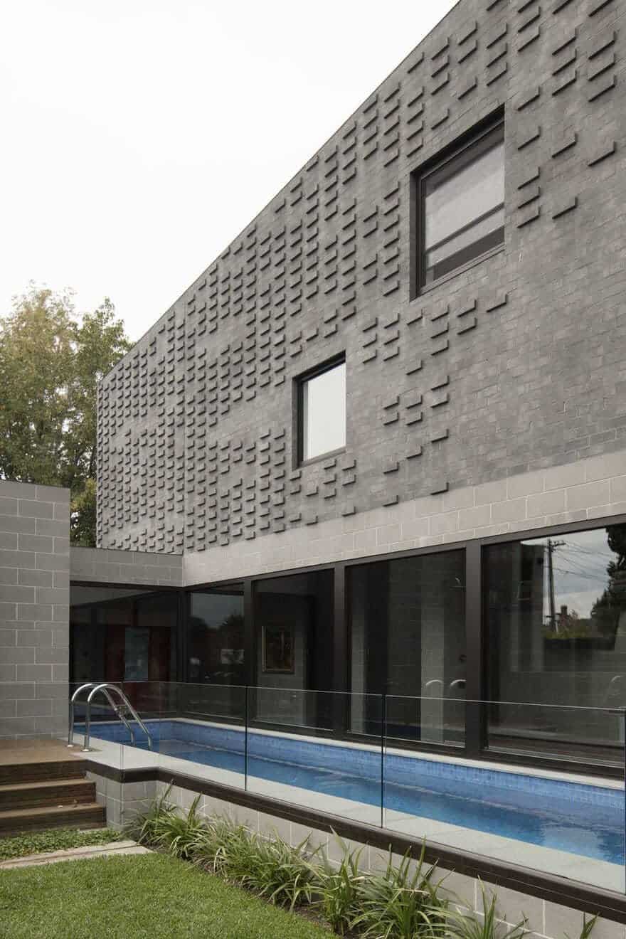
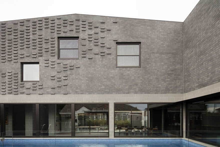
The brief also requested a lap pool. Firstly, we decided with the client early on that the pool must be experience throughout everyday of the year, so often a pool is used in summer and then completely forgotten till next summer. Our approach to this was to position the pool right in the centre, this then becomes the visual and formal anchor for the moment you walk in. You are immediately drawn down the crazy paved hallway by this body of water, which leads you through to the rear living areas. Reflection from the water is bounced into the house throughout the day and the pool not only becomes a place for the kids to train, but a visual element that adds to the interior.
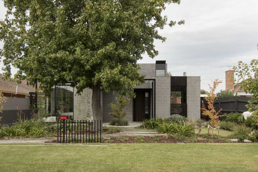
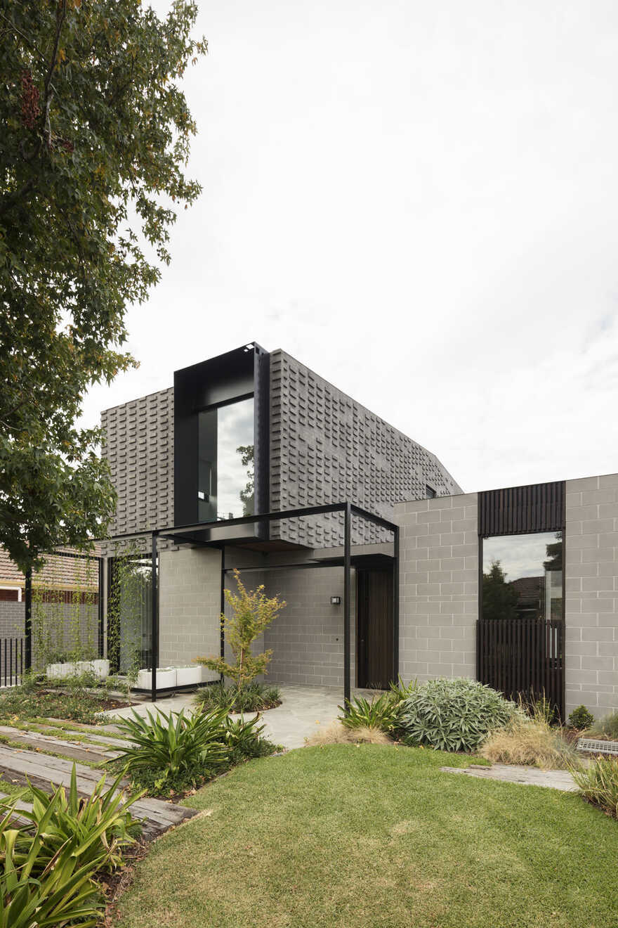
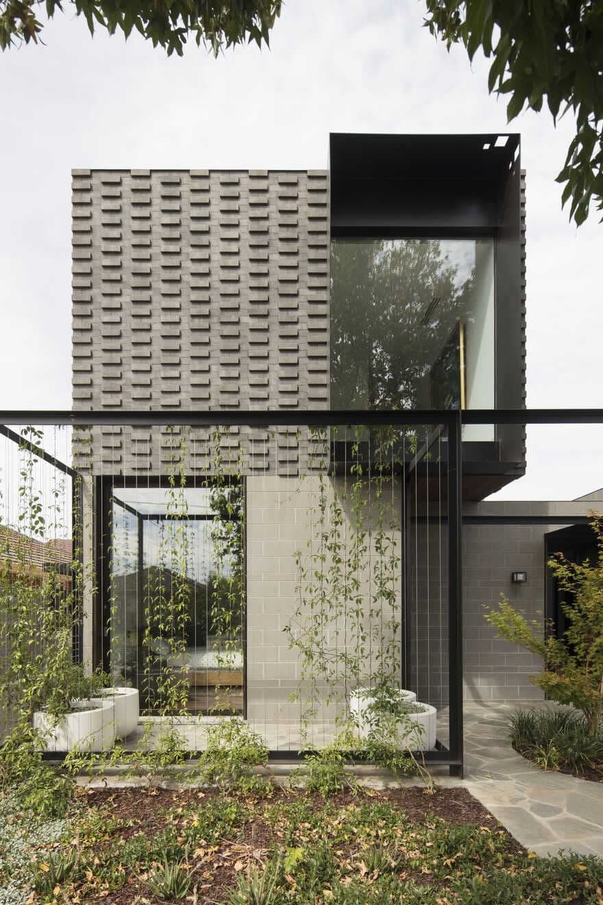
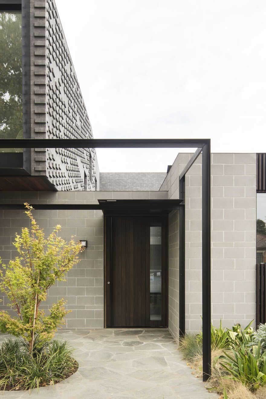
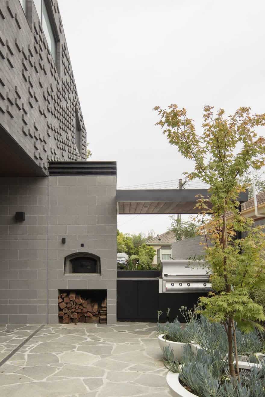
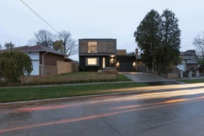
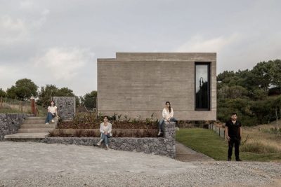
Wickham House offers a sculptural gesture to the street, articulated with refined metal details and contrasting materiality and texture. Formally from the street, the idea was to present an architectural response that related to its context, but with clear distinction. The height of the house steps behind the front tree, to take advantage of the beautiful view of the green foliage, while at the same time, retaining a scale which is familiar for the street and context. In contrast, the textural play of the bricks and form is used to create a sculptural street gesture, finer steel portals and details create a entry garden, welcoming both the visitors and the landscape in. An open fenceless frontage, encourages the house to visually participate in the community and streetscape.

