Project: Gray Puksand Offices
Designer: Gray Puksand
Location: Melbourne, Australia
Size: 630 m2
Year: 2017
Photographer: Tatjana Plitt
An open and agile creative studio space for Gray Puksand’s Melbourne-based team of architects and designers. Gray Puksand has completed its new Melbourne studio fit-out by walking the walk on their own design methodologies.
Many architects and designers struggle when designing for themselves. It can be a minefield of too many great ideas and not nearly enough budget to achieve them. When the opportunity arose for Gray Puksand to redesign its Melbourne studio, they knew they had to stay true to their design ethos, and treat themselves as they would any other client.
“We really stuck to our own methodology, holding workshops with all staff before commencing design, and collaborating with staff members throughout all stages of the program,” explains Gray Puksand Partner and Workspace Lead, Heidi Smith. “We first ran a workshop to talk about the strategy; exploring how we ideally wanted to work, and this really informed the direction and the ideas carried through to completion.” Smith worked with the whole team to discover the message they wanted to convey internally and to clients and visitors. “This is our usual approach with all of our clients, so it was good to walk the walk with ourselves as clients; I wanted to make sure that we respected our own processes.”
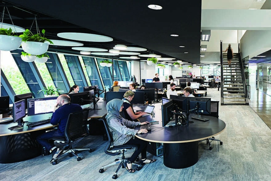
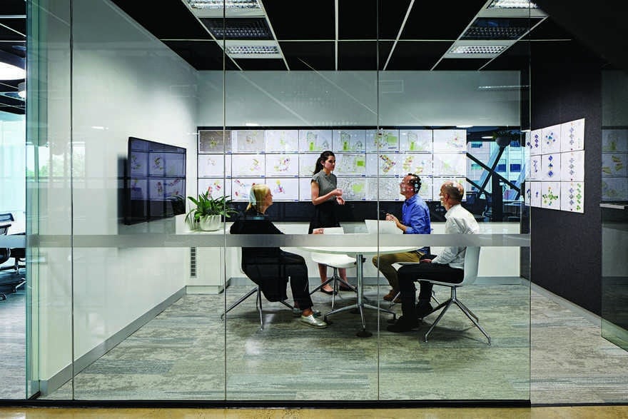
The Gray Puksand team has drawn upon a wealth of experience in workplace to deliver a world-class creative studio space in Melbourne. Pushing the boundaries of what a workspace should be, the design focuses on agile working styles – moving away from static dedicated workstations, to communal desking, collaboration spaces, formal and informal meeting spaces, and retreat spaces.
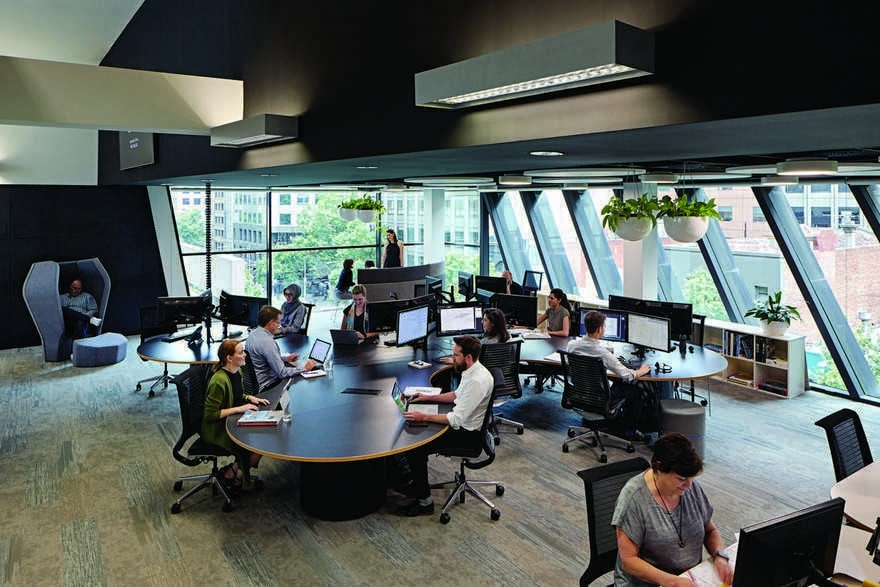
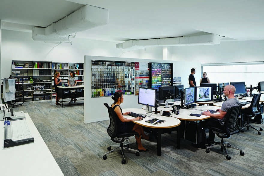
The existing office – a fit-out that was 11 years old – included an open-plan main floor and a mezzanine. The new fit-out uses the same two floors, but dramatically alters the layout. Technical staff generally occupy the upper floor, where the work involves more desk-based activities, however the working style is still agile, with the ability for team members to work collaboratively and flexibly. The main floor has seen the most dramatic changes, with ‘experimental’ work pods set up as test cases for clients. “While our original fit-out was beginning to age, it was fairly forward thinking in the day; in that was one of the first all-bench, no segregated office, open-plan style. We wanted to make sure that we continued to stretch and experiment, not just replicate what we had.”
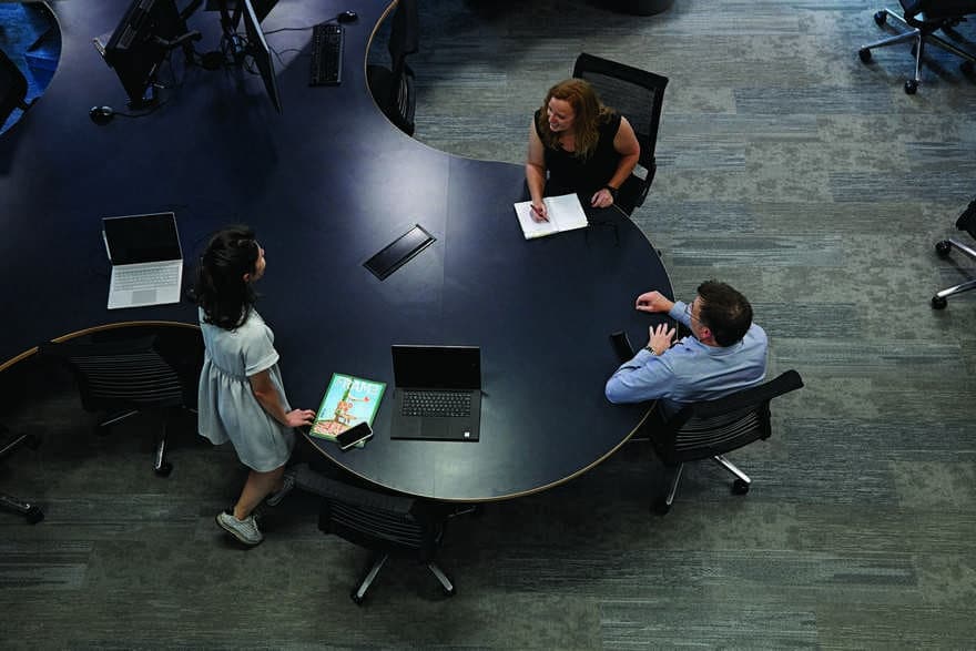
The resulting layout employs two pod-like ‘amorphous’ workstations where staff can gather around and work both in a fixed location or in a more agile way, so when staff are doing desk work there is still room for informal collaboration. “They are proving really successful,” Smith says. “It’s really exciting to see that we’re still testing new ways of working, which we can report back on to our clients and help them to make more-informed decisions down the track.”
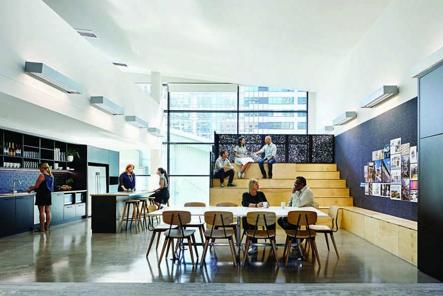
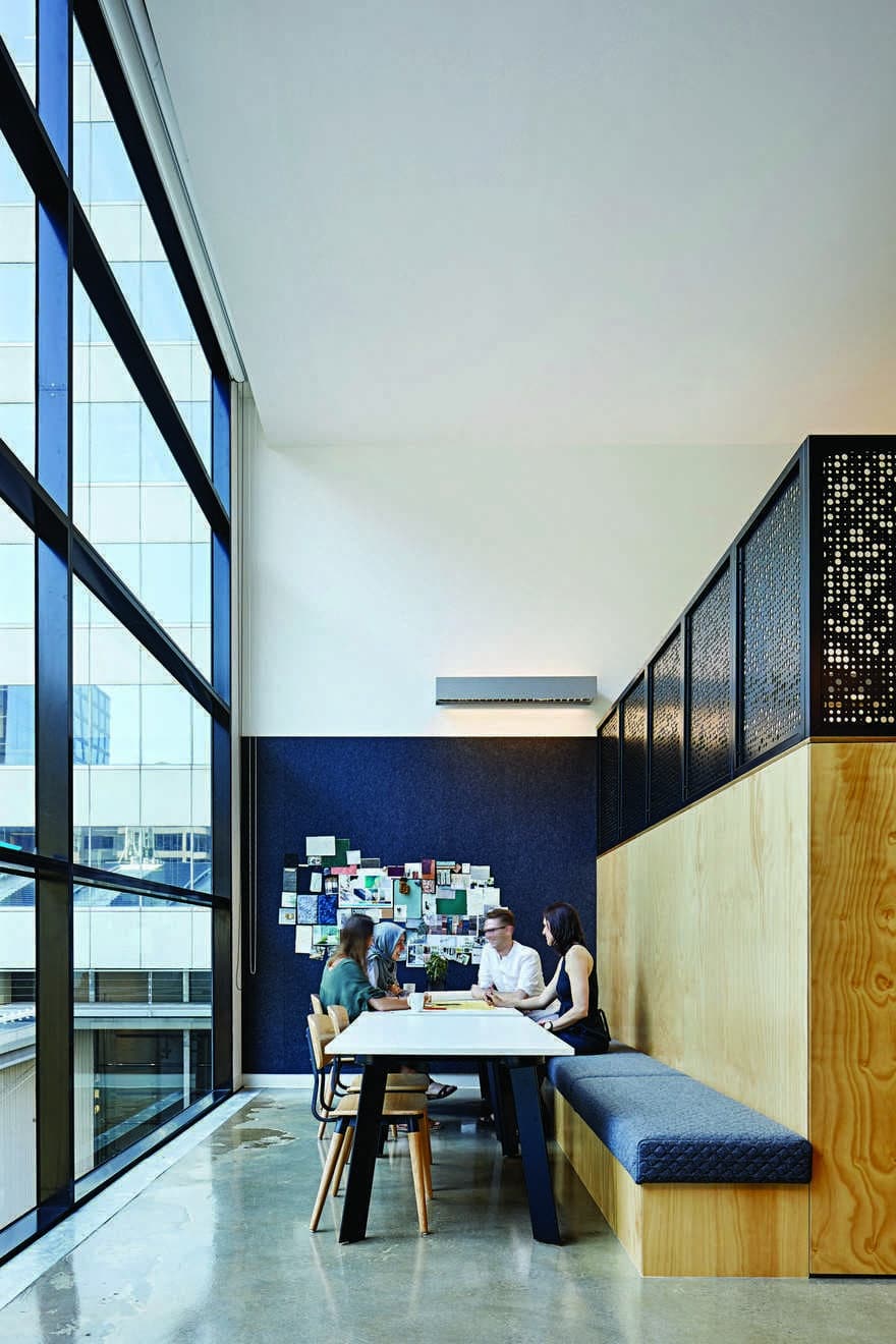
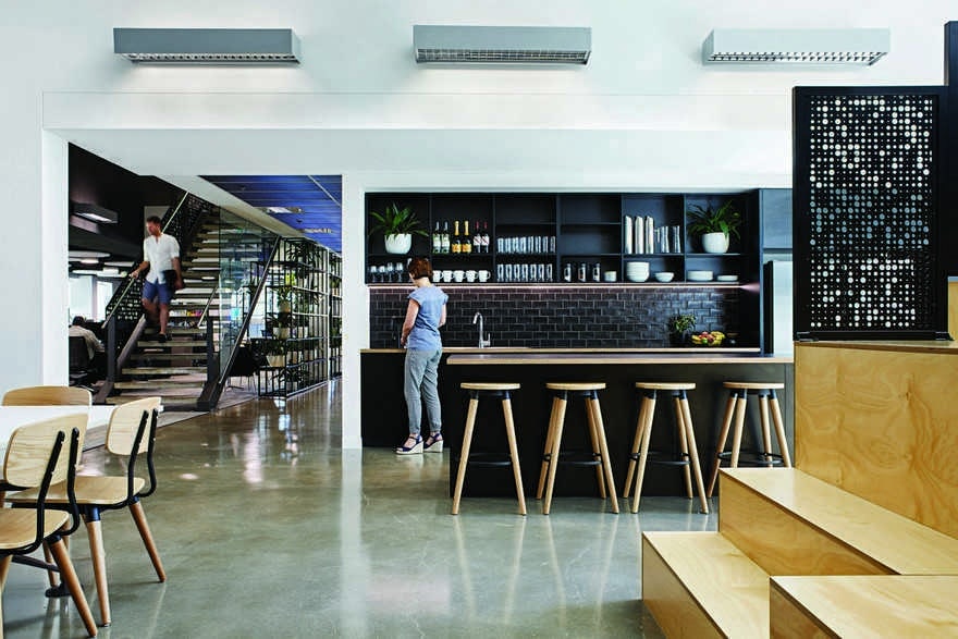
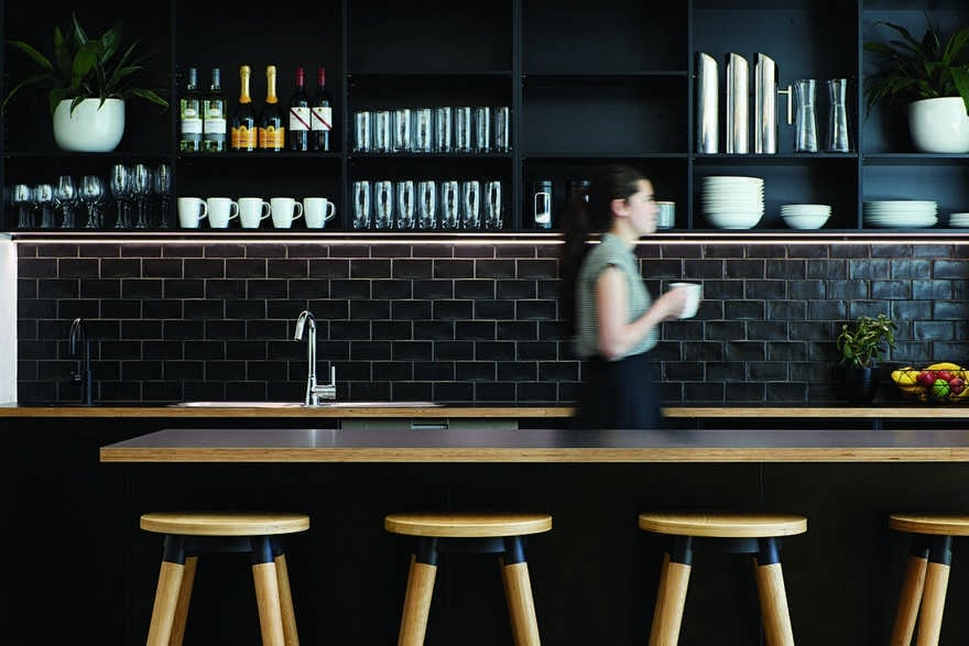
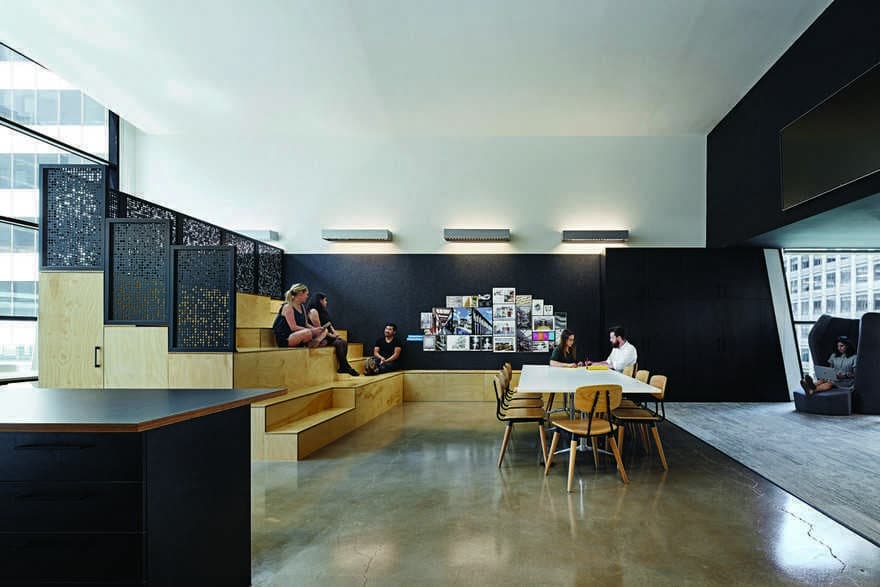
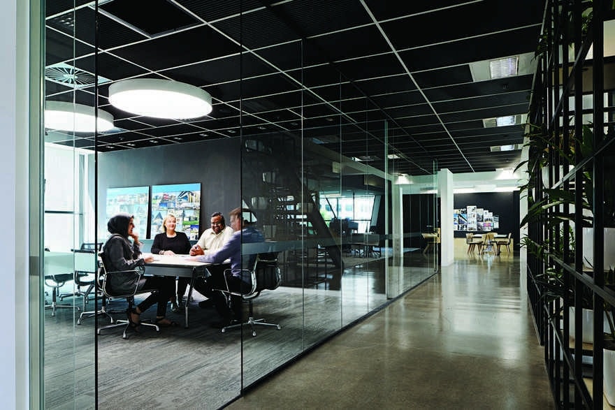
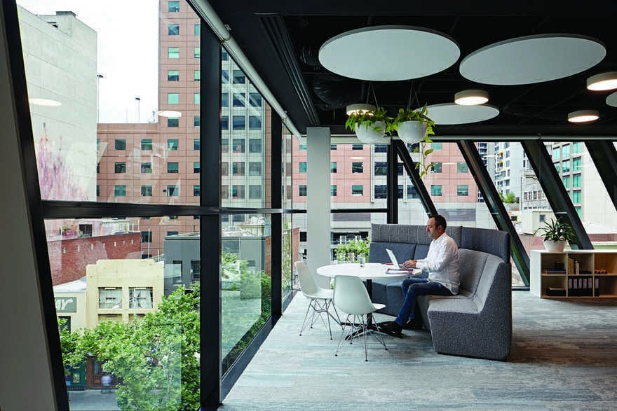
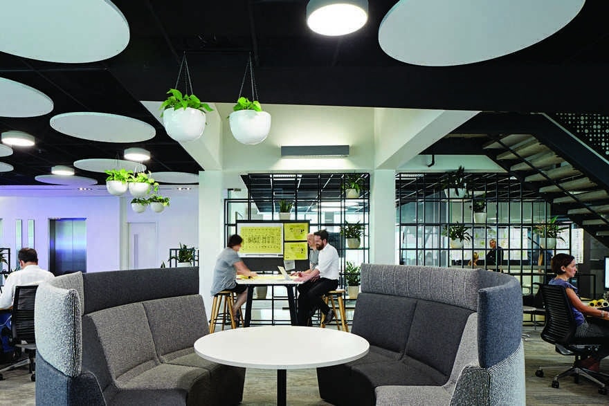
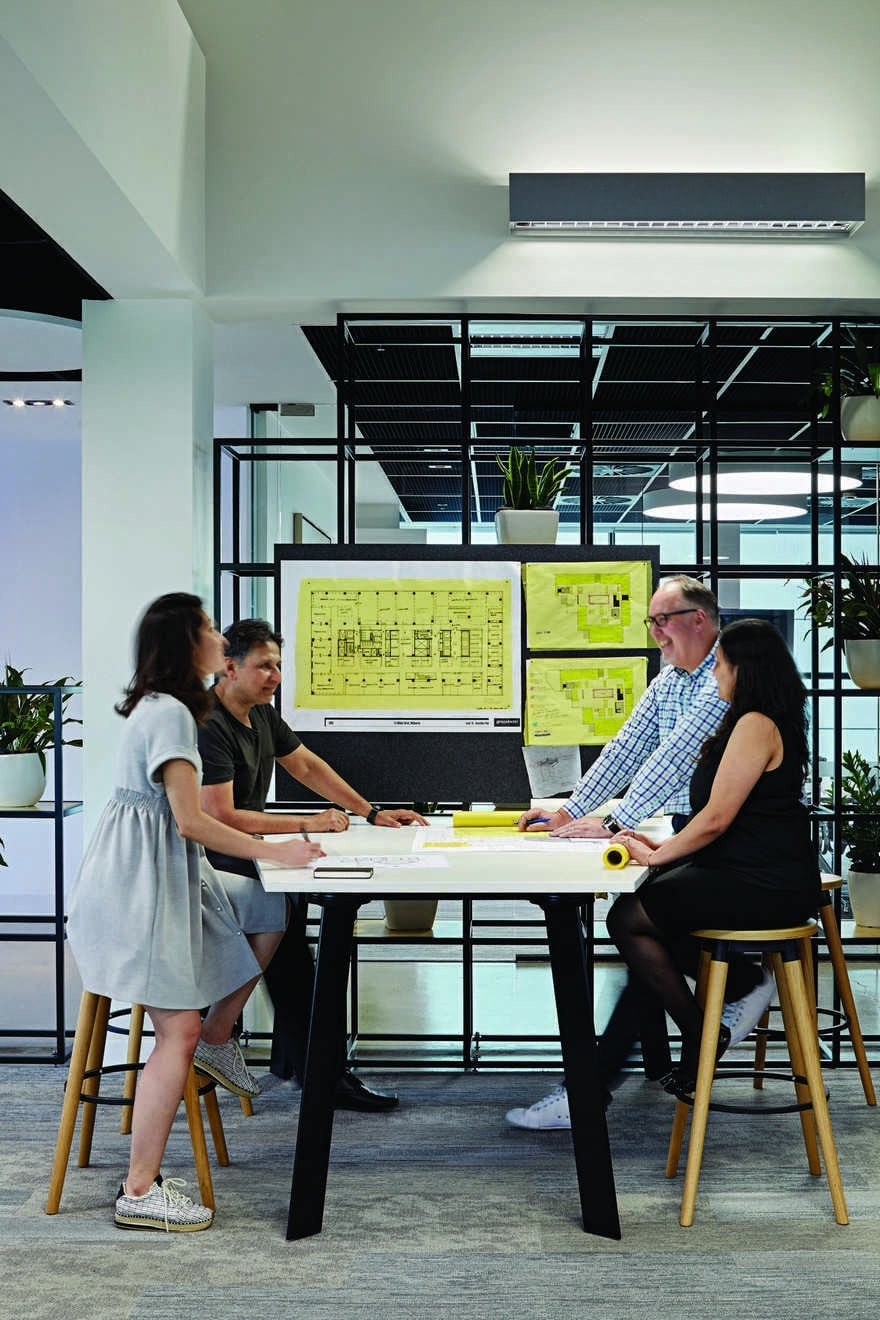
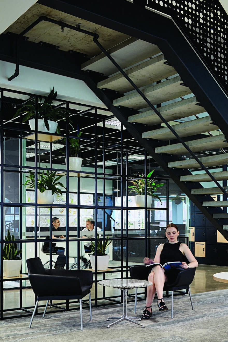
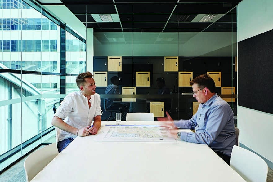
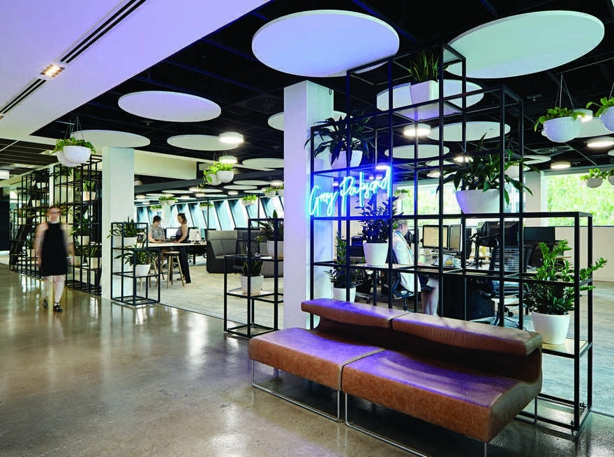
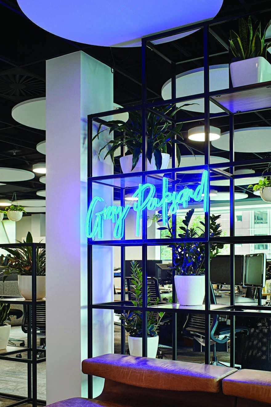
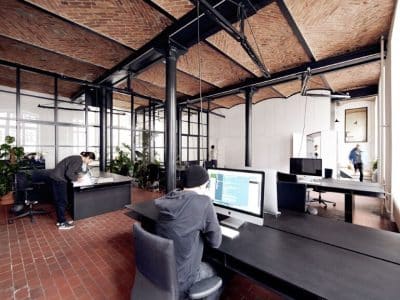
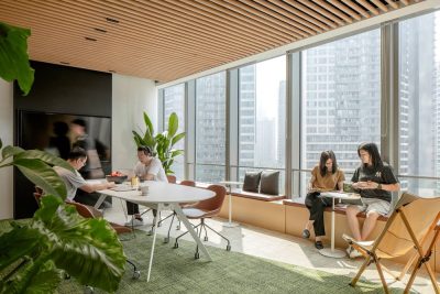
The other focus was providing for a variety of work settings. The design employs everything from sit-to-stand desks, to collaboration desks, retreat-style spaces, and project areas with pin boards ideal for workshops. Perhaps the most prominent addition is the oversized stepped seating, which is utilised as a presentation space, as well as for informal seating and collaborative working. Solid partitions have given way to permeable wire frames with planting, colours have been pared back, large sections of carpeting have been replaced with polished concrete, and ceilings exposed. The raw aesthetic and minimal colour palette have been partnered with blonde timbers, plants, and flourishes like the neon entry sign and black-metal detailing.
Identified during the workshop stages was a desire to create much more of a ‘studio’ feel, throwing off the shackles of a corporate aesthetic. “We’ve got a really cohesive studio feel, and now we don’t have a reception area, it’s actually really transparent and our guests are welcome to wander straight into our studio,” Smith says.
Every element of the design is built around supporting the methodologies espoused by Gray Puksand. From the consultative, collaborative process behind the design, to the range of spaces which support better design, this is a workplace by designers, for designers, and it’s already prove a dream workspace for the Melbourne team.

