Project: ADG House
Architecture and Interior Design: TR Studio
Location: North London, UK
Area: 215 sq ft
Year: 2020
Photo credit: Agnese Sanvito
London-based architecture and interior practice TR Studio showcase the renovation of a two-storey family home realised through the completion of an extensive interior refurbishment and loft conversion navigated during the Covid-19 UK lockdown.
Located in Mill Hill, North London, as with each new project, the studio spent substantial time understanding how the client used each aspect of their home alongside learning their aspirations for how they wanted to live in the space with growing children.
Known as ADG House, the initial brief provided by the client was to optimise a much-loved family home, maximising space and increasing flow. The client wanted to have a larger kitchen and achieve a more social open kitchen, dining and living area for improved day-to-day family life as well as to benefit large family gatherings which they frequently hosted. Utilising the large rear garden was also key to the success of the project. The studio was also tasked with creating a larger primary bedroom space with ensuite and dressing space and a loft conversion to provide an additional large bedroom and ensuite space.
Upon entering the detached property, which in keeping with the local architectural vernacular features two bay windowed rooms split by a main entrance hall, the studio overhauled the traditional and compartmentalised layout. Due to budget constraints, the footprint of the ground floor was extended at the rear by a small additional 8sqm however, rationalising the space and opening it up, the studio successfully created a light and airy layout with views from front to back and side to side throughout the rear of the ground floor.
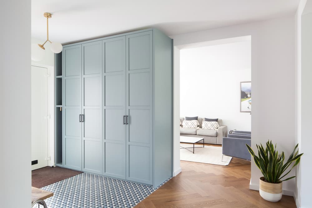
In the hall, a blue toned contemporary geometric encaustic cement tile defines the area whilst providing practicality and creating a visual statement. Here bespoke floor to ceiling storage with traditional paneled doors were designed and built by the studio to allow plentiful housing for shoes and coats. Across the rest of the ground floor a warm, oak timber flooring was used to create a herringbone design.
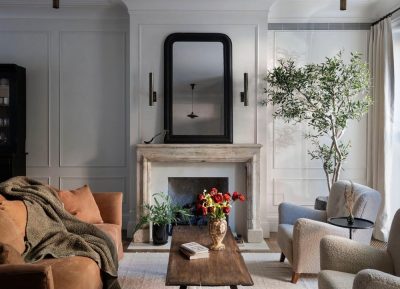
In the new large and new-open plan footprint, to the left of the hallway is the first of the living spaces. The bright and airy space is painted in Farrow & Ball Wevet to allow for maximum light refraction. Around the bay window, dressed simply with off white roman blinds, the studio created a bespoke timber window seat.
The room is dressed in a simple and contemporary style with neutral chaise sofa, marble toped coffee table, a pair of mid-century styled grey wool armchairs and a classic Gubi Grasshopper floor lamp.
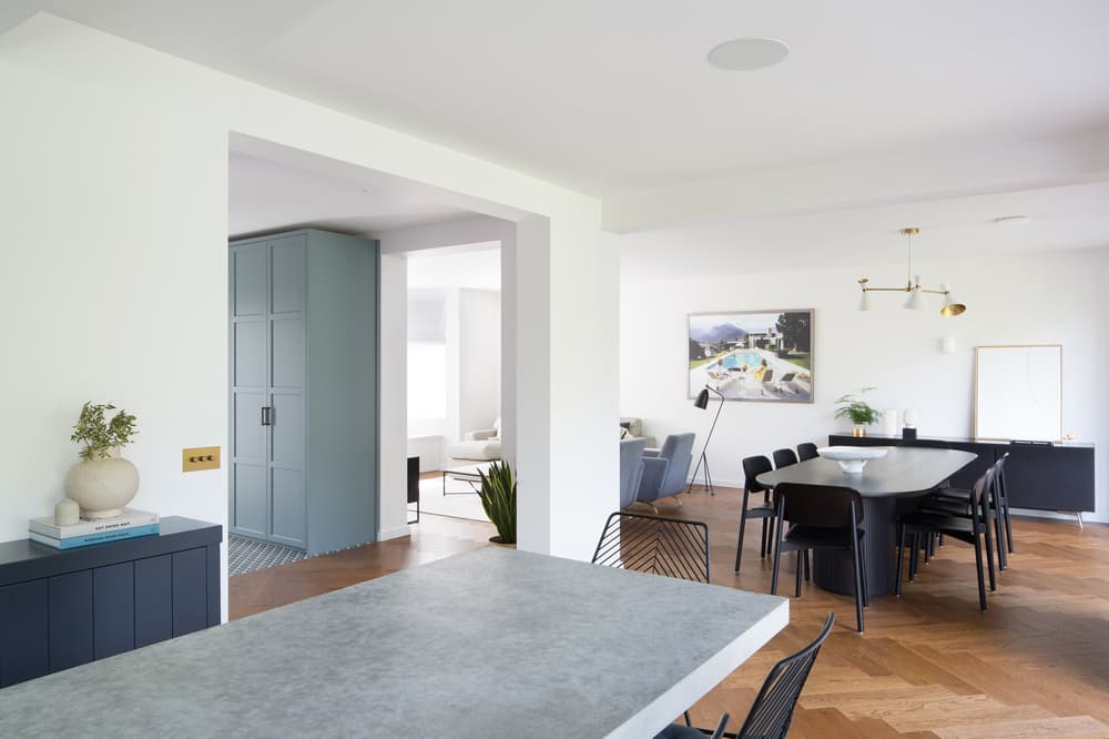
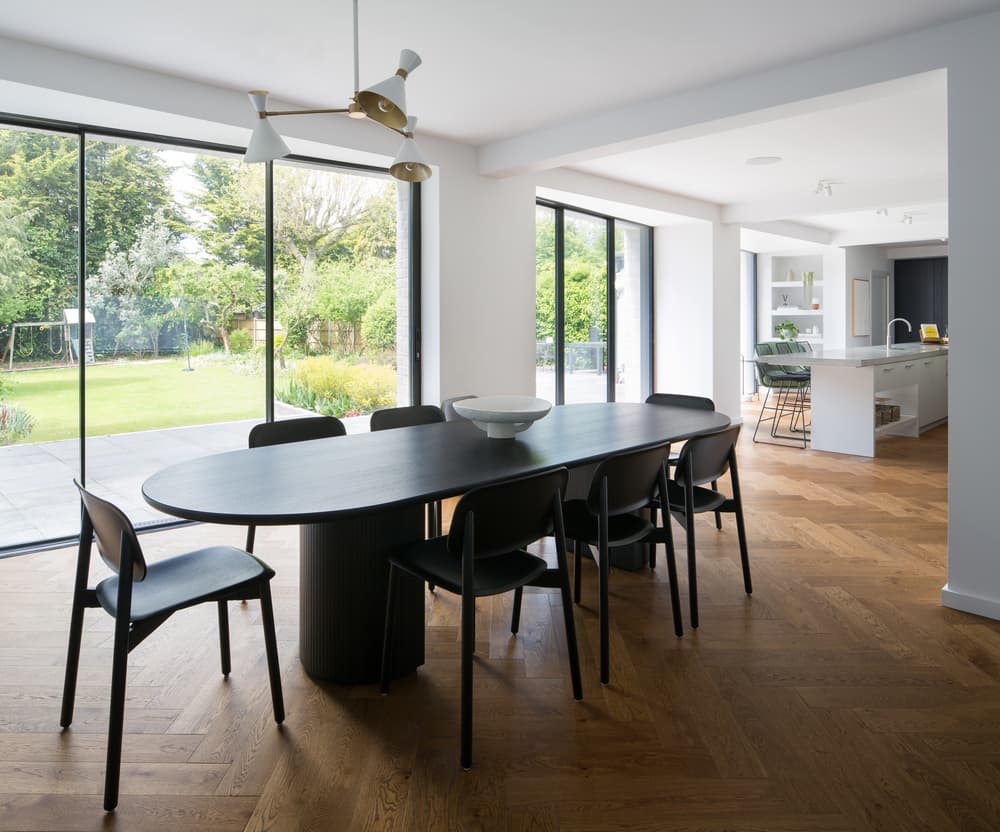
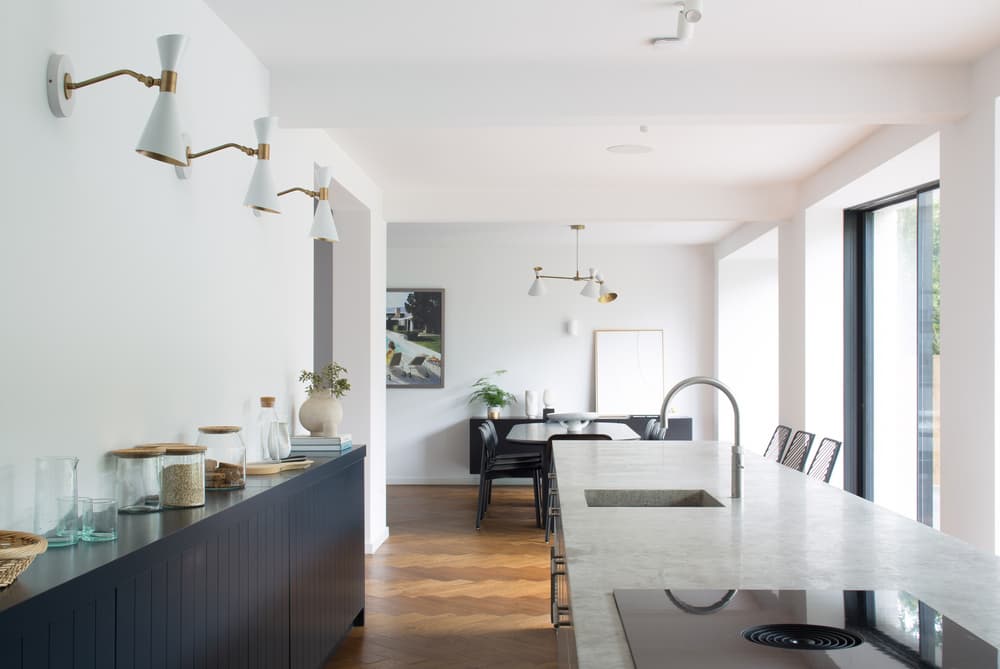
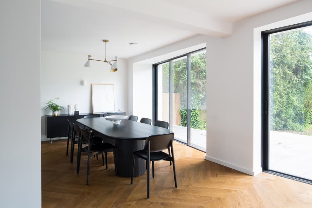
Flowing through into a defined formal dining area, a large 8-seat oval dining table in black timber and matching black mid-century chairs add a sophisticated style with a statement mid-century pendant light adding warmth to the entertaining space with its brass detailing.
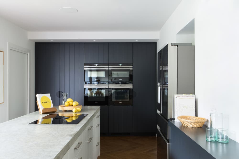
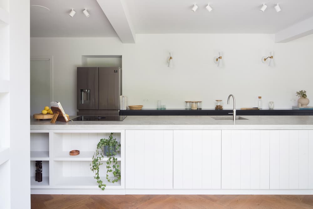
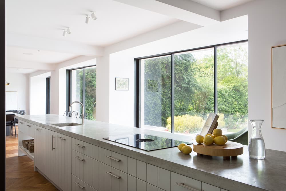
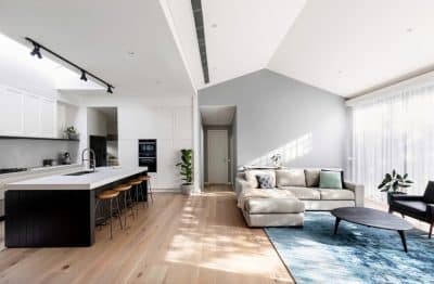
To the right of the dining space a long six-meter kitchen island crafted in-situ from poured concrete creates a strong feature to the space and becomes the heart of the ADG House. Additional bar seating provides a further social element to the flowing layout. The statement concrete countertop houses bespoke shaker-style storage units and conceals appliances. Bespoke shaker style units and cabinets in Farrow & Ball Off Black and Blackened break up the mass of the units and offer variation while adding functionality and stye to the space. The colour palette is playful, fresh, and energetic.
Mid-century wall sconces illuminate the kitchen area and provide a visual connection to the dining room space. Just off the kitchen, a small playroom with garden views is housed. All living, dining, kitchen and play areas were devised by the studio to have views which are directed outwards towards the large garden attached to the home.
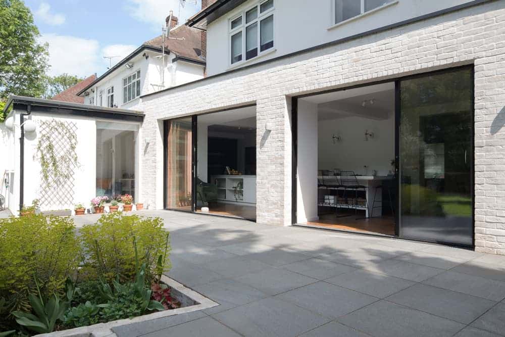
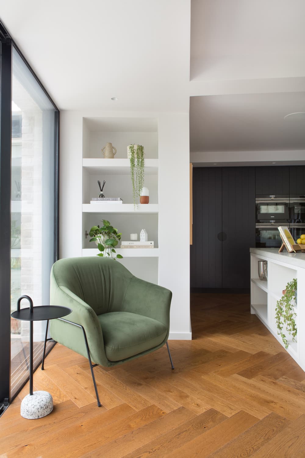
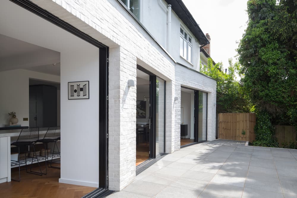
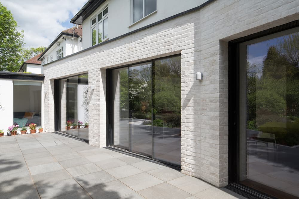
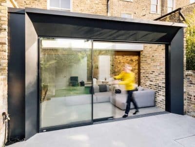
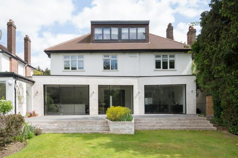
Three large format sliding doors which form part of the small 8sqm extension were designed to sit at irregular angles framing the view, as well as maximising natural light and connecting the space to a refurbished garden patio. When open create an expansive modern indoor/outdoor space is obtained. By subtly changing the angles of the extension the studio was able to create a much more interesting space with surprising additional elements such as a small reading nook.
The studio used the existing foundations to reduce client costs and worked closely with the Structural Engineer to utilise what was already there with minimal structural works. The 1930s built home was poorly insulated, so the studio undertook to up-spec and insulate all the internal walls ensuring they weren’t weak in comparison to the new construction.
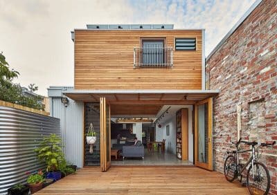
From the exterior, the extension and its graphic floor to ceiling glazing punctuates the sweeping angles and white bagged brick façade which was chosen to sympathetically sit with the existing architecture of the property whilst adding a modernity. Whilst the extension did not increase the ground floor footprint by a large amount, the impact on the space was significant, changing the feel completely.
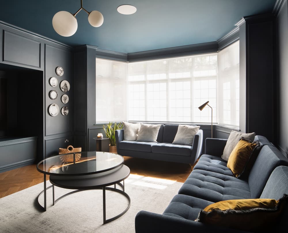
Making up the ground floor layout, an enclosed TV and movie room adds a punch of strong colour to the ground floor. Here the client wanted a space for entertaining away from the children. Walls and ceilings are painted in Farrow & Ball Hauge Blue creating a space with an intimate and cosy feel. Furniture and decoration continue a mid-century aesthetic.
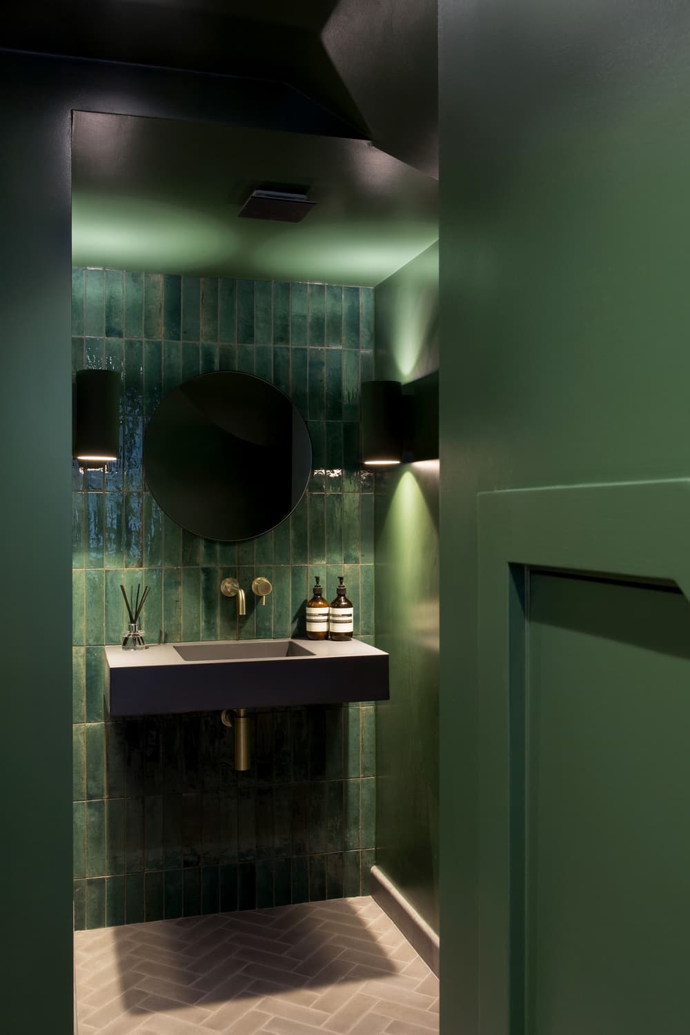
Further colour is seen in the small ground floor powder room. Designed to make guests green with envy, the space showcases bold handmade Bejmat glazed tiles full of natural nuances. Walls, ceilings, and doors are painted in a complimentary Farrow & Ball Duck Green. Here, the floor crafted from natural terracotta tiles nods to the herringbone pattern elsewhere across property.
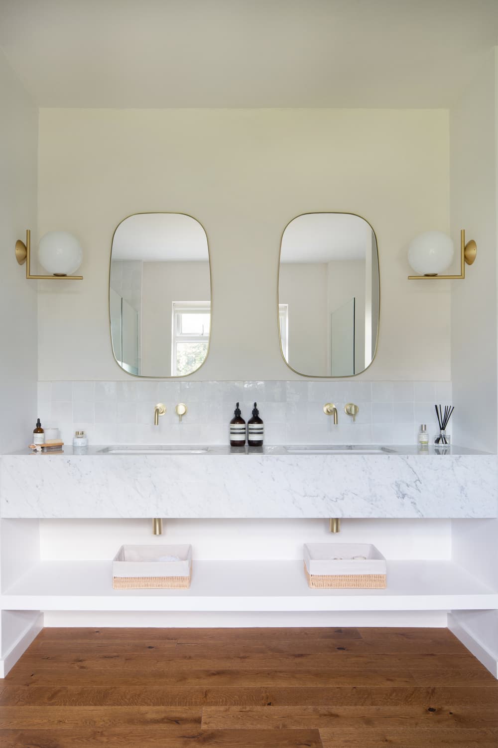
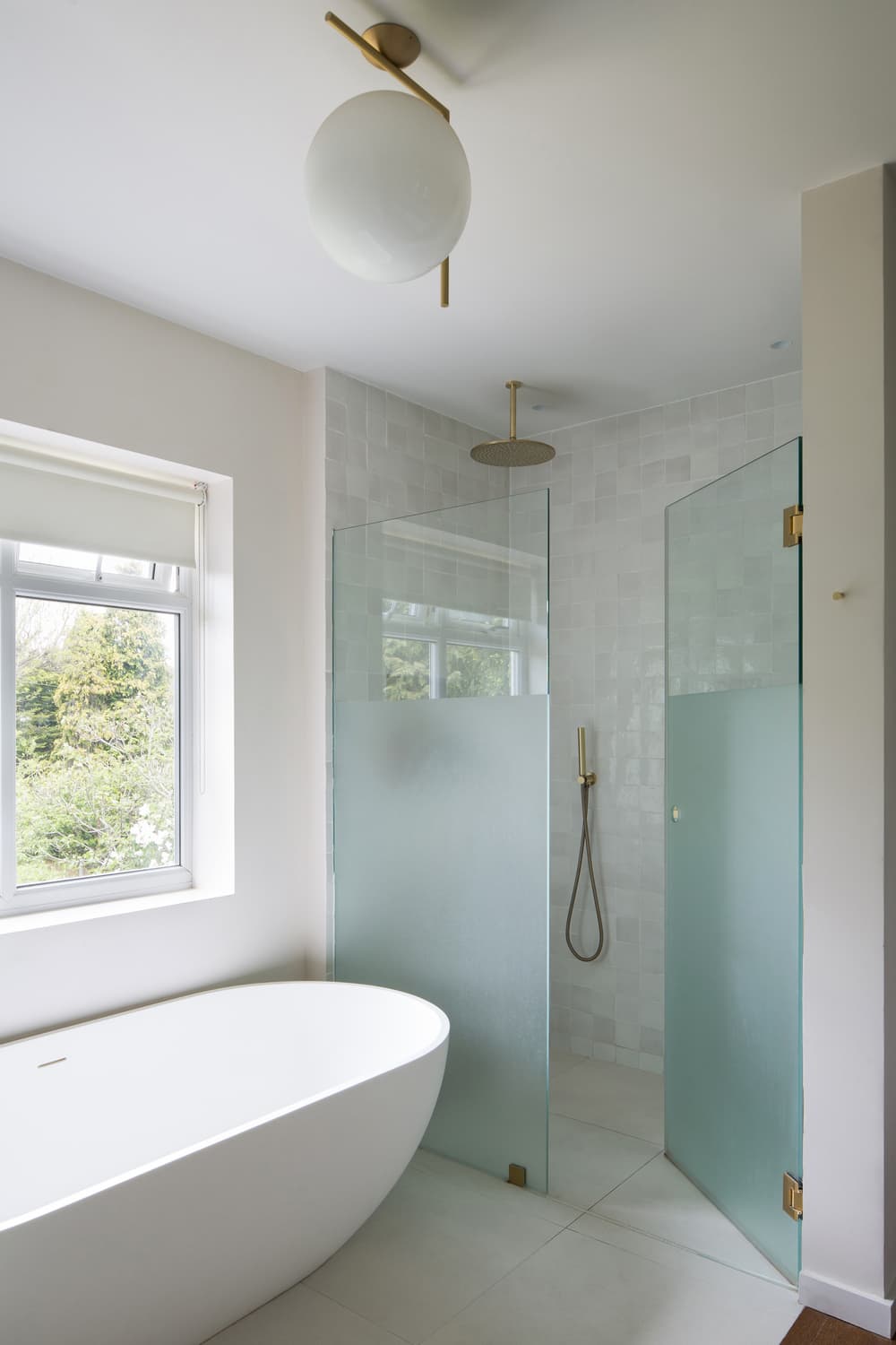
On the first floor the studio moved the master bedroom to the rear of the property. In doing so the studio create a primary suite which included a bedroom, large ensuite with bath and shower and a dressing room. The ensuite was designed to feel expansive and tranquil. Zellige tiles in ecru define a large shower enclosure with brass detailing whilst a curve free standing bath is nestled under a window with garden views. A double vanity unit is crafted from white Carrara marble illuminated with Flos IC lighting by Michael Anastassiades. Painted throughout in Farrow & Ball Strong White, following the language of the ground floor, the first-floor primary suite is light and airy.
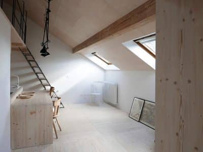
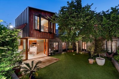
Creating a second floor, the studio added a loft conversion. Utilising a large sloping roof light, light flows down into the stairwell. A large dormer window serves the new additional bedroom within the converted loft space with views across the treetops.
On the project Tom Rutt comments:
“The existing space was broken up into many rooms on the ground floor. With the family wishing to be able to interact with each other in an open plan space, we wanted to open the rear elevation, so sight lines and communication were possible whilst retaining some smaller, contained rooms for the children to play (Den) and adults to relax in the evening (cinema room). We carefully retained what we could from the existing space whilst opening it up to become a family home, with larger, open plan spaces with improved light and spaciousness. Working through the first Covid-19 UK lockdown resulted in materials and labour being significantly limited so we’re very pleased with the results achieved by the studio and our wonderful team of contractors during such a challenging time.”

