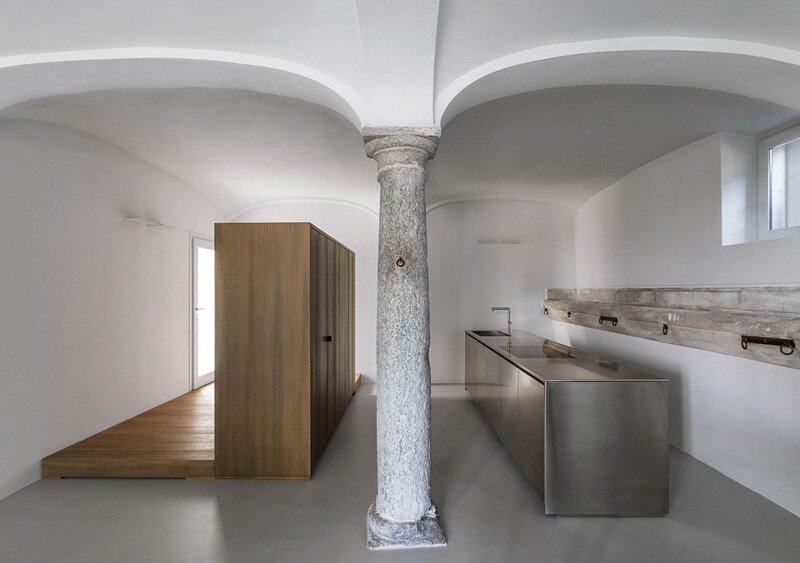
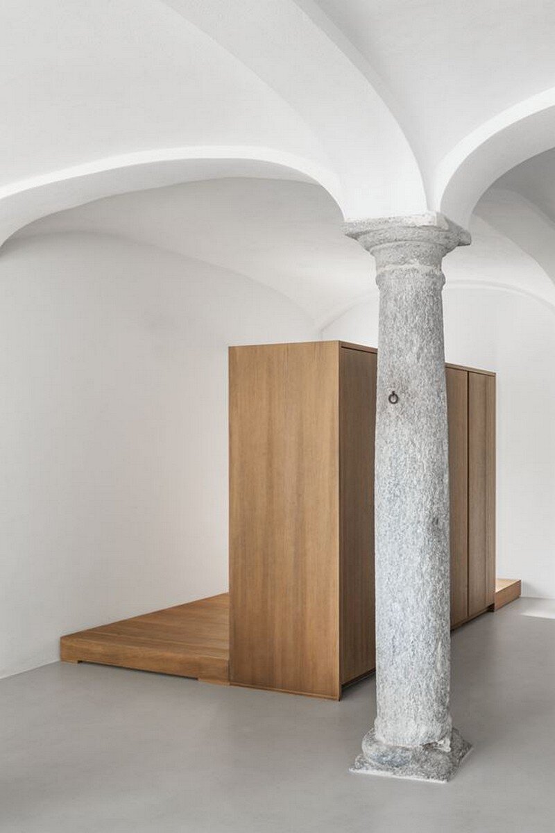
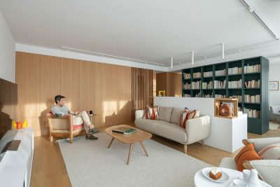
Located in Varese, Italy, AG Apartment is a residential project designed in 2016 by Italian studio Duearchitetti.
The AG apartment is part of a building from the end of the eighteenth century. The original structure of the building has been able to enhance the quality of the environmental context, establishing a continuous dialogue between the surroundings and the construction. Formerly the residence of a rich family from Milan, the property has recently undergone a complete restoration dividing it in apartments.
The interpretation and the analysis of the construction characteristics of the apartment, developed on the ground floor with a smaller portion at the semi-basement level, have been essential to identify of the proposed project solutions.
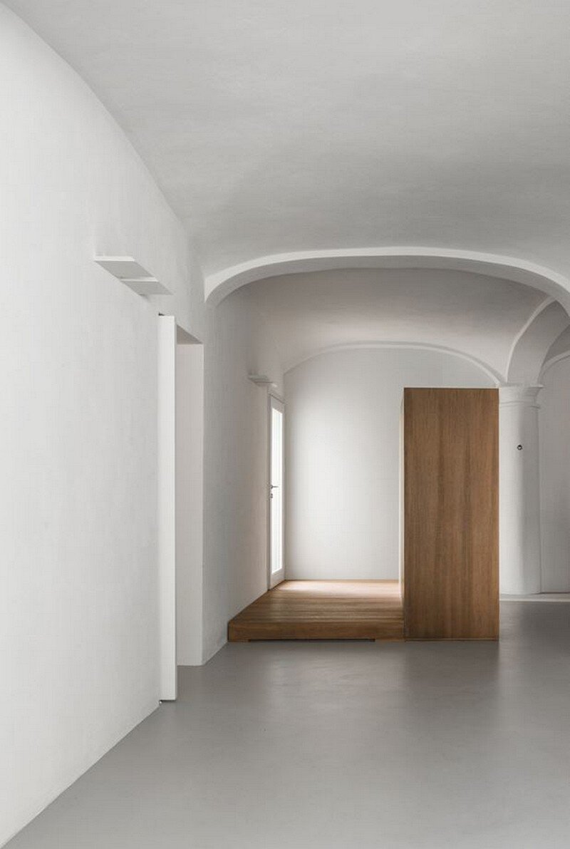
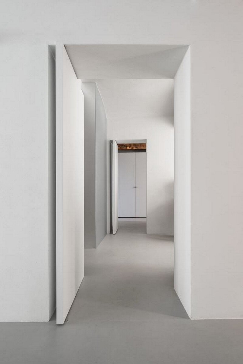
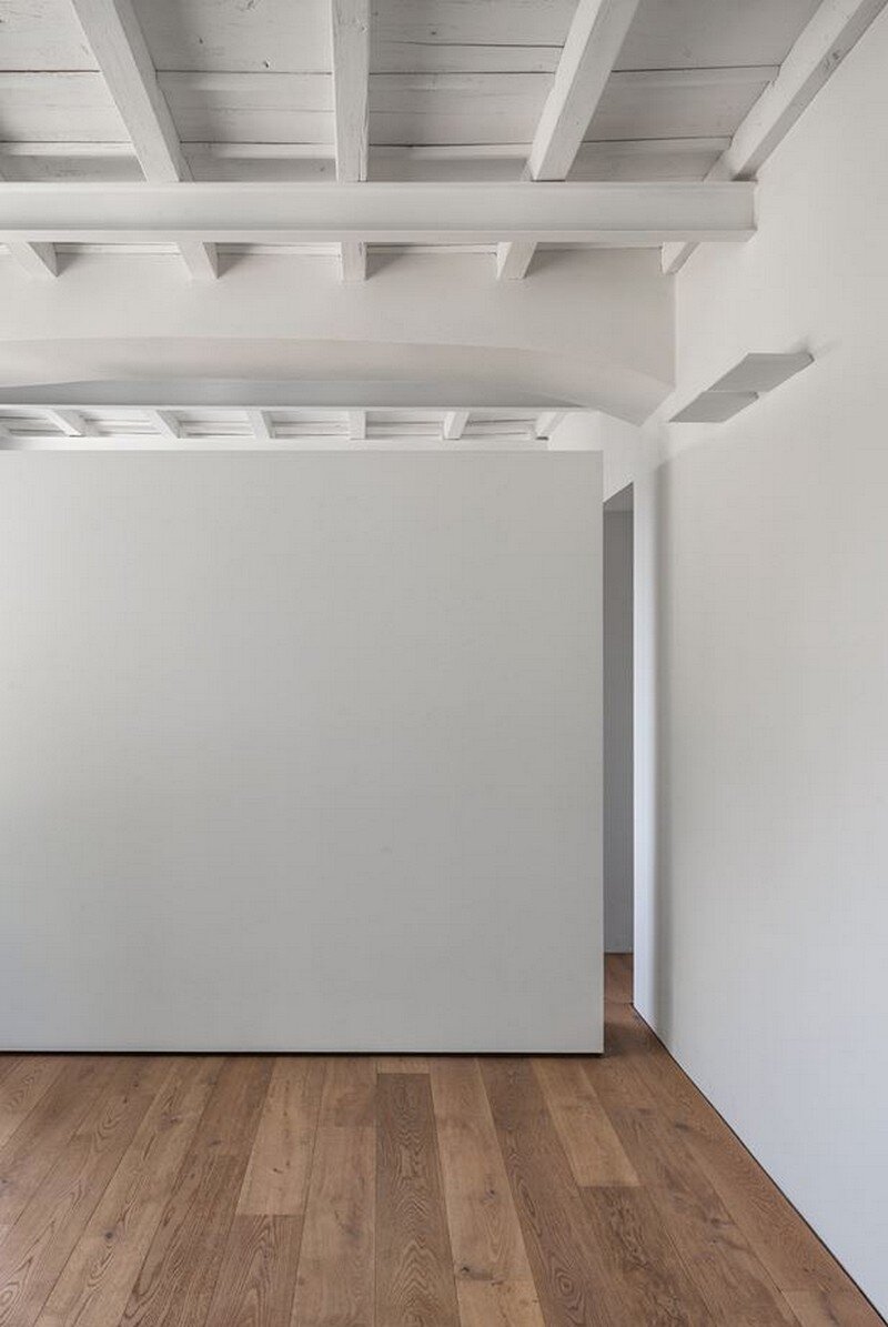
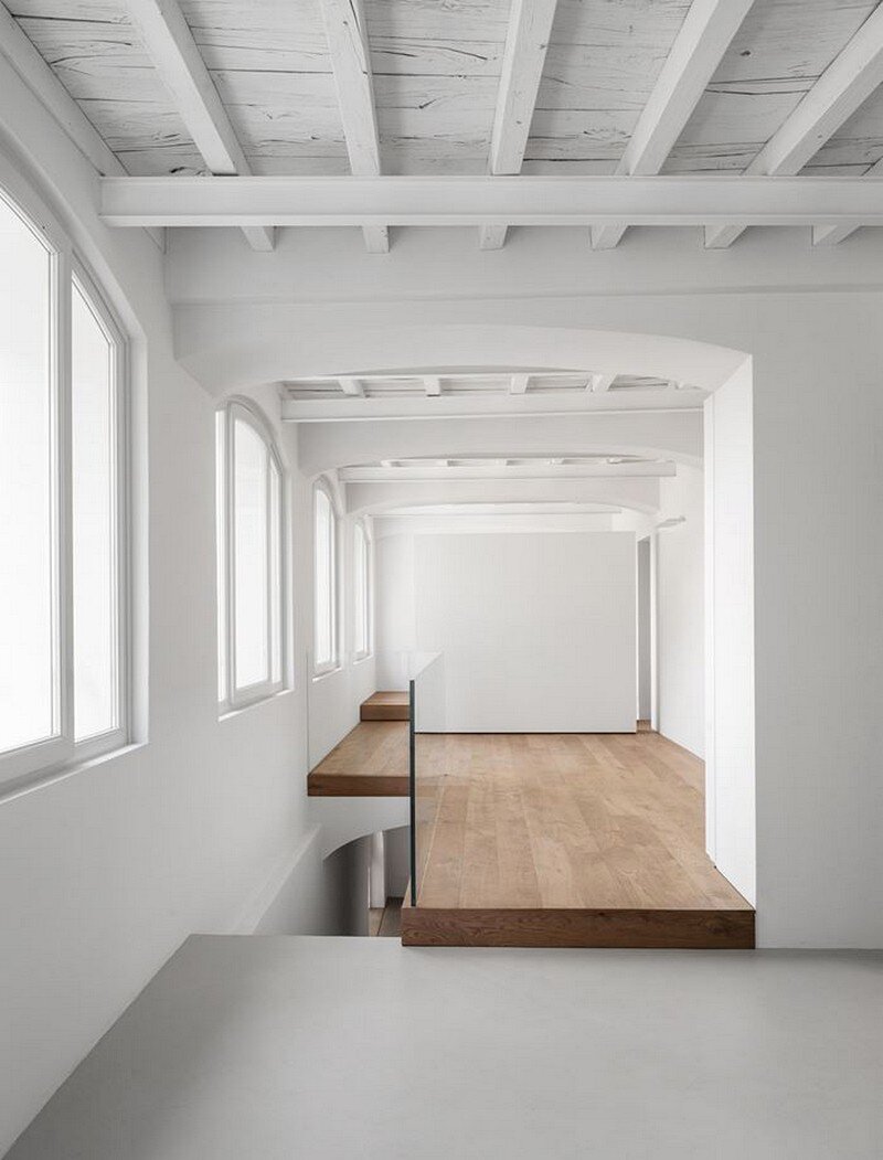
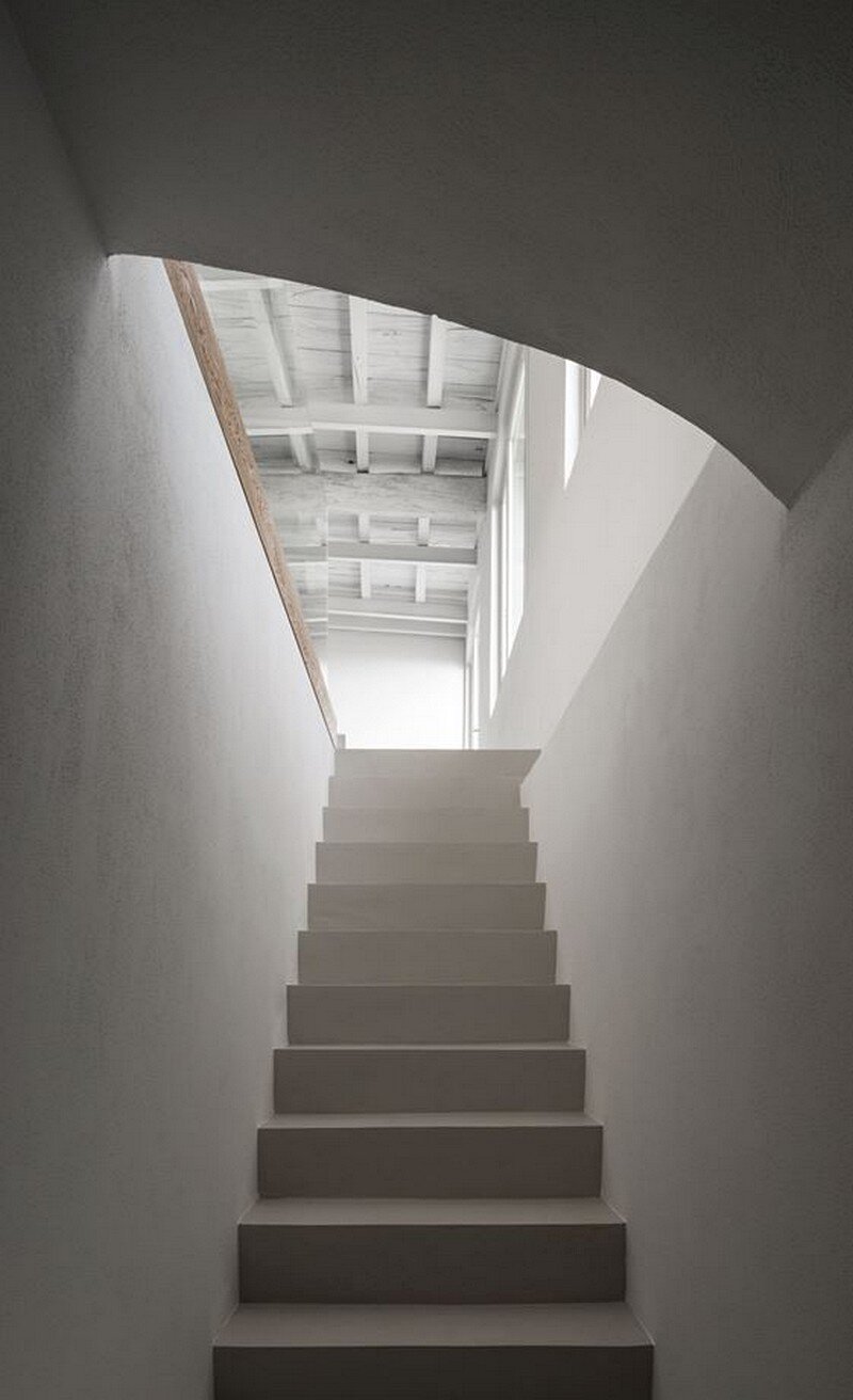
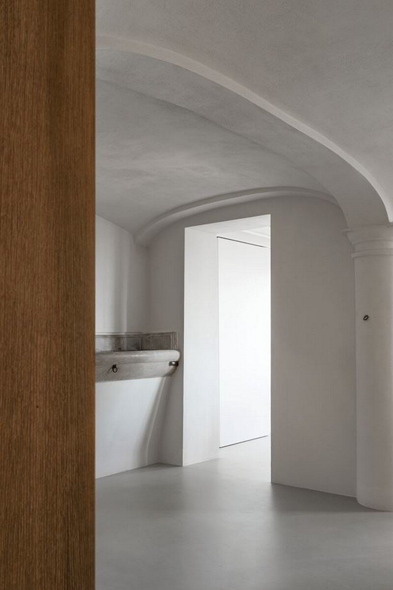
The wall mass remains free from interferences; vertical pivot doors are closing the existing passages between the various spaces. The concrete floor is alternated with wooden floors underlining the original difference of floor levels.
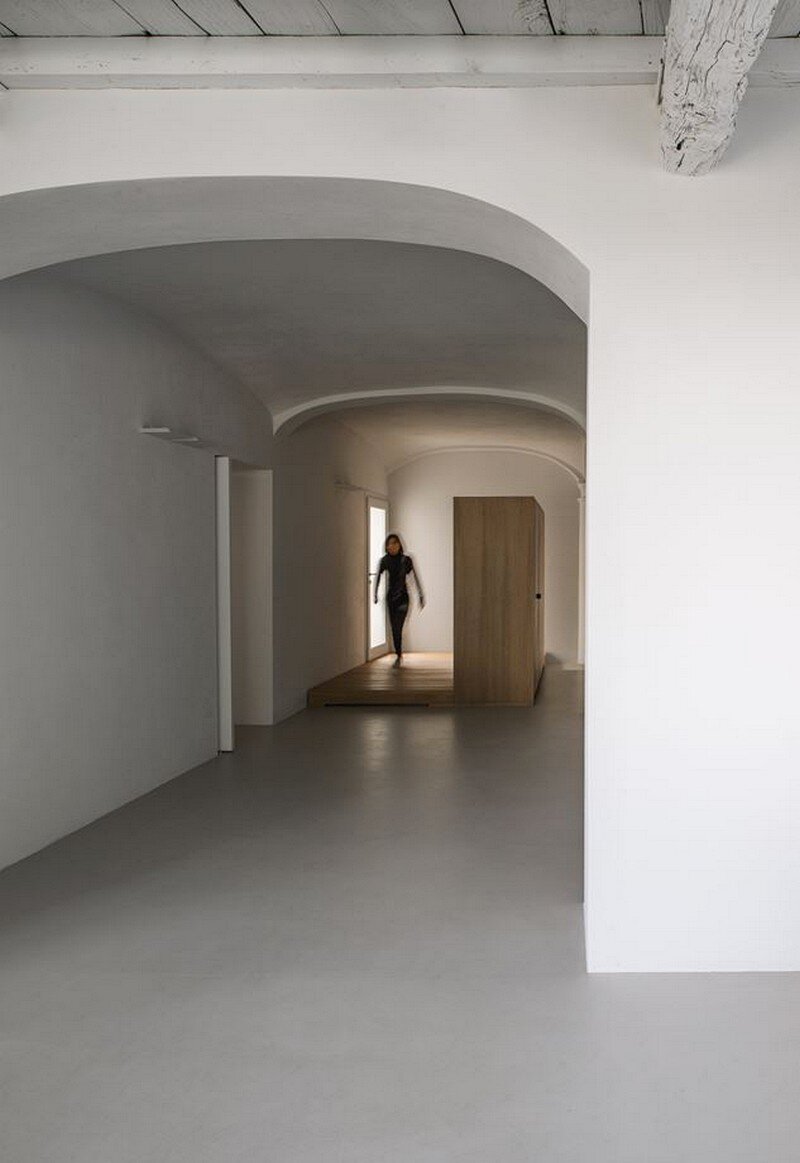
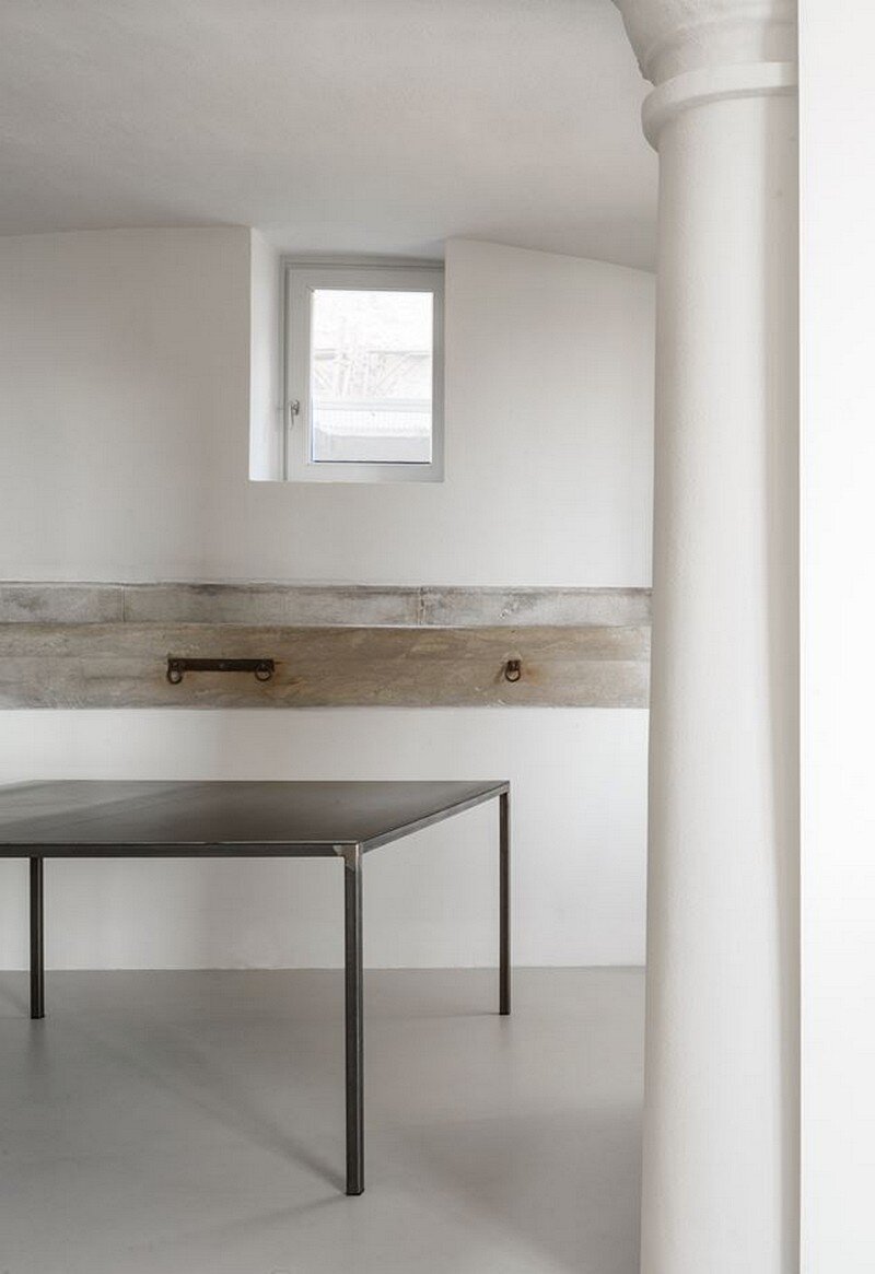
The main floor has a shape referable to a square, even though irregular. The presence of a beautiful manger in stone reminds us of its original destination. Thick walls divide more or less randomly the space, cross-barrel vaulted ceilings are flanked by wooden beamed ceilings.
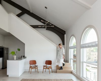
The space presents a twofold relationship between inside and outside. Wide rectangle openings are facing a courtyard and the afternoon light is passing through. A sequence of five arch windows is characterizing the north/east façade. The view continues all the way to the heights of the city if Varese. The light, incident in the first morning hours, softens during the day.
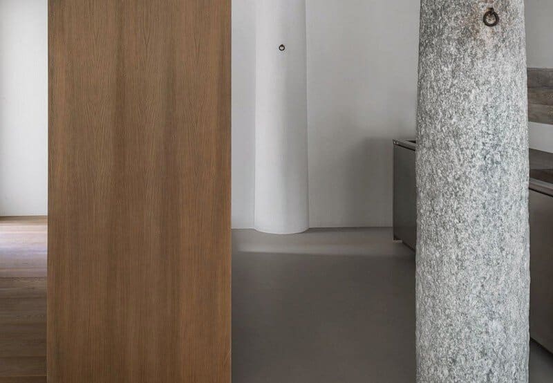
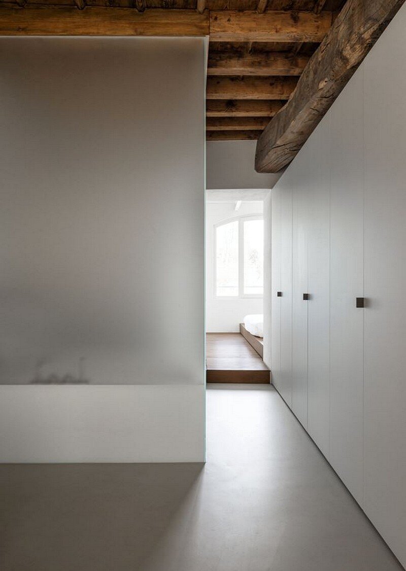
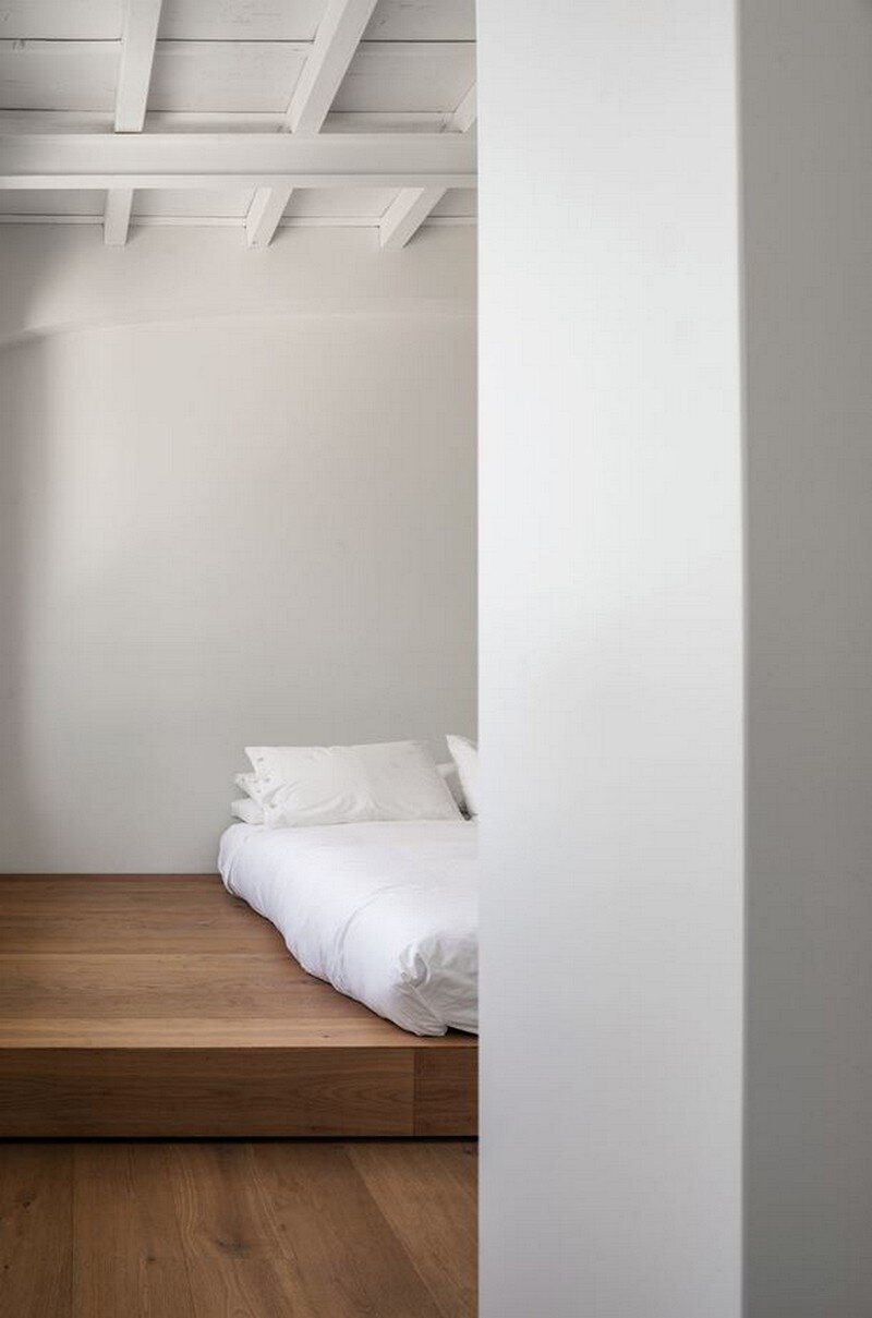
The will to enhance the existing construction brought us to project approach. The apparent spontaneity of the space has been our guideline. We wanted to emphasize the original structure of the building, its materials and its irregularity. The subdivision of the internal space, necessary to satisfy the needs of the new destination, is done by specific interventions with selected materials. Glass is used to delimit the bathroom zones. Wood is used for the containing volumes in order to separate the entrance and to shield the sleeping area.
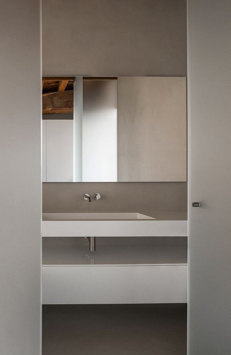
The choice of integrating the containing elements with the walls allowed us to enhance the empty space and its variability of light and shadows during the whole day. The satin finished glass walls bring a diffused light into the bathrooms enhancing the concise choice of furniture and get like lanterns in the evening hours.
Thank you for reading this article!

