Project: Apartment Lady
Designer: Idealists Studio
Location: Šiška, Ljubljana
Area: 62 m2
Project year 2019
Photo Credits: Blaž Gutman
Text by Idealists Studio
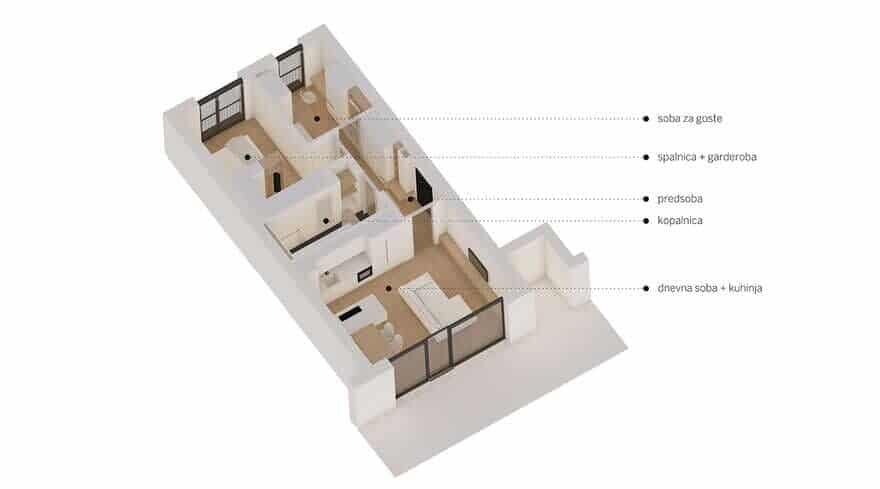
When our team was chosen to design a new interior in one of Ljubljana’s newest buildings, the apartment was practically ready to move in – painted, with all the hardware installations, oak laminated parquet and a completed bathroom with ceramic tiles and sanitary equipment. This bright apartment Lady, oriented southeast to northwest, was designed for the general user and had a floor plan largely pre-defined.
What kind of interior to design for a successful and graceful lady with many passions that eats her life with a large spoon? Accordingly it was decided that the apartment had to reflect its owner’s spirit – refinement, sophistication and warmth. At the same time it should serve as a place of creation: everything from sewing, cooking, pastry making, occasional guest hosting, working from home which is interwoven in everyday life and finally storage of all other cycling and sport equipment.
Our client wanted to keep her apartment bright, seemingly warm and simply shaped, with some addition of blue which she adores so much. That is why we sought conceptual inspiration from the period of Bauhaus and many times overlooked Elieen Gray’s interiors. With its clean lines and functionality her pieces were nevertheless designed with comfort in mind in addition to a great deal of feminine elegance and glamour.
The interior was designed by carefully playing with volumes and voids according to their function while dematerializing them and maximizing their use. As such the design is consistent through the whole apartment Lady – each full element is useful and intended for a specific purpose and each void is formed with the knowledge that it can soon be filled.
The latter basically functions on its own, but if the owner fills it with objects such as paintings, statues or some useful pieces such as fashion accessories and dresses, they (the objects) are placed in a functional frame or compositional context and do not act foreign.
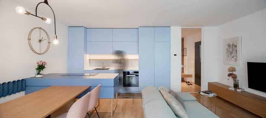
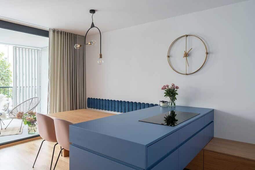
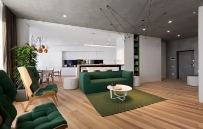
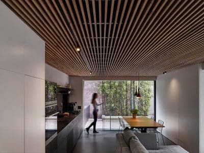
At the beginning we rearranged the kitchen in the living space from an L shape design into two parallel lines that gave us additional storage space. The kitchen island formed as a volume that rests on a long storage bench that connects the kitchen part and the dining space and with its reduced lateness opens up the room and lets light seep through.
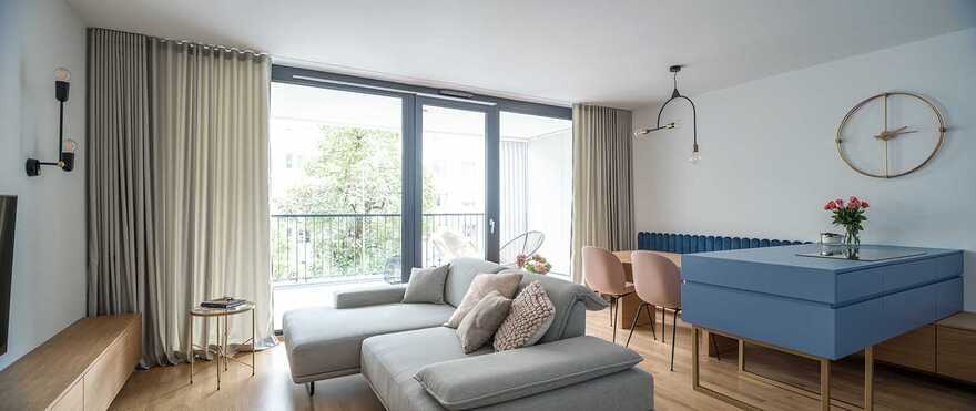
This new orientation of the kitchen and consequently also the dining part enables circular visual communication between the latter two and the living room, perfectly fitting into its user’s living habits. Perfect counterbalance to an elegant kitchen in two shades of blue lies in furniture covered with oak veneer. Consequently this volumes combined with different colours and materials form a starting point upon which other spaces are designed. The latter is manifested in different functions of assembled volumes and colours.
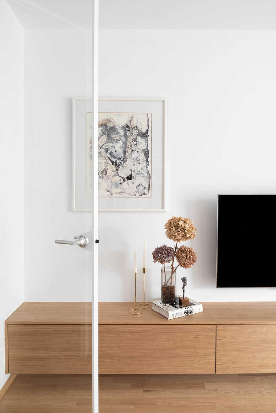
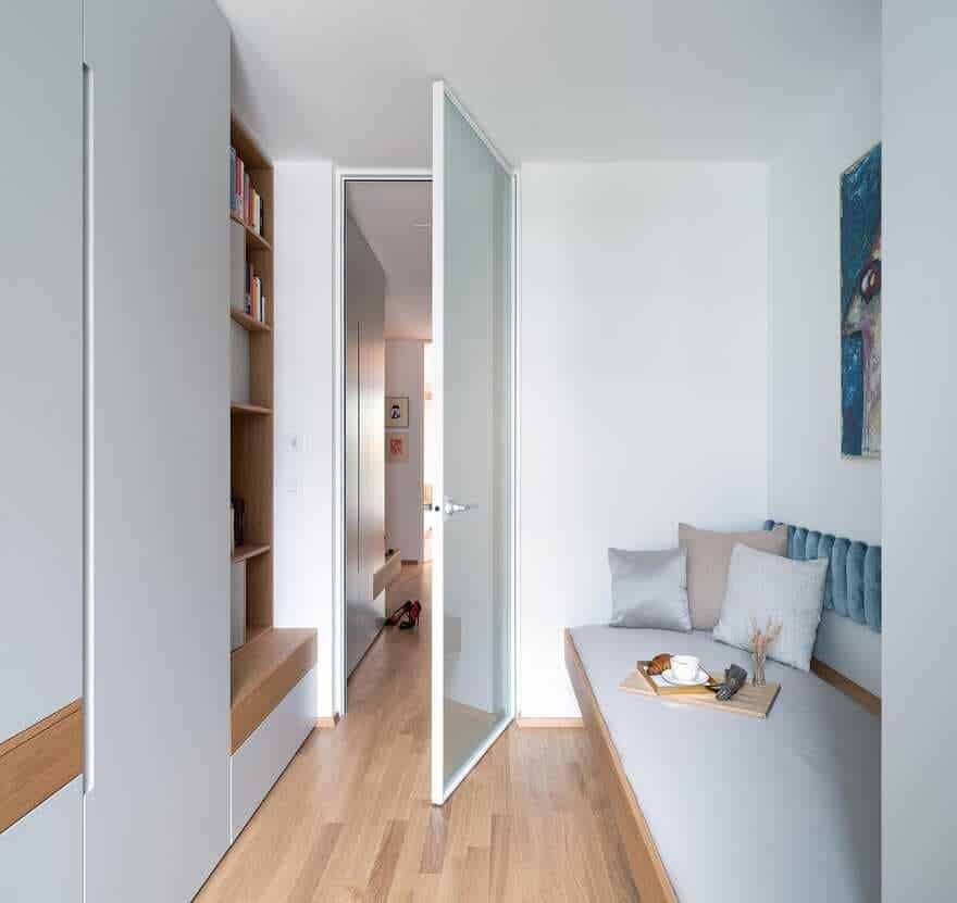
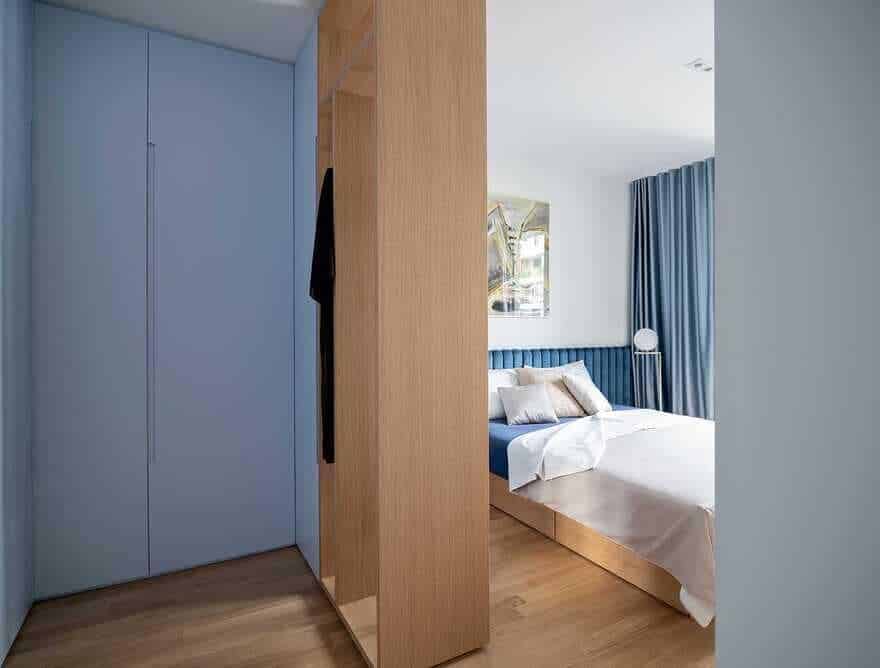
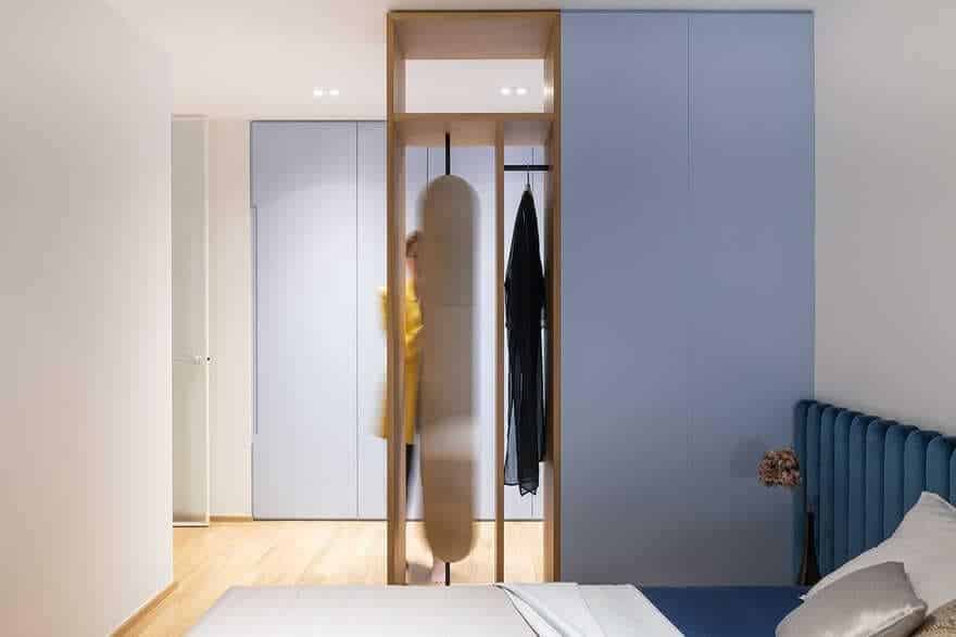
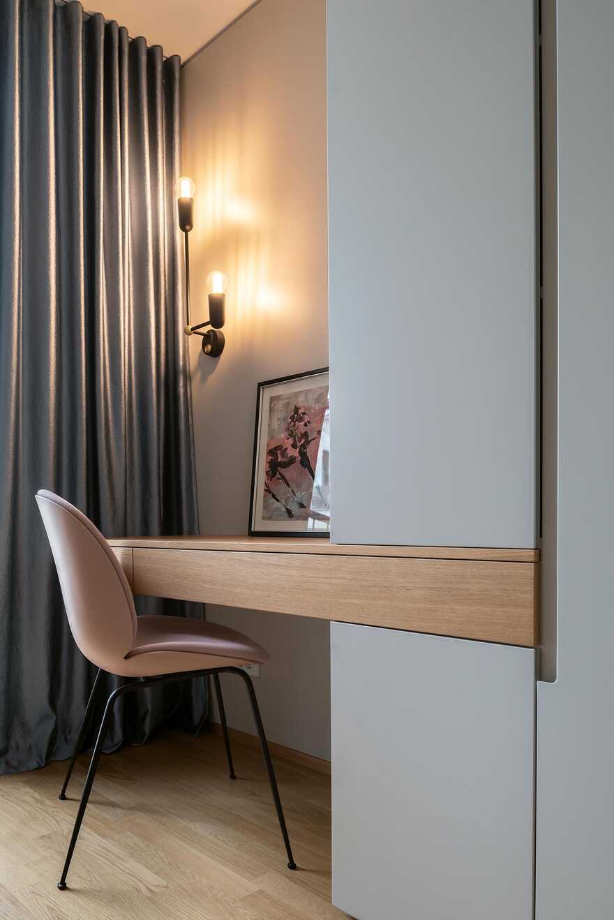
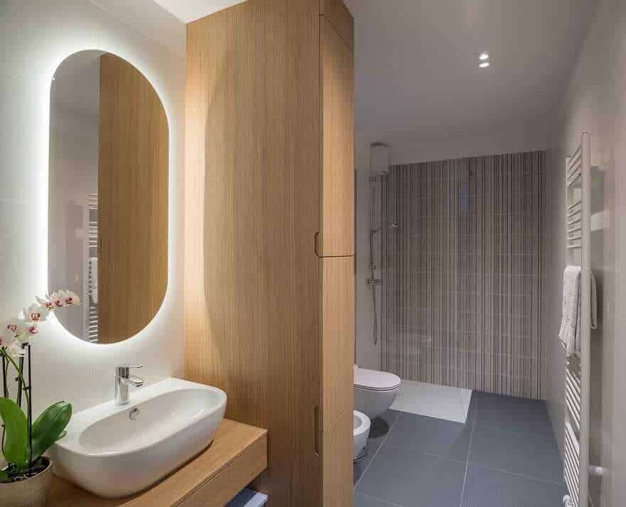
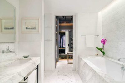
The work area and guest bed are represented in the cabinet as voids and are highlighted by wooden lines that visually continue in the form of a bench through the hallway and into the living space where they manifest as a cabinet under the television. In the bathroom this large volumes function as a visual barrier, while empty spaces get occupied by convenient objects. The empty frame in the bedroom lets light pass through to the wardrobe while still dividing the sleeping part from the dressing room and in addition serving as a hanger and a place for a rotating mirror.
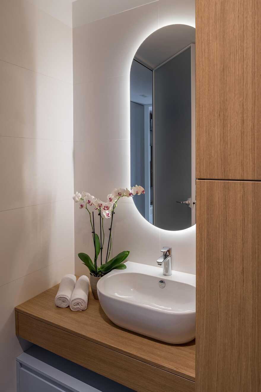
Clean minimalistic lines are complimented by rounded shapes as details that make the space more elegant and sophisticated. This shows best with the shapes of mirrors in this apartment which have a dual function – for example the mirror in the bedroom that simultaneously serves as storage space for jewellery likewise the mirror in the hallway (together with the blue lining) also serves as a cover for the installation cabinets, as a shelf for hanging keys and finally it acts as an introduction to the aesthetics of the apartment Lady (and its owner) to every visitor.
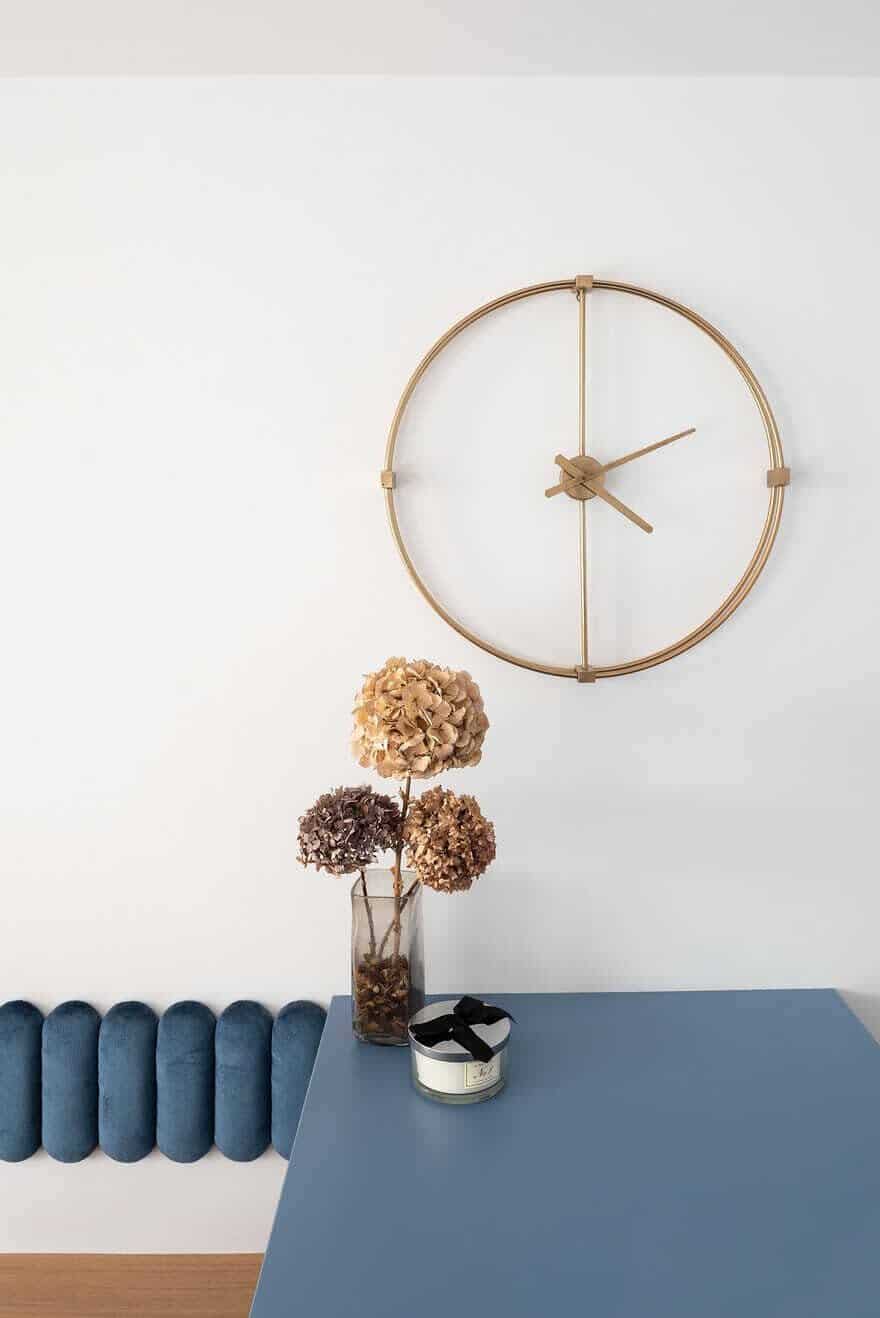
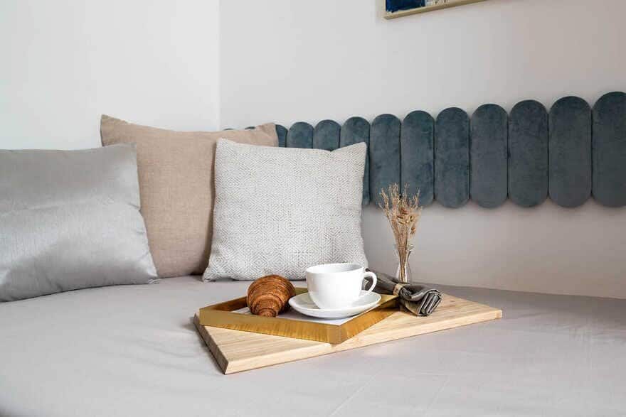
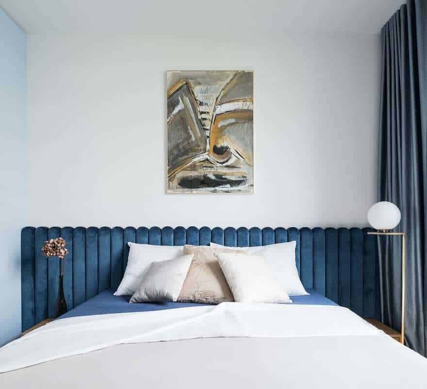
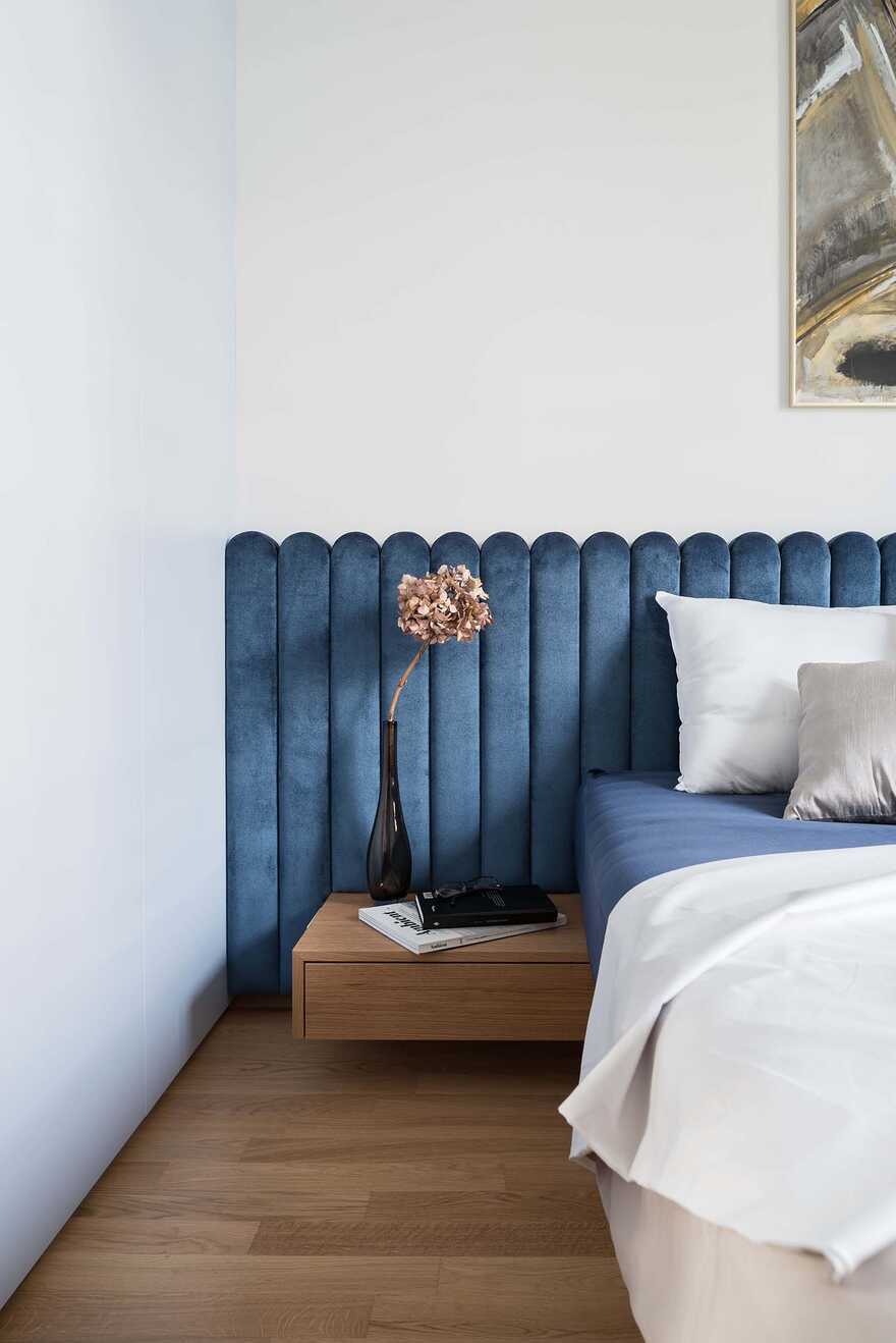
The luxurious deep blue velvet on the rounded upholstered backs of benches and beds adds a desired elegance to the space, while carefully selected fabrics in curtains and cushions further enrich it with different textures and delicate contrasts.
Delicate design together with feminine lines of selected functional pieces, contrasts with pragmatically designed furniture and suggests an aesthetic choice that clearly defines the identity of its user – a timeless Lady.

