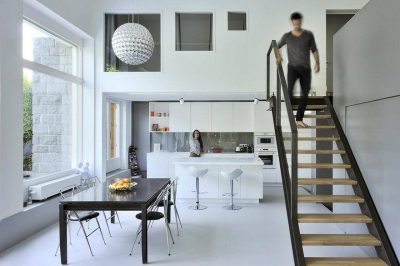
Project: Breaking Walls Loft
Planning and design: Architect Boaz Snir
Location: Tel-aviv, Israel
Area: 30 square meter
Duration of renovation: 3 months
Photographs: Valery Zyuz
Cost of project: 70,000 nis
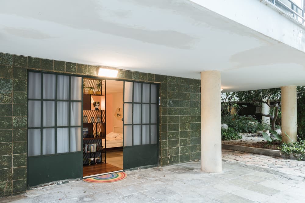
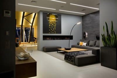
The Breaking Walls loft apartment is located on the ground floor of a Bauhaus building preservation next to the sea. The 30-square meter apartment was previously used as a psychology clinic, and was recently purchased by a couple in their 40’s that live in the North. The couple wished to have a small and practical vacation apartment for their Tel Aviv excursions.
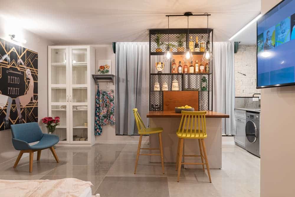
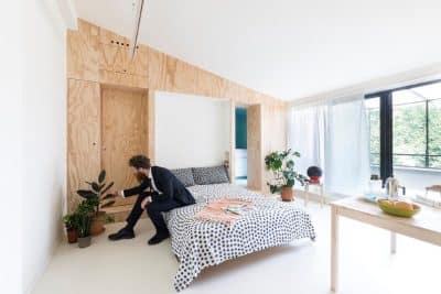
Originally the apartment was used as a psychology clinic and was divided into two 15-square meter rooms with a dividing door in between. I decided to remove the wall and create an open space with minimal partitions to create a sense of openness and expose the natural light.
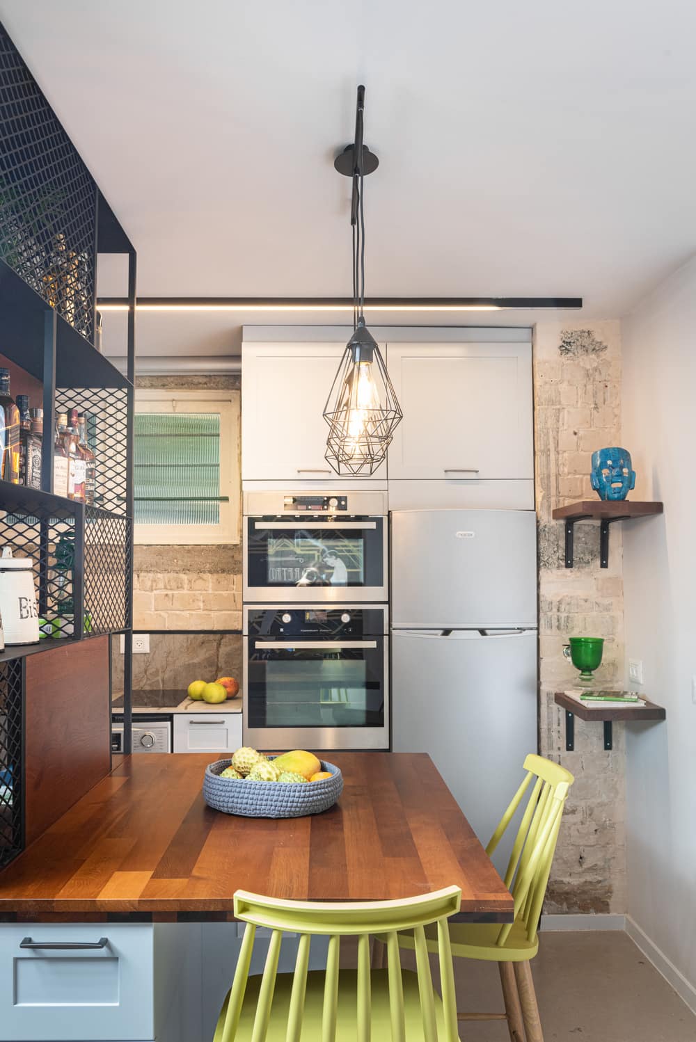
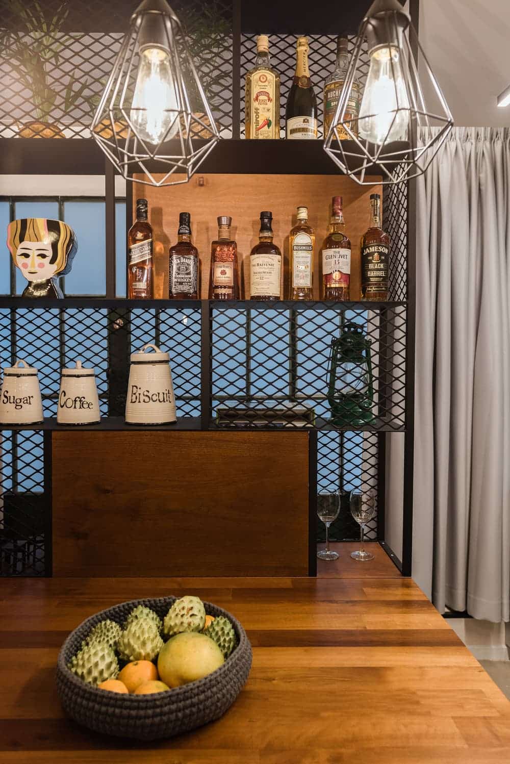
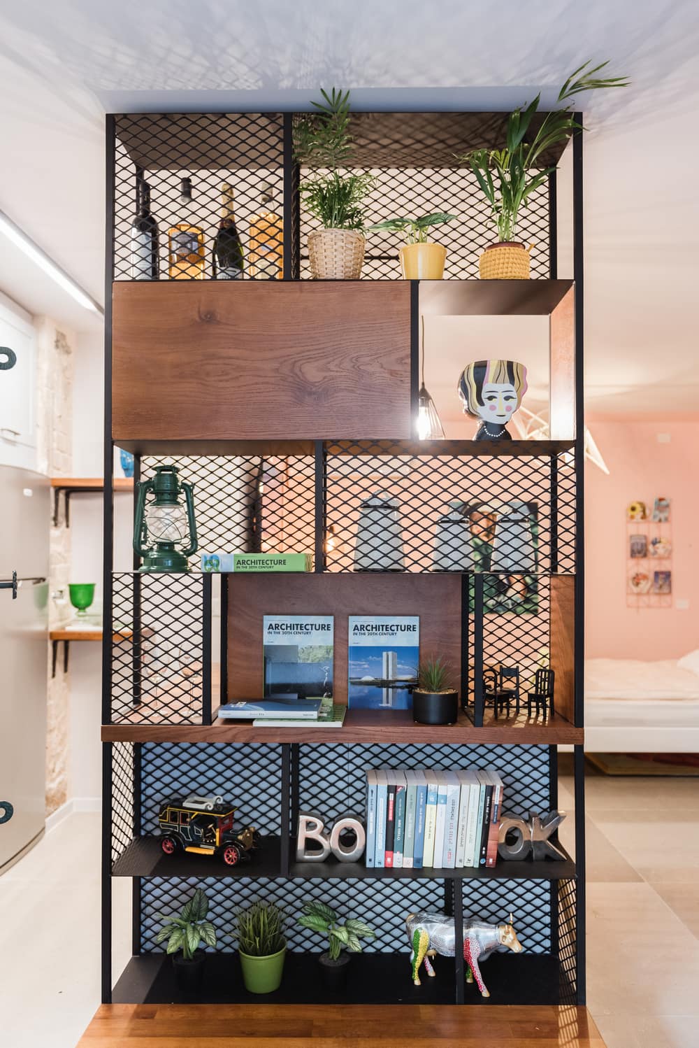
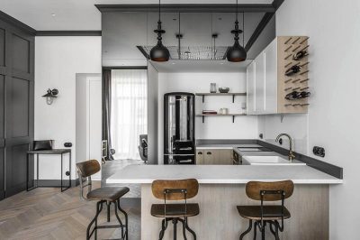
The division between the spaces is only hinted at. In actuality there is only one built partition that separates between the bathroom and the open space, and another made of iron that anchors the kitchen island and defines the entrance hall. This partition also separates the intimate inner space from the glass entrance doors, and is also used as a kitchen storage space, a bar for drinks and a display case.
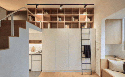
The wood motif is very apparent. I chose to work with European ash wood that I combined in the entrance hall, the wooden shelves, and the island’s upper surface.
The rest of the floor was paved with large slabs of shay grey marble with minimum joints to give the floor space a sense of flow and make it feel larger than it is.
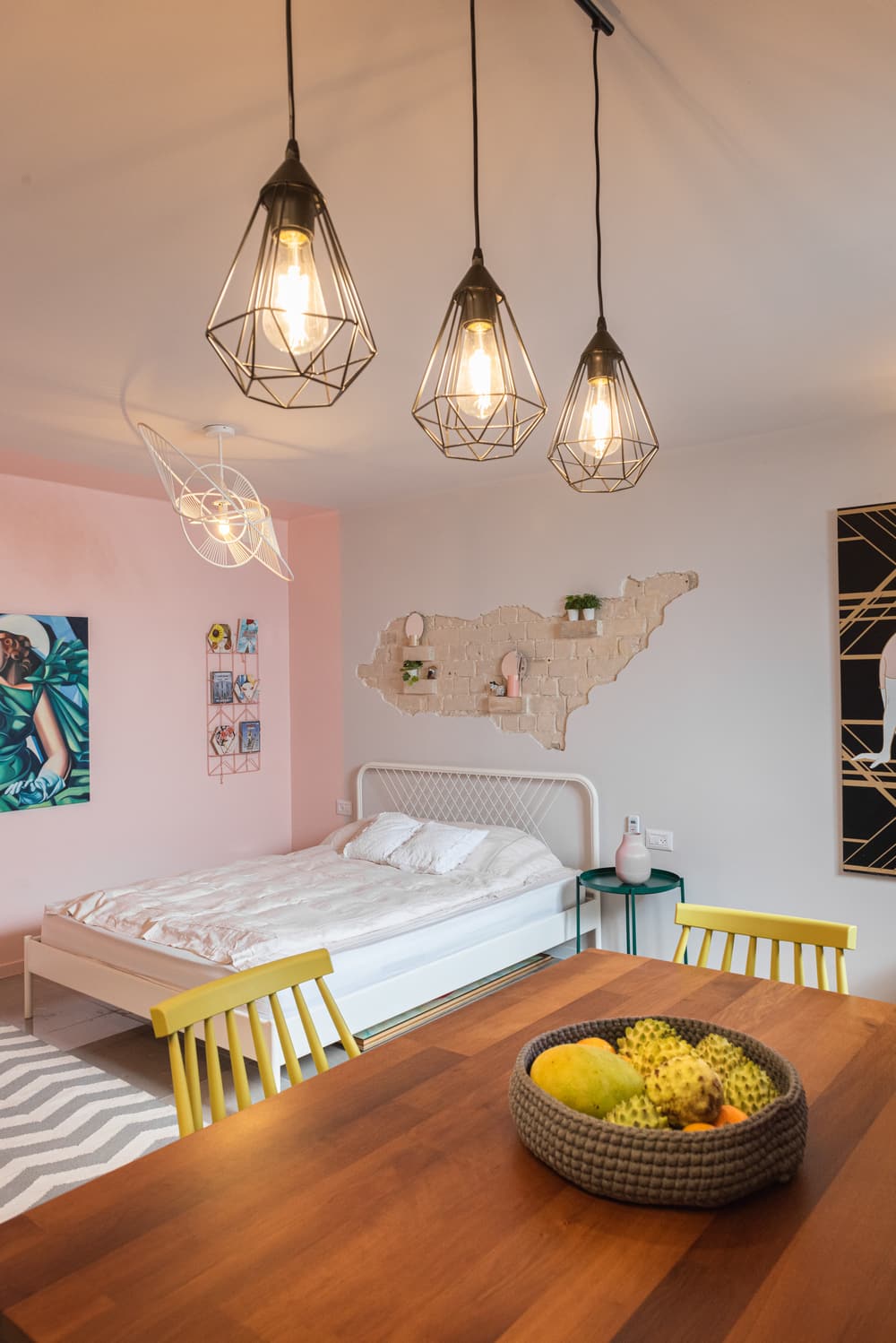
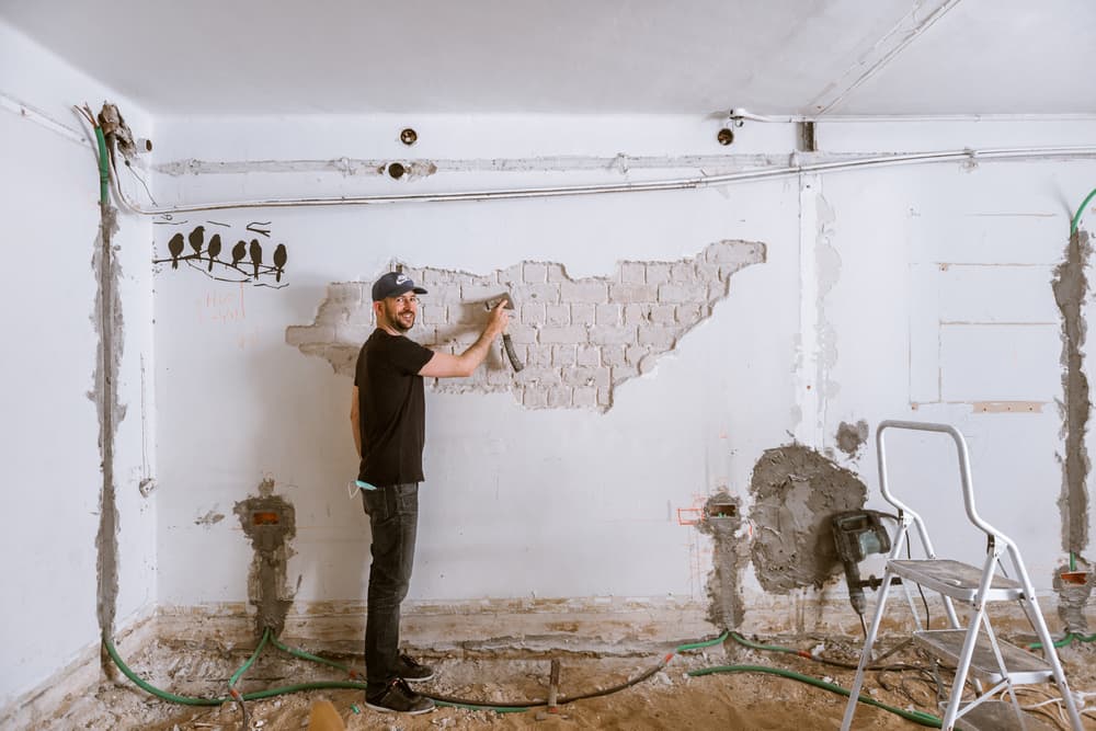
The main thing that guided me along the process was to preserve as many structural motifs as possible and restore their original splendor. I aspired to reveal the original framing walls as much as possible, and expose the silicate stone that is characteristic of the (pioneer?) construction of Tel Aviv’s early days.
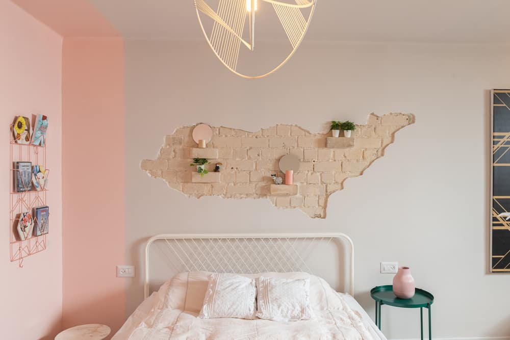
To do this, we shaved down the plaster layer in specific areas of the apartment and as we exposed the bricks, an exciting and historical detail revealed itself: the original building sketches that the builders left as their seal, which we kept exposed as a keepsake of those days. I also chose to keep the original concrete belt, kitchen window, and the glass-fronted display cabinet that was well-kept over the years and made from Belgian iron profile.
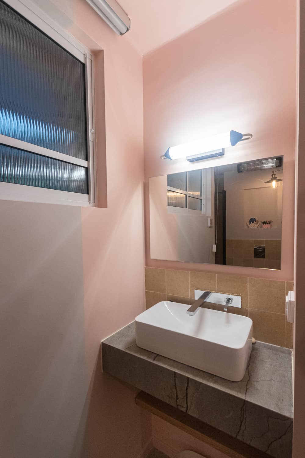
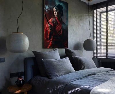
To break the natural color (a sandy tone) I included a pastel grey-pinkish shade. The different tones and shades meet in between the various functions and in so doing create the conceptual differentiation. With a similar thought in mind, I opted to include the original green shade of the entrance doors as a recurring motif. For example, the green dresser by the bed, the various accessories, as well as the woman’s green clothes in the artwork hung in the sleeping area.

