Project: 1920’s Brick Bungalow Addition / Open House
Architects: MODO – Michael Ong Design Office
Location: Hawthorn East, Melbourne, Australia
Builder: Seventy7 Projects
Photography: MODO
What is Open House?
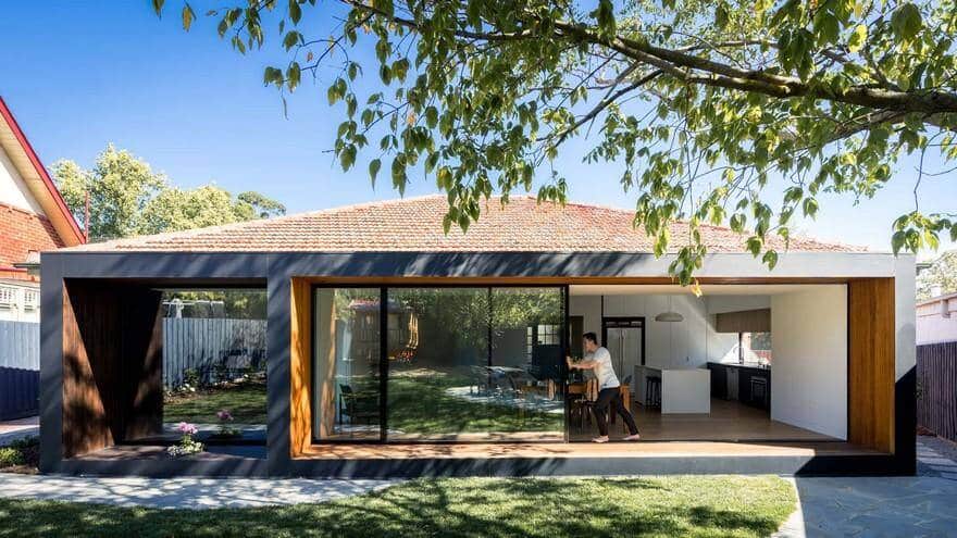
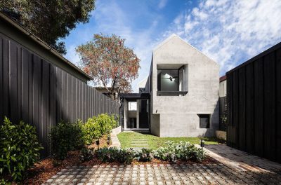
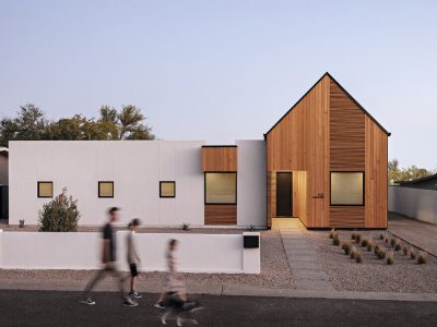
Located in the leafy suburb of Hawthorn East, Open house is an renovation and addition to an existing brick bungalow. The existing house was in great condition, however the rear lean to extension completed in the 1970s has become an awkward living area with a poor connection to the garden. Once in the garden, the constraint of the site geometry becomes apparent, the triangular block compressed towards the back, forming a rather narrow garden, made tighter with a large stand alone shed.
The client came to us prior to purchasing the house to understand how they could convert this home for family of 4, and importantly a house that not only compliments their lifestyle but one that can enhance their connection between the family, garden and their home.
Sense of light and air
Our understanding of space can be drastically influences by how we bring in air and light. The current extension at the rear has become an obstacle, blocking out the air flow and sadly limiting the northern exposure, resulting in spaces that were dark and that felt small.
Value through design
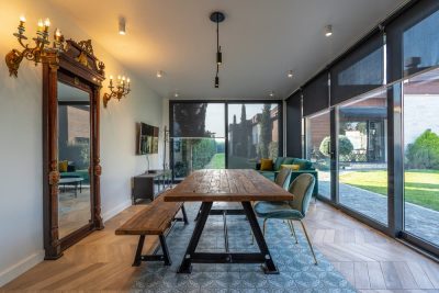
We immediately knew the best method to bring value through design would be to remove the lean to. By pulling open the rear facade and changing the relationship the existing spaces had with light and air, we were able to revitalise the existing spaces. Creating rooms that are brighter, which as a result made spaces that felt and function bigger.
Proportion in design
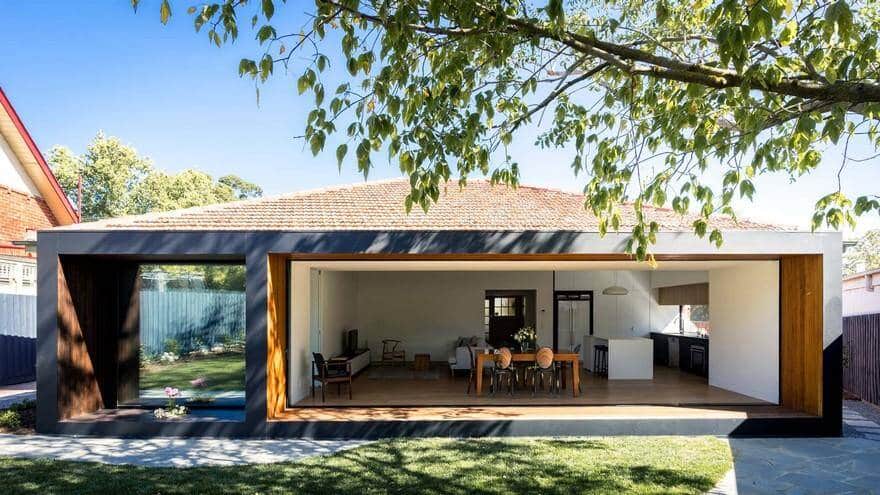
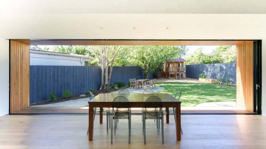
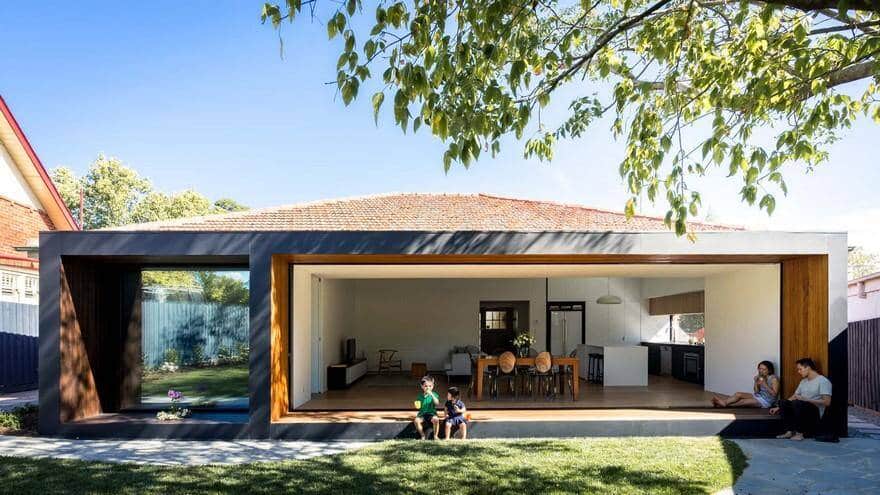
Our client understood the value of create an architectural response that was simple, minimal and deliberate. We purposely pared back the building form and materials, to allow the proportions of the house stand clear. The slender wide windows allow the house to frame a panoramic view of the garden, this long rectangular view was carefully detailed to widen the perspective of the garden. Creating an optical illusion of making the garden itself feel wider then it actually is.
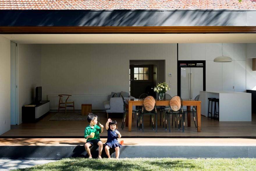
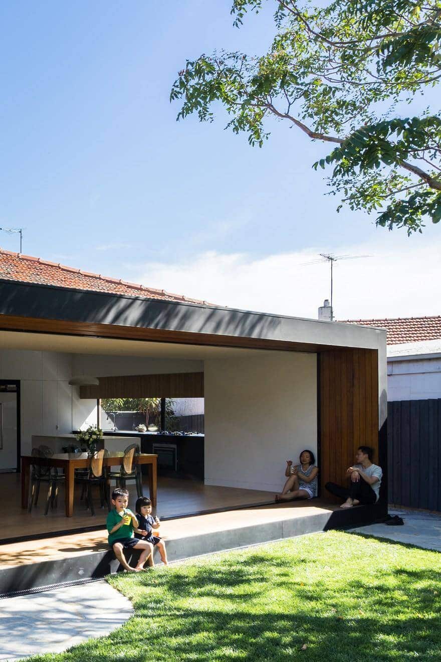
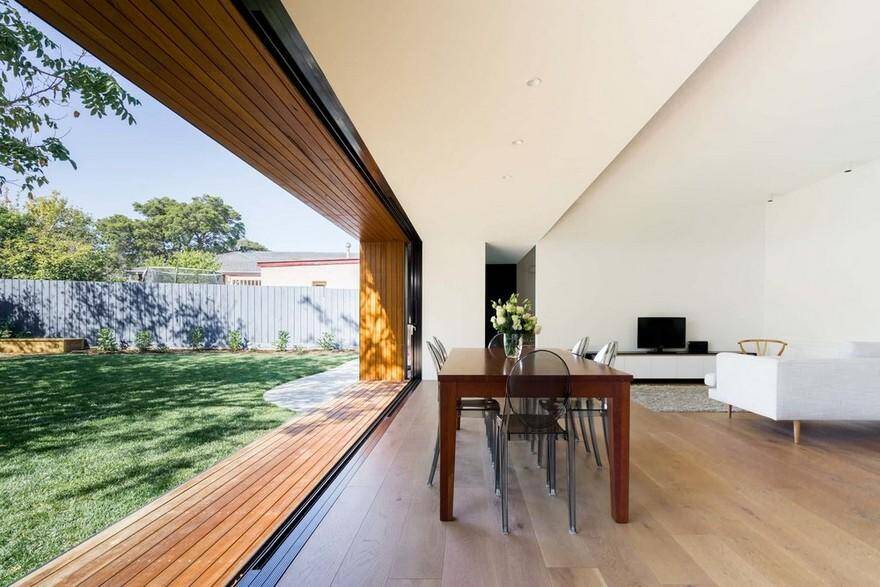
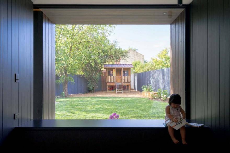
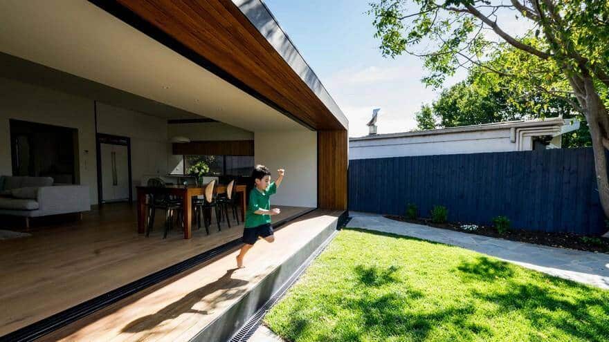
The three sliding doors, can then be slid away into the fixed pane to the side, instantly opening up the entire house into the exterior. The deep timber surround around the windows can then be used as an inviting seat bringing the family out into the garden, while the top eave acts as a sun shade to block out the northern sun while still letting in the winter light.
Building less but building better
Rather then simply adding more to the original house, we looked at what we could do within the original and raise the question, how much space is actually needed to fulfil the functions of the brief?
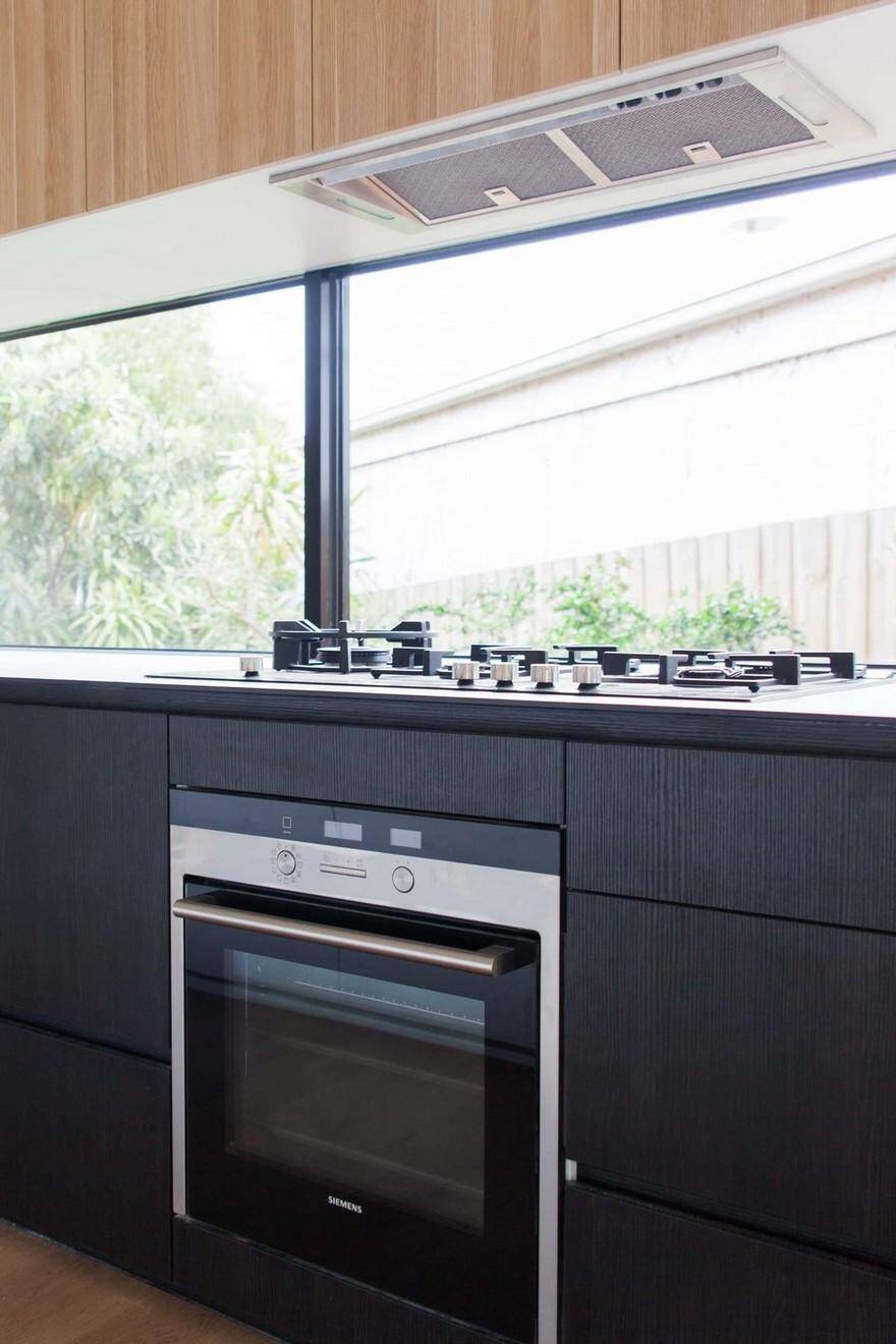
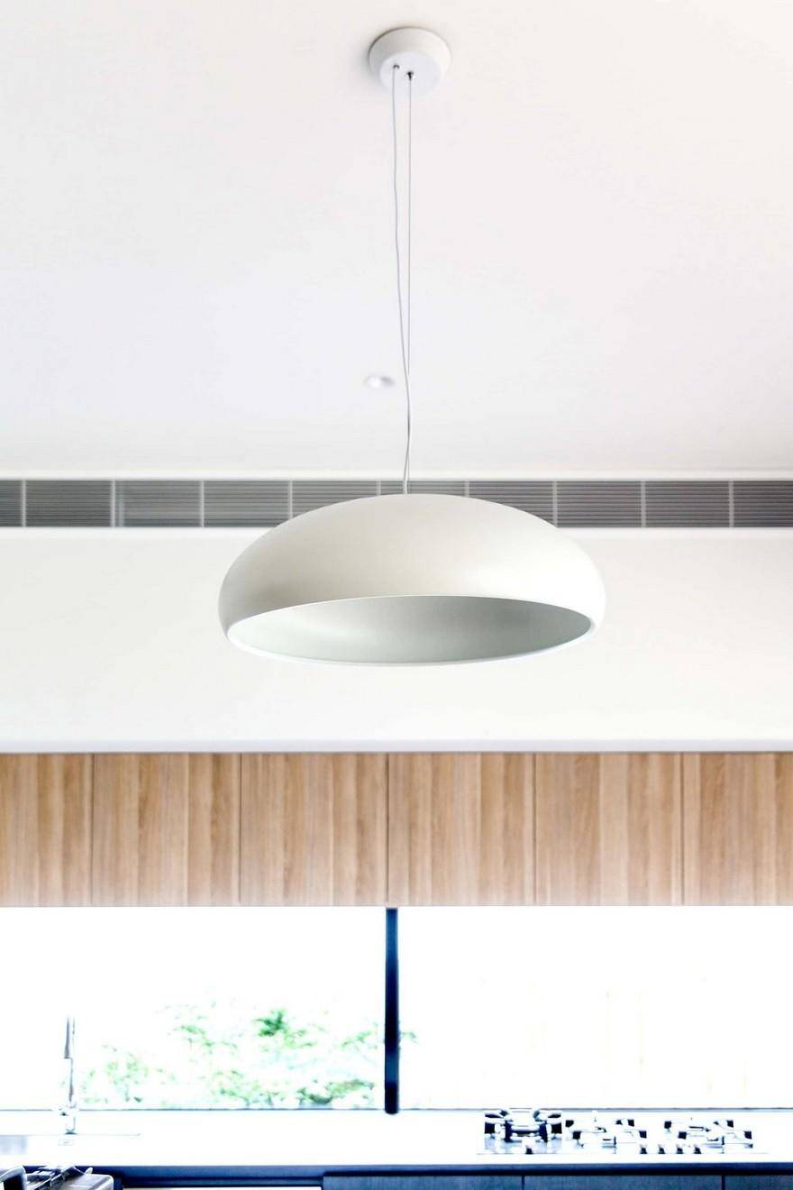
Firstly, by removing the rear lean to and opening up the northern facade, we were able to flood the existing living areas with much more light and air, instantly making it feel larger and more functional. Our focus then became on the finer details, based around material selection, construction method, integrated joinery and lighting. Ultimately we were able to reduce the overall floor area of the house, while adding in more light, air, function and liveability.
A common misconception is real estate is bigger is better, here we challenge this notion and design a house which is smaller then the original dwelling but one that provides more function and vitality than the original dwelling. Through a thoughtful and analytical design process we were able to make every space work efficiently and effectively, while maintaining flexibility for the growing needs of a young family of four.

