Project: Bright Family Home Stijn & Annemie
Architects: Atelier Vens Vanbelle
Lead Architects: Dries Vens, Maarten Vanbelle
Location: Ghent, Belgium
Area 188.0 m2
Project Year 2017
Photographs: Tim Van de Velde
Text by Atelier Vens Vanbelle
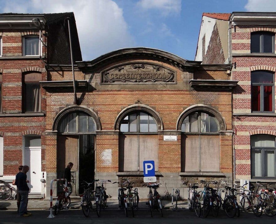
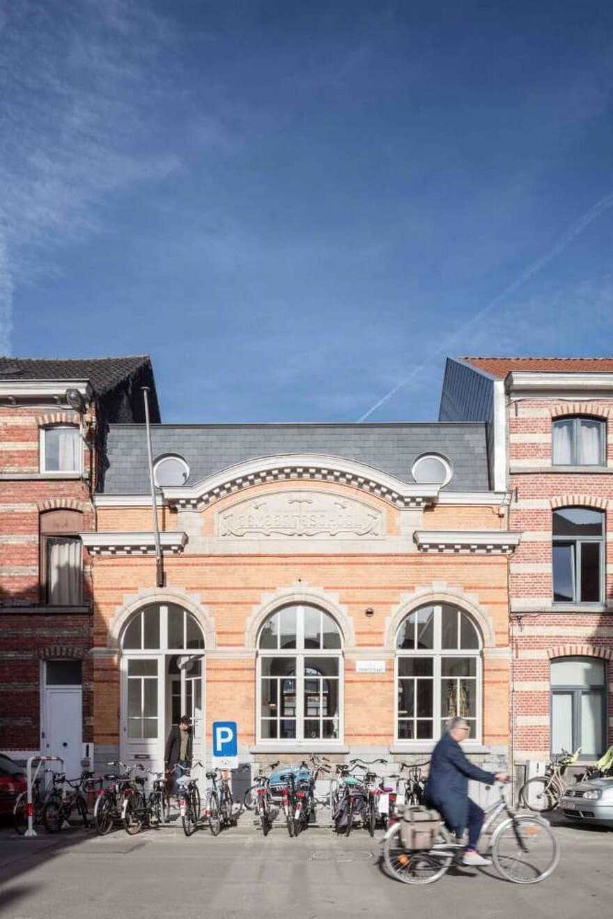
When Stijn and Annemie bought the listed school façade (anno 1908) with the vacant piece of land behind, they were already the fourth owners in a row. The other buyers hadn’t found a proper solution to build a contemporary house behind this facade. What do you do with a heritage listed school façade that you have to restore in the original state with the authentic window division etc?
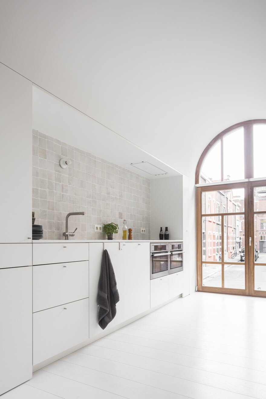
The façade was beautiful but extremely difficult at the same time, because it does not have the proportions of an ordinary home. The windows are not only very large, they are also quite high in relation to the street.
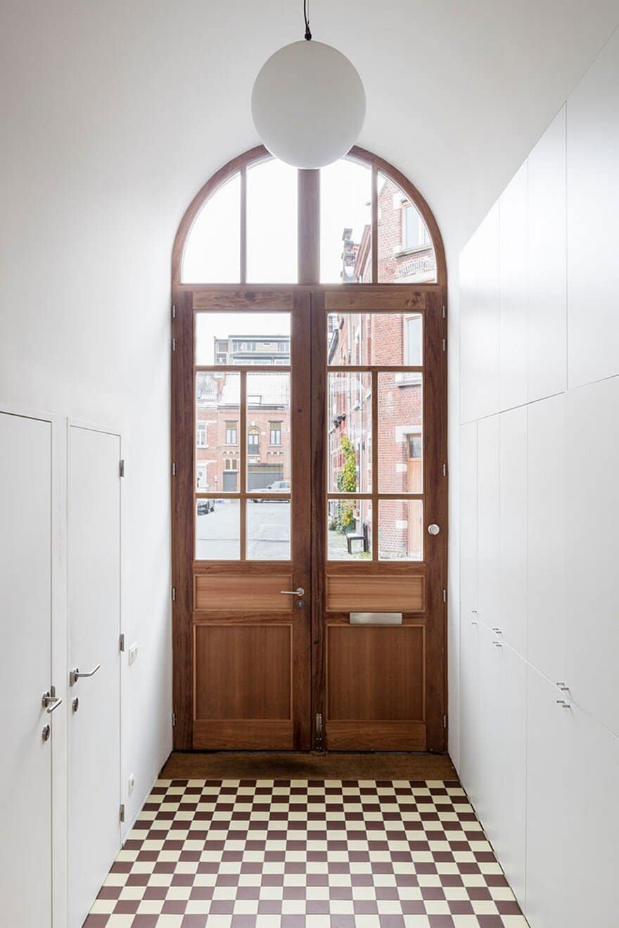
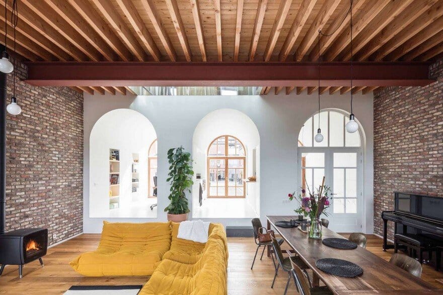
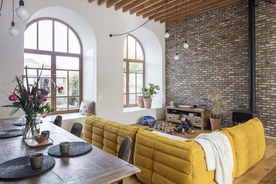
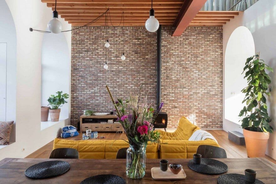
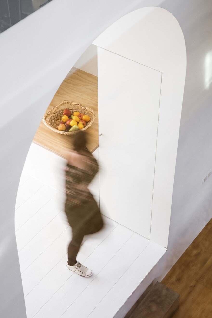
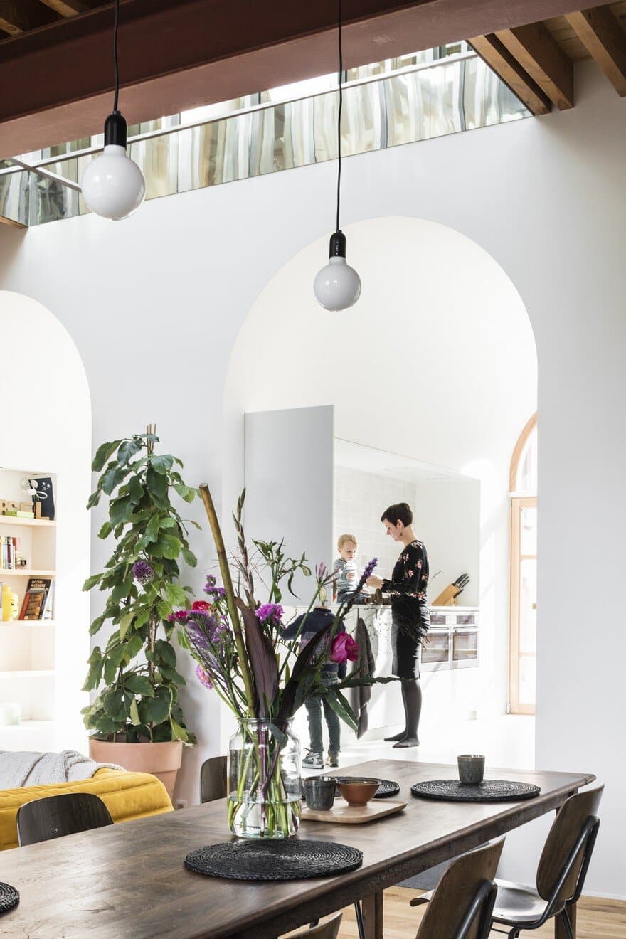
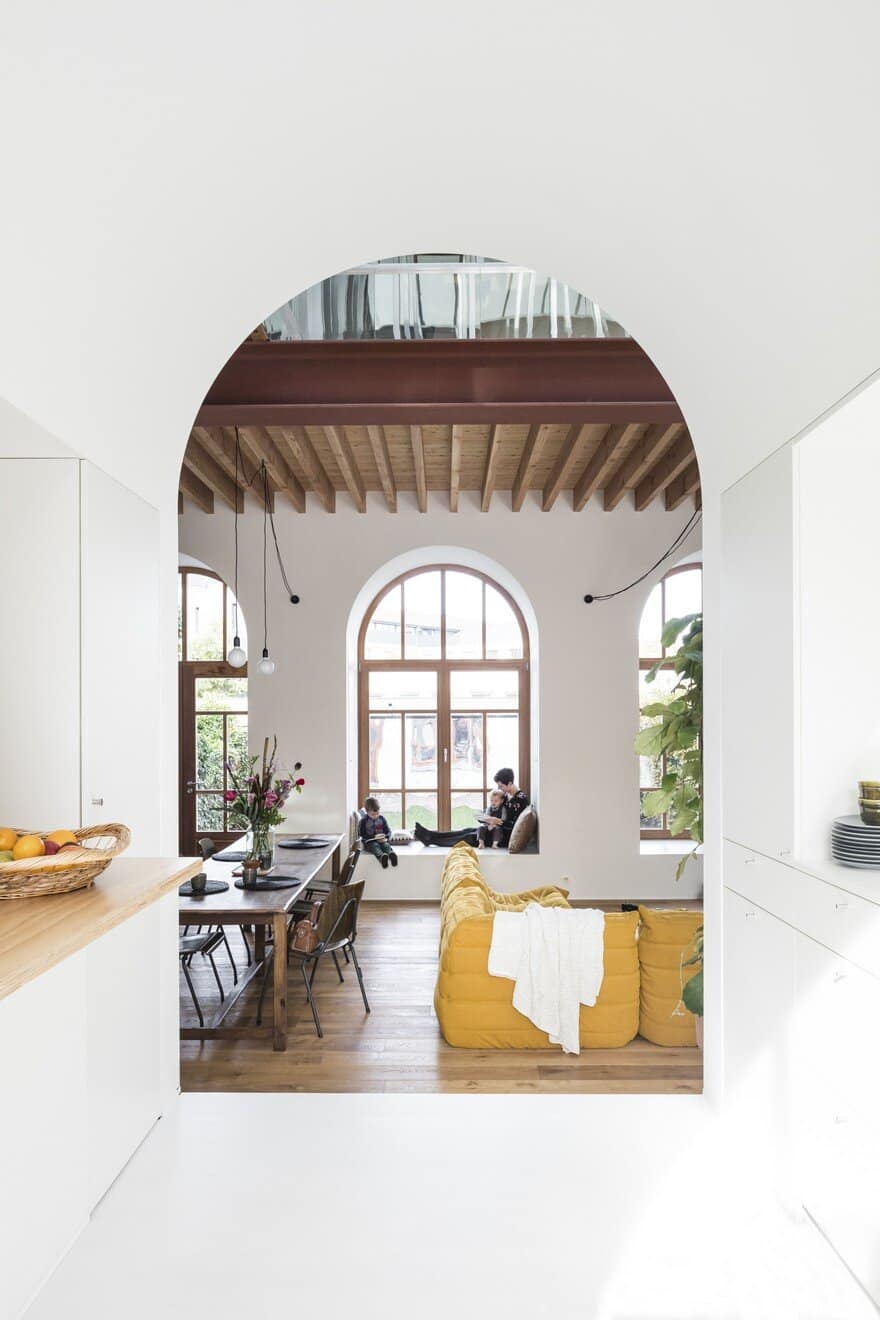
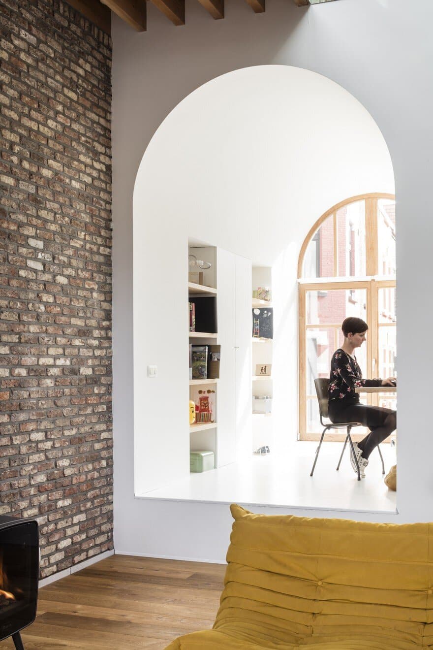
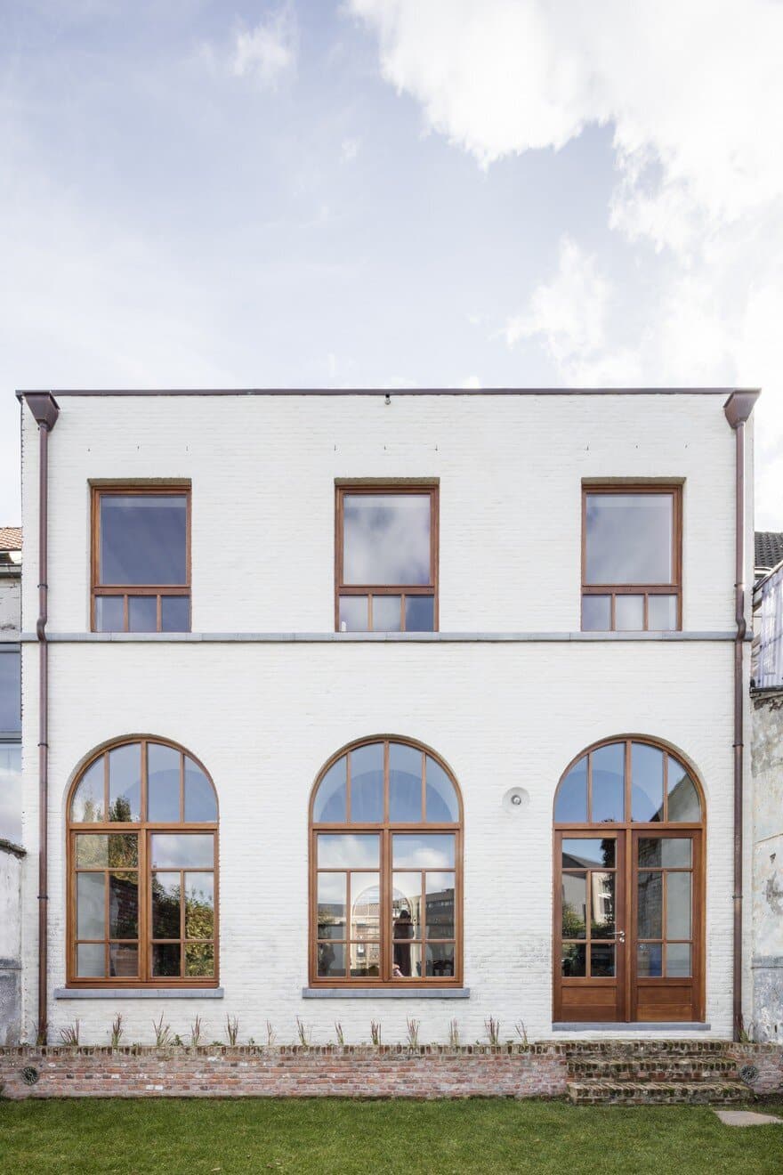
Contact with the street is very important, so it was decided to extrude the windows into spaces. The first ‘tube’ is a majestic entrance, the middle one is the kitchen, and the third is a desk/office space. This principle was repeated in the rear facade where the niches are storage, sitting and play areas. The living space is situated in between these two white extrusions.
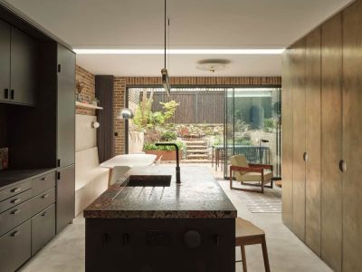
Everything is designed in relationship with the dimensions of the windows, and the gap between the windows: the kitchen, the desk. The niches between the extruded windows are always served on two sides. These spaces were limited, but still everything fits in nicely. The staircase is hidden between the entrance and the kitchen, as well as a toilet, the entrance to the semi-underground basement, etc. Furthermore, the kitchen, desk, cupboards etc were also fitted in the thicknesses of the walls.
Because of the high position of the windows in relation to the street, there was room for a handy basement with extra storage space and laundry room under the kitchen and the office. Due to these level differences with the street side, the living space is somewhat lower and more enclosed. This gives a sense of homeliness, but at the same time everything is open and airy.
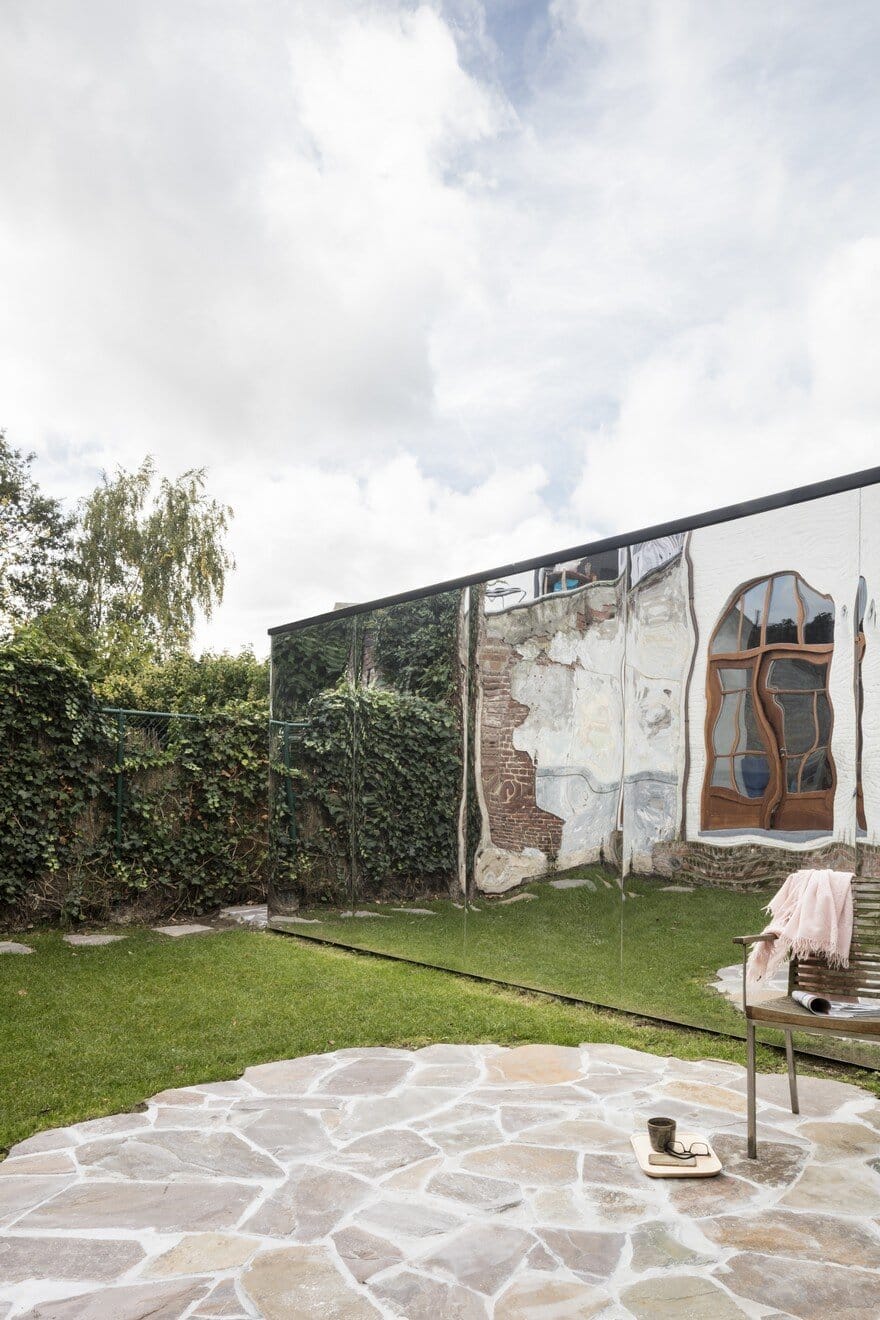
The garden is slightly lower than the living space, giving you a wider view towards the back. This creates a broader feeling than the actual surface of the garden, and that is enhanced by the mirrored garden shed. The city garden feels more spacious than it actually is, and the new rear façade was designed in a simple way to give a pleasant atmosphere to the garden.
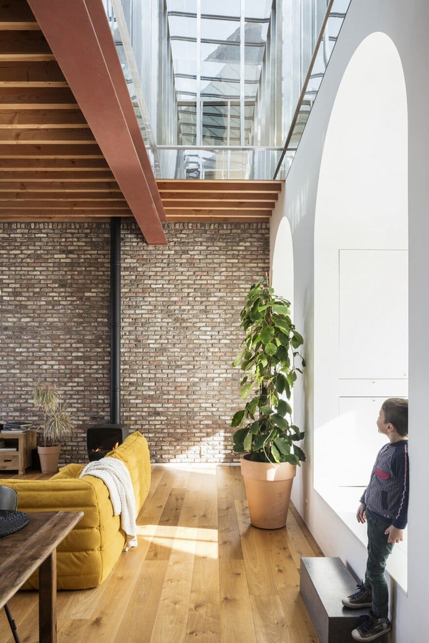
The spaces of the extruded windows were kept abstract white, while in the interspace / living space a more cosy atmosphere was created. When choosing the materials in the living space it was very important that it would be a real home and not a school. In addition to the two brick walls, there are the wooden oak floor, the wooden beams of the ceiling and the industrial beam. The ceramic tiles in the entrance hall in two colors are again a conscious nod to the school of yesteryear. Also, the door between the entrance hall and the livingroom follows the original window division of the school façade.
Due to the choice of materials, the building appears to be spontaneous and lived through, while it actually is a completely new construction behind the facade.
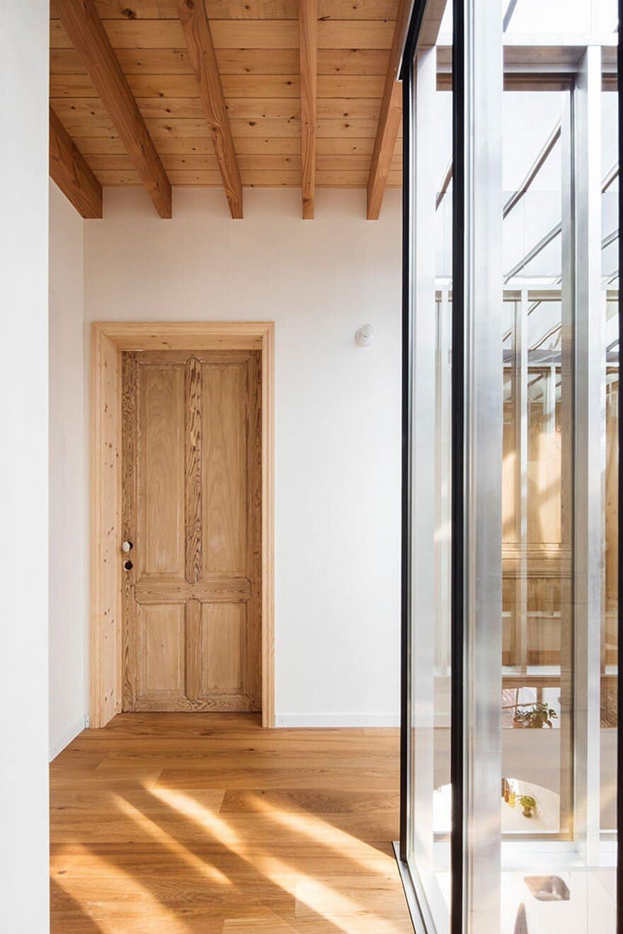
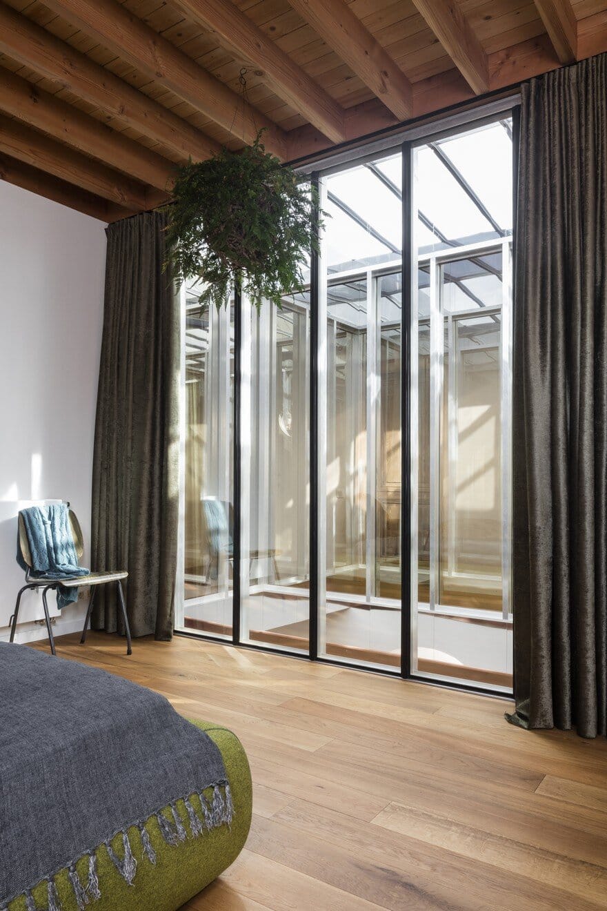
The sunlight enters through the south-facing facade and the white tubes, but also through the void centrally in the building. The void was lined with greenhouse profiles and mirroring glass. This glass provides privacy towards the first floor, while the sunlight is drawn into the living space in a fascinating way.
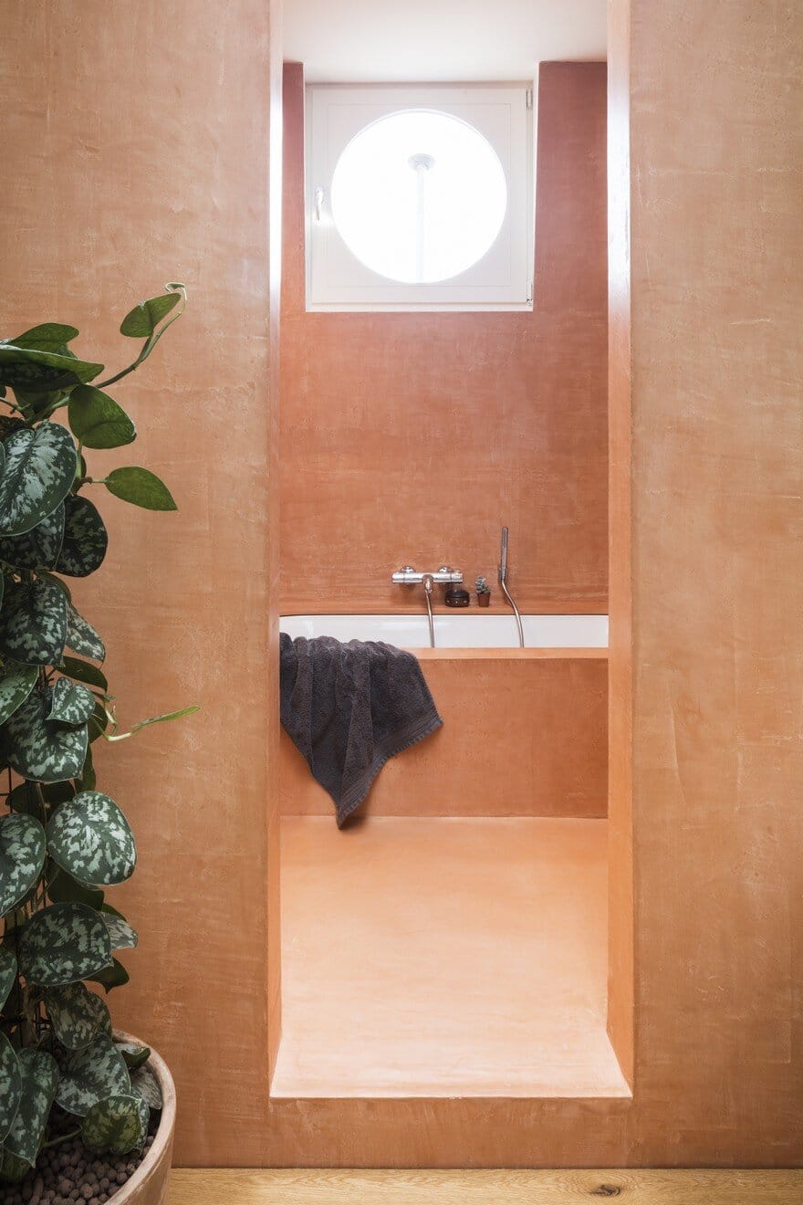
Every room has in some way contact with the living space, from the desk downstairs to the bedrooms upstairs. At the top of the stairs there is a spacious bathroom with a separate walk-in room with bath and shower. The corridor winds around the void, past the three children’s bedrooms up to the master bedroom. From here there is a visual contact with the rest of the house through the one way see-through glass wall.
The house is built with a logical route in mind: when the inhabitants get up in the morning, they first pass the bathroom, then go downstairs through the stairs in the kitchen for breakfast, etc. The result is an airy and logical house, just like the concept of this new building that forms a harmonious unity with the 19th century façade.

