Project Name: Bungalow at Shivalik LakeView
Architecture Firm: Shayona Consultant
Principal & Founder Architect: Ar. Prashant Parmar
Design Team: Ar. Harikrushna Pattani, Ar. Hemang Mistry, Ar. Ashish Rathod, Ms. Pooja Solanki, Ar. Vasavi Mehta.
Completion Year: 2021
Carpet Area: 2500 sq.ft
Project location: Ahmedabad, Gujarat, India
Photot Credits: SahajSmrutiStudio
Courtesy of Shayona Consultant
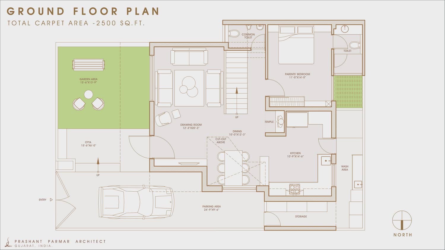
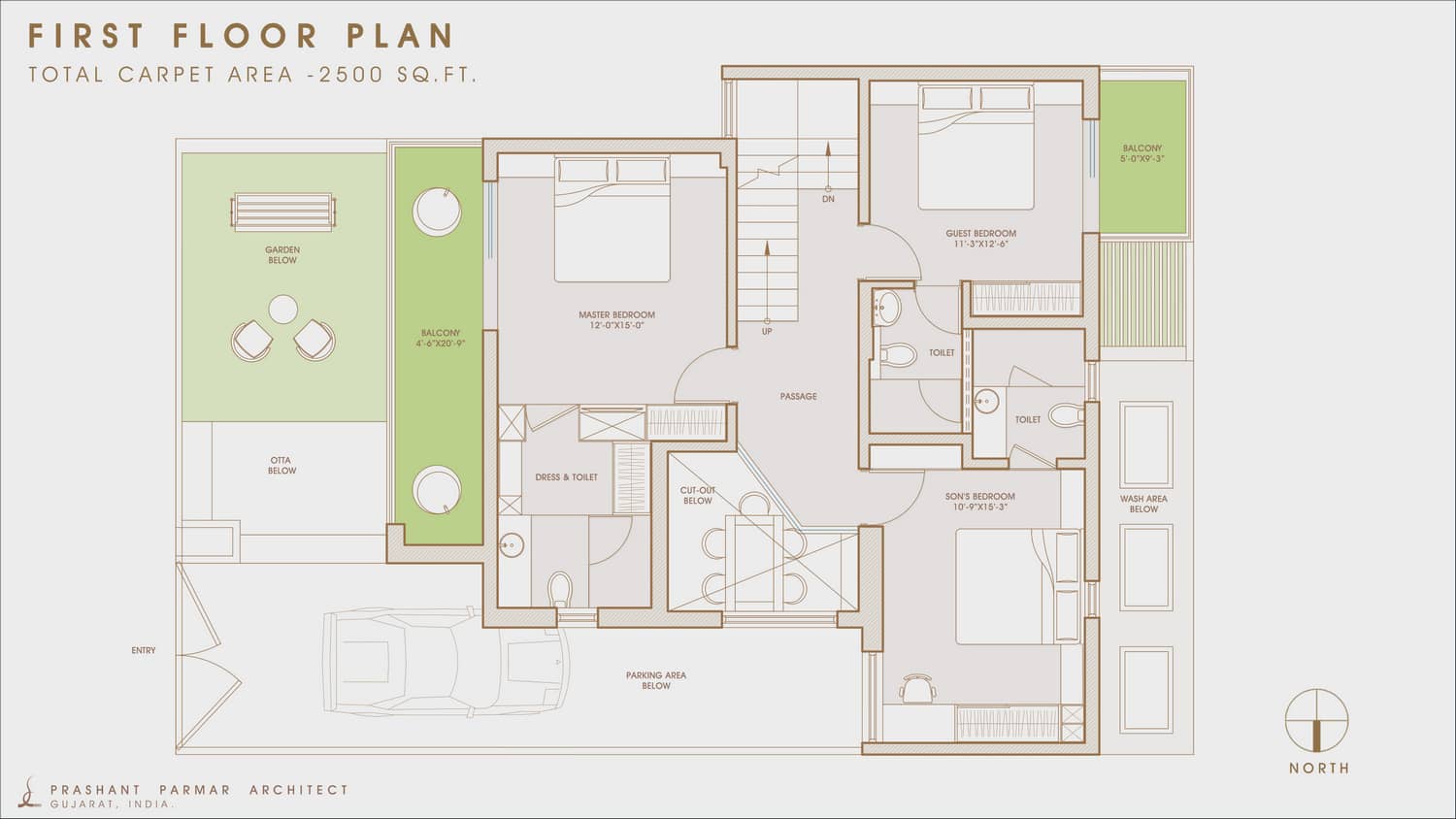
This is a 4 Bedroom bungalow with drawing, kitchen, dining, garden and balconies. Client came to us with a desire to create a home with modest and timeless interior. They wanted their residence to be very simple, modern and maintenance-free.
One is welcomed by a refreshing garden entry that keeps the house light & air ventilated.
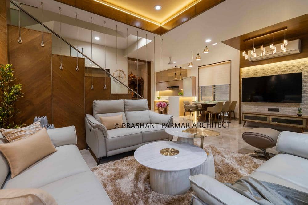
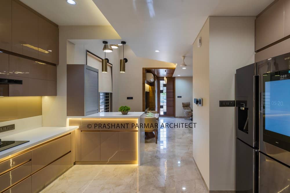
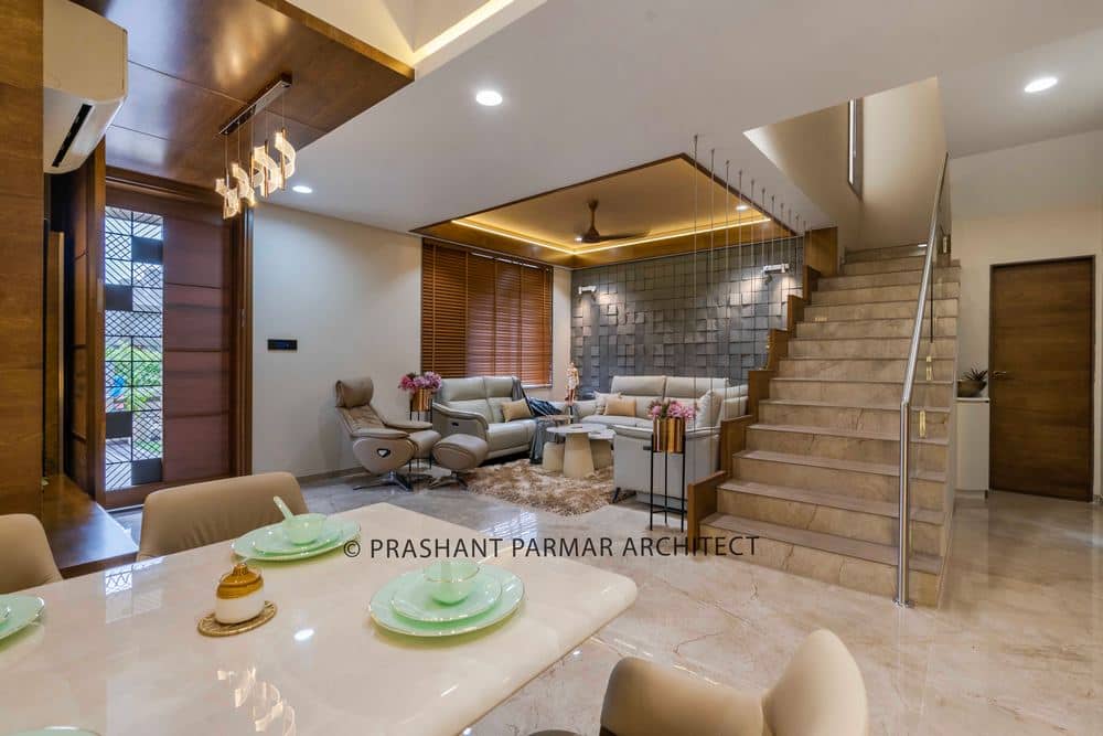
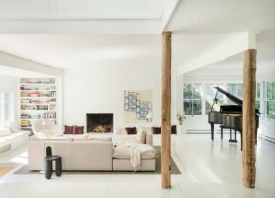
An-open planned layout of drawing, dining, kitchen follow a modern theme with Italian marble flooring and neutral color scheme.
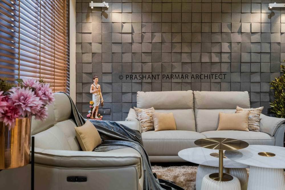
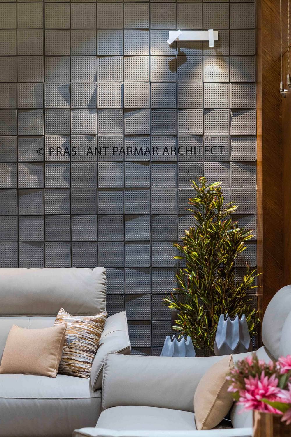
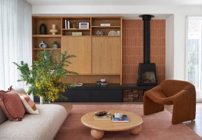
The Drawing room is highlighted with geometric-patterned wall as a backdrop to seating , creating an essence of dramatic yet cozy ambience. The monochromatic Italian leather material of the sofa furniture with stylish round-centre tables add luxury and comfort to the space.
The SS strings designed for staircase helps to keep transparency and openness within the space.
The temple is beautifully designed with carved wooden cabinet which gives a serene sight right from the entrance.
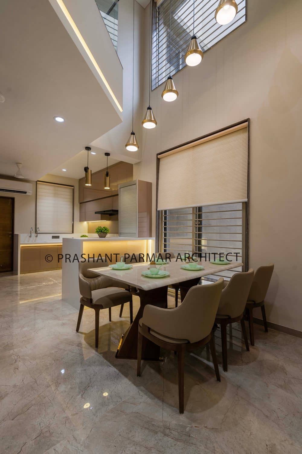
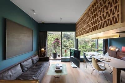
The dining table is kept simple with ivory-shaded stone paired up with nude colored tufted chairs.
The cut-out above dining helps to keep easy communication and interaction within both the floors.
The service platform visually divides the dining and kitchen area. The kitchen also follows the neutral color scheme with PU finishes and white corian top.
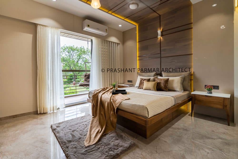
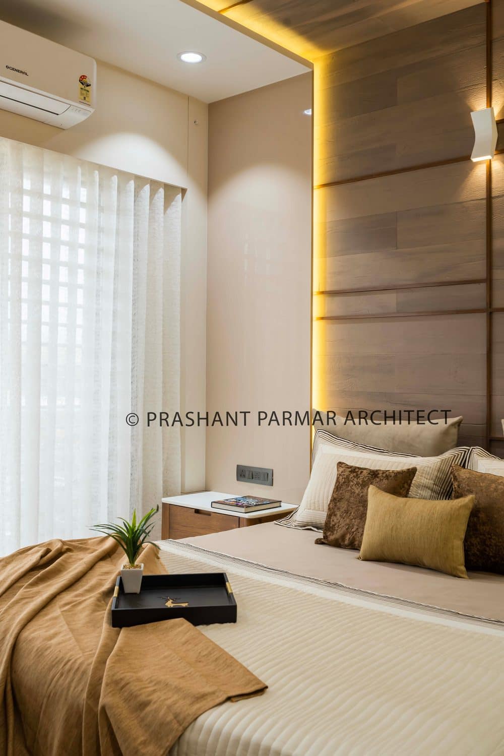
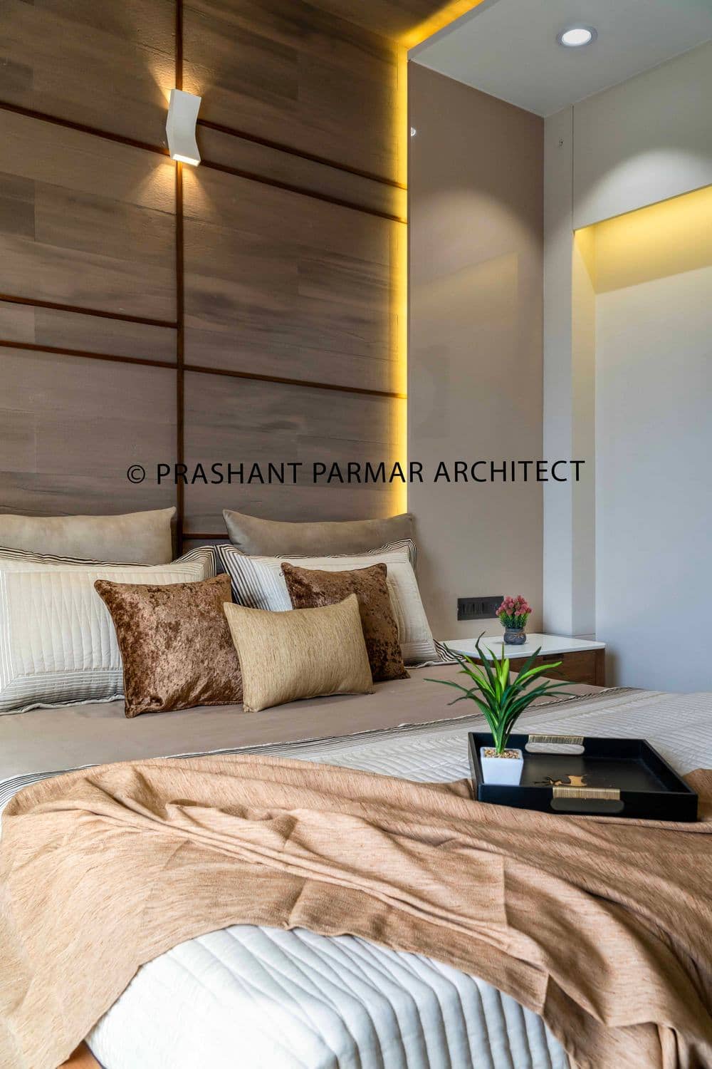
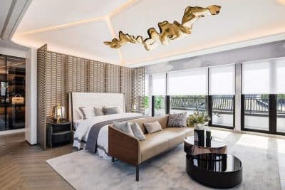
The bedroom on the ground floor belongs to parents. Here, the simplicity reflects through its white PU finishes and warmth of veneer finish. The tufted pattern of the bed highlights the whole room.
The continuing veneer paneling from ceiling to the backdrop of the bed looks astonishing for master bedroom. Other than this, the whole room is kept mute. The TV unit is designed in a unique way with blending the toilet door and wardrobe storage within. The storage hidden behind TV is the new way to come up when one needs more storage. There’s a linear balcony, opening in the front, which keeps the room well light & air ventilated.
The Son’s bedroom has been rendered with the grey color scheme, sliced in a pattern in the headboard, continuing from the backdrop with raw stone texture and mirror grids. The toilet door is camouflaged with the storage with PU finishes.
The guest bedroom is kept simple with veneer and muted color palette.
Elements, spaces, materials can be used in most thrilling and attractive ways, to showcase an aspirational lifestyle. The client’s main desire was to keep his home simple yet elegant. The overall aesthetic of the house is kept sleek and clean, with the addition of some textural and material play, peppered with soft neutrals and monochromes.

