Project: Caffe La Tana
Designer: Ste Marie Studio
Location: Vancouver, Canada
Completion date 2018
Photographer: Ian Lanterman, Conrad Brown, glasfurd & walker, Ste. Marie Art and Design
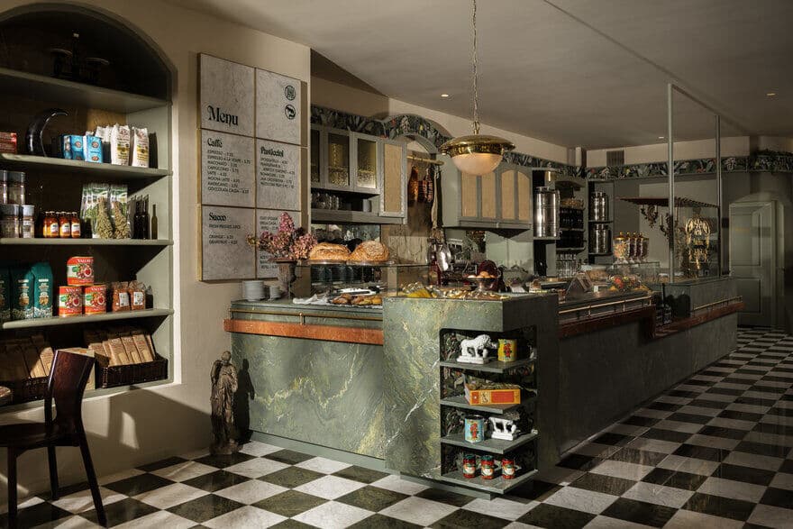
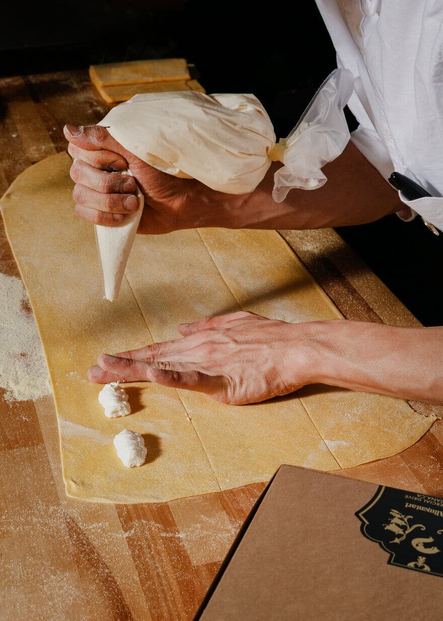
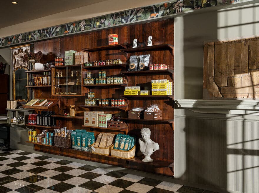
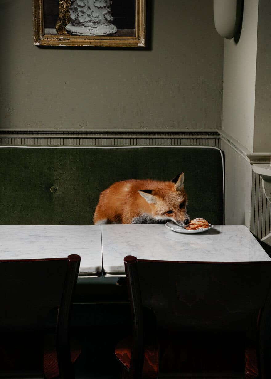
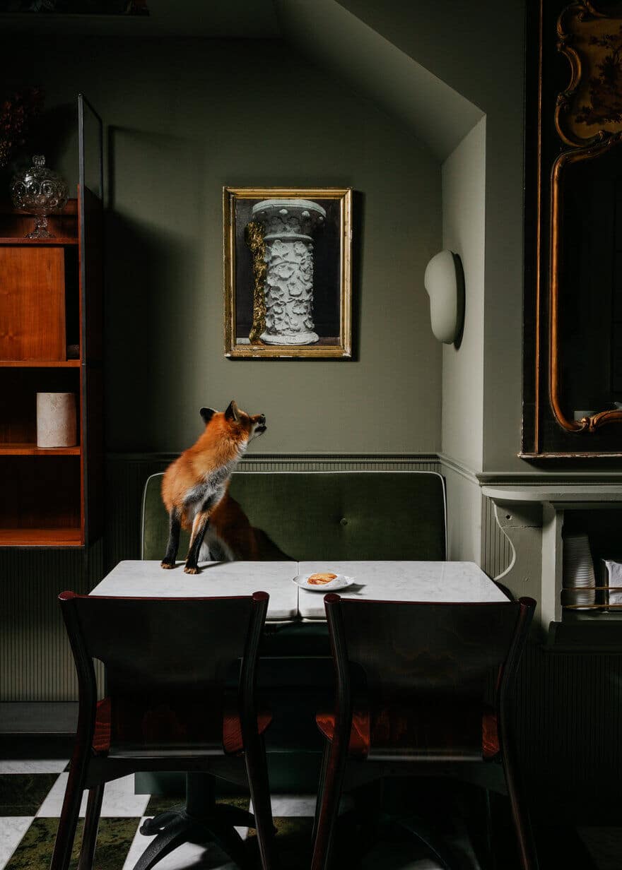
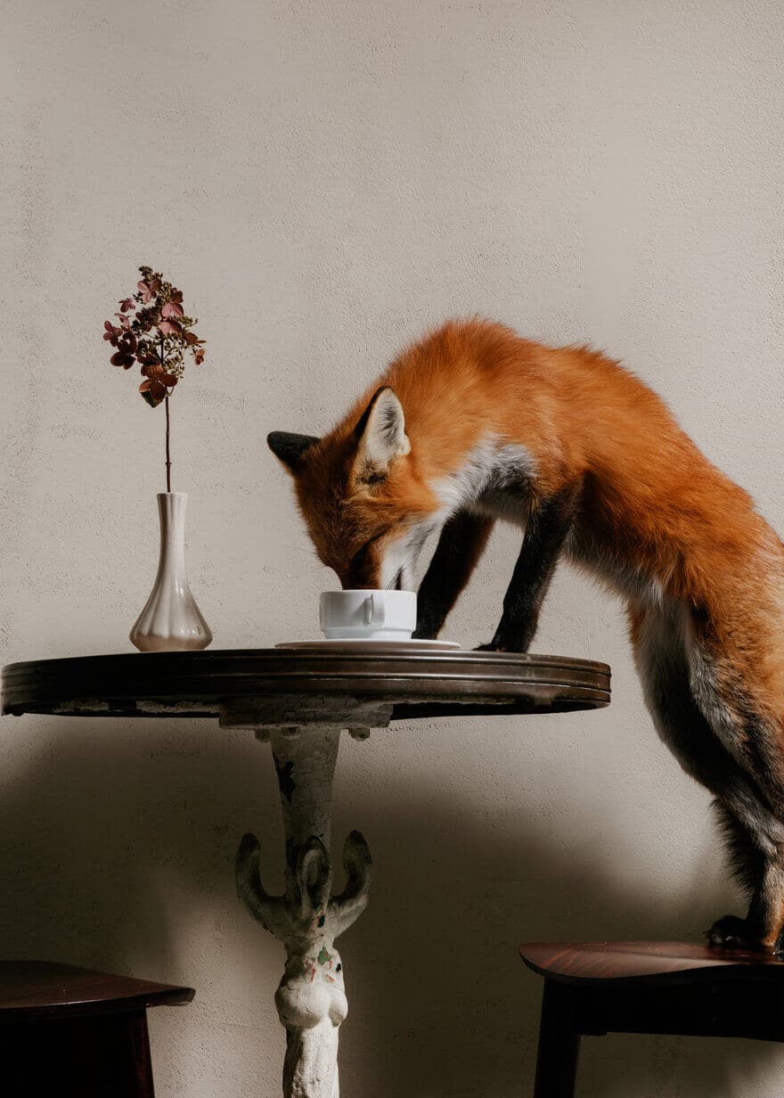
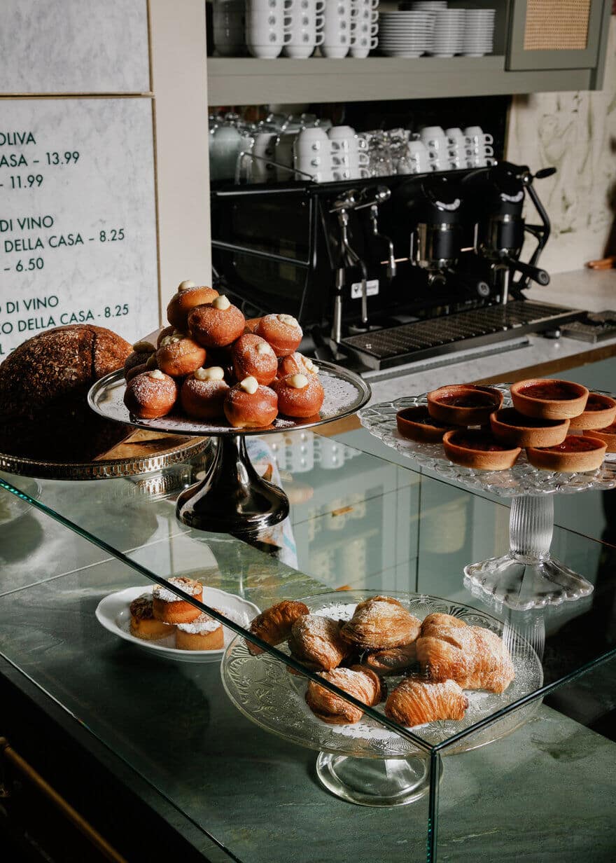
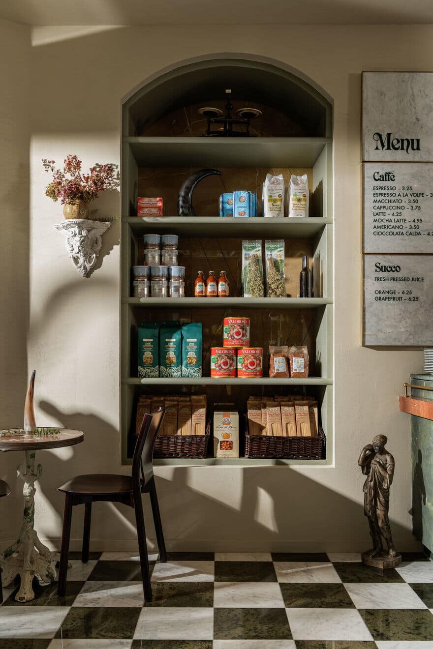
This fall the team behind Osteria Savio Volpe & Pepino’s Spaghetti House opened the doors of their third concept, La Tana– loosely translating in Italian to “The Den” and pointing to the idea that this was the home of our beloved Fox, Savio. An old world-inspired establishment, Caffe La Tana is styled after the Italian alimentari: a small, neighbourhood gathering place serving pastries and simple meals; brewing strong, Italian style espresso; making fresh pasta in house; and stocking the finest imported Italian meats, cheeses and dry goods.
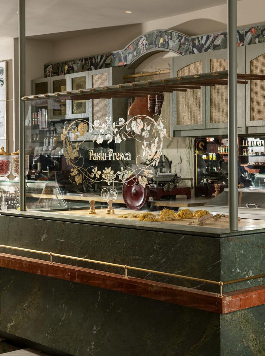
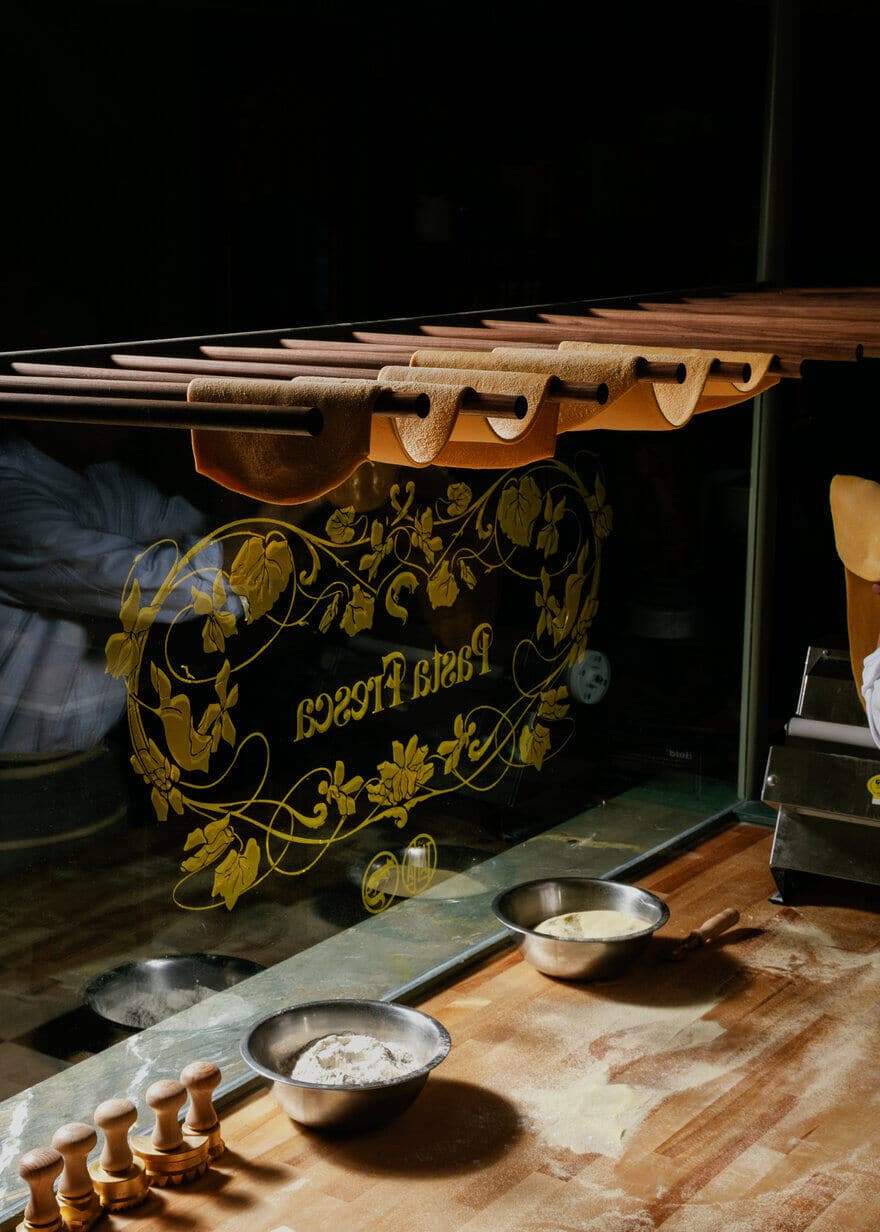
Strategy | Narrative | Concept Bedecked with deep green marble, antique shelving and custom woodwork, classic tiled flooring, and a tailor-made, hand-drawn wallpaper, the La Tana space, designed by studio, Ste Marie, evokes Italy’s elegance as influenced by Ste Marie’s eye for the unexpected. “We endeavoured for La Tanato be two things: elegant and effortless,” — a physical manifestation of the Italians’ age-old gift of making art out of life, as best exemplified by the Pasta Fresca station, where guests can watch the pastaio’s labour of love in progress. “Selfishly, I wanted a place that would bring me back to my favorite memories of traveling in Italy with my family and happening upon a tiny hole in the wall that turns out to be warm, welcoming and special.” -Craig Stanghetta
C.C: Carmen Cheung, Ste. Marie Senior designer and Project lead
C.S: Craig Stanghetta, Ste. Marie Creative Director and La Tana Co-owner
K.R: Kate Richard, Designer
What was the brief?
C.S: In this instance I co-own the place, so we are directing the brief in many ways. Our studio has a department that focuses solely on positioning, narrative and concept development and as such, that side of the studio took the lead on working with ownership, on getting clarity of concept, product offer, experiential opportunities etc. Frankly, I’d been wanting to do a little shop like this for so long. I had been squirrelling away little ideas and pieces of the narrative whenever I would travel to Italy or hear stories from friends and family about their favourite little spots. So this phase was mostly just us following our hearts and stomachs to unearth ideas that we selfishly wanted to exist in our backyard. The idea for the name was a play on the name of our other restaurant: Savio Volpe – La Tana being the idea that it’s the Cantina of our cunning fox where he keeps his treasures.We had also opened a small “Red Sauce” spot just next door which obviously skews to the New World interpretation of Italian cuisine so we really wanted La Tana to be the counterpoint to that in every way.Next door has the typical Red Vinyl booths and carpeted dinning room of those heyday joints in Jersey, NYC and Montreal so we pushed for this deep green palette for the neighbouring La Tana and we’re pretty iron clad that every choice here needed to skew Old World – albeit with a bit of irreverence and originality in the nuance.
CC: In this project our vision was to create a space that encapsulated the grocers/cafes in Italy during the 19th century, having that old-world Italian charm when you walked through its doors and imbuing a sense of familiarity, charm and comfort.
What are some design details? Materials used, color palette?
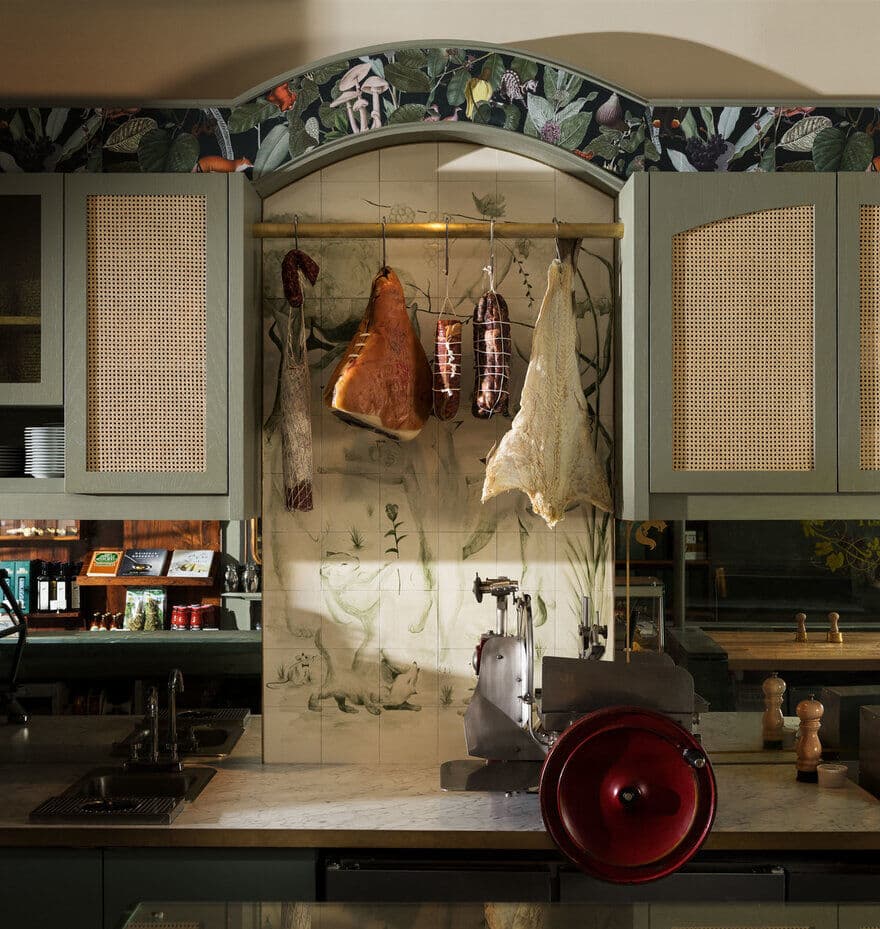
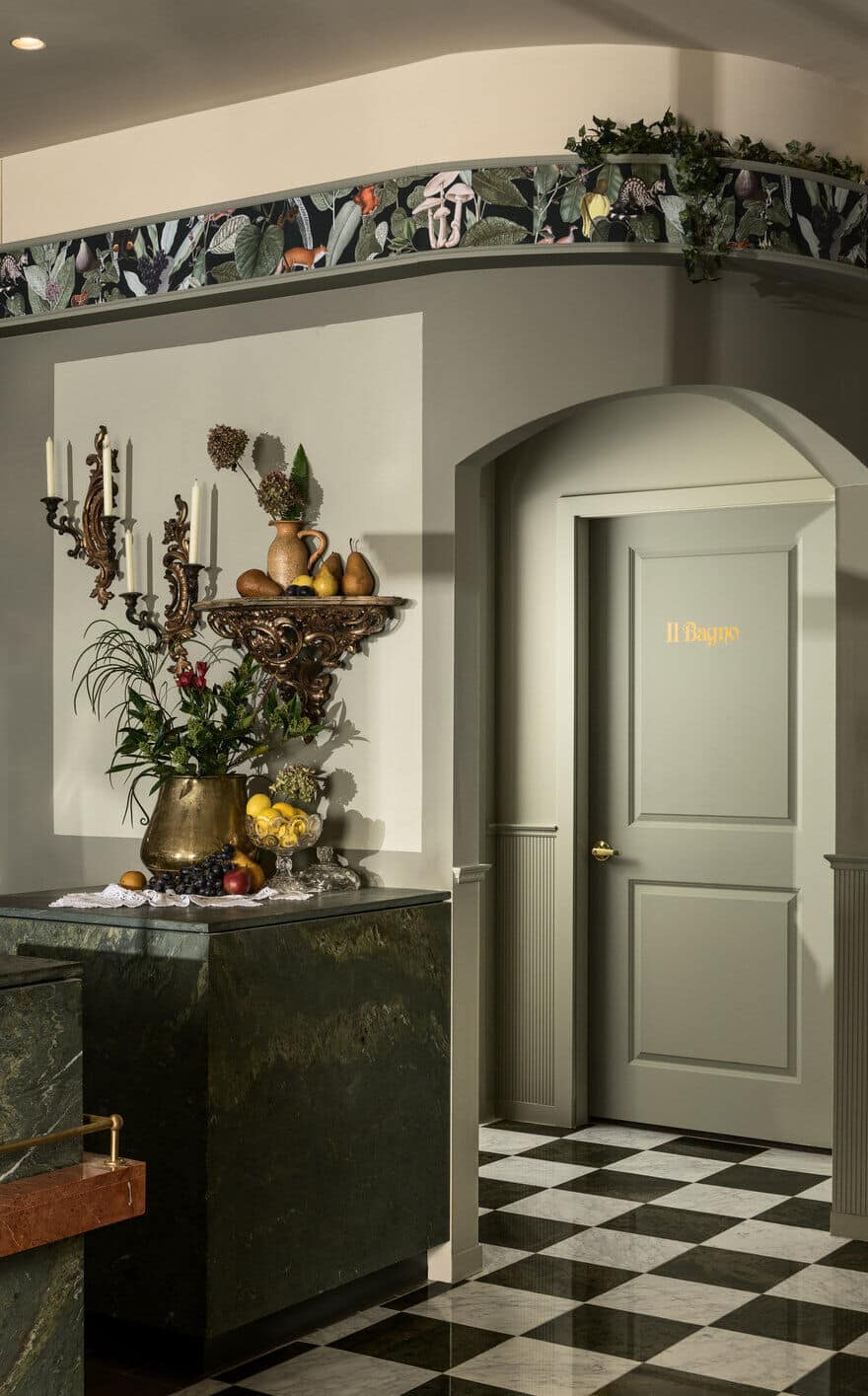
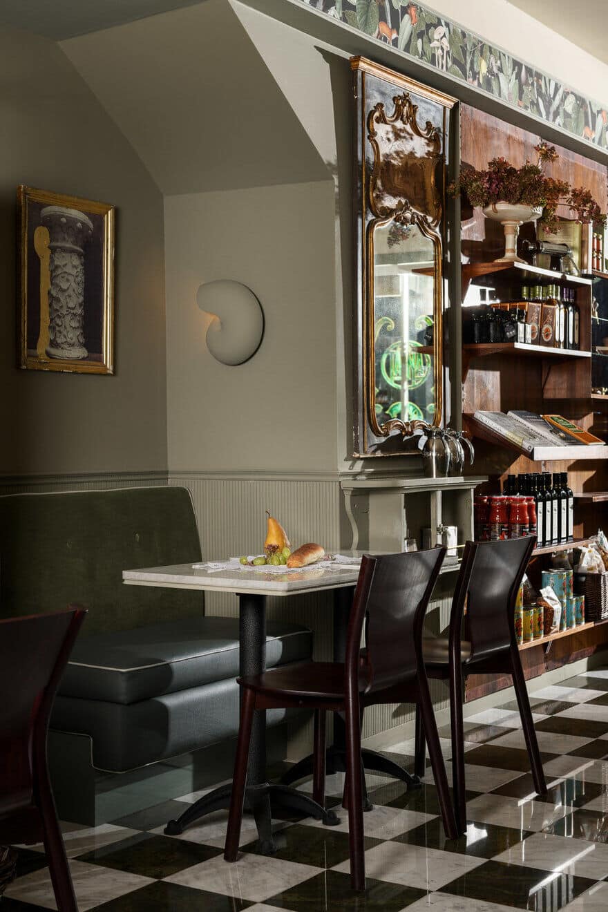
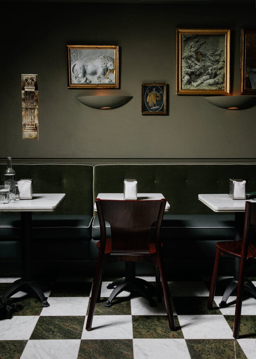
CC: Some design details include: A hand applied plaster technique, giving an aged surface texture on the walls. A custom designed wallpaper with images pulled from archived Pomology & Zoology textbooks. A colour pallet comprised of monochromatic, muted grey-greens tones with a selection of unique marbles layered throughout. Subtle hints of orange focus attention toward the front bar, accentuating the featured daily food offerings. One of the stand out pieces was the purchase of a rare brass pendant fixture designed by Luigi Caccia Dominioni in 1965. The warm glow can be seen from outside thecaféin the evenings welcoming you in.
C.S We also had our friend Antique and Architectural Salvage expert Scott Landon help us find some extremely rare Italian antiques, objects and fixtures. Including a 60 year old map of the Venice trading routes and a late 19th century Italian mirror. Another vendor that specializes in Italian plaster casting was helpful in creating ornate rosettes and wall mount sculptural elements. What I like the best however is the interplay between these classical elements and the more modernist forms of the stonework and custom art.
Could you speak a bit more to the wallpaper?
When asked to design the wallpaper for the space, I looked at it as an experiment in storytelling. I was brought on near the projects completion, so it was really fascinating for me to be able to see the design decisions of the space come to fruition and connecting them to the narrative in which they were informed. In turn, the wallpaper became a reflection of this narrative, exploring how the foxes den becomes this neighbourhood gathering place, where food brings community together. I had fun diving into the open source archives of various libraries/museums to source the content and actually ended up gaining a fair amount of insight on botany/pomology in the pr0cess. Visually, the design of the wallpaper was inspired by the walls of Victor Hugo’s Hauteville House and Carlo Mollino’s Turin apartment, Museo Casa.
Was the other custom artwork informed by a similar process?
KR: Carlo Mollino was a big inspiration throughout the process of most of the art. His 1945 Casa M2 Photo Panel was a single black and white photograph mounted on 25 separate panels. We found some Italian artwork in the New York Public Libraries Public Domain archives and placed it in 16 separate frames as a homage to Mollino’s work.
What were the challenges with the project? The solution?
CC: We were met with a few challenges when it came to building the glass enclosure for the pasta prep area and installation of the pasta drying rack. The original design included three glass sides but would have been difficult to secure in place. In the end, we decided to go with one glass panel at the front with 2” round poles on either side, extending from the marble counter top to the ceiling providing the extra strength needed. Securing the wooden dowels for the pasta rack was also tricky, as a lot of options would have either been too insecure, or taken away from the design intent. Craig came up with the idea of using a through hole, allowing us to then add brass finials at the end of each rod, which turned out to be one of the most interesting details in the café.
What was unique about the project location/ building. Did this provide design challenges?
CC: The location played a big part in the project, it was the perfect backdrop for Caffe La Tana because of its rich history and connection to the Italian community. Caffe La Tana is well suited for this neighbourhood which often is referred to as ‘little Italy’.
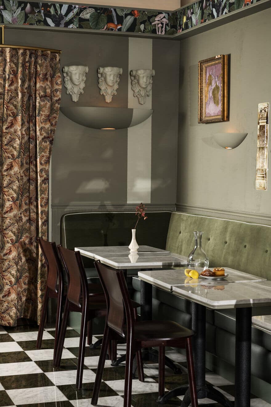
CC: We drew inspiration from Italian Architects Carlo Mollino, Carlo Scarpa and Austrian/Czech Architect Adolf Loos. Caffe La Tana is a reflection of their modern architectural style and minimalist design principals. Stone, marble and painted wood were used thoughtfully in order to set the framework and shape the interior forms, allowing them to almost feel sculpted from a common block of material/colour.
Any design standouts?
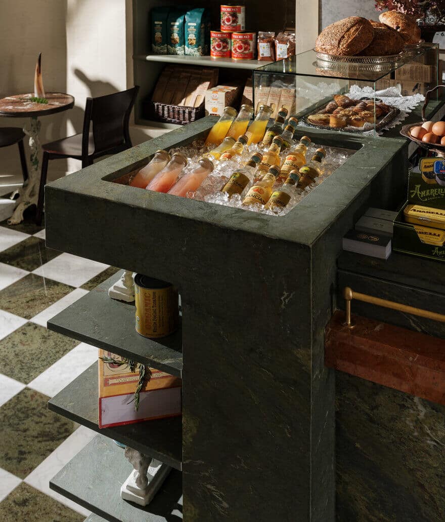
CC: My favourite feature has to be the front bar, especially the green marble with subtle hints of yellow and white veins flowing together. The striking orange marble ledge sweeps across the entire length, staggering at different heights as it draws your eyes further into the space. From there you continue to look around to uncover the many details that build on the narrative of the fox’s den.
C.S: I agree with Carmen – the bar is the lifeblood of the space. It grounds everything and allows us to sort of dance around the space creating visual interest in every tiny nook and cranny. Without it I feel the space would be a bit whimsical and not have that firmness and conviction of what you’re lucky to happen upon in the ancient towns throughout Italy. So much of this place is an homage to the nobility of material, craft and culture that we couldn’t stop short and needed to lean into the old materials and techniques of the bygone masters. That said we also have been having a lot of fun finding new interpretations of old imagery and executing them in new ways. You can see it in the custom work we had commissioned and in other pieces we executed in house. We worked with a local artist James Daviduk to hand paint another standout feature: the custom tile backdrop for the meat station which features our hero fox surrounded by a bounty of food and being hailed by his fellow forest creatures! Oh, not to mention we have an extremely gifted designer within the studio Kate Richard who designed our wallpaper and custom artwork throughout.

