Project: Choc House
Architecture: Yael Perry Interior Designer
Location: Even Yehuda, Israel
Total Area: 220sqm & a garden
Year: 2023
Photo Credits: Karin Ravenna
The CHOC house, a four-story house previously designed in a rustic style and plagued by numerous infrastructure issues, underwent a comprehensive redesign and renovation process. This extensive renovation project breathed new life into the home, removing old interior partitions and a harmonious blend of straight lines and soft, round details.
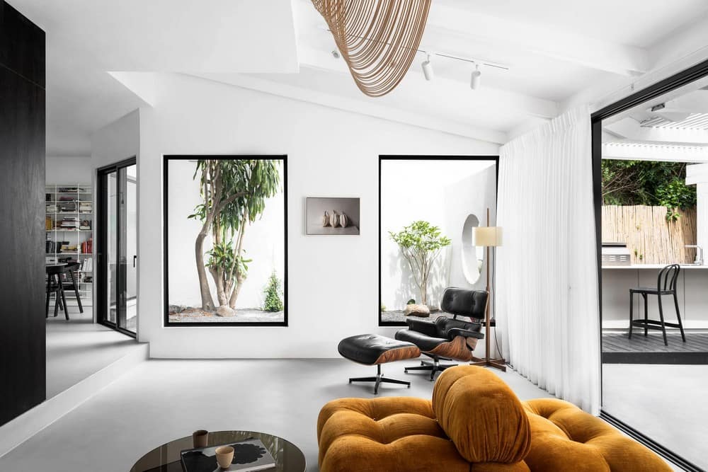
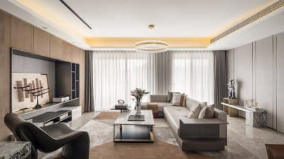
The result is a minimalistic and modern space, drenched in monochromatic grays and chocolate hues with subtle hints of orange and pink. Natural, exposed materials such as stone, wood, stainless steel, brass, and glass contribute to its unique character.
The Entrance & Lower Levels:
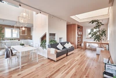
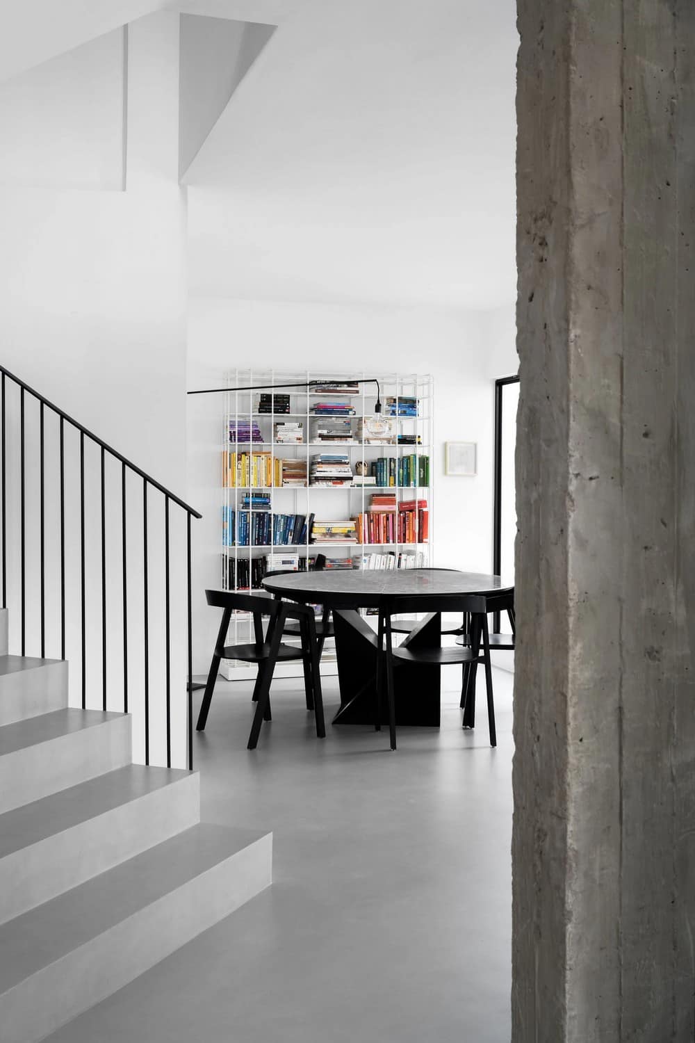
The entrance level of The Choc House welcomes into a bright, open expanse encompassing the kitchen, dining area, living room, and garden. All traces of the old rural design, including interior partitions, were demolished, creating a wider, brighter open space.
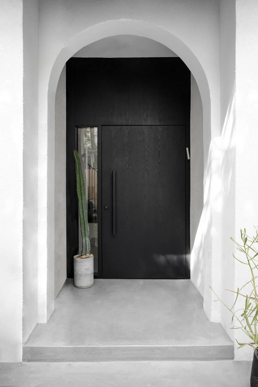
A bespoke wooden door, Integrated in a glass opening, surrounded by an arc marks the entrance, while the removal of an old gallery above the entrance creates a double-height airy & bright space.
The wall that once separated the entrance from the kitchen has been dismantled, opening up the space to reveal an unobstructed view of the kitchen, dining area, and the generous natural light that pours in.
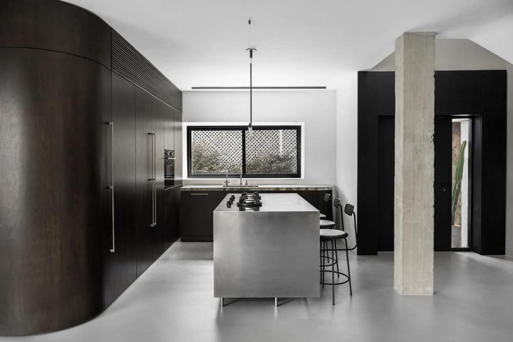
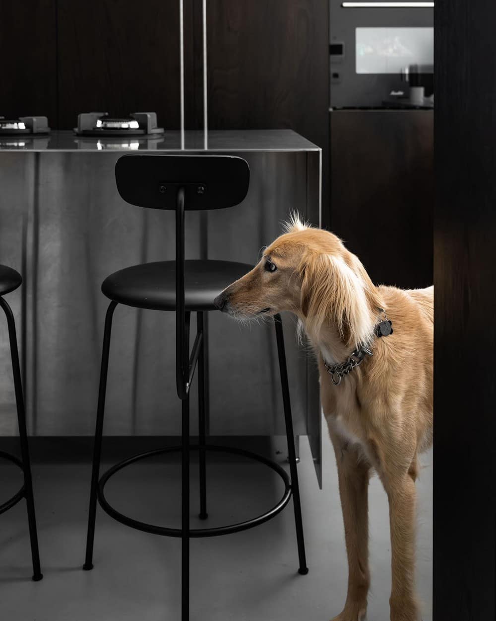
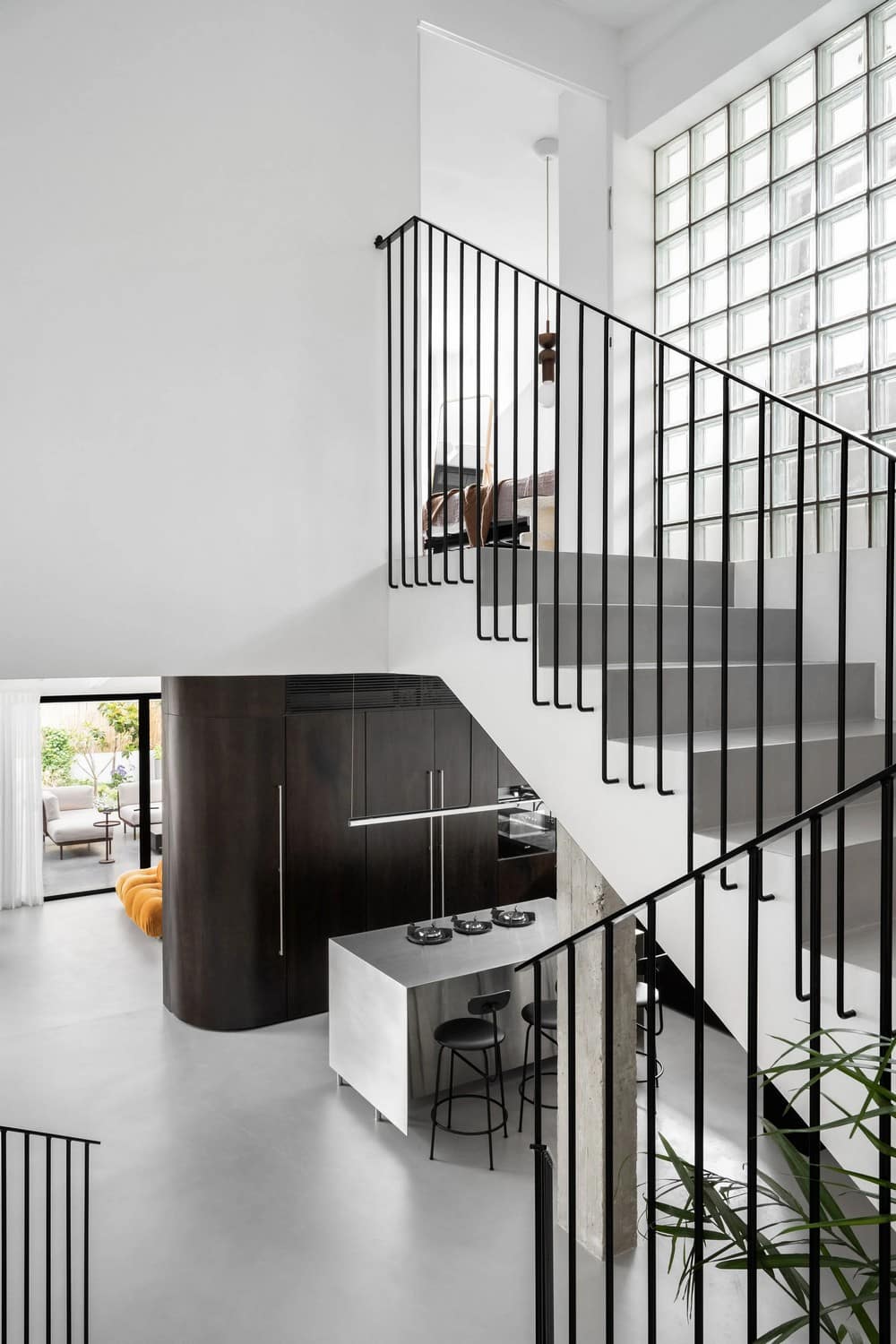
The kitchen combines various materials such as wood, stone, stainless steel, and Rezina. Floor-to-ceiling cabinets efficiently hide kitchen appliances, with a circular door seamlessly connecting the kitchen to the living room. The cabinets stand on a higher level than the living room, creating a combination of the wood, wall & Rezina floor.
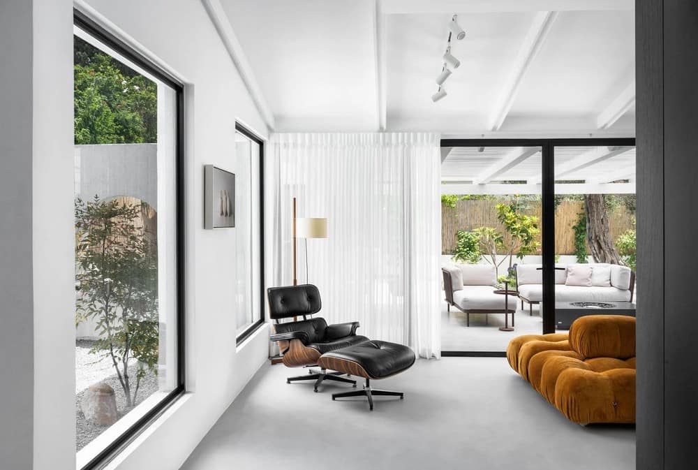
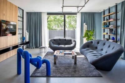
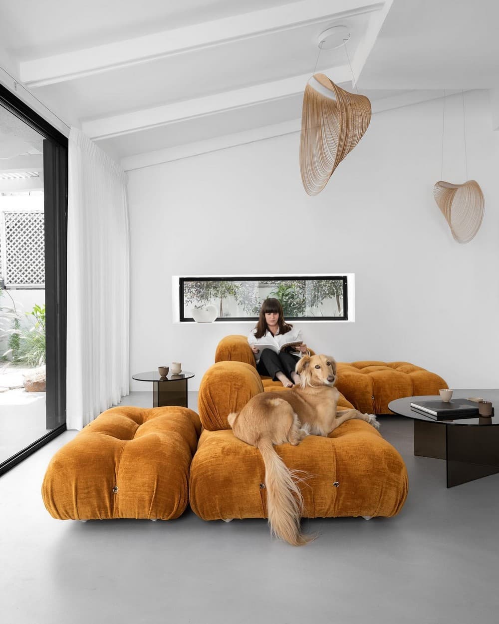
The sink cabinet, with its rounded side panel, harmonizes with a natural stone surface, exuding warmth and functionality. At the heart of the kitchen stands a stainless steel kitchen bar, used for culinary endeavors and casual dining. The kitchen leads to the living room and garden level, with both spaces adorned in shades of gray. An orange modular sofa, in the center of the living room, as a focal point, captures the vibrancy of the fruit trees in the living area.
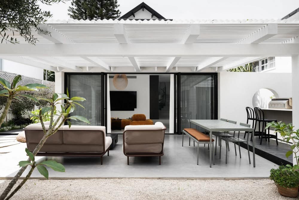
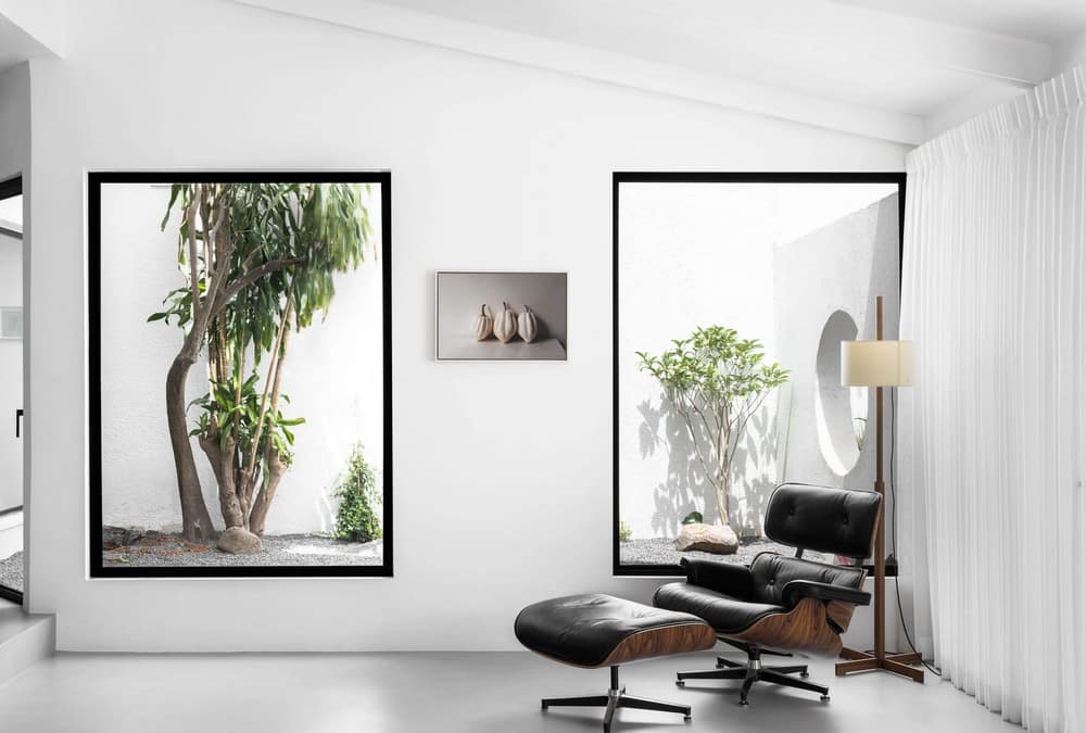
This versatile sofa adapts to the family’s needs, easily transitioning from television viewing to entertaining guests.A minimalist patio, adorned with tiny basalt stones and subtle greenery, maintains a clean and inviting aesthetic. Between the patio and the garden, a circular opening was created to connect between the spaces. The garden, an extension of the house’s design philosophy, features smooth concrete flooring interspersed with basalt stones. In the center of the garden, next to the outdoor kitchen, located an outdoor seating combination with a table combined with a fireplace used for pleasant sitting in all seasons.
The Staircase:
In this interior design project, we executed a comprehensive renovation of the staircase, delivering a transformative result. The staircase underwent a complete overhaul, including the removal of the existing stair covering and railing. During the meticulous renovation process, we expertly applied Rezina to the stairs, creating a minimal monochromatic and durable surface. To seamlessly integrate the staircase into the overall design concept of the house, we crafted a bespoke iron railing with gentle curves, enhancing both aesthetics and functionality.
The Upper Levels:
Previously, the area near the master and the staircase housed a gallery that lacked structural support and felt enclosed. This space underwent a significant transformation, with the removal of the gallery and the closing of the opening with glass bricks. These glass bricks not only flood the home with pleasant natural light but also visually connect the entrance to the rest of the house.
On the upper level, located the master bedroom. During the demolition process, all interior partitions were dismantled, and the ceiling was meticulously treated to ensure structural integrity. This space continues the design ethos, combining geometric lines with soft, rounded elements.
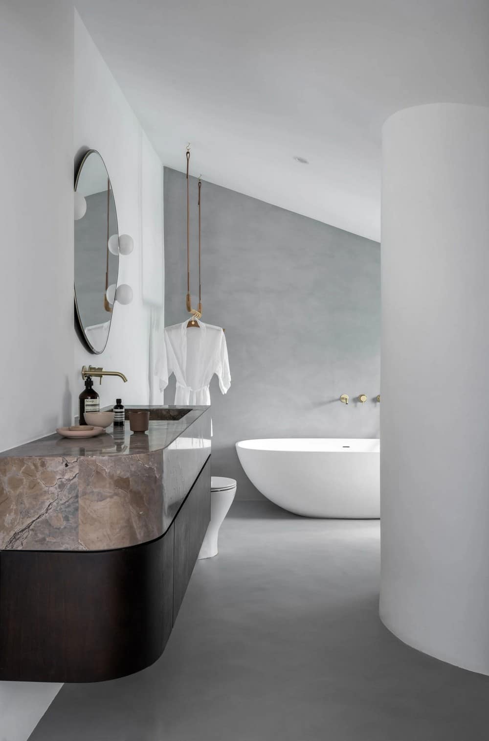
The minimalist bathroom boasts a free-standing bath set next to the shower. A new curved concrete brick wall frames the shower, creating a serene space. The master bathroom combines gray shades, brass accents, and deep chocolate shades of wood & natural stone. a curved sink cabinet floats above the minimalist gray Rezina floor.
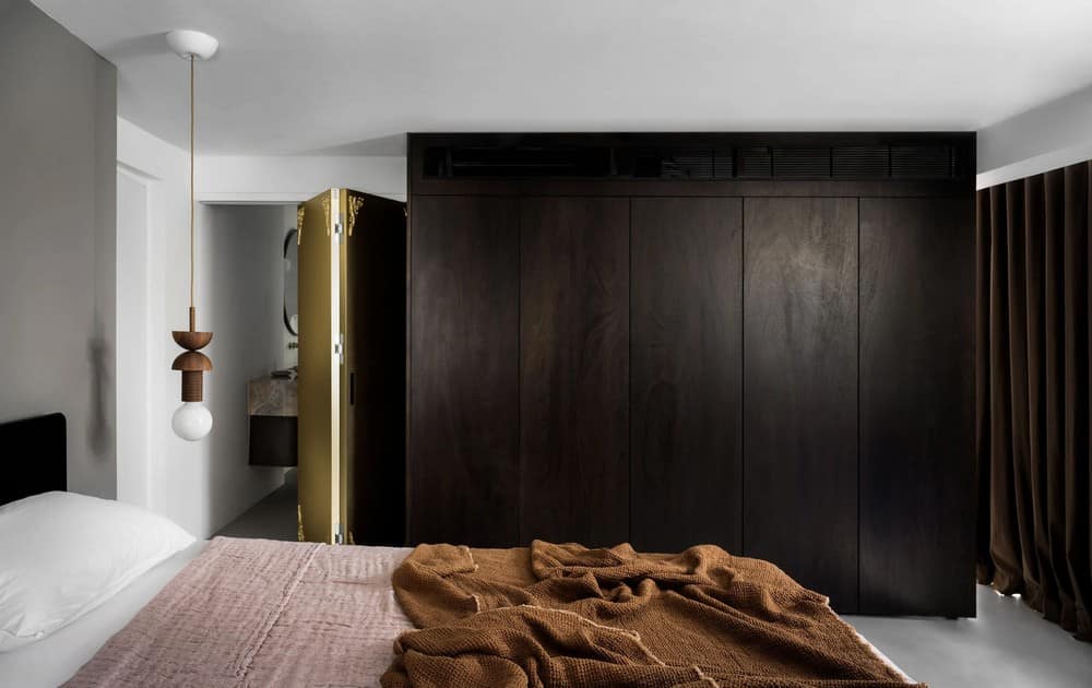
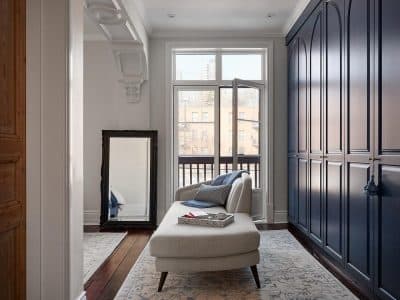
A double-sided wardrobe, painted in a rich chocolate hue, adds a touch of luxury. A custom-designed Harmonica door, adorned with decorative elements, complements the minimalist taps in champagne tones.
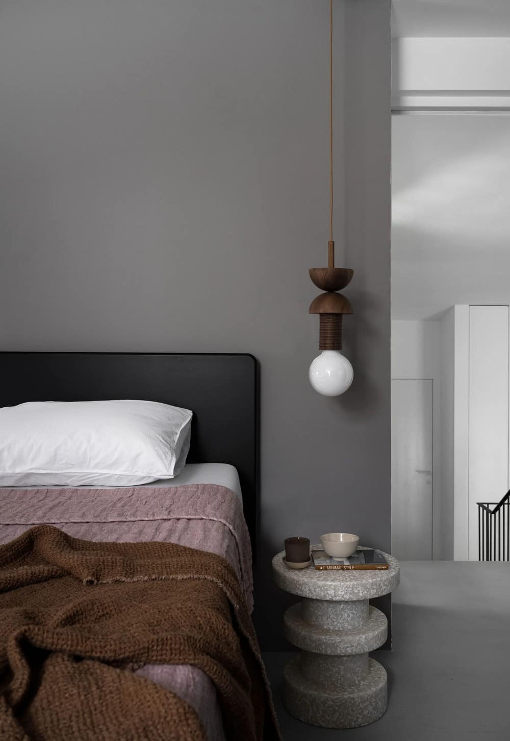
The Master bedroom walls are applied in gray Rezina as the rest of the house, with a spacious, minimalistic bed positioned centrally. Nearby, a cozy work area invites productivity in a serene setting.
The Basement:
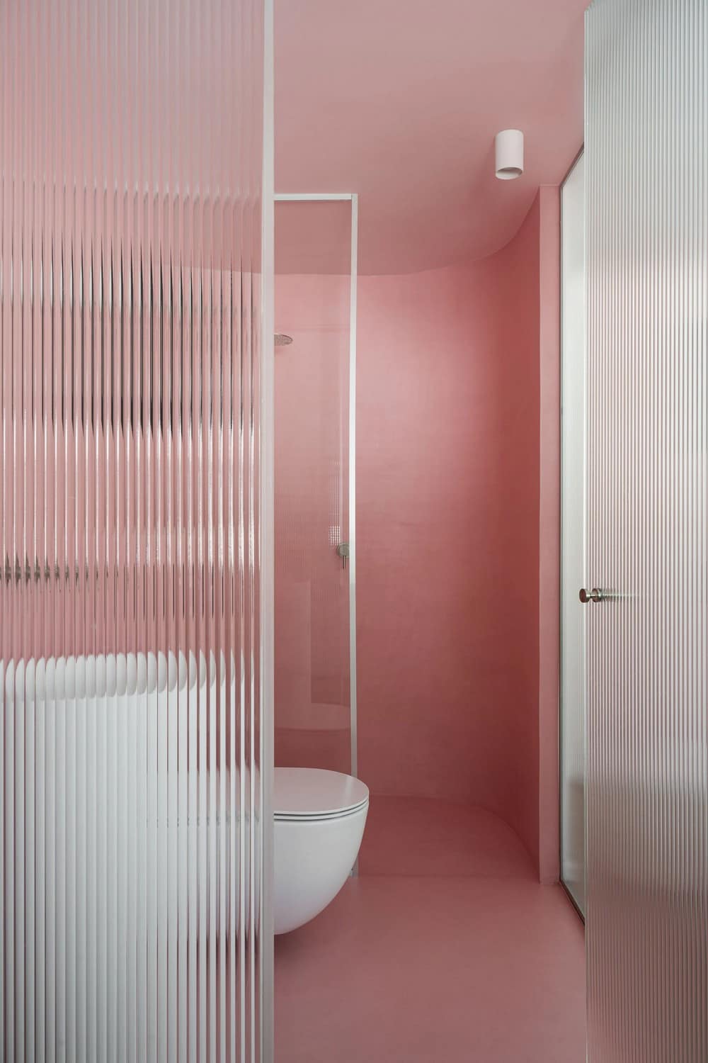
The basement floor, previously a maze of cramped and non-functional spaces, now serves as a versatile open living area. All interior walls were removed, creating a cohesive, functional space. The bathroom, primarily used by the younger members of the household, features an inviting pink tint, framed by a curved wall and continues the circular design language found throughout the house. A glass partition separates the bathroom from the living area, maintaining privacy while embracing the open concept.
In conclusion, The Chocolate House stands as a testament to the transformative power of interior design. It seamlessly blends the old with the new, geometric & curved lines, celebrates natural materials, and creates a harmonious and functional living space.
