Project: Clark’s Oyster Bar
Architecture: Clayton & Little
Team: Paul Clayton, Principal / Sam Manning, Project Architect
Interior Design: Clayton & Little in collaboration with McGuire Moorman Hospitality
Contractor: Burnish & Plumb
Landscape Architect: NDLI
Structural Engineer: Floyd Goodrich
MEP engineer: TTG Goetting
Location: Austin, Texas, United States
Photography: Casey Dunn
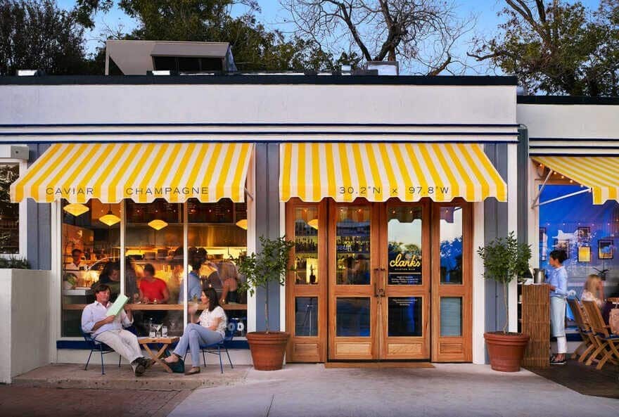
Clark’s Oyster Bar is a remodel of a 1940s building that once housed a former restaurant and before that an auto repair shop. On the edge of the historic Clarksville neighborhood and a commercial strip, Clark’s is positioned as Austin’s definitive neighborhood oyster joint. Clayton & Little worked closely with the owner to revitalize this 1,400-square-foot gem from the inside out.
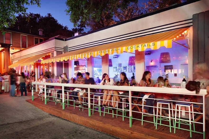
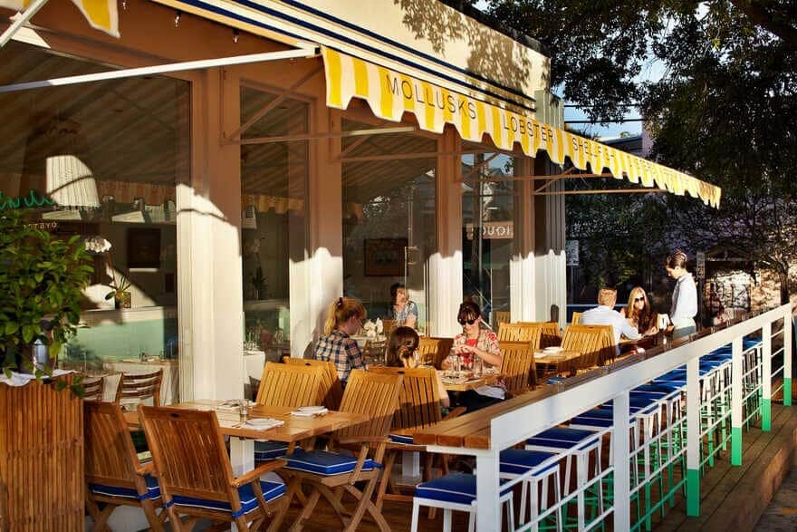
Exterior work included a new insulated roof, accessibility improvements, and a south facing wood deck covered by awnings to create an intimate outdoor dining area. Taking advantage of Austin’s warm climate, the new patio significantly increased the restaurant’s capacity while maintaining the charm and energy appropriate for this small neighborhood restaurant. The restaurant seats a total of 67 customers; about half of the seating is inside while the remaining half is outdoors.
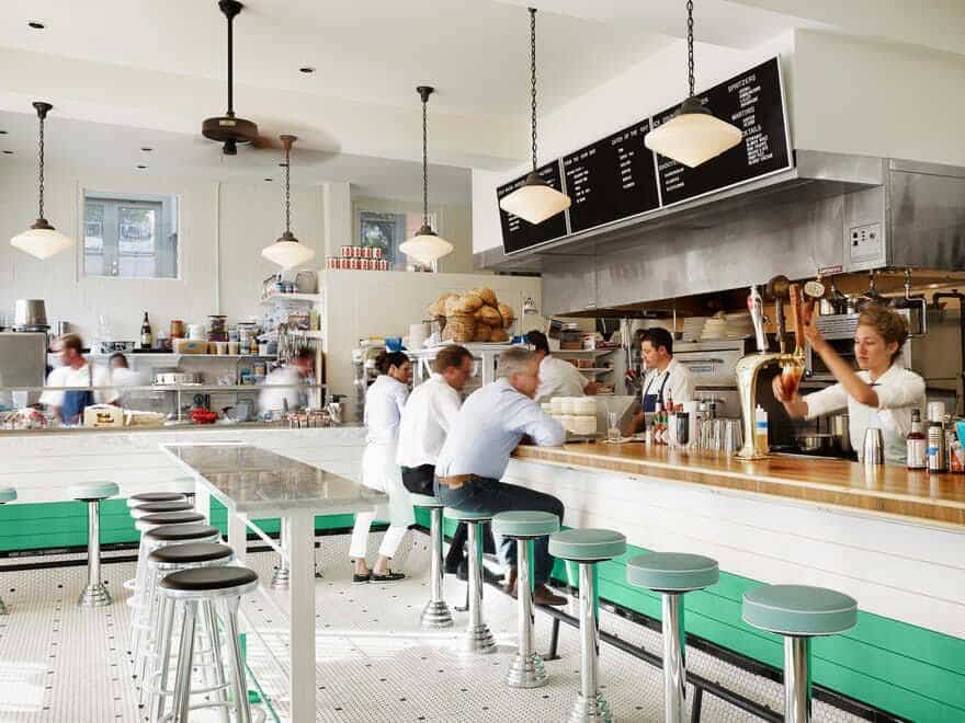
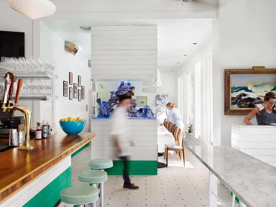
A refreshed open-layout kitchen with all new equipment opens up to the bar and dining area, clustered around a 300-gallon aquarium. Diners have the option of sitting in the bar area open to the working kitchen and oyster bar, at a quieter dining table inside, or outside on the patio.
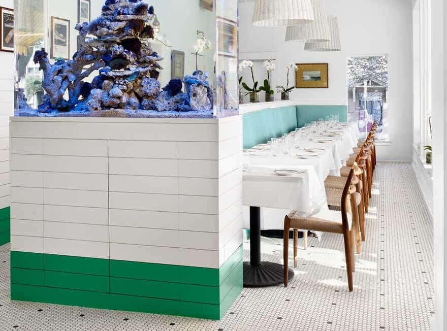
The new aquarium was positioned between the lively bar area and the quieter table seating to create a visual barrier between the spaces. The aquarium also helps cut off visual access to the restroom doors and service area walkway at the rear of the narrow building.
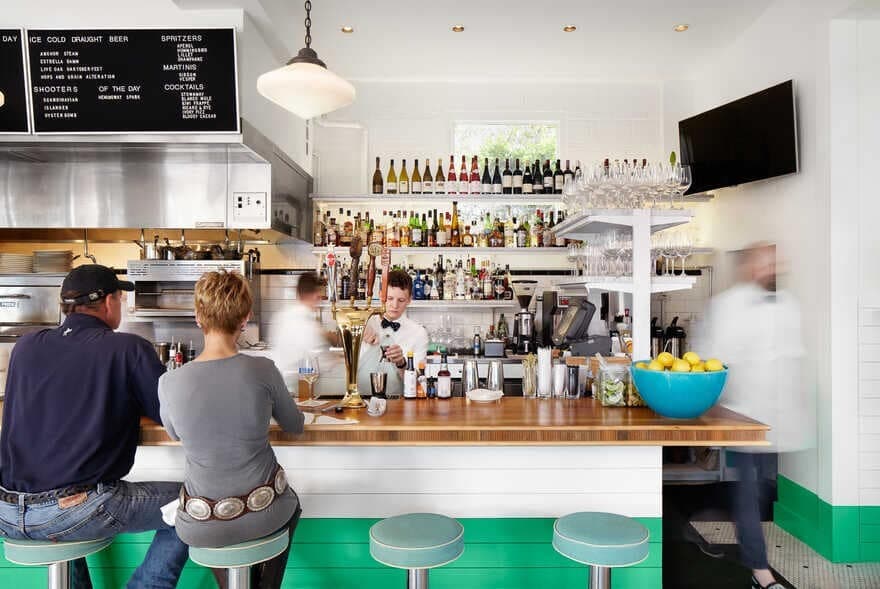
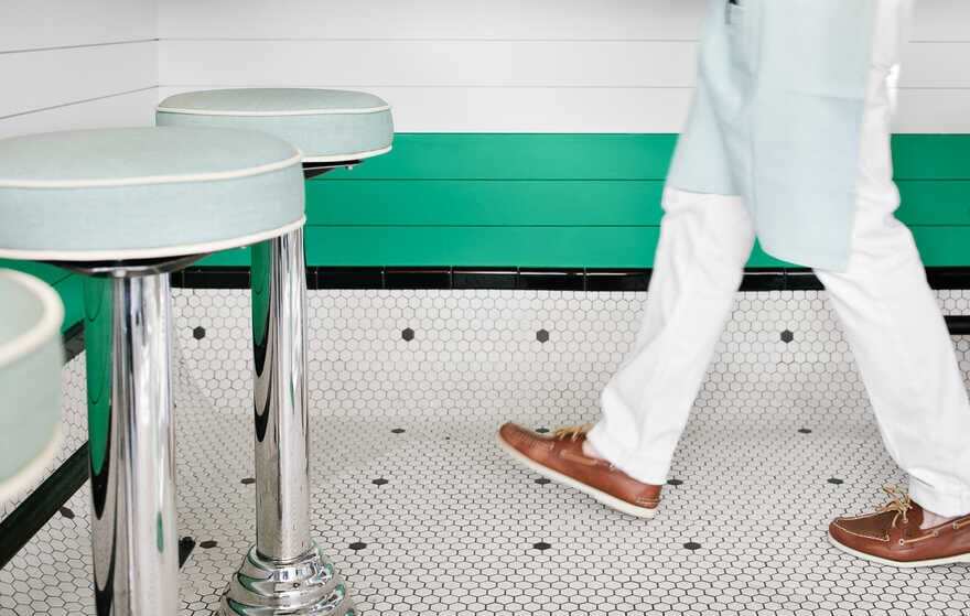
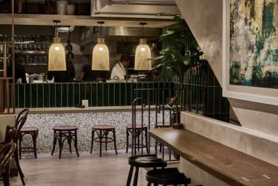
The material and color palette are simple, yet rich, with subtle nautical cues to reflect the menu. Stained pecan-topped bar with fixed chrome and fabric bar stools face the working kitchen and a polished marble-topped bar faces the oyster station. Patterned white and black hexagonal tiles are used on the floor, while white and green wood paneling lines the walls. White walls and tall ceilings create an open and airy space. New schoolhouse style pendants in the bar area add a vintage feel. White rattan light fixtures hang above the seated dining area with durable wooden and woven wicker chairs.
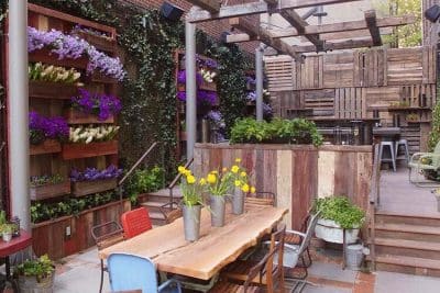
The patio runs parallel to the dining room inside. Stools line the outdoor bar while wooden tables run along the windows. The outdoor patio includes a simple, thermally modified wood deck, coated metal railings and stools in white and green that match the interior paneling. Yellow and white striped awnings cover the patio and provide shade throughout the day.
Through a close collaboration with the owner, elegant and cohesive interior and exterior spaces with subtle nautical elements were achieved with basic materials and simple yet meticulous detailing.

