Design: Nihil Estudio
Project: Coconut Pasteleria
Location: Av. al Vedat, 180, Torrent, Valencia, Spain
Area 190m2
Year 2017
Photography: Courtesy of Nihil Estudio
“Patience is a virtue that every good baker must know how to grow”. Starting from the bases of -all good confectioner- and finding a place with no affable initial characteristics to the sweeten experience that is supposed to be enjoy eating and also elaborating, a good sweet, Nihil Estudio went into a project that talks about pampering and taking care of all the details.
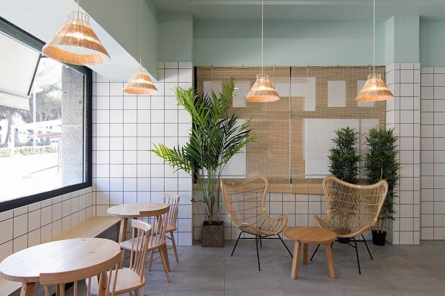
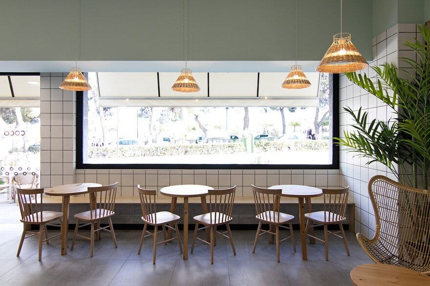
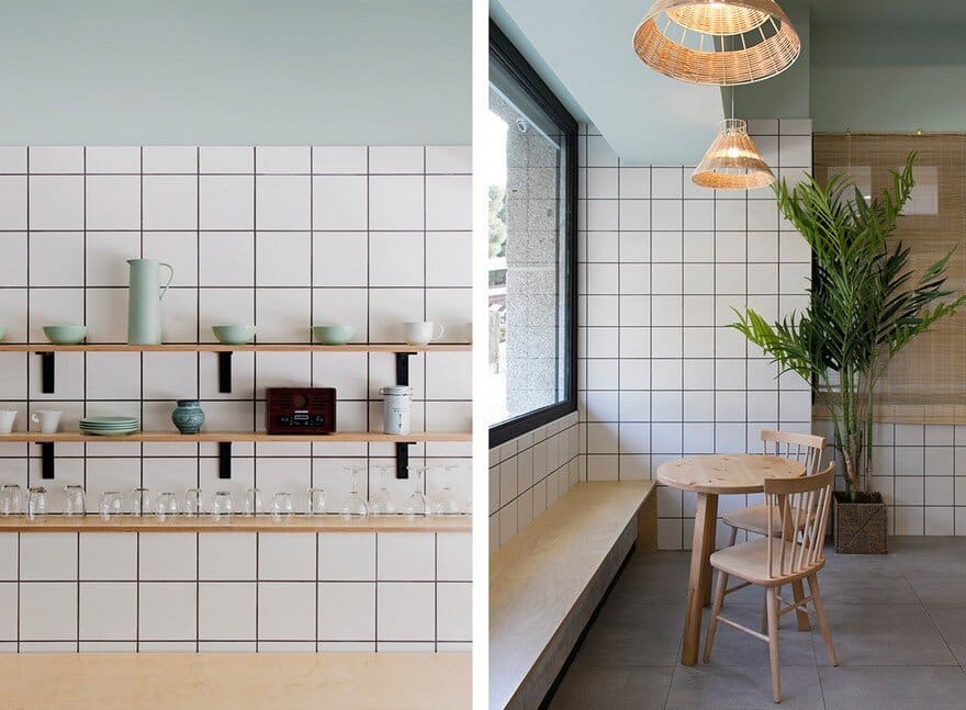
Just as the best confectionery requires quality in the ingredients and care in the disposition of each cake, from Nihil Estudio this pastry was treated as if it were a portion of itself. With a materiality that fragments the space horizontally, three layers of materials, textures and different chromatic ranges are generated to make a nod to the ingredients of a cake. With a painted tile base, the tiled walls and ceiling, which culminates in green with a pre-existing moldism, reminds us of the part that embellishes and culminates the sweets. This element also crosses and connects at the same time the area of the shop and the zone of purchase and consumption of Coconut Pasteleria.
It is the idea of a portion of a cake leading into interior design. An apology that Nihil Studio extends throughout the entire premises, passing through the open areas to the public and giving the work areas a meticulous aesthetic, favoring not only the enjoyment of the diner, but also the worker.
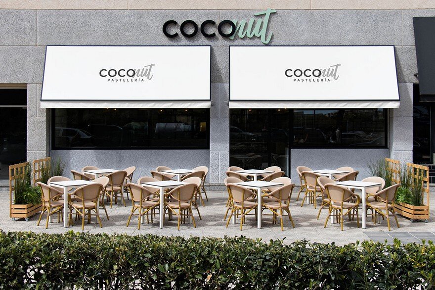
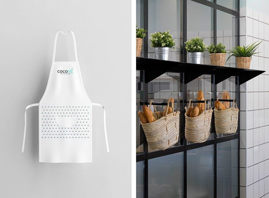
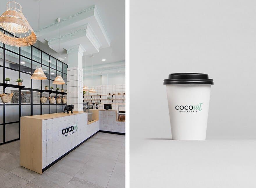
Coconut Pasteleria borns from the respect to the technique and the artisan quality of the pastry work, praising it with a language that goes towards the most contemporary confectionery. Following these premises that speak of tradition and avant-garde, spaces of work more spacious, comfortable and aesthetic care. That is how from Nihil Estudio, Coconut Pasteleria was equipped with a new workshop that opens to the public with a glass, serving as a claim, showing transparency in the production systems of the product and allowing the entry of natural light into the work áreas. Even from the street you can appreciate the craft work, opening it to the outside generating a continuity into the space, being able at the same time to privatize and preserve the privacy of the worker. On the other hand, expository elements are generated that appear in the shop’s own window and baskets as hanging elements that recall the most traditional part of this work, also serving as a support to the counter.
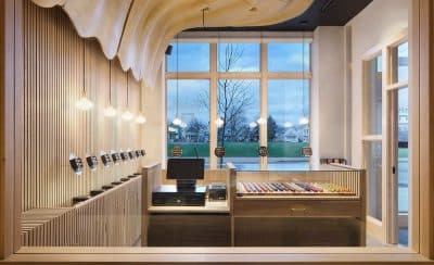
This opening of the craft part from the trade, enhances the enjoyment of the final customer, opens the pastry chef to the public, showing the craft of the handmade product. A feeling that is accompanied by a counter, where the client can find two product displays. This element embraces the space from the entrance and is able to distribute it, generating movement within the premises and marking the circulation that is divided between the shopping area and a small cafeteria area.
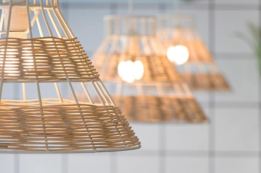
The wood and wicker extends in the room in the elements that the client can “touch”. The warm contact of the bar, the chairs, the tables and even the lamps, have been provided with these materials to enhance the feeling of comfort in the final customer. This link between the traditional and the avant-garde extends from pastry to graphic design. A work that combines different design techniques within Nihil Estudio maintains the essence of the premises, dividing between rigidity and movement. A combination of fonts and colors that, like the interior design of the bakery, generates a harmonic flow between both systems.
The material and chromatic combination carried out in the interior design, now embraces the graphic design. They also study the labels, cards and even the clothes of the workers, and a packaging that goes from the boxes for the cakes to the coffee glasses. A 360º project that Nihil Estudio translates the nature of the pastry to design in all its disciplines.

