Project: Dropbox Office Expansion
Architects: Perkins+Will
Location: Austin, Texas, United States
Area: 3,700 sqft
Year 2018
Photography: Casey Dunn
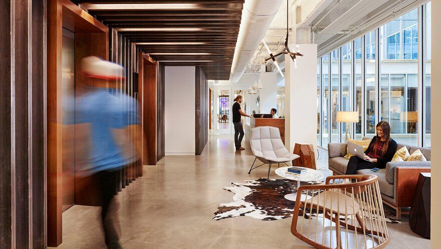
With more than 500 million users and over 300 thousand apps built on its platform, Dropbox is a game changer in the tech and business industry. To continue its global growth, the company expanded to the heart of Austin, TX into three levels of a Class A building on Congress Avenue. Perkins+Will worked hand-in-hand with the company’s internal culture and facilities team to create a space that reflects the Dropbox’s mission to unleash the world’s creative energy by designing a more enlightened way of working.
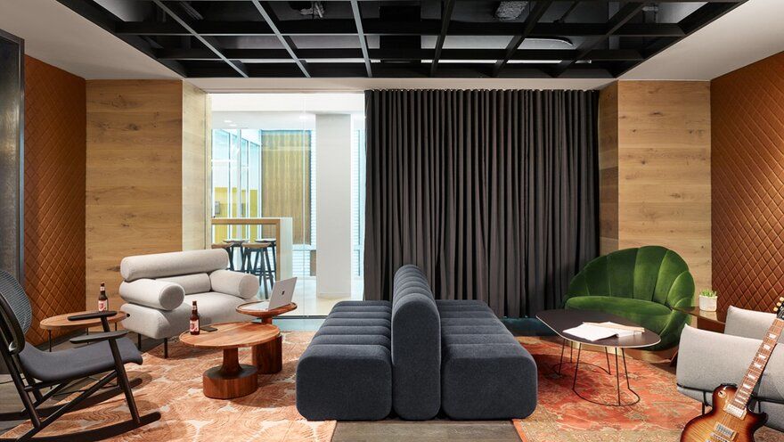
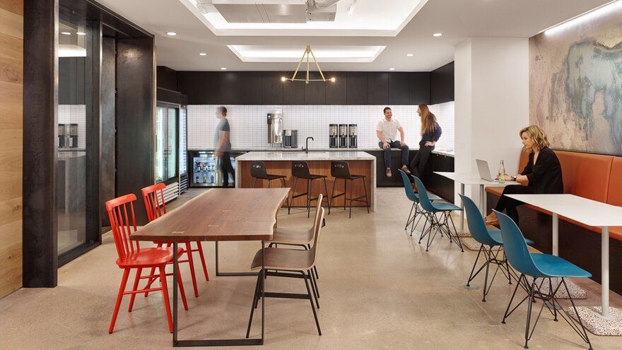
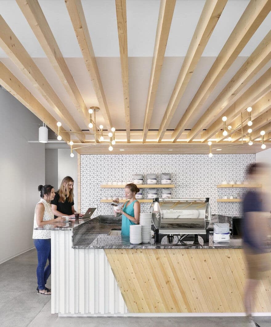
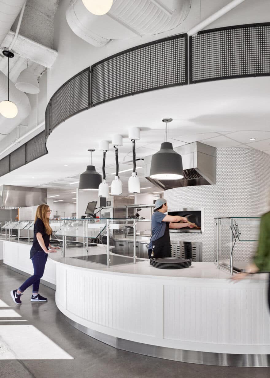
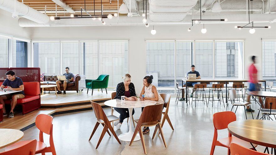
Level 4 was built out as their original office space in 2015 with 2 more recently completed expansions on Levels 3 and 5 in 2018. This new workplace blurs boundaries of work and hospitality spaces making the new office landscape an extension of daily life. The design achieves its intent of flexibility and freedom to best suit the creative and collaborative work style that defines the Dropbox culture.
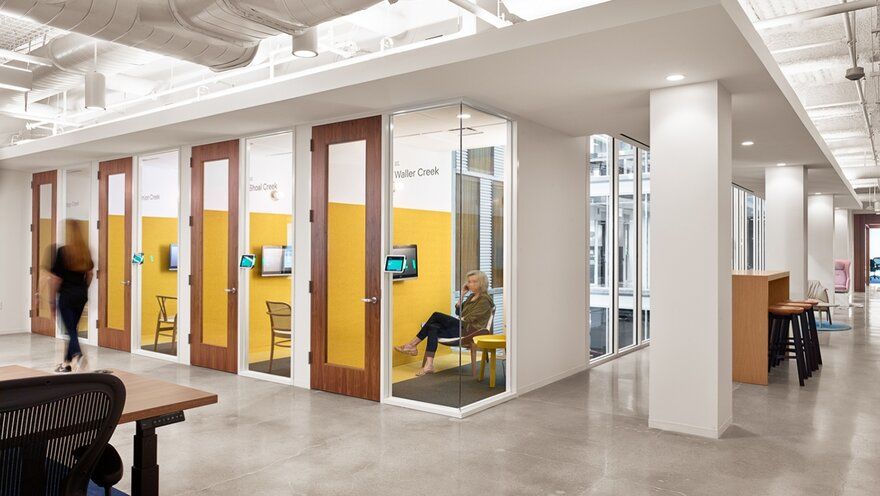
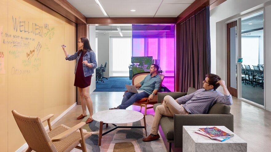
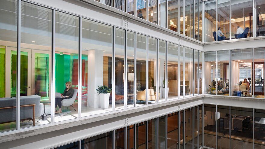
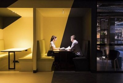
For the recent expansion levels, Perkins+Will cleverly integrated hues from Dropbox’s branding guidelines to designate destinations, utilizing glass walls with colorful dichroic film in the lounge areas.
These walls create elements of surprise and delight, and are enhanced when juxtaposed with the wood surrounds and textured natural materials of the furniture in these spaces. The entry area on this floor features another glass statement wall with dichroic film that incorporates all of the colors used on the floor. These elements are located directly adjacent to open work areas serving as collaboration and relaxation areas.
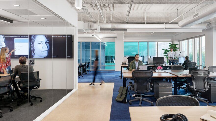
For their expansion space, the power was embedded in floor raceways at every 14 feet with completely mobile sit-to-stand desks to allow each team to configure their area as they like — giving each employee choice in how they work. The evolution of the power system opened up the visual landscape and has created the maximum flexibility within the workstation area; shifting the open area into a lab-like experience.
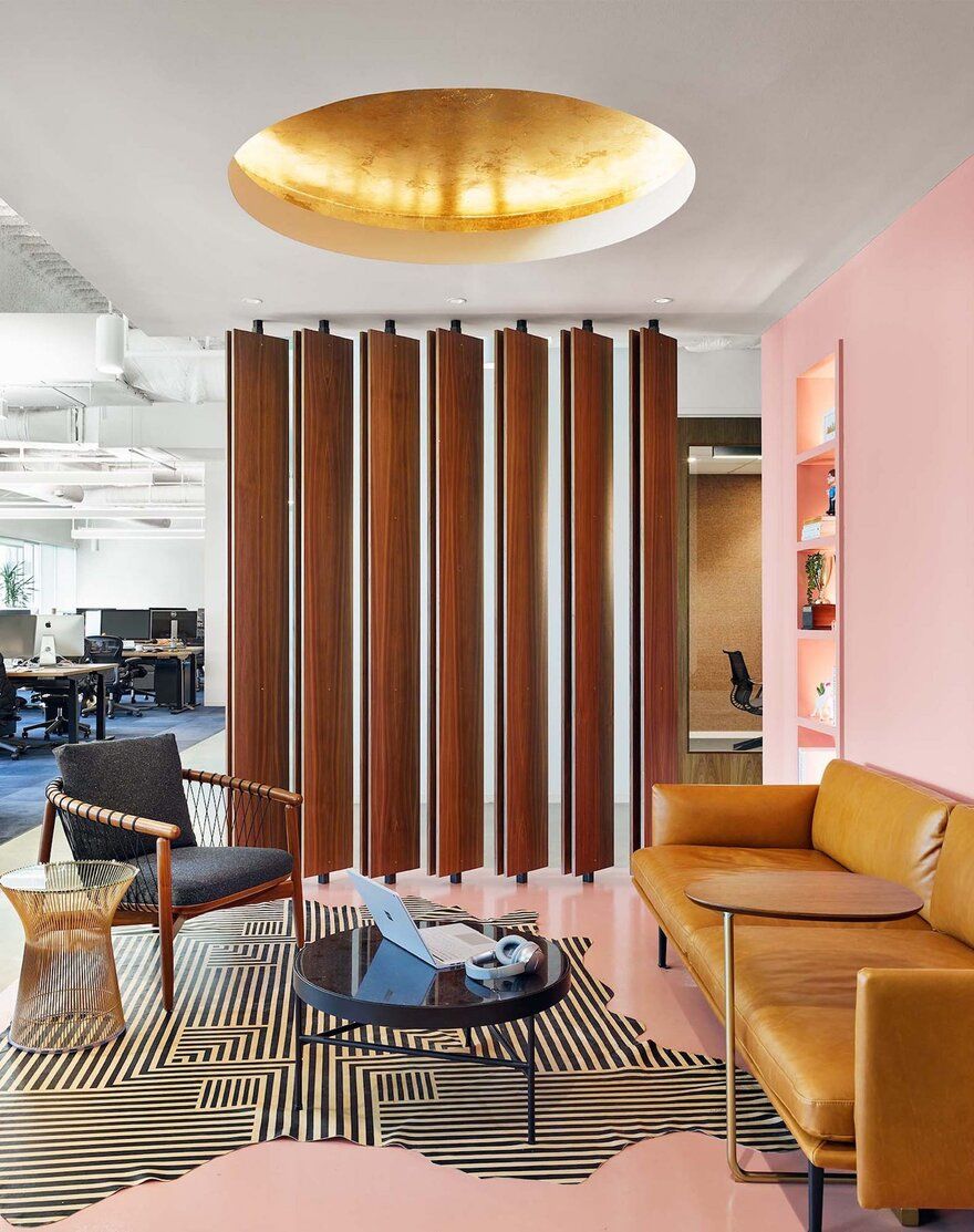
Rather than focusing efforts on physically branding the office with the Dropbox logo, the client sought to create a seamless fusion of the existing office with the company’s new branding and developed culture. This involved a thoughtful selection of materials and furnishings, as well as lighting and architecture that evoked specific emotions. These elements, combined with saturated accents that subtly reference the branding, tie the new space in with the rest of the office and successfully illustrate the company’s growth.

