Project: Hames Sharley Perth Studio
Architect: Hames Sharley
Location: Perth, Western Australia, Australia
Project size: 1100 m2
Completion date 2021
Building levels 2
Photo Credits: Dion Robeson
Courtesy of Hames Sharley
Hames Sharley’s new Perth studio showcases both the work of the architecture and design company, and the revitalisation of a long-neglected part of the city.
Situated on Hay Street, above a Target store, the 1,100sqm space was abandoned for decades, and long deemed unfit for use. Hames Sharley had been commissioned by the City of Perth to examine reactivating such vacant tenancies, and worked with site owners the Humich Group to revitalise the redundant space.
How is the project sensitive to site/place/environment/culture?
The Hames Sharley Perth Studio project is unique in its repurposing of existing dormant space. We engaged with the City of Perth and received huge support from the Council in our efforts to help use the spaces that already exist and move more people into the heart of the city. This aligns to a longer term strategy from the City to make better use of the upper Mall spaces helping drive pedestrian traffic into the retail malls, occupying an existing mix of characterful buildings, improving community, helping businesses thrive and creating the activity hive that is unique to city centres. We completed a contemporaneous project for the City identifying upper mall opportunity and investigating alternative uses for those spaces, this work required local business, corporate landlord and community engagement. Our own studio is effectively the first built result of this work and demonstrates Hames Sharley’s commitment to the City and quite literally practicing what we preach.
Community engagement continues with the Perth Lord Mayor issuing an open invitation for the public to visit and regular unexpected guests having an informal tour whilst bringing their fond memories of the Coles cafeteria.
How does this project incorporate best-practice sustainability principles?
With views, abundant natural light, exceptional acoustics, and a roof terrace offering access to the outdoors – a premium in city locations – the site is a model of adaptive reuse and project sustainability. As well as the expected use of low-energy fittings, the project limited transport of materials by using local suppliers and products where possible, and has dramatically reduced commuting within the company. By relocating the studio in the city, access to clients and consultants requires less travel, with better access to public transport for staff. A bike store and end-of-trip facilities further reduce emissions, and the project’s ongoing sustainability strategy aims for eventual carbon neutrality.
The greatest sustainability initiative is simply reusing existing space. Of the 1,100sqm workplace, only 20sqm is a new floor area built in lightweight materials. The remainder was all existing concrete slab, mostly forming internal spaces and around 200sqm used to be roof slab that has now been enclosed. This is a giant percentage of the floor area and a great saving of embodied carbon compared to demolition and / or new slabs being poured. The majority of the existing slab was simply polished to create a finished surface rather than expend energy and cost on further coverings.
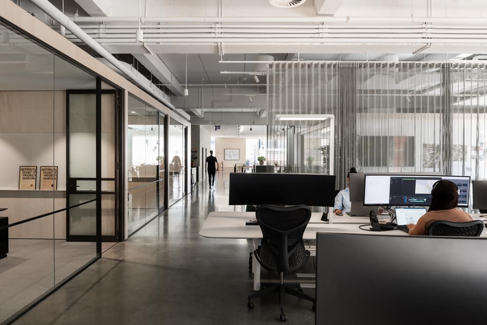
The lighting to the workstation area is part of the furniture solutions with individually controlled floor lamps lighting the working plane and throwing light to the slab soffit above. The high Colour Rendering Index quality and even light to the working plane is essential for user comfort and supports the type of work we do. That each one is individually controlled, dimmable and operates with absence detection means that each person can influence their preferred light level and as people leave the lights individually turn off saving power.
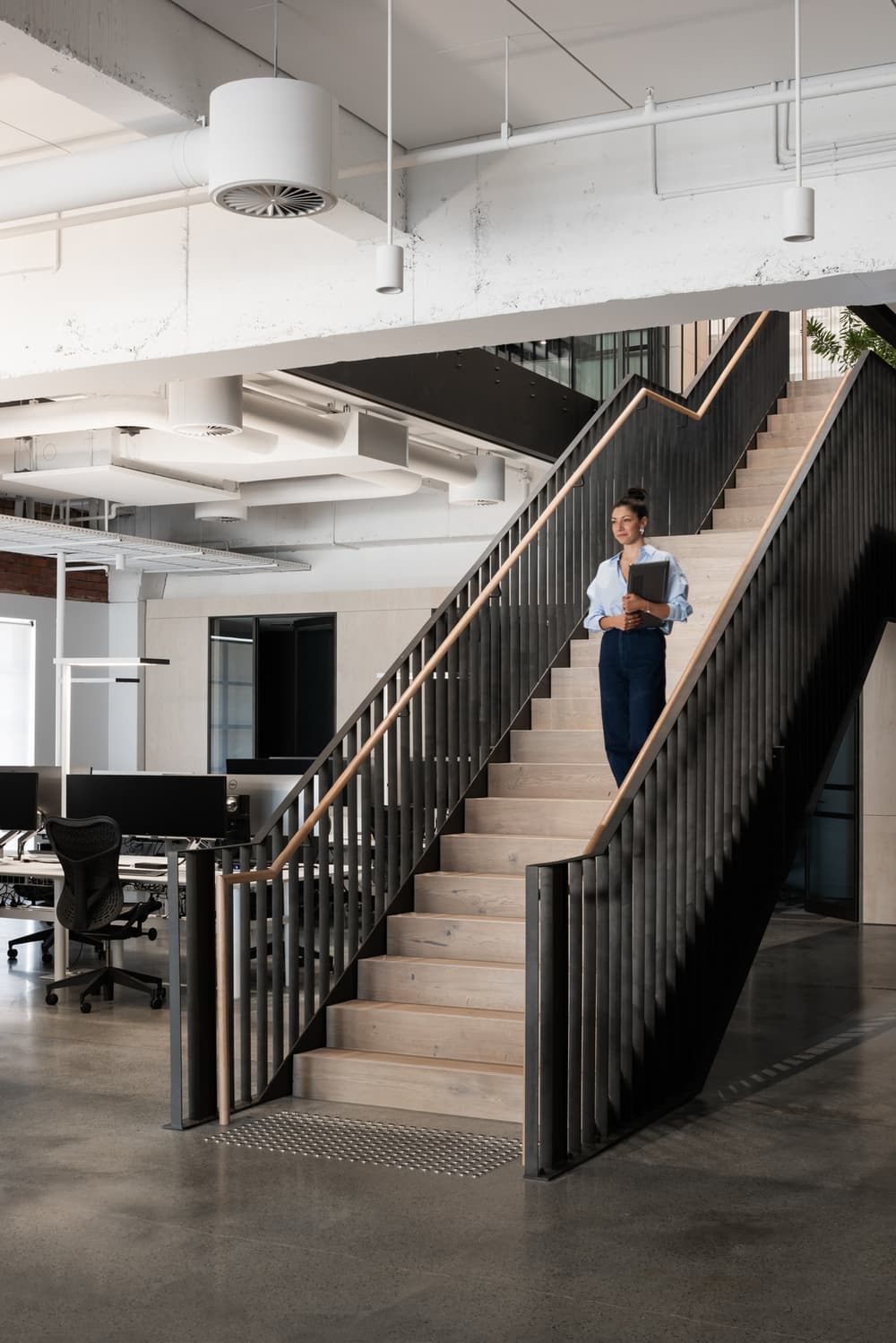
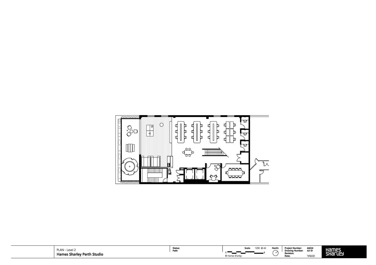
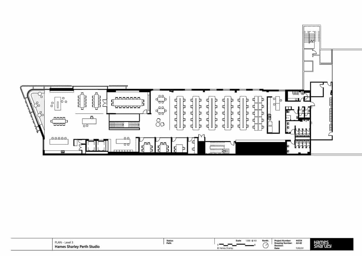
A key element to the interior is a new tenancy stair and void. This provides direct visibility between the two floors of staff and promotes healthy activity with a 5m stair to climb that is deliberately positioned as the easiest direct route between the two floors with lift usage minimised.
Mechanical systems are absolutely aligned to workstations to provide the best possible fresh air supply to staff working positions whilst advanced filtration systems have significantly improved air quality to the extent Hames Sharley has authored an academic research paper citing the studio and its measured results and linking them to employee health and wellbeing.
All materials, furniture and fittings were selected considering local manufacture and assembly plus recycled and recyclable material content.
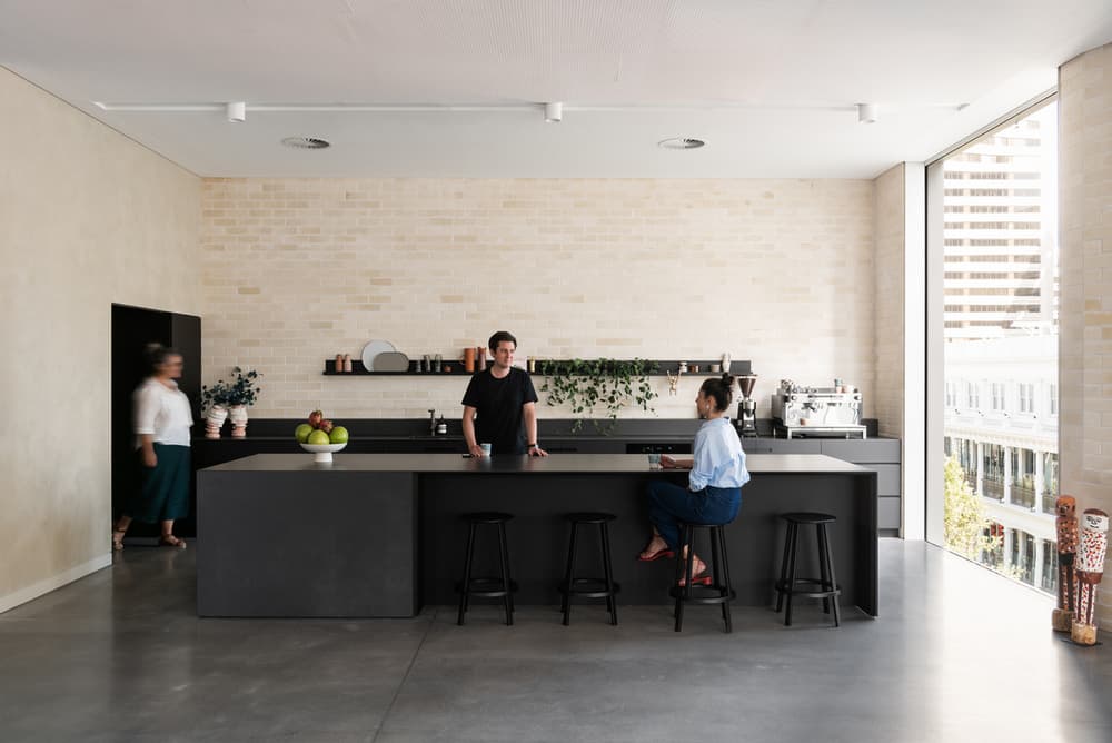
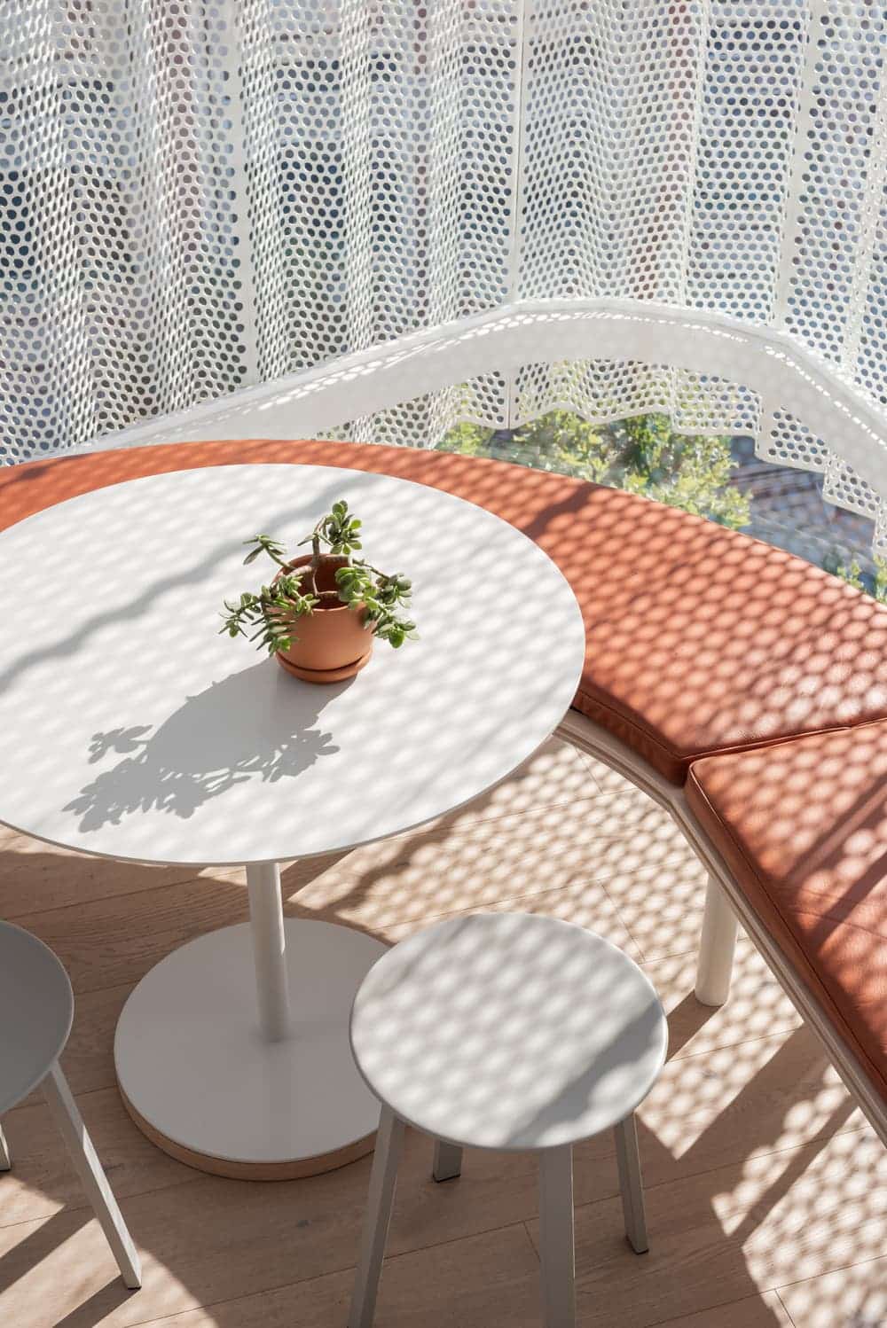
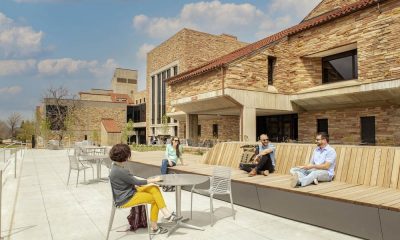
Natural light and access to views have been dramatically improved through this project. Existing windows across level 3 were increased in size and new windows were cut on level 2. New openings include a giant opening from level 3 event space onto a long Juliet balcony. The south facade on level 2 was removed entirely and glazed, opening onto a staff roof terrace. The level 3 south extension is entirely glazed, jutting out over Hay Mall and screened by a perforated steel curtain. Windows to workspace all have operable panes to directly provide fresh air, whilst the roof terrace and Juliet balcony provide the option to open to the elements on the south for both floors.
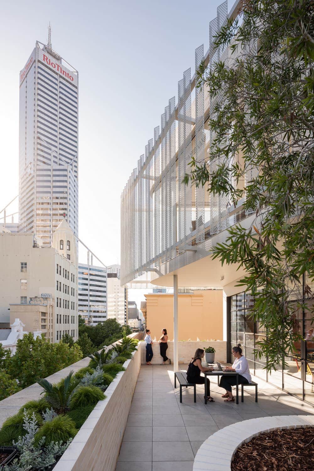
A level 4 rooftop event space for the building landlord was designed and built at the same time. This offers a large outdoor space for staff to use for lunches and a weekly morning yoga class. The space will be occupied by a bee colony for three months per year providing postcode 6000 honey.
What are the interior design principals of the project?
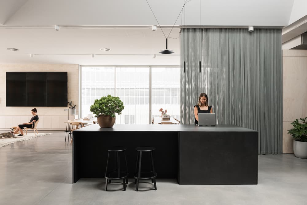
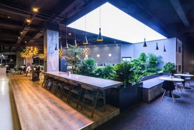
Grounded by simplicity and honesty, the Hames Sharley Perth Studio simultaneously celebrates the nature of time and decay by respecting the imperfections of the existing building while modern insertions find inspiration in muted, natural elements to generate a sense of familiarity and calm.
It is a successful example of the clash between imperfection and perfectionism and the result of a carefully weighed design process with a united architectural vision.
Physically, the interior demonstrates a unique design that maintains a fine balance between aesthetic, function, and human-centric space. And on a psychological level, it succeeds in inducing warmth and safety and creating an environment that encourages interaction, recreation, retreat and reflection.
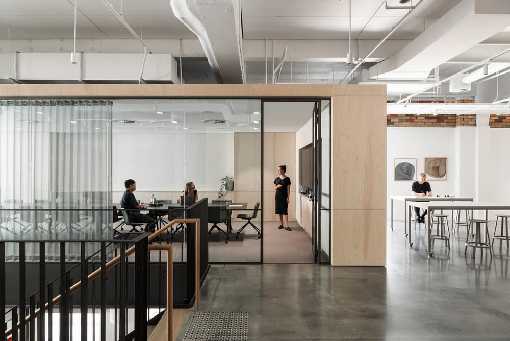
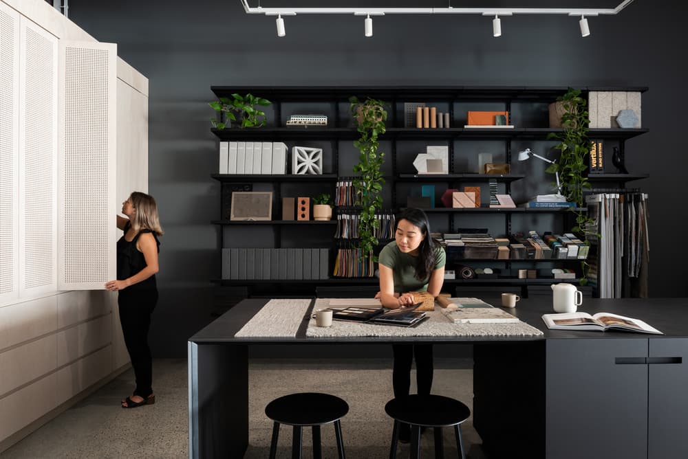
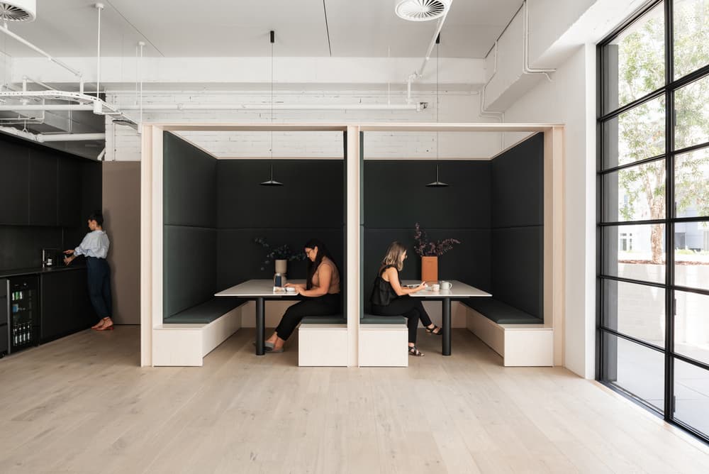
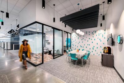
The palette is authentic, timeless and natural, and links physical expanse and enhanced creative thinking. Low ceilings were removed, revealing 4.3m high slabs, which were painted white, with services left exposed. Existing brick walls were cleaned but otherwise untouched, and the concrete floors polished, with meeting spaces designed as pavilions of natural plywood that act as an unobtrusive backdrop, their independent volumes simultaneously celebrating the height. Drapes and joinery in deep calming greens compliment indoor plantings.

