Project: IT Office
Design: Ezzo Design
Client IT office: [e-spres-oh]
Furniture and decorative objects: Paul Hetzl
Art work interventions: Flaviu Roua
Photography: Andi Popescu
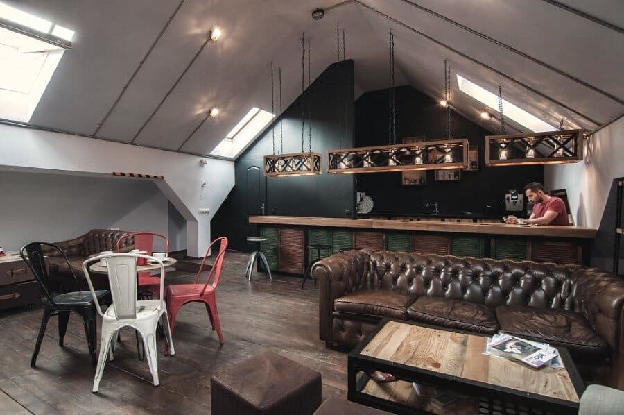
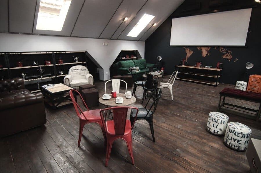
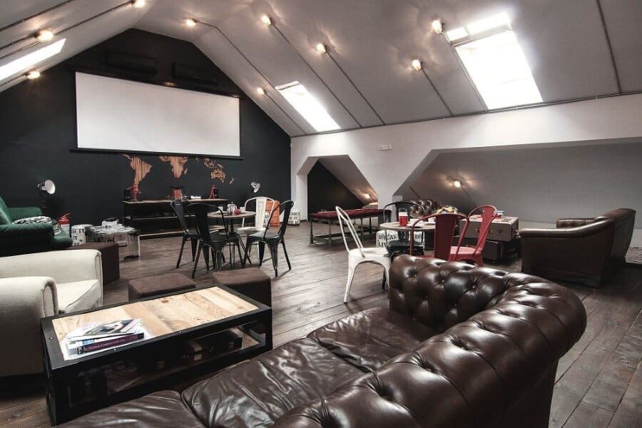
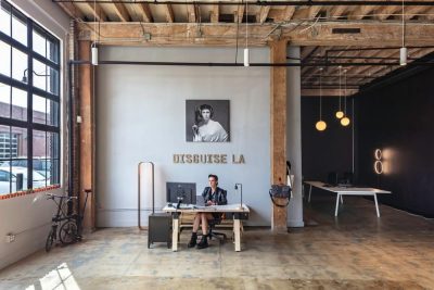
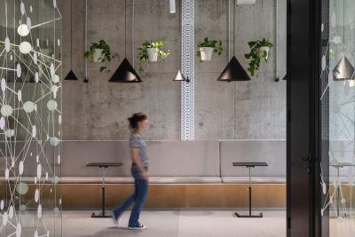
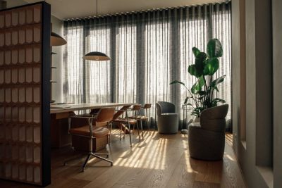
This IT office belongs to [e-spres-oh], a web development company based in Timisoara, Romania. Creative interiors, warm and comfortable, have been designed in industrial style by Ezzo Design Studio.
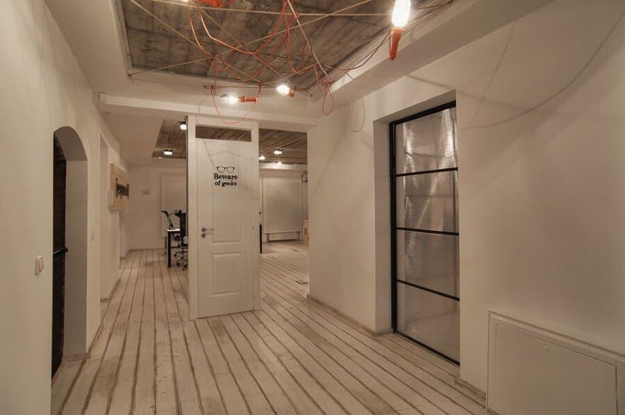
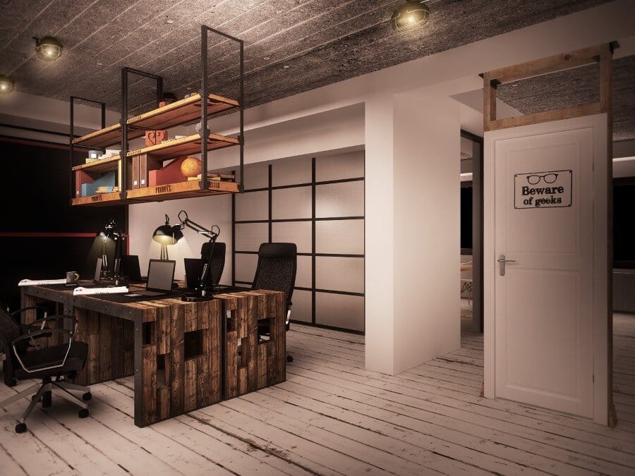
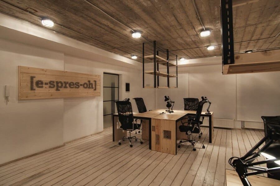
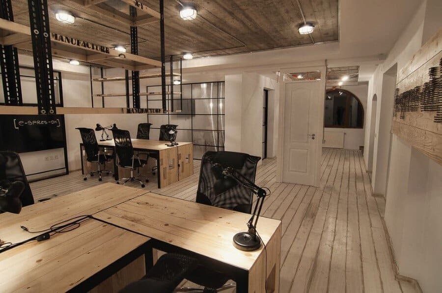
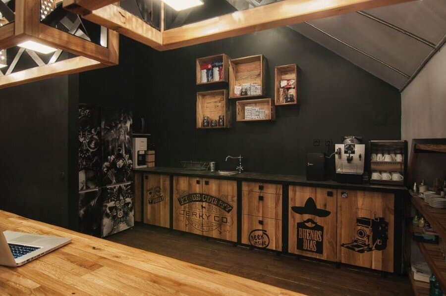
Description by Ezzo Design: [e-spres-oh] is meant to be a studio of creation and relaxation, a real brainstorming for the software developers working in this office. Right from the very beginning you are guided by the symbolical entrance which announces the experience you are about to see behind the “door” with an ironic message “beware of geeks”. As soon as your perception returns with a smile, you will discover the real story behind the door: although it is a space designed for offices, the atmosphere that wraps up the room is relaxing, being framed in wood and shabby-chic floors, the industrial pendants, not to mention that piece of wood pierced by screws in a shape that reveals the identity of this office placed on 3 levels: a cafe, an office and a lounge, under the same roof, but under a different dimension: [e-spres-oh].
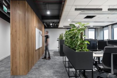
The open office at the 1st floor, reveals the wooden desks made of old industrial euro-pallets; on the right side it being barred by the conference room and its central piece: an industrial fan as a decorative object. The next floor reveals the lounge, a space designed for relaxation, with huge windows looking out to the sky, revealing an avalanche of warm light.
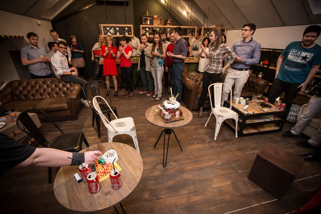
The atypical open space placed on the 2nd floor is differenced by the wooden recycled pallets and the industrial structure of the ceiling made also from solid wood, along with the modern furniture pieces and its layout around a central area designed for meditation (couches made from natural materials).
The conference room is placed aside but still cosy and this despite the fact that it has been arranged in a former technical, industrial area, a solution the designer came to in order to maximize the available space.
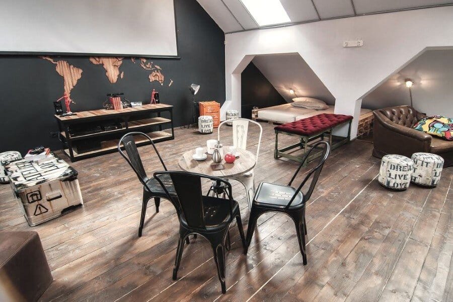
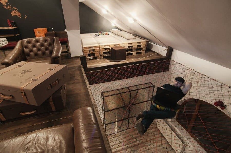
Once you start your tour and reach for the lounge area, meaning the 3rd level – the attic, you will first discover a nasty ceiling, to be more specific an atypical one: a huge spider web as a hammock, right above the spiral stair. So now you are pretty sure that the next space you are about to discover won’t be a squeamish one and your curiosity starts growing.
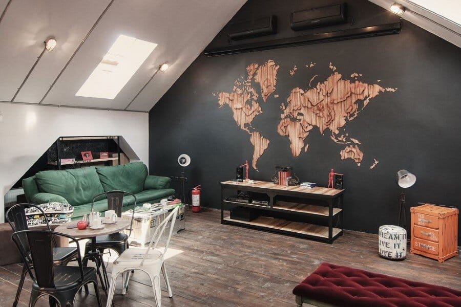
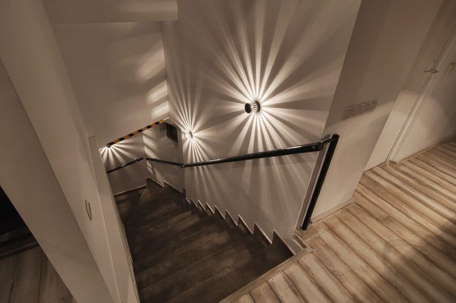
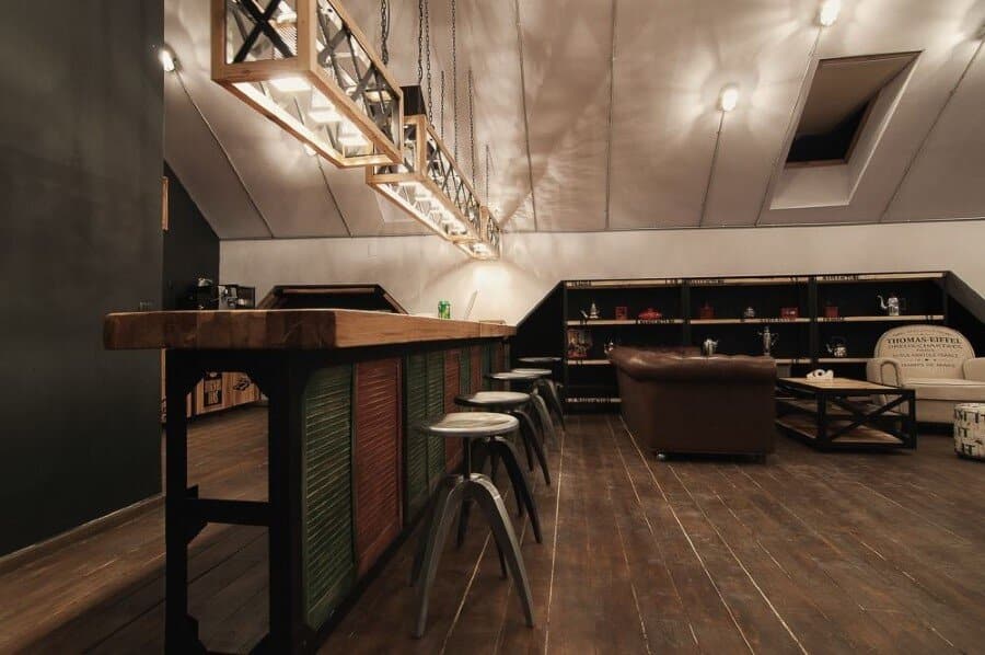
Once you take the stairs, on the left side you will find some lights apparently as shadows of classic desk fans. Thus the industrial lights, the recycled materials in an unfamiliar pattern with shapes and colours apparently disorganised, the world map, they all come to underline the idea of“global awareness” by appreciating the diversity and complexity of sizes all gathered in a single entity. The countertop made of solid wood, the lights shaping out of kitchen graters with a different utility, the bed in the corner of the attic made from old wooden pallets, the pouffes and tables made from vintage travel bags, all of them pointing out the idea of vintage mixed with the industrial character as a new trend in design.

