Project name: Maia Active Flagship Store
Design firm: Sò Studio
Design concept: Gadabout Soul
Area: 120 m2
Location: SLG30-2, Taikoo Li Sanlitun, Beijing, China
Completion time: 2020
Photography: Objective Visions
Compared with other areas in Beijing, Sanlitun is always more vibrant and fresh as it keeps changing and updating. With a mixed, inclusive atmosphere, it has been attracting and gathering various young people in the city.
This place is relaxing, relevant to everyday life and ever-changing, which coincides with the brand values of MAIA ACTIVE.
MAIA ACTIVE is an activewear brand co-founded by two Chinese designers. It emphasizes sports aesthetics, and strives to provide Asian females with lightweight, comfortable and stylish products.
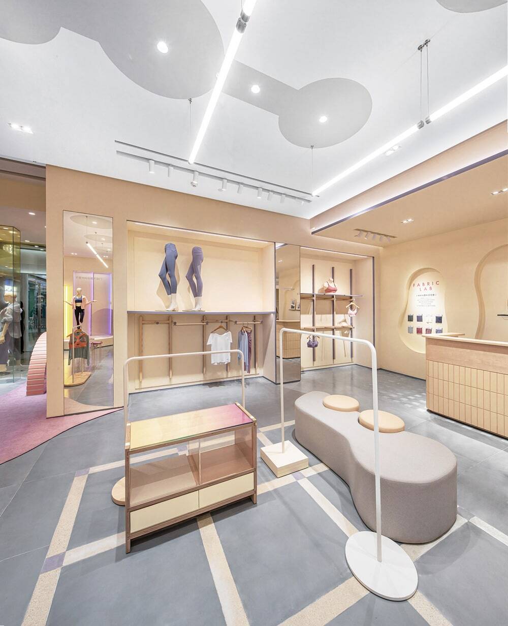
We were invited by MAIA ACTIVE to conceive its flagship store in Taikoo Li Sanlitun. Inspired by the relaxing, free ambience of the site, we identified “Gadabout Soul” as the design concept. Sole is intangible, and that’s why it has infinite vitality and freedom. Flexible curves were introduced to run through the space, so as to bring aesthetic fluidity to daily life.
Starting from the design concept, we thought of Wayne Thiebaud’s paintings. The cakes depicted in his paintings feature fluffy, lightweight textures and the mix of cool and warm tones, which inspired us a lot in the spatial design.
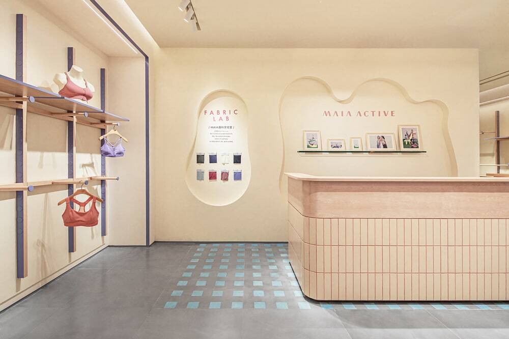
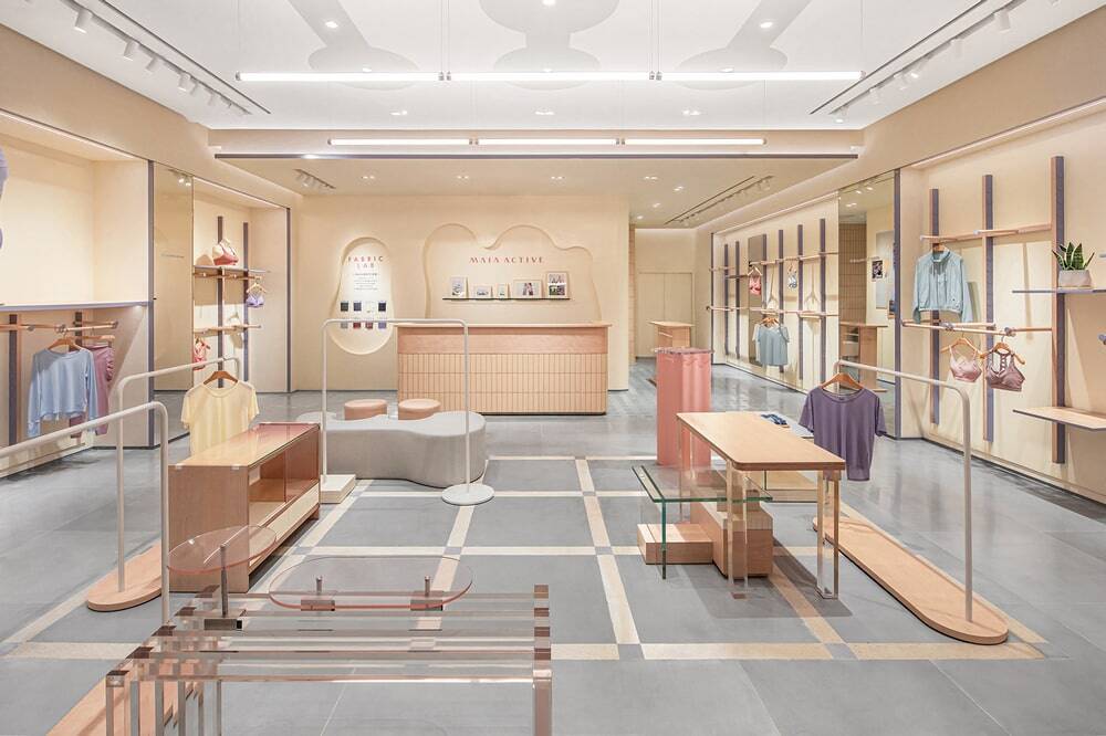
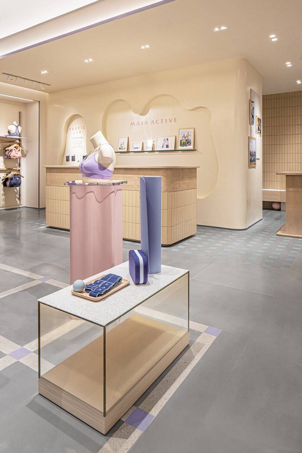
Cream yellow was chosen as the dominate hue and applied to large areas of the space. When looking through the curved entrance into the interior from a distance, the whole store is like a section of a cream cake, the soft yellow color of which brings customers and the space closer. In addition, salmon pink and purplish gray are presented via different textures and forms, which inject vitality and a sense of rhythm into the interior.
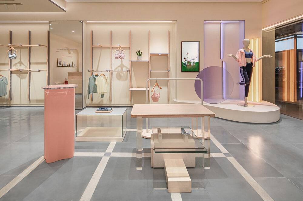
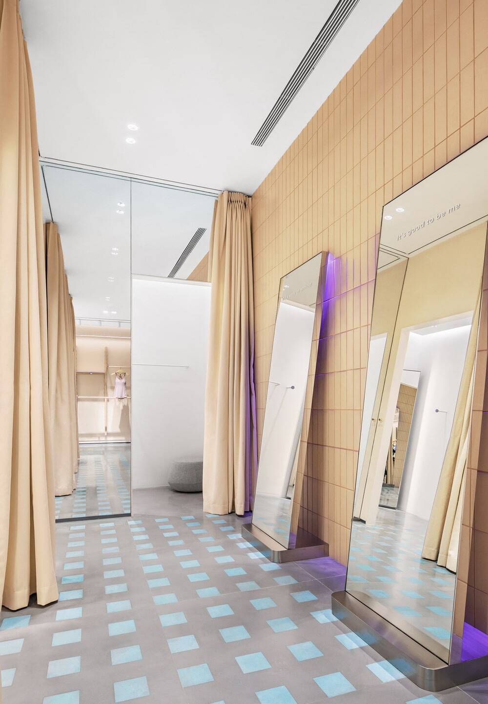
The irregular polygonal space is divided into several core blocks, including the round stand inside the entrance, display furniture combinations at the middle, fitting area, resting area and wall display area. To increase the rhythm of the overall space and break the dullness, we emphasized the roundness of structures at all functional areas. With simple yet diversified forms, the functional blocks are like freely moving “points” in the space that encounter with customers. Through combining a variety of materials, we hoped to redefine the apparel store and break the constraints of scenes.
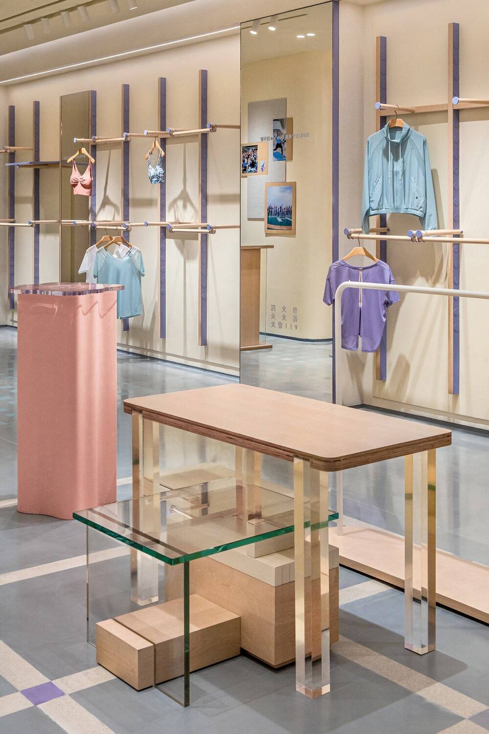
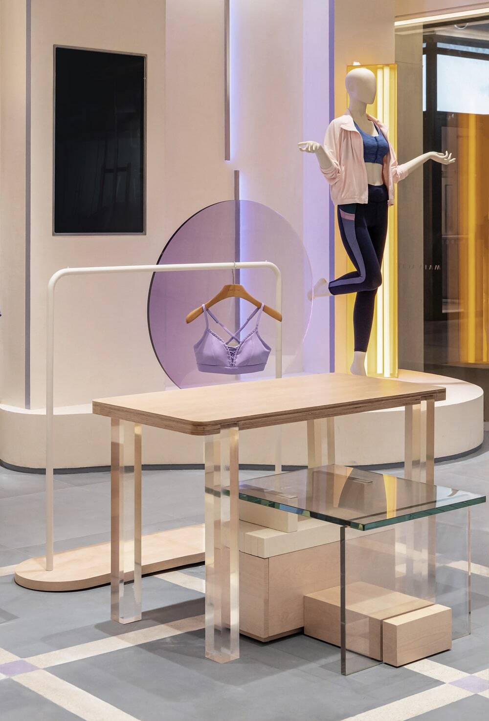
The distinct wooden racks in the display area resemble simplified Pilates equipment, and the interspersed purple acrylic panels inject lightness and fluidity into the space via transparent textures. Various materials and forms, which are like groups of distinctive props, help enrich the narratives of the space.
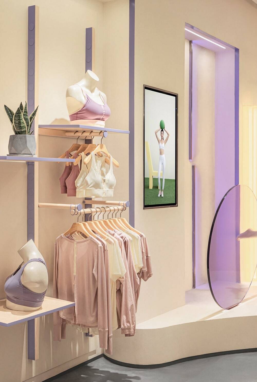
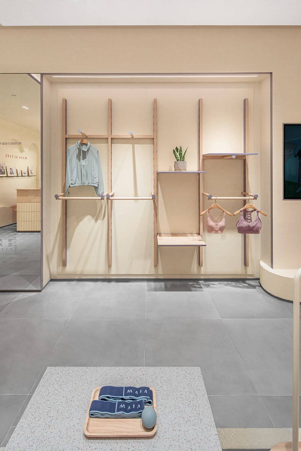
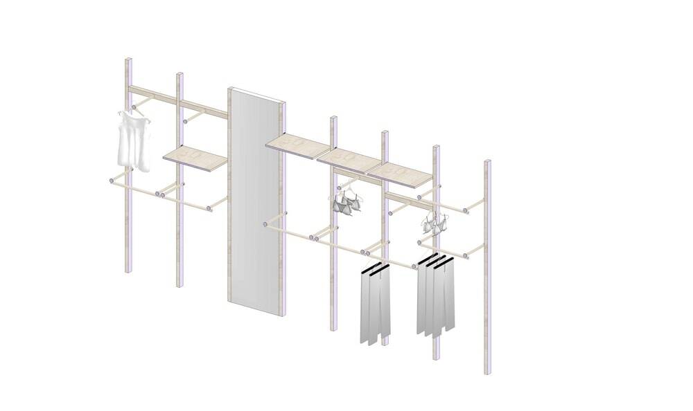
To create more flexible functions in the store, we specially designed a column system for display racks. Each column is clad with wood-grain veneers, and the color on the sides of the columns can be adjusted according to the varying theme of the store during its operation. In addition, holes are carved out on the columns to allow for different combinations, thereby creating multiple display modes and activating the fluidity of the space. Clothes can be hung in various manners, and can be displayed on multi-level panels as well.
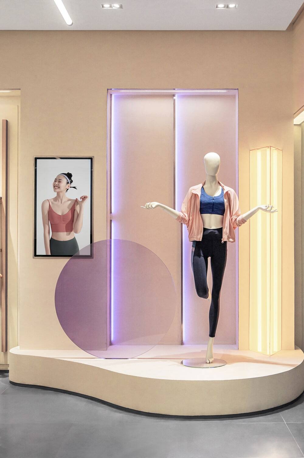
As for lighting treatment, we referenced to American minimalist artist Dan Flavin’s colorful light installations. By the combination of glass materials and color gradation, the space is endowed with varying lighting effects at different time periods. The movement of light changes the stillness of the space, and introduces the concept of “time” into it. Either strong or soft, the lighting enriches the variations of colors within the interior.
The design started from a free attitude, and was executed in a flexible manner. To trigger the beauty of design via creating unexpected encounters and surprises is what we’ve always been trying to do. When this reshaped space opens in the city, it not only brings updated visual experiences, but also conveys values and spirits.

