Project: Modern Medical Office
Interior Design: Jeanne Schultz Design Studio
Location: Austin, United States
Area: 2430 ft2
Completion date 2018
Photographer: Andrea Calo
This historical building constructed in the 1950s was built by the first practicing gynecologist of Austin who was known to be a community leader and provided services to at risk women. Over the decades it was used as a general business office, then in the late ‘90s a second story addition was designed by the dissolved Austin firm QMET.
The project scope included a restoration of the interior of the building to its original use as a modern medical office through a series of sensitive architectural and design solutions for our client, a young up-and-coming plastic surgeon who specializes in facial feminization and surgeries for transgender clients.
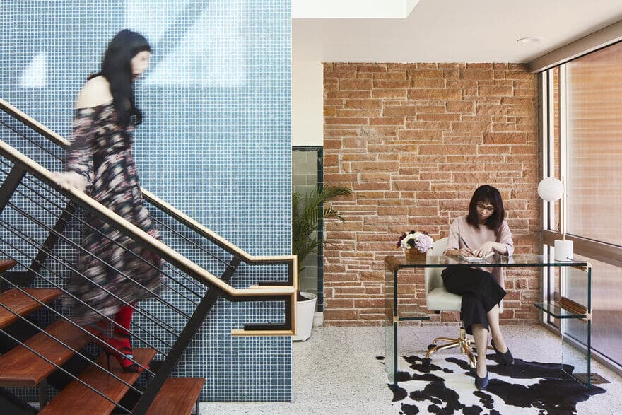
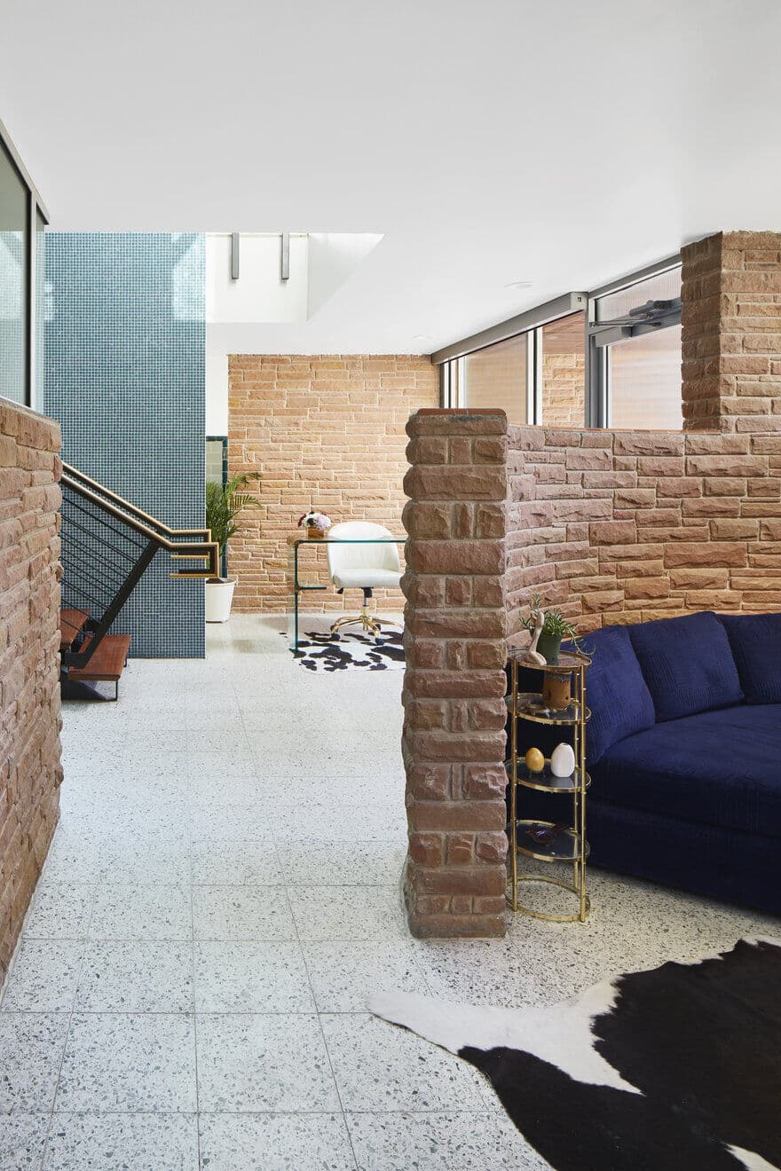
The lower level, where most of the patient activity was planned to occur, lacked spatial definition and demanded programming of visibility and privacy. The existing open floor plan contained two niches defined by clay-cladded half-walls and a single private room enclosed in the back corner with aluminum storefront. A steel and glass partition designed and built during the 1998 addition, as well as rounded steel columns original to the structure, stood singularly without a physical relationship to other components other than their structural connection.
Utilizing one of the original steel columns and the once “floating partition” as a spatial demarcation, Jeanne Schultz created two new spaces on the lower level that softly complimented the midcentury character of the building with modern applications.
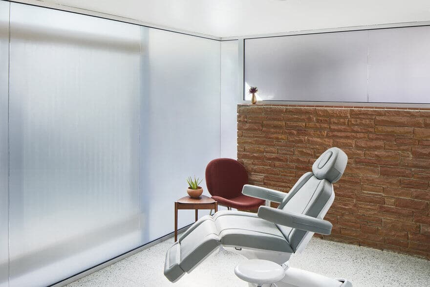
The first new Patient Room was defined by connecting the clay half-wall that transversely divided the lower level to the axis behind the “floating partition.” To make the existing half-wall completely private, we added a butt-joint glass clerestory with frosted film which was set inside aluminum channels and then glued to the tile-capped top.
We drilled into existing mortar joints only and the ceiling to anchor the aluminum channels, so the clay bricks would not be disturbed. A butt-joint glass curtain wall with frosted film set in aluminum channels was glued to protect the original terrazzo flooring, and reinforced in the steel structure of the ceiling.
The geometry of the curtain wall was broken down into panel widths which reflected the configuration of the “floating partition” from the 1998 addition.
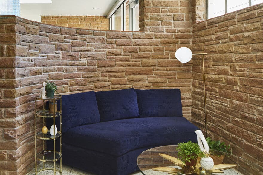
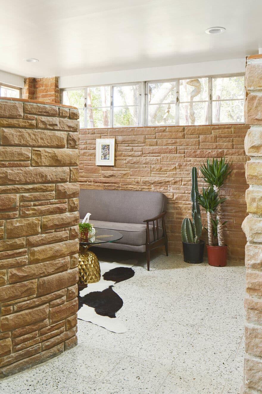
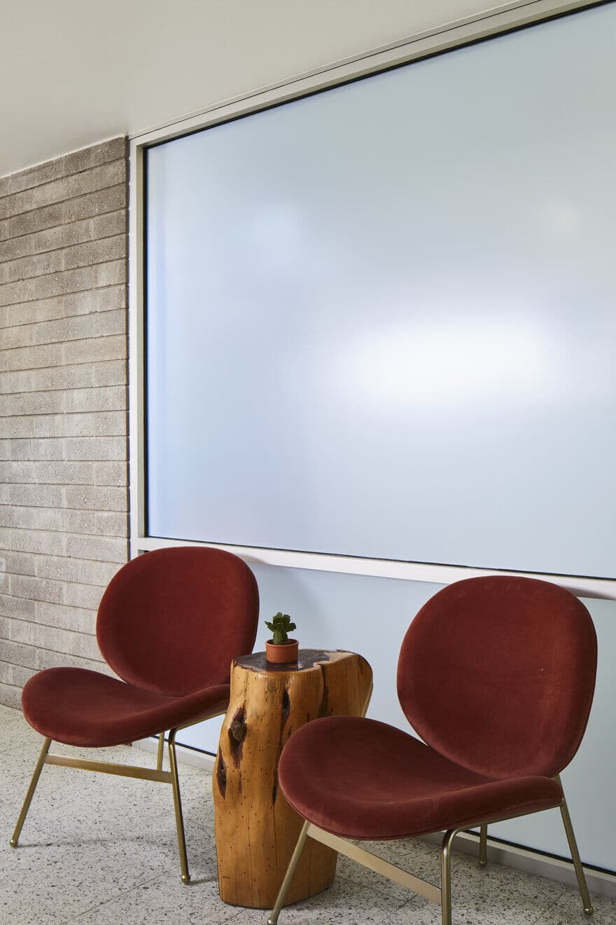
On the opposite side of the clay and glass wall became the Waiting Room – an intimate corner nook secured by the second original clay half wall which curves at a 90-degree radius. All-original aluminum windows sitting at a high sill punctured the two exterior walls with soft light in a thin strip, leaving a clay interior wall canvas below.
We chose prints of abstract paintings by Paul Klee as artwork that would allow the clay walls to stand as sculptural features and complement the geometry of the windows above. Inside the frame, the Klee work could be disruptive while also featuring the saturated color palette of the space. To furnish the uniquely shaped room, we procured a Milo Baughman style loveseat that was configured at a 90-degree curved radius and upholstered in its original crushed velvet blue fabric.
A black and white spotted cowhide with a playful rounded pineapple-shaped coffee table from West Elm sat at the center of the space with a tweed taupe Danish sofa on the opposite wall. The seating arrangement was conceived to alleviate the awkwardness that single-chair waiting rooms can create.
The scale of the nook, its comfortable furniture and delicate trinkets make the Waiting Room feel more like a lounge at home than a transitional space.
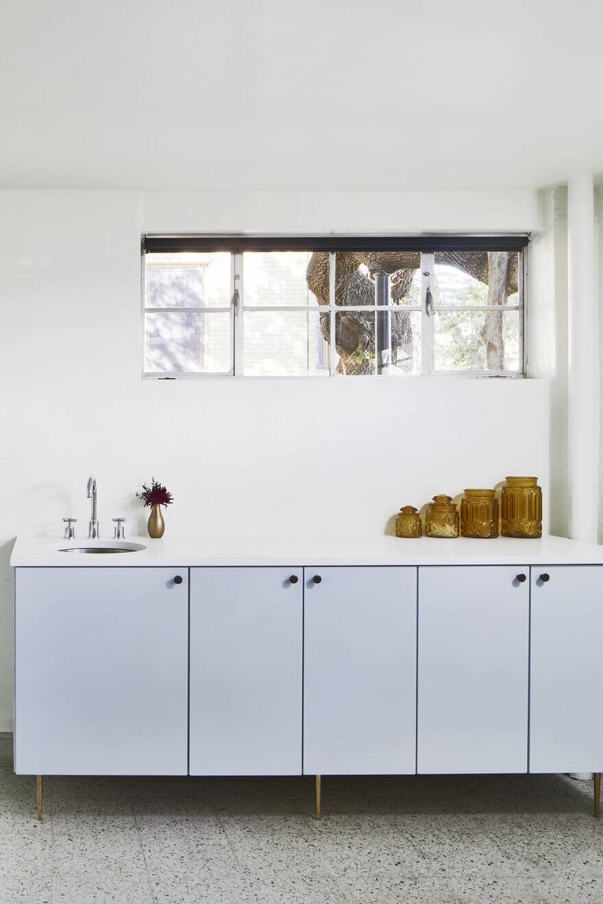
Specialized millwork was custom designed for each of the Patient Rooms on the lower level to accommodate the doctor’s storage needs for procedures, cleaning, and product sales. The cabinetry maintained a simple, rectilinear form and was painted a shade of blue drawn from flecks of aggregate in the original terrazzo flooring and the mosaic tile wall erected during the 1998 addition. Instead of demolishing the original concrete baseboards of the rooms, the cabinets were constructed as floating boxes that were reinforced and rested on conical polished brass furniture legs. Weathered copper knobs with a red-orange hue complemented the block of slick blue cabinetry and reiterated a subtle earthy texture drawing from the original clay walls. The counter tops were specified as MetroQuartz in Titanium White, a durable engineered material that yielded a crisp and functional working surface. A circular stainless steel under mount sink carved into the mass of the cabinetry and, coupled with a curvy faucet and vintage inspired cross handles, provided a contrast in geometry.
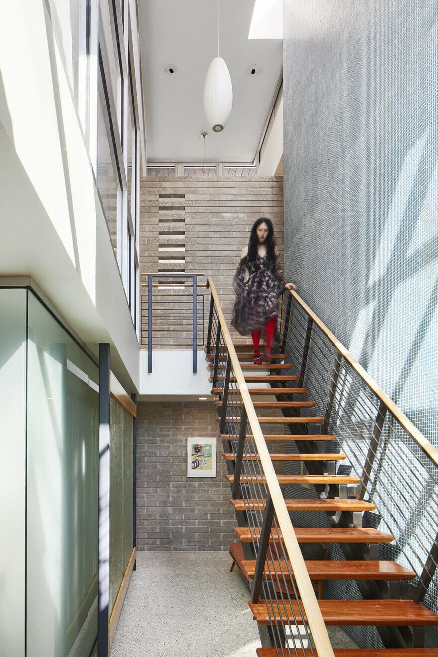
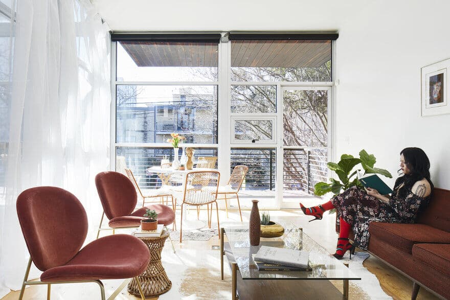
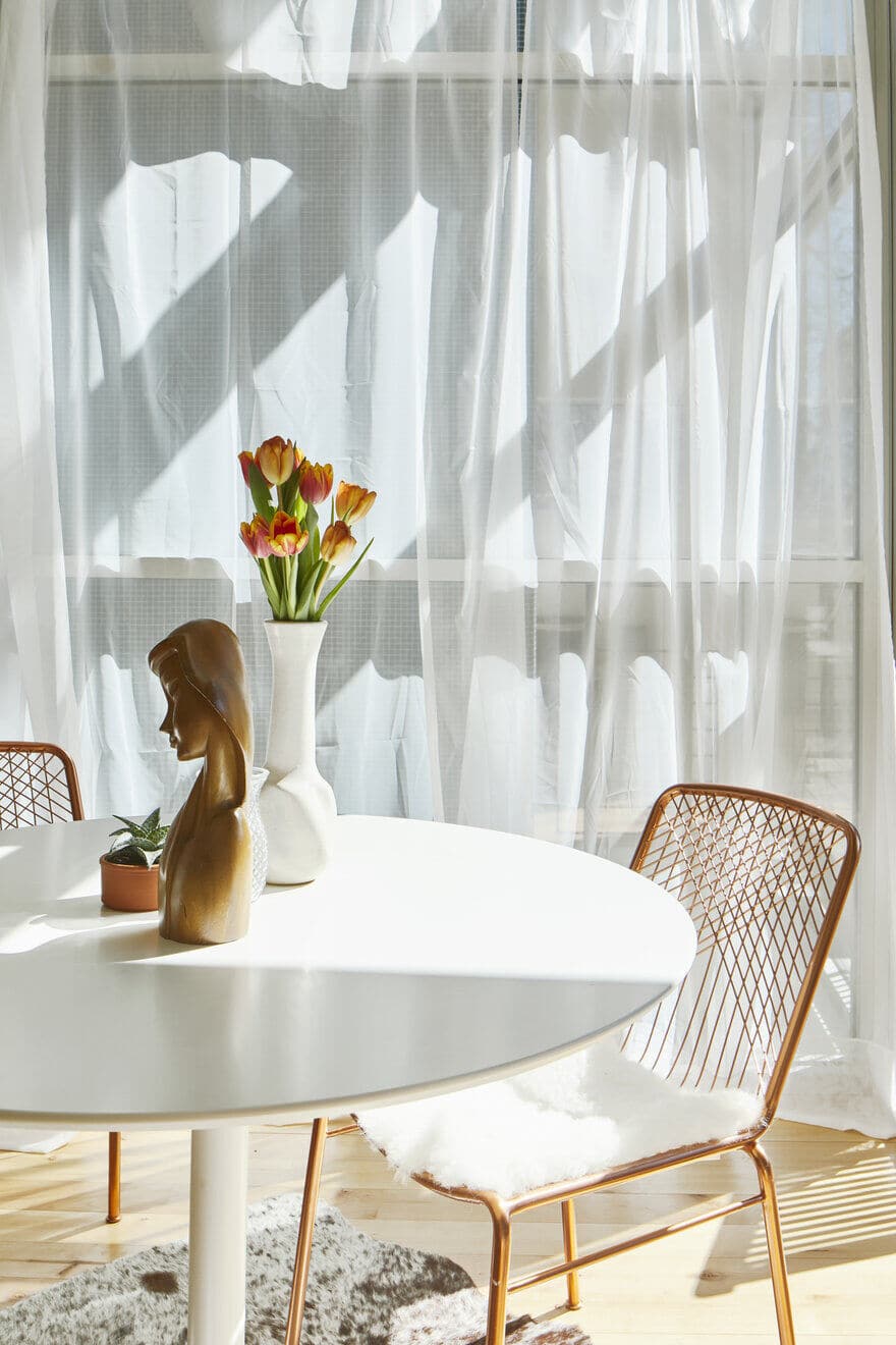
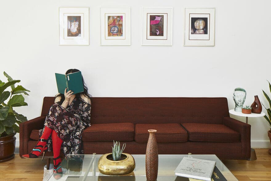
At the upper level, we configured a large room to become a flexible event and consultation space for the client, updated components of the kitchen and bathrooms, and designed special branded details that paid homage to the period of the building’s construction. The flexible event and consultation space was generous in area and had floor to ceiling storefront glass windows that offered an abundance of natural light from both the exterior and the tangential stair shaft with skylights above. We reconfigured the entry glass partition to receive a pivot door and hardware that matched the patient rooms downstairs, further instilling uniformity in the architectural material palette. Multiple seating groups were established, including a cluster of copper velvet chairs with a vintage wicker table procured locally from Uptown Modern Austin airily resting in-between. An anatomical tulip-style table was situated near the exterior windows surrounded by copper chairs and sheepskin pads with the vintage wooden bust of a female face as the table centerpiece. Other motifs and decorative objects resembling the human body adorned the room in the spirit of the client’s practice and celebration of gender identity, such as a vintage acrylic mold of a nondescript face, a Paul Klee lithograph from the Head of Man series depicting a person’s face with soft curves, and a miniature vintage stone sculpture of an undefined nude body.
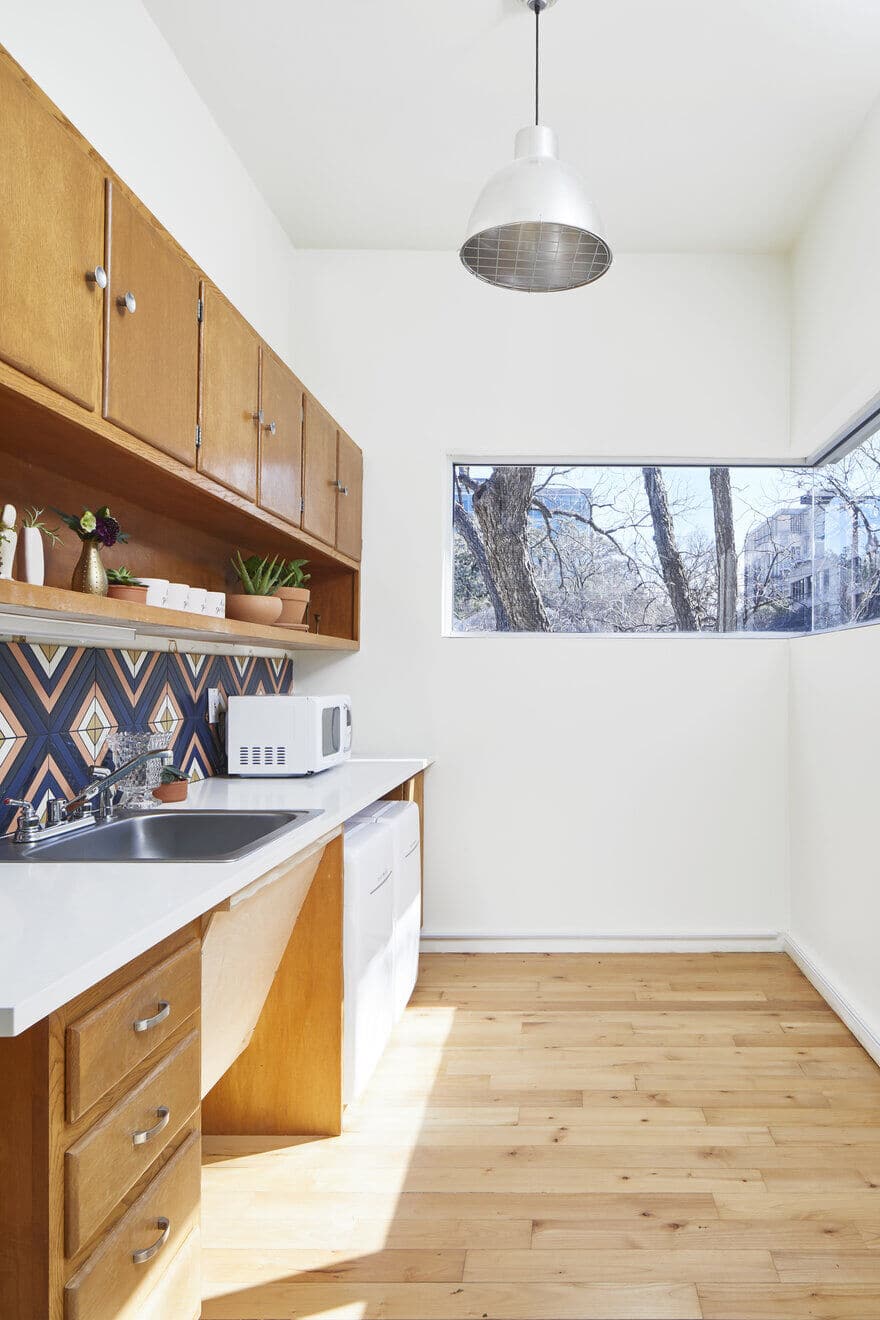
The final point of renovation occurred in the kitchen. We replaced the counter tops from their late ‘90s blue laminate material with Titanium White MetroQuartz, left the millwork intact, and installed a backsplash made by Fire Clay Tile ‘Grove’ in warm hues, which incorporated the blue and orange tones found throughout the building. The radiating diamond backsplash pattern created a whimsical midcentury vibe in conjunction with a set of white Daewoo mini-fridges and microwave oven – which harkened back to the kitchens of the ‘50s. The main goals of the renovation and restoration were to demolish and replace only what was necessary, create operational functionality for the client, and shape a safe, comfortable, and enjoyable patient environment. Architectural interventions were carefully considered with both the client and the building owners, who have owned and maintained the building since its birth in the 1950s.

