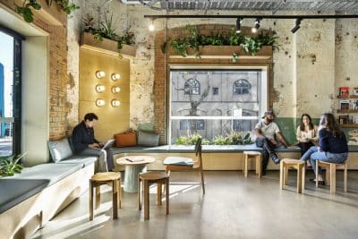
Project: MTZHF Advertising Agency Offices
Architects: Gensler
Location: San Francisco, California, United States
Area: 7,000 sqft
Photography: Jasper Sanidad
The edgy office at 220 Sansome Street in San Francisco—home to advertising agency MUH-TAY-ZIK | HOF-FER—is a 7,000-square-foot testament to collaboration between client and designer. “I wanted to invent something I couldn’t think of,” explains John Matejczyk, the agency’s cofounder and creative director. “It all started with helping the Gensler team understand who we are—a creative mix of weirdos and adventuresome thinkers. But I wanted all that adventure to be sitting on a well-reasoned pedestal.” And the colors? “They come from our work and our people,” Matejczyk says.
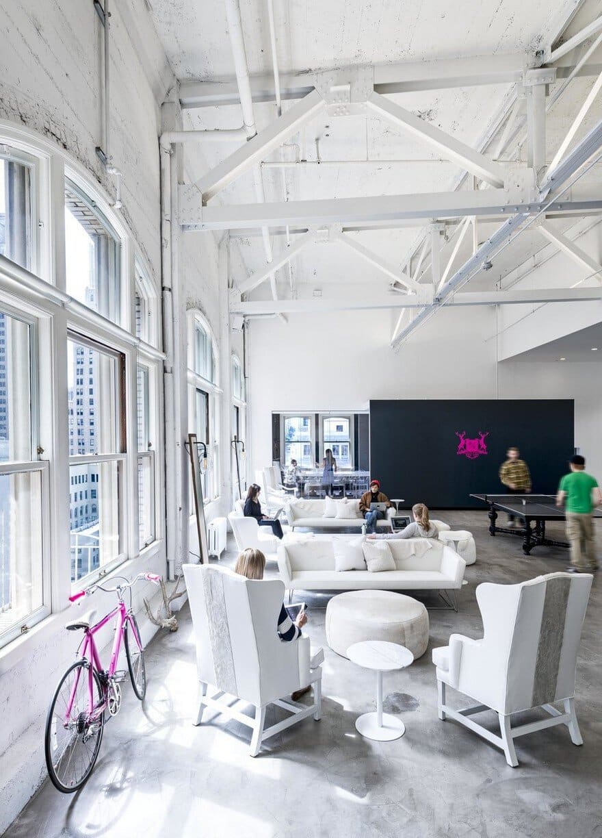
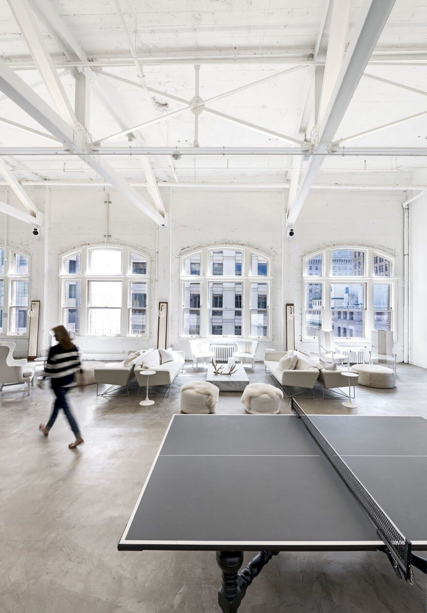
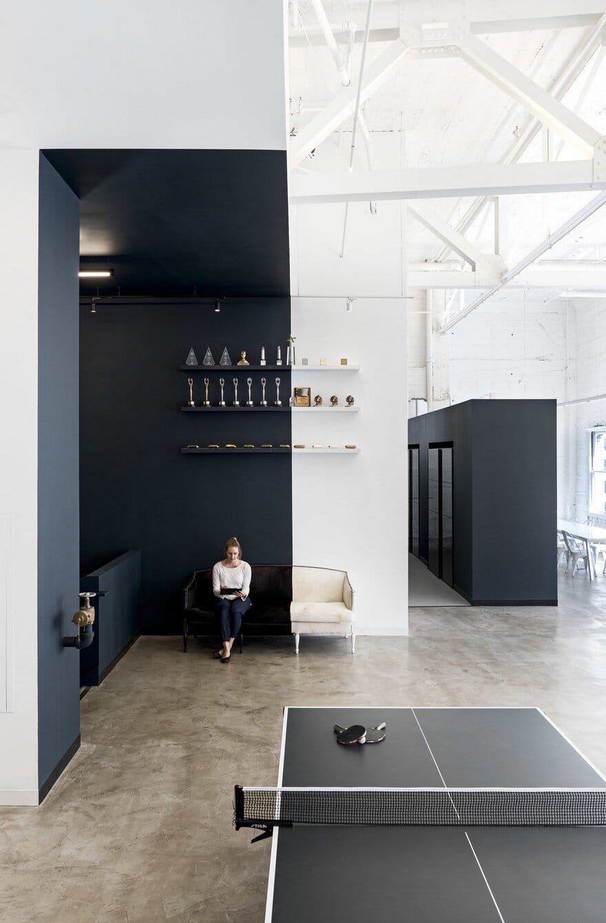
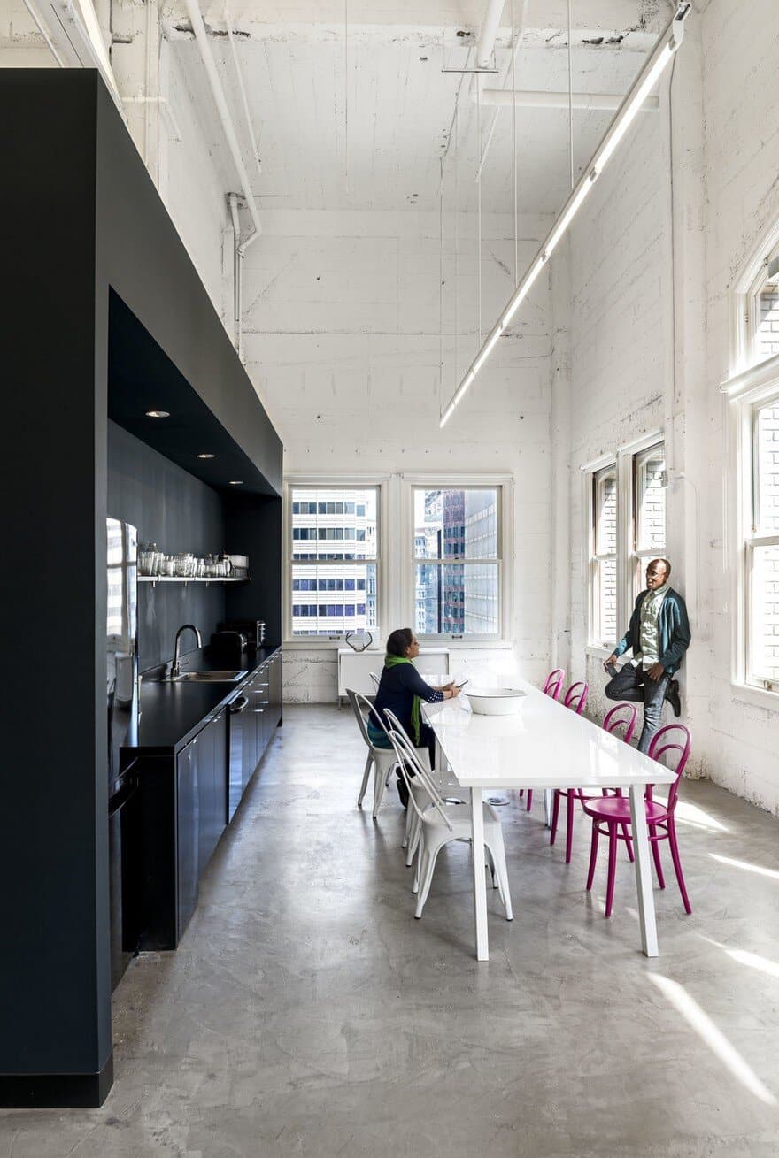
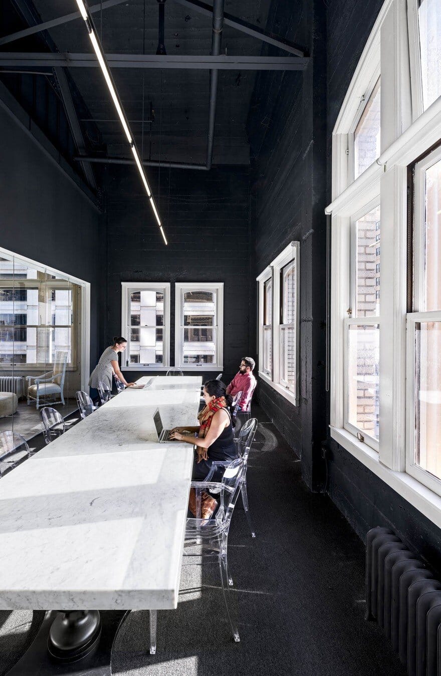
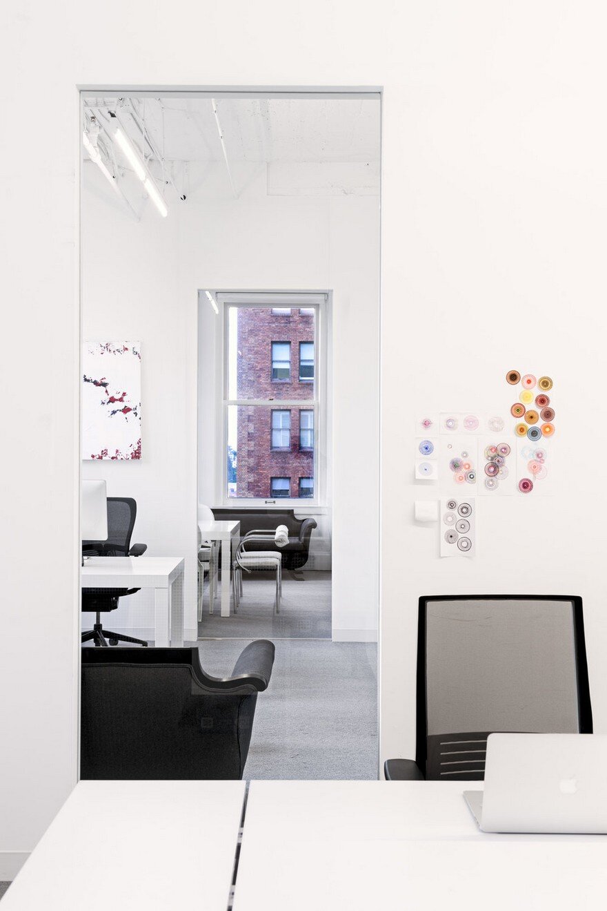
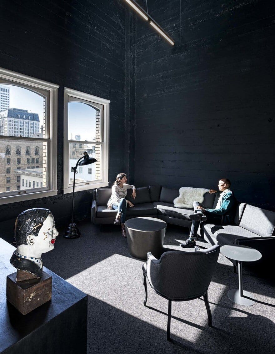
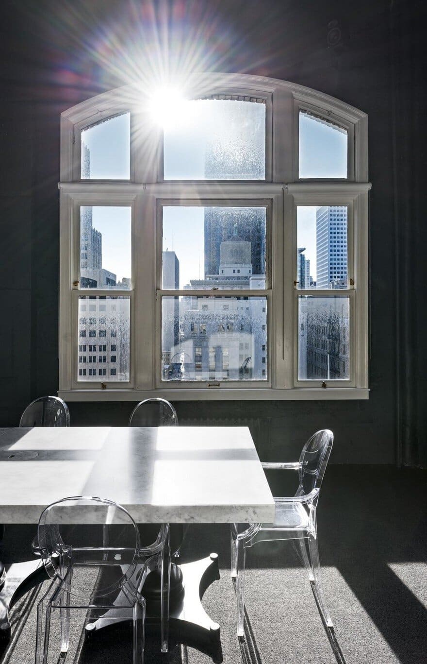
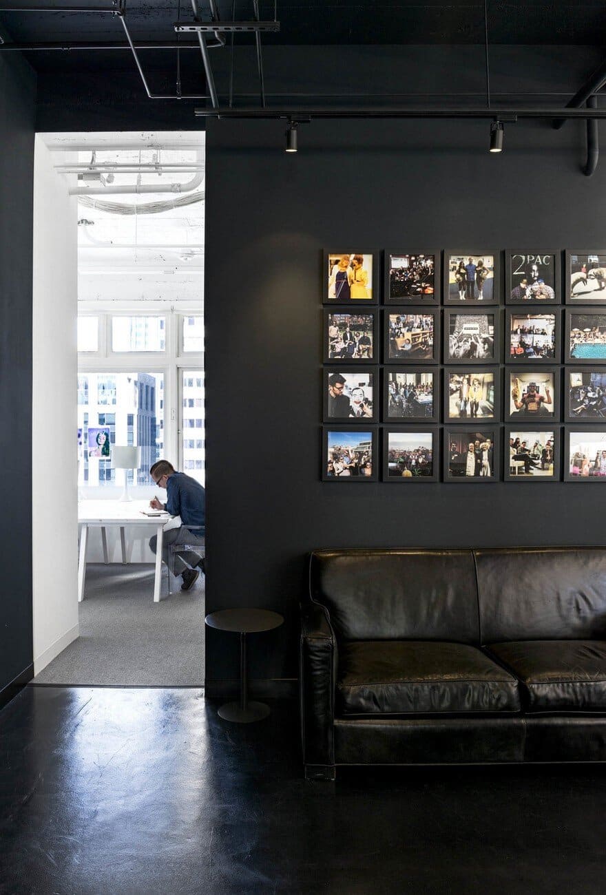
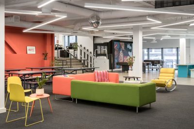
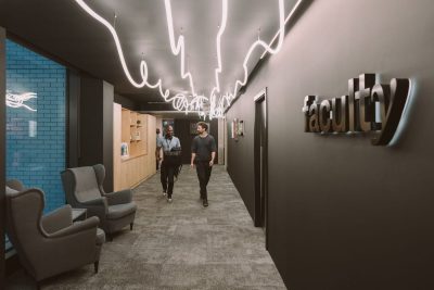
Distributed across the 15th and 16th floors of a high-ceilinged, 1920s building, the existing space was raw but striking, with steel trusses and concrete ceilings, floors, and walls. Gensler designers Collin Burry, Aishanie Marwah, and Howard Yao based their approach on an analogy of the two hemispheres of the brain—celebrating the contrast between the “white canvas” of the artistic mind with the “black suit” of the business mind. The work zones—including a 64-foot-long collaborative table with 32 workstations, private offices, team tables, collaboration zones, and café—are rendered in white, while the more formal, client-focused spaces are black.
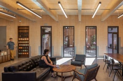
“In their old office, people were spread out and chopped up,” said Burry. “They didn’t like that. The idea here was to put everyone at a long kitchen table, so to speak.” But there are also opportunities for people to find solitude upstairs or brainstorm with their team. They can also transform the space easily for client presentations. Within the pared-down color palette is a rich mélange of textures, furniture, and lighting fixtures. The cofounder’s wife, Lyn Matejczyk, combed through antiques shops and flea markets to assemble a collection that ranges from a kidskin loveseat to wicker ottomans—all refinished, reupholstered, and repainted.
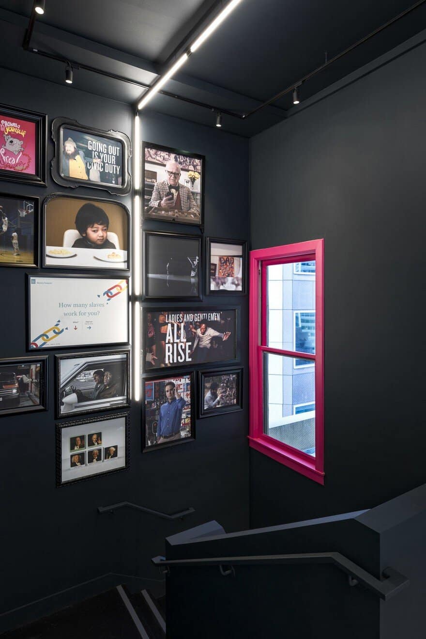
The communal worktable ensures a constant hum of collaboration, but Burry felt it was important to highlight the connection between the two floors with a “crazy blacked-out staircase” adorned with print ads and framed stills from the agency’s commercials. “Sometimes the biggest challenges create the biggest opportunities,” said Burry. “This design allows the agency and its work to keep evolving.”

