Project: Narrow Minimalist Property
Architecture: Tamar Blumenfeld & Yehudit Moore at Blumenfeld Moore Architects
Styling: Nelly Levin and Elki Gazit
Location: Sharon region, Israel
Owners: A couple + two grown children
Property: 460 sqm (built)
Ironwork: Arteferro
Photography: Shay Gal
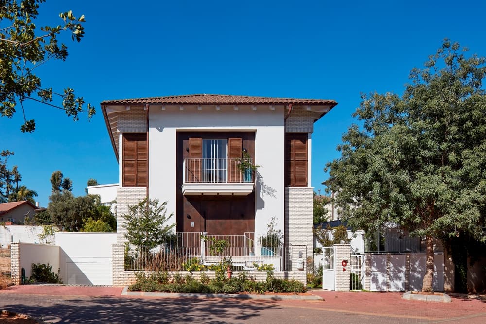
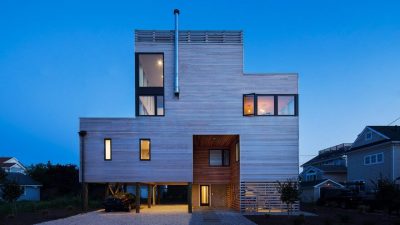
At the entrance to a small alleyway in a quiet neighborhood located in the Sharon Region, a minimalist two-level detached property is revealed, with its minimalist, narrow, and symmetric facade. “The house is revealed in a way that is simply straight to the point”, say architects who planned this project, Tamar Blumenfeld and Yehudit Moore, partners at Blumenfeld Moore Architects.
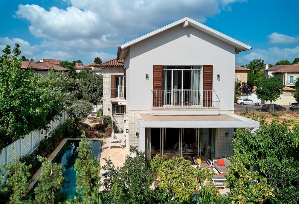
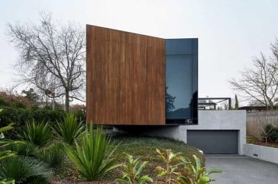
“This is a narrow two-level symmetrical facade property with steps that lead straight to the entrance door”, note the architects. Light brick cladding and weathered steel shade Dekton boards cover the front facade, with a large Dekton plate entrance door in its center. A balcony was designed above the entrance, which doubles as a door canopy. The balcony, from which the entire alley can be seen, is accessed via a light Belgian profile door and walnut wood shutters.
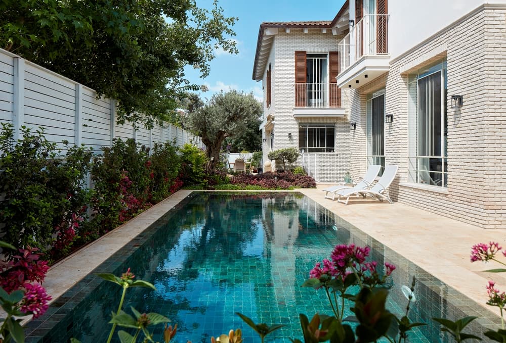
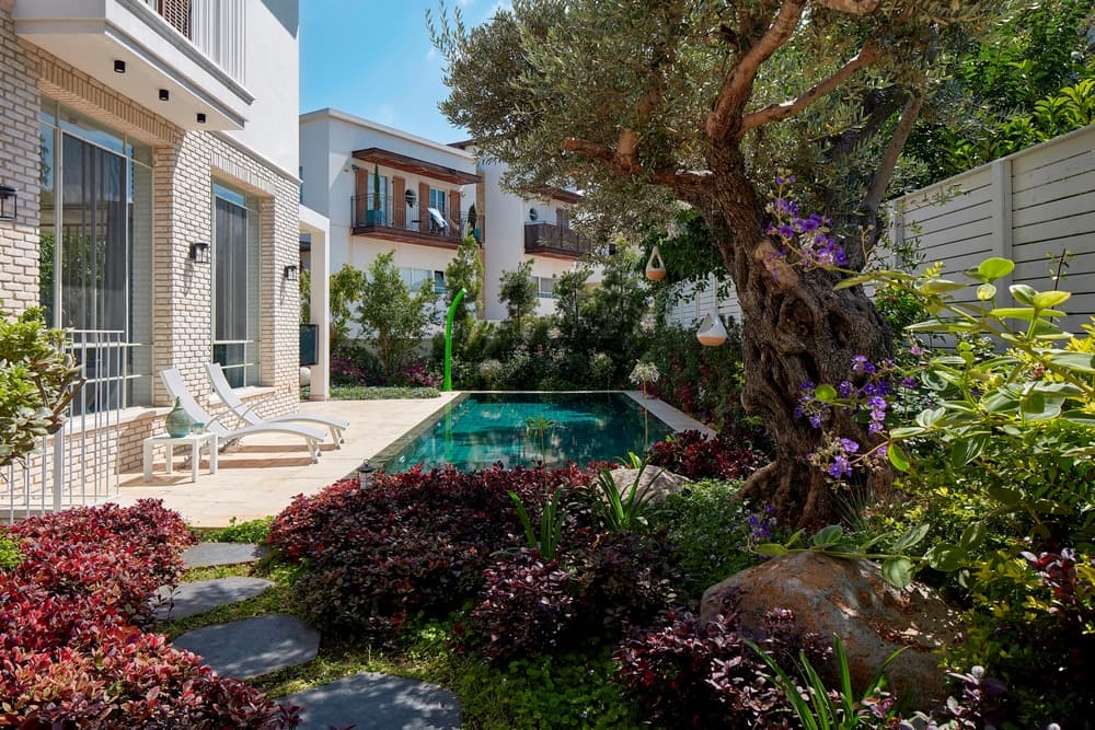
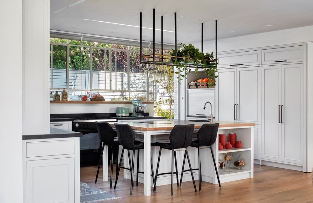
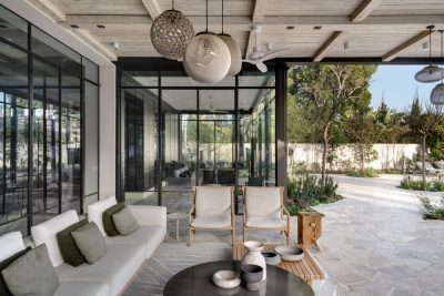
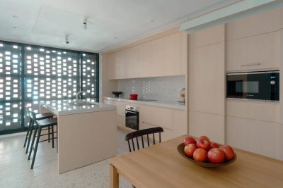
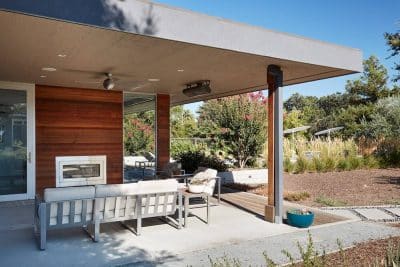
The ground floor is visible in its entirety upon entry. “The spaces are interwoven and lead you on a journey surrounded by lush gardens”, Blumenfeld and Moore explain. “Each space has its own exit to the garden in a way that extends its functionality. As such, from the family corner, we can access the north garden which was designed as an external family corner with added outdoor water elements. From the lounge, we can access the east garden with an outdoor seating area laid out under a large pergola, and from the kitchen, we can access the east garden with an outdoor dining area that overlooks the swimming pool”, they continue.
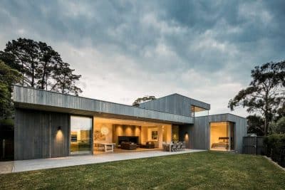
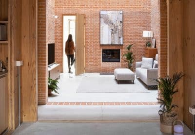
“We played with recurring materials throughout the space”, the duo adds. “We made use of three main materials – brick, wood, and iron and this trio reappears throughout the property whether in the furniture, the ceiling beams, etc. The outward opening windows however are the features that set the tone throughout the property. Thanks to the use of iron, we managed to create clean and minimalist openings. Interiors and exteriors work in symbiosis and as such, the windows are very important features in the projects we plan. We chose profiles from Arteferro that allowed us to create this symbiotic dialogue”, they summarize.
“It is important to note that on the one hand, people love Belgian profiles, but on the other, they are apprehensive due to the false impression that they are high-maintenance or not insulated enough, and thus cannot compete with aluminum”, they explain. “However, Arteferro’s designs and materials prove that this is not the case, as they are able to provide high-quality and low-maintenance solutions, which we highly recommend. We are all for proper iron Belgian profiles, however, it is no less important to choose the right professionals to create them. The experts behind the materials are critical to the end product and we enjoy working with the exceptionally professional team at Arteferro”.
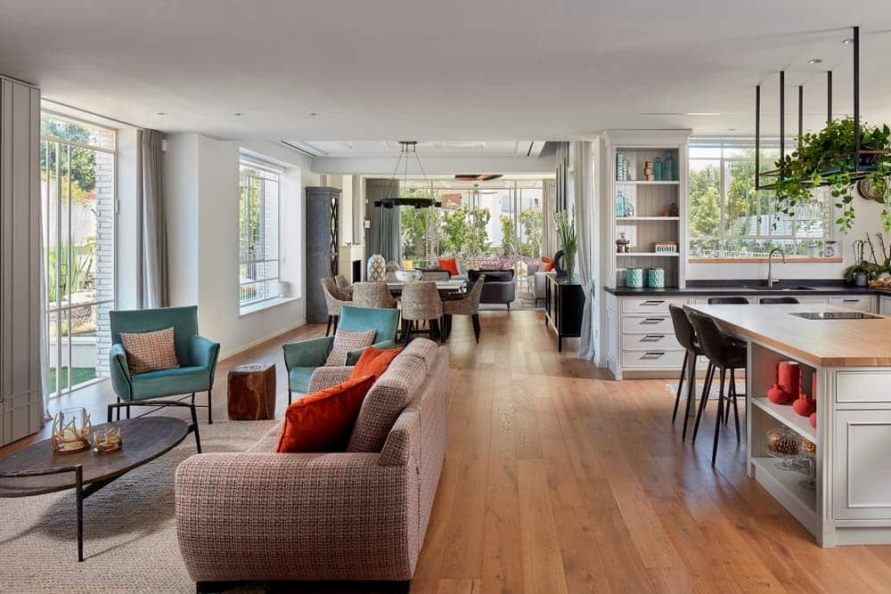
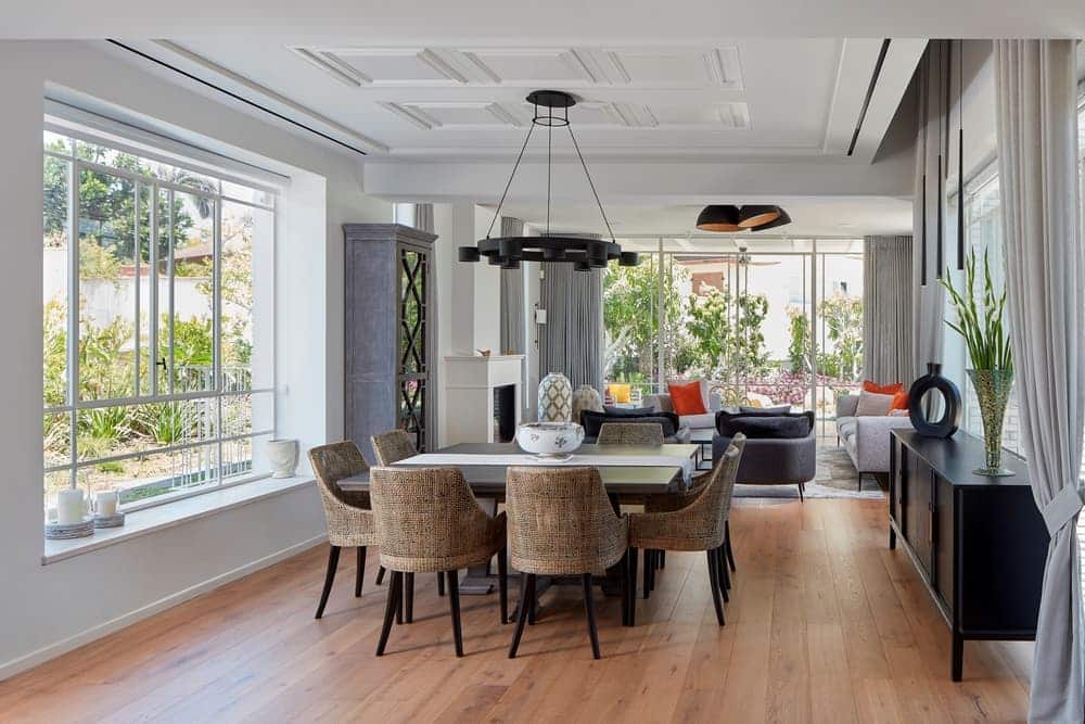
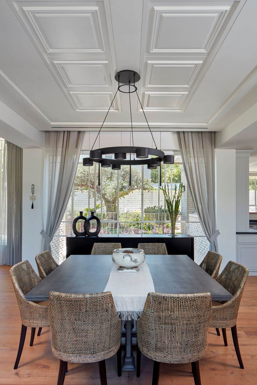
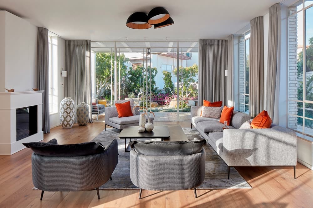
The entrance was fitted with a carpentry wall that includes a utility cupboard and a door that leads to the elevator and guest toilets. A delicate staircase was designed in fine iron profile in the same tone as the walls and fitted with oak treads. A glass partition was fitted between the staircase and the family corner through which the entire level can be seen. The family corner and the kitchen were planned as one space. The dining area continues on from the family corner, followed by the living room, which is mostly surrounded by large windows. A cozy fireplace was fitted in the center of the north facing wall.
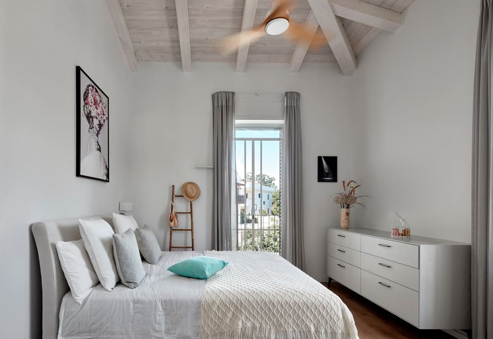
Two-bedroom suites were designed for the children on the top level, as well as a master bedroom. All rooms enjoy sloping white wood beam ceilings. The level was planned in such a way that the master bedroom is separated from the children’s rooms by three steps and a home office.
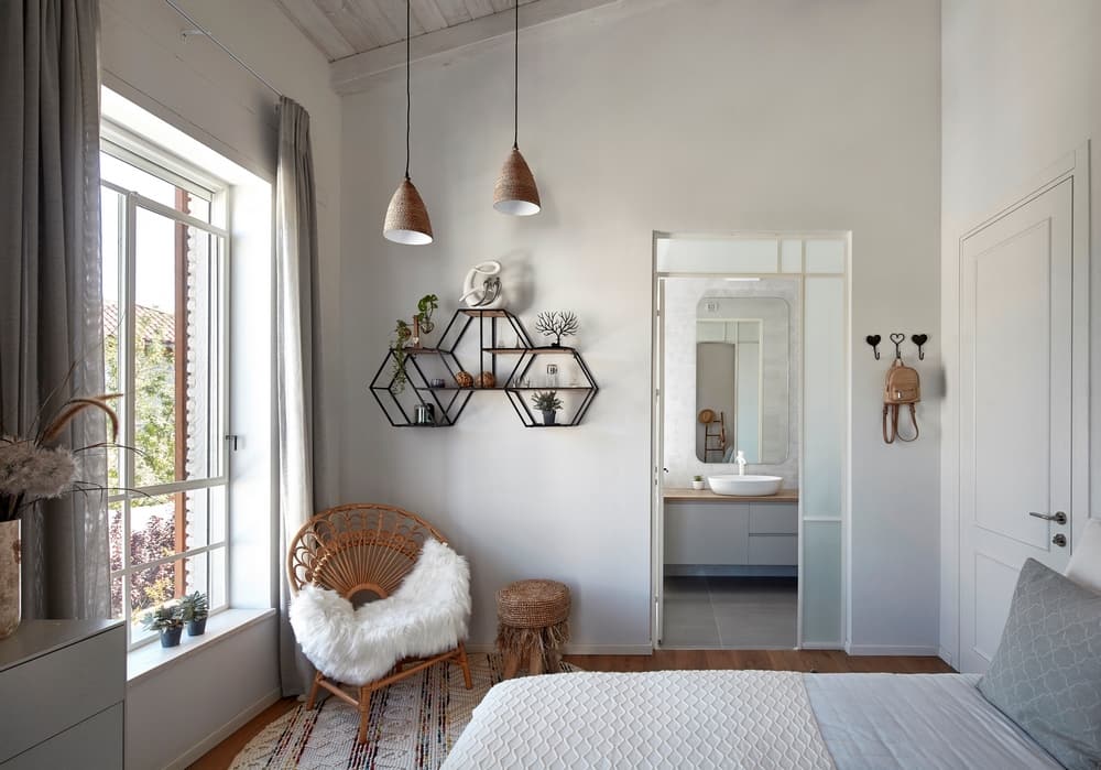
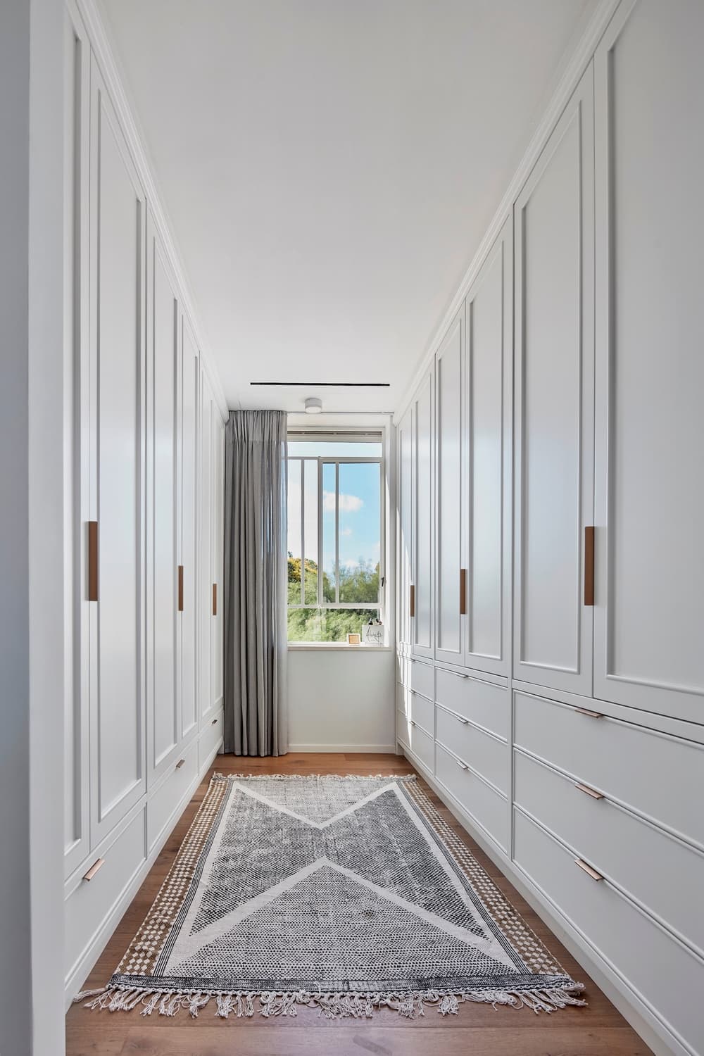
The master bedroom was designed as one space with a sloped ceiling under which half a wall separates the sleeping area from the bathroom. One side of the wall is fitted with a TV and the other with sinks, with the toilet and shower fitted directly across the bathroom. The large, fitted cupboards were painted a light color and the framed doors were fitted with golden handles.

