Project: Open Form Companionship
Interior Design: HAO Design
Location: Kaohsiung City, Taiwan
Year 2019
Photo Credits: Hey!Cheese
Text by Hao Design
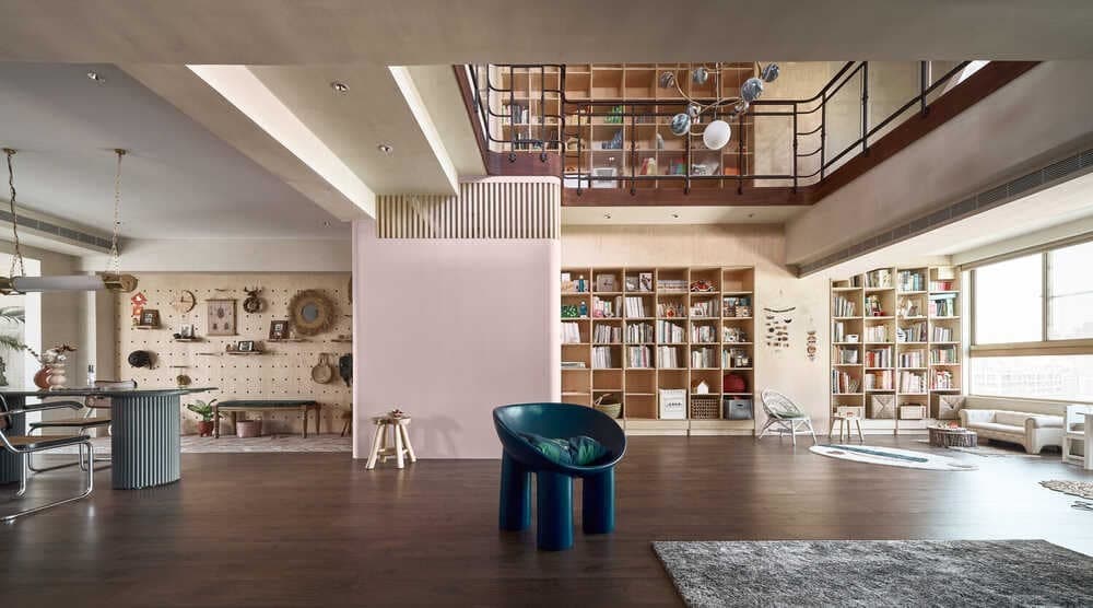
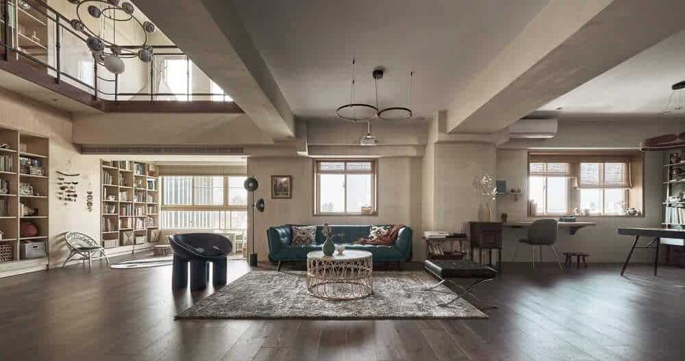
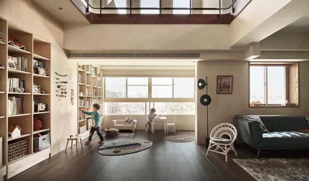
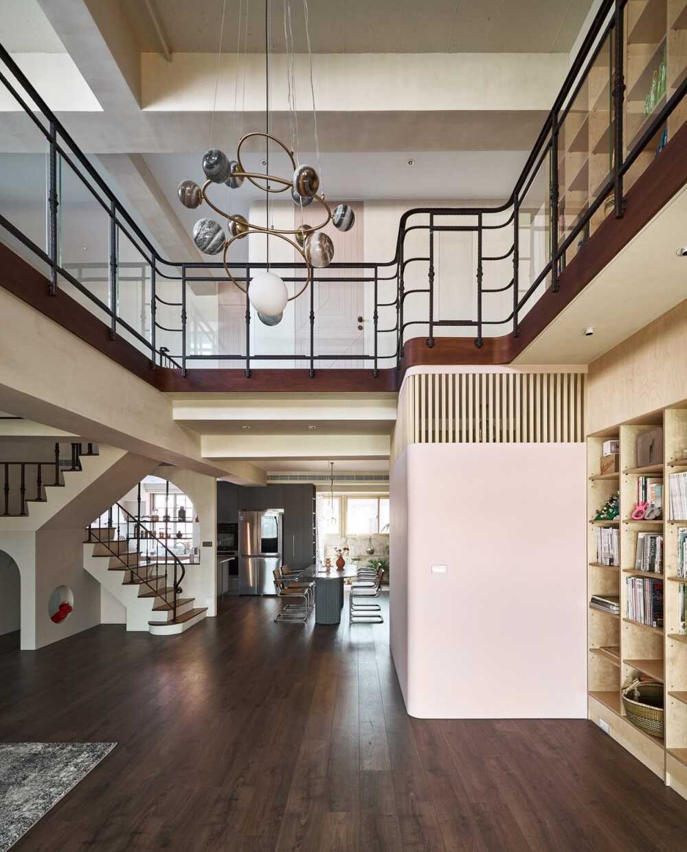
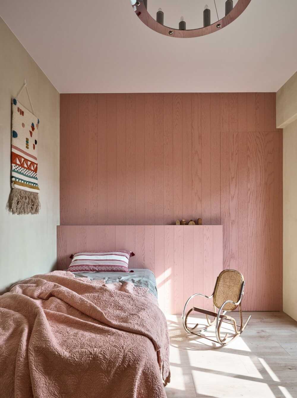
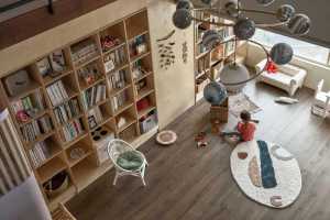
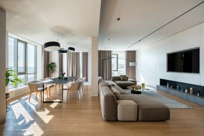
Unlike the usual parent-child space planning, which seeks to fill every place to meet the needs of all family members, here the designer chose the “children’s perspective” as the theme, supplemented by the needs of adults. The designer seeks to make a blank canvas from the spacious multi-layer space, and add a little bit of colorful pigment that is easy to mix to match to every room so that the little master can over time gradually fill in the colors and complete the mosaic with his own personality. The large spaces seemingly left blank are actually just the starting point, reflecting the most authentic family experience at all times.
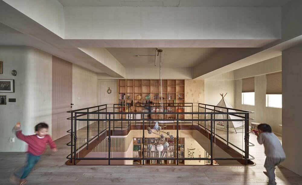
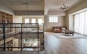
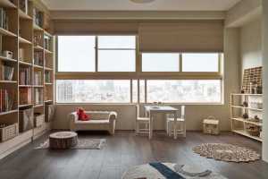
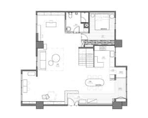
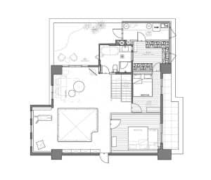
In order to allow the children who have been at home for a long time more freedom, we decided to abandon the original house structure and adopt an open layout. This allows every corner of the room to play a different mission. It is a self-contained living space that can be controlled by the child independently.
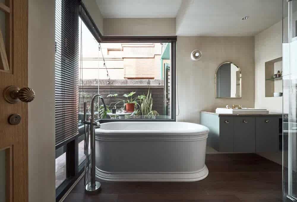
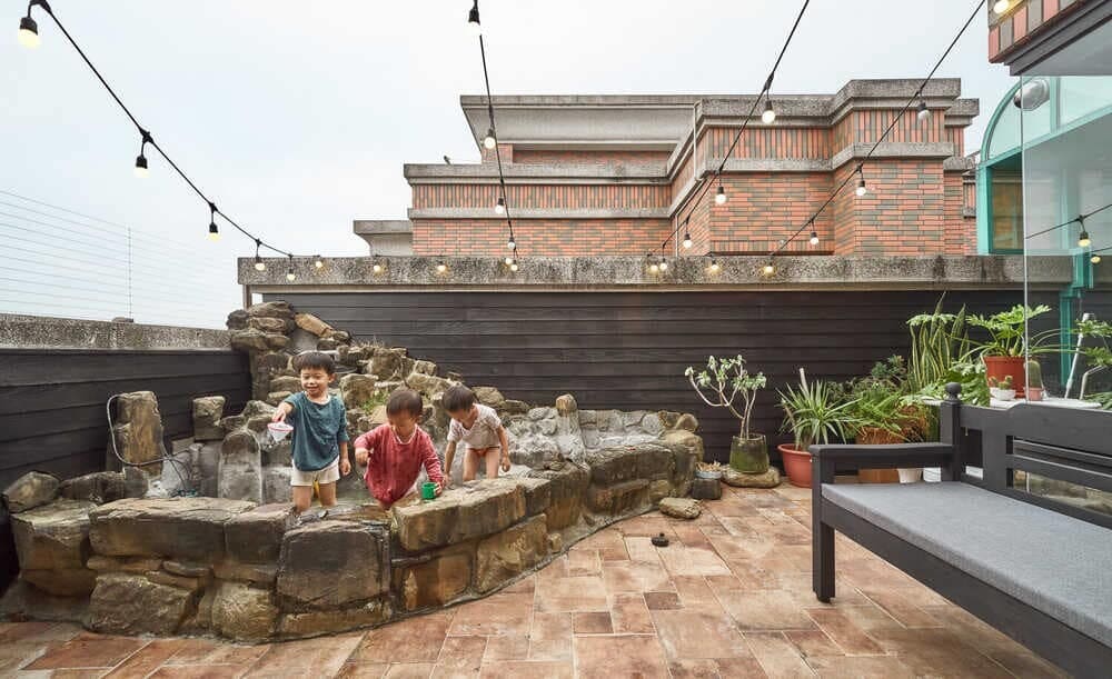
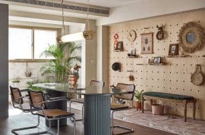
From the entrance, one can see the leisure outdoor kiln altered flooring extends the dynamic line to the balcony. It is deliberately designed to make it convenient for the child who like to play outside to wash his hands and feet. On one side, the entire pegboard can adjust its functions elastically. Different heights also allow the child space for free play and layout. The practical design of the corner space combines with the natural vegetation to create a feeling full of vigor.
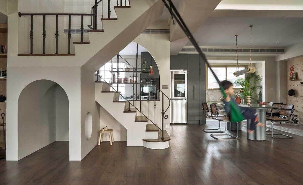
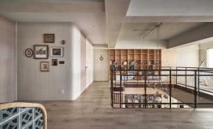
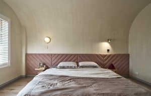
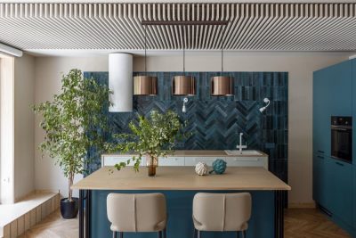
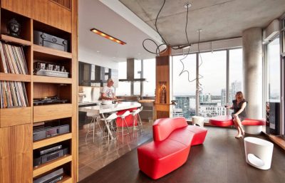
The opening design of the round arch of the kitchen and the location of the working area are convenient for keeping companions in sight and enhancing communication. The second floor is designated as the dynamic game area. The stair handrail combines woodwork with cement hollow bricks and the door engraved like the vein of leaves, revealing the hidden “natural” vocabulary with vintage elements in the details. The upholstery on the whole side of the master bedroom allows elastic adjustment and the diagonal stretchy cloth also mirrors the vein of leaves engraving of the door. The original beam is decorated with arch shaped hems. The overall hue is a “semi-finished” suspended state. Following the principle of “less is more”, excessive decorations are removed. It is just like retaining the simple and original appearance of the soil. Let the vision and touch return to the most primitive simplicity and freedom, and keep the pure origin of children’s imagination.
The design follows minimalist aesthetics, but it also adds some lively warmth to the parent-child space. Based on the style of self-fulfillment, the daily living scene is made full of “human nature” through the interactions of family members over the years. Deliberately leaving blank space makes the seemingly “incomplete” form more expressive of one’s spirit and liberates one’s ideal home from restrictions.

