Project: Ramat Hasharon Residence
Planning and designing: Halel Architecture And Interior Design
For: a couple in their 40’s and their 4 kids.
Where: Ramat Hasharon, Israel
Square lot area: 410 square meters
Builded land: 230 square meters
Photo Credits: Maor Moyal
The search for the perfect home is a difficult and challenging task, without a doubt. A father of a family of 6 who went on a journey to find the perfect house and saw no less than 300 properties until he found the one, together with Hadas Roth and Shira Muskal, owners of the firm “Halel Architecture and Interior Design” who are in charge of planning and designing the project, will testify to this. The new house they created is characterized by a meticulous fusion style that emphasizes original architectural motifs that are largely responsible for its uniqueness and elegance. Get ready to fall in love.
Welcome to the home of a couple in their 40s, who have four children – a home that was specially tailored to their tastes and needs and does not betray, even for a moment, the long journey that the father of the family made from the moment he made the decision to leave their apartment until the day he finally found the property of his dreams.
“we have known the owners of the house for years, We designed the apartment they lived in until they moved to the new house, which over the years became too small for a family of 4 teenage children,” according to interior designer Hadas Roth, owner of the firm Halel Architecture and Interior Design, which specializes in property improvements.
“Before we found the house, which is located in Ramat Hasharon, the owner looked at no less than 300 different houses in the Sharon area. This property, which we helped to locate, particularly fascinated him not only because of its great architectural features that are difficult to find in new construction (such as a division into levels and high, sloping ceilings) but also Thanks to the exciting and special story of the house.”
“It was built in the 1970s by a Greek architect and was the joint home of two good friends. The impressive and spacious building was divided into two separate units centered on a common patio, the yard was also open and shared,” explains Michal Aizenberg, project manager on behalf of Halel Architecture and Interior Design.
“Over the years, one of the friends decided to sell her house, which, as mentioned, is characterized by unique architectural elements that are no longer seen in new construction: the four levels, the lighted patio, the sloped ceilings and the green grove that borders the rear front (instead of neighbors) were very enchanting to the new owners, and after many months of searching, the decision was finally made And the property was purchased.”
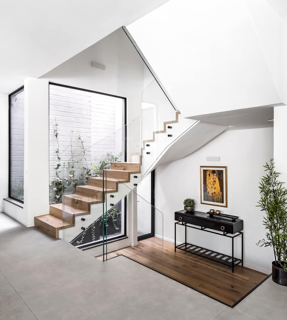
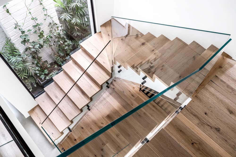
As part of the new planning process, the firm’s planners created a number of fundamental changes in the existing structure. First, it was necessary to divide the shared patio, in the center of which was an existing tree that should have been left. Therefore, a wall was built around it in different levels, covered with concrete textures and plasters, and vegetation was planted next to it. In this way, a new, bright, intimate and private patio was actually created next to the staircase that connects the levels. Another fundamental change was the redefinition of the existing functions in the levels.
Originally, the entrance to the house was made directly from the lower level on the ground floor, where the guest bathrooms and a work space used by the previous owner of the house were located. In the new planning, it was decided to allocate this level in favor of the bedroom suites of the two teenage children and to move the entrance to the house to the second level where the public space is located. To that end, the planners changed the location of the entrance; Now those who come are welcomed by eight wide, moderate and comfortable steps around which plants have been planted and next to them a relaxing waterfall has been integrated – an experiential and interesting way to enter the house.
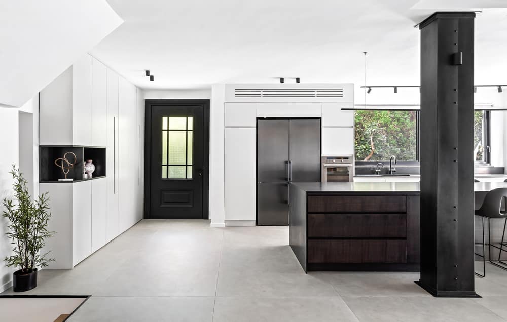
Next to the entrance door to the house, a wall cabinet was designed in which the electrical and communication systems are hidden, and a place for coats and everyday items. The fronts of the furniture were painted in the oven and thin grooves were made in them that serve as both handles and ventilation openings. At the end of the unit, a stylish niche was designed for decorative objects that breaks the sealed mass.
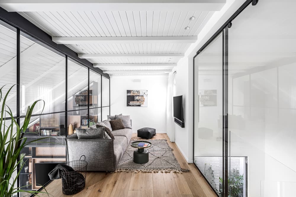
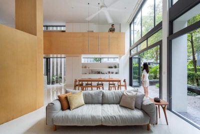
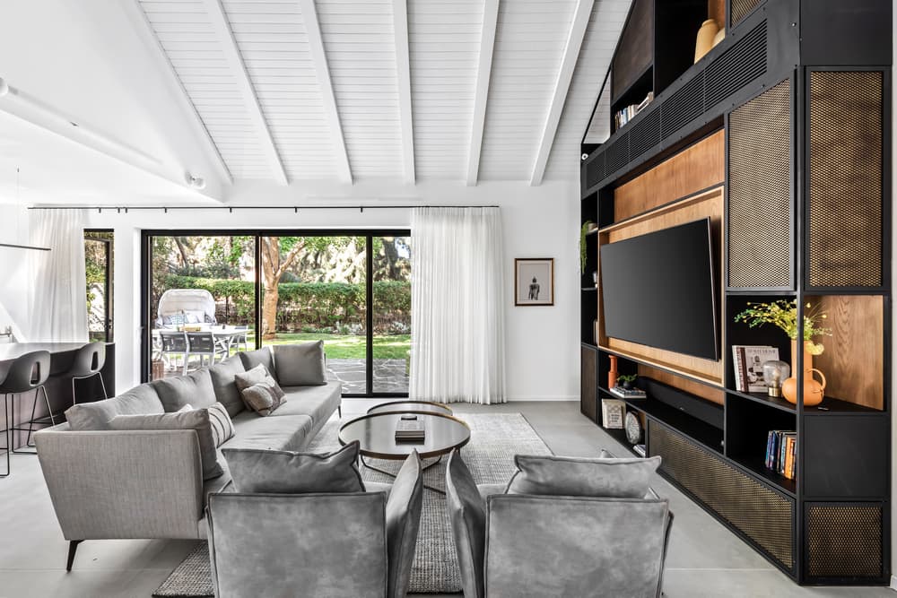
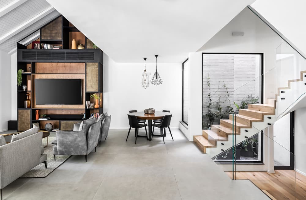
In the bright and spacious public space are located the kitchen, the living room and the dining area. “In fact, we were left with only the shell of the original building and most of the interior layout was completely changed, so were the windows, which were significantly expanded and equipped with aluminum and glass systems that let in plenty of light and air,” says Hadas Roth, owner of the firm. “From a country house in its being, we turned this living environment into a fusion experience that connects different design styles that coexist here in complete harmony.”
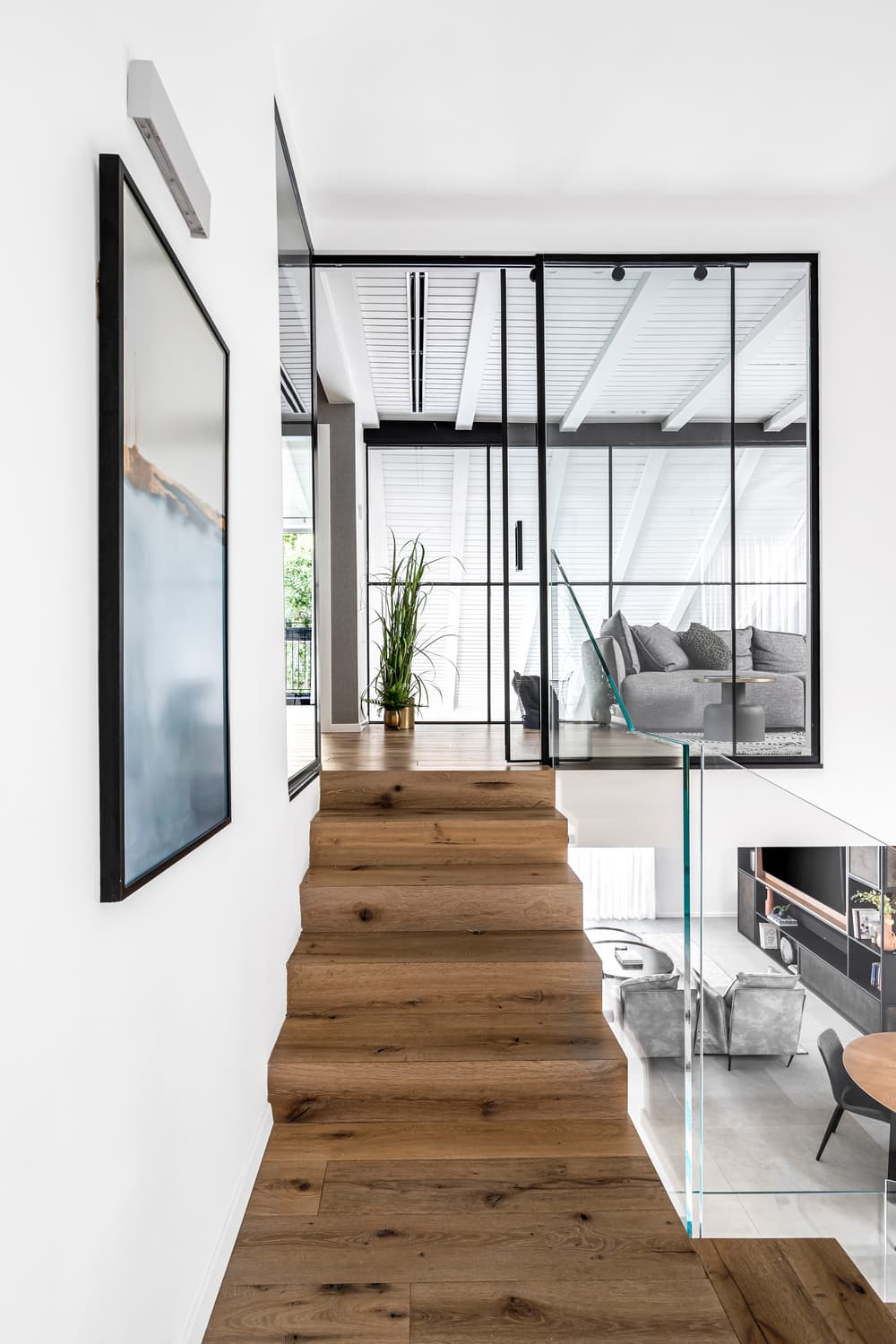
“The original staircase was very impressive, so we left the existing skeleton and covered the steps with oak; a dominant and present material that repeats itself in the various wings, alongside the iron and concrete,” Aizenberg adds. “These three materials exist together in every space, in different doses and applications. This is how we created a system of connections between the various functions and the spaces and maintained a uniform concept that never stops renewing and changing. In practice, this house can be defined as sculptural and three-dimensional. We turned the challenge into an advantage and created an optimal connection between the levels.”
Another impressive architectural feature, which is present in this house and gives it its unique appearance, are the sloped ceilings that were originally covered with wood that is now painted in light colors and decorated with blocky beams that enhance and emphasize the motif of height and slopes. According to Roth, “In the living room, we emphasized the height dimension even more by designing an iron and wood library that forms the heart of the house. A power wall in the public space that brings together a variety of important functions such as a VRF air conditioning system with the TV screen, a beverage bar and display shelves for accessories and books.”
The floor of the space on the public level is paved with compact and large tiles (1/3 m) and it forms a landing between the lower level and the third level (where the suites of the two small children are located), which are paved with oak parquet and are visible even when on this level. The original kitchen, which was enclosed between walls, was completely opened towards the living room and the dining area when a single structural column, which is a memory of the old design, was covered with natural iron panels and became an integral part of the new design.
The fronts of the new kitchen were painted in the oven and the fronts of the island were covered with combed wood that adds layer and texture to the space. The surfaces are black natural granite stone surfaces that integrate with the natural and organic materiality in the space. The dining area is located in the only area in the space where the ceiling is lowered, an optimal location for an intimate and anchored function by nature. The planners chose a round dining area that does not take up much space and enhances the feeling of “togetherness” at family meals.
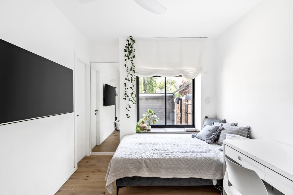
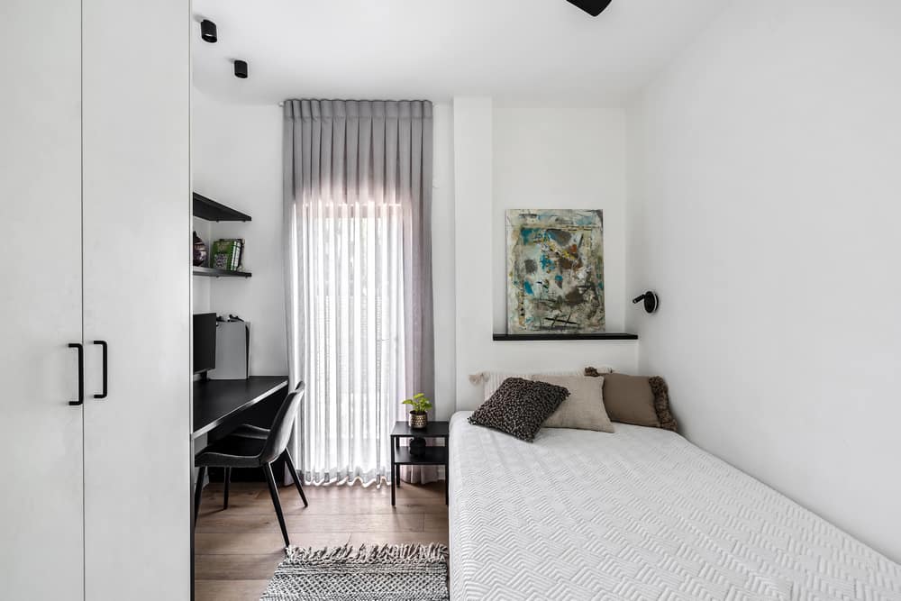
The four children were given private suites; Two of them, those for the older children, are as mentioned on the lower level and two more, for the younger children, are located on the third level. Each of them was designed in line with the general design concept and includes a bright and spacious bedroom, a private bathroom and a wall closet.
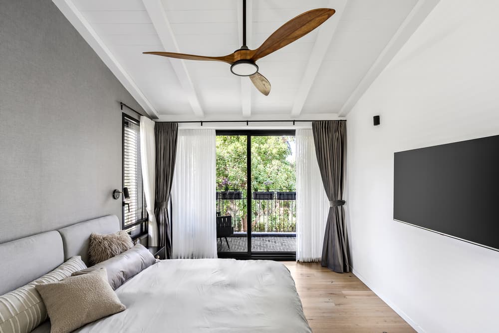
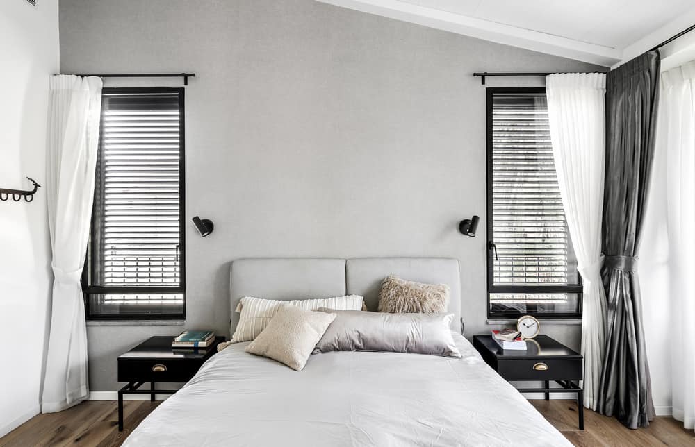
The parents’ master suite, located on the fourth level, includes a gallery that overlooks the living room. It was originally enclosed by a wooden railing that has now been replaced by a glass display case that allows on the one hand to observe what is happening in the public space and on the other hand privacy for the parents. The original ceilings were removed and in their place new beams were installed that correspond with the ceiling of the living room: “We raised the height of the original ceiling. That is how we increased the volume and therefore automatically the space looks bigger,” says Aizenberg.
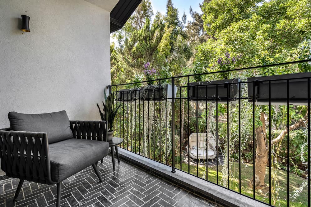
“We created an aesthetic and clean room with hotel vibes and a perfect view towards the grove. The floor of the space was covered with a slightly bleached oak parquet and instead of blinds we installed velvet curtains that give off the atmosphere of a boutique hotel. In the corridor, which leads from the bedroom to the bathroom, the storage cabinets and the clothes were designed and dyed in the oven in the shade of The walls and they have integral handles. The intimate covered balcony in the master is the couple’s favorite place according to them, and serves as a kind of picture frame of the outside.”
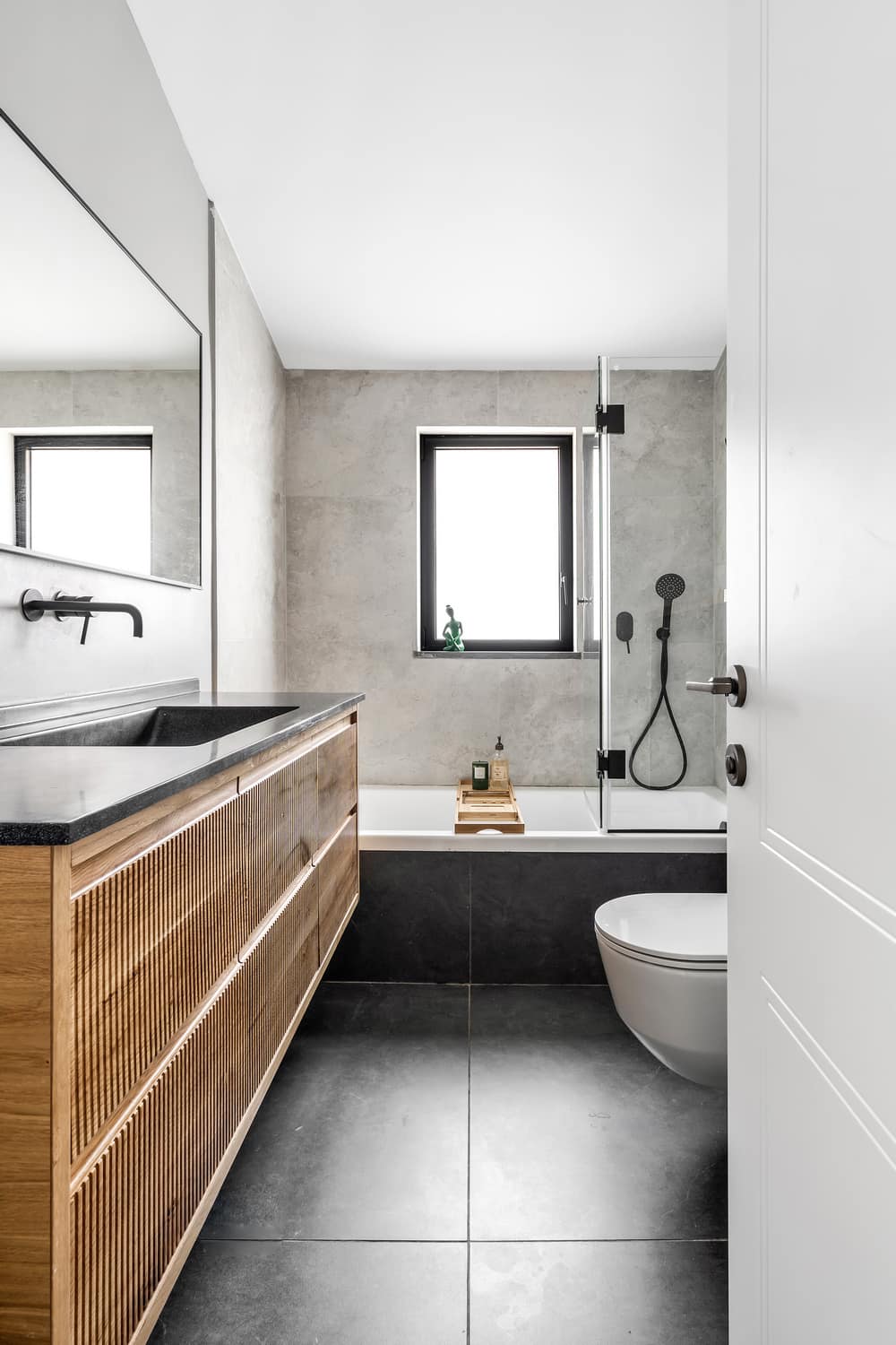
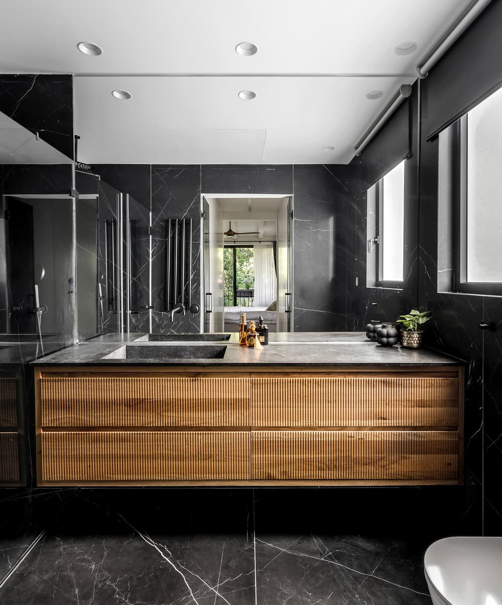
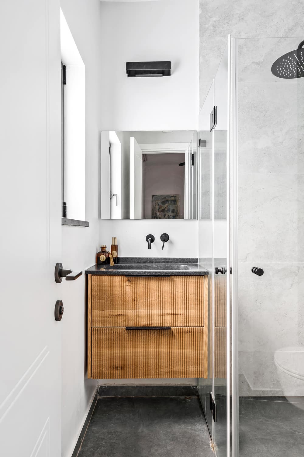
“The bathroom in the master bedroom was designed with a darker and more dramatic line. Its floor is covered with stone-like porcelain granite tiles and to give it a sense of size we designed a huge mirror on the wall that doubles its size. The couple enjoys a large and luxurious shower and the bathroom cabinet we designed for them is made of oak wood with a texture of stripes and grooves.”
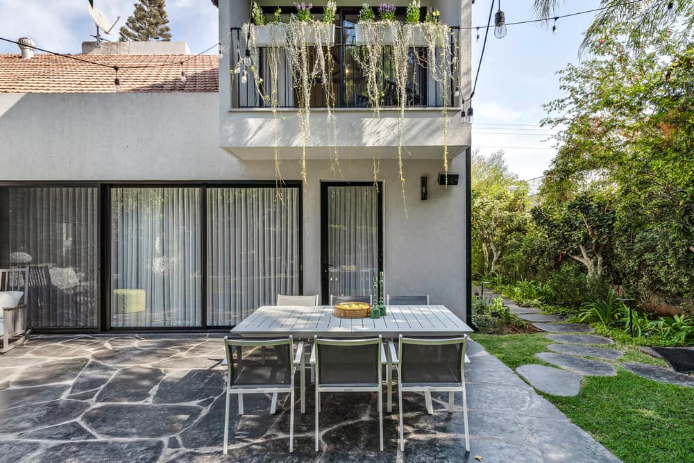
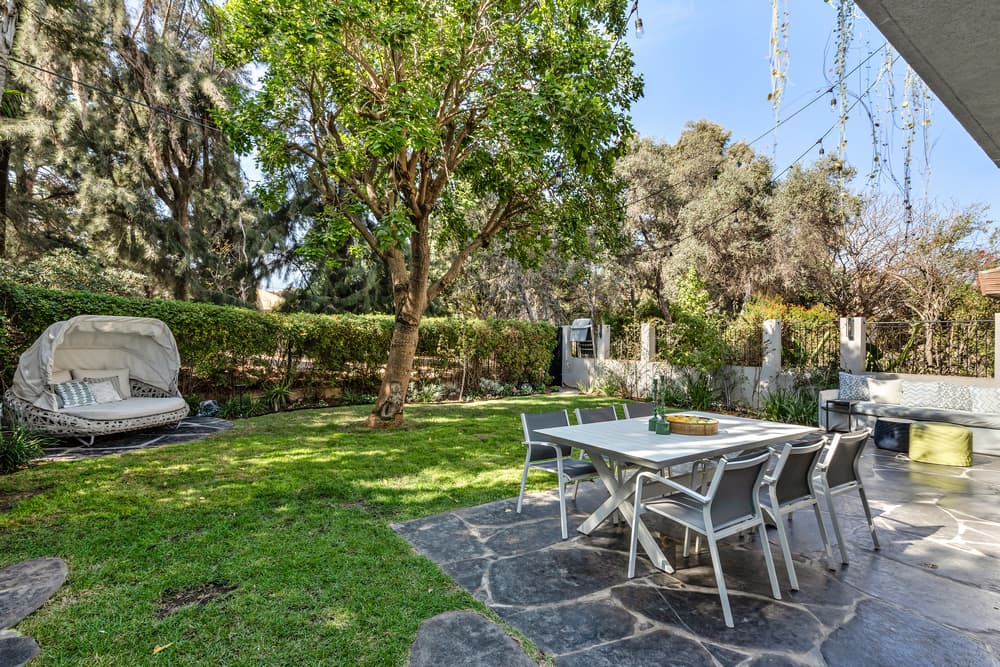
One of the great advantages of the Ramat Hasharon Residence is, as mentioned, the adjacent grove bordering the backyard and it is evident that the design language of the interior of the house is also maintained in the outdoor environment: “We preserved the organic and natural appearance by using unhewn amorphous basalt stones – a black and natural stone that penetrates into the private space as well.” Roth summarizes.
