Project: Rodrigues House
Architect: Luciano Kruk
Construction: Constructora Correa
Project Manager: Arch. Belén Ferrand
Construction Manager: Arch. Belén Ferrand
Collaborator: Denise Andreoli
Location: General Rodriguez, Provincia de Buenos Aires, Argentina
Photos: Daniela Mac Adden
Text editing: Arch. Mariana Piqué / Luciano Kruk
Land area: 1980 m²
Built area: 159 m²
Construction year: 2018
Rodrigues House is located in La Esperanza, a gated community halfway between Pilar and General Rodríguez. This rural urbanization’s great lots are surrounded by polo clubs. Its streets, made out of compact calcrete and crushed stone, are configured in accordance with the area’s longstanding woods.
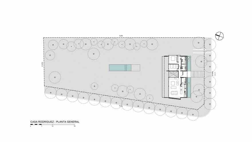
The corner lot in which the house is situated is 80 meters long and 29 meters wide at the front, and becomes narrower towards the back. Rows of willow-trees surround the terrains flat topography.
This commission was made by a young couple with no kids that wanted to build their permanent residence. They asked for a house with a pure external image and an uncomplicated inner distribution. A single floor needed to accommodate a master suite and a second bedroom sharing a bathroom with a completely integrated social area. They also requested a project for a future enlargement in view of the possibility to include a third bedroom.
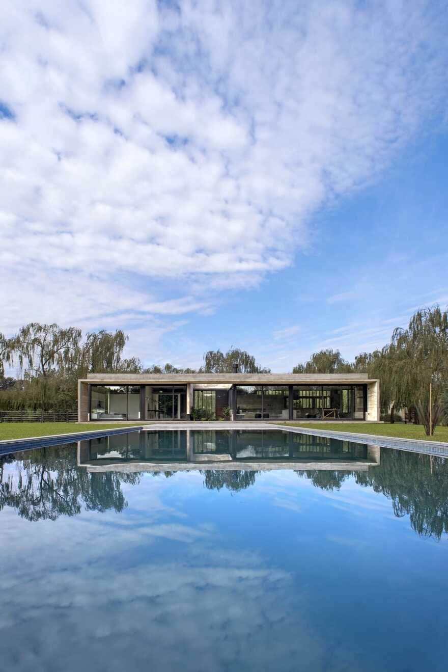
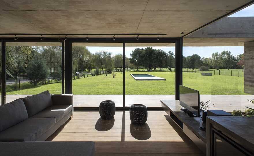
They wanted a spacious gallery that would allow them to be in close touch with nature and a swimming pool. After taking a look at other houses built by our studio, they manifested their attraction to reflecting pools and patios, and they came up with the idea to incorporate those into their project.
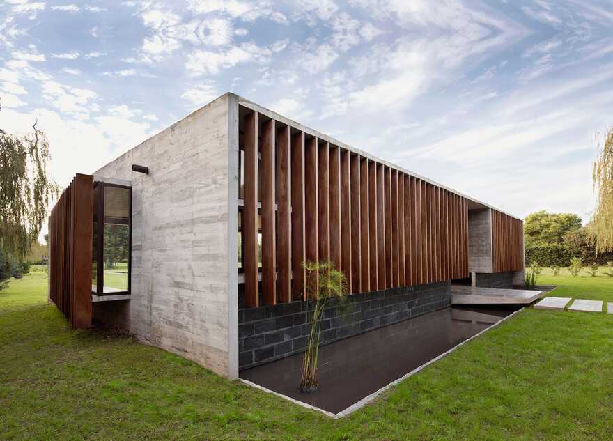
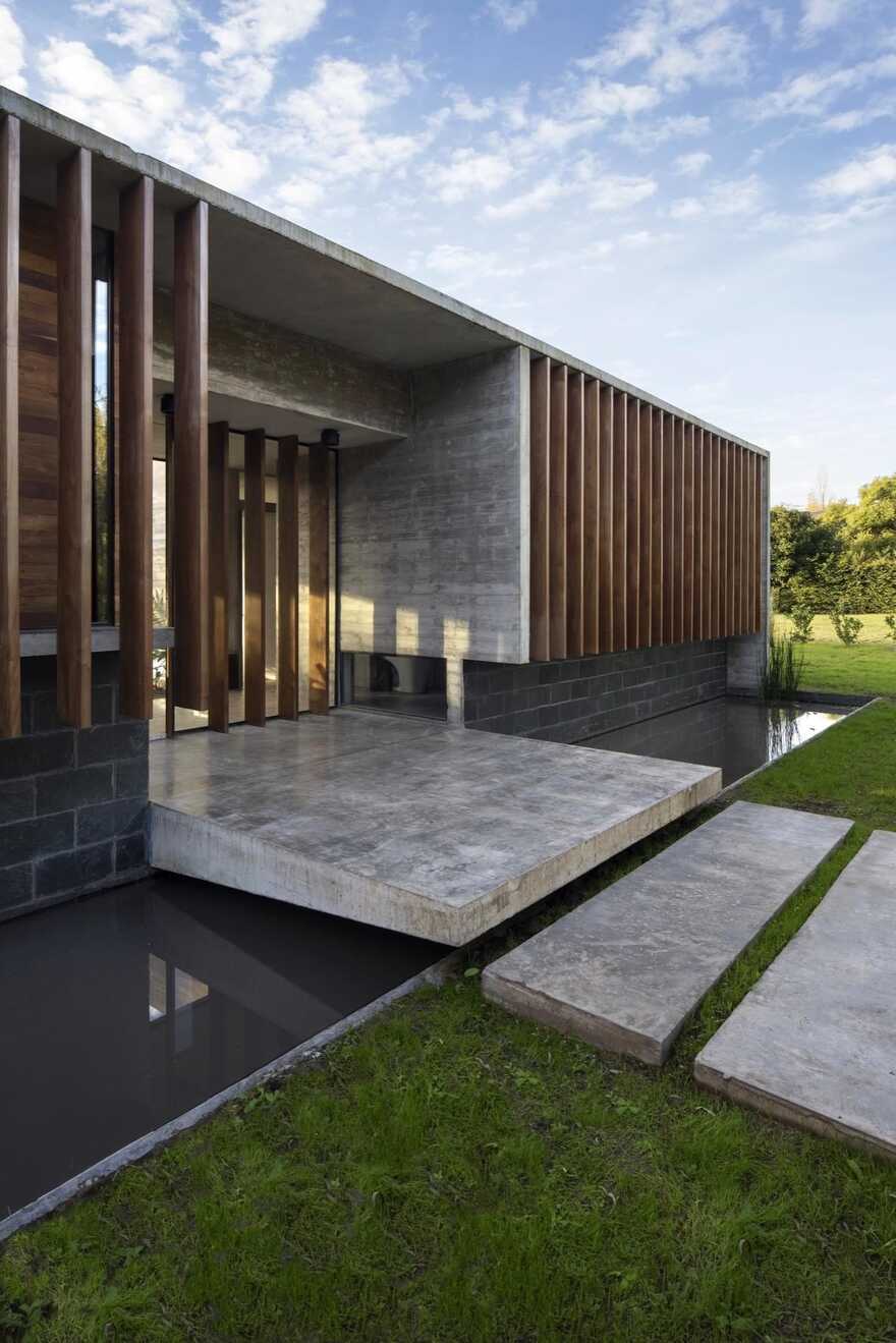
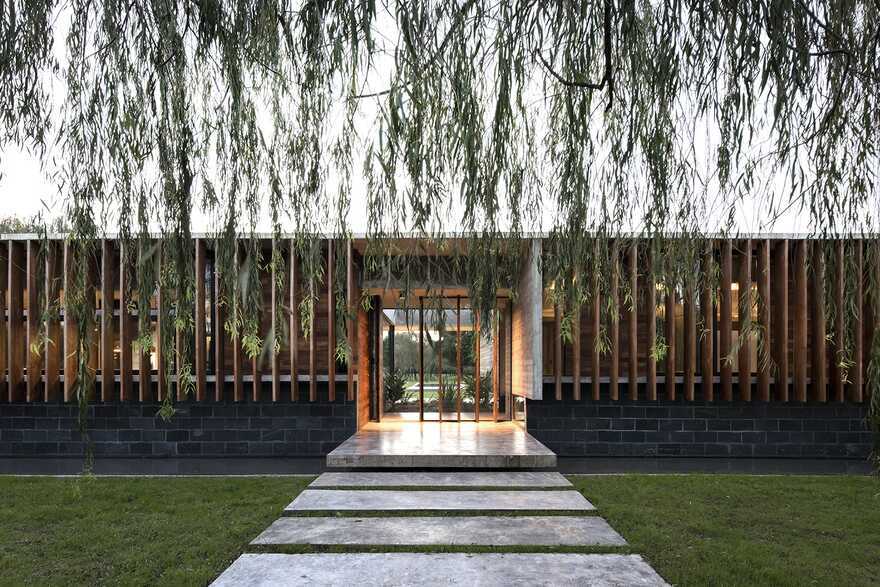
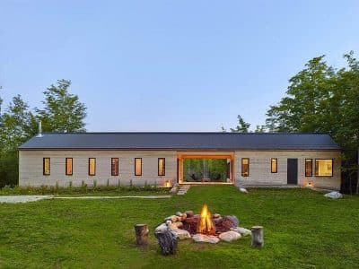
The Rodrigues House was designed as a pure volume. Taking into account regulatory setbacks and keeping in mind a future expansion, the built area took up the lot’s whole width. A platform made out of concrete allows one to walk over a reflecting pool and reach a semi-covered reception hall. Right across the door, the first thing that comes into sight is a leafy inner patio just behind a glass panel. This patio arouses the senses as it allows views that go to the back of the lot.
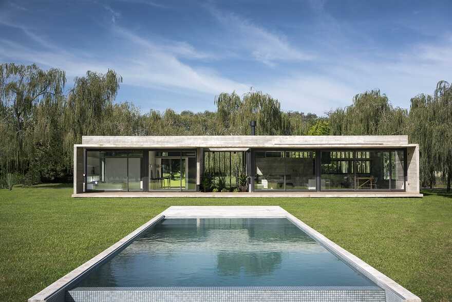
The path that connects the entrance, this patio and the pool in the backyard intercepts the one created by the spaces within the house, which helps organize the house around two axes. Facing north, the main areas open up –through the gallery- to the exterior space, whereas service areas aligned become part of the façade. At the same time, the inner patio establishes a border between the private and social areas of the house.
With regards to the limits of the built volume, the front, the back and the sides were treated differently, thus creating three separate systems.
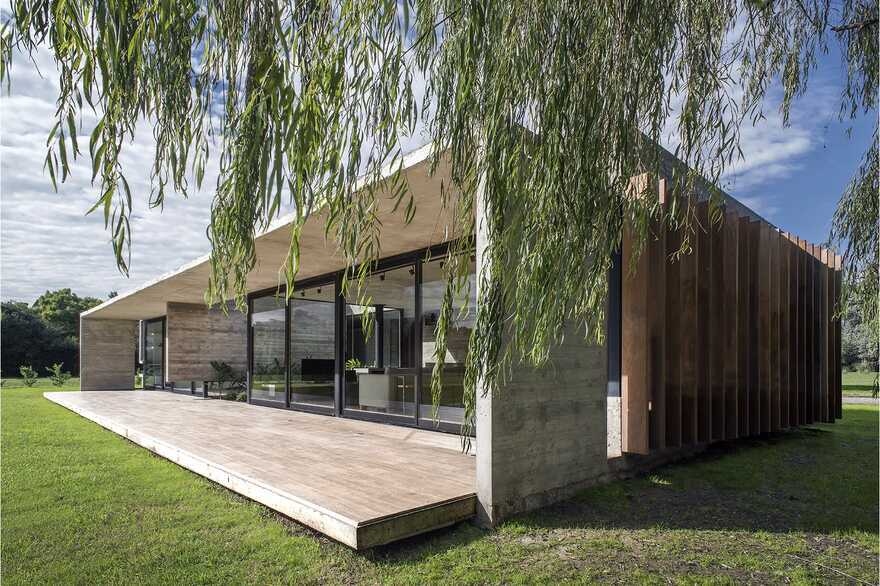
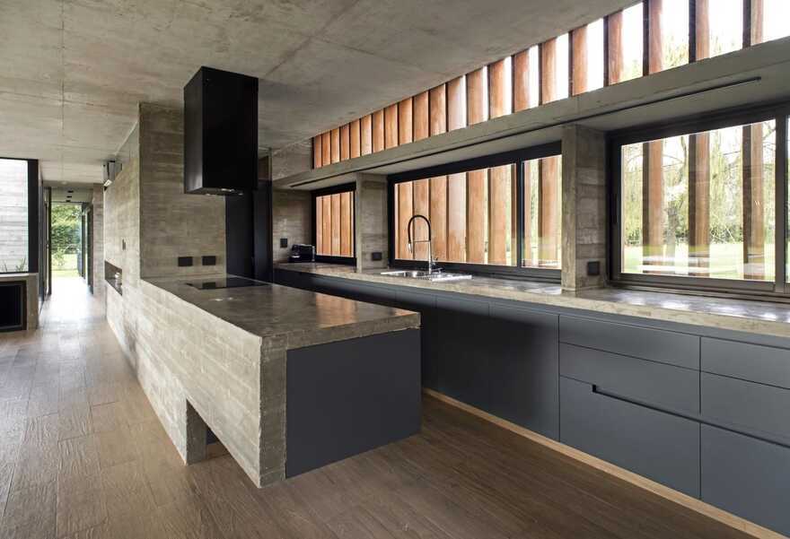
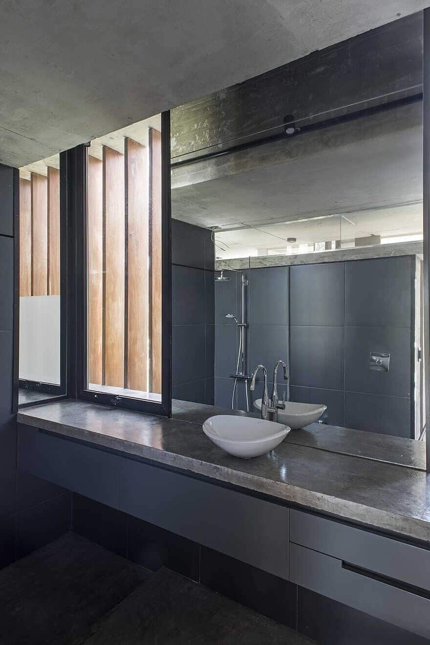
The main facade’s most noticeable characteristic is its system of lapacho wooden planks that hang vertically all along the front. Behind this latticework, a system of short hanging walls in combination with translucent glass, configure the inner skin of the wet spaces. The plank system helps harmonize these openings and closures creating a rhythm and an organization that allows looking out from the interior without being seen from the street.
As these planks fail to reach the floor, a short black flagstone wall rises. Its darkness makes it look further away, which in turn makes the planks pop up from the wall, and the whole structure appears to be floating. The facade itself was intended to appear to be floating, hanging above the water.
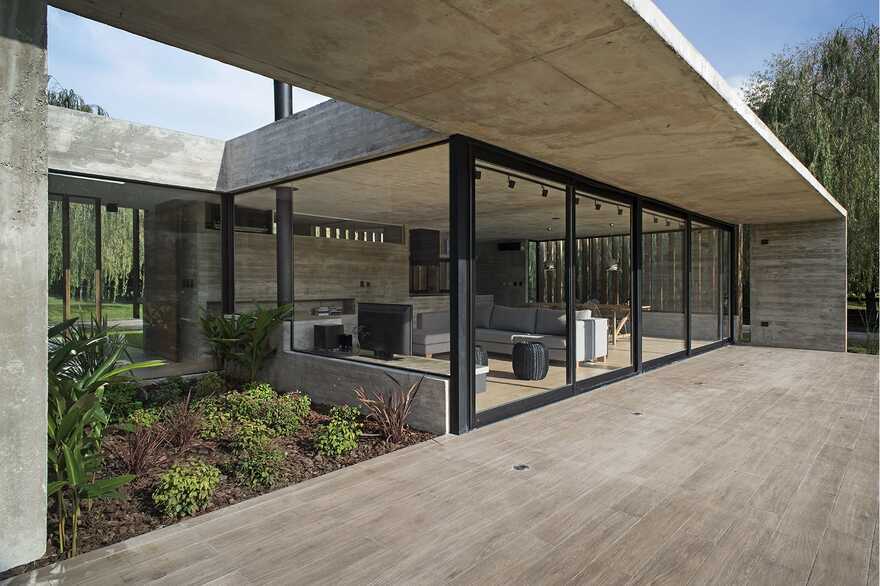
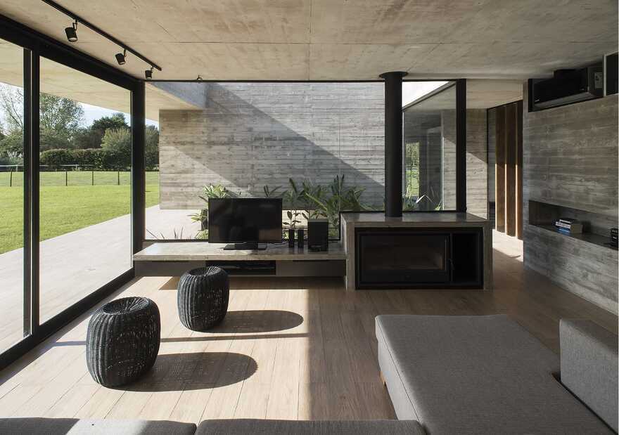
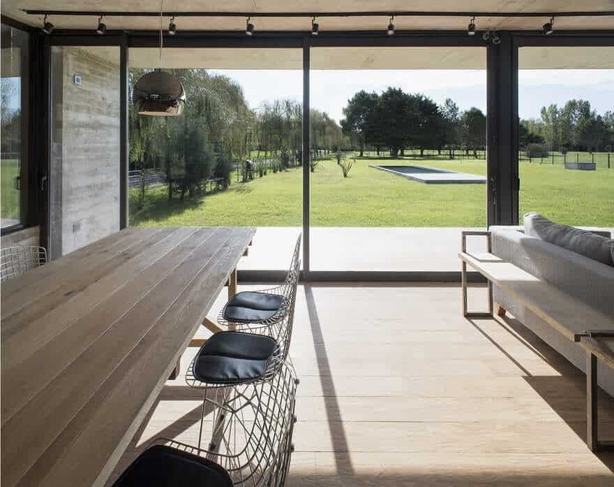
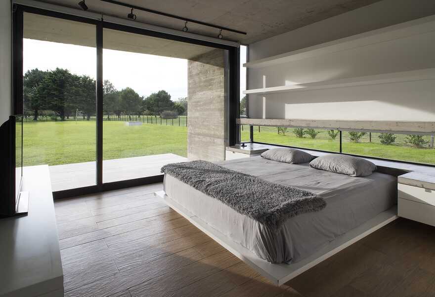
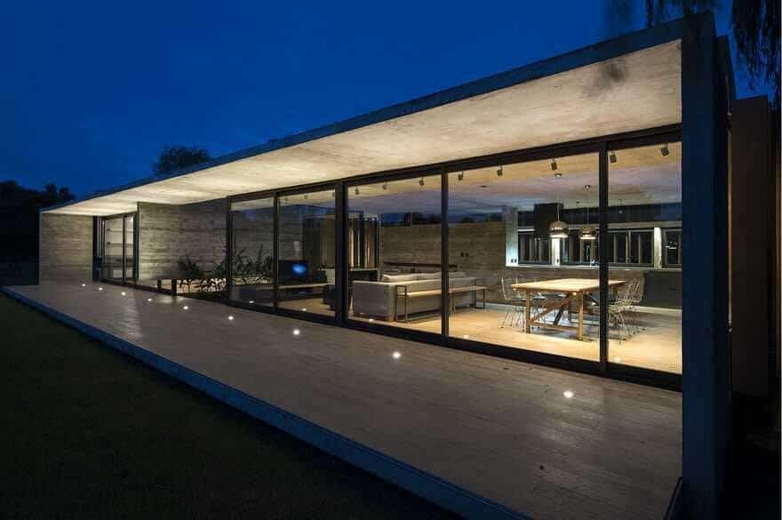
Unlike the front skin, the back of the house is completely made of transparent glass. The openness with which its joinery is designed from floor to ceiling allows for a complete integration between the inside and the outside. The semi-covered gallery serves as a transition towards the backyard and shelters the inside from direct sunlight.
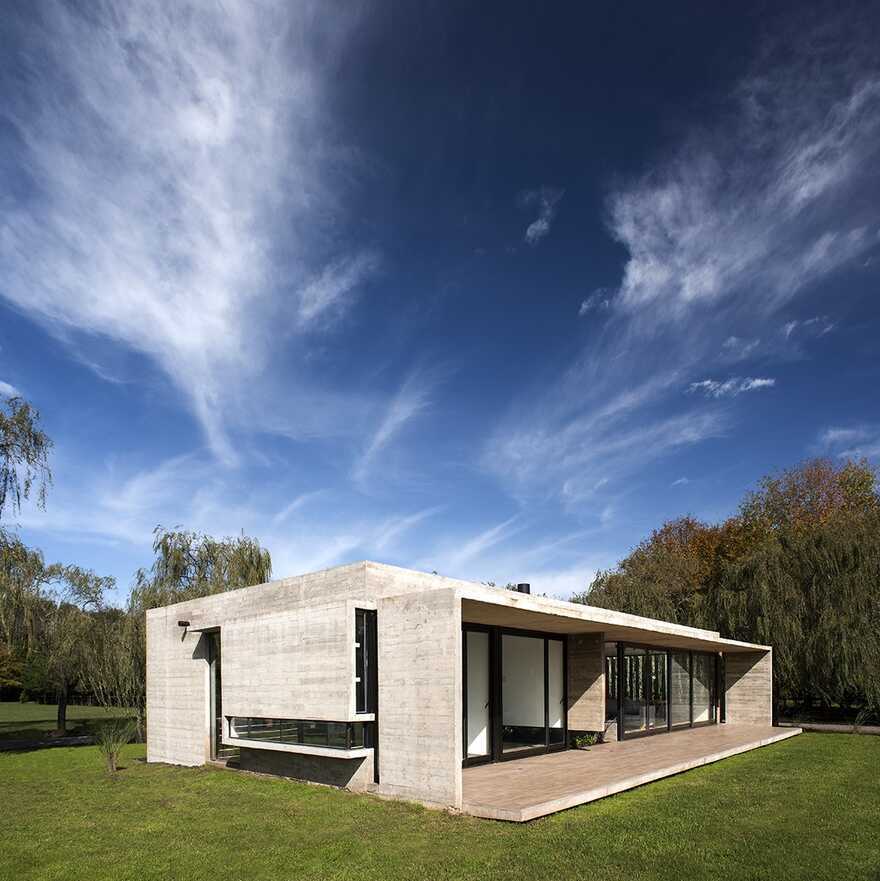
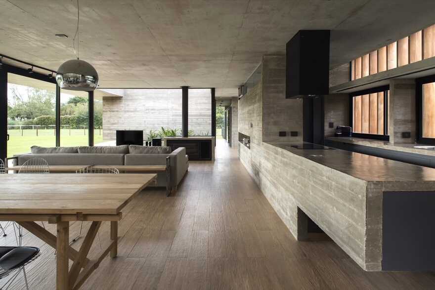
The side shell is made of almost blind partitions standing on the floor. Contrary to the other two systems, the sides of the house don’t deny their connection between the volume of the house and the terrain. The one facing the side street also takes advantage of one of the tools used by the facade’s system. With the intention to allow some light to enter the house and to provide some views from the street into the social area, a series of vertical wooden planks float over the glazed pane. In this way, and taking into consideration the connection of this area with the inner patio, the unified living and dining rooms are sunlit and open from three of their sides. On the other hand, the opposite side of the house is not as open: a concrete wall and glazed panes of well thought of dimensions wrap the most intimate parts of the house.
The lighting intensifies the building’s horizontality. Inside, two sets of rails hang from the ceiling from side to side both on the front and at the back. Also, a row of built-in lights is set along the gallery’s ceiling and floor.
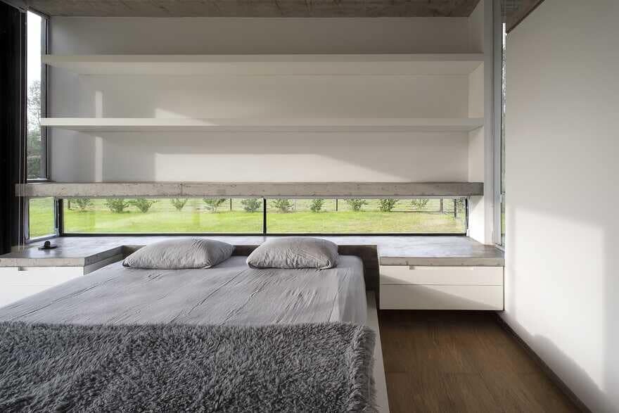
The commissioner asked that the inner walls of the private side of the house be white, so these were built with plastered bricks. The structure of the Rodrigues House is organized around a concrete loads-bearing walls system that interacts with inverted t-beams, which reach the height of the loads and hide the system from view. The ceiling is a traditional flat roof system: a light sloped base-floor over the slabs, concrete bed and membrane.
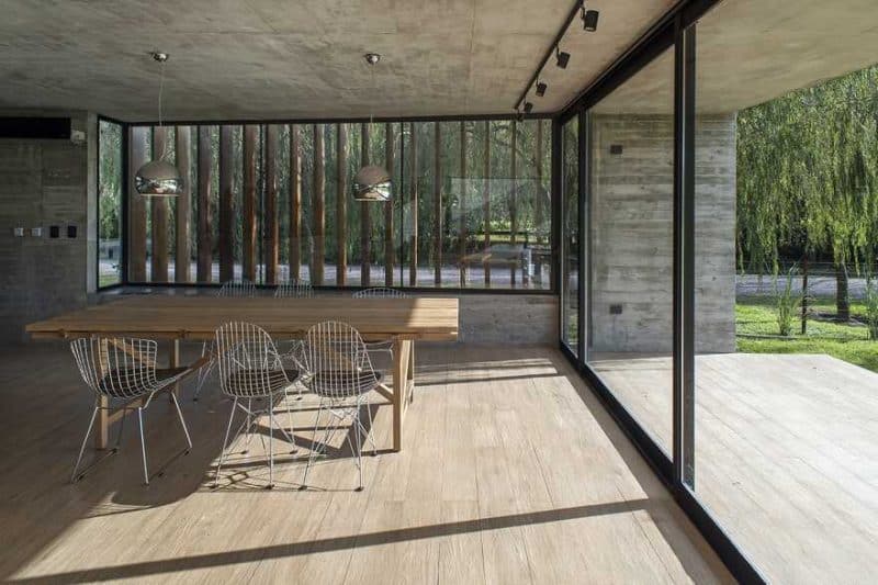
Inside, the exhibited slabs function as ceilings. The exposed concrete surfaces reflect their handmade formwork. While on the walls we used horizontal pine planks, you can still notice the places where the phenolic plates touched each other on the ceiling.
On the one hand, the austere exposed concrete guarantees the building’s continuity in time. On the other, the material composition aims at becoming one with the rural environment where the house is located. The simplicity of the functional organization, perceivable on the floor-plan, comes into reality on the morphology that contains it: a big tunnel made of mainly horizontal edges.

