Project Name: Runxuan Textile Office
Design Firm: Rationale International — Masanori Design Studio
Chief Designer: Terry Xu
Design Team: Gorry Huang, Gavin Peng
Construction Drawings: AND Design
Materials Supplier: Grepoo Material Trade
Main Materials: Aluminium Alloy, Florina Ceramics
Original Brand Furniture: Masanori Art
Location: Foshan, China
Completion Time: 2020
Area: 250 m2
Video Production: MUTU 3D Film Create
Photographer: Yun Ouyang
Text and photos: Courtesy of Masanori Design Studio
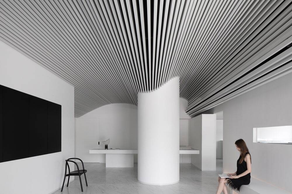
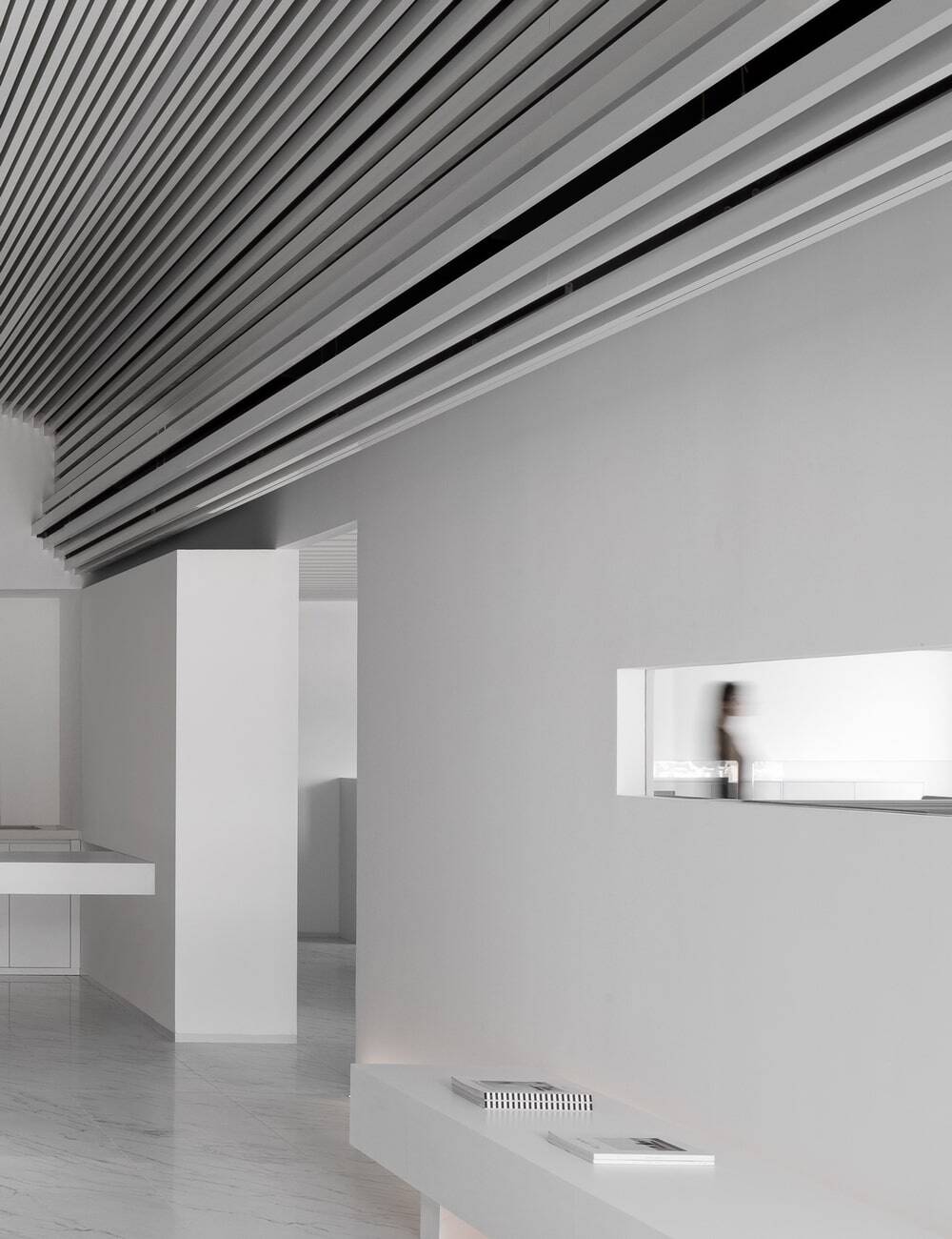
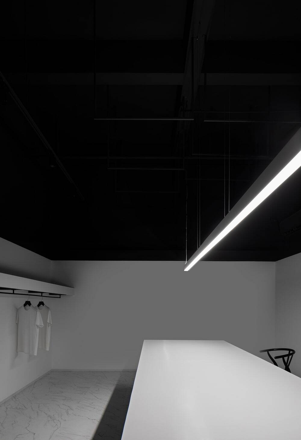
The space features pure white tone, as well as natural textures and atmosphere. The interior design draws on the pureness of white hue, and interprets the production process of cloth via architectural languages, which extend from the exterior to interior and conveys the brand values in a subtle manner. The flexibility of cloth is translated into mountain range-like undulating rhythm in the interior space. The artificial “skylight” reconnects the space with nature, and helps produce a comfortable, pleasant working environment.
From cotton to yarn, behind the cloth is textile culture, which is interpreted through spatial design languages and fused with modern materials. The design pays great attention to the integration with nature, in order to respond to the brand’s pursuit of natural and quality raw materials.
Project Background
The Runxuan Textile Office is located in Zhangcha, which is a famous textile town in Foshan, China. Most villages here have an industry park, and textile workshops are scattered throughout the town.
Rationale International — Masanori Design Studio was entrusted to conceive a workspace for RUNXUAN TEXTILE, which hoped the new office could help enhance its brand image and competitiveness in the market.
The space occupies the first floor of a property. The facade of the entire building are available for the brand, but the property owner required that facade renovation should ensure ventilation of the second floor and respect the existing tile cladding.
Interweaving of Straight Lines and Curves
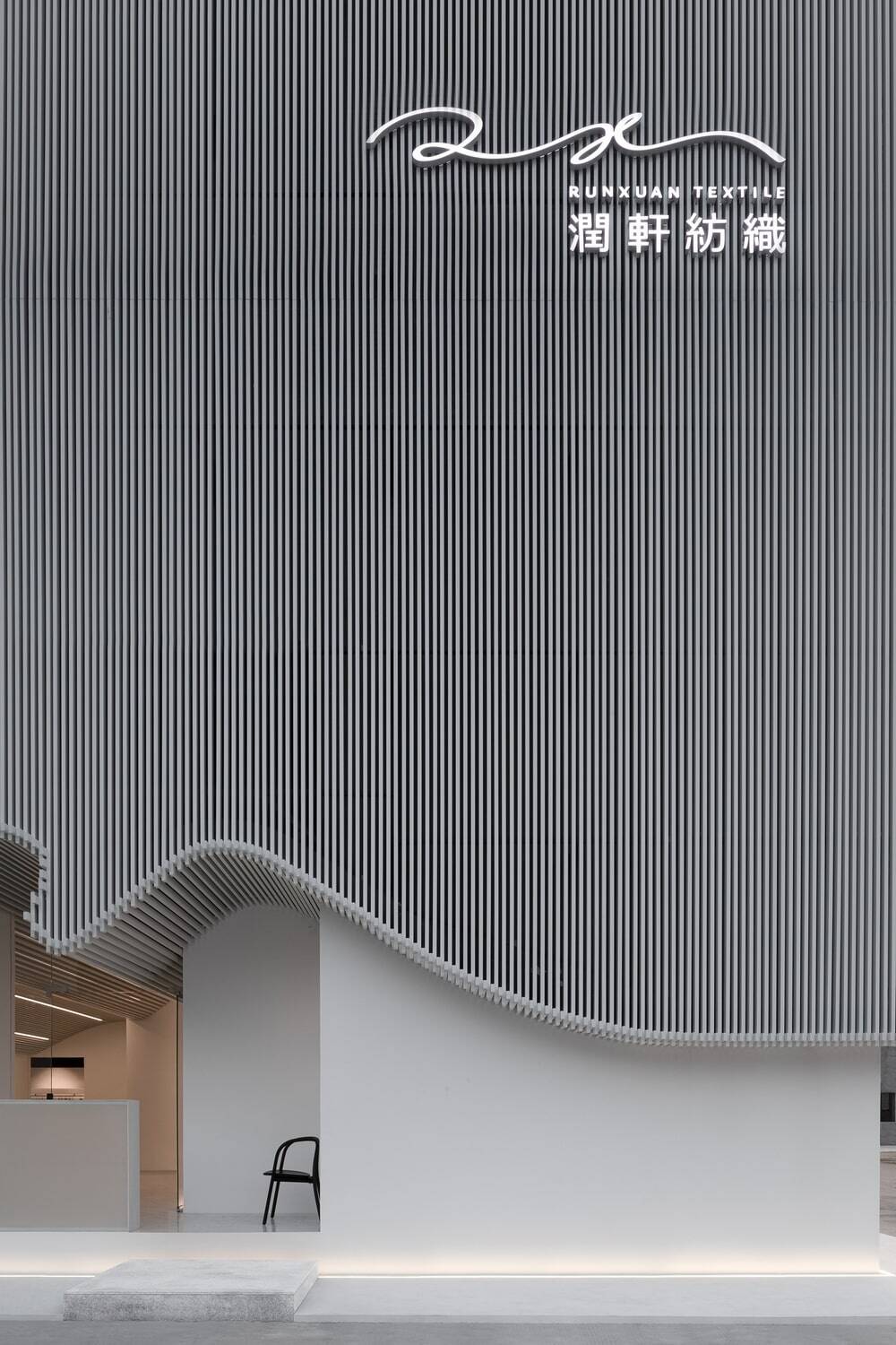
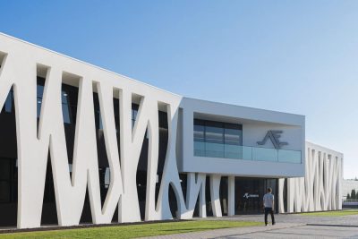
The curvilinear bottom of the building implicitly expresses the flexibility of cloth. The curve of the front facade is consistent with the logo of the brand, thereby creating a visual highlight and impressing visitors at first sight.
Both the exterior and interior are dominated by white hue, as pure as cotton. The large French window reveals the pure interior, which is endowed with a sense of layering by spatial structures.
White aluminium bars extend from the top of 2F facade to the ceiling of the first floor. Looking like dense, orderly rows of yarn on looms, those neat lines envelop the entire building.
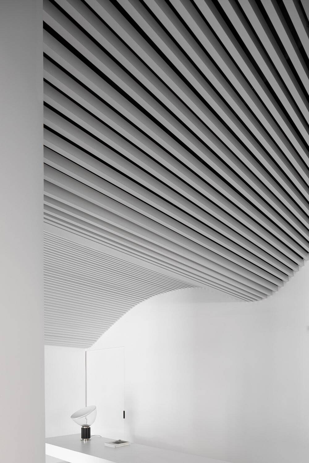
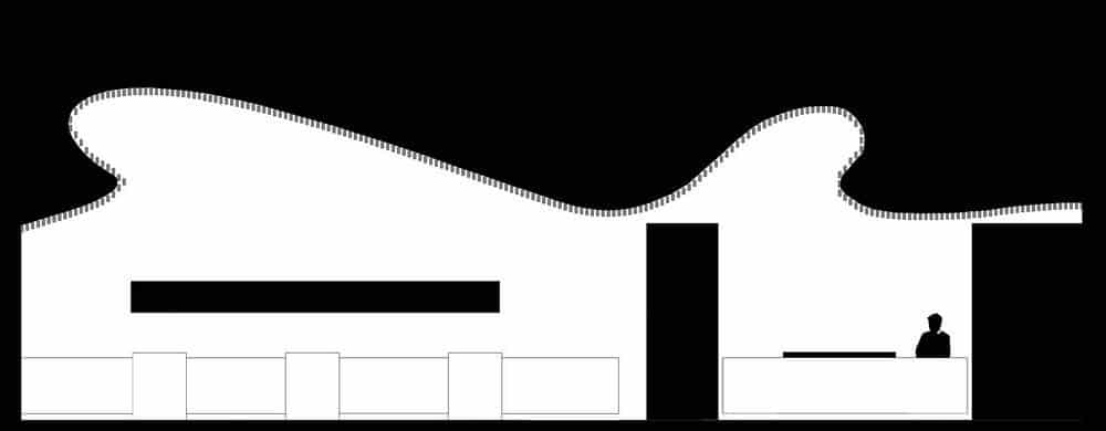
The bottom ends of external aluminium bars form an undulating curve, which echoes with the curving form of the interior ceiling. In this way, aluminium bars integrate the top area of the building facade and the 1F ceiling into a whole.
The design interprets cotton and yarn straightforwardly, while the imagery of cloth is expressed in a relatively euphemistic manner. The designers innovatively applied cloth elements to both the facade and indoor space via architectural languages, hence producing three-dimensional visual effects and realizing the unity of interior and exterior.
Pure White Tone
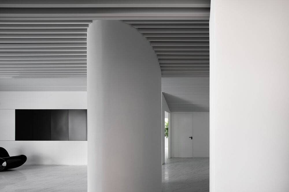
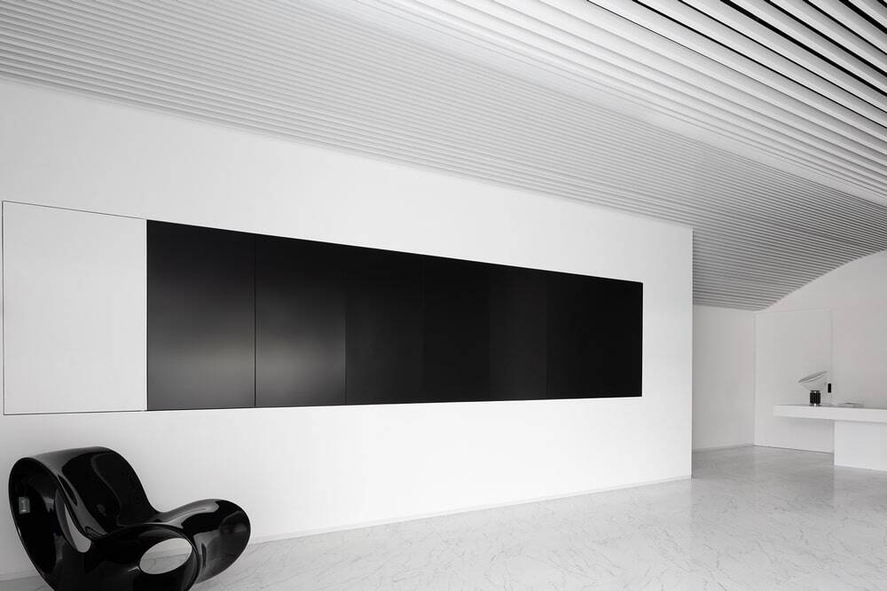
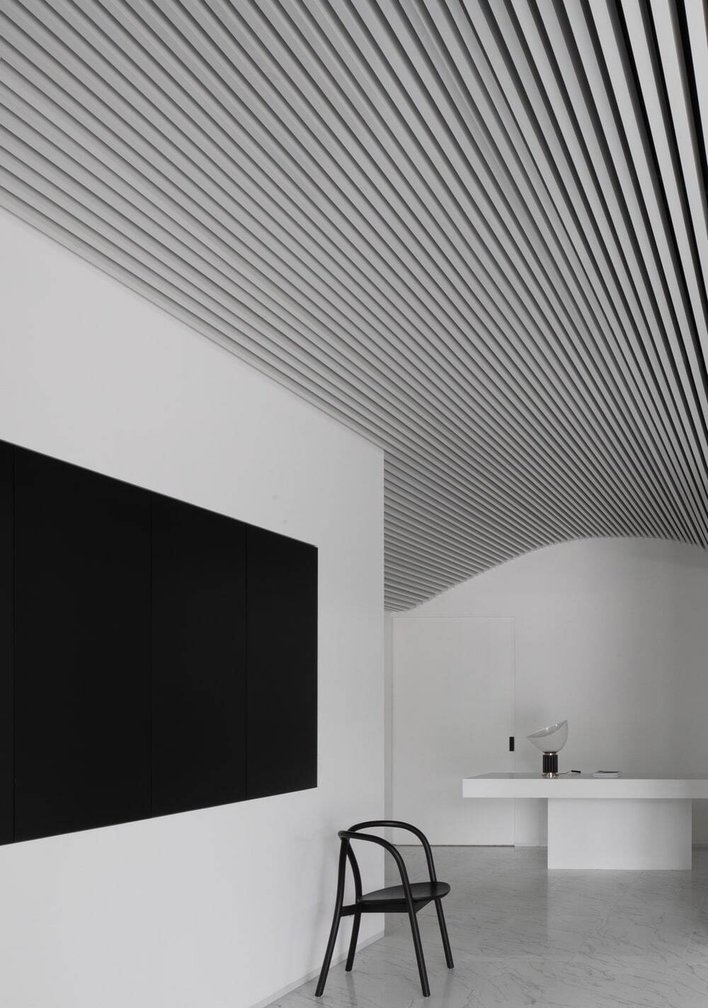
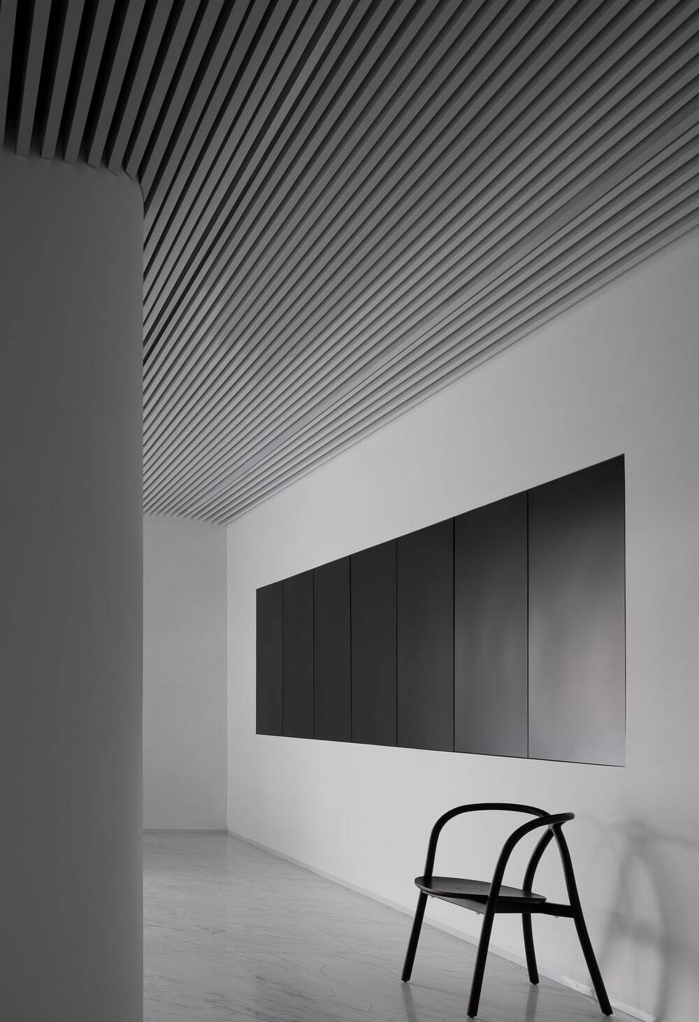
The white tone that extends from the facade to interior becomes a visual highlight. Besides, the undulating ceiling gives the space a strong sense of architecture. Meticulous details, connection between ceiling and walls, columns, and play of light and shadows, bring various changes to the space.
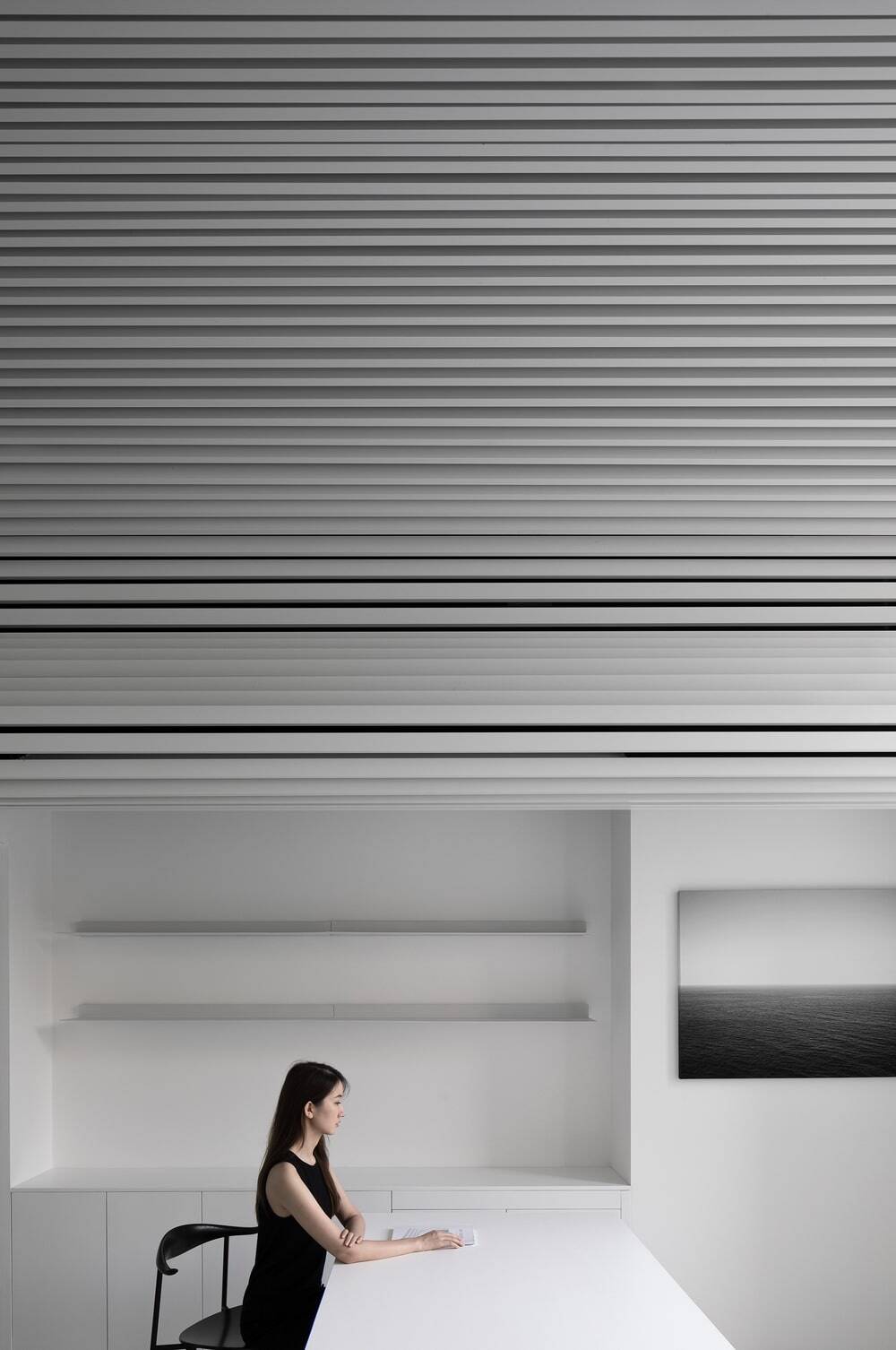
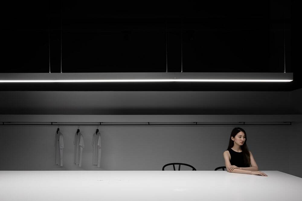
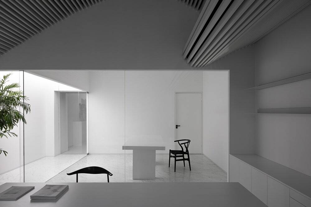
Minimalist white office furniture blends with floor and ceiling, and is complemented by green plants and black chairs dotted throughout the space. The functional layout is clear, which creates a sense of order in the free white-hued space.
The aluminium structure is also used in the interior, forming an undulating three-dimensional ceiling that shapes like the mountain or wave, which gives people a strong sense of natural atmosphere and vitality. Such design adds interest inside and helps people to adjust the mood when working.
In this space, one seems like standing under a loom. The “yarns” are interwoven with the light, and such black and white colours form artistic scenes from different angles.
To meet the client’s needs, the designers integrated the brand connotation into the working space. Moreover, by optimizing the indoor functional layout and solving its lighting and ventilation problems, they ingeniously created a healthier and more comfortable office, which became another feature of this project.
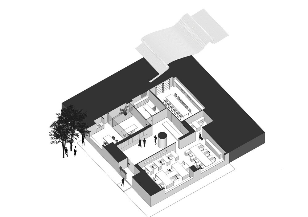
A reception room and two independent offices were orderly set on the left section inside the entrance. The main problem was the lack of natural light and ventilation. To deal with it, the designers created a separate passageway at the side of the three rooms, and made an artificial “skylight” via a stretch ceiling, which seems to bring natural light in. As the passage connects the three rooms, when the back door of the reception room is opened, the wind can be directly introduced into the two office rooms.

