Project: San Francisco Eichler Remodel
Architecture: Klopf Architecture
Project Team: John Klopf, AIA, Jackie Detamore, AIA, Klara Kevane, and Yegvenia Torres-Zavala
Landscape Architect: Outer Space Landscape Architects
Contractor: San Francisco Design and Construction
Cabinetry: Benchmarc Woodworking
Zinc Panels: Product and Design Metalwork
Photography ©2015 Mariko Reed
Location: San Francisco, California
Year completed: 2015
The owners came to Klopf Architecture with a clear vision: Create a brighter home with clean lines and visual surprises – but that enhances the Eichler vernacular – that blurs the boundaries between inside and outside and supports “modern living”. Renovating a 1962 Eichler home into a contemporary, higher-quality home required more than a few changes. However, love of the Eichler style and respect for the house’s history required keeping many elements. Klopf Architecture partnered with the owners of this Eichler home in San Francisco’s Diamond Heights to balance these two competing desires while significantly updating their 2-story courtyard home on a hill.
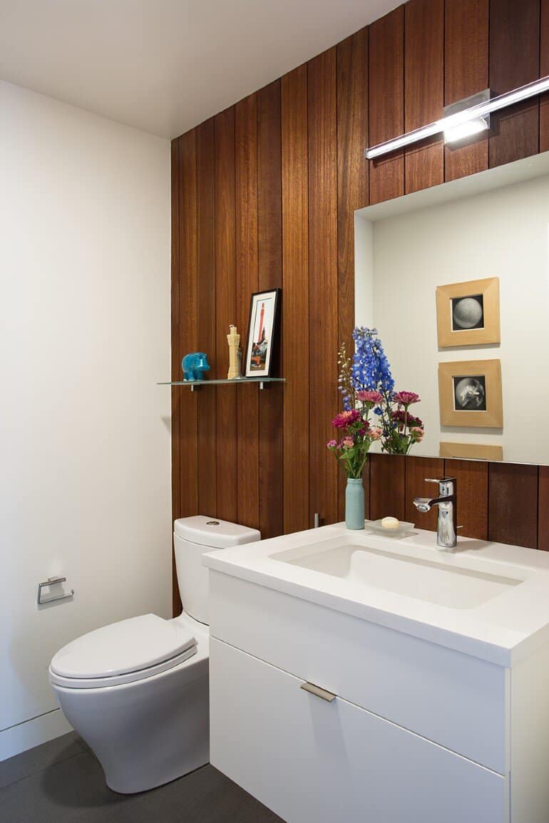
On the list of important features to keep were the mahogany paneling (or at least as much as was salvageable – after all, the owners were very close friends with the man who had supplied all the mahogany paneling to the Eichler Corporation), the large walls of glass with expansive views, and openness to the courtyard at the main level. Elements not worth saving were the shingles that had been added to cover the entire exterior, the tiny master bathroom and closet, and a galley kitchen that was not only too small in general, but not well suited to two tall men.
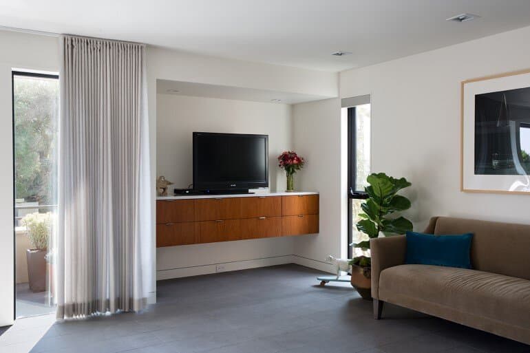
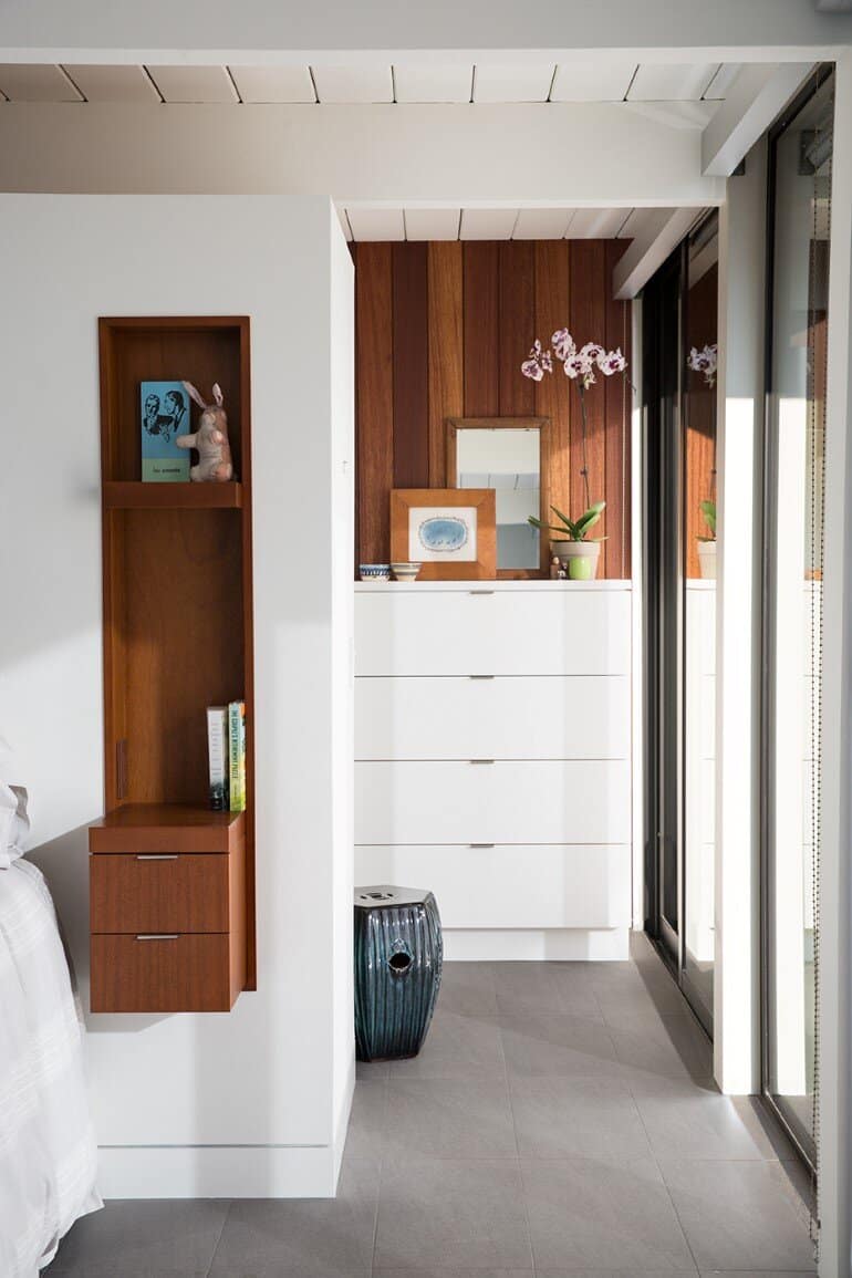
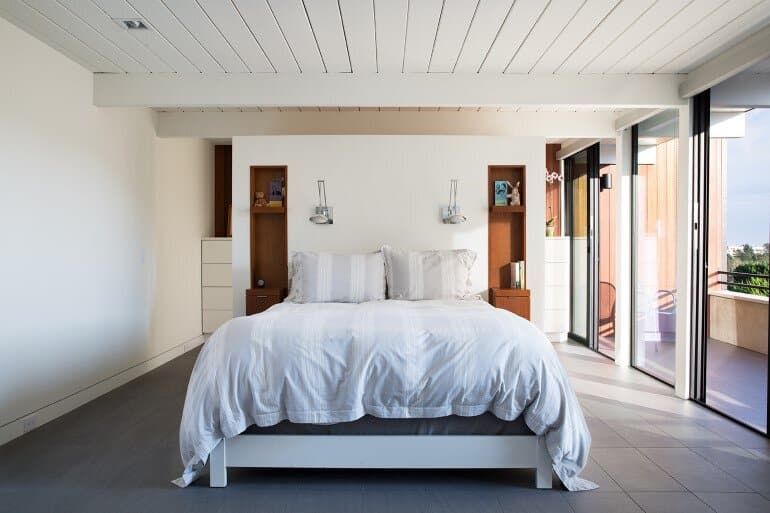
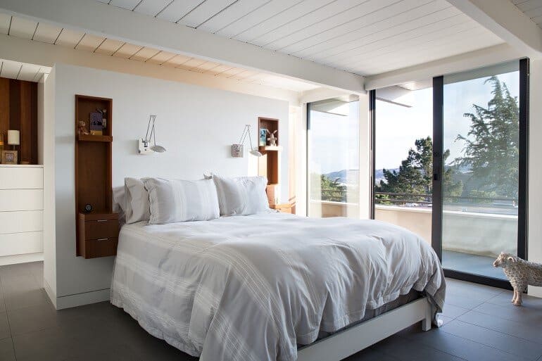
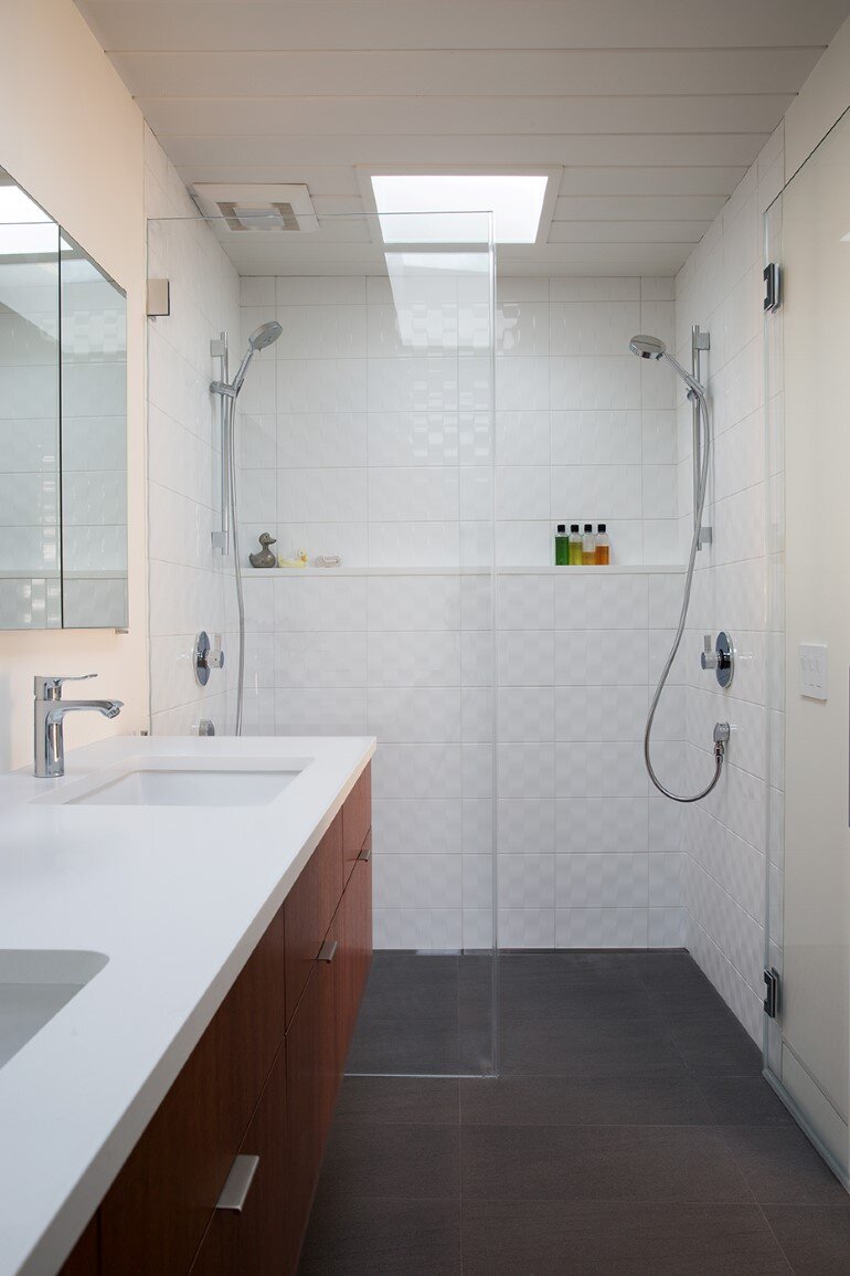
Along the way, Klopf Architecture, builder Tim Chupein of San Francisco Design and Construction, and the owners developed the program further. During the design process, the vistas and flows that resulted from combining two small bedrooms into a large master suite with an open closet / dressing area behind the bed proved irresistible. The team also realized that the fireplace and massive chimney flue took up valuable space and could be reconfigured into a TV nook on the main level and allow for a larger master bathroom above. During construction, Tim Chupein recommended moving the hallway washer dryer into what had been an exterior mechanical room to provide a spacious laundry room off the kitchen.
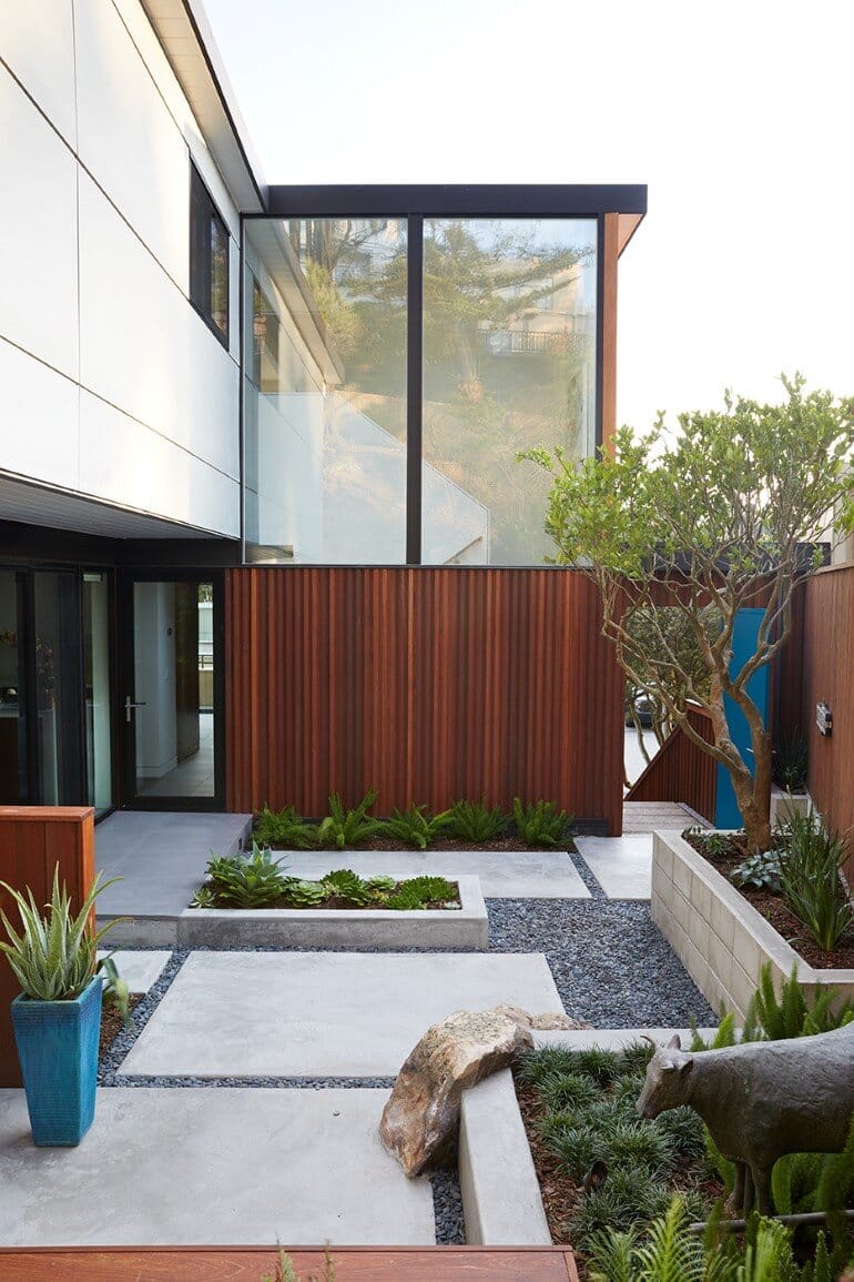
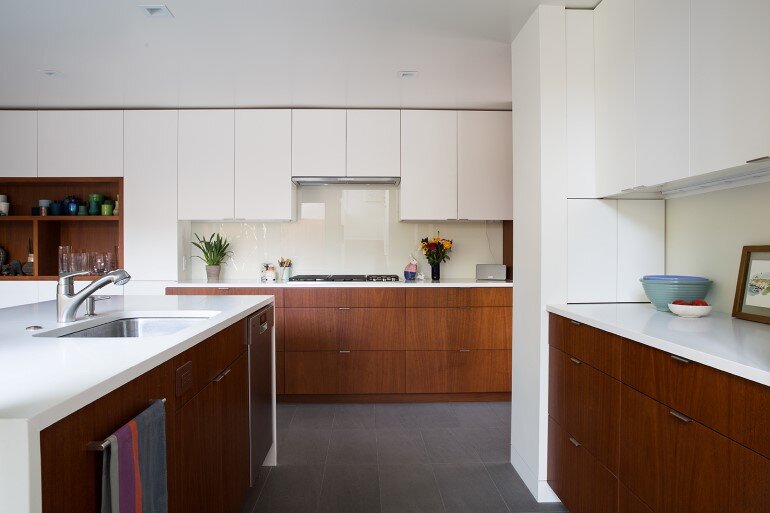
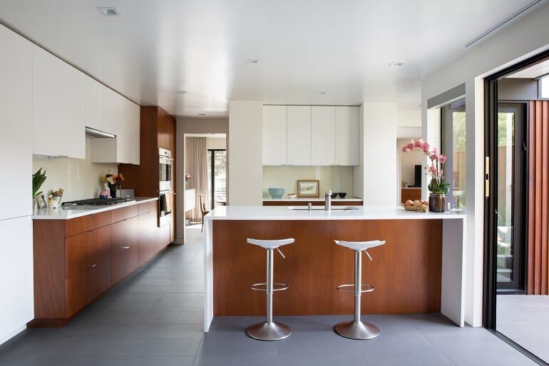
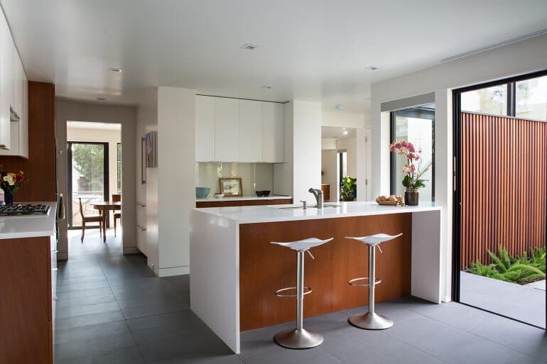
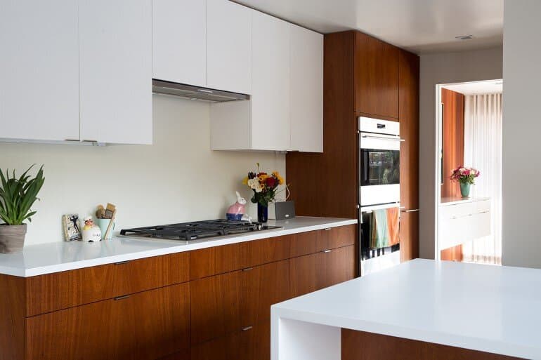
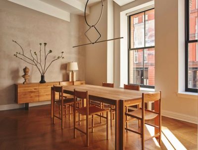
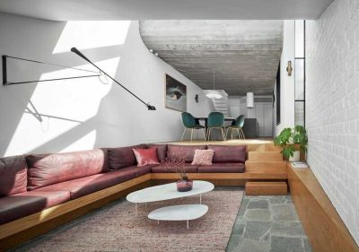
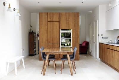
From conception, the owners sought to increase the number and range of built-ins throughout the house. Benchmarc Woodworking meticulously designed and built hanging bathroom, living room, and dining room credenzas, as well as a wall of mahogany and white cabinetry that extends from the kitchen through the family room, uniting the space. The cabinetry, together with a more open and newly landscaped courtyard by Outer Space Landscape Architects, creates an exceptionally open and spacious feel. Designing 2” higher counters and adding a waterfall island also enhance the flow.
Eking out a few extra square feet here and there (from the chimney and mechanical closet) and sacrificing an unneeded fourth bedroom made an enormous difference in the functionality and openness of this house. Before, the house felt like a number of smaller spaces cut off from each other; now it feels grander and generous. The use of luxury materials also reinforces this feel.
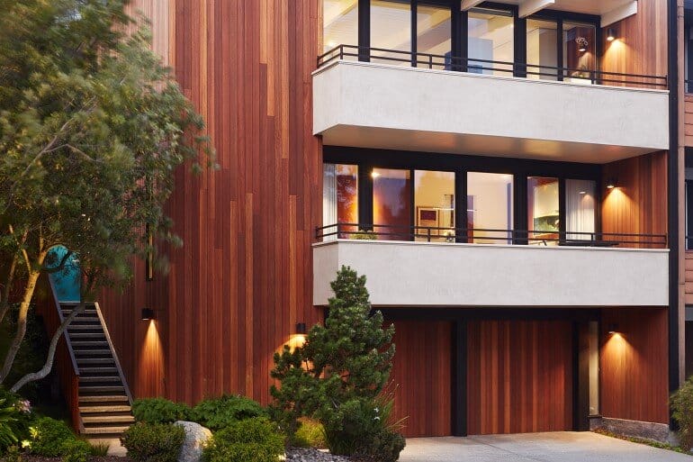
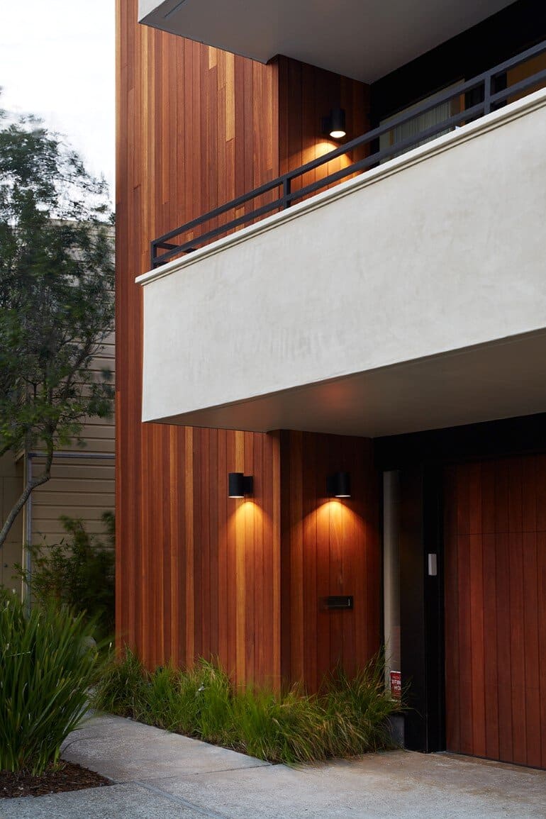
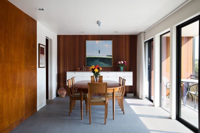
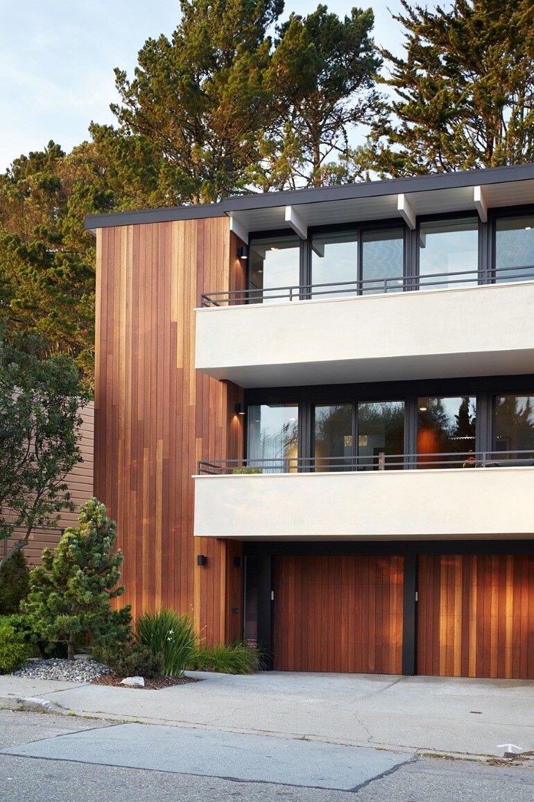
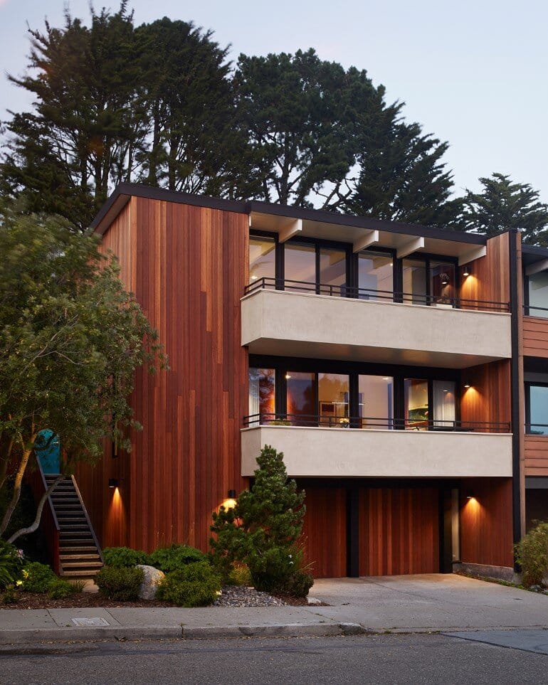
Taking a cue from original architect Claude Oakland’s drawings, Klopf eliminated the wood shingles on the balconies and restored them to a smooth plaster and replaced the added wall shingles on the rest of the house with new vertical Kayu Batu siding. The Kayu Batu harks back to the original “thinline” Eichler siding and restores the “inside-outside” intent. It continues into the house in the dining area and the master closet, blurring the line between indoors and outdoors.
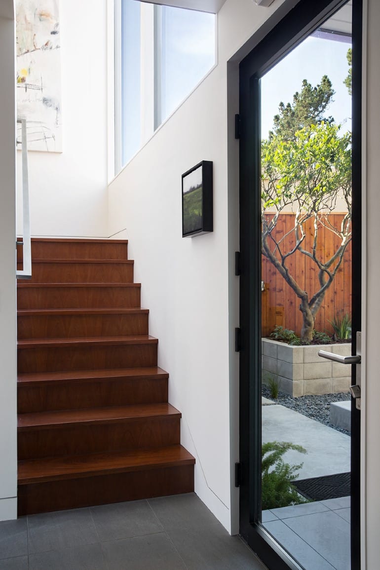
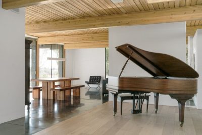
Also drawing on Oakland’s original design, the natural, clear-sealed Kayu Batu harmonizes with the re-used mahogany paneling and new, matching cabinetry to create a palette of white and mahogany throughout the house. The large, gray Italian floors tiles are reminiscent of a typical Eichler concrete floor – and work well for the new radiant heating.
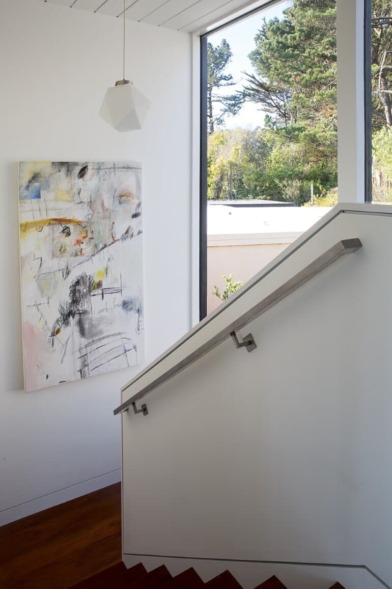
Special to this house are the zinc wall panels in the courtyard, which were part of the “surprise” in the owners’ original brief and also a tribute to the father of one of the owners, who built a firm that sells and installs commercial building materials. Upon entering through the courtyard door from the street stairs, one sees the panels that span the second floor courtyard wall and continue “through” the large glass windows with minimal interruption into the interior of the house. Custom zinc handrails were also fabricated and installed by Product and Design Metal Work. Dark bronze anodized Fleetwood doors and windows further reinforce the use of “commercial” materials.
Appropriate to the style of the house, the owners have a clean, minimal aesthetic – free of clutter but filled with carefully placed art and whimsical collectibles. With white walls, warm mahogany and rich grays throughout, the home is bathed in light and feels both elegant and welcoming.
Thank you for reading this article!


