Project name: Santos Pousada Apartment
Architecture Office: Hinterland Architecture Studio
Main Architect: Filipa Figueira e Tiago Vieira
Location: Porto, Portugal
Year of conclusion: 2021
Total area: 80m2
Architectural photographer: Ivo Tavares Studio
Text by Hinterland Architecture Studio
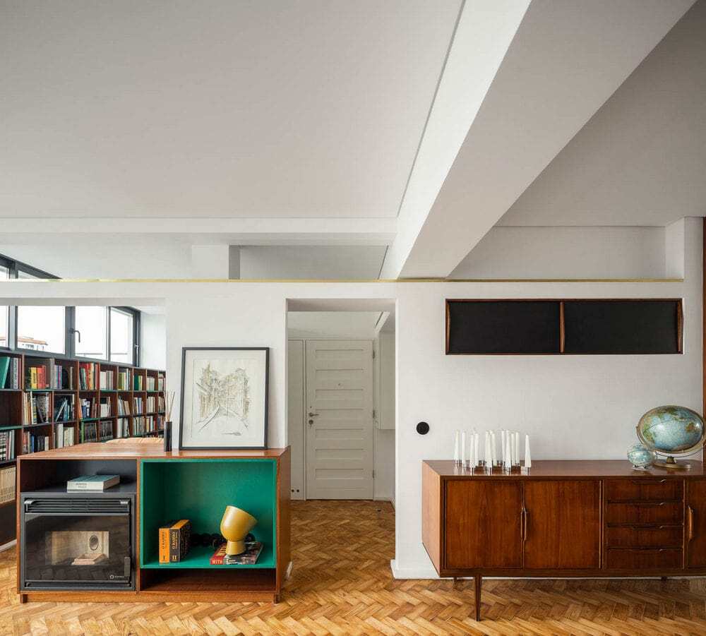
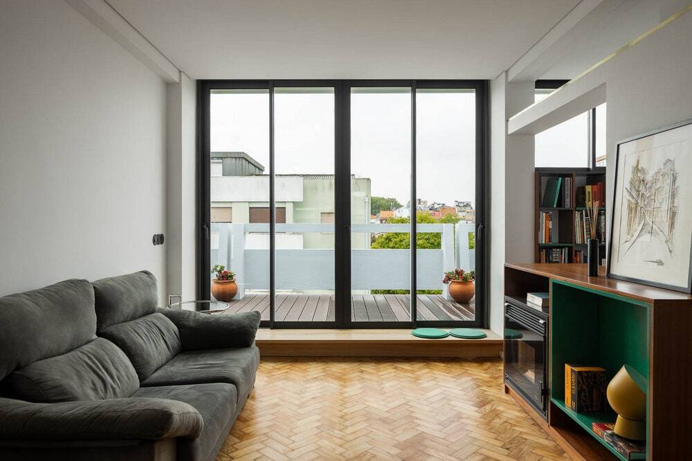
Santos Pousada Apartment is located on the top floor of a building designed by Portuguese mid-century architects Arménio Losa and Cassiano Barbosa. Built in 1956 as a rental unit building the last floor was originally planed as an exterior semi public space. During the original construction this space was adapted to two symmetrical apartments, repeating the scheme of the remaining floors. This programmatic change is responsible for some of the most singular formal elements of the apartment, the concrete structural elements and the size of the windows that represent 55% of the facade surface area.
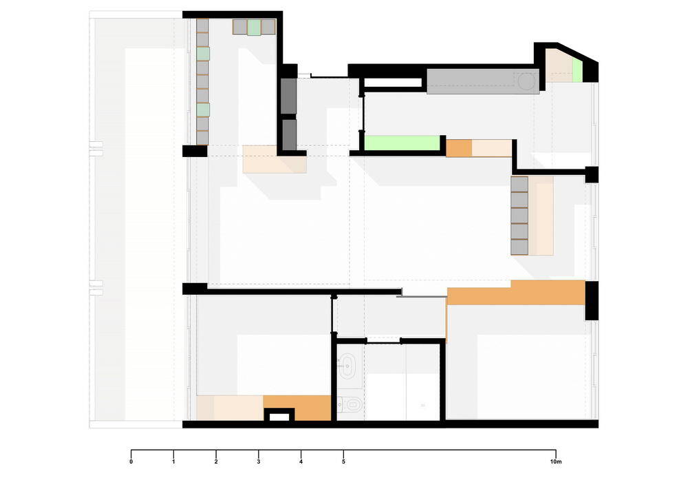
The aim of the project is to completely modernize the original three-bedroom apartment with 80sqm gross area into a more confortable, energy efficient two-bedroom apartment for a young couple with a kid, dog, office, and a library without compromising the mid-century original style.
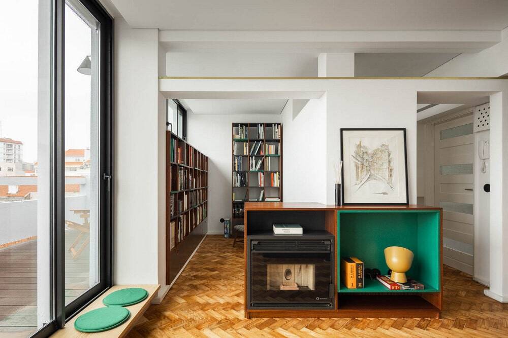
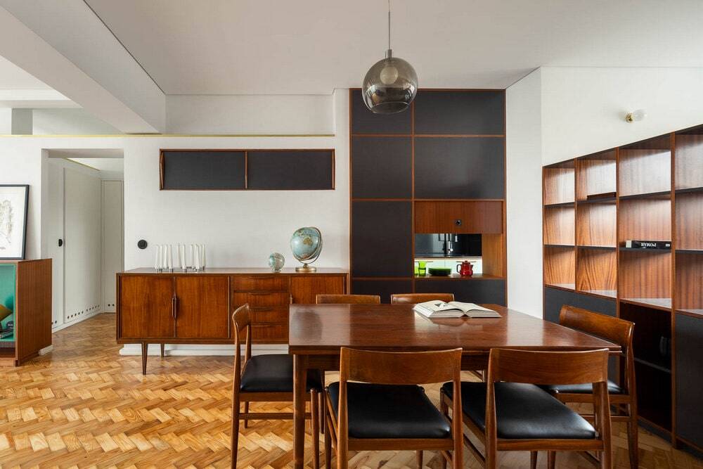
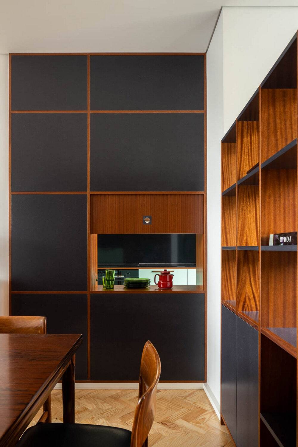
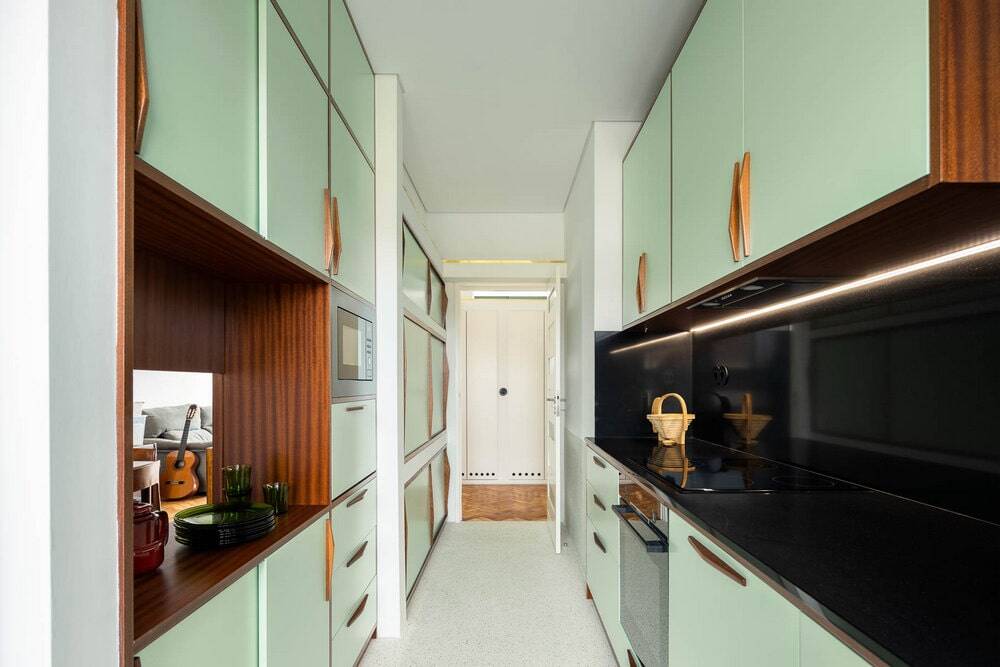
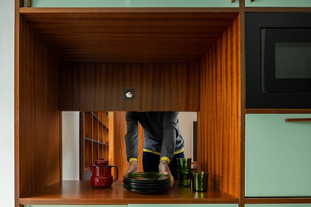
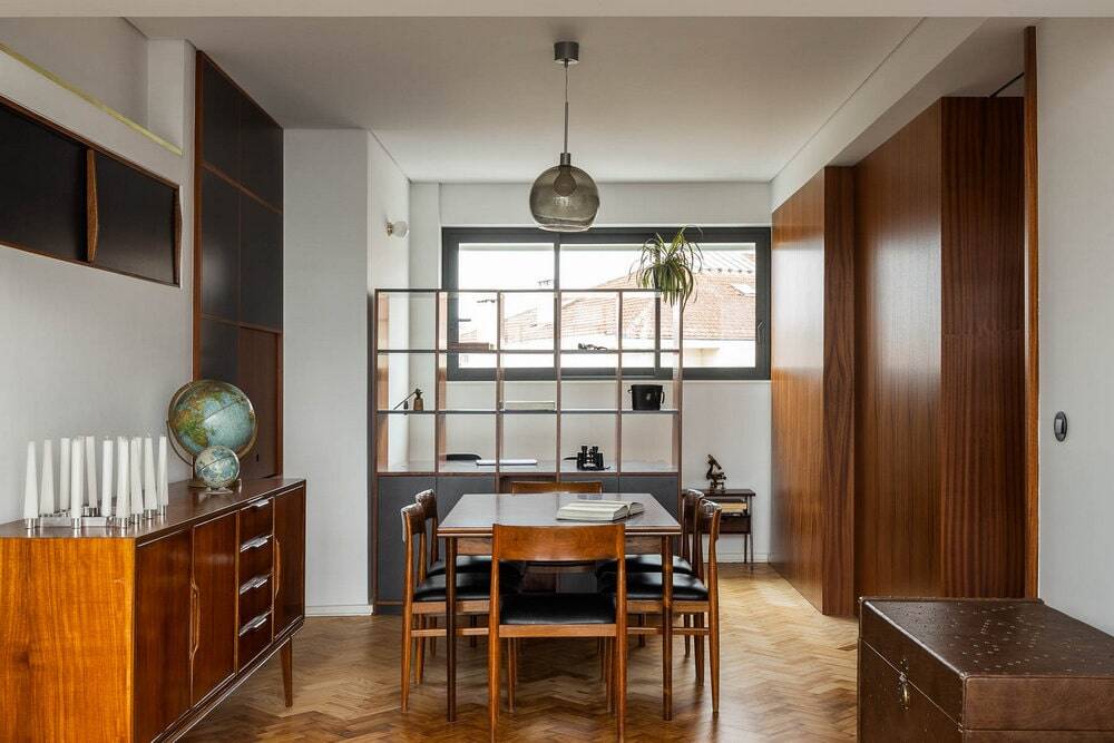
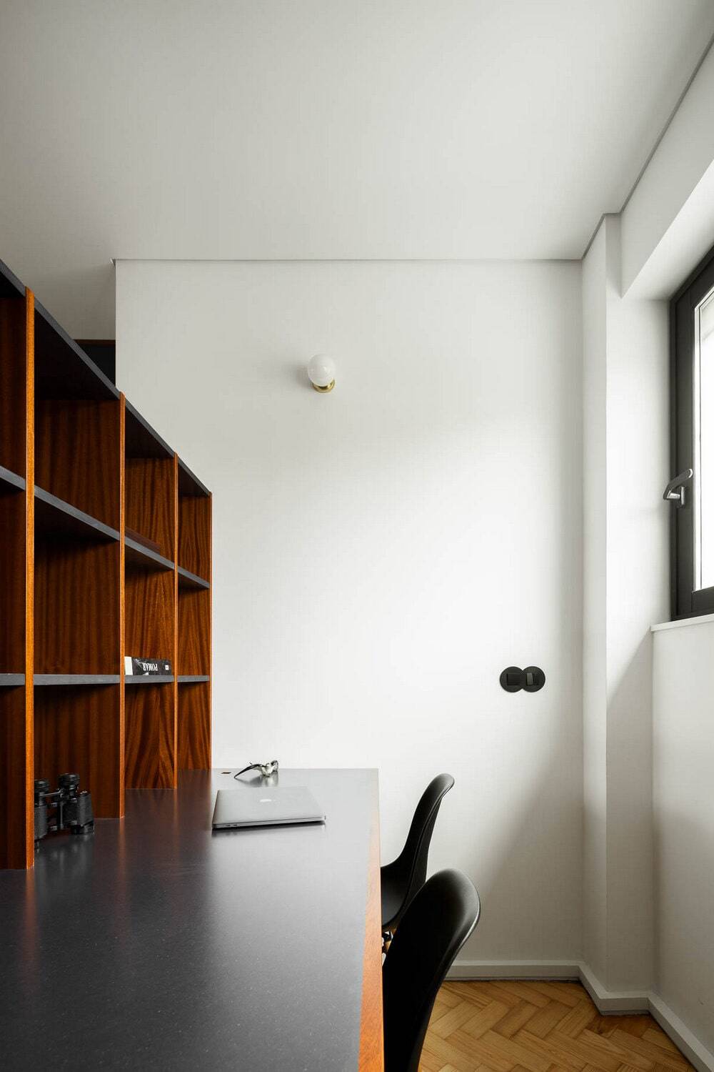
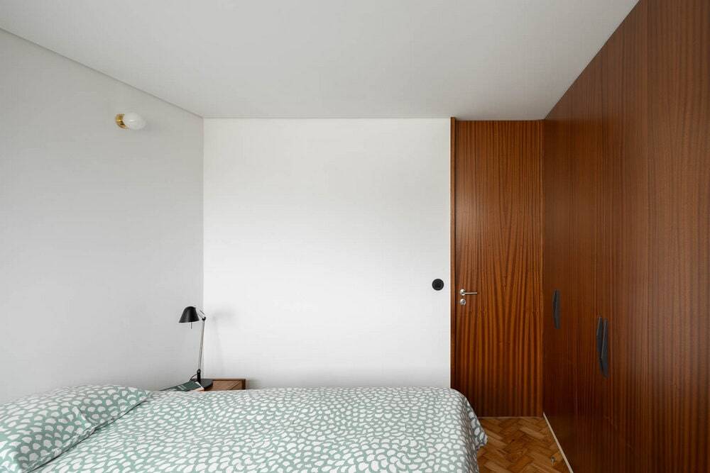
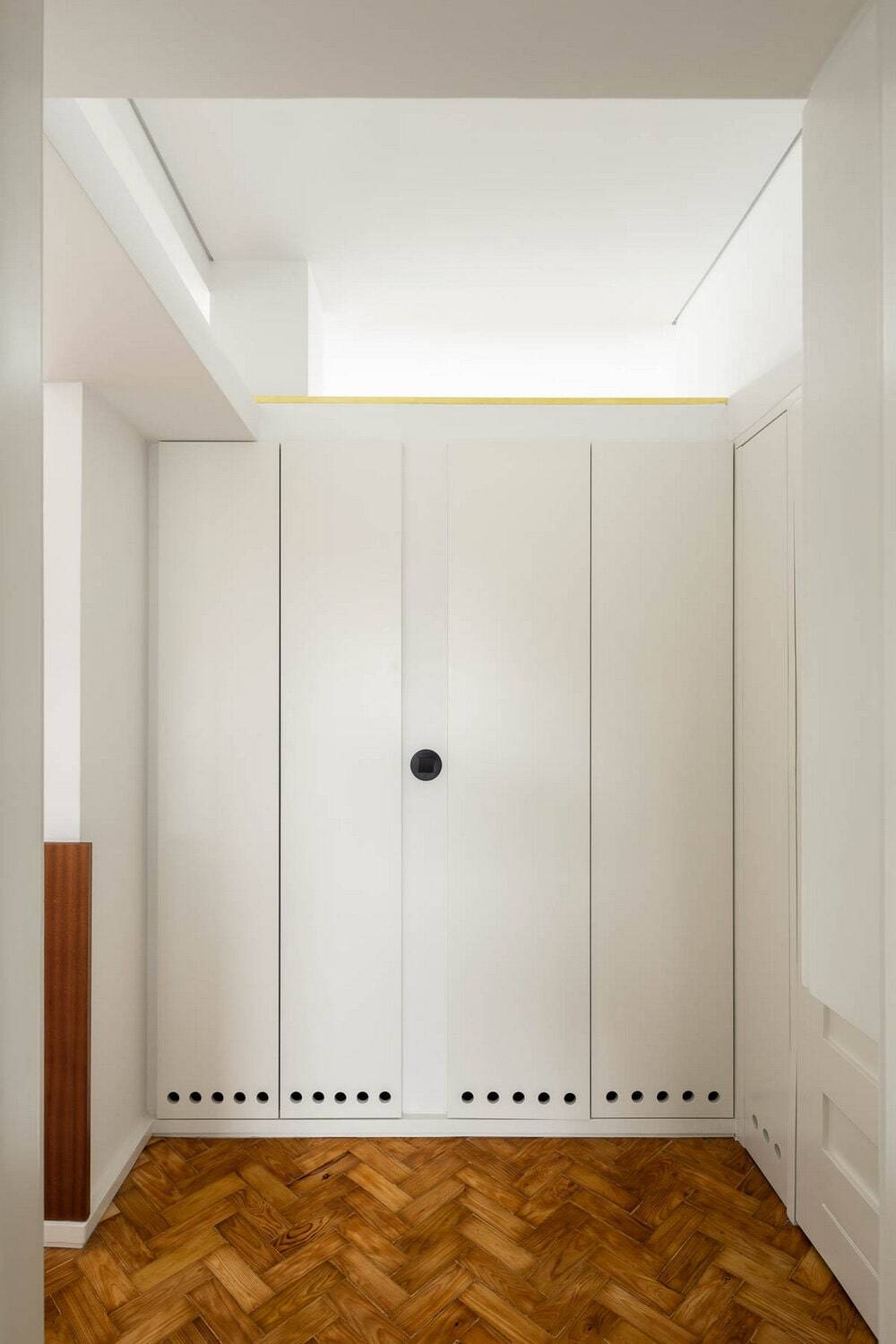
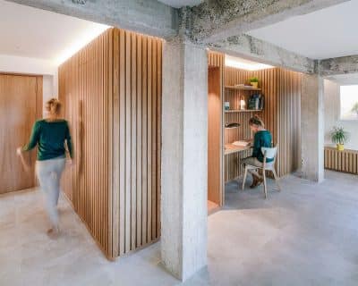
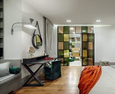
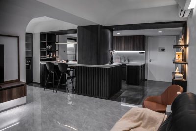
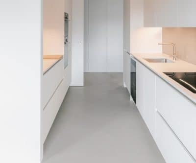
The project strategy was to define a central open space on the apartment where the family spends most of the time, increasing its area by demolishing some interior walls. Here we have the living space, dining space, library and office. The several spaces are organized with three types of carpentry elements, loose elements, wall aligned elements and diving elements that in some cases totally replace the walls between different rooms. The remaining spaces are secondary and reduced to the minimum size with walls full of cabinets to place appliances, infrastructures and storage.
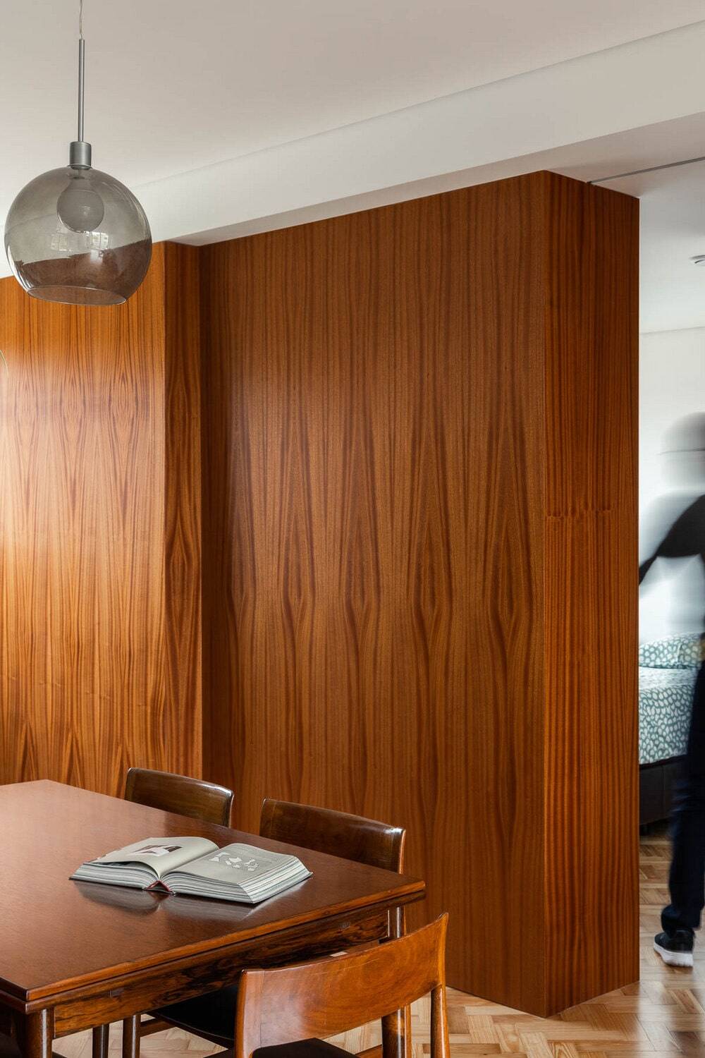
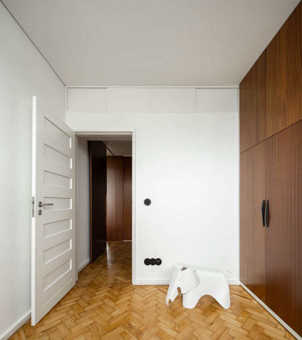
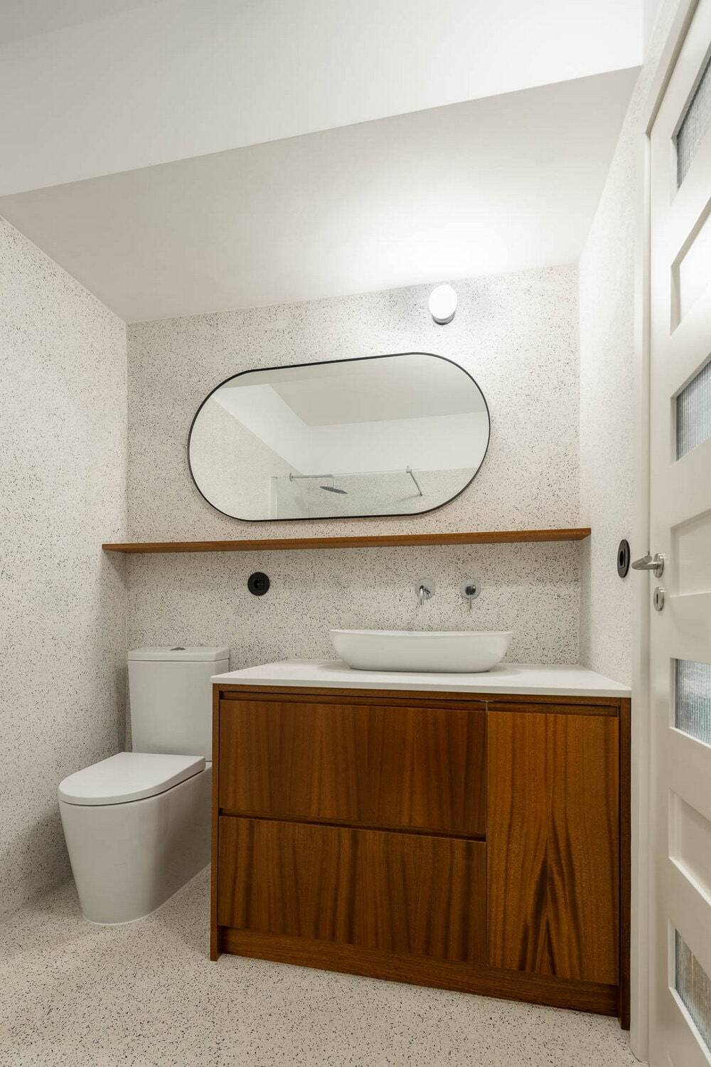
The chosen materials are mostly defined by the original project. The original wood pavements and wood doors are restored and the existing terrazzo floors are replaced by new ones that go up the stucco walls. The natural wood elements use the mahogany from the original project and the light wood painted fillings are replaced by lacquered
and coloured mdf. The dark tone of the carpentry balances the natural luminosity provided by the big windows.
The atmosphere of the big textured wood panels brings to an end the 65-year-old rental unit vibe and inserts on the space the intended permanent home character.

