Project: Skycolors Apartment
Interior Design: Erashevich Design Buro
Location: Minsk, Belarus
Area: 80 m2
Year: 2023
Photo Credits: Ekaterina Samoylovich
The sky in Iceland is a different color and has many shades….
We don’t travel to warm countries or to the sea just to sunbathe. We love to explore the world, its natural beauty, which can be especially experienced in the northern countries, in unusual places that are not oversaturated with tourists.”
“We love minimalism, the feeling of air in the interior, we love art, subtle combinations, nuances rather than contrasts.”
These are phrases from a conversation at our first meeting with the owners of a flat. A young couple of very beautiful people, inspired by travel and discoveries that are made together.
While drawing up the assignments and selecting references, I already imagined how beautiful it would be.
The young people are both employed in the IT field. The logic and rationality in relation to the organization of space is one of the most important for them in interior. We developed the layout, reasoning together, living through each scenario of life in this new space. The first for a new family.
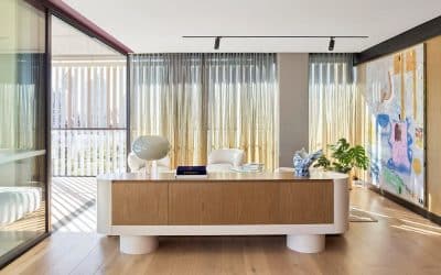
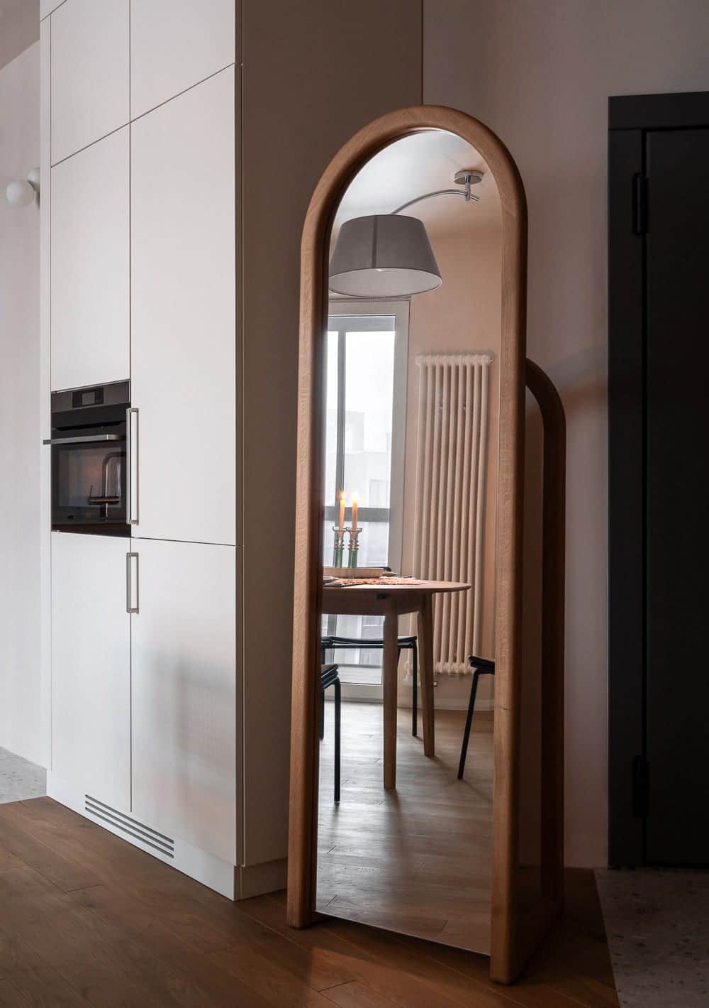
The Skycolors apartment has an open space central area. The entrance to the apartment was zoned with a tall and massive mirror by local masters @KaraniDreva with a frame made of natural wood. We thought for a long time about how to separate the entrance, drew partitions and various types of zoning, but settled on the simplest and most concise solution.
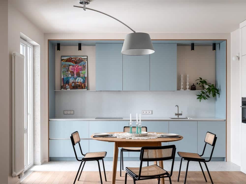
Cooking and warm meetings with friends are an important part of the lives of our heroes. Attention was paid to the kitchen, making it part of the living room, and a large folding table, the central point of attraction. We accented it with a lamp that illuminates the table and brings everyone together for a single action.
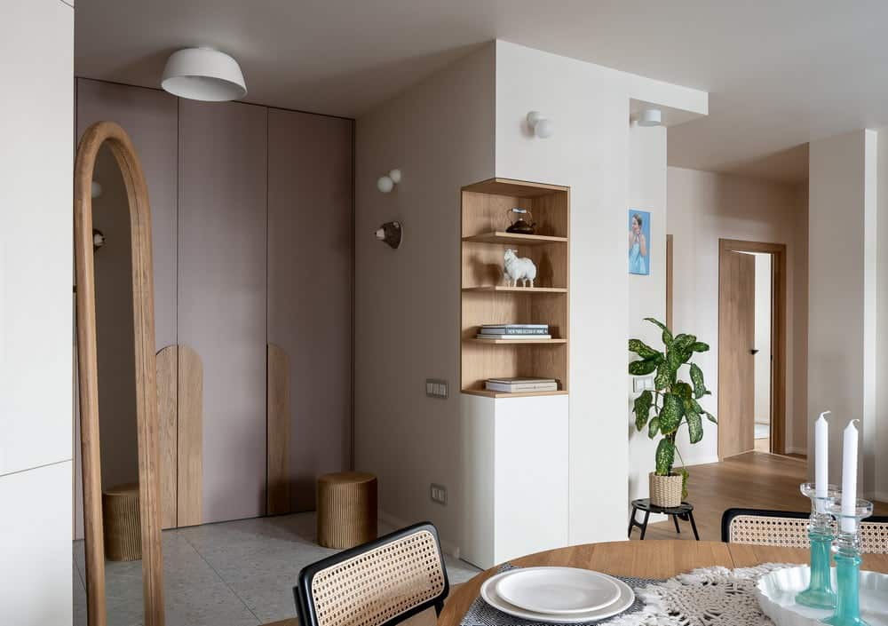
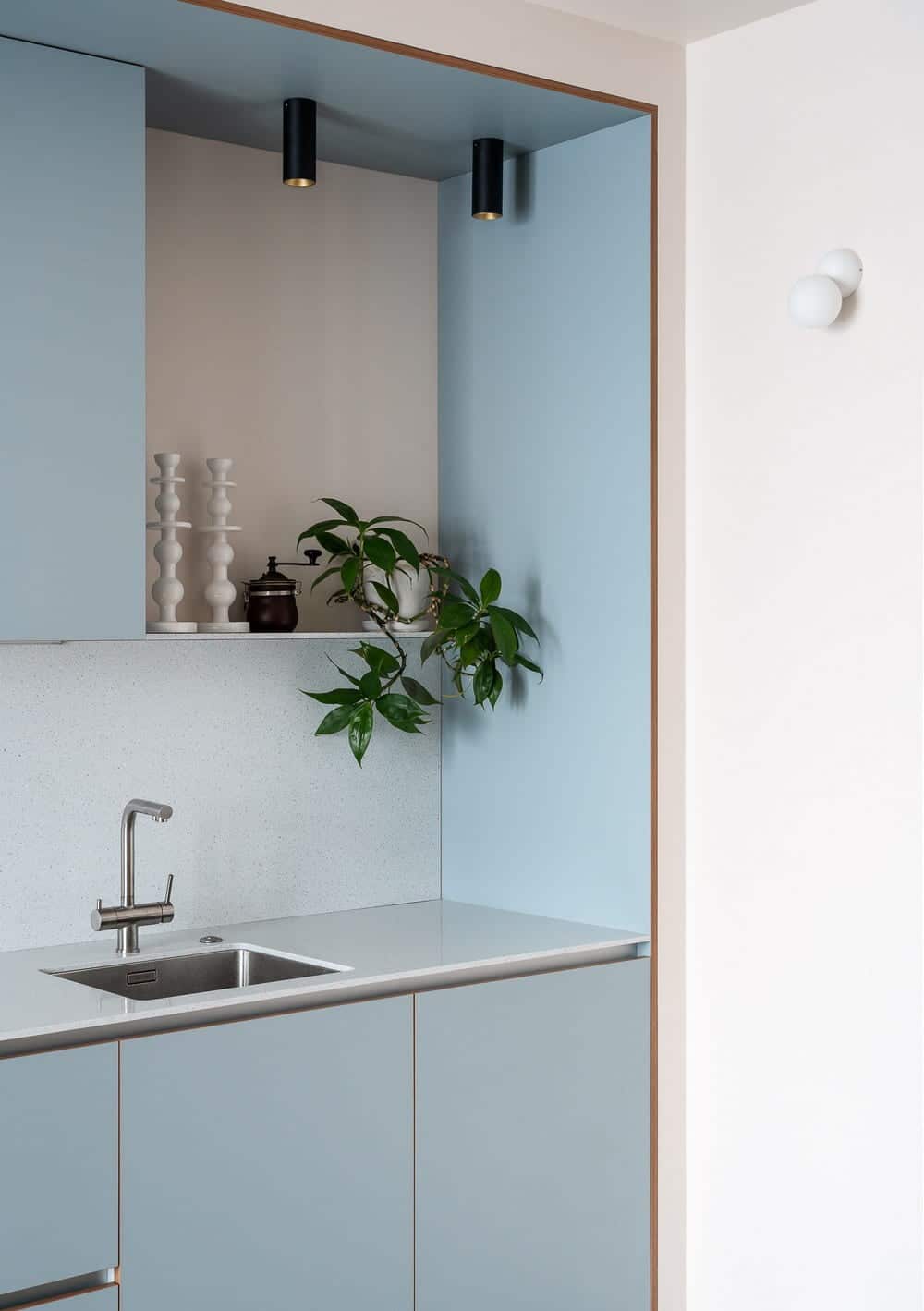
In the kitchen there was a place for decor, a painting by young artist Misha Daylida, and a plant on a mini shelf. The kitchen came to life with all decorations.
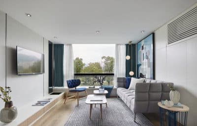
Special attention was also paid to the light in this apartment. There are almost no ceiling lights. Light in the living room is provided by wall sconces, table lamps, and discreet spotlights in areas. This way allowed us to create a very cozy, relaxing atmosphere in the living room.
The walls and ceiling are painted the same color. It took a long time to select the color, but we found exactly the shade that looks very natural and natural in different lighting, morning, afternoon and evening.
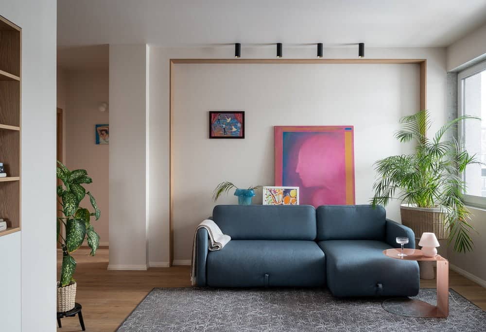
We discussed art in the interior as an integral part of life. Therefore, in the living room behind the sofa there were several works at once. The painting “Letter to a Friend” by Olga Zhebina is a bright accent spot. It is complemented by small children’s works (the designer’s children are Marya and Gretta Erashevich). In a niche with spot lighting there is a small work by Daria Sumareva-Kopach. It was her works, executed in a range of cool shades, that completed the overall concept of the interior, in which heavenly shades are the essence and inspiration.
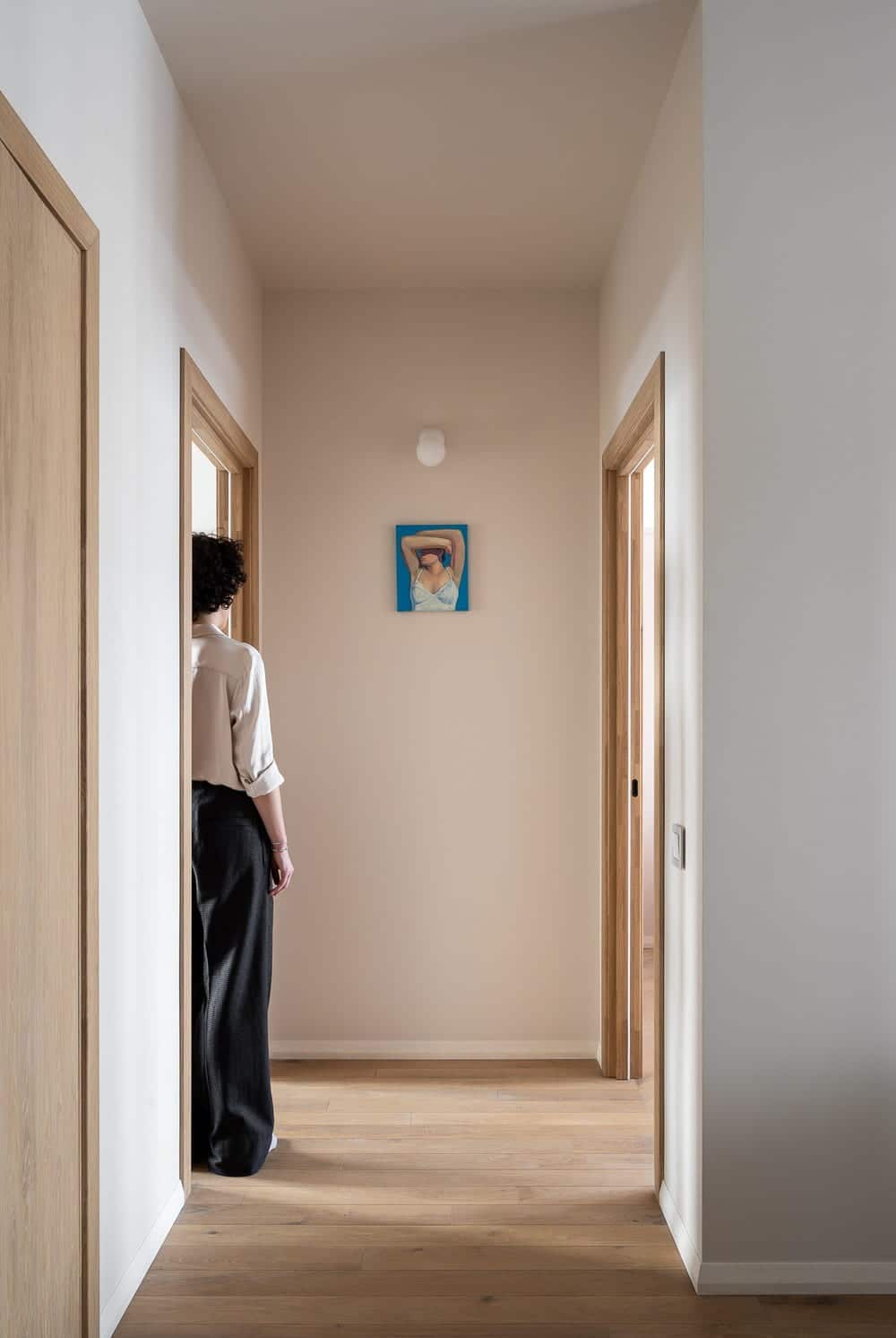
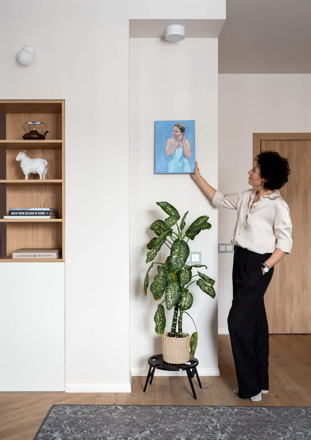
In the corridor from which you can exit to the office and bedroom there is also a small work by Daria Sumareva-Kopach.
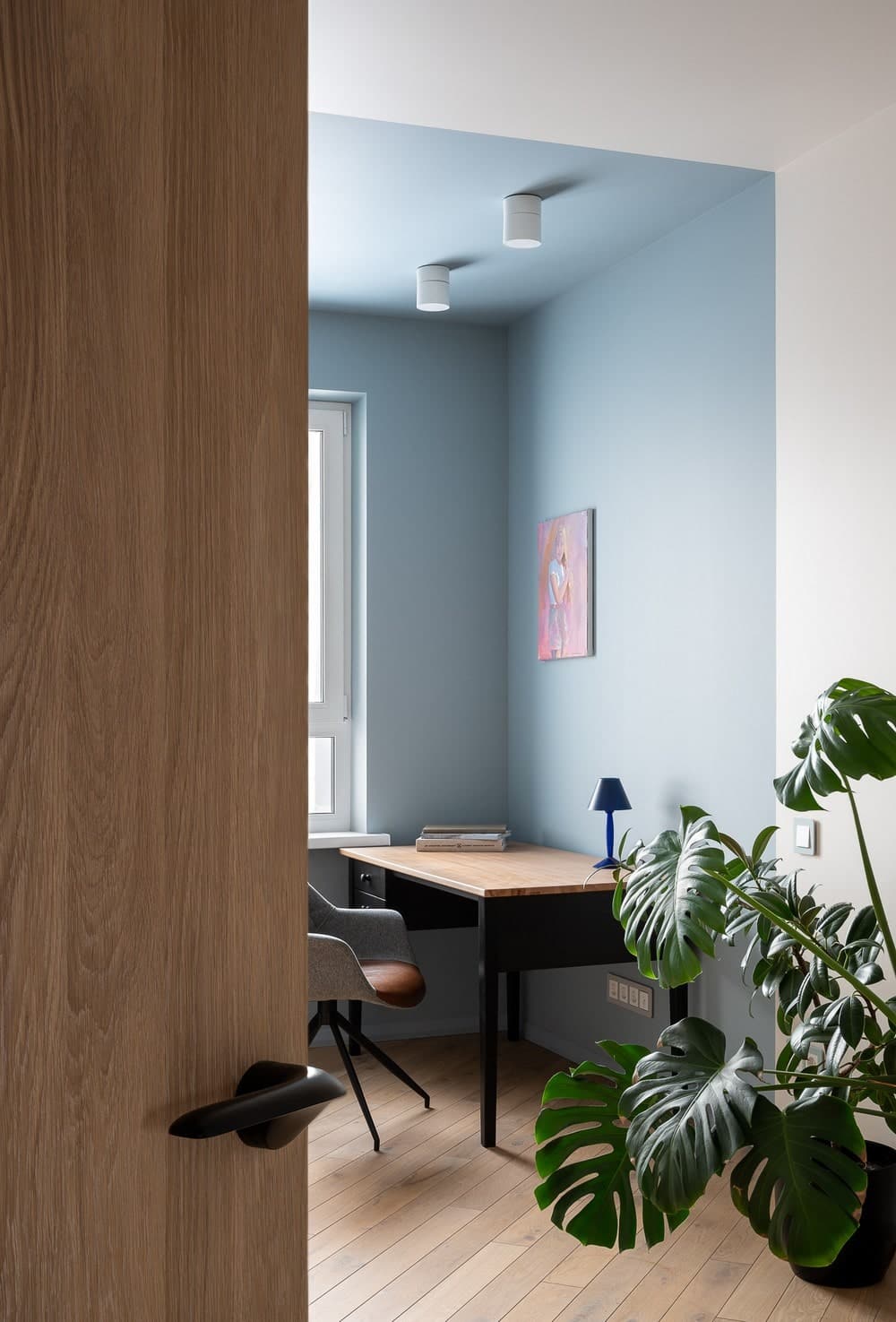
The home office, is designed minimalistically, without unnecessary distracting details. The likelihood that the office would later become a nursery was high, so when placing sockets and lighting points, several scenarios for using this room were taken into account.
Above the table is a painting by Daria Sumareva-Kopach. The rocking sheep decor seems to hint that the office may soon change its purpose.
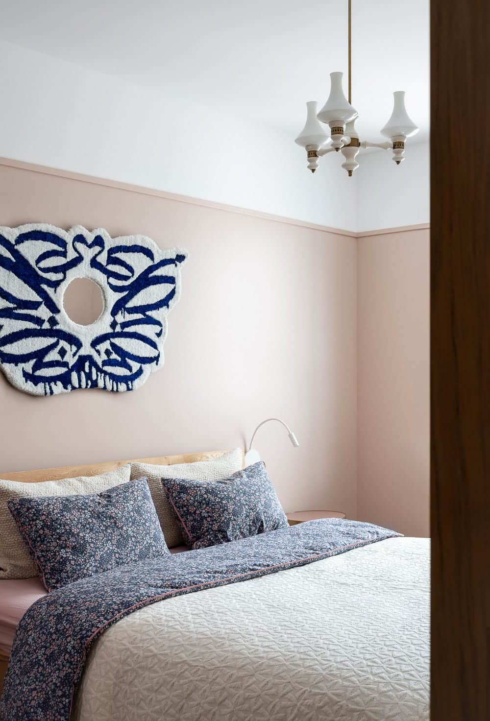
The focal point of the bedroom is a decorative mirror with a textile frame. This art object was created by a young textile artist Valeria Kaplan. Reminiscent of the wings of an angel who protects and protects.
A vintage lamp from Finland also attracts attention and immediately directs our associations to Scandinavian design.
The guest bathrooms and bathroom are made in sunny shades to create a mood.
