Project: Spojovna Brewery
Architect: mar.s architects
Project location: U Kunratického lesa 1801, Praha-Kunratice, Czech Republic
Completion year 2018
Project size built area 1100 m2, usable 775 m2
Photo credits: Jakub Skokan and Martin Tůma / BoysPlayNice
Text provided by Mar.s Architects: The SPOJOVNA brewery is located on the border of three Prague districts – Chodov, Kunratice and Šeberov. This area is unique for its composition of residents.
It is a blend of different worlds (which are also a beer names): študák, being represented by a student hostel, kravaťák – a business one in the nearby office park, and fešák – the common life of the housing estate inhabitants. These worlds intersect in the new brewery. The lunches belong to white collars and the evenings to students and locals. Hence the name of the brewery – SPOJOVNA (THE LINK INN).
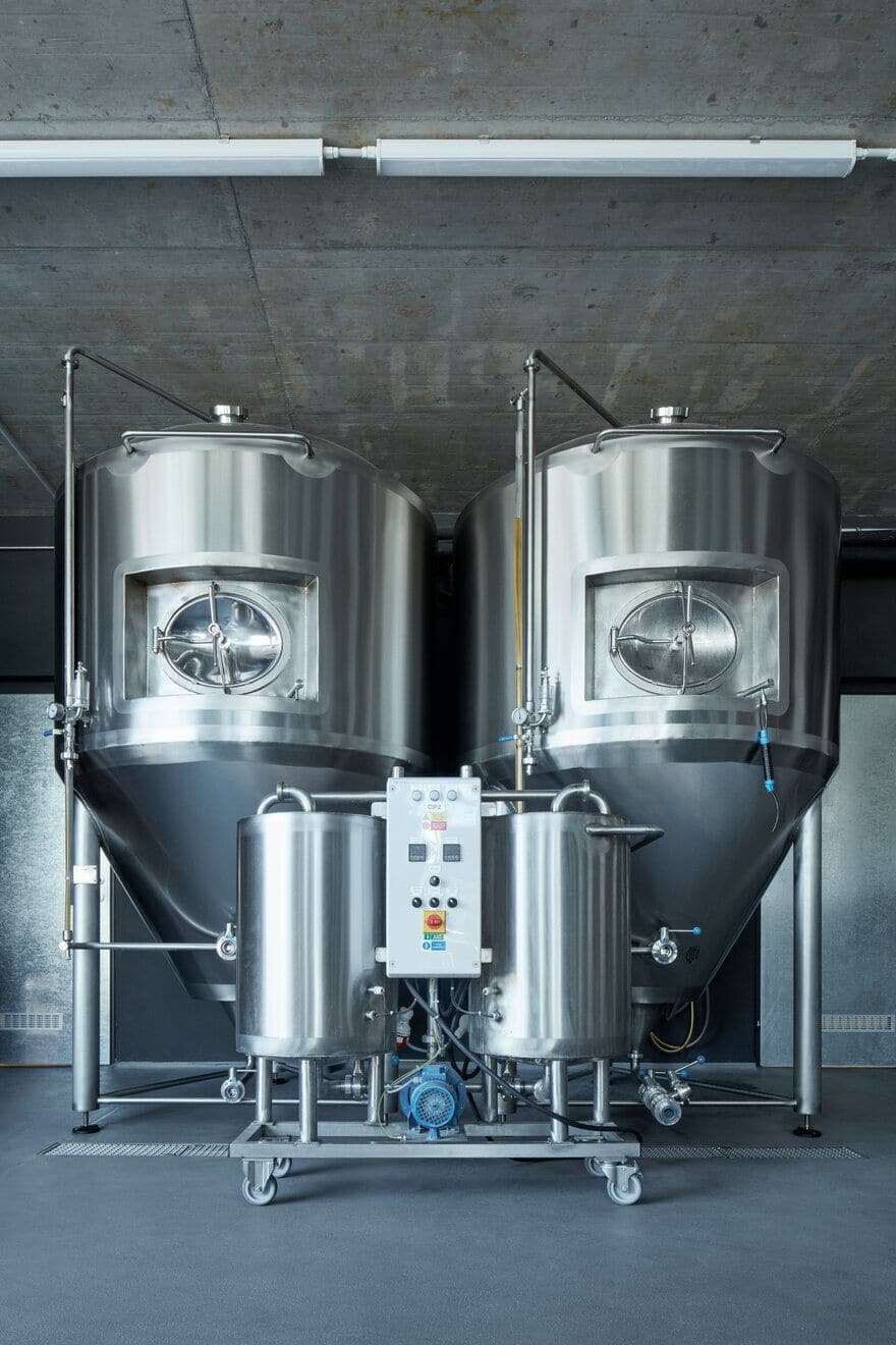
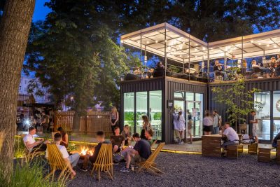
The grounds consist of the brewery house with its background and a restaurant, a large garden with an outside bar for various sports and cultural activities. With top-fermented beer being the main article, SPOJOVNA complements the portfolio of breweries and the members HOSTIVAR, HOSTIVAR II and TRAUTENBERK.
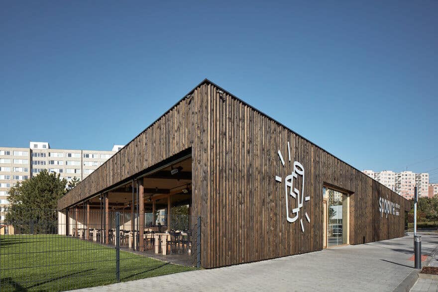
The building itself reacts to the specifics of its location (which determined its shape) and follows in the footsteps of the first member brewery – Hostivar. Both buildings form a parallel with regards to the use of similar principles but different procedures.
The façade uses 3D black-stained spruce cladding with spruce windows. Only two important places break up the solid shell – the brewing house and the restaurant, which is south-facing and joined to the roofed terrace and garden with a large glass wall.
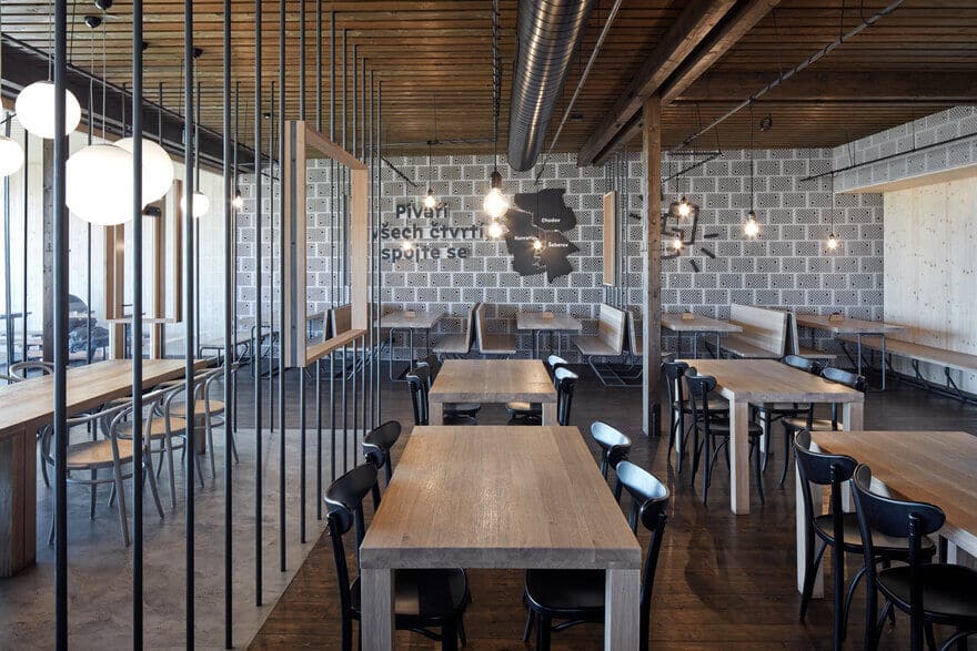
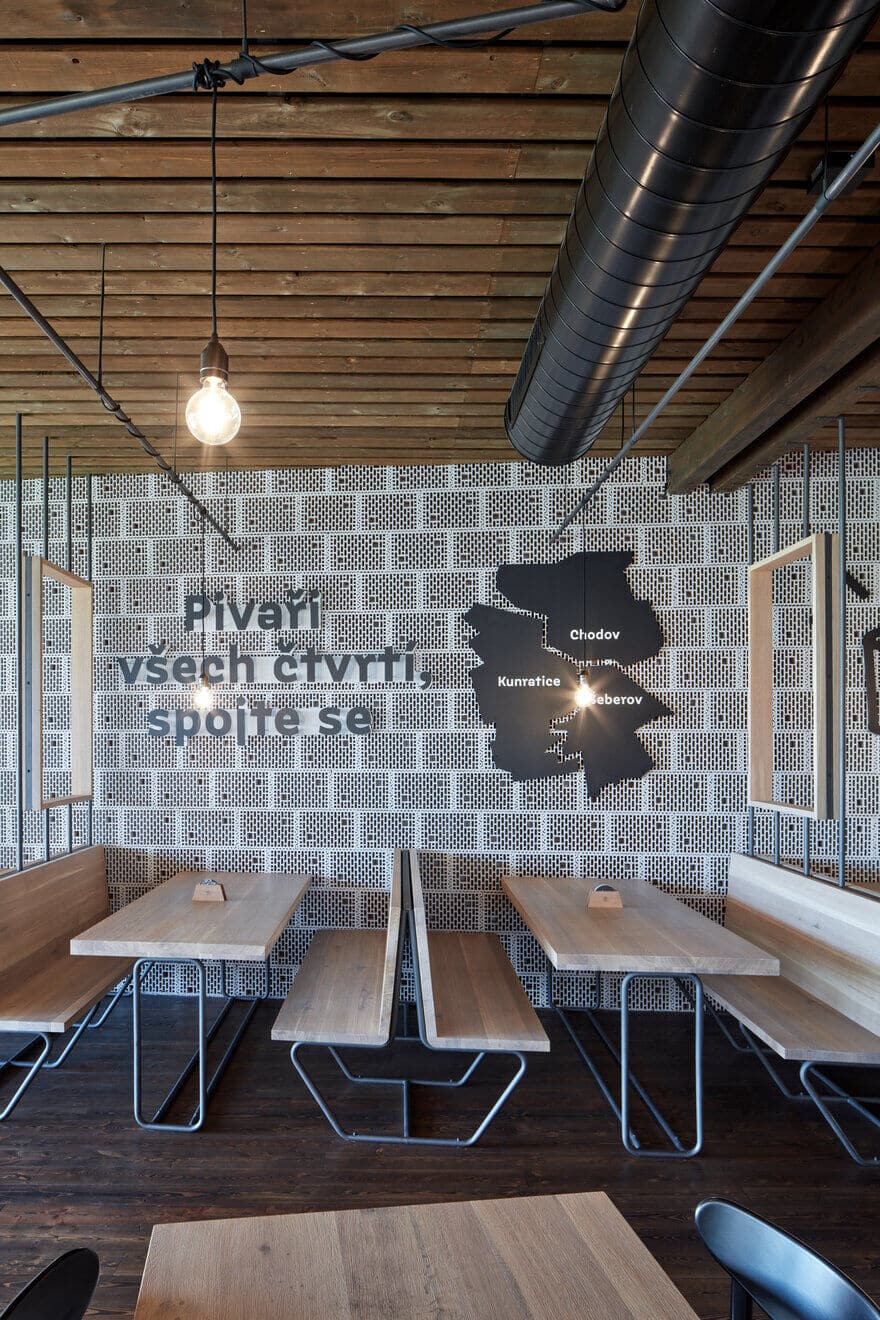
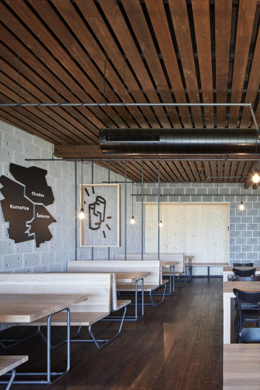
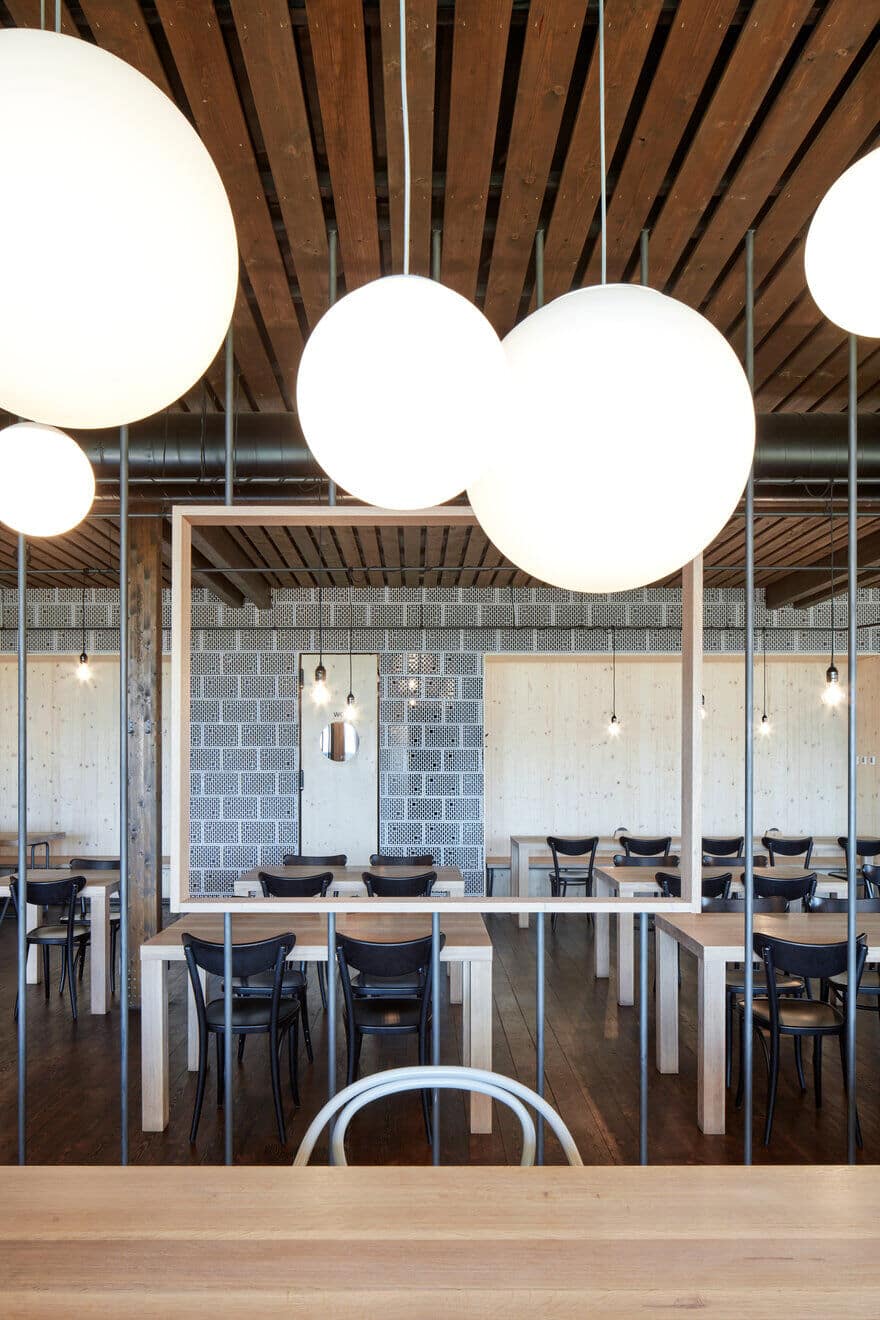
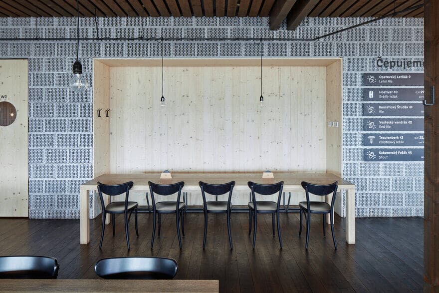
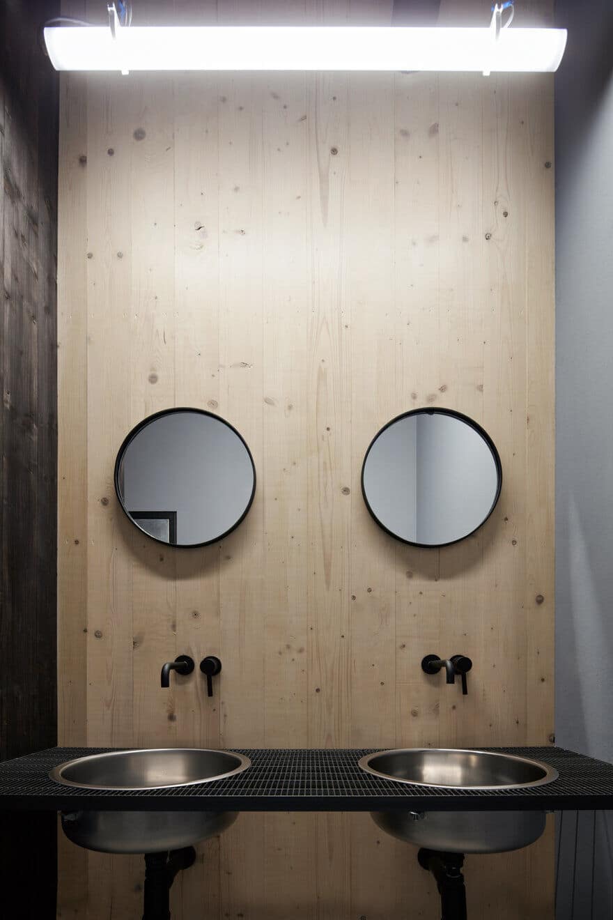
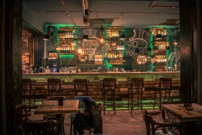
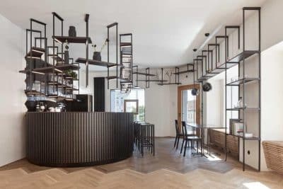
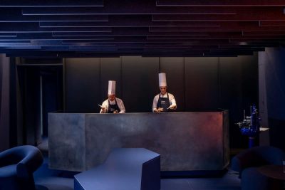
The interior uses a combination of several types of material: spruce for the floor boards, cladding on the ceiling and one of the walls; grey-painted bricks with the perforated side facing the interior; and all exposed areas are protected with a concrete screed. One of the most significant elements of the whole interior are black-painted steel bars, used as table and bench legs, as a support for light fittings under the roof and last but not least as frames of dividing constructions where we can only guess the real shapes.
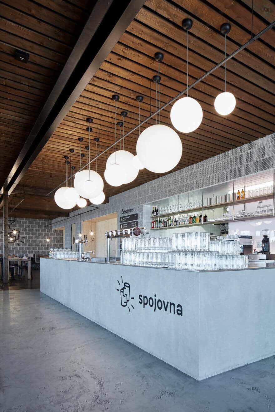
A good example is the construction of the wood-burning stove and the wall of the lounge area which seats 16 people and where we can also find the shareholders’ table. Another Significant element of the interior is the concrete bar with a view into the kitchen and clusters of glass balls, which visually determine important areas within the restaurant. Graphic design, logo and claims are done by graphic studio dynamo design.

