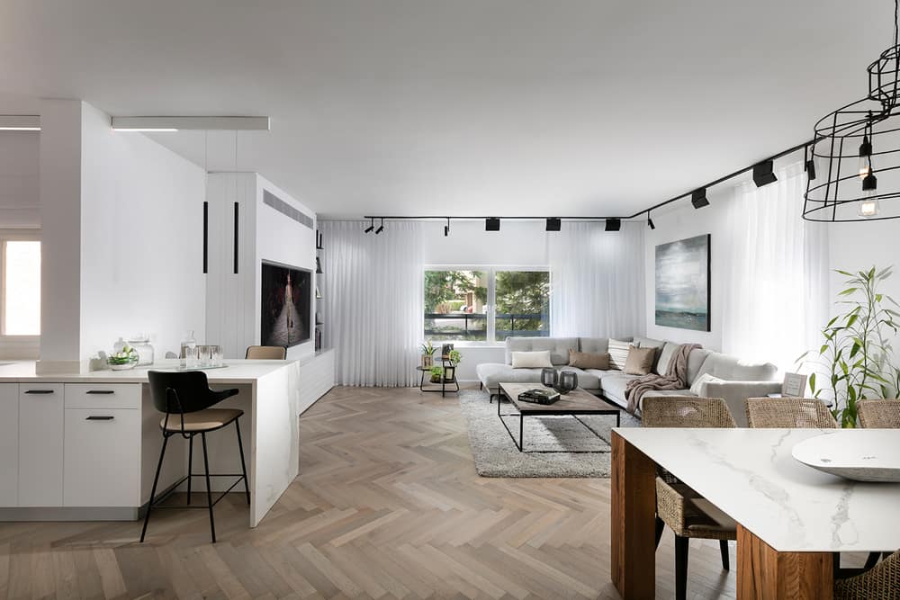
Project: Renovation of a 4-room apartment in Ramat Hasharon
Architecture and design: Lilian Ben Shoham
Tenants: The architect and her daughter
Location: Ramat Hasharon, Israel
Area: 110 square meters
Renovation duration: 4 months
Photos: Elad Gonen
The architect renovated the house for herself, resulting in an apartment combining many design styles that create perfect harmony. When the architect Lilian Ben Shoham came to see the apartment she intended to purchase, Lilian had already planned how it would look and what exactly she would do to make her home the way she liked it. Right from the start, one thing was clear: her home would be a collection of different design styles that would come together in perfect harmony.
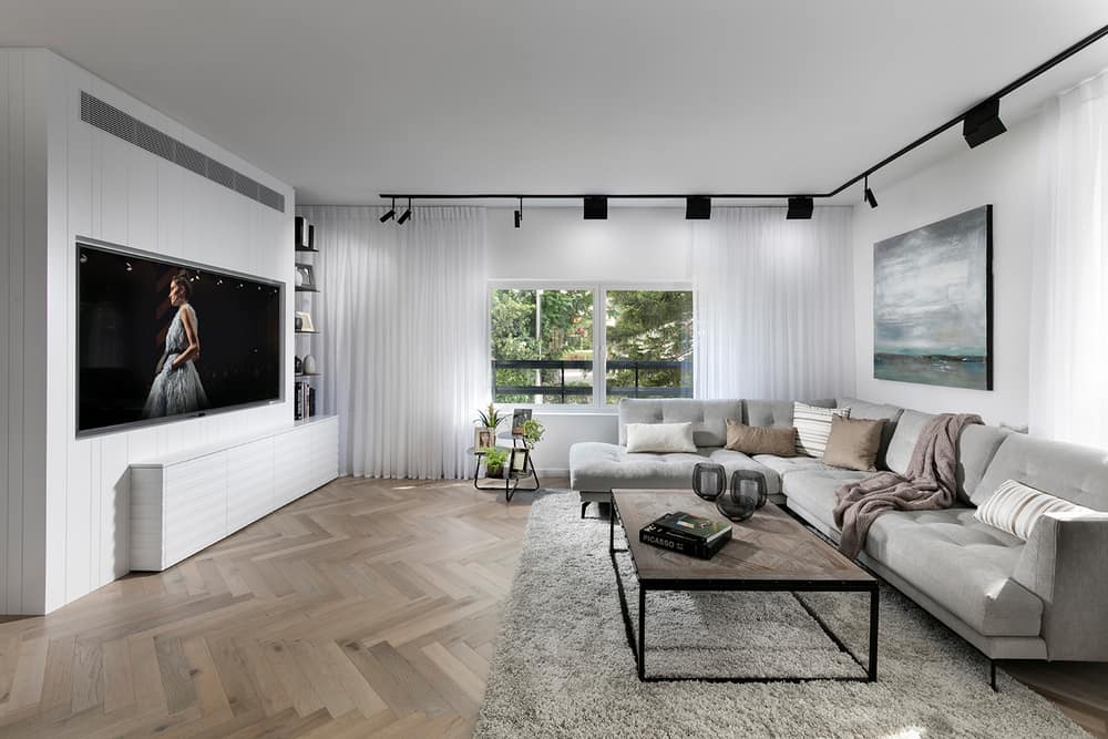
“When I went to see the apartment, I made the plan. It was clear to me that the house would combine several different styles – modern, classic, industrial, warm, and rustic and they would all live together in astonishing harmony. I wanted to have a house that resonates with the materials. Let it be modern but warm and a bit classic,” says Ben Shoham. The architect decided to keep the 4 rooms as the apartment was before the renovation but changed the division inside the apartment to better suit her family’s needs.
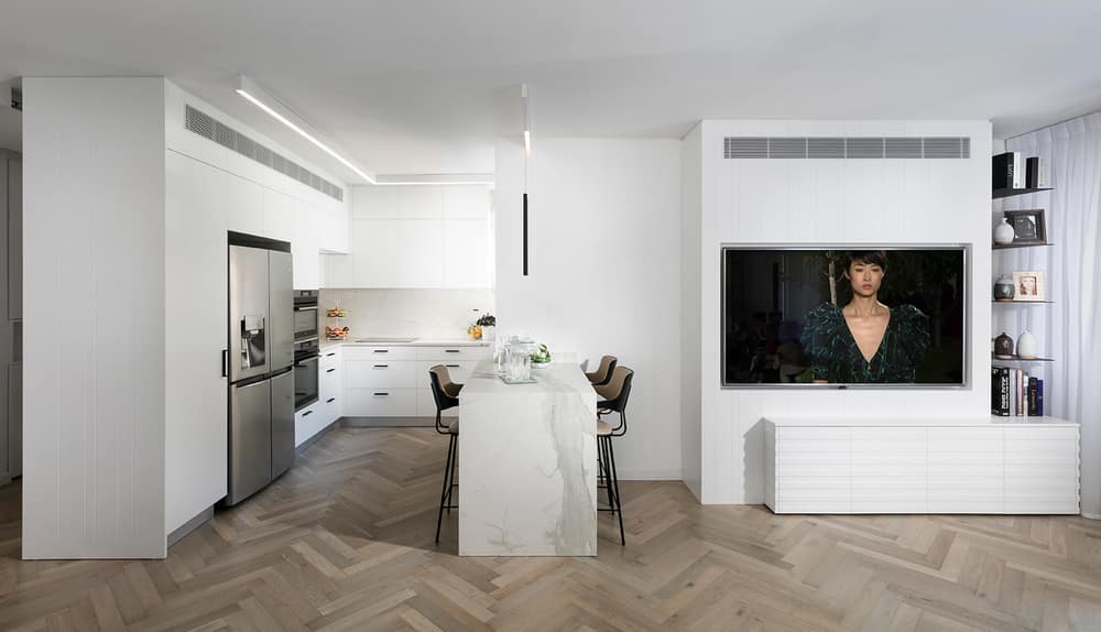
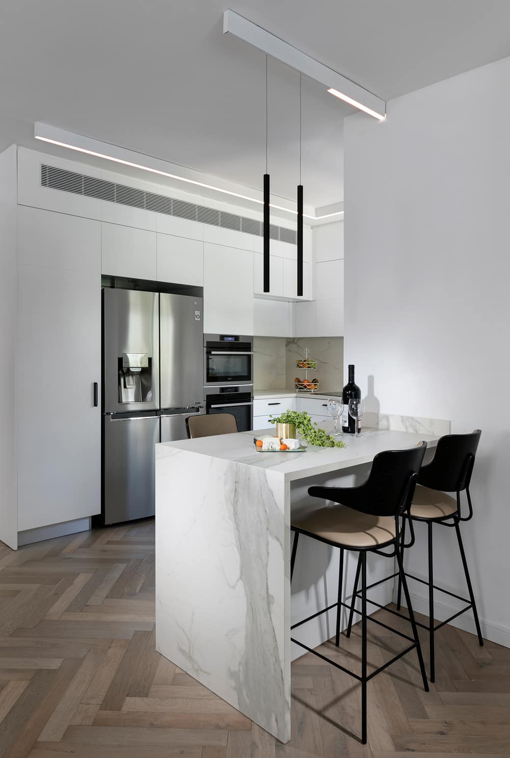
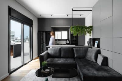
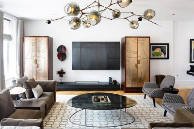
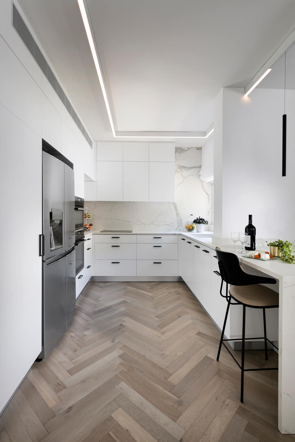
Ben Shoham expanded the kitchen and moved it away from the living room to be located on the other side of the public space. The wall that separated the kitchen from the living room was removed to open up the space. The ח-shaped kitchen structure, in smooth white color with industrial metal handles, ends with a small counter made of porcelain granite identical to the kitchen counters and is used for light meals. The entire floor was replaced with a fishbone parquet, which creates a classic and warm look. Adjacent to the counter is the TV wall that combines a modern, industrial, and classic style. ”I chose to make a power wall for the TV made of wood carpentry with a white engraving that combines black cantilevered metal shelves on the side, creating an industrial look next to the warm and classic wood look. The wall also includes air conditioning vents that fit smoothly,” says Ben Shoham.
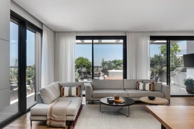
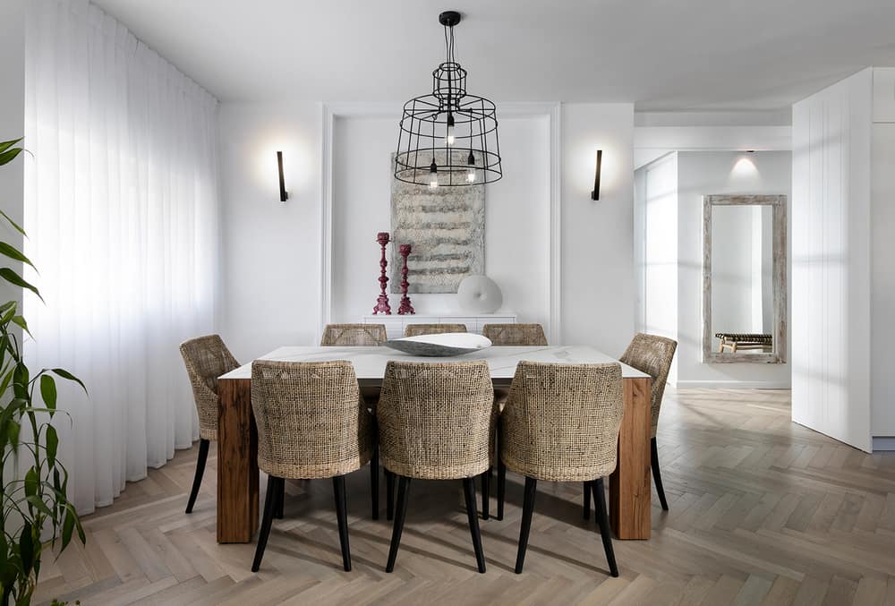
A gray corner sofa was chosen for the living room. In the center, a coffee table with metal legs and a wooden plate simultaneously creates a rustic and modern look. The dining area continues the design line. The dining table is made of wooden legs with a porcelain granite plate on top. Above it is a light fixture made of armored iron with an industrial appearance. In front of the dining area is a modern sideboard made of grooved wood painted white, similar to the carpentry on the TV wall.
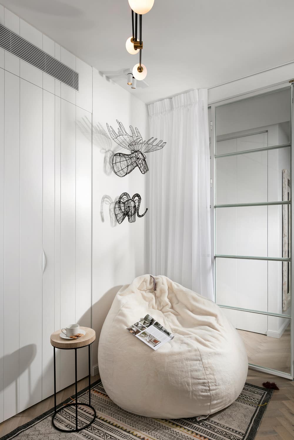
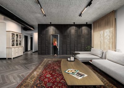
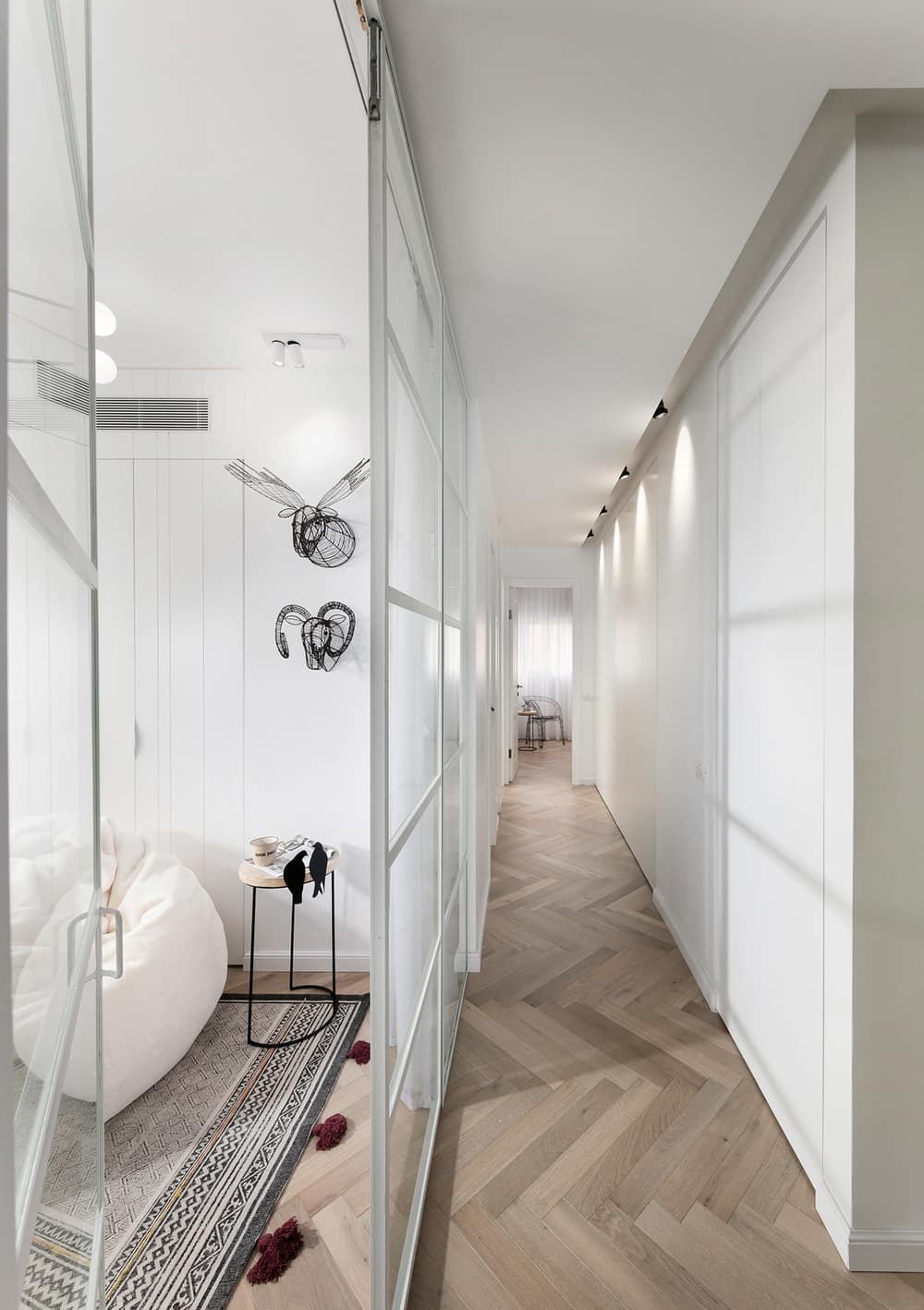
Before the renovation, the corridor leading to the bedrooms was narrow and closed. Ben Shoham created cabinets on both sides with custom carpentry, offering plenty of storage spaces and a hidden laundry room. ”It was important to me to create as many storage spaces as possible. I like that everything has its place. The cabinets on the sides of the corridor were designed for this purpose, creating maximum utilization of a space that is not normally used,” explains the designer. The guest room’s wall, which is also used as a study and is located at the beginning of the corridor, was replaced by a glass wall with a white Belgian profile, creating the illusion of “shortening” the corridor and giving it a sense of space.
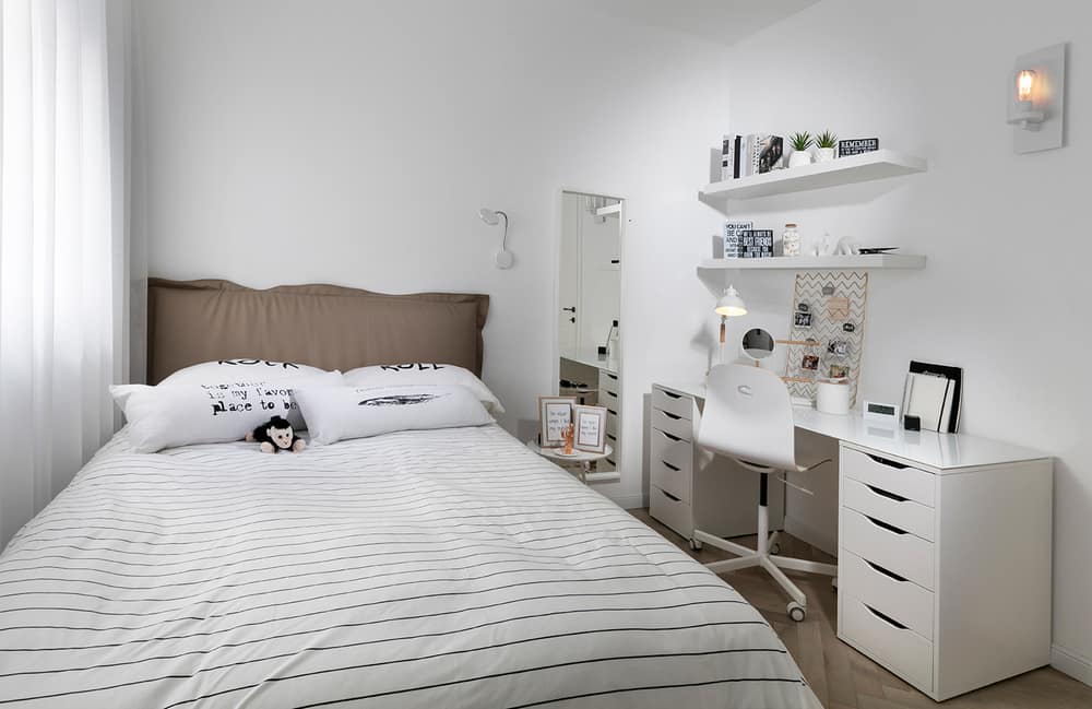
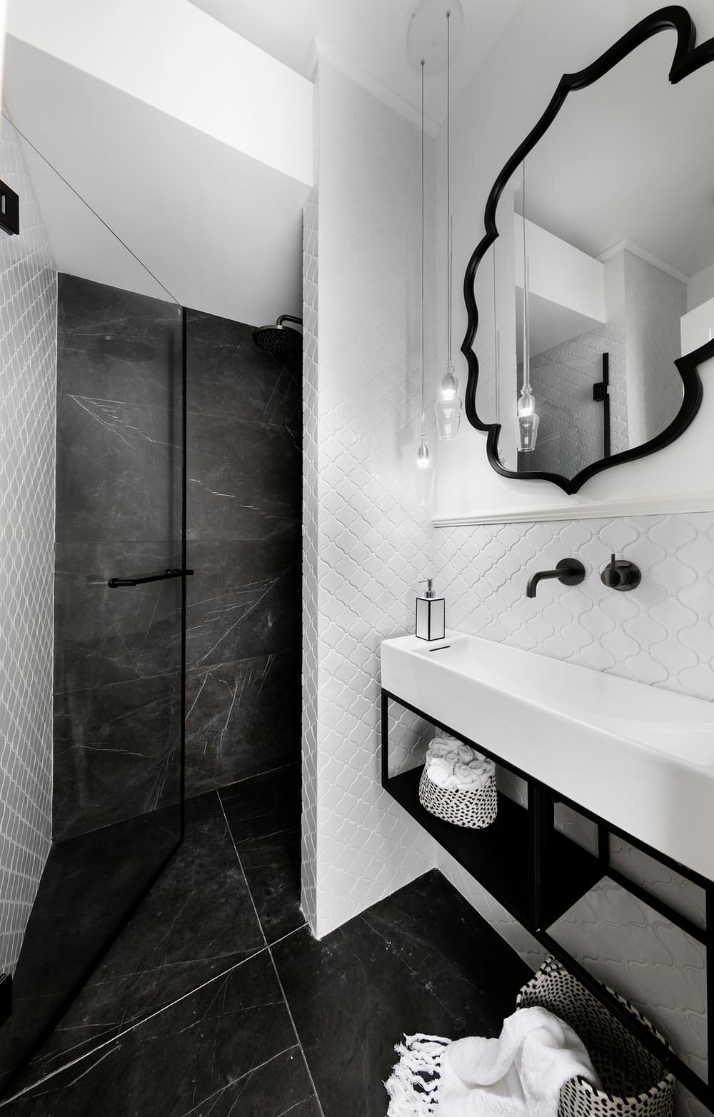
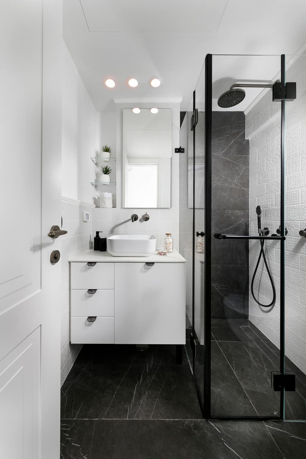
The color palette chosen for the house – white, black, wood, and mocha – continues in the bedrooms and bathrooms. The architect divided the general shower into two and created two bathrooms, one connected to the bedroom, which became a luxurious suite. The shade chosen for the bathrooms is modern black combined with a white mosaic in accordance with the design concept. The master suite inspires an atmosphere of calmness and tenderness. Two wardrobes were placed in the small hallway to the bathroom for maximum space utilization. At the end of the hallway, a glass door with a Belgian profile leads to a dramatic and modern bathroom, in contrast with the warmth and rusticity of the bedroom. “The combination of the different styles and materials created a harmonious, intriguing, pleasant, and special look. The house inspires an atmosphere of calmness, warmth, and flow while maintaining modernity and an industrial allusion,” concludes the architect.
