Project: The Project of a Lifetime
Architecture, planning and interior design: Shpigel Architects
Location: Hadera, Israel
Owners: A couple in their 40s’ + four children
Plot: 300 sqm
Property: 320 sqm
Project duration: 14 months
Photo Credits: Elad Gonen
This plot was bought by the owners with the view of building their first private property on it and creating a modern and cozy home for their family of six. The husband, a hi-tech professional, managed this complex construction project from start to finish and the results speak for themselves.
Israeli architecture has come on leaps and bounds in recent years, and private properties that are being built throughout the country these days, are a testament to this international-eclectic, inspiring, and evolving architecture.
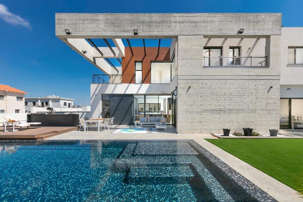
This property in Hadera, designed by Arch. Ron Shpigel, owner of Shpigel Architects, is a classic example of this. This architectural masterpiece, characterized by straight linear lines, measured masses of exposed concrete, and impeccable symbiosis between interior and exterior, proves that sometimes less is more.
The property owner, a hi-tech professional, took on the challenge of managing the entire construction project from A to Z. The exciting results are evident.
The power of simplicity: Welcome to the home of a couple in their 40s’, parents to four adolescents. A few years ago, the couple decided to buy this plot in Hadera, on which they were to build the home of their dreams.
The chosen plot, 800 sqm in size, was divided into two: a 300 sqm plot on which the property was to be built, and an additional plot, 500 sqm in size, intended for rental, overlooking leafy green suburbs.
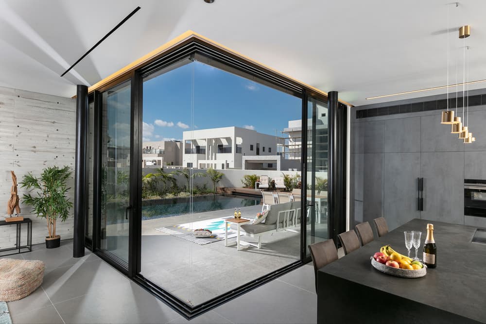
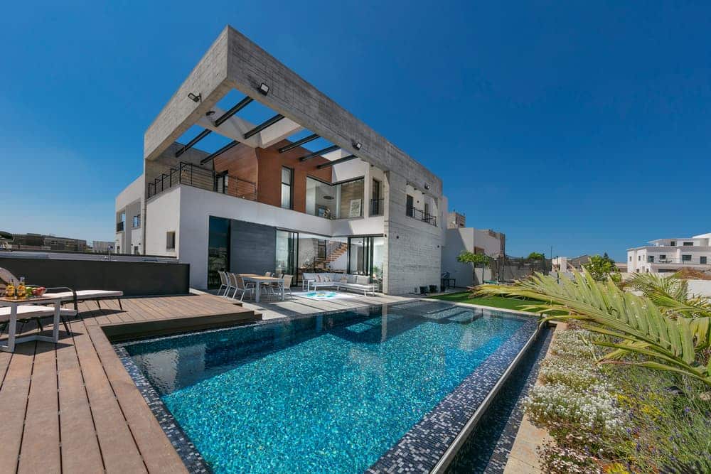
“The couple that up until that point lived in a standard apartment had a dream – to create a living environment for their family, that is modern and current on the one hand, whilst being homey and cozy on the other”, says Arch. Shpigel. “The L-shaped property looks like a cube that has had one of its corners bitten into, with a beautiful opening in its center overlooking a well-manicured garden”.
According to the architect, the owner, who values order and precision, took it upon himself to do what most homeowners would avoid like the plague, and managed the construction process from start to finish: “He took on a huge responsibility, learned the ins and outs of construction management and despite no previous experience he managed to drill down to details and achieve results that even the most experienced construction managers couldn’t have achieved. He essentially committed his entire existence at the time to the project and executed it flawlessly”.
The couple approached Arch. Shpigel’s studio, as they were impressed with some of his projects, planned around Hadera. The urban-modern architecture, the use of natural materials alongside industrial ones, and the attention to detail appealed to the owners. All these elements, and more, were incorporated into the planning and design of their new property.
“This property is abundant in detail”, explains Arch. Shpigel. “It drills down to the finest details and each element was carefully considered before it was incorporated into the plan, from the exposed concrete walls and through to the impressive staircase. The architectural concept begins with the exterior of the property. Large concrete steps, dramatically lit, lead to the main entrance. The entrance door is a feature in its own right: “The tall door, covered in wood-like aluminum cladding, emphasizes the vertical lines of the design, and adds a sense of height. The ‘bitten cube’ construction was created by using floating concrete beams that have two purposes: to create an open conceptual framework that defines the dining area, and in parallel to create shade and cool the property. The black windows frame the view like a living and breathing piece of art”, adds Shpigel.
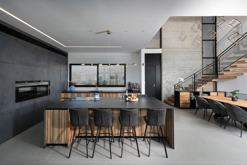
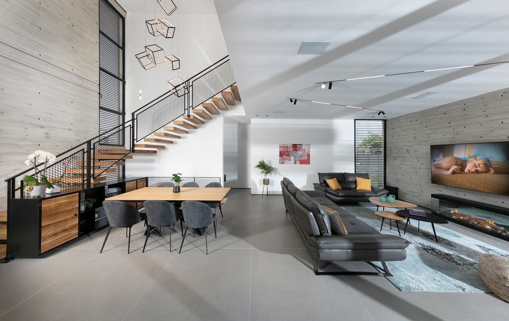
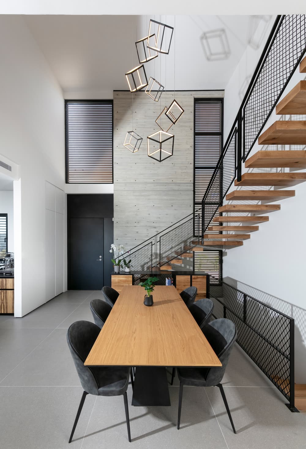
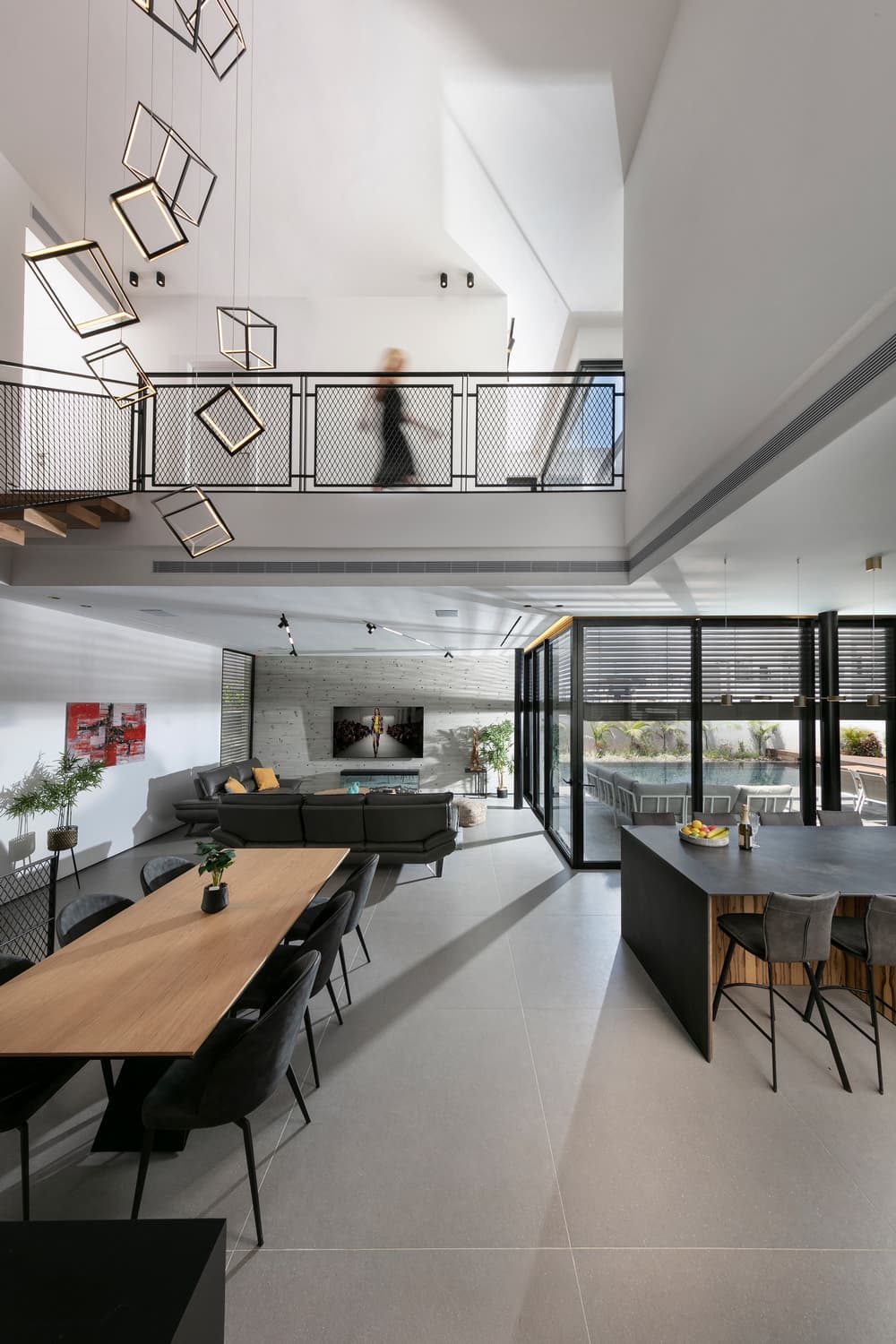
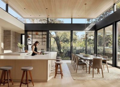
The open space is light and airy and at the same time, thanks to achieving the right balance of mass, volume, materials, and colors, there is a cozy and embracing feel to it. The lounge is located on one side of the level and the kitchen on the other. The dining area, located next to the staircase, enjoys double headroom that washes the property with plenty of natural daylight.
“We used materials and a color scheme of grays, blacks, and wood”, explains the architect. The exterior displays a marriage of exposed concrete, black aluminum, and wood-like aluminum, which can be seen in the front door and the rear of the structure. The color scheme continues throughout the interior, and the dynamic between the shades is evident in elements such as a dark iron staircase banister alongside wooden furniture”.
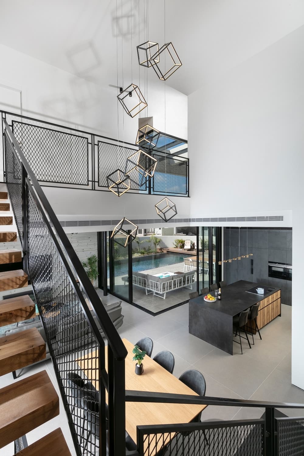
Whilst on the topic of staircases, there is no doubt that this particular one is one of the most important elements in the property. “We designed a wooden staircase that floats in the double height space”, adds Arch. Shpigel. “The stairs are visible from every corner of the property thanks to an open upper corridor that overlooks the entrance hall and creates an important central axis within the property”, continues the Arch. “To draw attention to its height, we positioned an eye-catching cube shaped light fixture in its center. This is a design piece that anchors the area and emphasizes it. The cube-shaped piece creates a dynamic look that corresponds with the property’s unique character”.
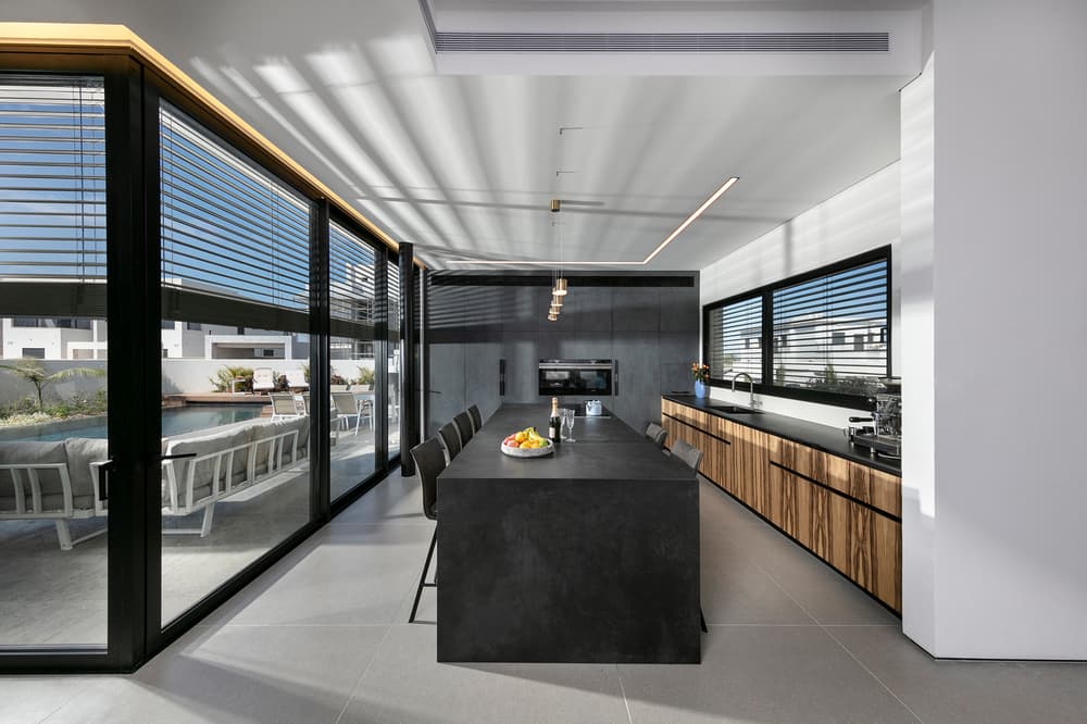
The contrasting use of materials continues in the kitchen, where Arch. Shpigel created a dark kitchen carpentry unit that was fitted against the entire garden-facing wall. This includes a hidden door to the pantry, which can also be accessed from the driveway. The unit is covered in stone-textured gray Formica and wooden elements were incorporated into the space around it, such as the front of the worktop and the dark stone-topped kitchen island.
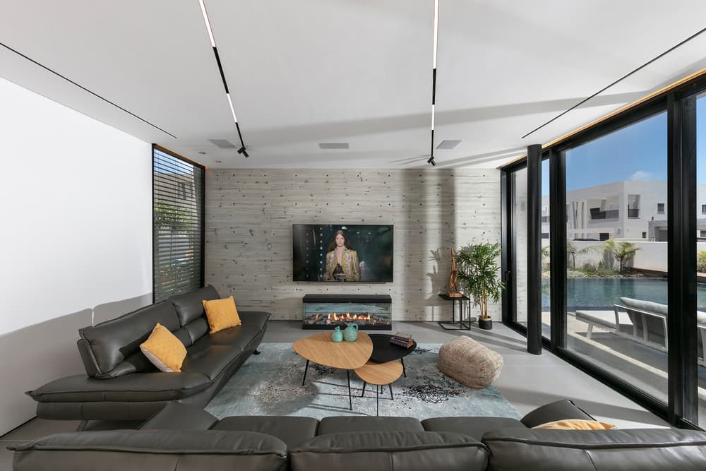
The lounge is defined by two walls, one in concrete cladding and fitted with an electric fireplace to add a cozy warm vibe, and the other is fitted with glass doors that overlook the garden. Contrary to standard design practice, the furniture was not positioned against any of the walls, but rather free-standing in the space, creating a homey feel. Diagonal hanging light strips were fitted on the ceiling to balance the concept of straight lines.
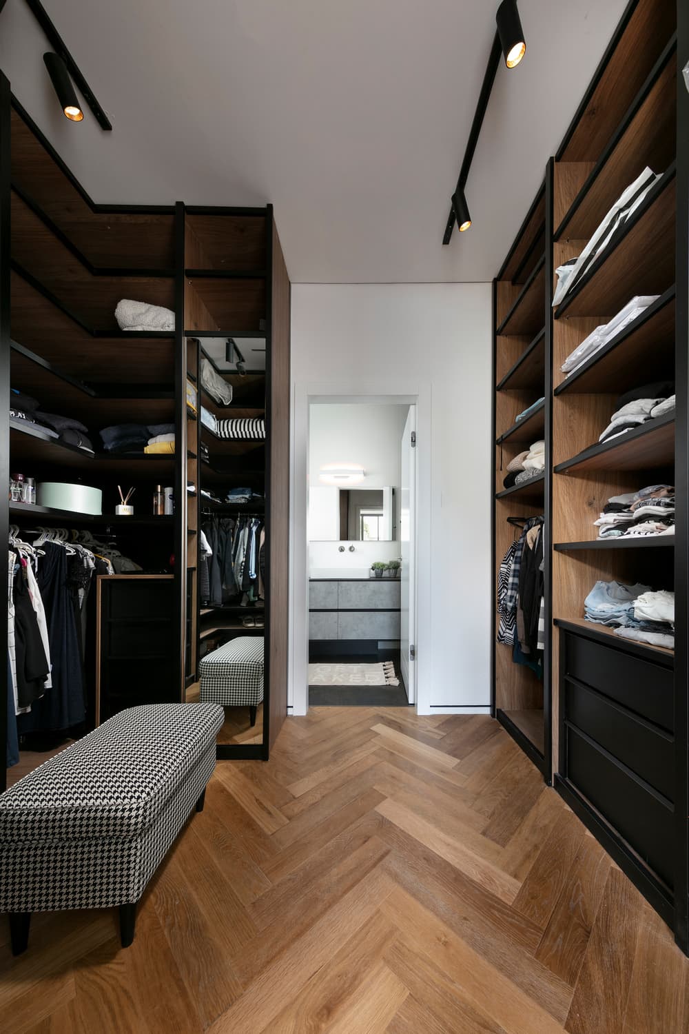
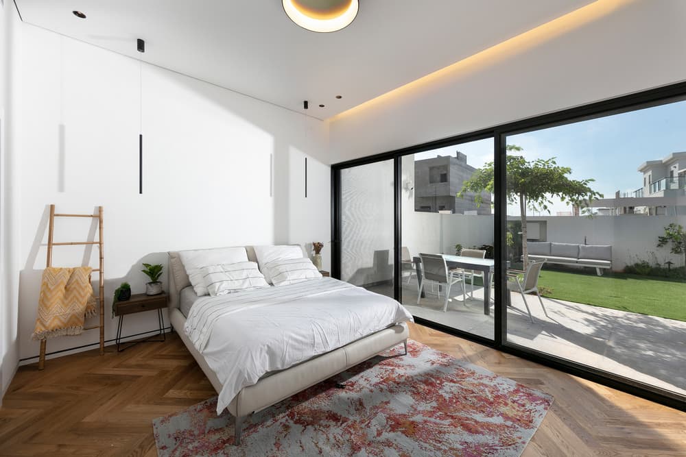
The master bedroom is located on the ground floor and enjoys a small intimate garden that is separate from the main one. Wooden floors were fitted in the bedroom, as well as a walk-in wardrobe that leads out of the bedroom. This creative solution was created by Spiegel as the owners wake up at different times and so wanted to avoid waking each other up in the mornings.
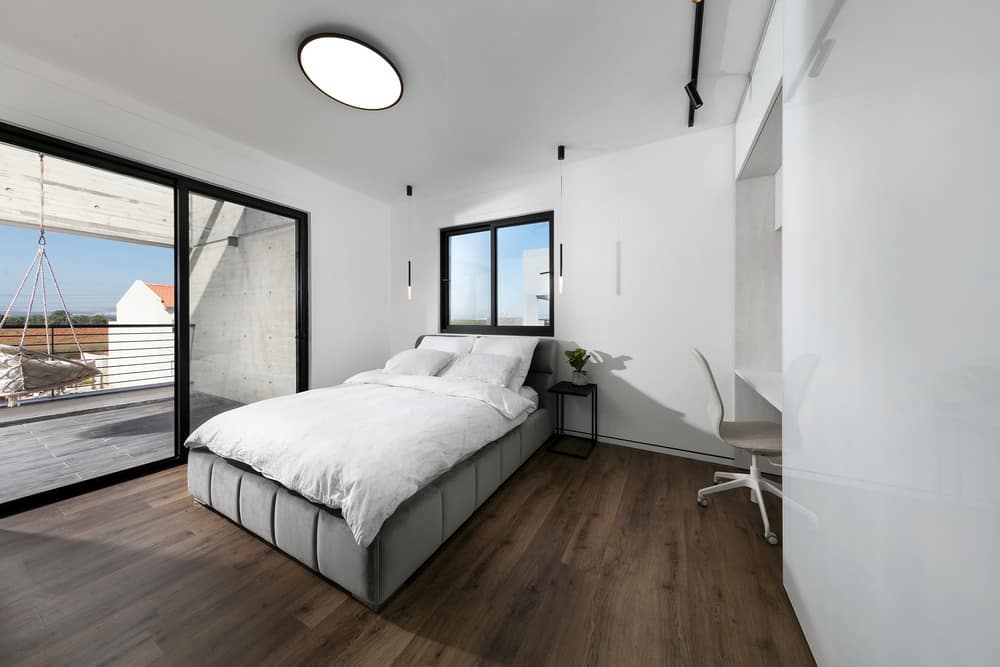
Each of the couple’s children has their own spacious en-suite bedroom on the top level.
And finally, the structure and the garden were designed as one unit, one an integral part of the other and vice versa. An infinity pool surrounded by lush plants was built in the garden, adjacent to the house one one end and to an elegant mosaic platform on the other.

