Project: Van Stapele
Design: Studio Modijefsky
Team: Esther Stam, Marit van der Gulik, Natalia Nikolopoulou, Agnese
Pellino, Maite Margalho, Mathilda Legrand, Marie Pierron, Pauline Renlef, Christel Willers
Assignment: Interior design
Program: Retail & bakery & dough kitchen & office space
Location: Amsterdam, The Netherlands
Status: Realised April 2024
Size: 300m2
Client: Vera van Stapele
Photo Credits: Maarten Willemstein
Design Philosophy and Material Selection
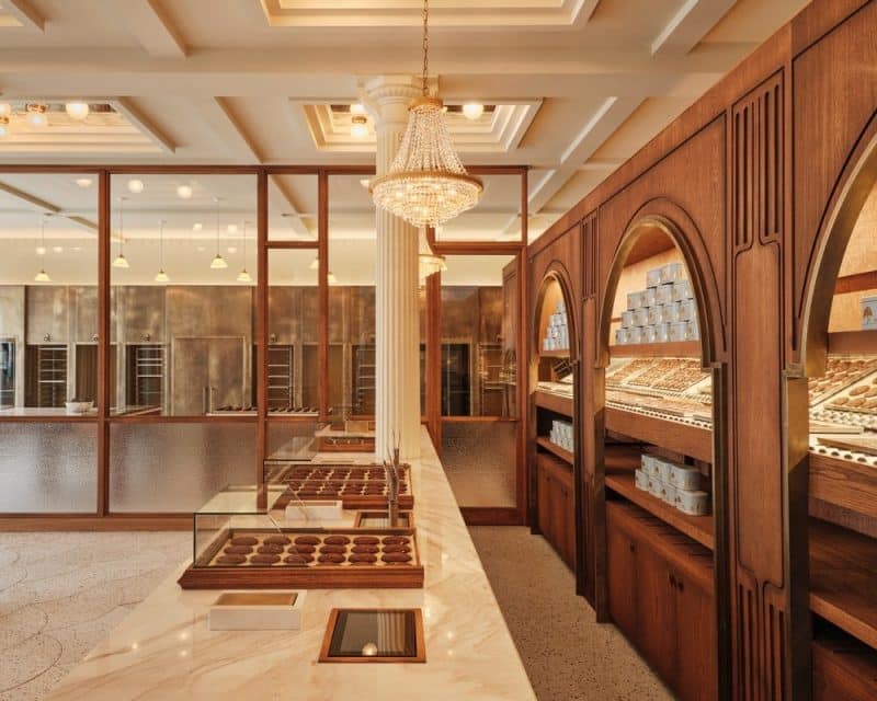
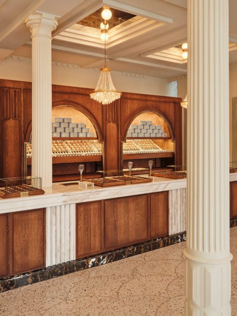
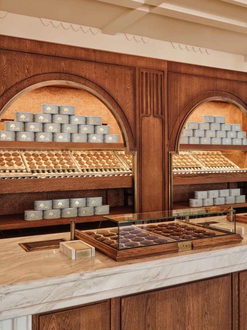
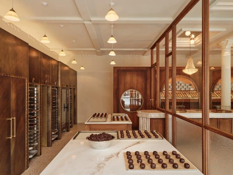
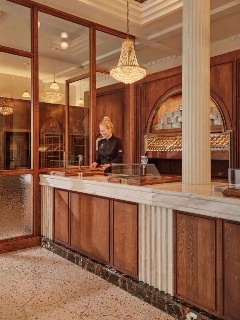
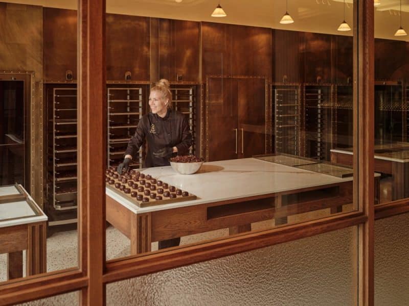
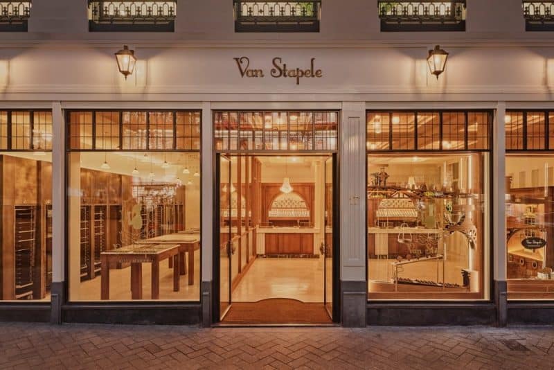
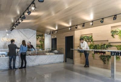
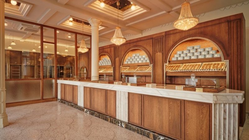
Studio Modijefsky has seamlessly transitioned the essence of Van Stapele from a quaint alley to a larger, more central location, preserving the intimate charm that has drawn customers for years. The design team chose a palette of cream white and various shades of brown, mirroring the iconic cookie itself. This choice enhances the timeless appeal with modern touches of antique brass and warm woods, ensuring that the new space resonates with the brand’s rich history and artisanal quality.
Interactive Design and Customer Experience
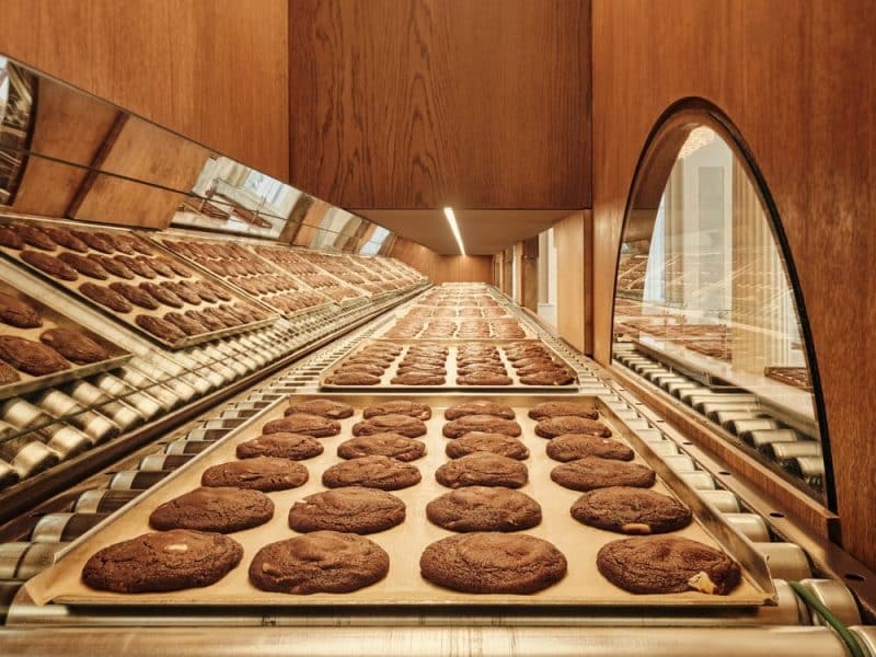
The renovation introduces a Willy Wonka-esque experience, transforming the simple act of buying cookies into a magical journey. An expansive glass wall allows customers to view the cookie-making process, from dough rolling to baking, emphasizing transparency and engagement. The cookies themselves travel from the oven to the front of the store via a mesmerizing conveyor system, blending functionality with spectacle.
Children’s Interaction and Store Layout
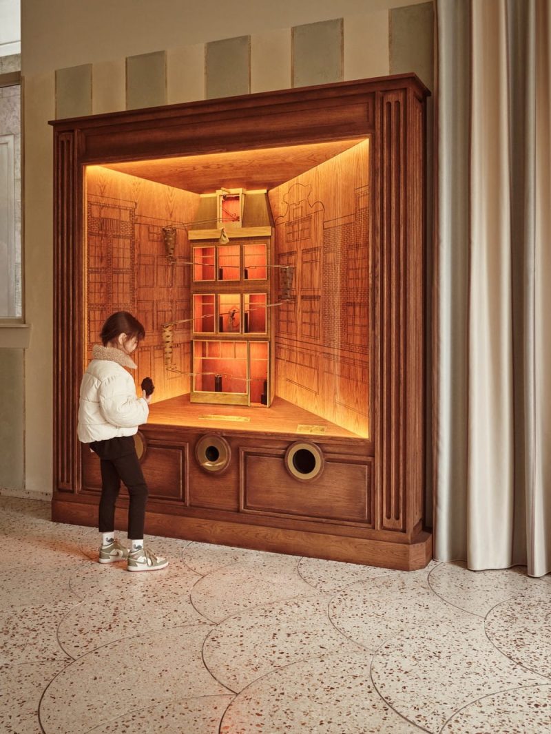
A special feature for younger visitors is the grab cabinet, where children use a coin to activate a mechanical display, ending with a surprise gift. This interactive element not only entertains but also connects them to the magic of the store. The overall layout, including the stepped ceiling cassettes and strategically placed mirrors and lighting, enhances spatial perception, making even queue times engaging.
Integration with Local Aesthetics and Custom Elements
The floor design incorporates custom terrazzo tiles, reflecting the local architectural style and integrating the shop more deeply into its urban setting. Every fixture and piece of furniture is meticulously crafted to support the bakery’s operational efficiency while also serving as a visual treat.
Conclusion: A Blend of Heritage and Innovation
The new Van Stapele store in Amsterdam exemplifies how thoughtful design can elevate a brand’s legacy while adapting to its growth. The attention to detail and integration of traditional and contemporary elements ensure that each visit is not just a purchase but a memorable experience. Studio Modijefsky’s approach has successfully created a space where history and modernity coexist beautifully, inviting customers into a delightful culinary adventure.
