Project: Willisdene House
Architects: Archier
Location: Hobart, Tasmania
Year 2017
Photographer: Benjamin Hosking
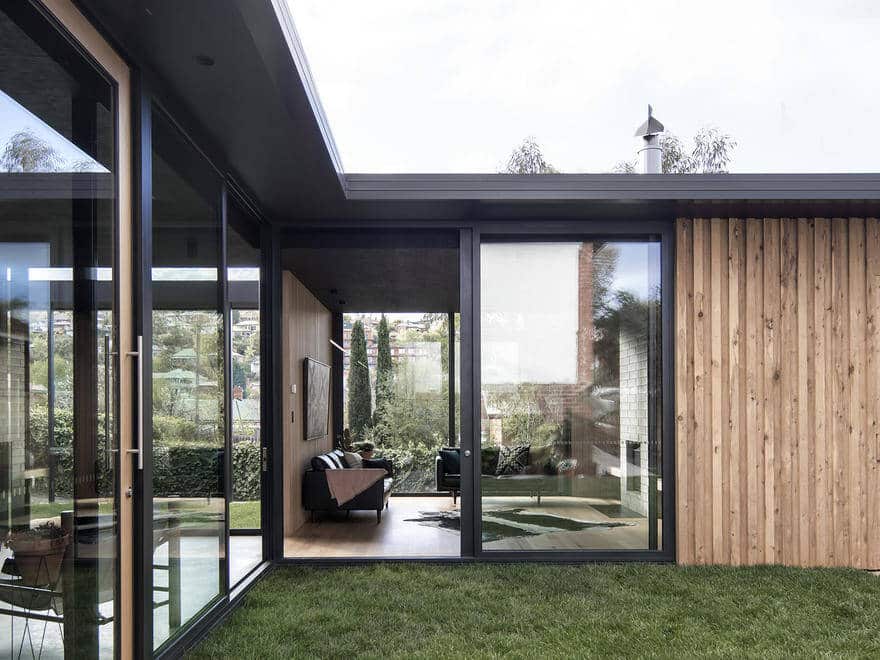
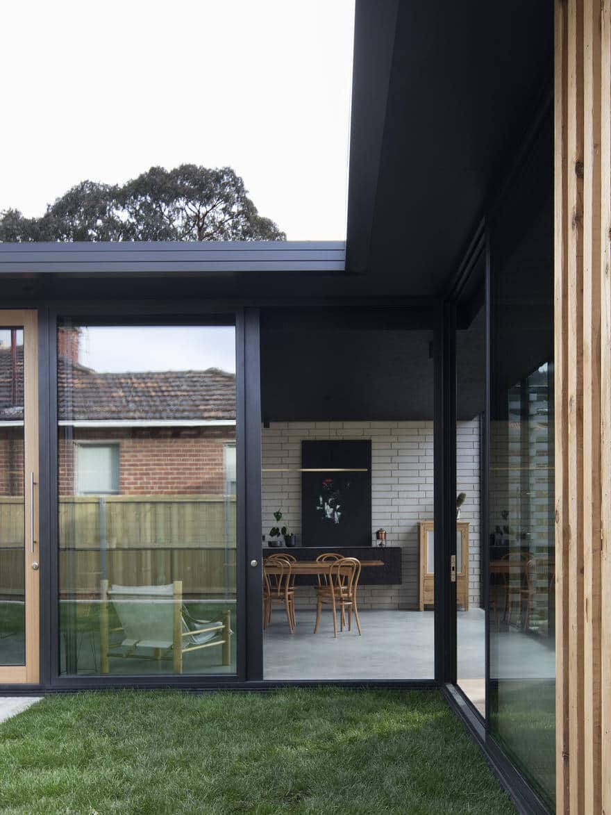
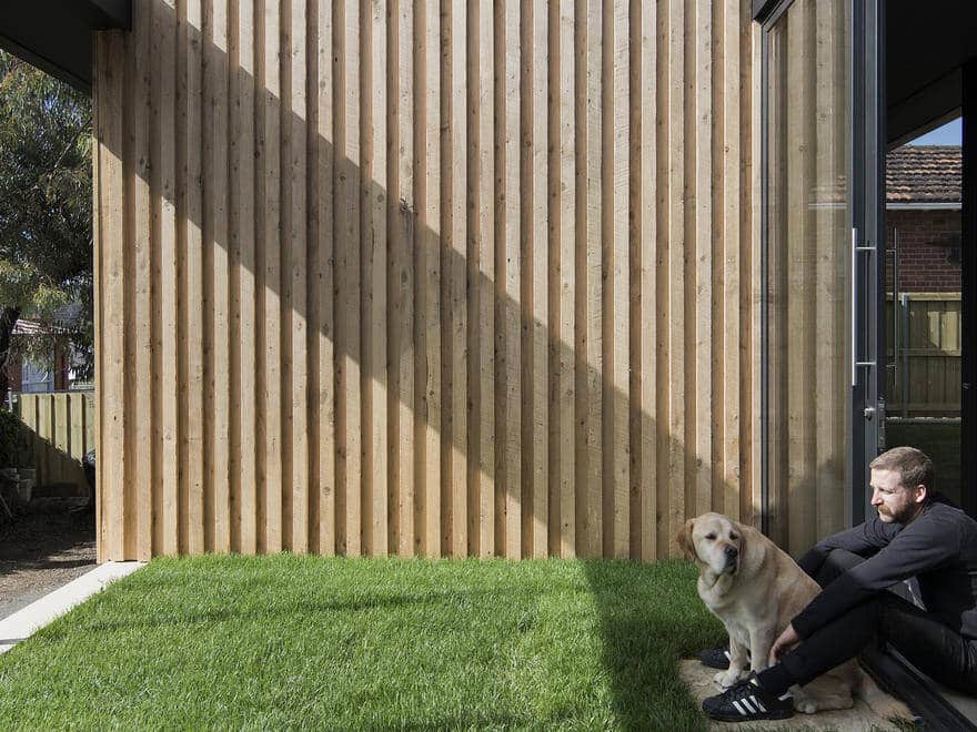
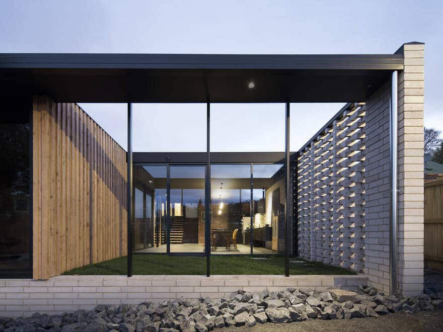
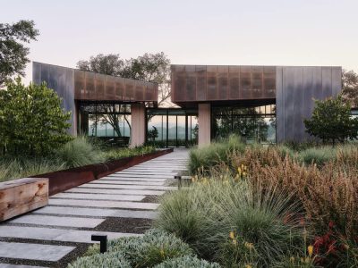
The Willisdene house leverages Australia’s largest latent asset – the stereotypical backyard – to create a new heart for the dwelling and family, re-conceptualise the relationship between the house and garden, and to embed landscape in the ritual of everyday life.
This project was conceived sitting in the backyard of Willisdene House 10 years ago. The design positions the yard at the heart of the project, reframing the relationship between the house and garden, incorporating it into the everyday rituals of the dwelling.
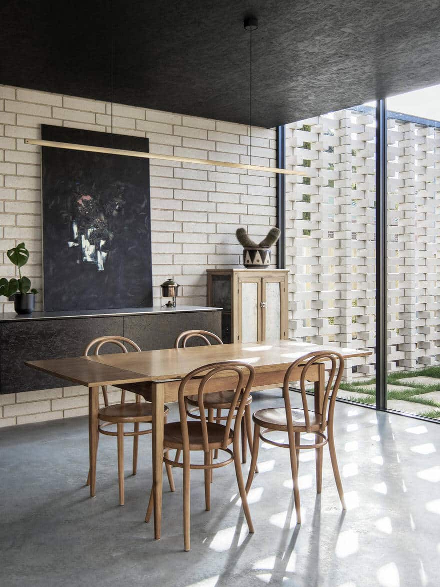
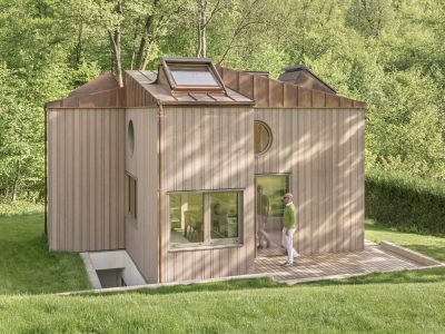
The courtyards bathe the new building in Tasmanian sunlight and create a frame to view the cloud formations, fashioned by Mount Wellington. They provide solar access for heating and crossflow ventilation for cooling.
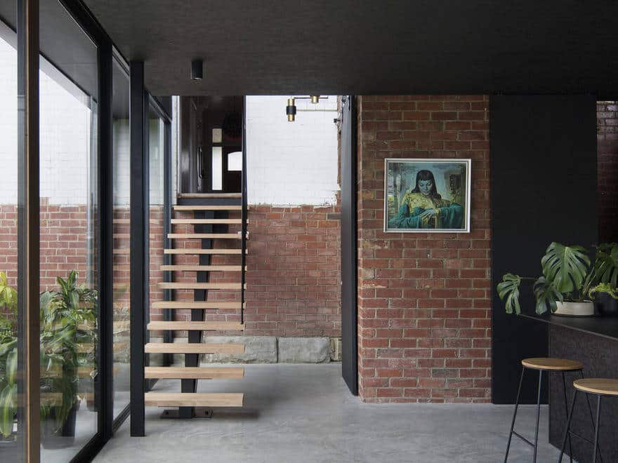
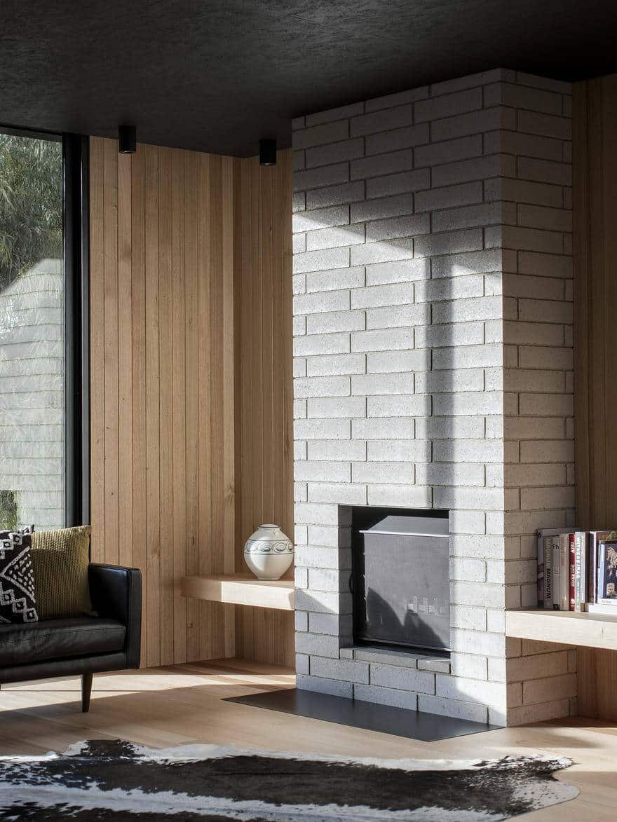
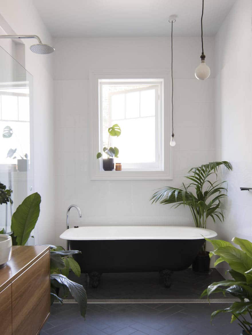
Material selections are genuine, simple and durable. Finishes have been kept to a minimum and where they have been used they are robust and natural, to ensure their longevity.
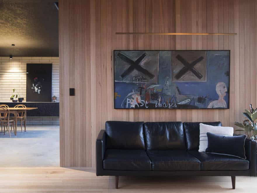
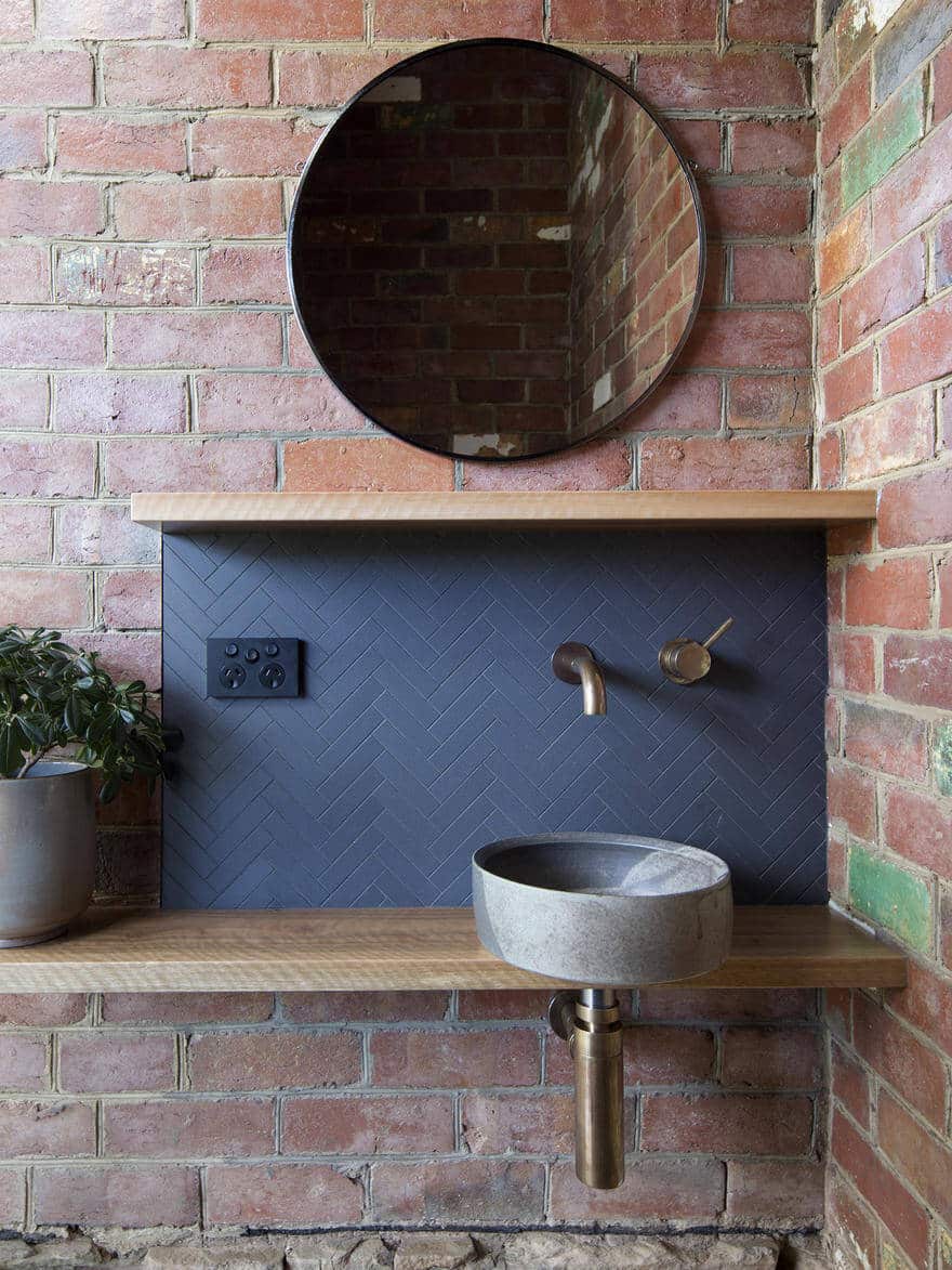
The project features bespoke basins by ceramicist Lindsey Wherrett, lights by Archier and artwork by Nathan Grey.
The original Willisdene House was built almost 100 years ago. The investment in quality architecture and construction will see it through for another century and more.
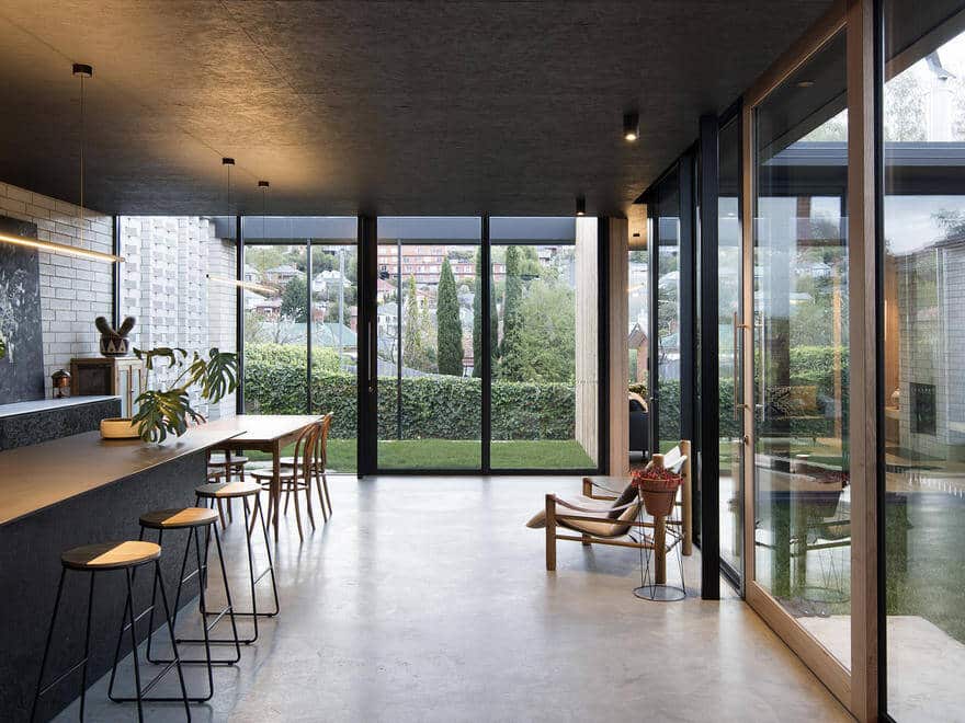
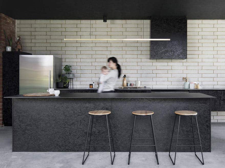
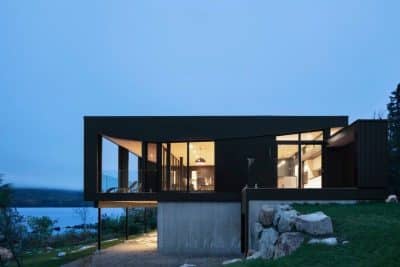
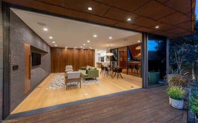
With two simple moves, the design integrates the backyard into the ritual of the every day from inside the house: A long north facing pavilion reaches out to the west, providing all daylight to the kitchen, dining and sitting space; a small courtyard and lounge cap this volume, with large picture windows that frame a delightful gum tree to one side and the central court on the other.
With no budget for high-tech ESD features, our approach was to optimise efficiency through basic passive principals, coupled with thoughtful material selection. Large north facing windows allow for plenty of solar gain in the winter whilst the eaves provide shade in the summer. Operable windows allow for crossflow ventilation and additional insulation has been added throughout the existing dwelling to increase its performance. Material selections are simple and durable. Finishes have been kept to a minimum and where they have been used they are robust and natural, to ensure their longevity.
Throughout the space we have leveraged our experience of prototyping and producing products. From our locally-made Ashfield towel rails to the handmade ceramic basin collaboratively created with Lindsey Wherrett – here, the products are designed for the space, not the space for the products. The tones in the custom ceramic basin were selected from the under growth of Mount Wellington, adding a layered response to site and context.

