Project: Belo Horizonte Apartment
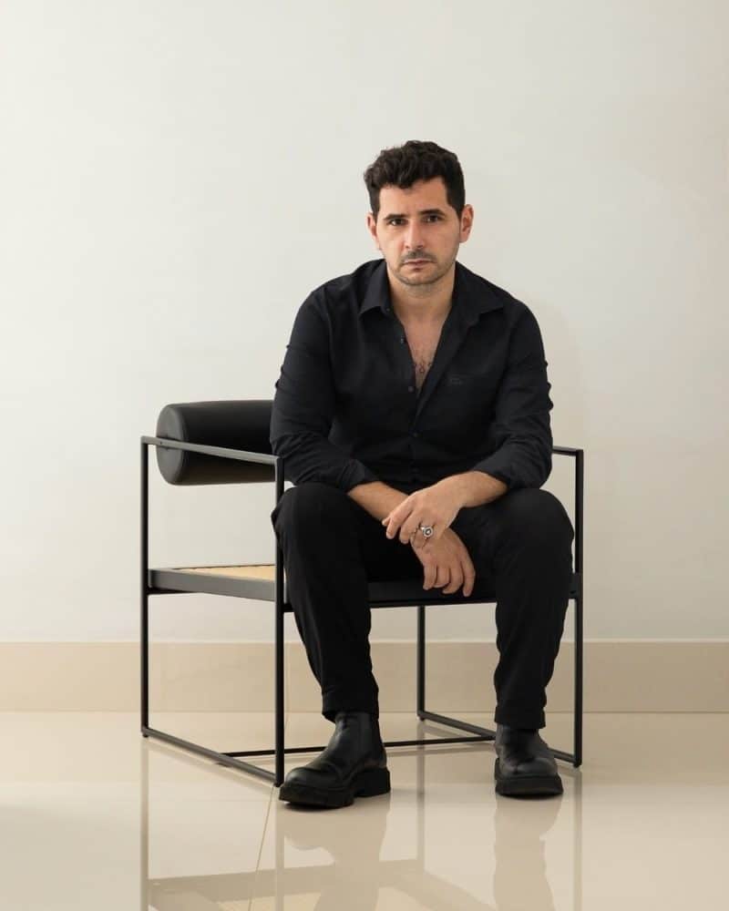
Architecture: Lucas Lage
Collaboration: Carla Cruz, Fabio Cardoso, Bruna Robson
Location: Belo Horizonte, State of Minas Gerais, Brazil
Area: 320 m2
Year: 2022
Photo Credits: Ivan Araujo
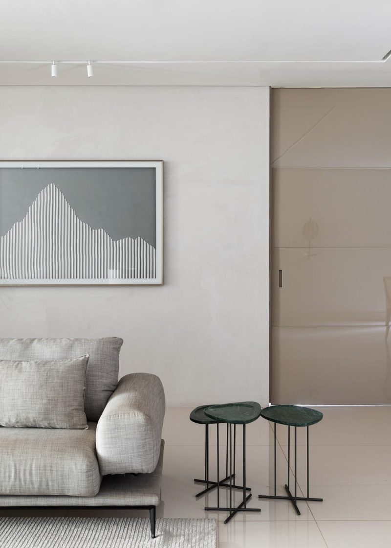
Belo Horizonte Apartment, where the owners acquired two apartments and carried out a renovation to combine two apartments into one, providing a better functional distribution for the couple with two teenages and with intimate and social spaces to receive friends. The clients wanted a project that was easy to visually perceive, with the warmth of home but without too much information about agreements and decoration, focusing on timeless furniture with a striking design.
What were the owner’s requests and expectations for the project and how were they met?
The client’s only request was for a more timeless apartment, the client also expected a faster renovation without many changes to the civil works, which was met within 4 months of work.
Was it necessary to change electrical, hydraulic material, etc.? Specify the details and reasons.
For civil works we avoid major interventions as much as possible, hydraulics we only change finishes and electrical we complement the existing ones with the audio, video and lighting automation project.
What is the inspiration and conception of the project?
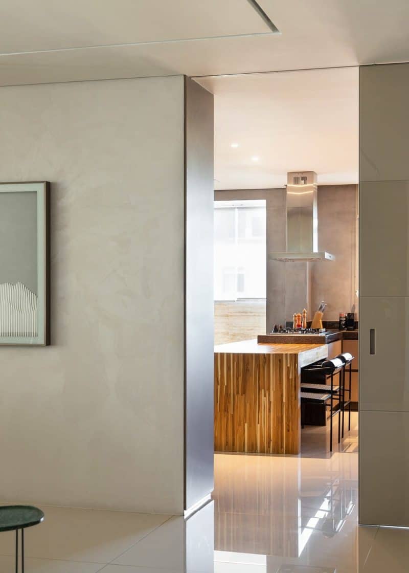
We seek inspiration from the lifestyle of the residents, who, like good miners, like to entertain, have a kitchen that is always full and the house is always open to those who like it. So we created a concept of maximizing the openings of spaces, so that from all environments vicie can have visual range and interaction with the surrounding rooms.
Is there a starting point that you consider to be key to the project?
Yes, we use it as a starting point to make the entire background of the room clear and act as a springboard for a better perception of the furniture and decorative objects.
Did you have any difficulties? What were the solutions found?
We had the biggest challenge of creating a single apartment from two, considering that in the end we didn’t have that feeling of being in a space that seemed like two properties were just “joined together”.
What factors were analyzed when choosing covering materials? What materials stand out? Are there any ecological or technological materials that deserve to be detailed?
The coverings were chosen based on the initial color palette and thinking about the contrast between them, glass x steel, wood x marble.
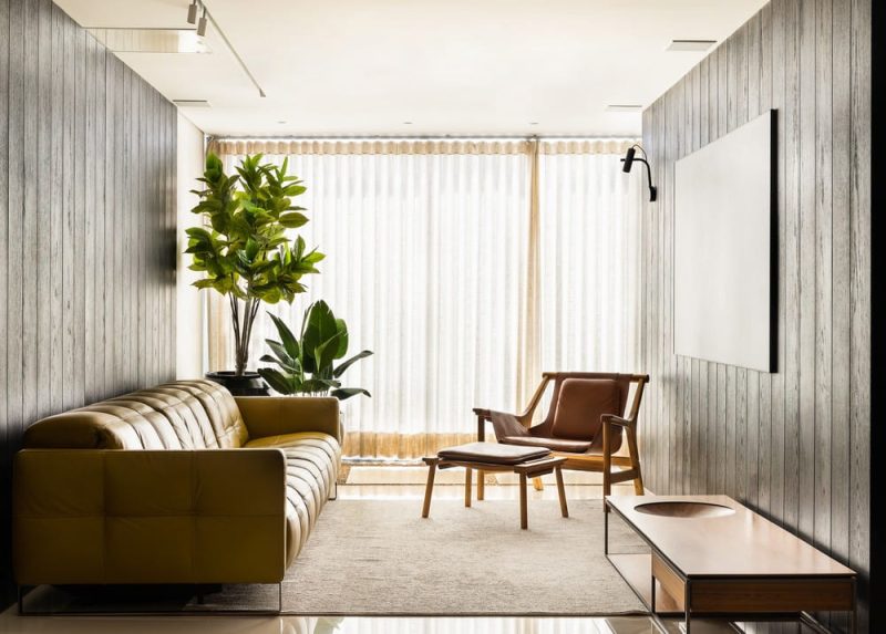
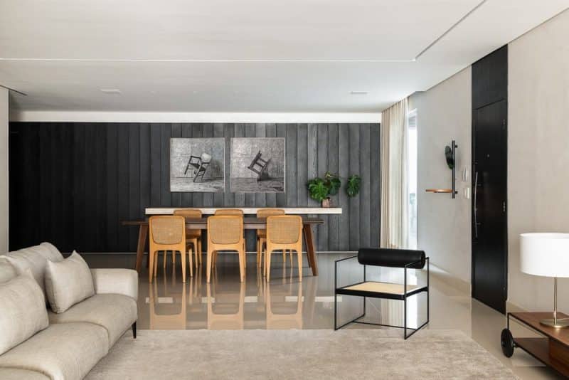
Highlights include the travertine and ebonized wood that mark the dining and Home TV environments.
Description of each environment
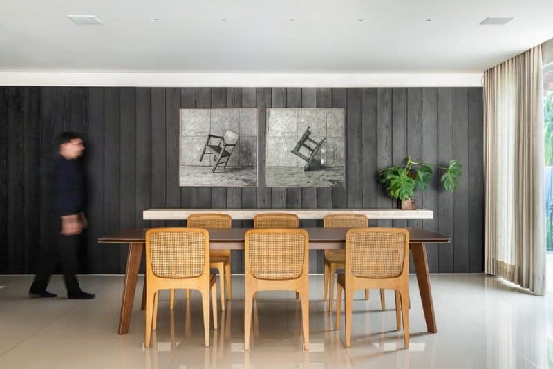
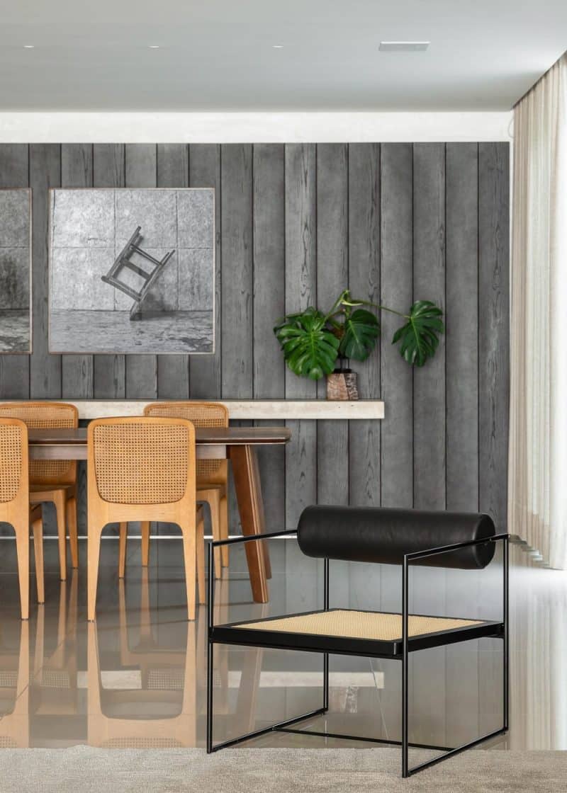
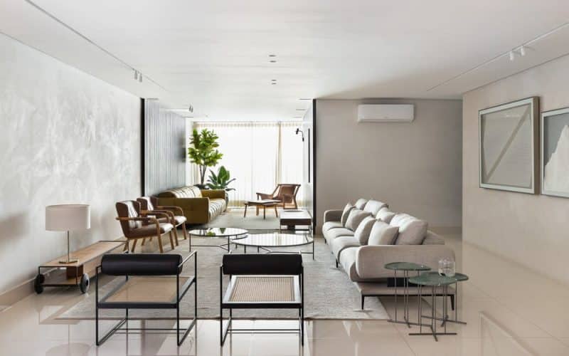
Home TV / living / dining room: As we have a single integrated environment, without wall separations, the design of the three rooms was conceptualized in such a way that the use of ebonized oak panels demarcated the limits of each room. On the home TV the panel is made for demarcation on the sides and on the dining room at the back along with the buffet sideboard. The lighting passes throughout the three environments, bringing integration and a continuous and diffused light throughout the space. All three environments feature a woody furniture palette in light tones, thus allowing a better reading of the pieces.
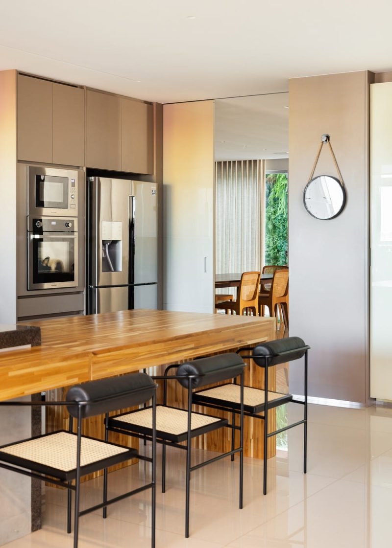
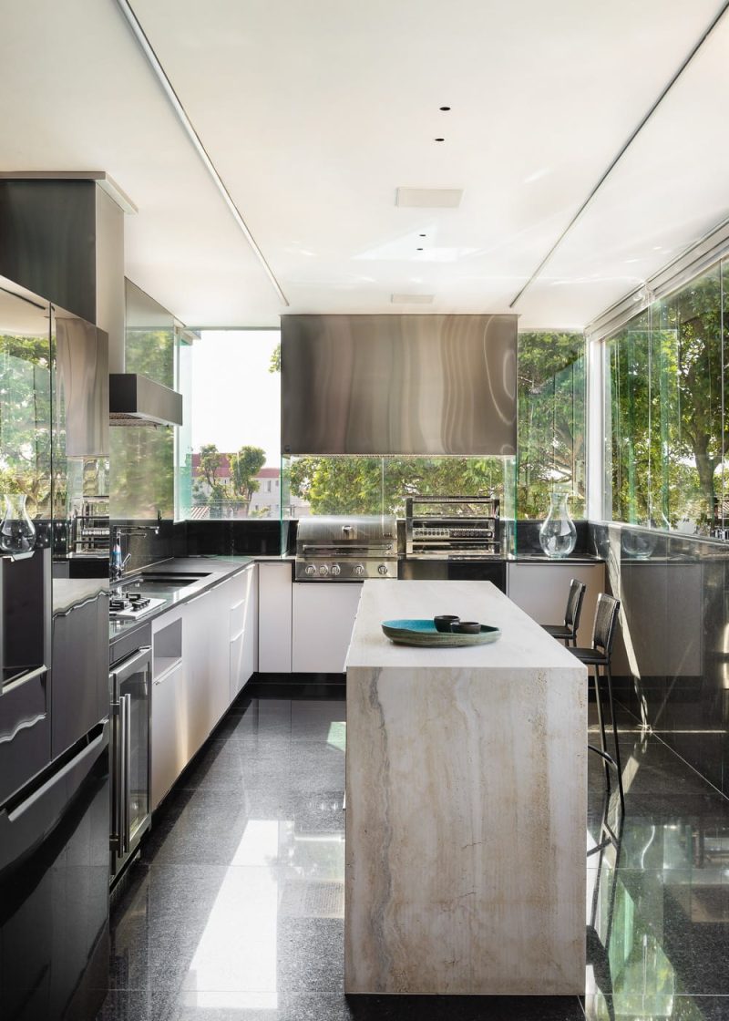
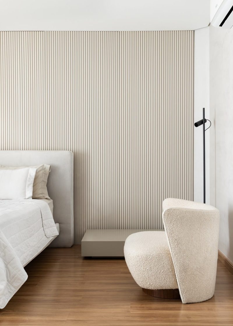
Kitchen: To create integration between the kitchen and dining, we expanded the entrance to the room with a generous sliding door, enabling visual and functional connections. For the kitchen, we thought of a large space in shades of brown and beige, with a table that embraced the central area of the space, ensuring that everyone was cooking together. Bedroom: a clean environment was designed for the couple’s bedroom, with only the necessary furniture and joinery. An environment that condenses everything to everyday use and that does not have any excess information or finishes. The entire palette and finishes are in sand, bouclé fabric and finishes that are timeless.
