Project: Bloomsbury Mansion Apartment
Interior Design: LLI Design
Location: London, United Kingdom
Photos provided by LLI Design
Intro
LLI Design were commissioned to completely redesign and refurbish a period apartment in a grand mansion block in the heart of Bloomsbury London.
Situated in the historic heartland of the west end and close to the theatres of Covent Garden this 2 bedroom apartment hadn’t been renovated in many years so was in effect a blank canvas to create a beautiful pied a terre for the clients.
The brief was to keep and enhance the period details of the apartment, incorporating the clients’ inherited furniture pieces and combining them with new contemporary pieces to create an eclectic mix that suited the clients aesthetic.
Existing Layout
The layout of the existing apartment was based around a long central corridor with rooms on either side.
All rooms enjoyed high ceilings, original cornices, skirtings, architraves; and generously proportioned windows. The central corridor that joined all the rooms, although in the centre of the apartment, had the benefit of borrowed light via fan lights above most of the room doors.
The two bathrooms were typically proportioned for an Edwardian mansion flat and were small and relatively dark.
On the north side of the apartment there were two reception rooms and a bedroom. On the south side of the apartment there was a further reception room, the kitchen, and another bedroom. On the west side of the apartment there were two bathrooms.
The rooms on the north side of the apartment overlooked the central courtyard of the grand mansion block, with the nearest adjacent tall building circa 5 metres away. The rooms on the south side of the apartment had views towards the city with the nearest adjacent tall structure some distance away. The effect of this is that there was a stark contrast in natural light levels between the north and south side of the apartment.
Revised Layout
To make the apartment work for the clients and to maximise all the space available it was decided to amend the layout as follows. The two reception rooms on the north facing courtyard side would be knocked through into one to create a generous open plan library / dining room. By combining these two rooms into one larger space it created a more cohesive feel to the apartment as a whole.
The light filled southside reception room would become a music room, with a baby grand piano as its centrepiece.
It was decided that the bedroom on the south side would become the master bedroom, it had the advantage of a beautiful, tall tree outside the window, unusual for a 5th floor apartment. The other bedroom on the north side would become the guest bedroom.
The kitchen would remain largely in its original position, albeit completely reconfigured and re-designed to incorporate a small island and a hidden utility area and a larder space.
The position of the kitchen door was moved, so that it would be accessed via the central corridor rather than a small dog leg off the corridor as it was before. The remaining dog leg was incorporated into the new master bedroom.
The guest bedroom remained in its existing position as did the family bathroom.
A small coats cupboard accessed from the central corridor was created from part of the library.
For the majority of the spaces wide plank timber flooring in a warm pale grey tone was specified to visually tie the spaces together. The bedrooms were carpeted in a deep pile soft grey carpet and the bathrooms were tiled, which was complimented with underfloor heating.
The lighting design for the apartment was challenging as the construction of the ceilings didn’t allow for any recessed lighting so all luminaires had to be surface mounted or incorporated in joinery.
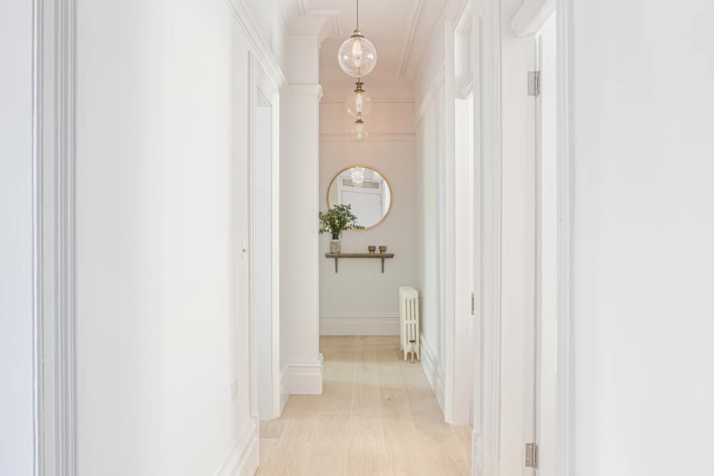
Central Corridor
The entrance to the Bloomsbury Mansion apartment needed to feel warm and welcoming with no clutter. The original layout made no provision for a coats cupboard. As the corridor was quite narrow it couldn’t easily accommodate a joinery cupboard, instead it was decided to ‘nibble’ a small amount out of the generous library room adjacent to the hall in order to create storage for coats, shoes, suitcases etc.
In order that the strong lines of the corridor were maintained and that the cupboard was as unobtrusive as possible a ‘invisible’ door was created, with no architrave and with the skirting detail included in the door design, so that the whole wall read as one.
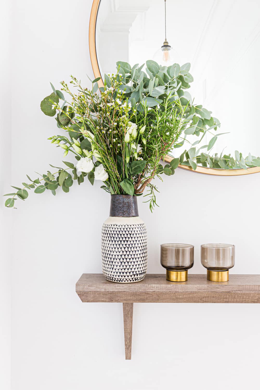
The high ceilings throughout the property were emphasised with a tonal colour scheme in half tones of grey picking out coving and skirting details. Large dramatic pendant lamps were specified all the way down the corridor to emphasise its length, with a large round mirror and a console shelf creating a visual full stop at the end.
Library
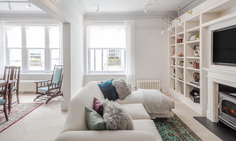
The two reception rooms on the north side of the property were integrated into one, to create a new library room / dining room. This helped natural light flow from one room to the other and brought a light airy feel to otherwise quite dark spaces.
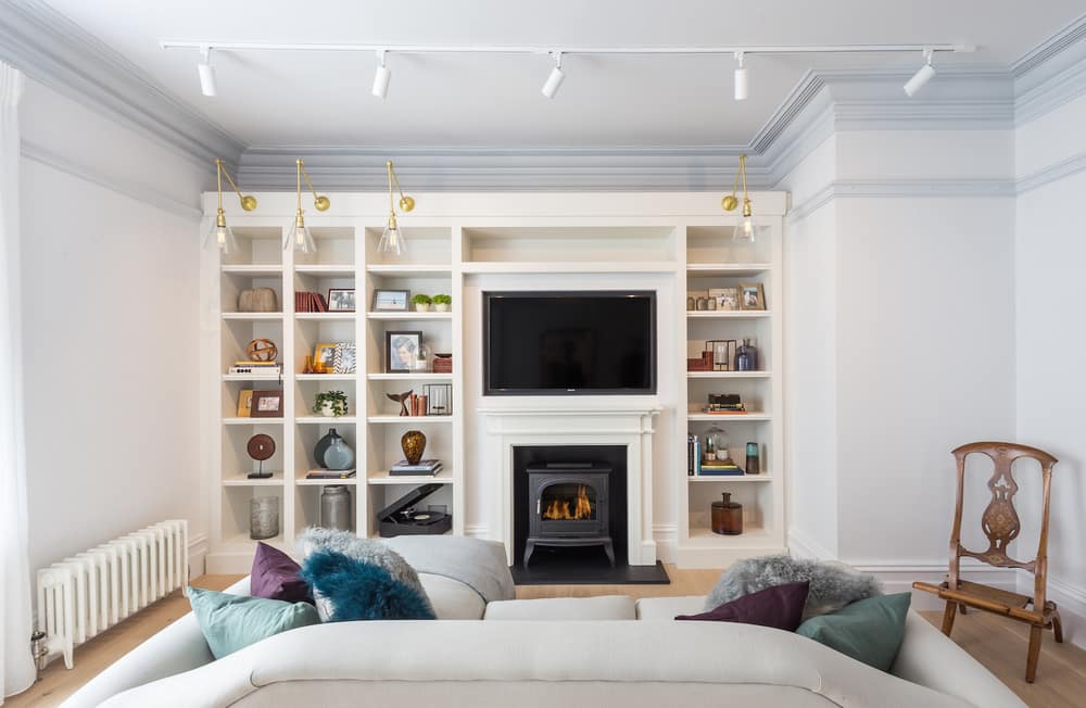
Part of the brief was to install a working fireplace to make the space feel warm and cosy, but because of the confines of the apartment block it was not practical to install a gas fire and associated flue / chimney, however a fire surround was designed and integrated into the new bespoke joinery unit and a cast iron, realistic faux log burner was installed in the new fireplace surround, bringing a sense of cosiness to the space.
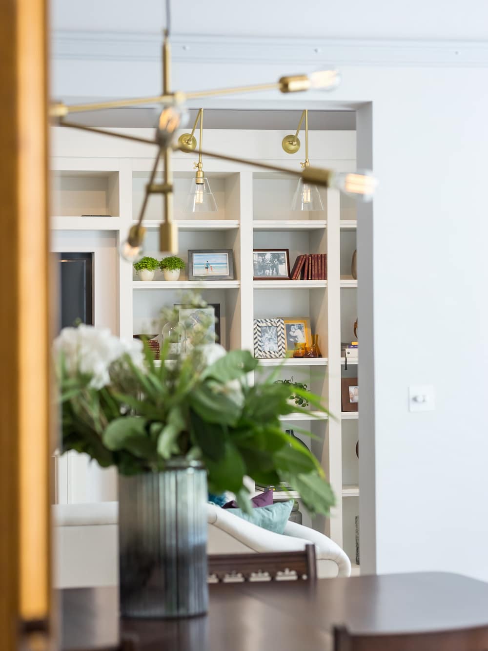
A small portion of the existing room which formed the library was partitioned off to create the cloak room in the central corridor, this created a small return in the library, but this wasn’t visually intrusive as the coving, skirting and dado detail wrapped seamlessly around the new return. The new return was then integrated into the bespoke joinery bookcase that was designed along the back wall thus making the whole amendment feel natural and virtually invisible.
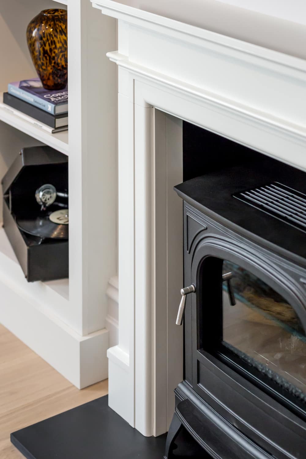
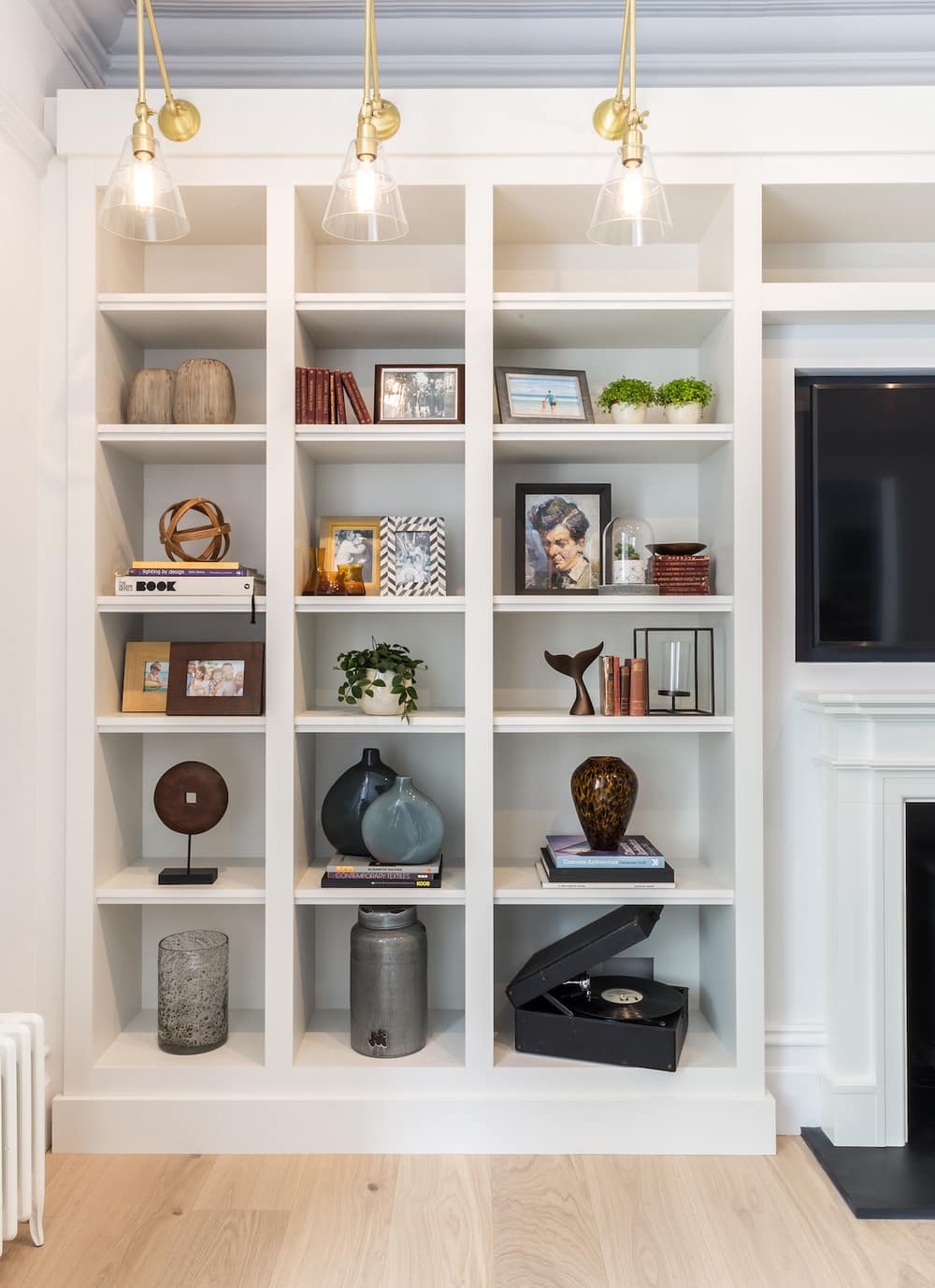
A large TV was integrated into an alcove above the fireplace, so that the TV sat flush and did not dominate the space. The bespoke joinery unit along one wall provided a much needed display space for objects, books and collectables, and feature wall lights with brass details completed the joinery unit.
A simple classic style sofa with a chaise end was added to complement the clients’ collection of antique furniture and rugs.
Once again period details were picked out in half tones of pale greys to give a warm and calm feel to the space. By combining these two rooms and with careful consideration and specification of furniture, joinery and the material palette, London interior designers LLI Design, completely transformed these spaces.
Kitchen
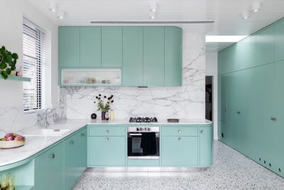
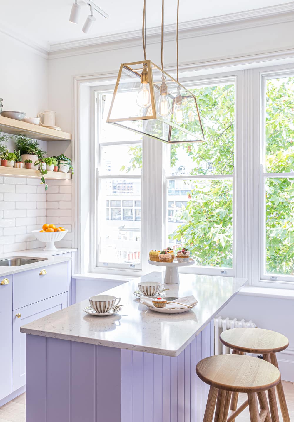
The kitchen benefitted from a window with views of the beautiful, tall tree outside, which it shared with the master bedroom. For the kitchen a fresh, bold and invigorating colour palette was selected, pale lilac lacquer, palest dove grey, and gold details with bleached wooden shelving created a fresh and bright modern kitchen with plenty of visual interest.
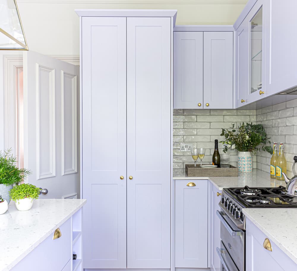
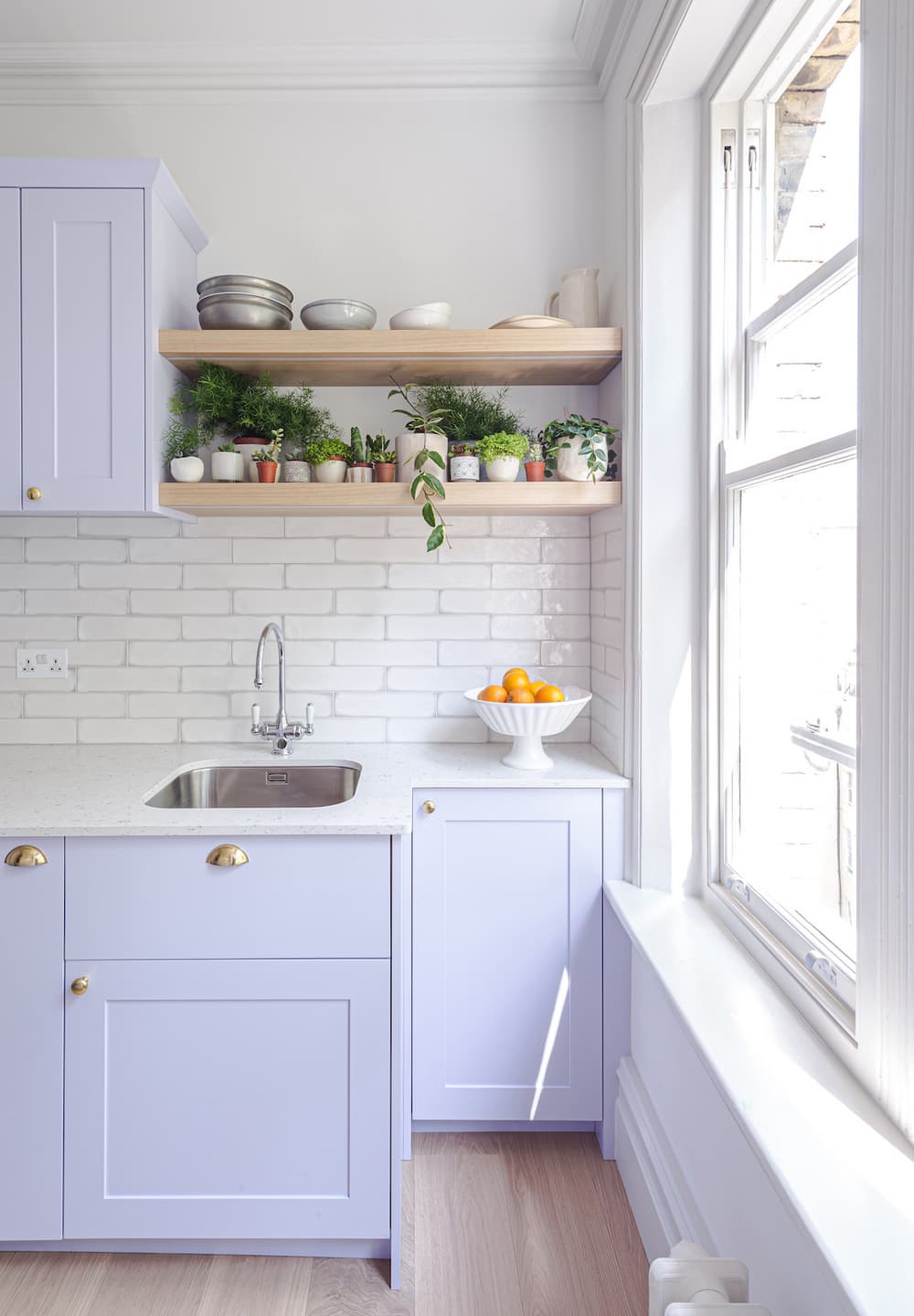
The bespoke joinery kitchen layout featured a centre island with a pale grey composite worktop and a dramatic gold pendant light. Traditional shaker style kitchen units, some featuring glass fronts to showcase glassware added to the visual interest. Cabinetry featured gold cup pull handles and knobs, which helped give the kitchen a contemporary feel.
The same warm toned wide plank floor as the rest of the apartment continued into the kitchen; this was repeated in the underlit wooden open shelves for plants and books. Glazed porcelain artisan metro tiles in soft tones with a pale grey border created the backsplash.
A tall lilac lacquer unit disguised a small but very practical utility area. The washer / dryer was placed at high level with a pull out drawer below for laundry and shelves above for linen storage.
The original opening for the fireplace range was repurposed to create a larder unit with pull out wicker baskets.
Dining Room
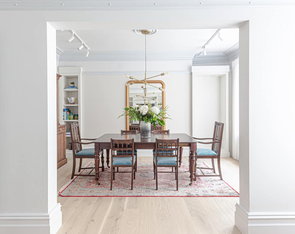
The furniture in the dining room consisted of the clients’ much loved inherited pieces that were renovated, restored and french polished bringing them back to their former glory.
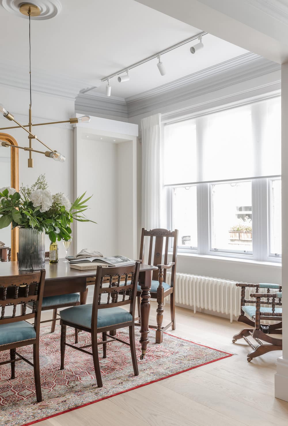
As a contrast to the period furniture the space was contemporised by a large contemporary, brass pendant light with exposed squirrel cage lamps to sit above the dining table. An opulent, oversized, gilt framed wall mirror bounced light into the room. Bespoke joinery alcoves were positioned either side of the chimney breast making the most of all available space. The clients’ richly patterned persian carpet helped pull all the visual elements together.
Music Room
The music room was designed as a bold and dynamic space, bright colours and patterns offset the drama of the polished black baby grand piano that was the centrepiece.
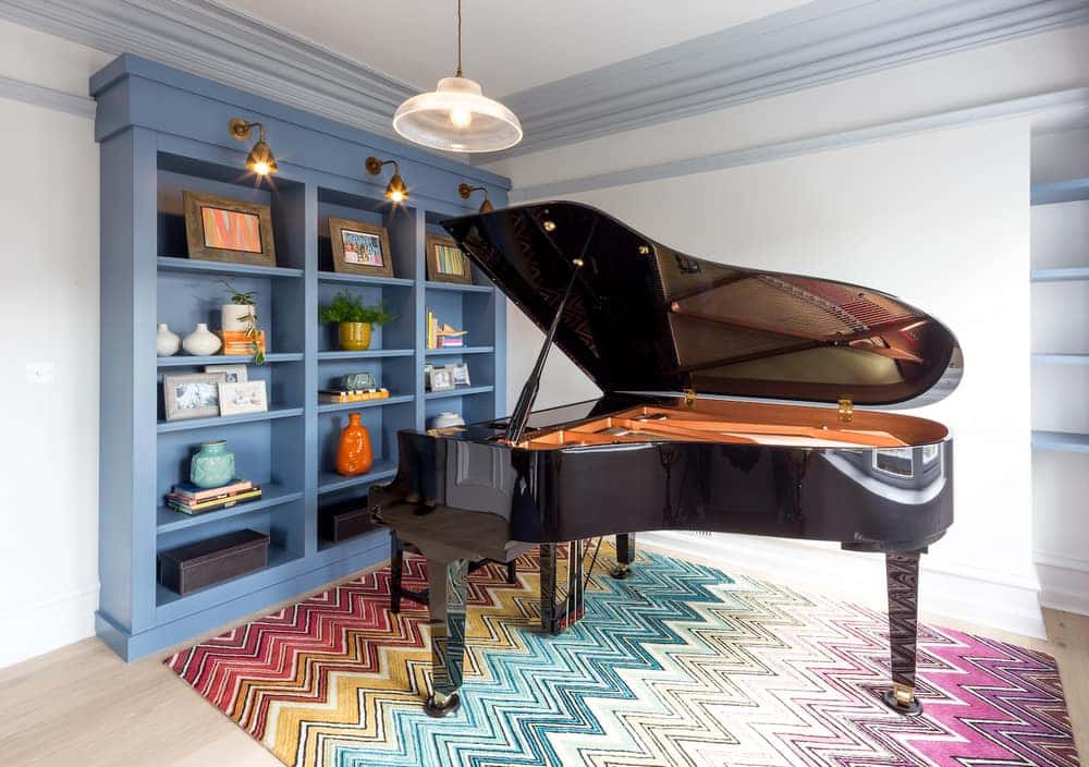
To balance the visual presence of the piano an extra large wooden framed mirror was installed on one wall and a classically styled chaise lounge added an air of decadence.
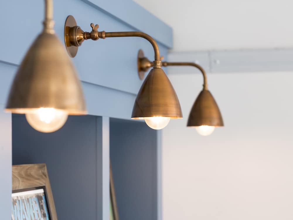
A bold statement multi coloured Missoni chevron rug and dramatic mid blue bespoke joinery unit with brass wall lights above completed the room.
Master Bedroom & Ensuite
A soft romantic feel for the master bedroom suite was created with a palette of bruised pinks, greys and taupes, with a mix of tactile fabrics to create a decadent mood. The french styled bed in a natural coloured grey linen with a bleached wooden frame, complemented the elegant classically styled bleached out bedside tables, which had staggered height vintage ribbed globe pendant lights above them. A large vintage metal distressed chandelier was sited above the bed.
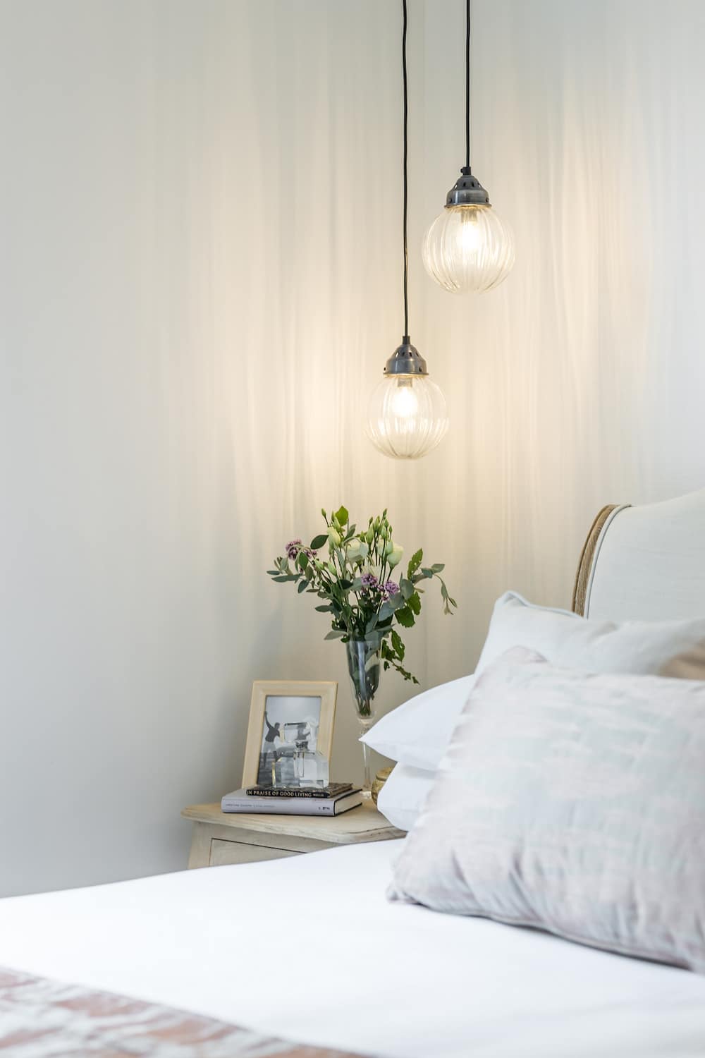
A bespoke full height joinery wardrobe in taupe satin lacquer along one wall, hid drawers and hanging. A gentle and very subtle texture wall covering was specified to enhance the feeling of calmness, and opulence.
Family Bathroom
Although small, the family bathroom benefitted from unusually high ceilings and had the benefit of a window, allowing natural light into the space. A simple, light palette of soft whites and carrera marble effect porcelain tiles were selected to make the space feel as big and a light filled as possible.
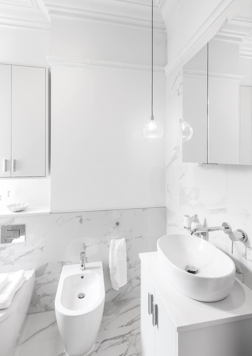
To add character to this small space, new ceiling coving and picture rails which matched details found elsewhere in the property were specified, this helped to bring a period feel to the whole and emphasise the rooms height, whilst also adding texture and visual interest. A simple ribbed globe pendant added accent lighting.
Storage was created by way of a bespoke white lacquered cabinet above the WC, a mirror cabinet above the basin and the vanity unit itself provided a large storage area.
Guest Bedroom
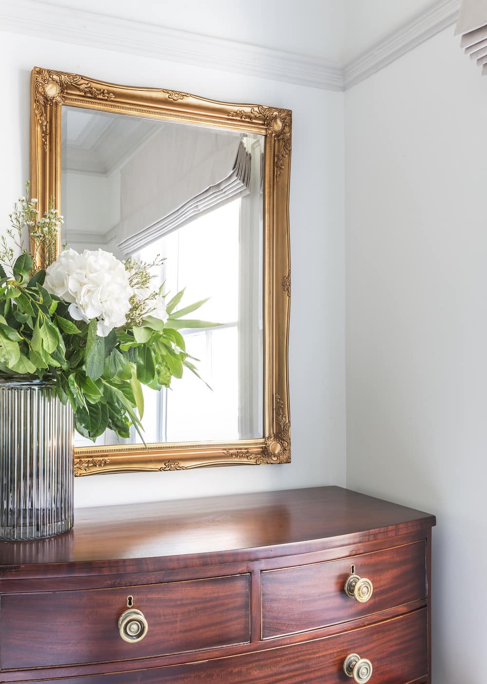
The classical bow-fronted richly coloured walnut chest of drawers inherited by the clients’ was the starting point for this room. This was emphasised by a classical gold gilt mirror above and a wall of panelled lacquer wardrobes along one wall. The upholstered bed in blue linen, and the contemporary styled foxed mirror bedside table gave this room a warm and welcoming feel.
Lighting Design
The lighting design for the Bloomsbury Mansion apartment was challenging as the ceilings were concrete, which meant that no recessed lighting could be installed, accordingly all ceiling light was provided by a minimalist architectural track lighting system, this supported the feature lighting which was incorporated by way of pendants, and joinery lighting.
Summary
By way of reconfiguration, clever use of colour and lighting together with bespoke joinery elements throughout, this property was completely transformed from a dark tired apartment into a light filled pied a terre for our clients.
It was essential that the apartment kept its character and atmosphere and by taking an holistic and sensitive approach to the design and layout LLI Design created a warm, friendly and practical apartment for the clients whilst staying true to the character of this grand mansion block.
As with the majority of LLI Design’s projects, the construction, joinery and home automation were carried out by our in-house vertically integrated teams – Pegasus Property & Pegasus Automation.

