Project: Californian Farmhouse Renovation
Architects: Dash Marshall
Location: San Miguel, California
Area: 371 sqm
Year 2018
Photographer: Bruce Damonte
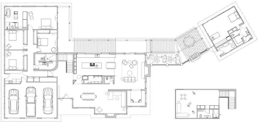
Text by Dash Marshall: For a pair of empty nesters who are often visited by their kids and grandchildren, we were asked to do two things. First, to rationalize the floor plan to make it better for entertaining. Second, to “just make it new already arghhhhh!”
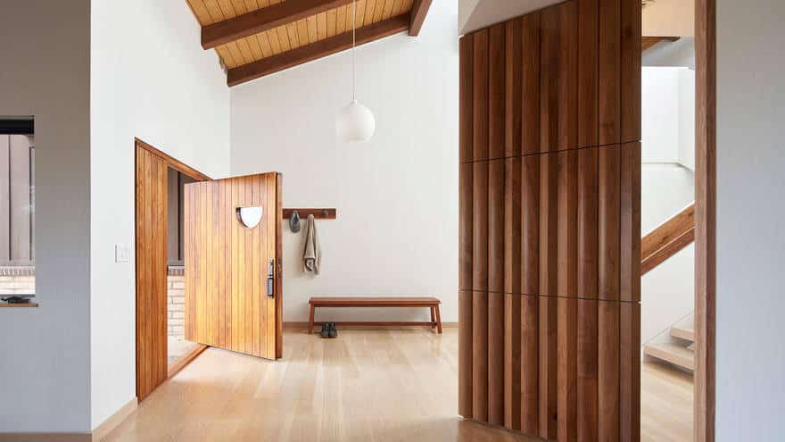
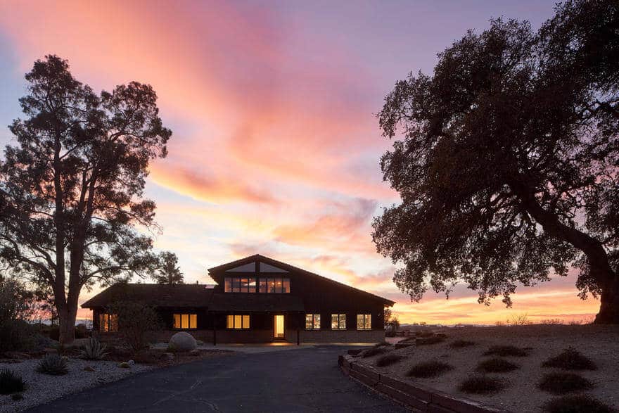
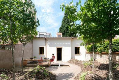
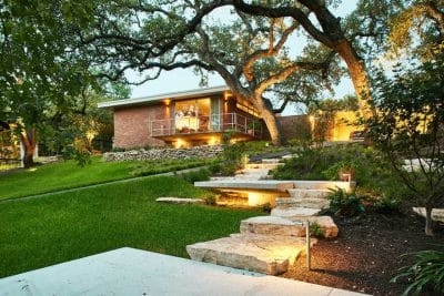
An existing 30-yr old Californian farmhouse was used as an exterior shell and the interior was renovated like Theseus’ ship, piece by piece, until it was totally new.
We started with the rituals. Arriving, cooking, eating, lounging, celebrating, bathing, sleeping. After analyzing each and discussing the the residents, we designed specific responses. These details are strange monsters in the floor plans. They probably don’t make sense until seen in use.
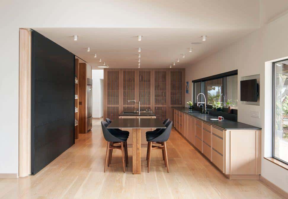
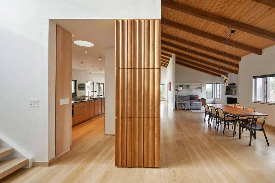
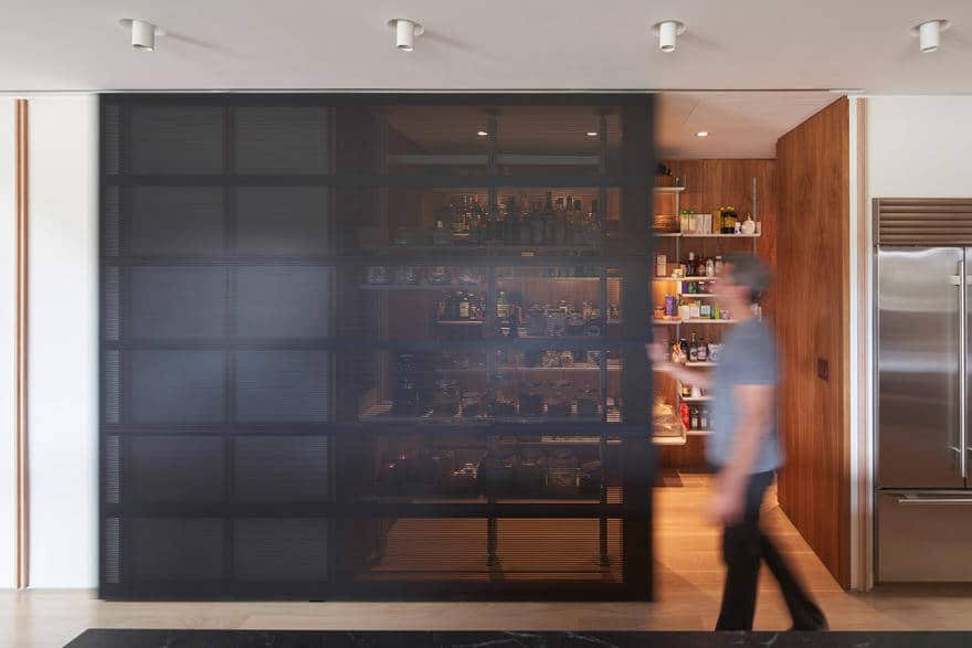
For a couple who are remarkably free of vanity, a master bathroom without the ever-present vanity mirror. For a kitchen that’s used to conjure prodigious meals, a ‘super pantry’ that makes cooking a joy. For the guests, a bathroom that cannot be missed—just look for the marshmallow. For a family that fondly remembers decades spent farming walnuts, a special trunk-like column that commemorates their labor.
The architectural language we developed pays its respects to the Missions of California, the vernacular metalwork of central coast farms, and Aalto’s use of wood that’s warm and crisp. A mixture of fir, white oak, and walnut are used to add richness to reductive forms.
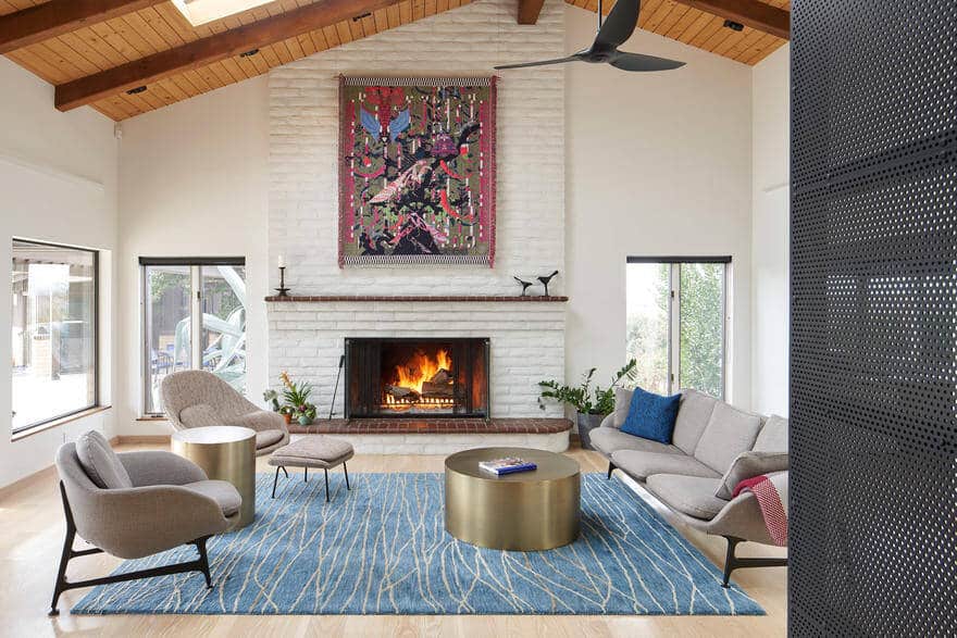
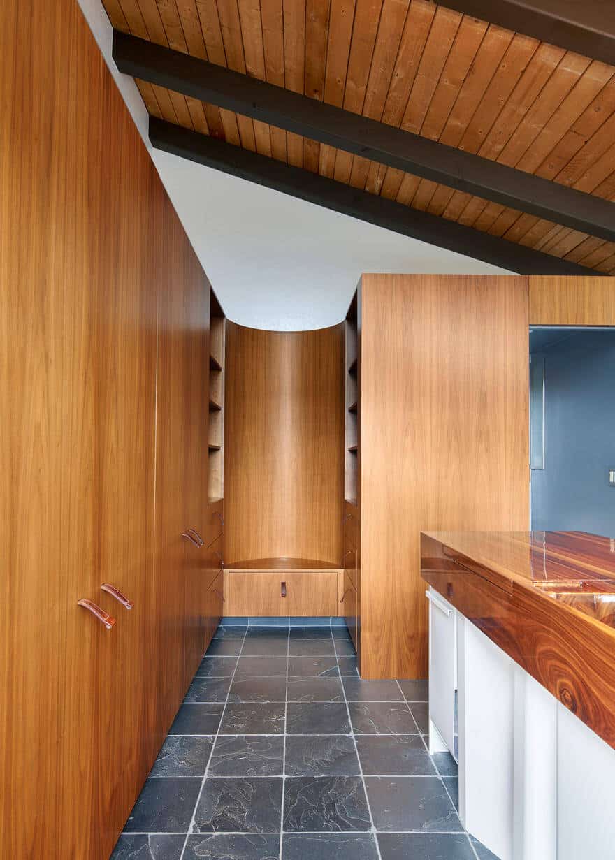
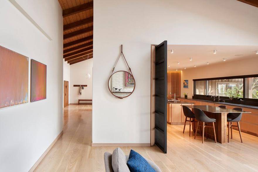
A large sliding perforated metal partition reveals the ‘super pantry,’ which has two layers of accessibility. The front row makes it easy to grab quick items like coffee in the morning, or garlic while cooking an evening meal. The back row provides deep storage.
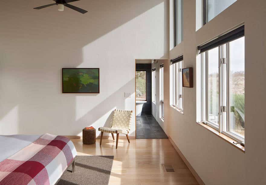
At the opposite end of the house, circulation between the master bedroom and bathroom has been adjusted to emphasize views across the property and the hills beyond.
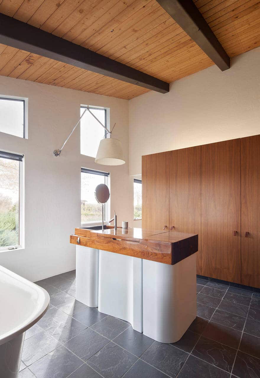
Inside the master bathroom, a sink milled out of solid walnut occupies the center of the space. Instead of being focused on perimeter walls, where the vanity is often located, this space is focused inward. Instead of being organized around vanity, it’s organized around self care.
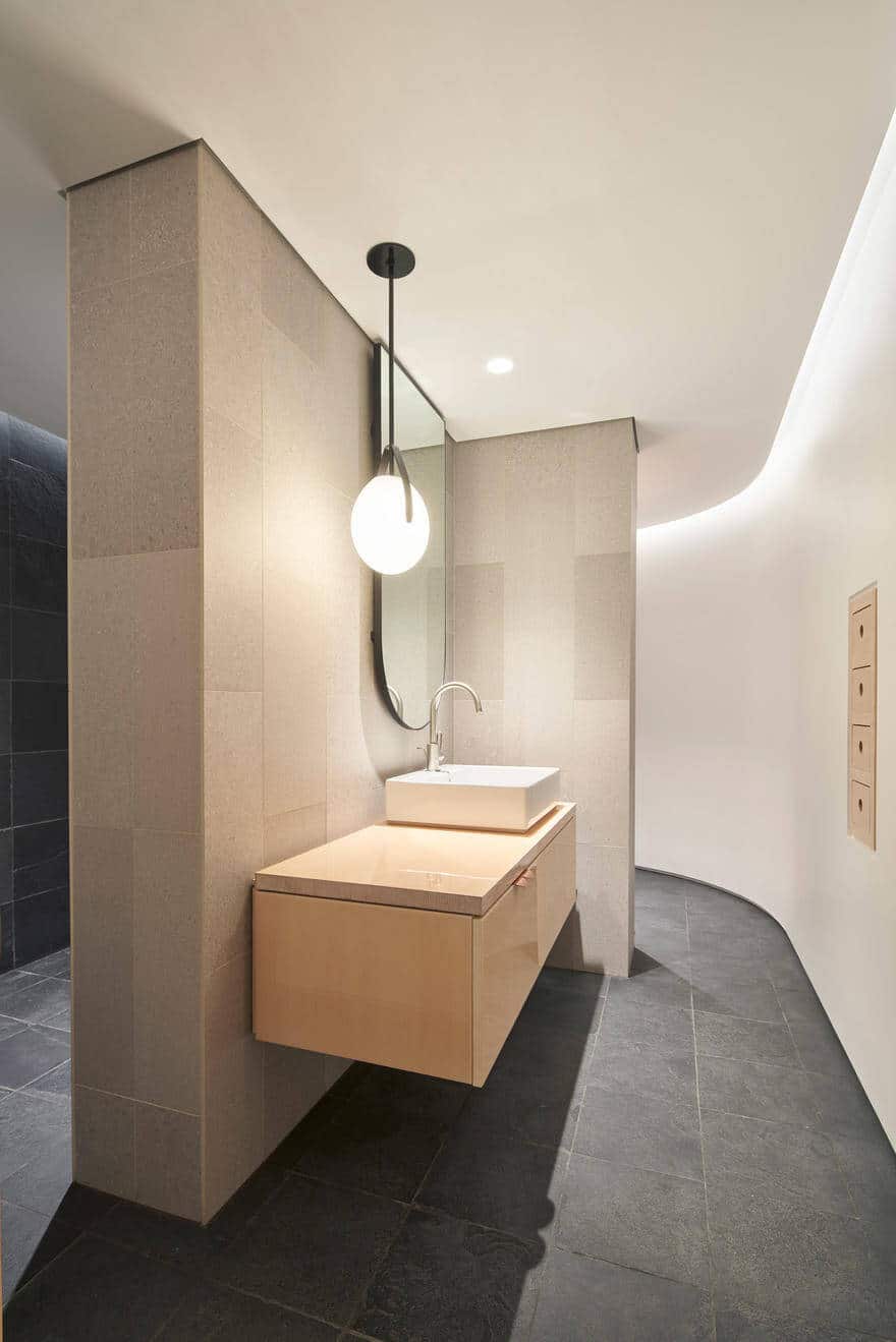
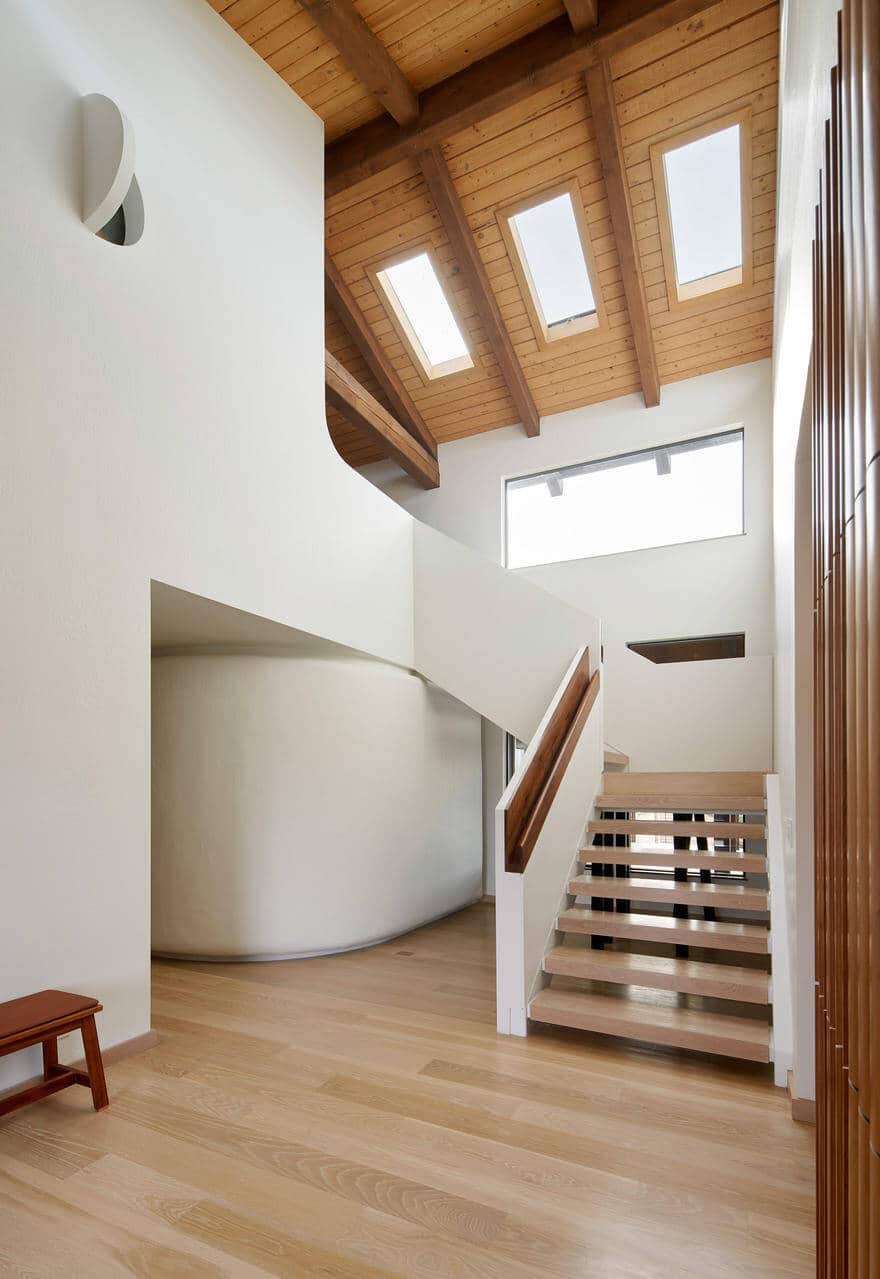
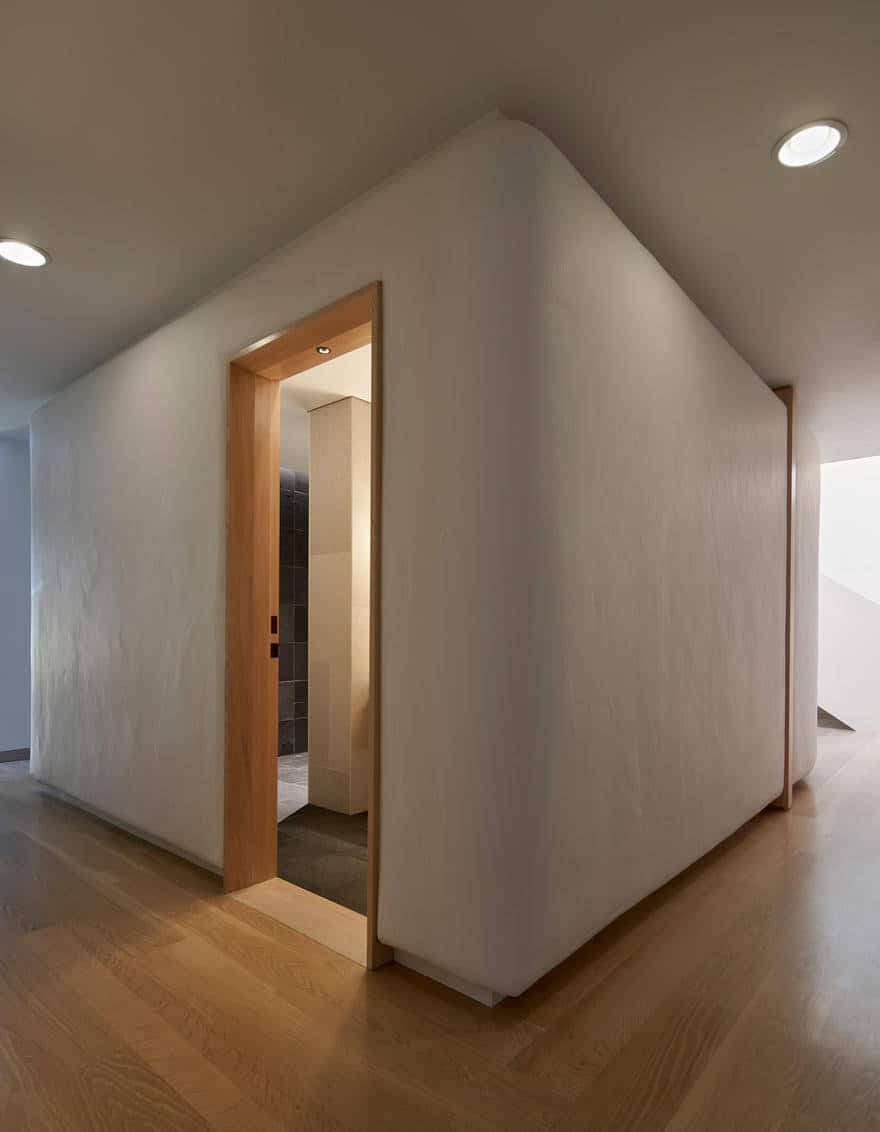
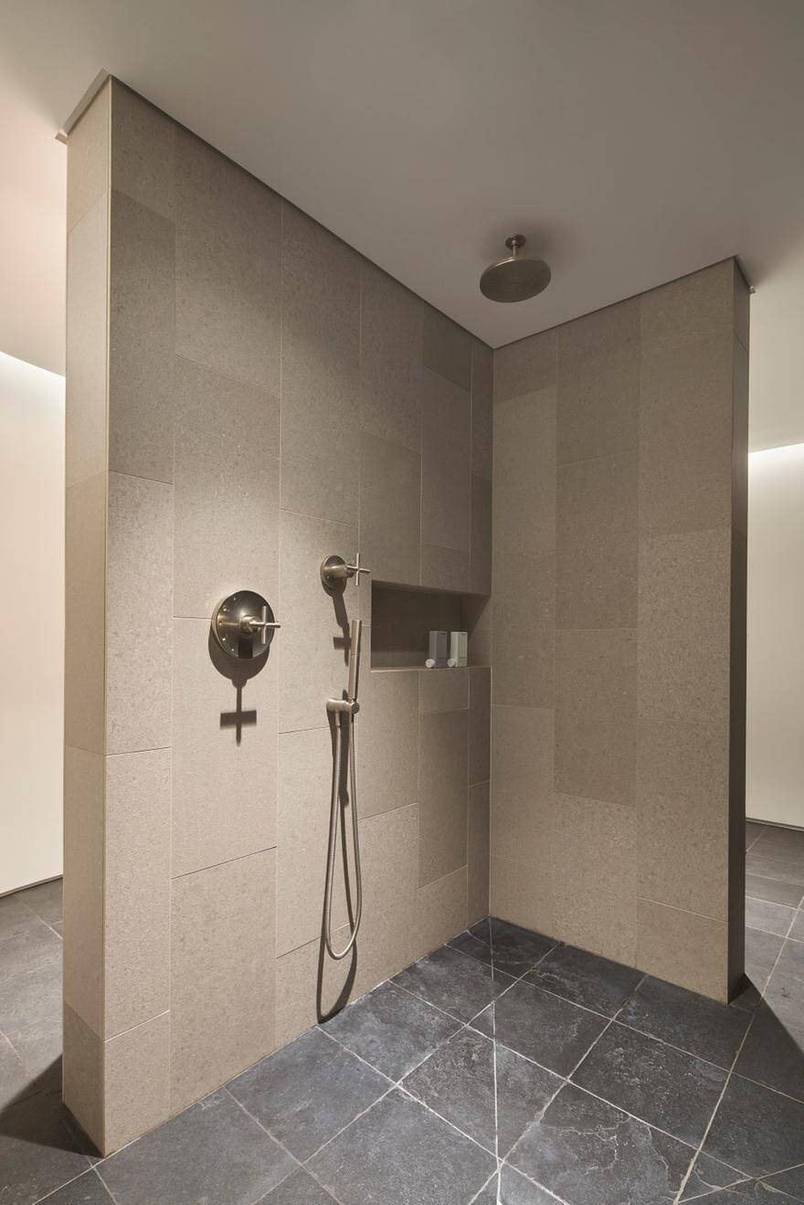
The guest bathroom has been replaced by a large marshmallow. Outside it is built of uneven stucco and plaster, like the local mission. Inside, it is organized into four zones that one can fully circumnavigate: sink, change, shower, toilet.
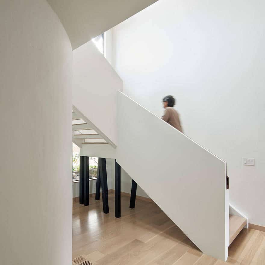
Upstairs, above the marshmallow, is a large space used as a kids’ playroom during the day and spillover guest room at night. The stairs were, of course, a fascination.
