Project name: Casa 15
Architecture: AM-arqstudio
Main Architect: André Malheiro
Constructor: RespirarArte
Engineering: Eduarda Oliveira
Interiors Team: AM-arqstudio
Location: Braga, Portugal
Year of conclusion: 2021
Total area: 350m²
Architectural photographer: Ivo Tavares Studio
When you first meet a client, you start traveling through spaces that are not built yet. Even before the client understands what the project goals are, the distinct spaces start taking place, sometimes is a word, other times as a perception of how a material feels when touched, and others, how the light makes you feel. Every project is a unique relation between intentions and desires translated into what is expected to be the comfort, the pleasure, and the relaxing sensation to the house’s inhabitants.
The couple who owns the house had a clear intention about the social atmospheres. For them, everyone should be visible and part of the family, no matter if cooking, reading, or working from home. On the other hand, they wanted to be comfortable at night without feeling uneased by shadows and exterior movements. The normal division between social and private spaces became clearer than usual, thanks to these constraints.
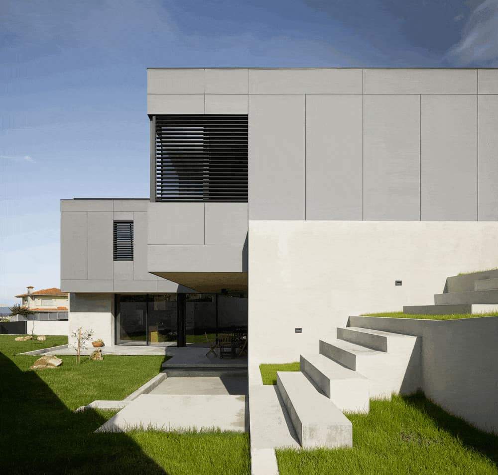
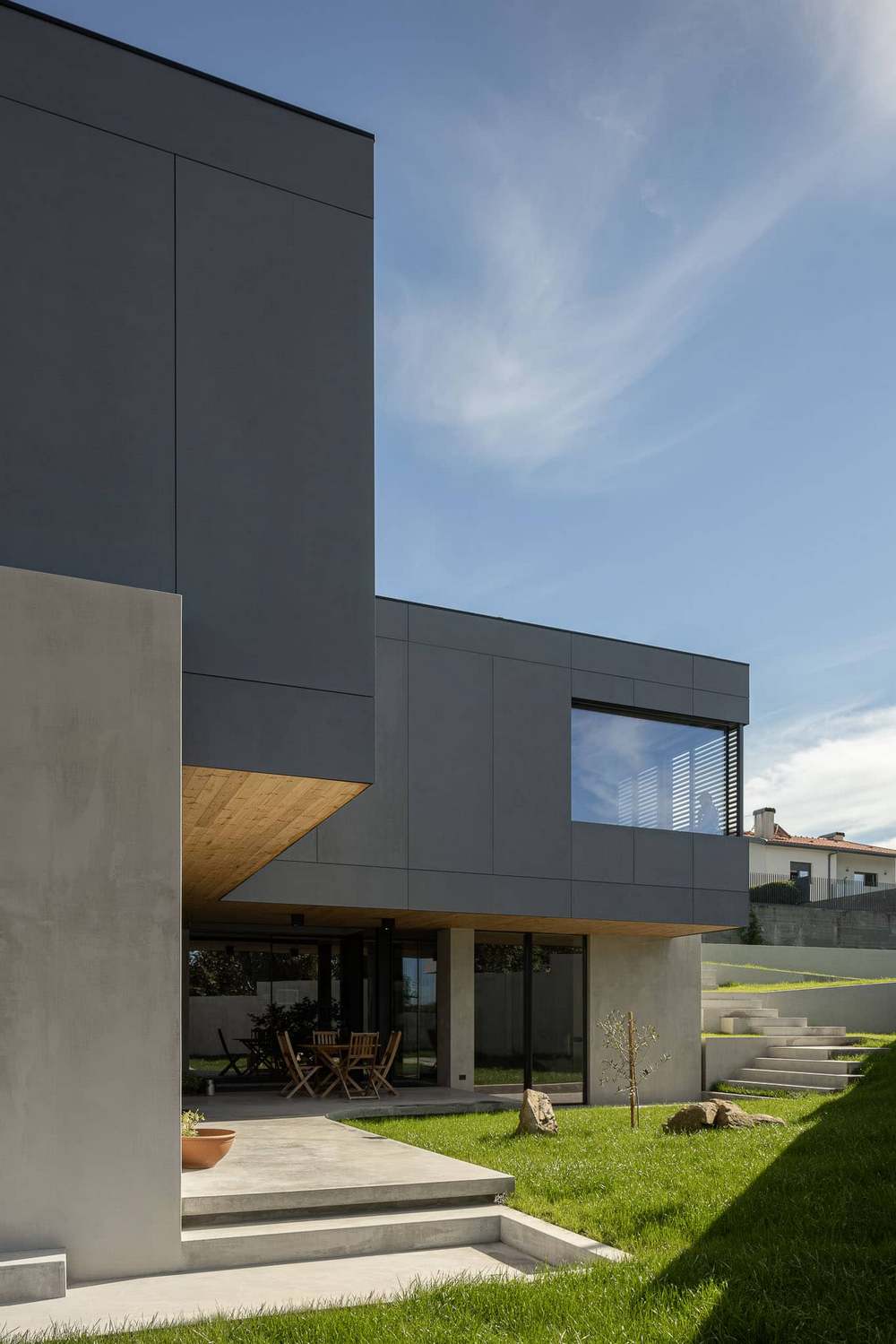
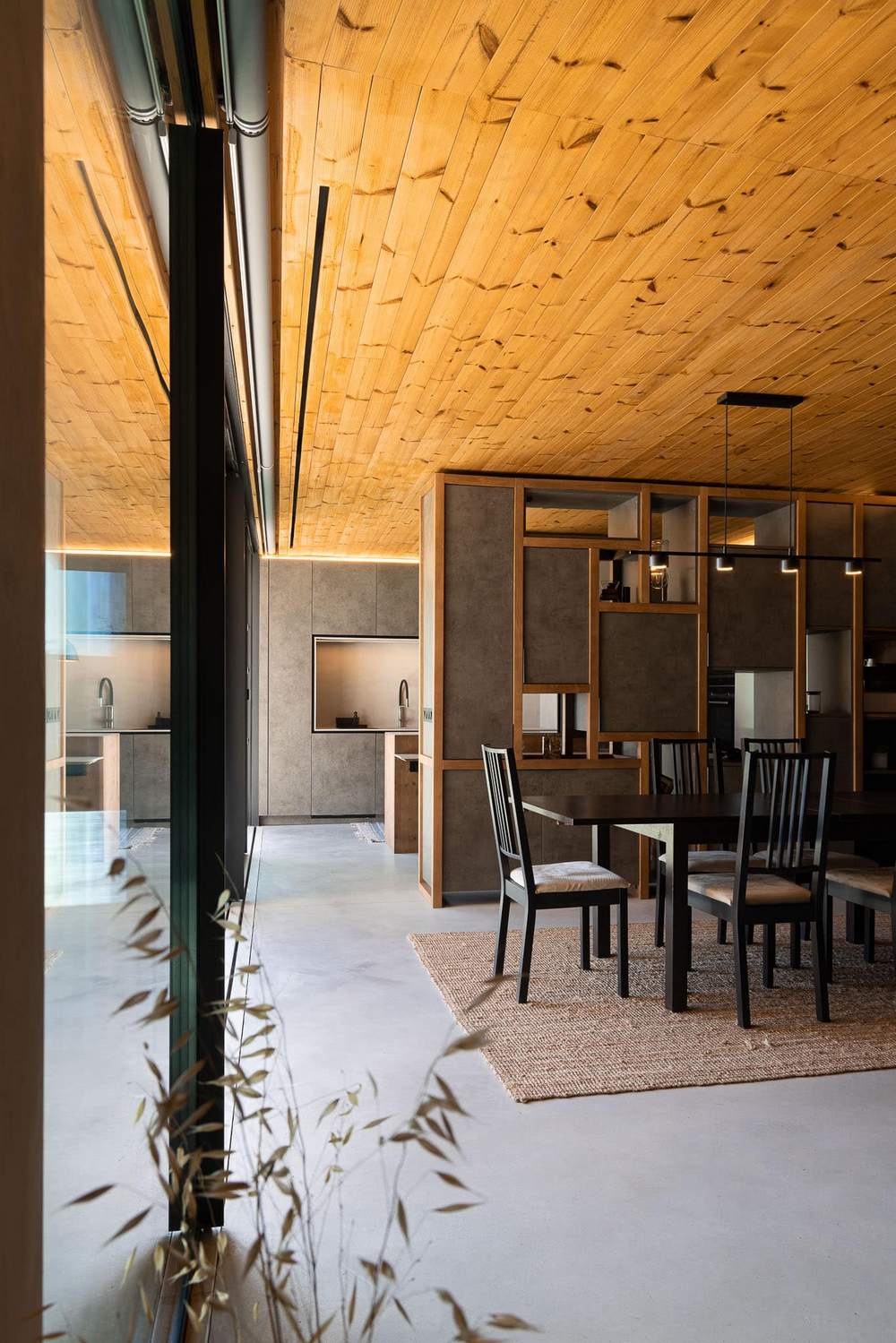
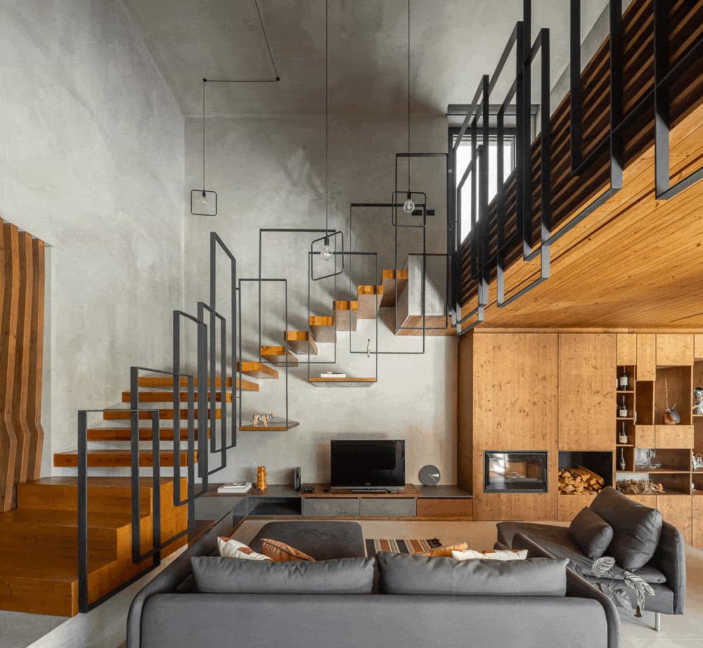
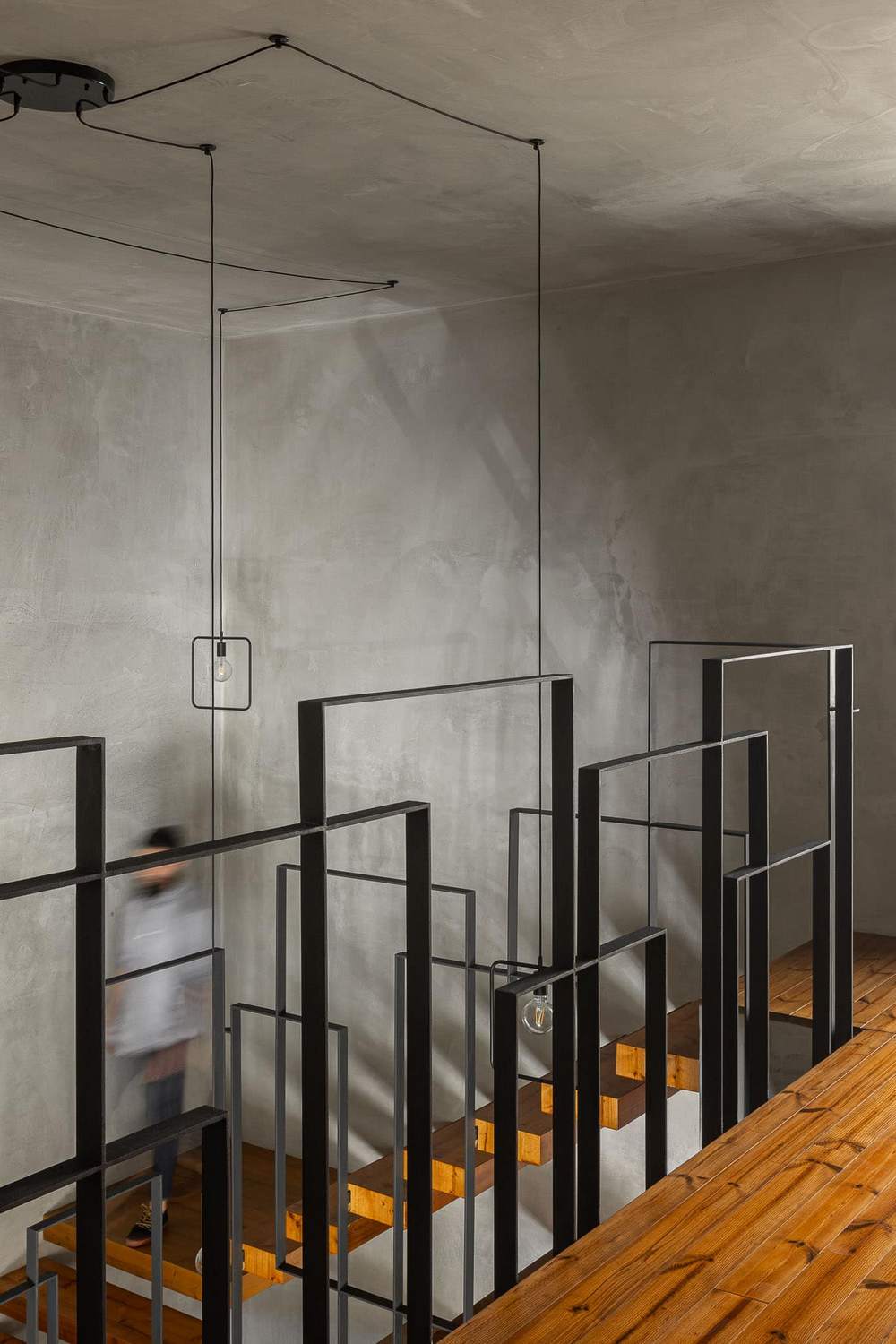
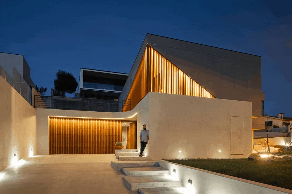
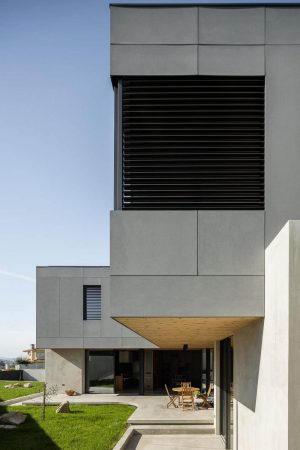
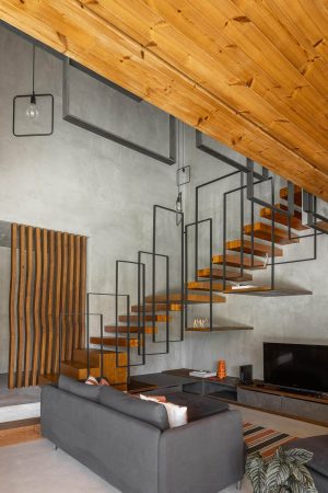
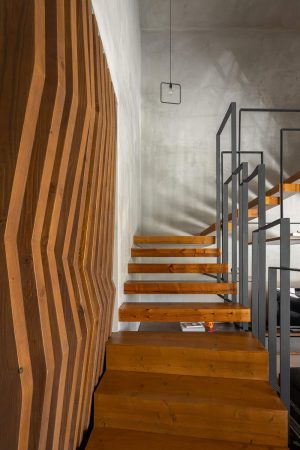
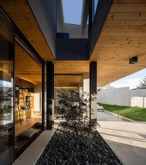
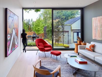
This was the narrative that started building the mental walk-through gluing all the interior spaces. When arriving at the door, the guests still don’t understand how the interior spaces are created, since the volumes don’t let you look inside, so you will need to find your way in. Once the main door is opened, as you enter the gray hall, there is an expectancy about what it going to be seen next. The first rays of natural light are an invitation to the living room. The next steps reveal a high ceiling, which connects the upper floor through suspended stairs using the same wood as seen in the exterior of the house, and all the social and working atmospheres, including the exterior garden.
Peoples’ fluidity through spaces, both horizontally and vertically, is connected by virtue of this core space, where the ceiling wood turns and becomes the floor finish of the level above. This game between continuity and transition allows the natural light to disperse into the horizontal planes, both floor and ceiling, converging into a gradient between social and leisure spaces and rest spaces.
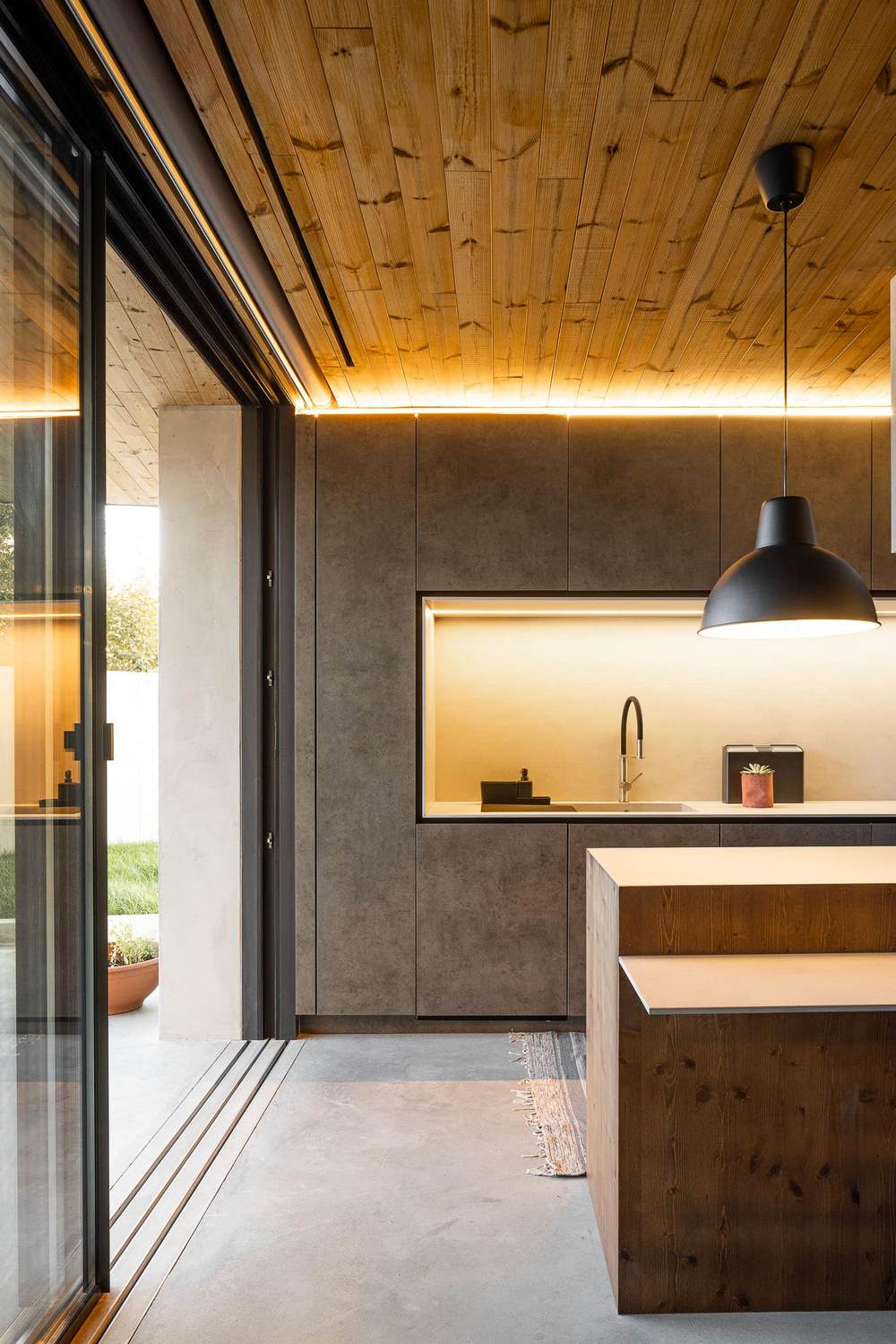
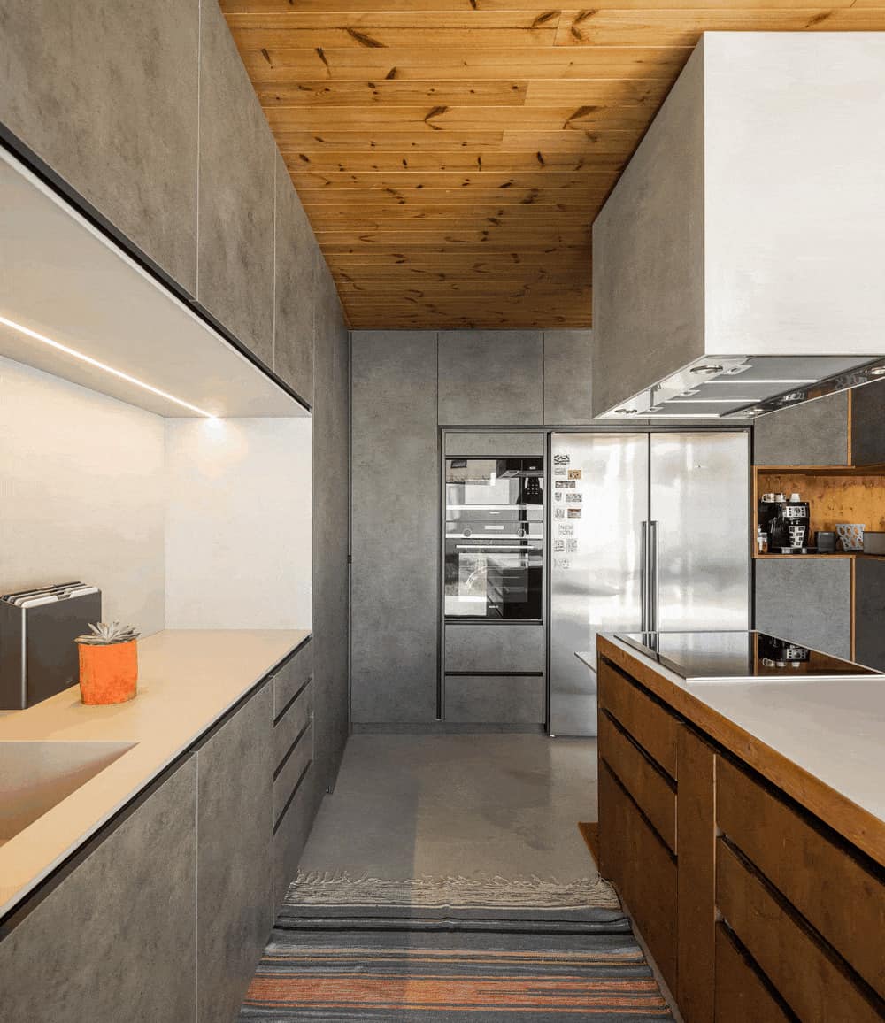
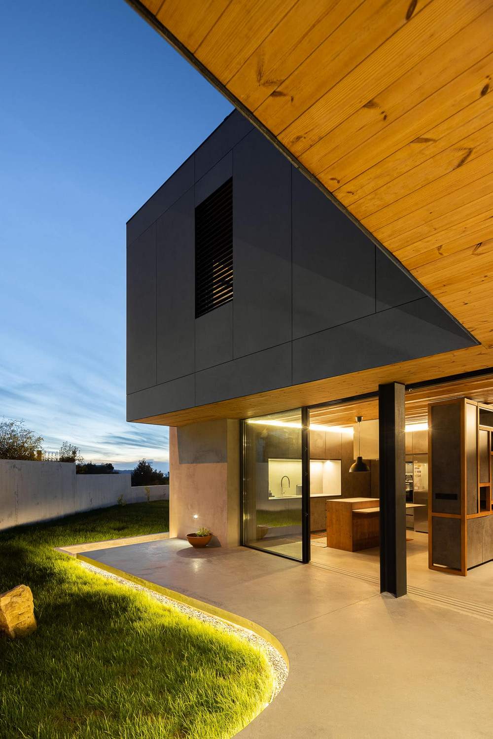
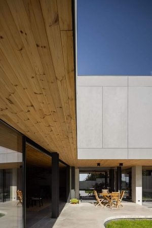
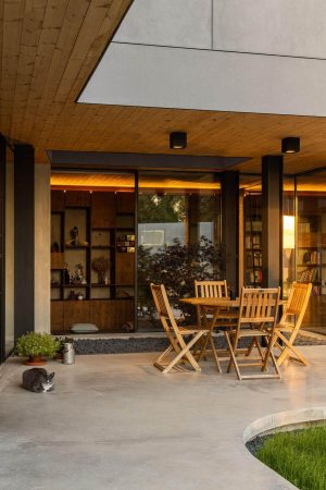
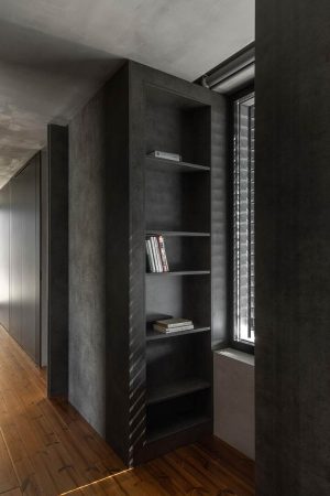
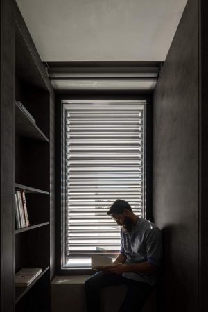
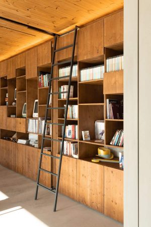
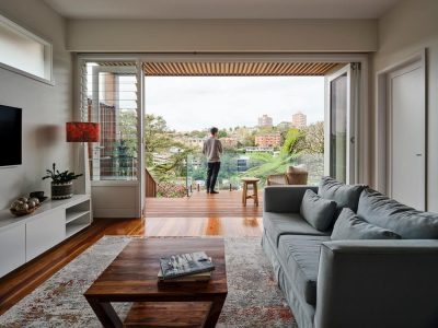
From very early stages, light reflection over wood surfaces, in contrast with gray and darker materials, was believed as the best way to mark the time running by. What starts as the first moment of the day – the breakfast – is the time were the natural light touches the kitchen floor and the wood balcony. The second moment reflects the light pointing to the dinning space, where both interior and exterior can be connected in this extended semiexterior space. Here, both the ceiling and the floor materials work to disguise spaces’ boundaries during warmer days. After that, the sun starts getting lower, until it touches the library’s wood furniture, giving it a warm and comfortable feeling, and inviting the transition from the home office to the living room. As this area is the last to receive the natural light, it signals the day cycle has finished.
During the day we can see the natural light reflecting and guiding the inhabitants to the more comfortable areas of house, while during the night the artificial light is placed in strategic places to extend the warm feeling. The confidence and security are achieved with light reflecting on the wood, which makes the entire first level a light box that invites exploration.
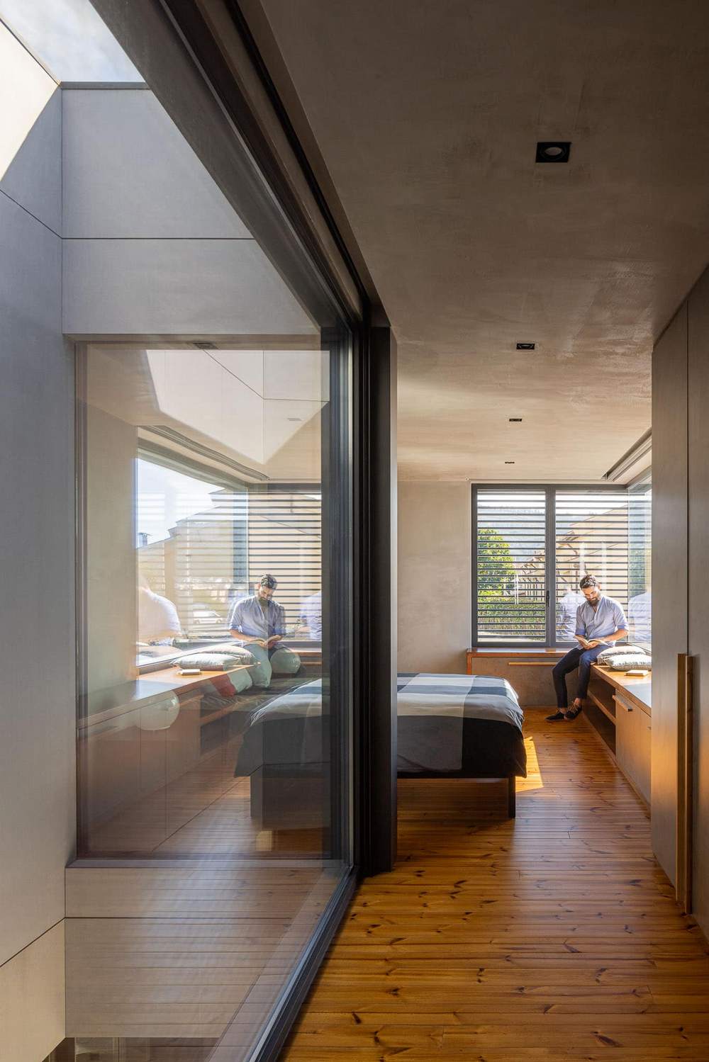
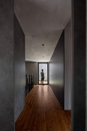
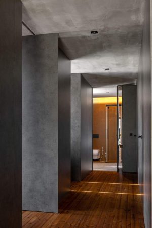
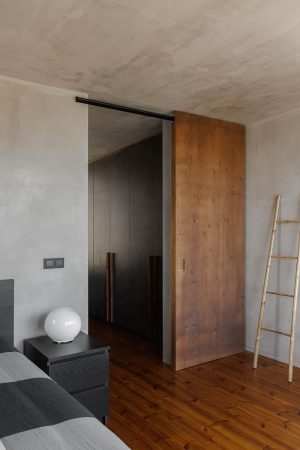
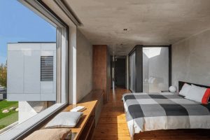
As the family starts the transition from social to private spaces, the main goal was to make a smoother fruition between a continuous space, as is the first floor with light flowing continuously through the day, and a quitter place were inhabitants go to rest. To achieve that, the corridor’s walls and doors have a dark concrete finish that is only interrupted by a window that lets the light enter. The rooms on the west facade are warmer, has they have received the last hours of sun, intensified by the wood’s warm feeling. There is a continuity of the floor expanding into a balcony protected by thin wood columns filtering the view from outside while letting the users see the outside.
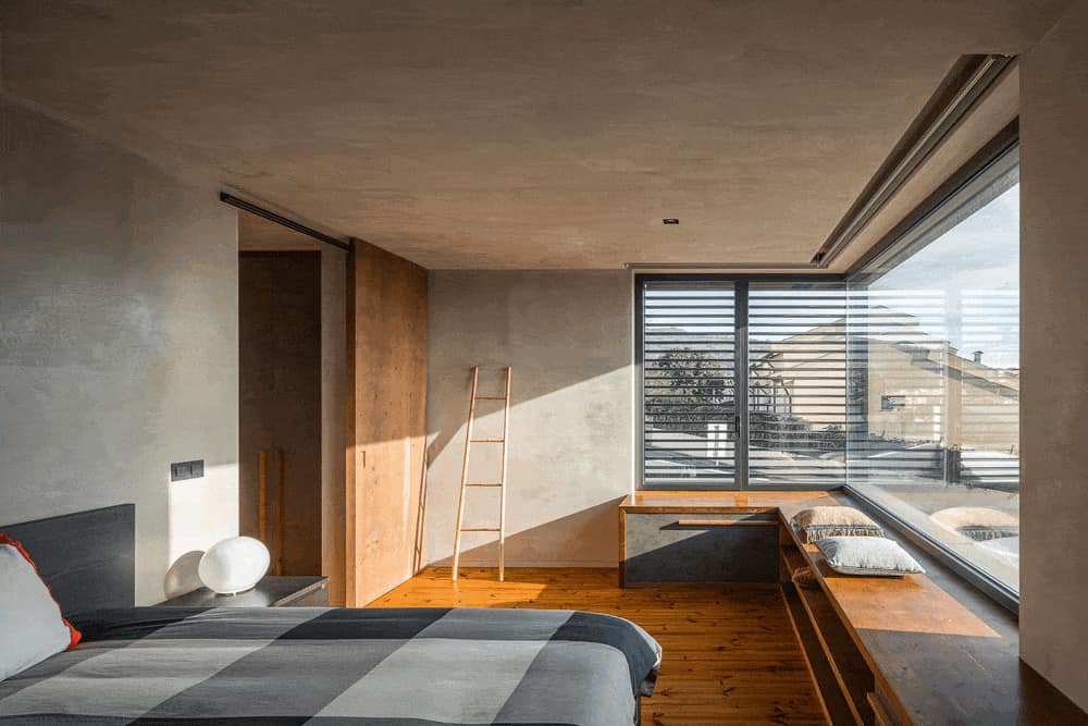
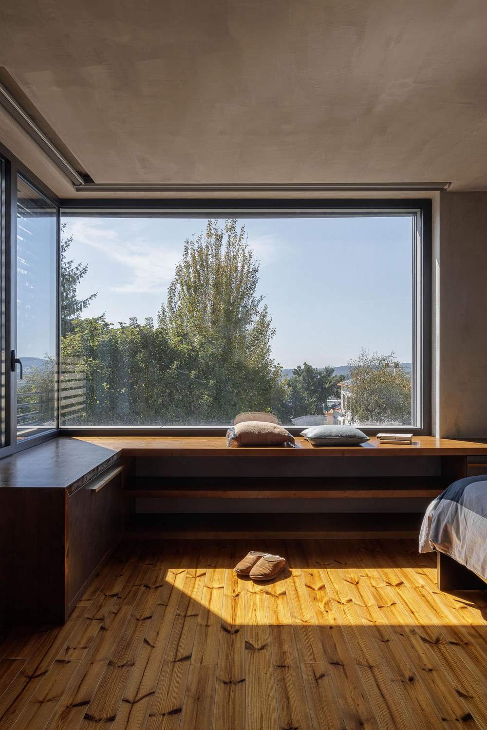
The master bedroom has a direct connection with the vertical winter garden, which reflects the light from the below level into the first level and vice-versa. If there is moonlight it will enter through this glass and invade the room, illuminating the room. A bigger window is placed in the corner of the bedroom, creating a particularly interesting moment when the natural rays almost become parallel to the ceiling and floor, shifting the wall from gray to almost white.
This game between darker surfaces and smaller openings make the upper level spaces quieter and secure, nonetheless without creating the sense of a small space. Even during relaxation moments, inhabitants can connect with the exterior as they wish, either walking to the outside to enjoy the warm wood on the private balcony or letting the moonlight invade the bed sheets through the vertical opening.
Casa 15 – List of applied products:
Cimentart – Microcement
Equitone – Fiber Cement Façade Tectiva
LunaWood/Banema – Wood Lunawood Thermowood
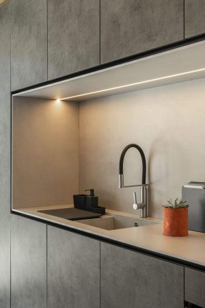
Egger – Melamine Dark Grey Chicago Concrete decor
Profiltek – Shower Screen Vita and Nordic
Divitek – Impermeabilization system
Sapa – Windows and Doors

