Project: Casa De Bouro
Architects: Mutant Arquitectura & Design
Interior Design: Mutant Arquitectura & Design
Engineering: Massa Cinza
Location: Terras de Bouro, Portugal
Area: 450 m²
Year: 2022
Photo credits: Ivo Tavares Studio
The concept for the development of the proposal was “a hug to nature”.
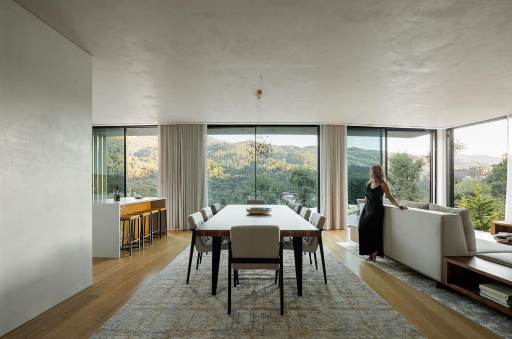
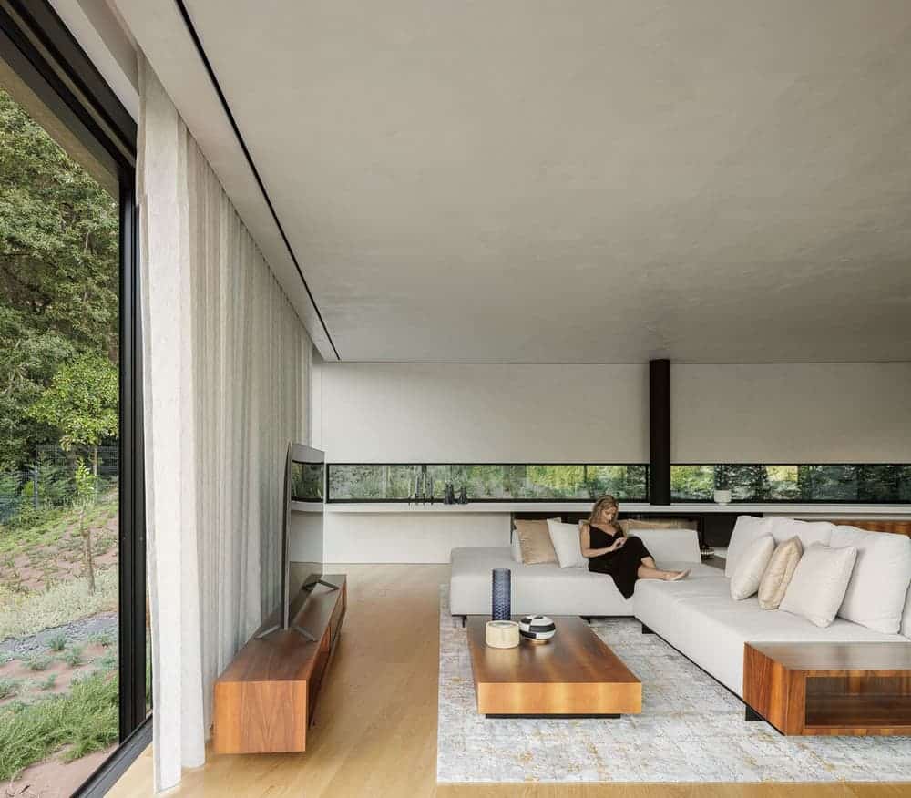
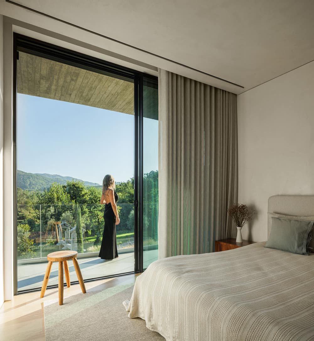
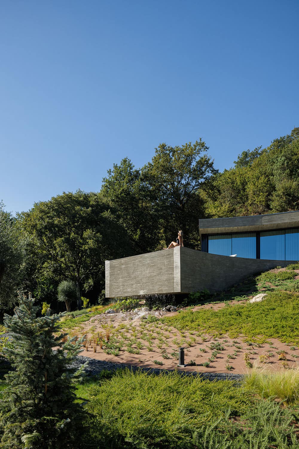
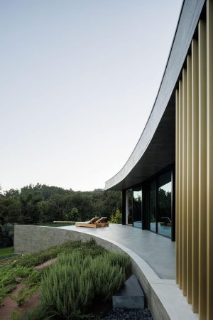
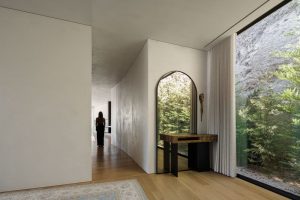
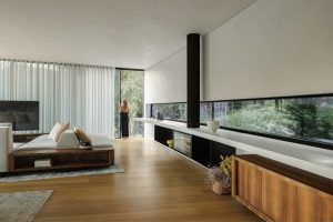
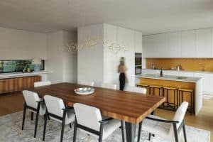
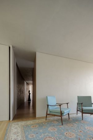
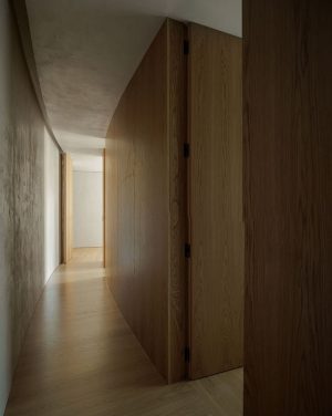
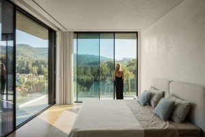
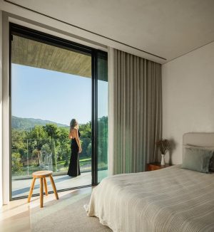
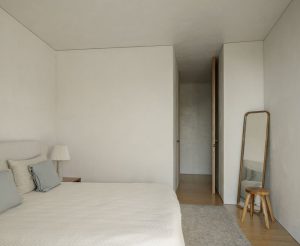
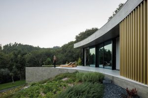
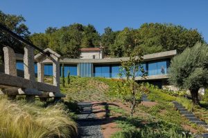
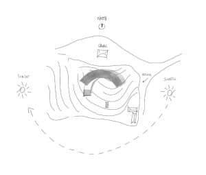
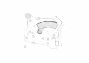
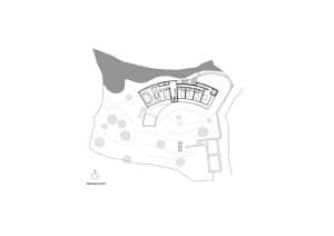
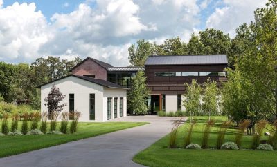
The genesis of the proposal configures a simple volume characterized by a rectangular parallelepiped that was deformed in order to embrace the area of land oriented south and that composes the patio. The Casa De Bouro program is organized in two floors, where the lower floor, in the basement, absorbs the spaces intended for the garage and technical areas and the upper floor intended for social and private spaces. The entrance hall, the four suites, one of them with a walk in closet, the kitchen and the living room communicate directly with each other. In the social space there is also a service toilet and a pantry to support the kitchen.
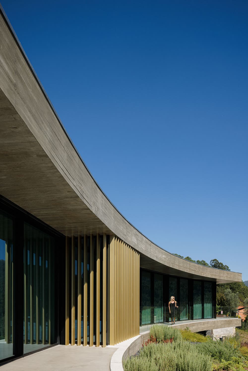
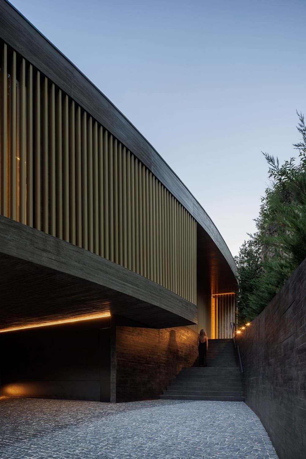
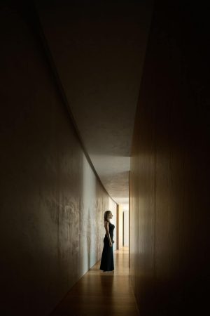
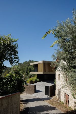
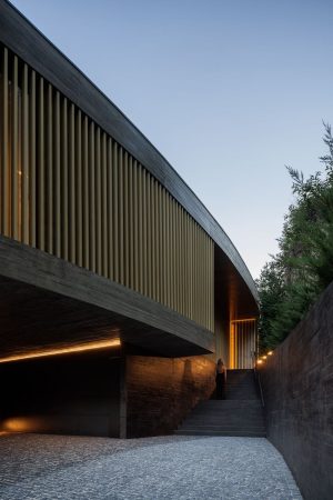
The entrance to the house is located in the center of the volume and the access to it is characterized by an enigmatic exterior path, that highlights the existence of the natural slope, to the north, promoting privacy and highlighting the nature of the site. The fact that the access leans against the existing slope conveys a deliberate feeling of visual funneling towards the entrance and simultaneously creates a sense of curiosity about what will be glimpsed after entering the house.
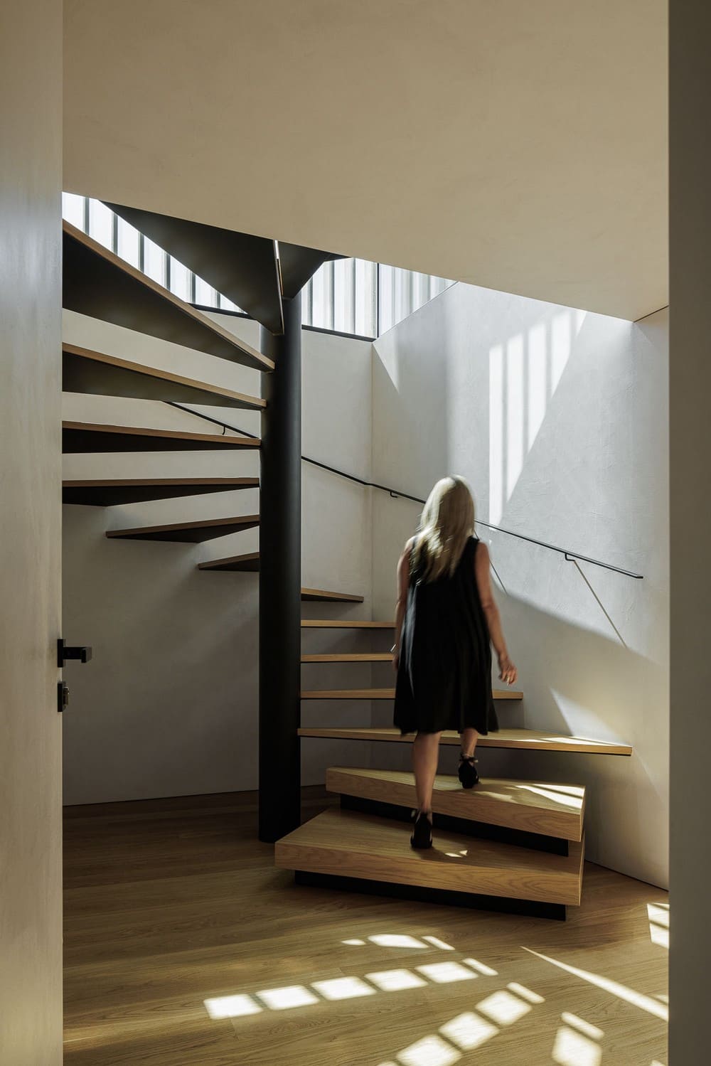
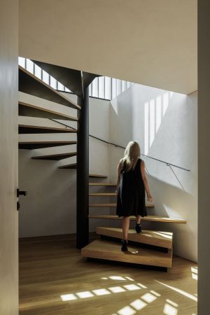
Once inside, there is a direct relationship with the patio, to the south, as well as with the granary, which belongs to the site. From there the whole program is developed, it is the arrival point of the access stairs from the lower floor and also direct access to the private space (east/south) and social space (south/west). Being a house inserted in nature, it was understood that it would be important to absorb a resistant and austere character that is characterized by the construction in exposed concrete, made in nailed wooden formwork in its traditional method. In contrast, elements in golden metal were applied to convey a sense of voluptuousness and refinement.
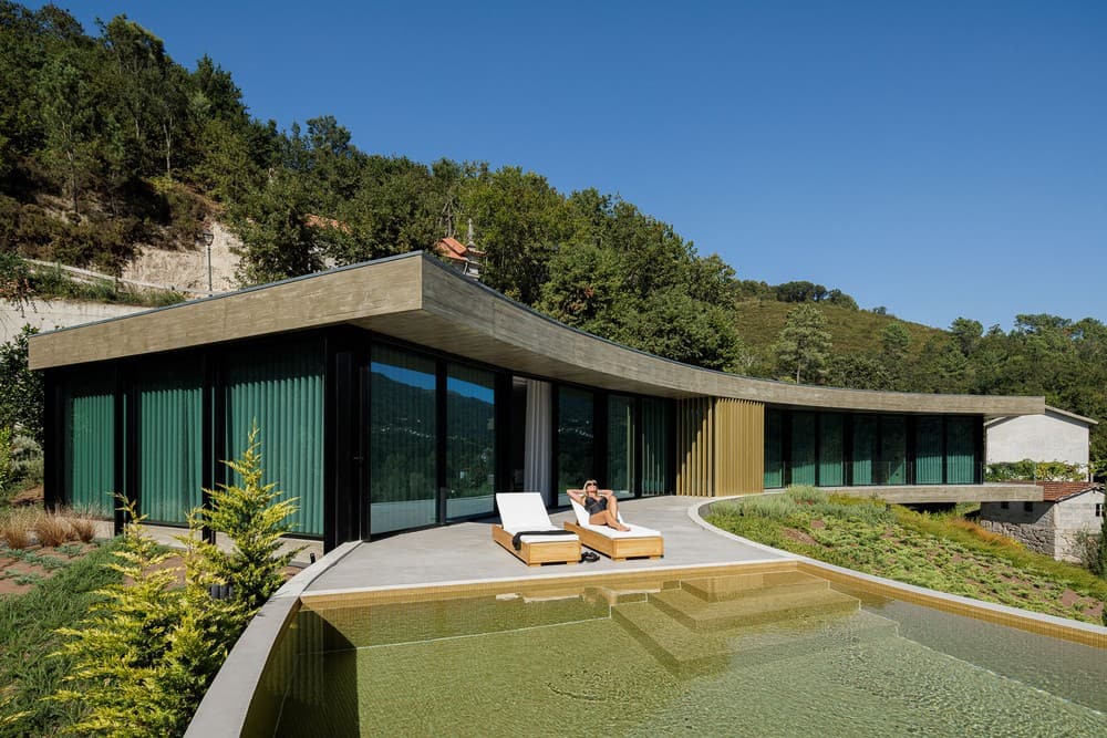

In order to maintain the land’s profile with a natural and irregular organic structure, it was understood that the swimming pool should be part of the construction’s volumetry, therefore, the slab of the 1st floor was rotated in the south/west direction in order to promote a natural relationship between the living room and the area that makes up this outdoor space. The volume of the pool promotes a visual tension characterized by its suspension and attracts to the “place” a new auditory identity characterized by the relaxing sound of the waterfall.
