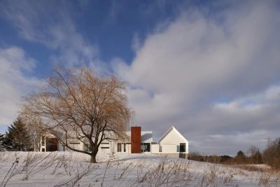
Project: Cherry Lane Residence
Architects: Clark | Richardson Architects
Builder: Glauser Building Company
Landscape: Tim Benton, Land Restoration
Location: Tarrytown, Austin, Texas
Area: 2647 square feet
Year 2018
Photography: Paul Finkel, Piston Design
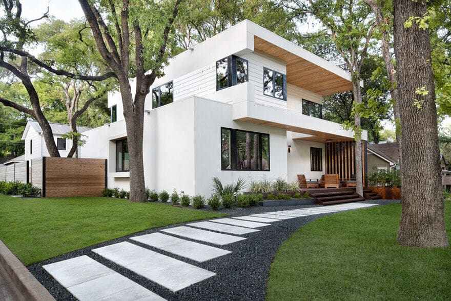
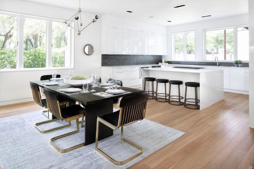
Our Cherry Lane Residence is a transformative whole-house renovation & addition to an existing single-story home in the Tarrytown Neighborhood of Central Austin. A family of 5 sought a modern, efficient design to fit their lifestyle while providing space to grow.
The roof of the existing home was removed, the exterior envelope re-imagined and a new second-story addition was added to elevate the new spaces into the dense tree canopy of the site. Outdoor spaces engage the neighborhood and take advantage of the beautiful old-growth trees on the property while minimizing the impact of the building footprint on the site. Minimal detailing and challenging modern craftsmanship throughout the home allow the spatial harmonies to sing.
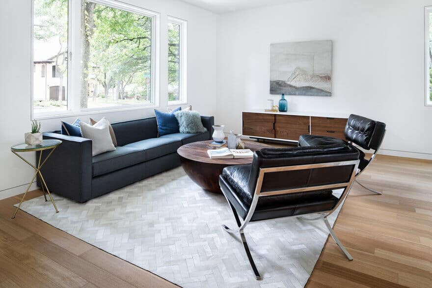
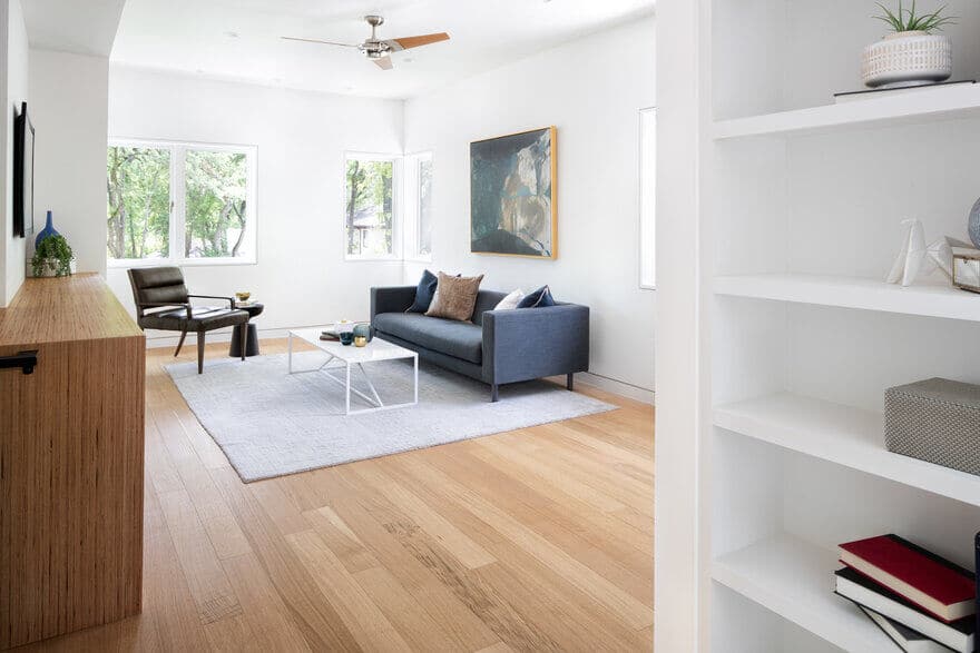
The clients approached us with the desire to re-imagine their rambling, low-slung single-story residence into a bright, crisply detailed, modern residence. The corner lot was compacted due to setbacks which were further complicated by the non-conforming situation of the existing residence and the abundant protected trees located on the site. With three young children, the programmatic challenge was to adapt this small existing home to the needs of a young family. Locating the children’s rooms in the upstairs addition allowed for a playroom to be separate from the downstairs living areas. The desired modern aesthetic remained warm and embracing by the selective use of materiality and tone.
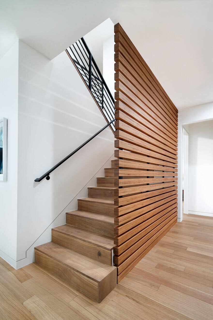
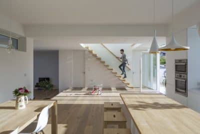
The design is a complete re-invention of the first-floor plan of the exiting residence using the stair as the central spatial organization element. By placing the stair, bathrooms, and other service spaces in the middle of the program, hallways were minimized, and functional space could be maximized. This placement enabled the street-defined corner of the residence on both floors to become the primary habitable space with ample views, daylighting, and natural ventilation into and through the Cherry Lane Residence.
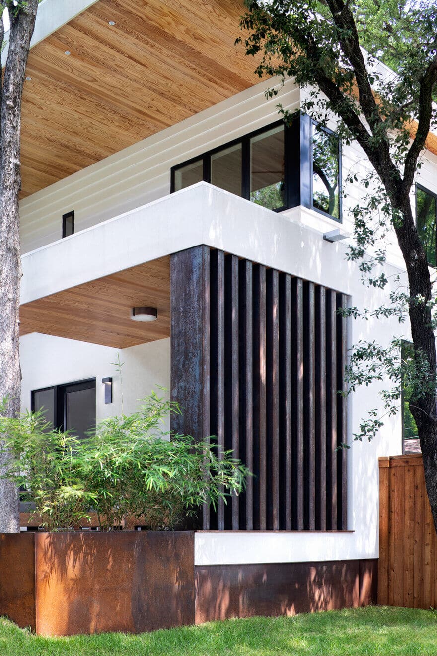
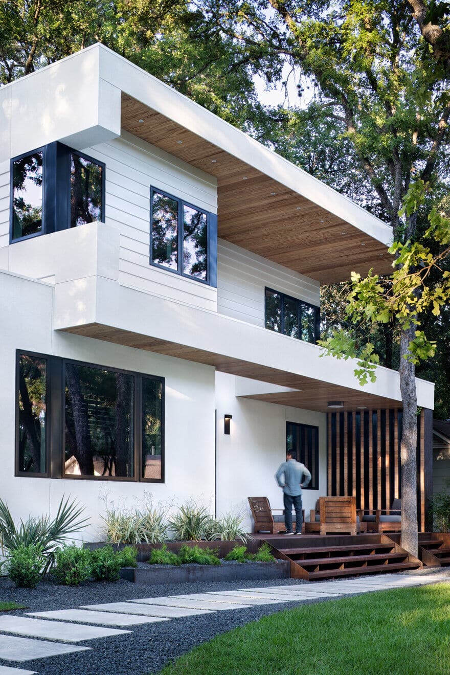
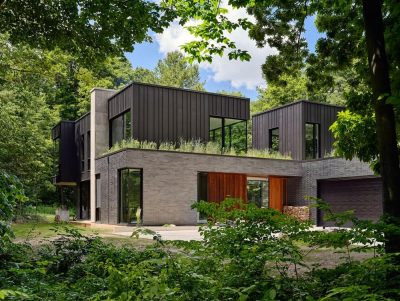
The transformation of a traditional single-story residence into a modern two-story residence is accentuated by a prominent ‘wrapper’ element. The front façade features a large overhang that transforms from roof, to wall, to overhand, to floor as a driving aesthetic force. It carries through to other facades, joining the complimentary parts as one unified design. The ‘wrapper’ is both aesthetic and functional by creating a dramatic street presence for the otherwise compact design and enabling generous outdoor spaces within its embrace.
Because the existing residence was built over current setbacks, city zoning only allowed for up to fifty-percent of the linear footage of the exterior walls to be removed and the second-floor addition had to be shifted into the center of the lot to meet the modern setback standards. The resulting design has two interlocking volumes which embody the zoning constraints of the site while also working aesthetically to frame outdoor spaces to the north and south of the residence. Additionally, the design of both the new drilled pier foundation system and the second floor were completed in conjunction with the City Arborist to ensure that the large protected Heritage trees surrounding the home would not be adversely impacted by construction. This included designing the pier system and steel floor framing to span over and around the existing critical root zones of surrounding trees. A mechanical loft was discretely placed in the center of the main flat roof, enabling the flat-roof aesthetic desired by the client but locating the hvac system to make use of the efficient floor plan without imposing on the inhabitable spaces within.
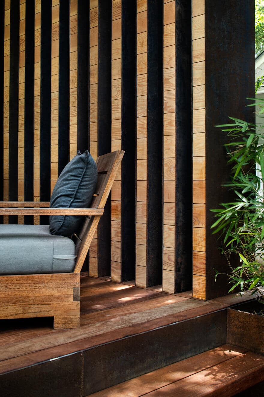
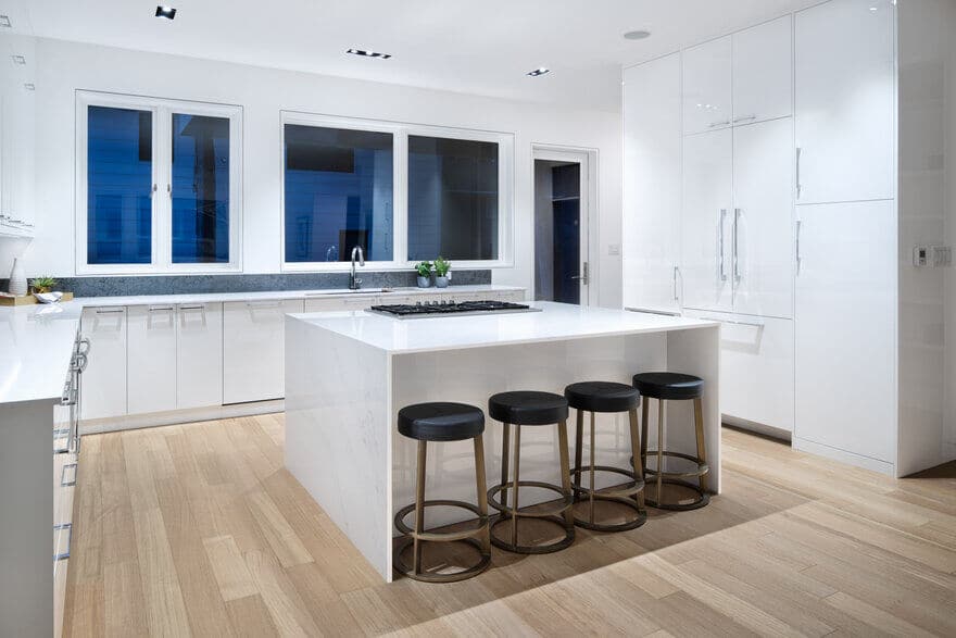
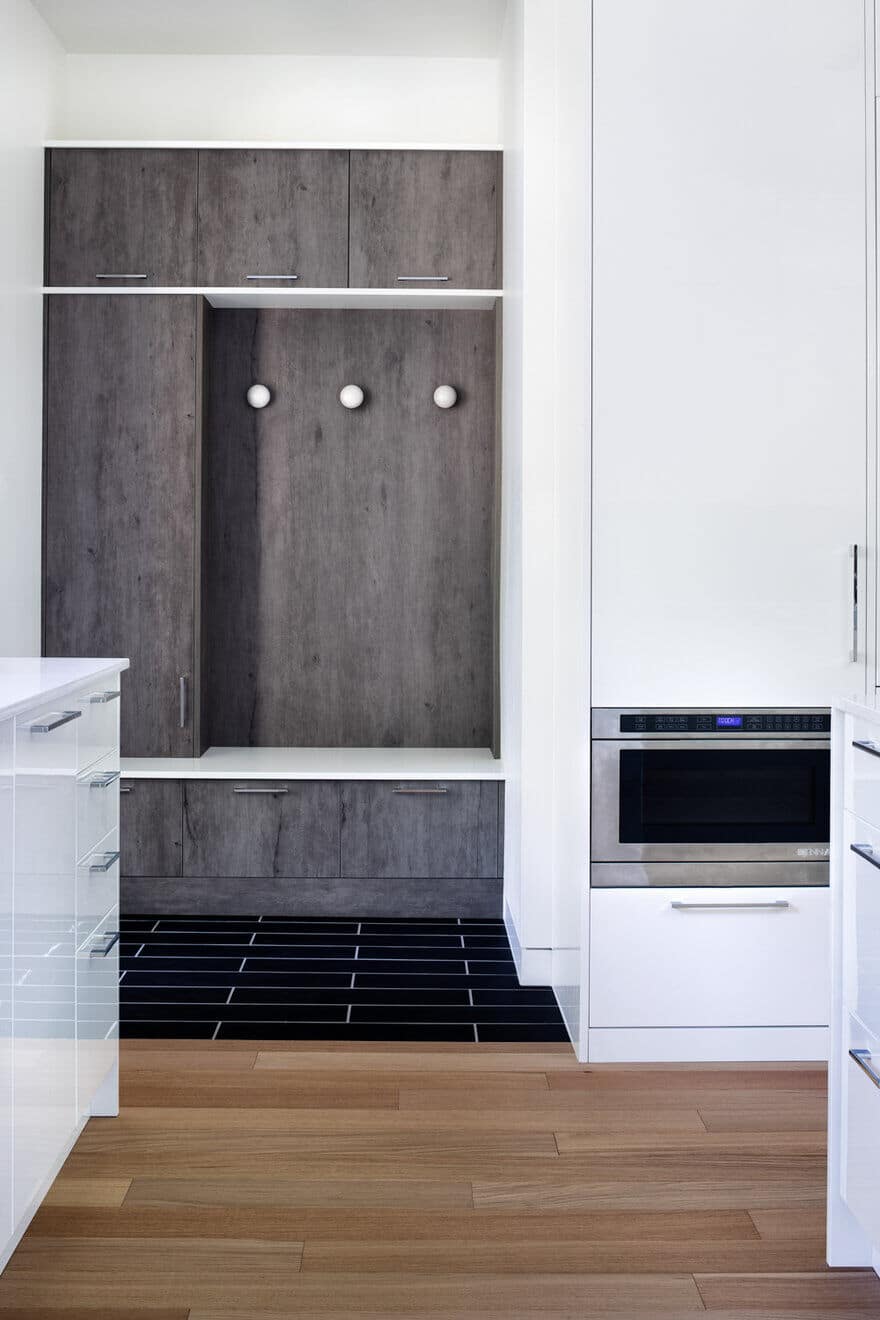
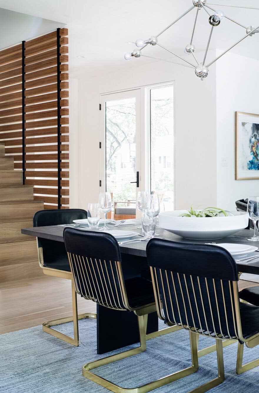
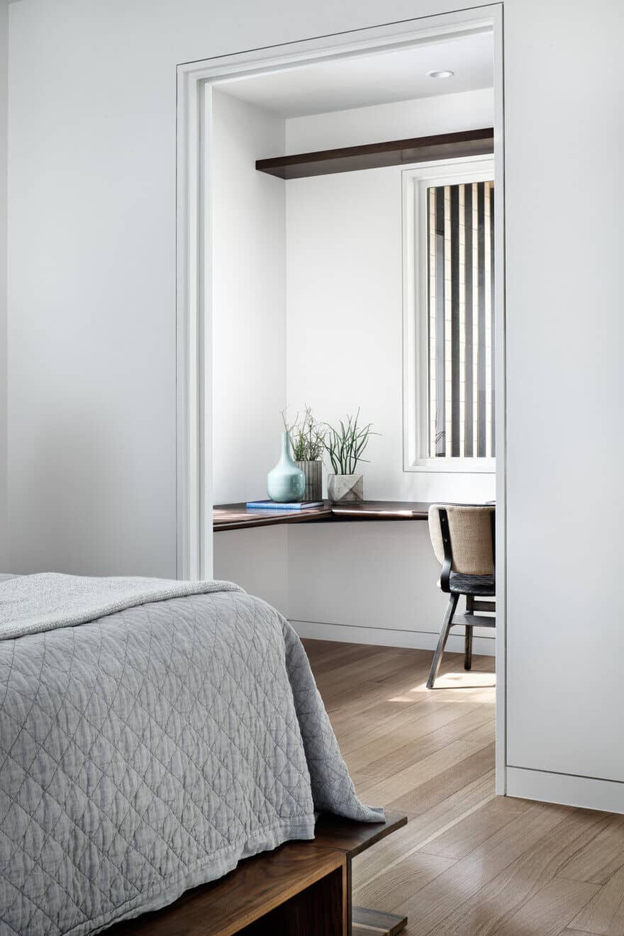
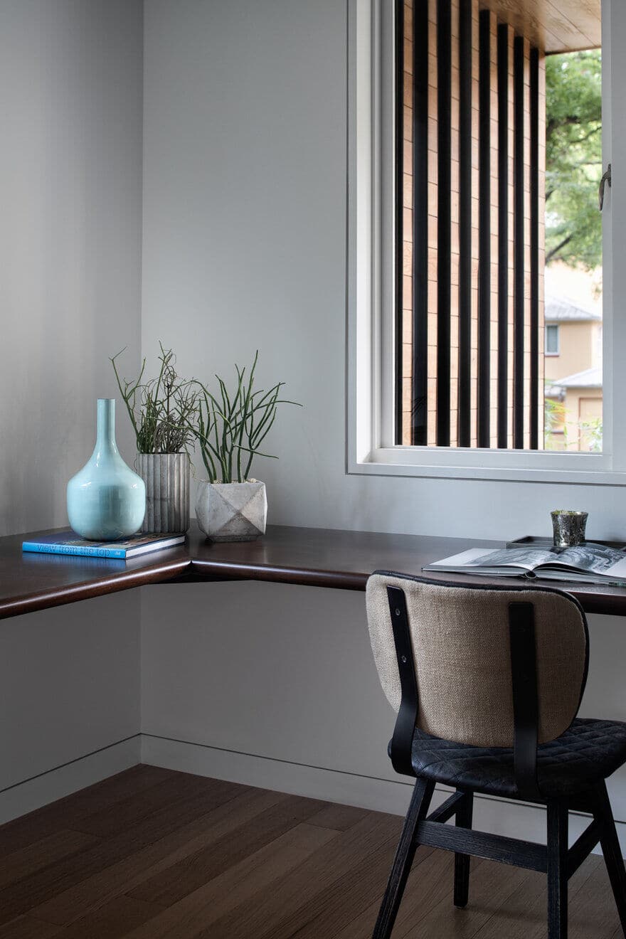
Wall-mounted toilets, built-in cabinetry throughout, and custom scuppers with rain chains were utilized for both aesthetic and functional purposes that required meticulous planning and coordination. Cabinet finish-grade Baubuche plywood was utilized as an interior ‘wrapper’ form to accentuate the stair by creating a horizontal louver screen. This serves as a semi-transparent backdrop to the entry foyer. It then moves up the stair at the landing to become a long built-in storage and entertainment hub for the children’s playroom. Flush trim details at baseboards, doors, and windows keep the interior aesthetic minimal and subtly reinforce the ‘wrapper’ aesthetic. An exterior vertical louver wall, clad in steel and wood, brings the façade ‘wrapper’ down one side of the front porch unites the driving form with the various materials while functionally creating a sense of spatial capture and privacy at the front entry.

