Project: Douglas Street House
Architects: Ashley Halliday Architects
Location: Millswood, South Australia
Area: 300 sqm
Year: 2019
Photo Credits: Sam Noonan
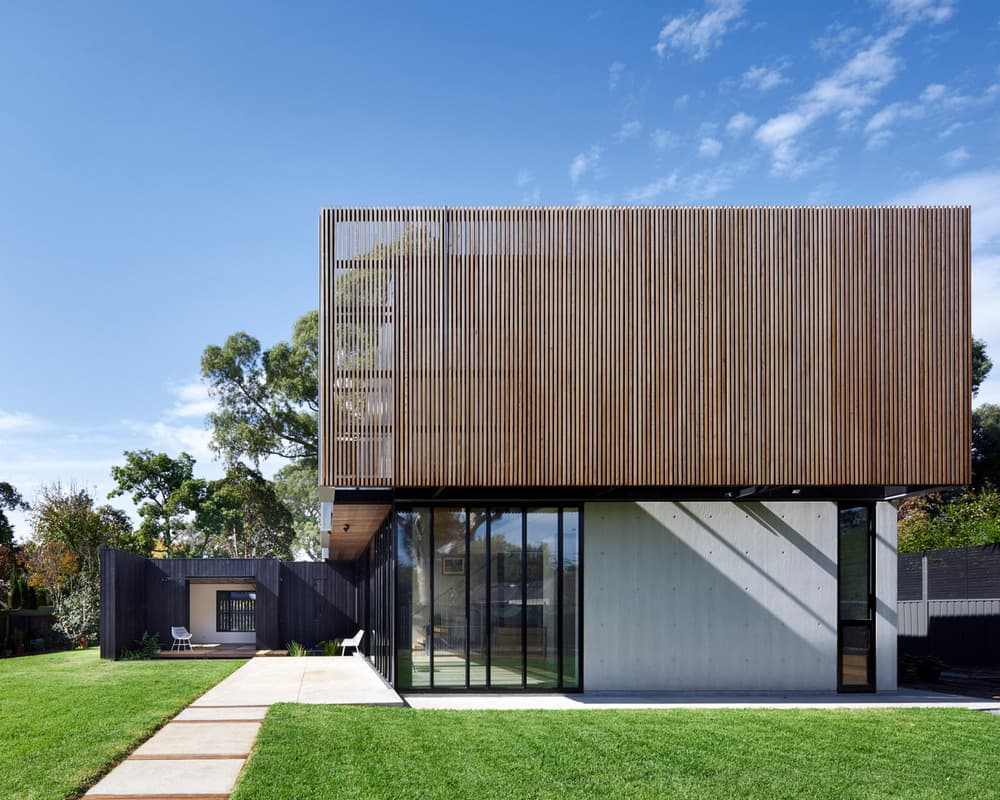
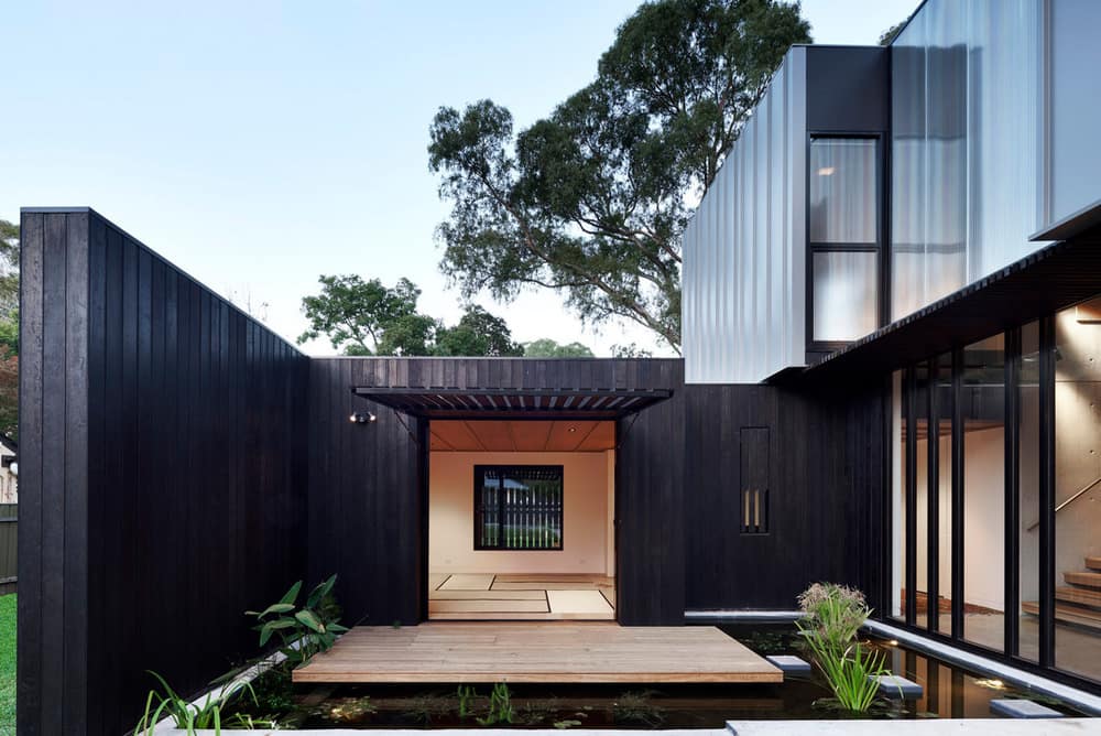
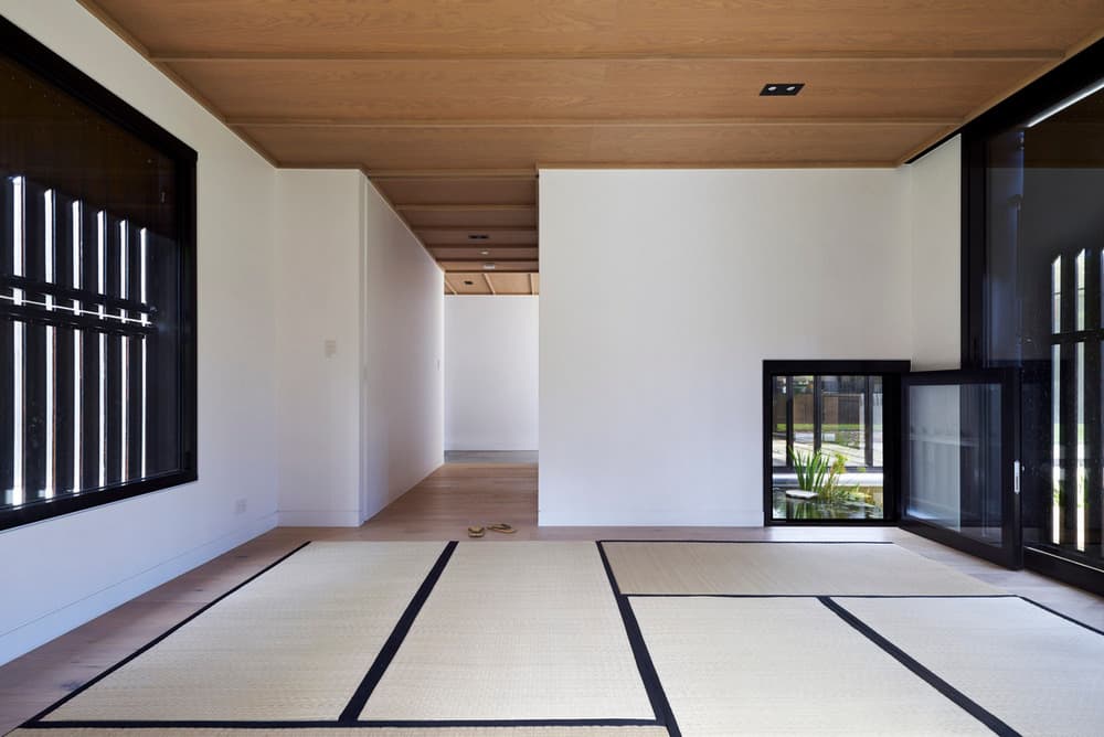
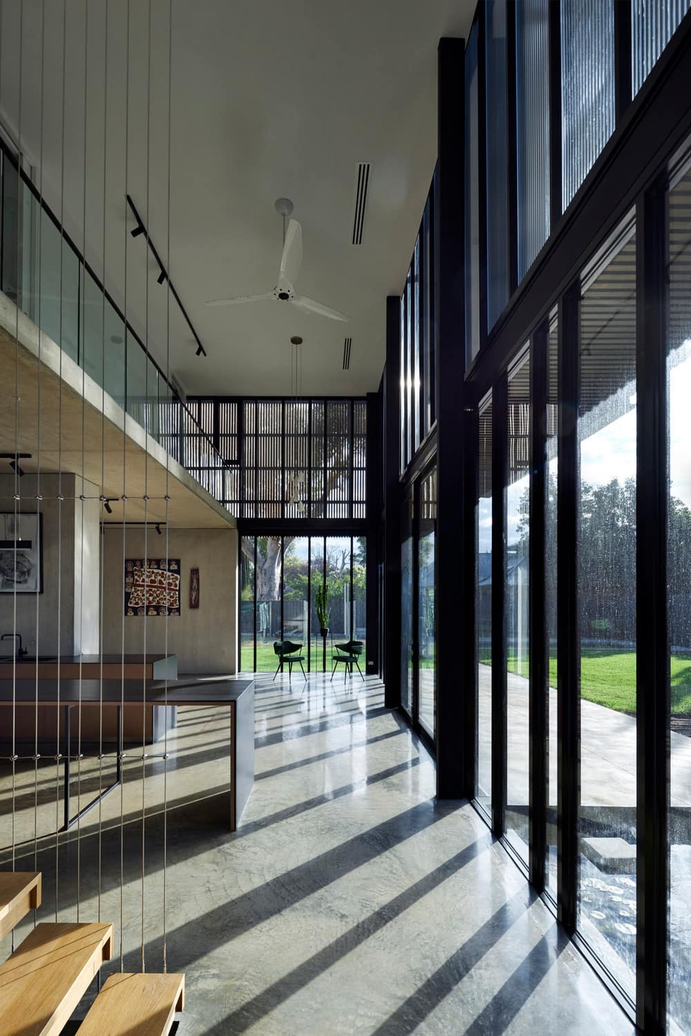
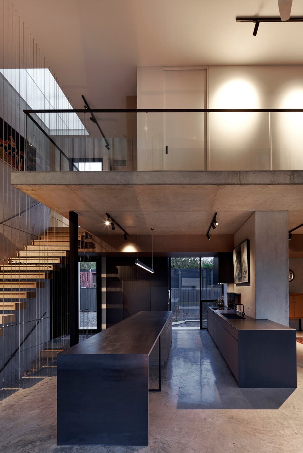
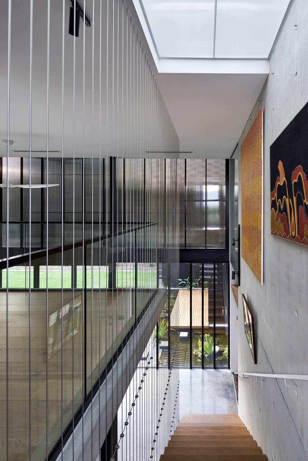
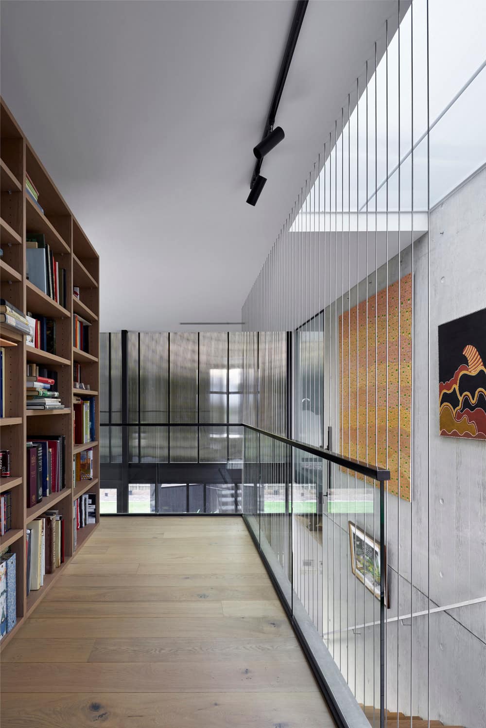
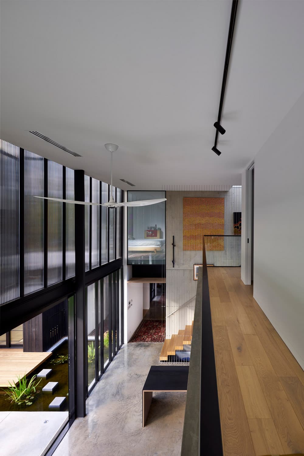
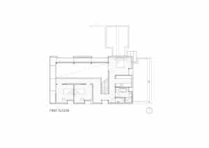
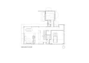
Influenced by the client and architect’s mutual appreciation for European modernism and contemporary Japanese architecture, we sought to explore familiar aesthetic sensibilities yet create an authentic new architecture through careful consideration and response to client needs and preferences, site context and climate. Douglas Street House is simple arrangement of interactive, meditative and service spaces at the ground floor with private rooms at the upper level organised around a generous central 2 storey void, the building positioned centrally within a generous landscaped setting. Adjunct spaces include a cellar/art/media space, garage and traditional tatami pavilion.
What drove the strong geometric appearance of Douglas Street House?
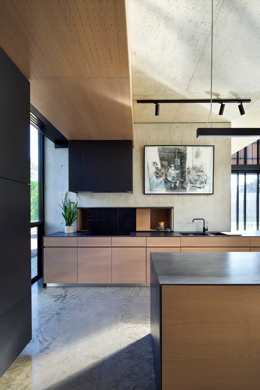
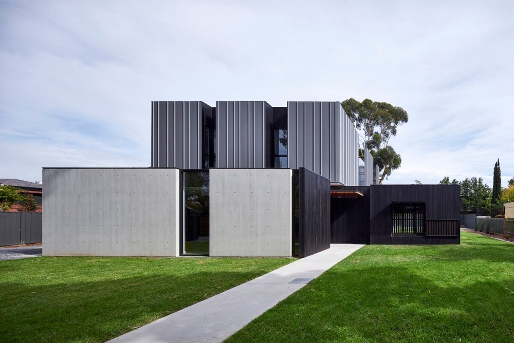
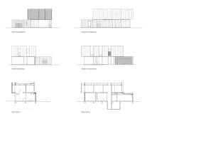
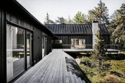
A key design move was the creation of a singular and balanced composition comprising clear geometric forms (light-weight top box, concrete and interleaved charred cedar and glass base), choreographed to create tension, drama and relief between volumes and surfaces, tones and textures, light and darkness. This strategy was reinforced by the interleaving of spaces and surfaces. For example – the charred cedar tatami pavilion and entry tucking in under the top box and its sharp junction with the raw concrete facade.
What other design qualities are achieved at Douglas Street House?
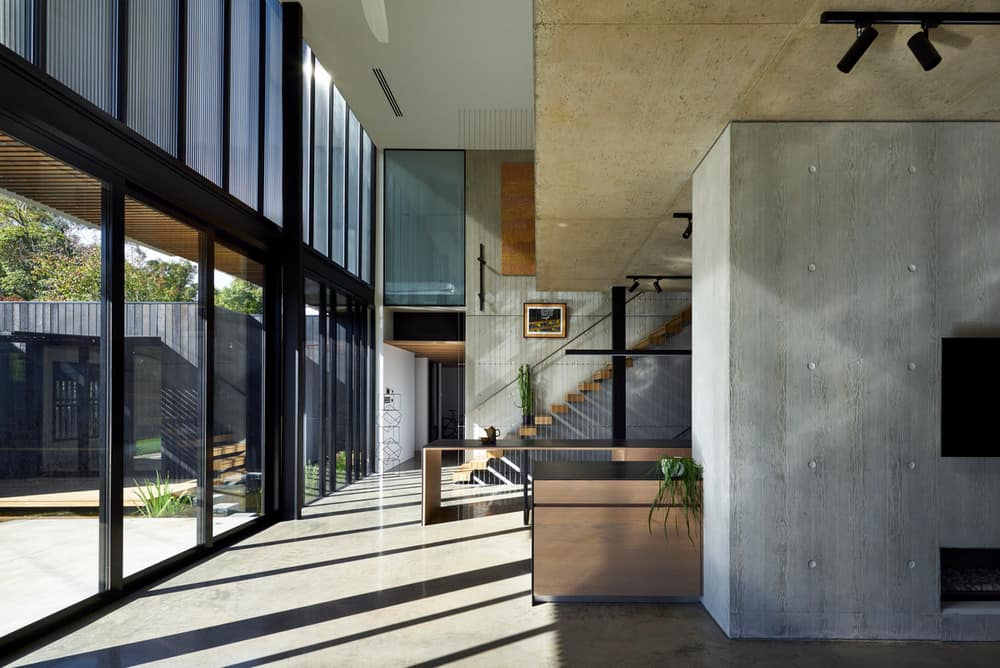
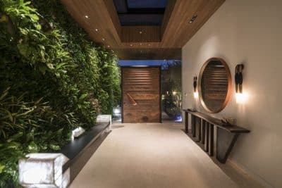
Douglas Street House cannot be taken in one glance – Its authenticity is defined through carefully orchestrated dialogue of experiences and moments through time and space (perhaps including curiosity, envy, surprise, delight, relief and rest). For example – The quietness, simplicity and intimacy of the front entry provide contrast with and provide relief from the raw concrete facade. The rhythm of timber ceiling panels in the entry hall accentuate a deep perspective visually framing and guiding you through to an expansive light filled and welcoming living space and garden setting.
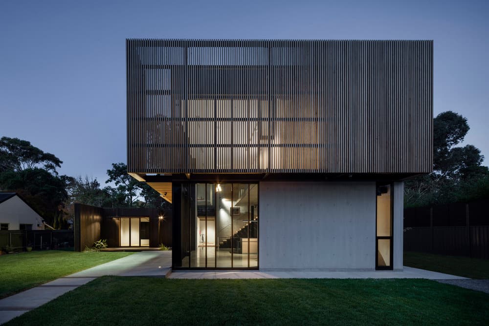
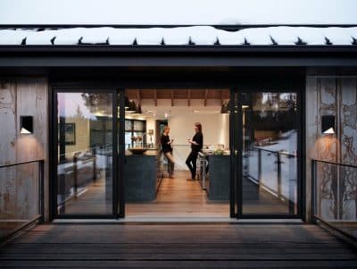
By day the building expresses considerable transparency, openness and connectivity with the outdoors through carefully placed openings, abundant natural daylight and ventilation, and deliberately framed views. By night, the building maintains these qualities also becoming a lantern, revealing the buildings elegant filigree structure through a transparent polycarbonate and glass skin, reversing the proportions of solid and void. This diurnal relationship keeps our clients cognisant of and integrated with the natural beauty of their place and the effects of change by day and season. The spatial boundaries, character and ambience of this home appear differently at different times of the day depending on the level and quality of light and atmospheric conditions.

