Project: Dovercourt House
Architects: Wanda Ely Architect
Location: Toronto, Canada
Photographer: Scott Norsworthy
The Dovercourt House is uniquely tailored to celebrate the clients’s heritage, and reflect their beautiful and hospitable spirits. The house draws upon, and re-interprets, many elements of traditional Japanese architecture, and marries those elements with a love for richness, colour and texture.
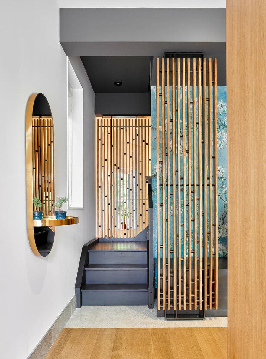
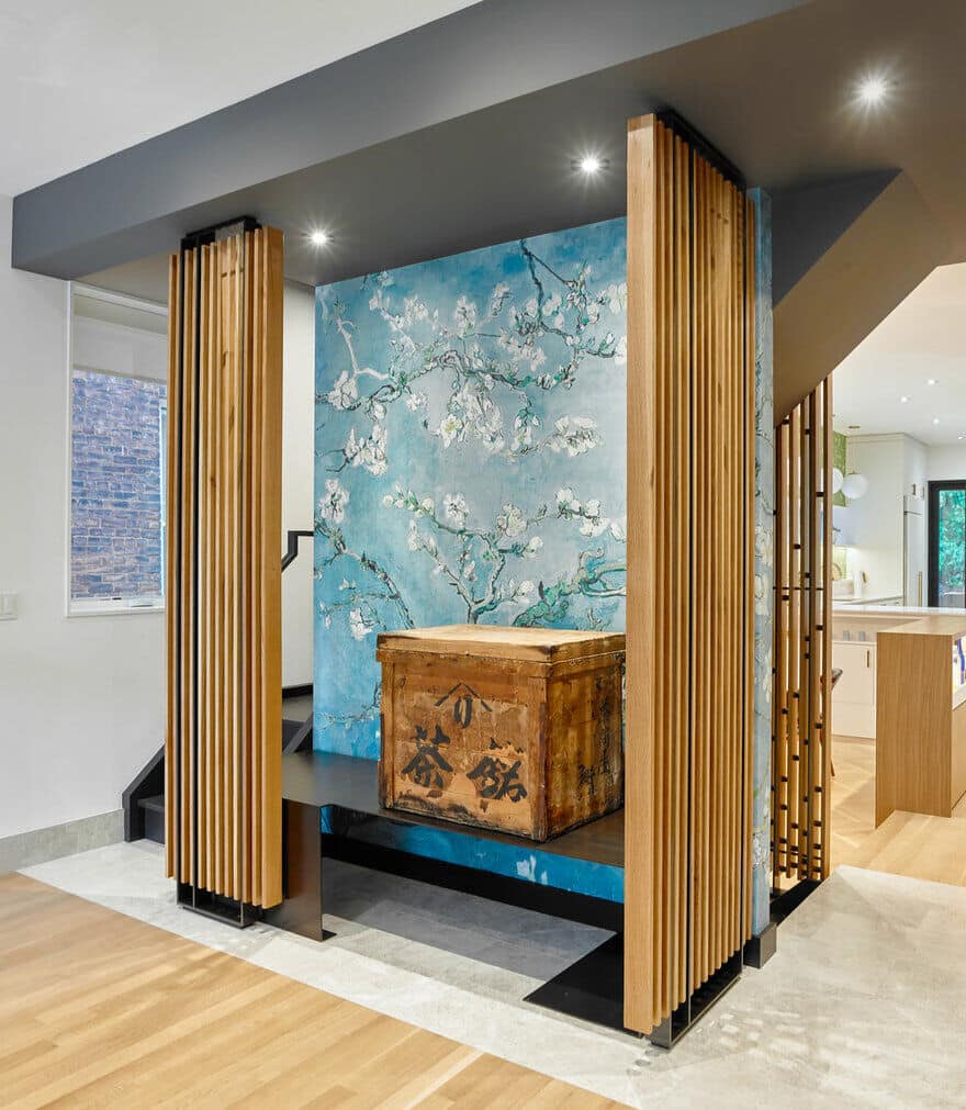
The house is conceived as a series of layers marked by thresholds: layers of light, layers of history, and layers of materials. At the heart of the home sits a sacred wooden box, a precious family heirloom that is the anchor around which the stairs revolve.
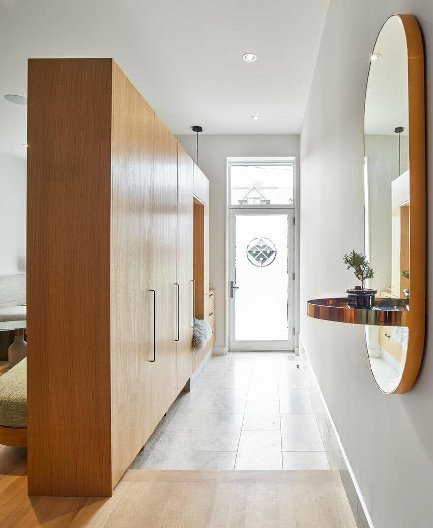
The view from the front door is carefully composed, drawing visitors inwards and welcoming you home.
The entry foyer is reminiscent of a traditional japanese genkan, the zone where one’s shoes are removed, one step lower than the main house. Shoes can be stored discreetly under the floating millwork. Part height millwork floats in the space to define an entry-way, provide storage, and frame views into the rooms beyond. The millwork, along with a changes in flooring material, and in elevation, mark the foyer as distinct from the rest of the house.
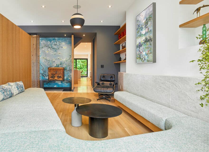
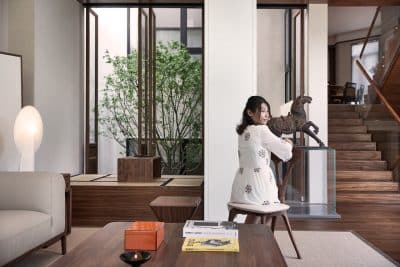
An old wood box sits upon a metal plinth, framed between delicate wood and metal screens. A bittersweet treasure from Mark’s ancestors’ time in the internment camps of B.C. through the second world war, the box sits in a sacred place at the heart of the home.
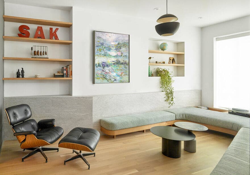
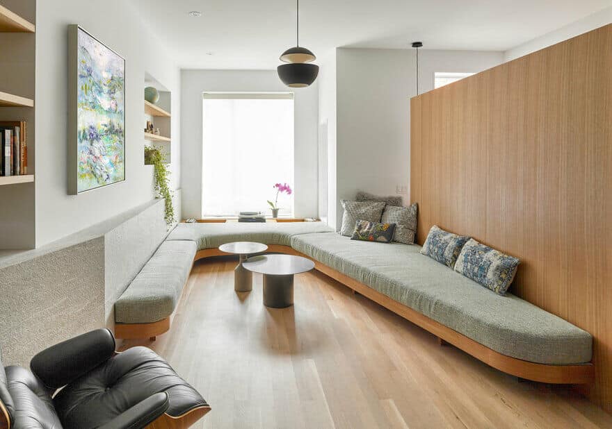
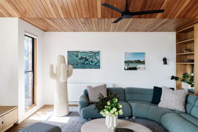
The living room is flooded with natural light. Carefully curated floating shelves display a collection of objects within two niches carved from the wall.
Within a relatively compact living room, a variety of activities are accommodated by a uniquely curved upholstered seat that lines three walls – its depth varies to allow for: conversations, music listening, lounging, reading, napping, etc.
The living room at the front of the Dovercourt House is divided from the kitchen and dining rooms at the back by a central zone defined by a charcoal grey mass containing the stairs and the family’s special wood box.
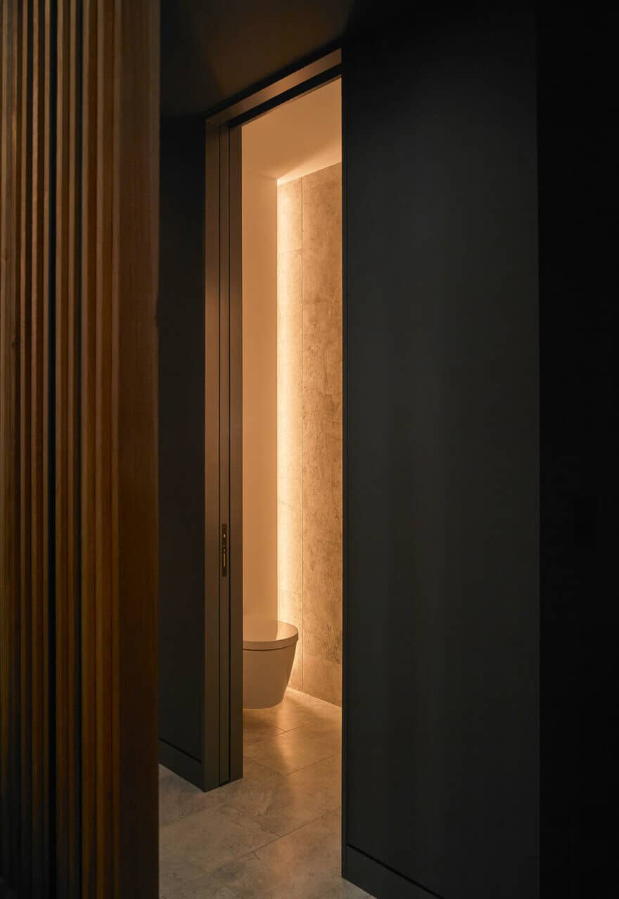
The powder room is tucked beside the stairs, and lit with hidden cove lights, meant to give a warm, soft glow. The floor tile that folds up the wall, washed with a warm glow it becomes an architectural night-light as you head up to bed. Instead of a mirror in front of the sink that displays one’s own image, an intricate mosaic tile takes the spotlight and the mirror is angled to the right, allowing a quick peek to check one’s hair or makeup.
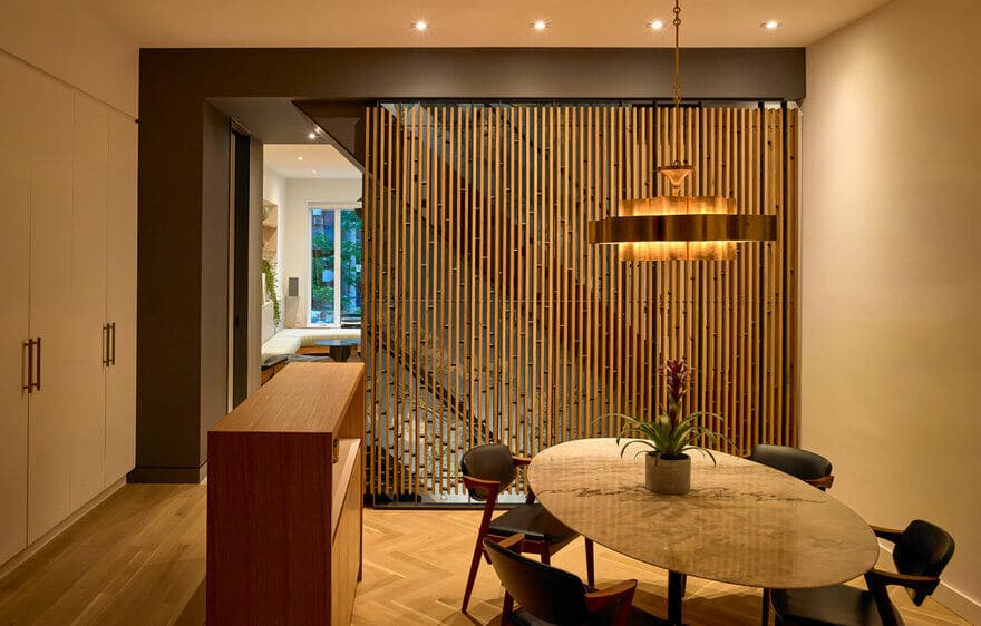
The dining room is sunken one step to create a sense of comforting enclosure, bounded by a modern interpretation of a traditional shoji screen. A change in wood flooring pattern marks the room as distinct, the herringbone texture reminiscent of customary woven tatami mats. A custom bar unit straddles the change in elevation to display liquor and barware and provide storage for table settings & dinnerware. Throughout the home, there is an elegance and refinement in the details that reflects a Japanese sensibility – valuing things of quality and eliminating everything else. The wood and steel screens glow in the evening; when illuminated from one side the steel spacer rods cast a random spattering of soft shadows across the white oak slats.
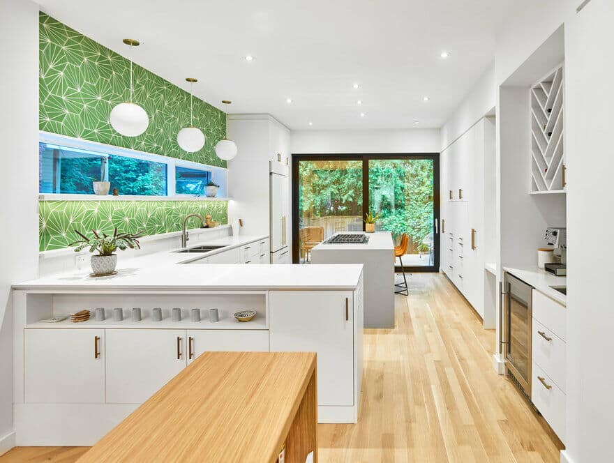
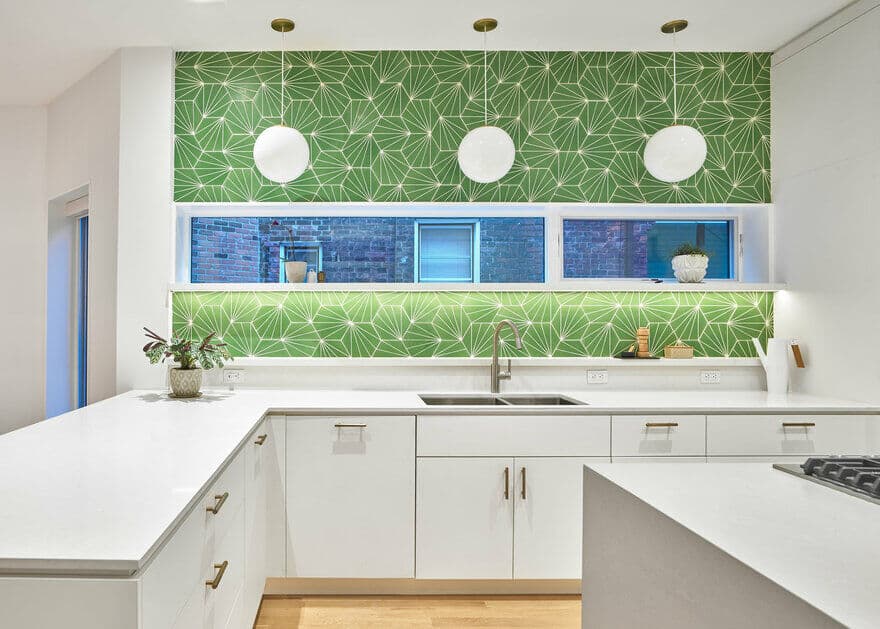
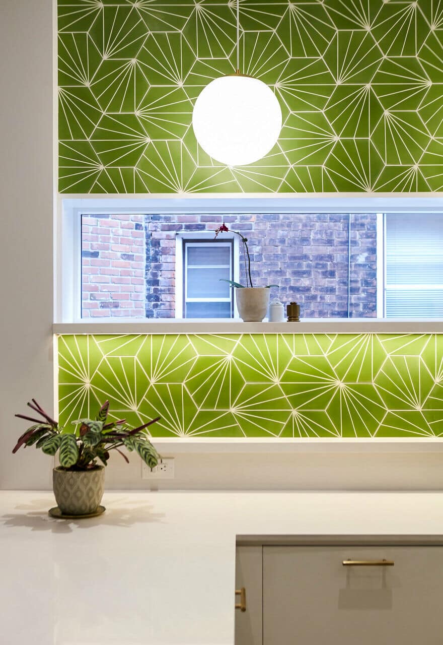
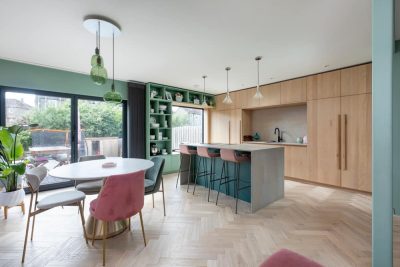
The kitchen palette is restrained; white cabinets and white oak flooring allows two green accents to be the features that grab one’s attention. At the end, a black sliding door frames views of the verdant yard beyond, and to the left, a vibrant green feature backsplash tile stretches to the ceiling. Opposite, a wall of cabinets houses an appliance garage and plenty of pantry storage.
The kitchen is laid out to be comfortable for two people to cook simultaneously. A wide gas range is integrated in the island with a discreet downdraft hood.
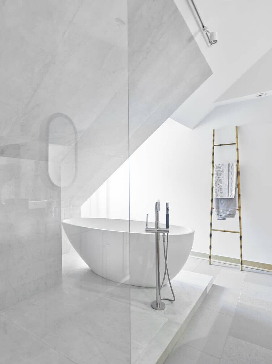
Upstairs, the master ensuite is a serene oasis, a retreat to a light-filled escape from the everyday routine.
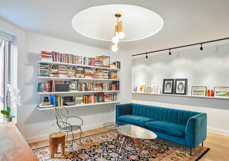
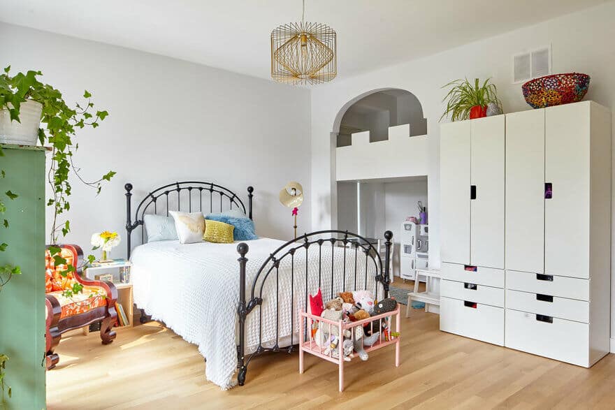
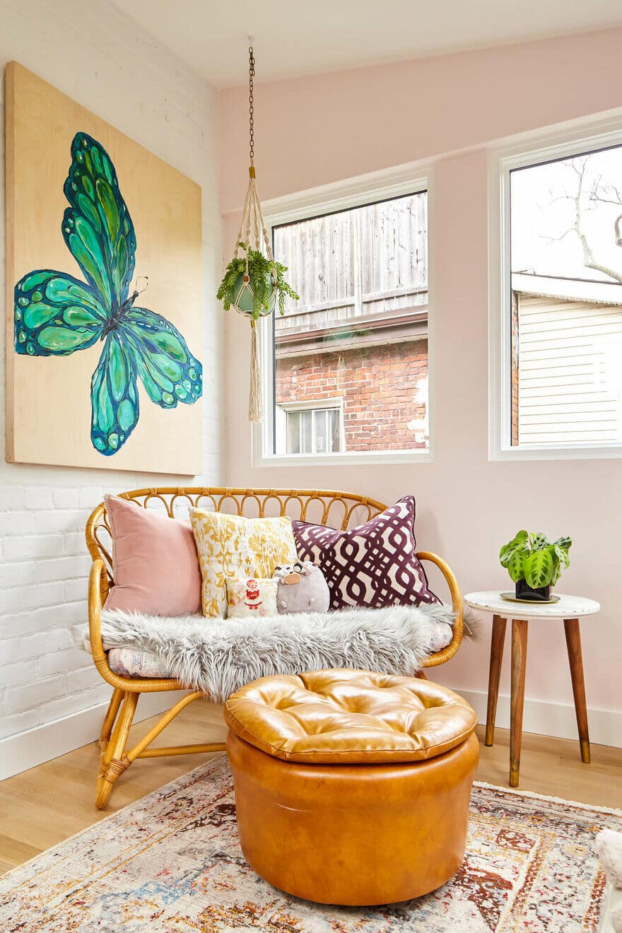
The design and materiality of the second floor is decidedly more casual, more eclectic and incorporates colour & texture referencing vintage, mid-century design.
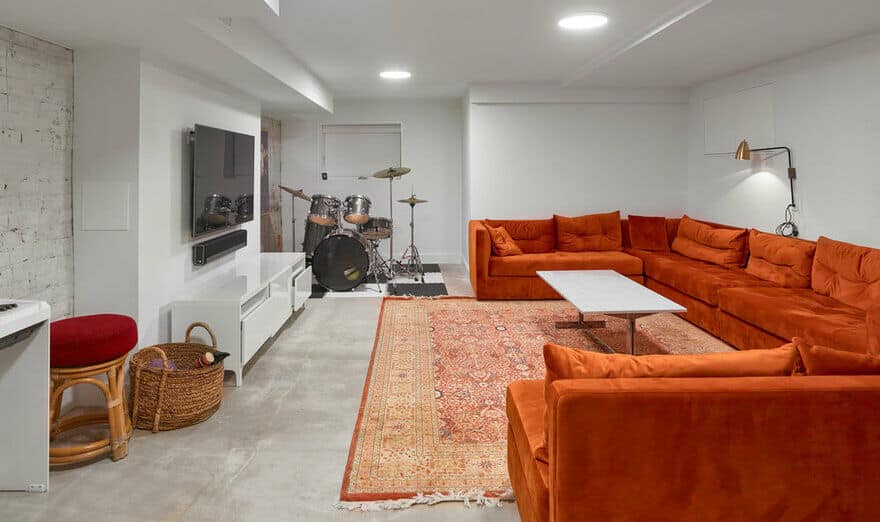
The basement rec room is a casual, multi-purpose space with a large sectional, TV, and drum kit.
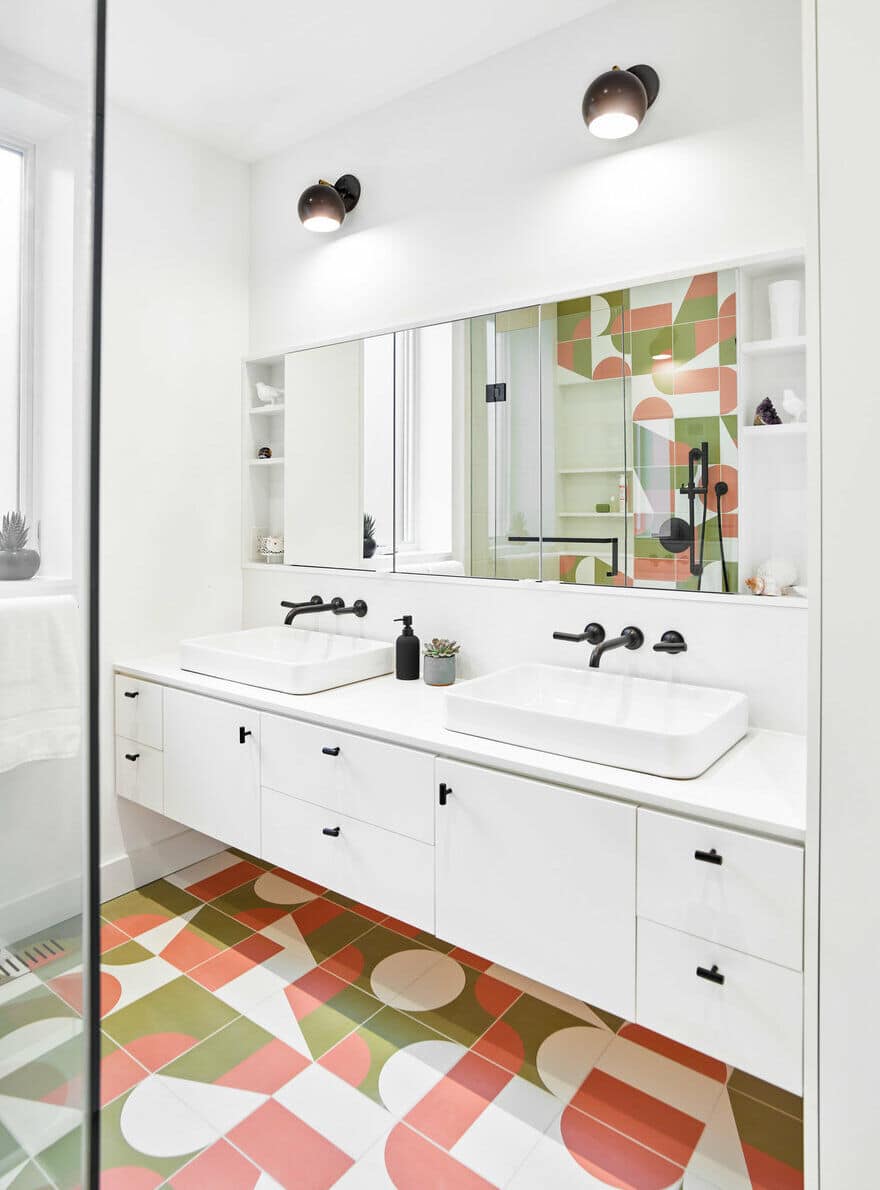
The girls bath upstairs features a fun geometric tile that folds from the floor up one wall in the shower. A long double vanity provides plenty of storage space for toiletries, makeup and bath supplies. The tile makes a fun, bold statement in the bathroom – a niche is perfectly aligned to the grout lines with shelves for shampoos and soaps.
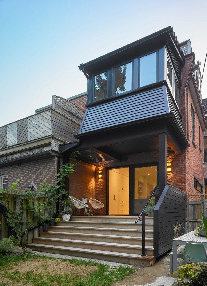
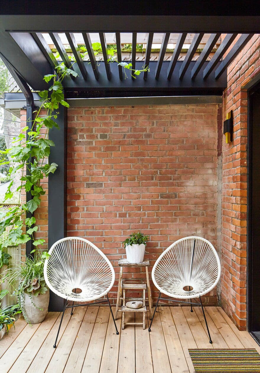
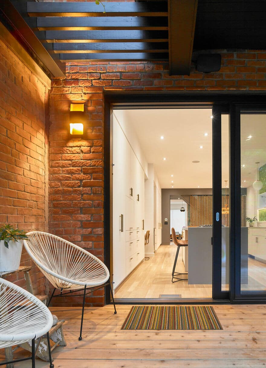
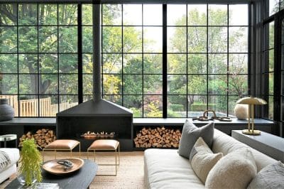
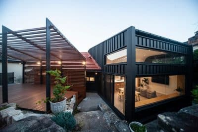
A new back deck is tucked under the overhang of a second story sunroom above, and black slats infill the gap to an adjacent brick wall, creating a cozy spot to relax outside, BBQ, and watch the kids playing in the yard.
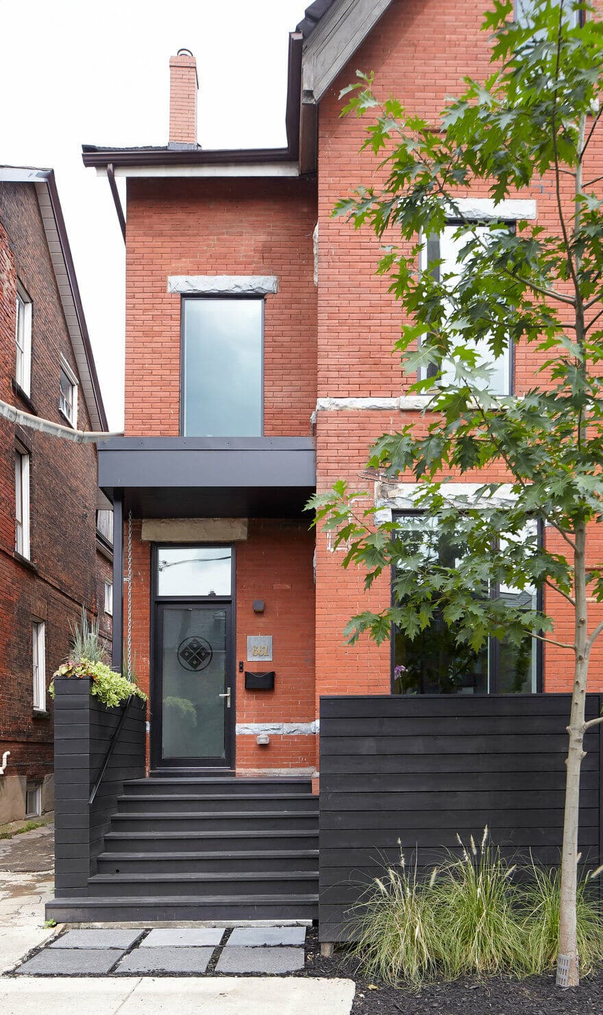
The deck becomes a natural extension of the living space when the large sliding door is open. The rear sunroom is re-clad in black siding match with the new windows. The front porch is rebuilt and tied into wood planters that screen the garbage / relying bins from view.

